


|
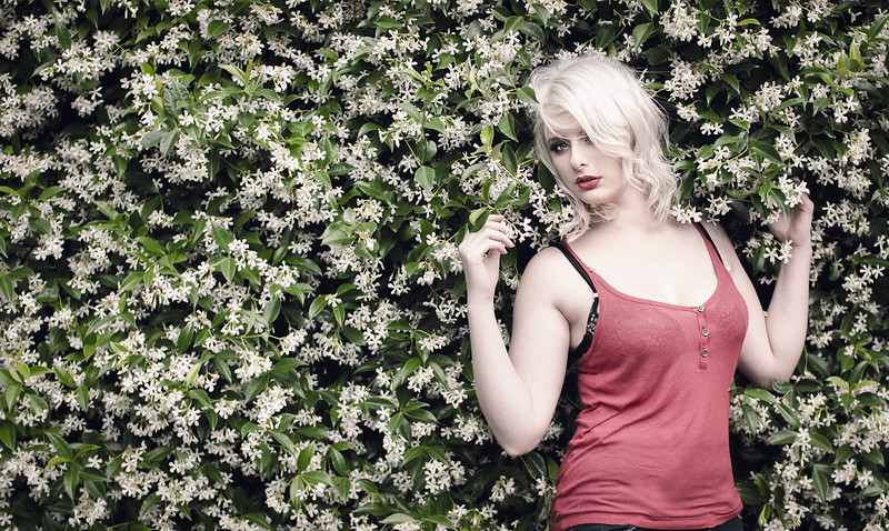
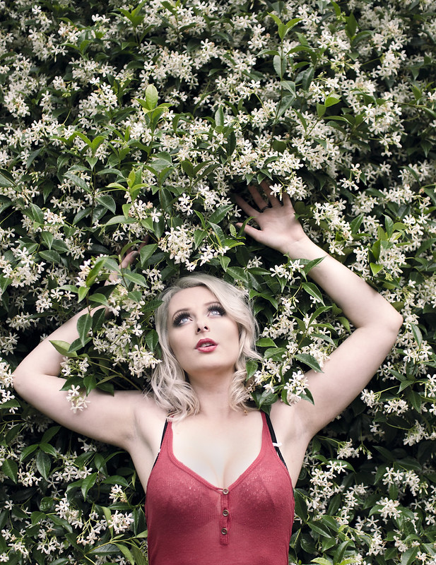
Cyberbob posted:With my three images for the day, I can't decide which I like best. I know which one I prefer, but I thought I'd publish all 3. They're different enough, and hopefully hold up on their own. The second one is really nice. I love her skin tones, her pose and the bit of bra over the top of her shirt adds just a little something to it, but not too much. It also reminds me of American Beauty without being an obvious copycat. I'd say the third is the weakest. I think the eye contact in the first 2 are key. And yes, she does look a little bigger in the first one, but she still looks totally gorgeous and I wouldn't say it's unflattering.
|
 #
?
Feb 22, 2013 07:47
#
?
Feb 22, 2013 07:47
|
|


|

|
| # ? May 23, 2024 17:50 |
|
|
Edmond Dantes posted:
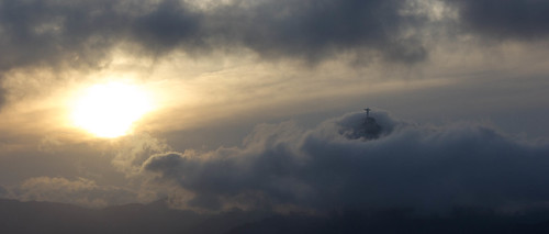
Put it this way - even the nicest, most technically adept landscape shots tend to bore the arse off me. I'm not particularly excited by landscapes most of the time, so it's an achievement to get me interested on that front. It's got a magical quality that I'm a sucker for. A landscape with a weight of emotion other than "hey it looks pretty and I've included the foreground interest and the right time of day for pretty light". All of those things make an accomplished landscape image, but they leave me cold. This has drama.
|
|
#
?
Feb 22, 2013 11:55
|
|

 I still consider most of my pictures blow, so the positive feedback on this one menans a lot.
|
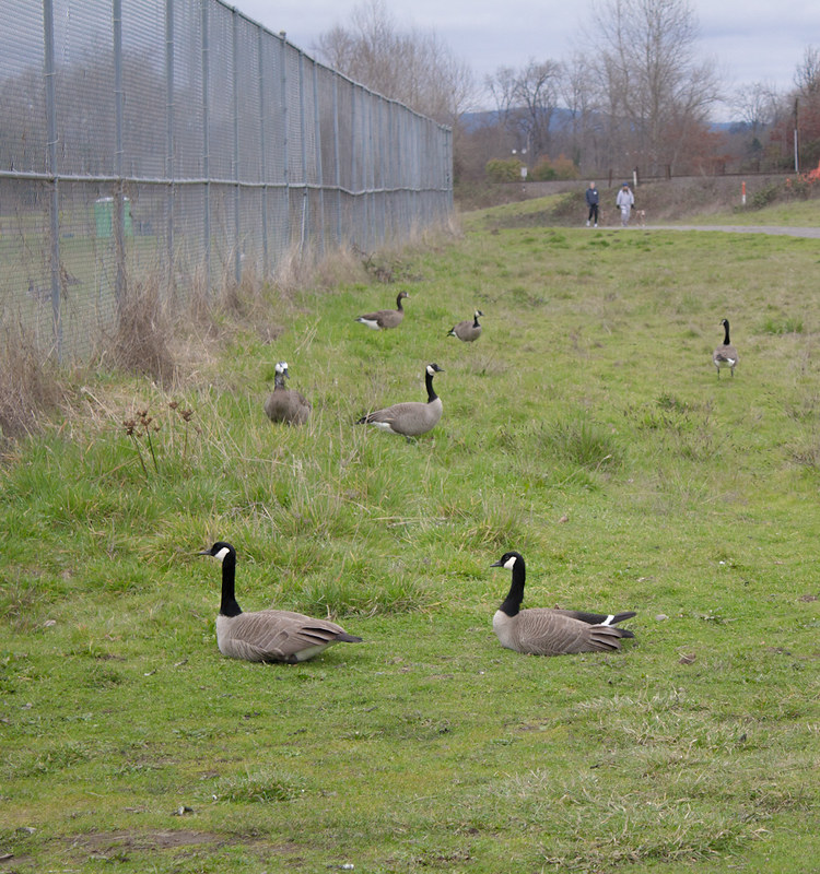
Bringing this in from Low Effort.slardel posted:
This would be perfect without the people and maybe the lone goose on the right. Keep it up!
|
|
#
?
Feb 22, 2013 18:48
|
|

|
Whitezombi posted:Bringing this in from Low Effort. And cropping the people out would be easy, even if just to quickly test the impact of their removal.
|
|
#
?
Feb 23, 2013 01:57
|
|

|
Whitezombi posted:Bringing this in from Low Effort. Oh, hey. Thanks. I guess I liked it with the sky included? Will play around with alternative crops.
|
|
#
?
Feb 23, 2013 02:06
|
|

|
slardel posted:Oh, hey. Thanks. I guess I liked it with the sky included? Will play around with alternative crops. Just clone them out, keep the sky. I meant clone not crop, my bad.
|
|
#
?
Feb 23, 2013 02:09
|
|
|
okay. Here's my amateur clone job on the lone goose and background people: geese volume 2 by s-bothun, on Flickr How glaringly obvious are the two identical splotches in the background?
|
|
#
?
Feb 23, 2013 02:19
|
|
|
slardel posted:okay. Here's my amateur clone job on the lone goose and background people: The real question is, how do you like it now? If you prefer it, take the time to do a clone job that satisfies you. This looks fine at this resolution.
|
|
#
?
Feb 23, 2013 02:26
|
|
|
slardel posted:okay. Here's my amateur clone job on the lone goose and background people: Much better! It is obvious. Take your time on the final and it will look nice. Do you see the huge difference it makes without them and why I recommended it? AND of course what torgeaux said. Whitezombi fucked around with this message at 02:39 on Feb 23, 2013 |
|
#
?
Feb 23, 2013 02:26
|
|
|
Yeah. It really does look better when the eye isn't drawn away from the subject by unnecessary clutter in the frame. Thanks ") Here is version 3 feat. photoshop  geese volume 3 by s-bothun, on Flickr It's hard for me to imagine how obvious the cloning artifacts would be to the average viewer if they weren't specifically looking for them. real nap shit fucked around with this message at 04:52 on Feb 23, 2013 |
|
#
?
Feb 23, 2013 02:53
|
|
|
krooj posted:To be honest, I preferred it in colour. In B&W it's clich�. I like this but SOME detail in the black space would help. I like how dark and moody it is, but some context of the room (very subtle) would help this photo imo. krooj posted:Thanks for the feedback - I'll try with a closer crop, although I still have a preference for that negative space. The vignette on the bottom left is distracting, but i really like the colors Edmond Dantes posted:I'm torn over this one. At first I saw it and thought "why so much empty space on top?" and I only noticed Orion after reading the title; I like it, but I think it would have been fantastic if the stars were more noticeable. The first one is really interesting to me, but im also a sucker for clouds. The other 2 dont wow me, but i think they're still good photos I posted this in the portrait thread but its probably better suited for PaD-- I won't even post why i processed it the way i did, id rather just get feedback from personal first impressions. Probably more valuable then hearing my thought process.  Shopping in the future. by francography, on Flickr
|
|
#
?
Feb 23, 2013 04:24
|
|


|
edit: im dumb
real nap shit fucked around with this message at 05:32 on Feb 23, 2013 |
|
#
?
Feb 23, 2013 05:01
|
|
|
Hmm just the color was adjusted in post, it's a tilt shift lens. I wanted the focus to be on the lights and I wanted to lead the lines to his head. Maybe I won't use such a shallow depth of field next time , I just wanted it to be a bit "otherworldly"
|
|
#
?
Feb 23, 2013 05:22
|
|
|
somnambulist posted:Hmm just the color was adjusted in post, it's a tilt shift lens. I wanted the focus to be on the lights and I wanted to lead the lines to his head. Maybe I won't use such a shallow depth of field next time , I just wanted it to be a bit "otherworldly" Oh. I'm not really familiar with what those lenses look like. Disregard me.
|
|
#
?
Feb 23, 2013 05:31
|
|
|
somnambulist posted:I like this but SOME detail in the black space would help. I like how dark and moody it is, but some context of the room (very subtle) would help this photo imo. My first thought was "cool" but then I looked at the other version you posted in SAD and I like the full color version more.
|
|
#
?
Feb 23, 2013 07:18
|
|


|
Cyberbob posted:With my three images for the day, I can't decide which I like best. I know which one I prefer, but I thought I'd publish all 3. They're different enough, and hopefully hold up on their own. My only criticism is her chest looks a little blown out on my monitor. I agree the third is the weakest, although still a neat shot. I think I like the first best, simply for the asymmetrical composition and you can see the tone of her iris better. That helps her eye stand out more for me. somnambulist posted:
This is way cool, although I agree about the color one being more interesting. murp posted:I LOVE these! But if I must critique, I would have went a little warmer for skin tone. I love the values and contrast in this. I'm sorry I don't have anything more helpful to say. I got this at the park today.  goldeneye by philip painter, on Flickr
|
|
#
?
Feb 23, 2013 20:13
|
|


|
Cyberbob posted:With my three images for the day, I can't decide which I like best. I know which one I prefer, but I thought I'd publish all 3. They're different enough, and hopefully hold up on their own. Nice on one and two, I would toss three with the nose (seems contradictory to my prior post but my model wanted to include her nose piercing). Consider a square crop on 2 that centers on her face! I prefer the cooler skin tone, matches the flowers. murp posted:
I would maybe play a bit with the contrast here, it seems a bit muddy for me. smallmouth posted:
Perhaps crop this? Posted some film shots in the film thread, these are from the same roll Newton rings, dust/scratches, and darkness intentional.   
Oprah Haza fucked around with this message at 00:57 on Feb 27, 2013 |
|
#
?
Feb 23, 2013 20:36
|
|
|
slardel posted:A couple of shots from me... First one tells me something, second one doesn't.
|
|
#
?
Feb 25, 2013 08:17
|
|

|
smallmouth posted:
I disagree with the others. I love the current framing on this photo. It's really unconventional, but the colors and scene are good enough I think it works without having to crop closer to the duck. slardel posted:
This feels really snapshot-ish. On the other hand, that house looks really interesting, and if you could have framed the house and the tree together, I think it would be an interesting image. ----   
|
|
#
?
Feb 25, 2013 09:13
|
|

|
All three of these convey "emptiness" to me in varying degrees. I prefer the B&W out of the three. Here's another that I took while roaming the lake:  IMG_1543.jpg by jmorris4371, on Flickr
|
|
#
?
Feb 25, 2013 19:53
|
|

|
Edmond Dantes posted:
Going back a little ways but I want to echo how impressive and lucky this shot is. murp posted:
A little older too, but I really like the idea and repetition in this shot. I would pull up the contrast and highlights a little bit, make a little less neutral grey overall. I really like that first shot, has an interesting sense of depth and openness. The last feels pretty weak to me. The subject seems interesting but the shot itself just feels too dark, it muddles the image overall and nothing in it seems to grab me because of it. You might be able to bring in some more highlights to the foreground and make it pop a bit more but it doesn't look like the lighting was terribly good to begin with. None of these really seem to be doing anything for me. I like your experimentation with processing, but it doesn't feel like it adds much to the picture. The composition feels a little plain too, they're pretty much all just standing center frame looking at the camera. Your last set of portraits in the thread (These ones) look a lot better to me; you have a more interesting approach to composition then your other works and, to me anyways, it really shines for it. Anyways, I'm pretty bad at portraiture myself so take it as you will! I just got back from visiting family and got to spend sometime downtown taking a few pictures. Not sure how I feel about most of them yet. The day was pretty nice but late winter in the south east means very little color in the environment but never enough snow to pay with!  IMG_6891 by Opals25, on Flickr  IMG_6856 by Opals25, on Flickr 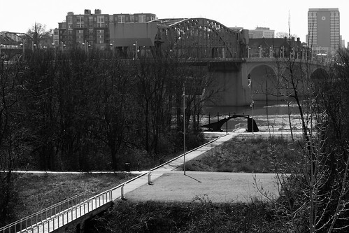 IMG_6884 by Opals25, on Flickr
|
|
#
?
Feb 25, 2013 22:33
|
|


|
Opals25 posted:
The first and the third don't really have a focus that draws me in. It's a nice overview of everything, but nothing that makes me interested. The 2nd one is close, but I get the feeling that you weren't quite centered on the bridge, and it throws everything off. Maybe if you can shoot it again back off a bit so that the whole walkway/bridge can be in view, and try to center yourself a bit more so that the left and right rails look the same. I'm crossposting these from SAD cause someone told me to. I think. probably. The sun was setting at the back/side of most of these, so the backgrounds pretty blown out. I might have to go back when I have access to photoshop and try using a mask to even that out.  P2250360.jpg by MrDespair, on Flickr  P2250358.jpg by MrDespair, on Flickr  P2250352.jpg by MrDespair, on Flickr
|
|
#
?
Feb 26, 2013 05:47
|
|
|
Opals25 posted:
Thanks for the comments. I was trying to convey the sort of dark emptiness of the store. I'm slowly working on a photoset of the touristy areas in the area during the offseason and this is a candy shop that's only open in the summer. There was so much glare coming off the front window I had to get right up to the glass to get anything useful and I should have exposed a lot better than I did I guess. On the other hand, I think if the room was lit better it would lose some of the gloominess I'm trying to convey.
|
|
#
?
Feb 26, 2013 08:22
|
|
|
Mr. Despair posted:I'm crossposting these from SAD cause someone told me to. I think. probably. The sun was setting at the back/side of most of these, so the backgrounds pretty blown out. I might have to go back when I have access to photoshop and try using a mask to even that out. The third is has nice parallel lines with the trees being similarly shaped to the buildings. I really like how this shot came out, but I've never tried matting or framing a square crop. Any suggestions?  LargeDepthofField2 by LibbyCr, on Flickr
|
|
#
?
Feb 26, 2013 18:04
|
|

|
LibbyCr posted:The third is has nice parallel lines with the trees being similarly shaped to the buildings. I like it. I would trim juuuuust a tiny bit from the top, so the white squares have the same amount of wall on the sides that on the top. like so. Does the original have a bit more at the bottom? I think it could stand to show the bottom of the stairs, looks like it's clipped a bit.
|
|
#
?
Feb 26, 2013 18:19
|
|

|
The original was much farther out in order to get the white poles to look straight instead of getting vertical distortion.  022313_0650 by LibbyCr, on Flickr
|
|
#
?
Feb 26, 2013 18:31
|
|
|
LibbyCr posted:The original was much farther out in order to get the white poles to look straight instead of getting vertical distortion. I tried framing it a bit wider, but the bottom of the stairs lines up with the cement blocks and they don't look good to be honest. I think you got it the first time, sorry! 
|
|
#
?
Feb 26, 2013 19:00
|
|
|
Opals25 posted:None of these really seem to be doing anything for me. I like your experimentation with processing, but it doesn't feel like it adds much to the picture. The composition feels a little plain too, they're pretty much all just standing center frame looking at the camera. Your last set of portraits in the thread (These ones) look a lot better to me; you have a more interesting approach to composition then your other works and, to me anyways, it really shines for it. Anyways, I'm pretty bad at portraiture myself so take it as you will! Thanks for the input, I admit I never really gave a poo poo about the rule of thirds after shooting so much of it. I think I secretly wish to shoot everything in square format. Thank you for the compliments on my other batch! Mr. Despair posted:
I would prefer to see these in a wider composition, the buildings are only kind of interesting to me, I would like to see them in their setting as a whole if that makes sense. Did you end up getting that massage?  Some more pretentious film stuff   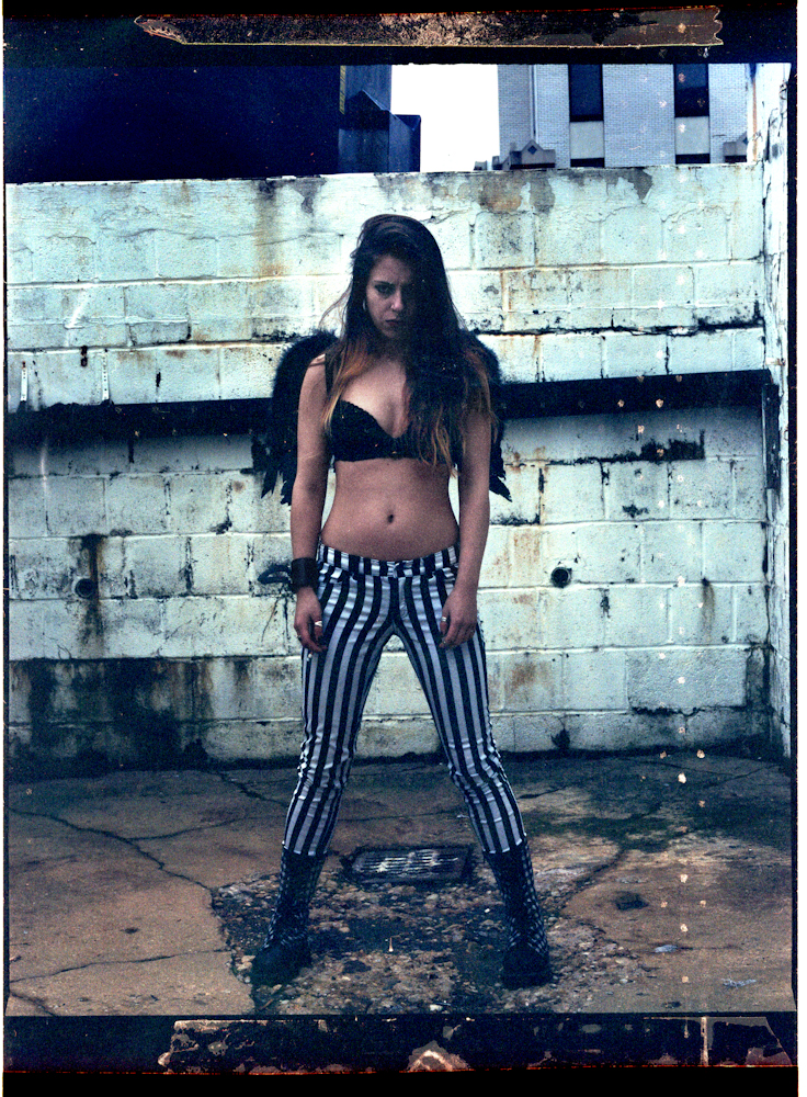
|
|
#
?
Feb 27, 2013 00:59
|
|
|
Opals25 posted:
I feel like with these you were trying to make a dramatic statement in a pretty banal setting, which isn't working out too well. I think the third photograph is the strongest of the three, and I like how you composed it with the path leading the viewer through the park and to the river and bridge in the background. However, I think you should shelve the first two. I grew up in a smallish town where no matter how much searching I'd do, I couldn't really find a grand scene that really benefited from the compositions you used in photographs one and two. I still used those composition techniques, and had the same frustrating results that you're experiencing now. In hindsight, I think keeping in mind the work of classic photographers like William Eggleston and Stephen Shore, photographers whose bodies of work consist of lots of shots of simple looking towns, would have helped out greatly when I was confronted with photographing such a "boring" town. That's really just a long way of saying that after looking through some of your photos, I can see that you've had the opportunity to photograph some really cool, grand settings, and that it's important not to pigeonhole yourself into thinking that everything you shoot should have that look to it. Always try to think about what approach would suit your setting the best. It's a style I am still not fully comfortable with myself, but we grow the most when we're faced with doing something new. ******* That being said, I would appreciate it if someone (or some people) could tear this photo apart for me. I like it a lot, which always makes me feel uncomfortable/guilty, so please make me like it less.  Nuclear Dreamscape by Myotomy, on Flickr My main concern with it at the moment is the inconsistent exposure across the snow, which I will probably spend some time touching up. What else sucks about it? What could make it better?
|
|
#
?
Feb 27, 2013 18:08
|
|

|
 That setting is crazy. It's like the winter version of the album art for Tweekend. 
|
|
#
?
Feb 27, 2013 18:12
|
|

|
RangerScum posted:I feel like with these you were trying to make a dramatic statement in a pretty banal setting, which isn't working out too well. I think the third photograph is the strongest of the three, and I like how you composed it with the path leading the viewer through the park and to the river and bridge in the background. The balloons are pretty bad. Did you add the person and the dog? The light and shadow seem off.
|
|
#
?
Feb 27, 2013 18:18
|
|
|
xzzy posted:
It's part of Indiana Dunes State park, about a one hour drive from Chicago, which after looking at your avatar I am guessing is probably somewhat close to you. Whitezombi posted:The balloons are pretty bad. Did you add the person and the dog? The light and shadow seem off. The person and the dog were comped in, but they were there with me and I had them in another shot of the plant so the angle/shadow is consistent... I just didn't like the other composition as much. They probably have a slightly different contrast level than their surrounding which could be screwing things up? As for the balloons, I grabbed them out of a different photo I had taken, and yeah that was a part of the photo that I struggled with. I like having them in there because it makes it all a bit more surreal, but I want the initial reaction to be something other than "those look bad." I dodged them to add highlights consistent with the scene's lighting, but I agree something is still somewhat off about them. Are they too bright/colorful? I could desaturate them a bit more. RangerScum fucked around with this message at 18:28 on Feb 27, 2013 |
|
#
?
Feb 27, 2013 18:19
|
|
|
RangerScum posted:The person and the dog were comped in, but they were there with me and I had them in another shot of the plant so the angle/shadow is consistent... I just didn't like the other composition as much. They probably have a slightly different contrast level than their surrounding which could be screwing things up? Their shadow is lighter and at a different angle compared to the poles on the right. I do think the contrast is off - look at the dog and the snow patch it is on. The balloons are too bright and colorful. I think you over dodged them and the highlights are too much. The balloons have no shadow on the ground as well.
|
|
#
?
Feb 27, 2013 18:50
|
|
|
The difference in value between the snow and the steam/sky throws me off quite a bit, in part because you don't get any sense of where the light could be coming from. IRL I'm guessing they're pretty similar, especially the snow and steam. It definitely makes it more surreal and oppressive feeling, but I feel like I have to actively work to suspend disbelief. I think lightening it just a little bit might help while still preserving the aesthetic.
|
|
#
?
Feb 27, 2013 18:58
|
|


|
RangerScum posted:It's part of Indiana Dunes State park, about a one hour drive from Chicago, which after looking at your avatar I am guessing is probably somewhat close to you. FYI, the Michigan City Generating Station uses coal and natural gas, so it's not nuclear Aside from the balloons, the steam coming out of the cooling tower also looks weird to me. edit: because what Spime Wrangler said.
|
|
#
?
Feb 27, 2013 19:05
|
|

|
RangerScum posted:It's part of Indiana Dunes State park, about a one hour drive from Chicago, which after looking at your avatar I am guessing is probably somewhat close to you. Yeah, this looks like you cropped in a nightime sky with a daytime smoke cloud and then added some balloons and it just feels really unnatural. MrBlandAverage posted:FYI, the Michigan City Generating Station uses coal and natural gas, so it's not nuclear Coal produces more nuclear waste in the atmosphere anyways, so maybe he's just making a really witty point about the downsides of coal power? 
|
|
#
?
Feb 27, 2013 19:09
|
|
|
Mr. Despair posted:Yeah, this looks like you cropped in a nightime sky with a daytime smoke cloud and then added some balloons and it just feels really unnatural. I was going for "weird and ominous" if that helps to explain any styling decisions, though unfortunately I was not witty nor devoted enough to the photograph to research the power plant ahead of time, but I am ultimately okay with this since the imagery will probably call forth an idea of nuclear power in most people's minds. Spime Wrangler posted:The difference in value between the snow and the steam/sky throws me off quite a bit, in part because you don't get any sense of where the light could be coming from. IRL I'm guessing they're pretty similar, especially the snow and steam. It definitely makes it more surreal and oppressive feeling, but I feel like I have to actively work to suspend disbelief. I think lightening it just a little bit might help while still preserving the aesthetic. Whitezombi posted:Their shadow is lighter and at a different angle compared to the poles on the right. I do think the contrast is off - look at the dog and the snow patch it is on. Thank you- I am going to touch these parts up. I'm going to do my best with the balloons but I wouldn't be surprised if they will always stay a sore point for me no matter how good I get them to look. I think I'm pretty set in leaving the steam as is because although it clashes with the sky, I like its overall effect. Thanks everyone for sharing your thoughts!
|
|
#
?
Feb 27, 2013 19:37
|
|
|
RangerScum posted:I like it a lot, which always makes me feel uncomfortable/guilty, so please make me like it less.
|
|
#
?
Feb 27, 2013 19:55
|
|

|
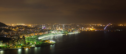
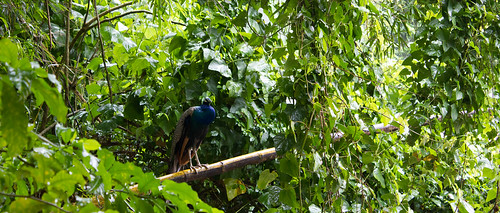
I like the second one, but in the other two she looks more bored/grumpy than mean. Dig the texture on the first one though. Here are a few more from Brasil; first two are from Rio's botanical garden, last one is Paraty.  _MG_3283.jpg by AxelDR, on Flickr  _MG_3276.jpg by AxelDR, on Flickr 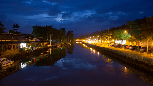 _MG_3175.jpg by AxelDR, on Flickr
|
|
#
?
Feb 27, 2013 20:31
|
|
|

|
| # ? May 23, 2024 17:50 |
|
|
Edmond Dantes posted:
I really like the lighting effects in this image and I also like the sky reflected in the water. Night time shots are never really easy to get but this one has worked out pretty well. I got a nice DSLR for Christams but until a couple of weeks ago when I was let go from my job I hadn't really had a huge amount of time to use it. In between jobs I started playing around with my camera more and while I still have a large amount to learn I'm happy with the progress.  I know this is blurry but I like the way it turned out in the end. Not having a tripod with me didn't help   This was the final sunset of 2012 taken only 10 minutes walk from my house. I like the way that the sun and the clouds work together
|
|
#
?
Feb 28, 2013 14:58
|
|