


|
Dr. Garbanzo posted:
With the first I think you could have bumped the ISO up a bit more so you could get the still components of the intersection sharp while still using a slowish enough shutter to get the movement of the pedestrians. As is, the photo kinda makes my eyes ache because nothing is very sharp. For the second, it's very snapshot-ish. If at all possible, I would have gotten down on my elbows and knees or at least held my camera as low as possible to get a more interesting angle on the water flowing over the ledge. The lighting is nice, though. ") ----    Trying to figure out how to shoot more subtle landscape photos. My normal thing is finding really contrasting features and such but I felt like I was getting into a rut. Not sure if any of these three really work, however.
|
 #
?
Feb 28, 2013 19:54
#
?
Feb 28, 2013 19:54
|
|


|

|
| # ? May 12, 2024 02:11 |
|
|
Casu Marzu posted:
The last one really does nothing for me because of the location. It's just a mess of dormant trees, dead grass, crappy snow. It represents everything I hate about boring old winter. I'd love to see the spot in the other seasons though, it might actually be quite nice. Posted these in the low-effort thread, posting them here too. 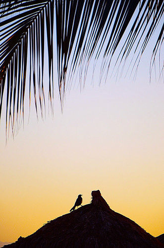 Not the Rockies by Trips in the Rockies, on Flickr 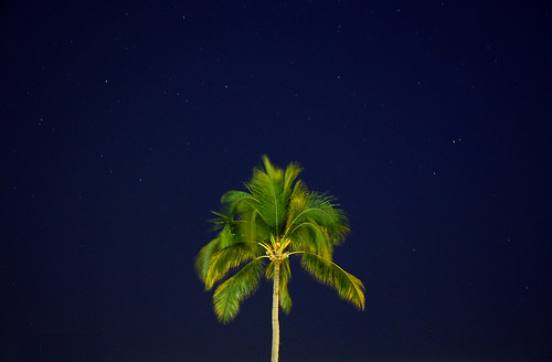 Not the Rockies by Trips in the Rockies, on Flickr Star trails  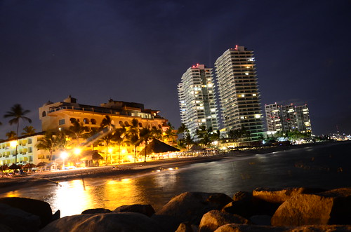 On the jetty by Trips in the Rockies, on Flickr I had gone to Puerto Vallarta last week. The last picture was after I got completely hammered and wandered onto the jetty in a long dress. I ended up tripping, falling and breaking my tripod. Hence the odd angle as my camera was balanced on a rock. I kind of like it though.
|
|
#
?
Feb 28, 2013 23:42
|
|


|
Picnic Princess posted:
drat, the first one is a really nice shot. I can never seem to nail backlit scenes such as this one. My first reaction to the second one was thinking I would have gone with a different crop, but the more I look at it the more I realize it's a really nice framing. You could have gone all the way and gotten longer trails  I think the angle on the third one helps it, it would have been pretty but wouldn't have caught my attention otherwise.
|
|
#
?
Mar 1, 2013 00:18
|
|

|
LibbyCr posted:The third is has nice parallel lines with the trees being similarly shaped to the buildings. Its a bit soft but there isn't much you can do about that now, looks like you missed focus by a bit. I like the photo though, and think its just slightly tilted but I could be wrong. I wouldn't crop it any differently though I like the symmetry of the poles. 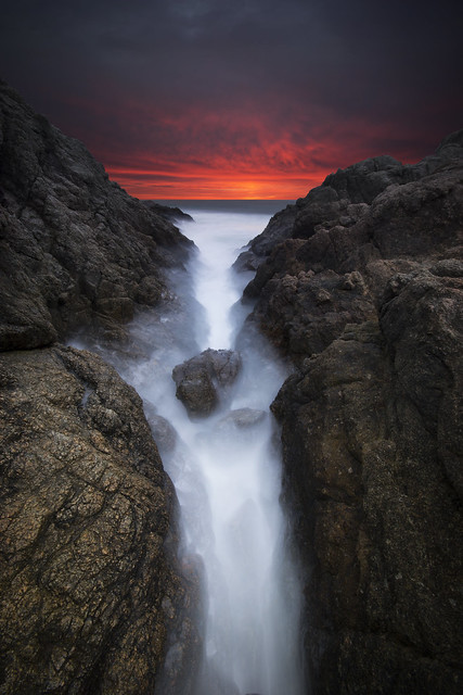 Too dark? Sometimes when I look at it I feel its too dark, others it looks just right, different monitors and all that. I tried pushing the exposure in the foreground a bit but it looked unnatural.
|
|
#
?
Mar 1, 2013 14:23
|
|
|
quote:
Exposure looks good to me overall, definitely not too dark. Is the foreground still pushed at all? It still looks very light compared to the sunset background, I can't work out where the light is coming from. 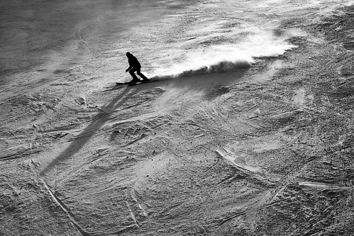 Moonskiing by Benbrewer85, on Flickr Is there any merit to this? Normally I try and shy away from extremes in post-processing but I like the results here. I purposefully shot into the sun to get the vapor trails nice and bright, and high contrast seemed the way to go. 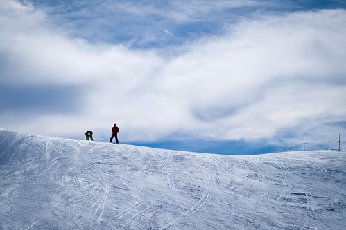 Conquerers by Benbrewer85, on Flickr 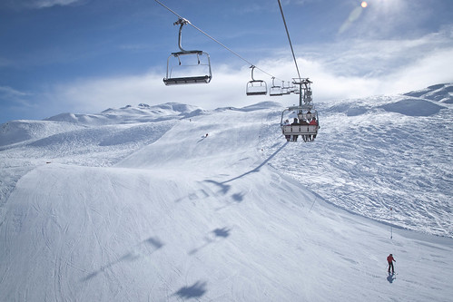 Untitled by Benbrewer85, on Flickr
|
|
#
?
Mar 1, 2013 15:34
|
|
|
Brewdog posted:Exposure looks good to me overall, definitely not too dark. Is the foreground still pushed at all? It still looks very light compared to the sunset background, I can't work out where the light is coming from. I simply love the texture you got out of the snow here. It turned overwhite snow into tractor-pull dirt. The shadow and highlight of the vapor trail looks like a scar. Fantastic.  the way home by thetzar, on Flickr
|
|
#
?
Mar 1, 2013 20:14
|
|

|
thetzar posted:
This is great. I can imagine a story based on this photo.
|
|
#
?
Mar 1, 2013 21:53
|
|


|
Brewdog posted:
He's skiing on the moon. Very nice photo.
|
|
#
?
Mar 2, 2013 09:33
|
|

|
Casu Marzu posted:With the first I think you could have bumped the ISO up a bit more so you could get the still components of the intersection sharp while still using a slowish enough shutter to get the movement of the pedestrians. As is, the photo kinda makes my eyes ache because nothing is very sharp. Re: first two. I think you have to change the angle from which you are shooting these. The lines don't look right to me. If you had moved to your right on the first one, and left on your second one, I think they would have been much better. Brewdog posted:Exposure looks good to me overall, definitely not too dark. Is the foreground still pushed at all? It still looks very light compared to the sunset background, I can't work out where the light is coming from. These are great. I particularly like the first one. As someone else said, the texture on the snow is fantastic. You got a great motion in the skier, and the sillhouete against the snow means that I'm not drawn in by details on the skier, but understand the general idea of a skier. It's really nice. Of the other two: I think the second is the strongest. The first is fairly generic, but the second is a great scene, with wonderful colors. Dr. Garbanzo posted:I really like the lighting effects in this image and I also like the sky reflected in the water. Night time shots are never really easy to get but this one has worked out pretty well. Go back, bring your tripod. It's a nice first shot but having nothing in focus doesn't help. Next time you could freeze the buildings and get the pedestrian movement.
|
|
#
?
Mar 2, 2013 17:04
|
|
|
Awkward Davies posted:Re: first two. Thinking back to the locations, you're right. Will definitely reshoot these.
|
|
#
?
Mar 2, 2013 17:54
|
|
|
Casu Marzu posted:With the first I think you could have bumped the ISO up a bit more so you could get the still components of the intersection sharp while still using a slowish enough shutter to get the movement of the pedestrians. As is, the photo kinda makes my eyes ache because nothing is very sharp. Love the first one. The second doesn't do much for me. The third one seems to me like it would be better with less snow on the bottom, maybe if you had taken the picture closer. Went out riding with my buddy today. He just bought himself a Triumph. I think I over-processed the panning shot    
|
|
#
?
Mar 3, 2013 04:53
|
|

|
I really like the second and the third would be a winner if the truck wasn't in the background. I wish I could get back to that location for my third shot but I was chased off after taking that snap by the owner and his dogs. Kinda hesitant to go back there again.
|
|
#
?
Mar 3, 2013 05:42
|
|
|
Why have you chosen to do selective desaturation? Do you think that it adds value to the image you are creating? I feel like you are trying to make the bike pop more against the background in each of the shots which is a noble goal, but I think the technique which you have chosen to use should be used in a more subtle manner in combination with other techniques to really achieve what you are looking for. Here are some from a fire across the street from me: 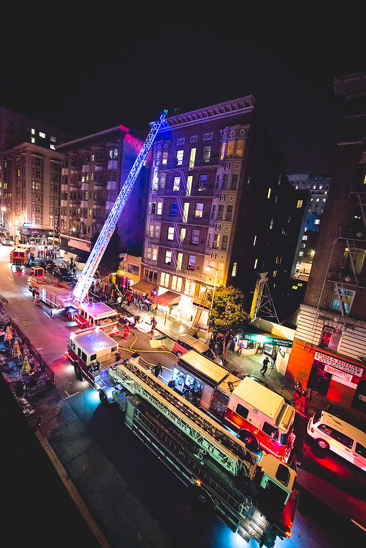 fire-103 by bowbles, on Flickr 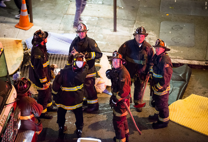 fire-107 by bowbles, on Flickr
|
|
#
?
Mar 3, 2013 06:35
|
|
|
blackmanjew posted:Love the first one. The second doesn't do much for me. First one is fine. Second one seems like you reeeally wanted to make sure that we know the bike is the subject. Pull back a bit; we'll still focus on the bike. Doesn't need to be a lot but as is it is cramped. Third - seems snapshottish. Just that truck behind him screams that there wasn't thought involved - why would that be a background for this shot? (not trying to be a dick, just trying to be to the point) It just looks like "I am taking pictures of a buddy driving in a parking lot. Evilkiksass posted:Here are some from a fire across the street from me: Nitpick time: I wish the third shot had all three firemen looking at the camera! Where his face is placed in the frame brings me to him first and that look plus looking away is just not doing it for me. Not much to do about it but just saying. I really love the first. The colors, framing, choice of focal distance - it is all really nice. The heavier saturation almost gives a glamour to the shot which is visually appealing and a nice contradiction to what is actually going on (I assume some sort of non-glamorous emergency). --  DSCF1768 by Paul Hofreiter, on Flickr  DSCF1649 by Paul Hofreiter, on Flickr  DSCF1742-Edit by Paul Hofreiter, on Flickr For this last one, I have a question. I have been playing around with the 35mm focal length and of course the closer you get the more you get a visual distortion that is more apparent with faces. Do you think people would be offput by something like this? I have my first paid gig next weekend - which generally I am pretty confident about - but I am trying out some things before the shoot that are a little different than what I normally might do (like 85mm-ish for shoulfers and head and 45mmish for full body)
|
|
#
?
Mar 3, 2013 08:03
|
|

|
Evilkiksass posted:
I like this one but I think you should crop everything out except the three firemen. They tell a story and it's great you got them looking at you. They almost look sort of sinister. There's too much noise going on in the left of the frame. Here are a few I took today using my Nikon 35/1.8f. My issue is that I can't seem to get everything in focus. Is it because I'm shooting with the aperture too wide open? Am I not using the right auto-focus mode (single point of focus)? It seems like it's only focusing on the actual sensor point I select and it is having trouble focusing the rest. It is very pronounced here, for example, where the flower on the right is in focus but not the rest:  Sherman Library and Gardens 2013-03-02 at 13-39-42 by bpetiprin, on Flickr Here, where only the front of the Lime is in focus:  Sherman Library and Gardens 2013-03-02 at 14-17-15 by bpetiprin, on Flickr Etc.  Sherman Library and Gardens 2013-03-02 at 13-52-56 by bpetiprin, on Flickr This one I really like:  Sherman Library and Gardens 2013-03-02 at 13-40-19 by bpetiprin, on Flickr beergod fucked around with this message at 08:23 on Mar 3, 2013 |
|
#
?
Mar 3, 2013 08:20
|
|
|
Autofocus modes will do nothing to get more of your picture in focus - you are on the right track thinking of aperture but it is also the distance to your subject (macro distances etc.) You are shooting wide open - if you want more of the picture in focus then stop down.
|
|
#
?
Mar 3, 2013 08:27
|
|
|
rio posted:
1) It's a pretty guitar but 80% of the image is taken up by a bland yellow wall. Get closer? 2) I'd like it more if you were lower and we could see the girl's face. 3) Looks good. Yes 35 mm will make their nose seem really big and unnatural. I just got back into photography after a 1 year hiatus. Here's a few recent shots:  Greylag Geese by The original David L, on Flickr  16Feb13 Parker Mesa-090 by The original David L, on Flickr  16Feb13 Parker Mesa-032 by The original David L, on Flickr
|
|
#
?
Mar 3, 2013 09:50
|
|
|
rio posted:
I like the extra context of the wall and highlight/shadow. There's enough variation in color to keep it interesting. beergod posted:
The framing of this is fantastic with the curve in the background highlighting the lime. Looking at the larger picture, I'm not sure any of it is completely in focus. Here's a few I took yesterday. They're a little dark for wildlife shots, but it's grey winter in MI.  hooded merganser by philip painter, on Flickr  hooded merganser pair by philip painter, on Flickr  hooded merganser pair by philip painter, on Flickr
|
|
#
?
Mar 3, 2013 14:47
|
|

|
beergod posted:Depth of field stuff To get a handle on how focal length, aperture, and distance to your focus point relate, here's a handy website that you can punch in all that information: http://www.dofmaster.com/dofjs.html . If you have a subject that you want completely in focus, front to back, then it needs to fit within the Near and Far limits.
|
|
#
?
Mar 3, 2013 15:01
|
|

|
beergod posted:I like this one but I think you should crop everything out except the three firemen. They tell a story and it's great you got them looking at you. They almost look sort of sinister. There's too much noise going on in the left of the frame. What aperture were you shooting at? If it was 1.8, then you went at it the wrong way round. Regardless, I think achieving separation of your subject from the background is a good thing for photos of flowers and plants. There's just too much visual noise without it.
|
|
#
?
Mar 3, 2013 17:47
|
|
|
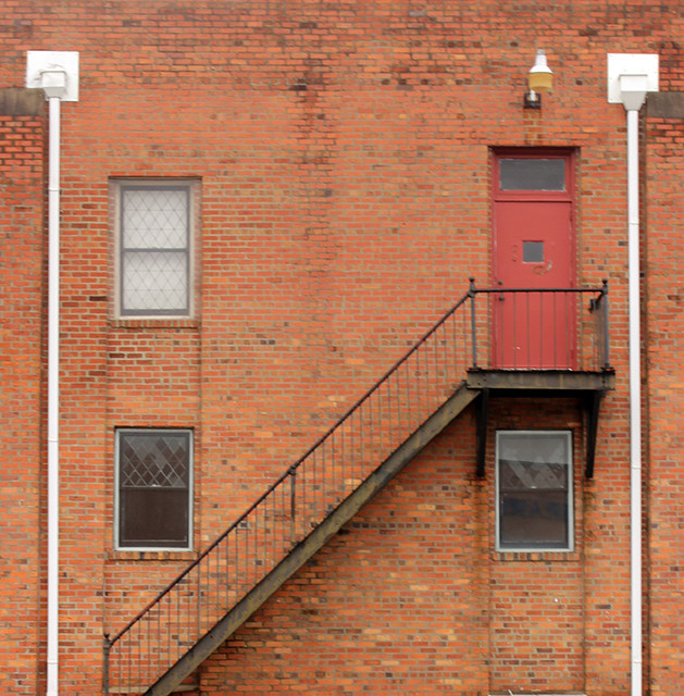
 579483-R1-23-1A by zackaryattackary, on Flickr I was trying to take a photograph of the Freight House District . I think I should have taken the photo earlier so there wasn't a huge shadow, but despite that I like how it turned out.(USER WAS PUT ON PROBATION FOR THIS POST)
|
|
#
?
Mar 4, 2013 05:54
|
|

|
Watermelon City posted:
Pst: read the thread rules
|
|
#
?
Mar 4, 2013 17:41
|
|
|
Evilkiksass posted:
I disagree with the others about cropping out the other firemen. The story is how these men are reacting to the situation - the officers and lead firefighters are discussing things, and the lower-ranked firefighters are nervously getting ready to go in, surveying the scene. At a larger scale, I think the image needs all 6 people. Both of these pictures, I think, have the right idea but they're missing a detail to make them much better photographs. In the first, the clouds need some sort of texture - otherwise, why are they in the shot? In the second, I think the message is one of economic downturn, but not squalor. Everything is ready if you bring in some seats and turn on the lights. So it's the right scene, but maybe the wrong angle/composition. Could be a lot more powerful with a person in it. What do y'all think of these?   Preggo My Eggo! fucked around with this message at 18:43 on Mar 4, 2013 |
|
#
?
Mar 4, 2013 18:32
|
|
|
Get lower and wider for both of those. Right now there's not much interesting in either of them. Also everything in the photos feel kinda flat and dull.
|
|
#
?
Mar 4, 2013 18:33
|
|
|
Thanks. I hear what you're saying. To me they look like they're not showing a big enough scene, so getting lower and wider should help.
|
|
#
?
Mar 4, 2013 18:52
|
|
|
runlegosleeprepeat posted:What do y'all think of these? I agree with the poster above. These suffer from the fact that they're not any different from what you'd see if you were just standing there looking at the thing - it's a normal focal length from a normal point of view. I think that's what ends up feeling so snapshottish about them; they don't show us anything interesting or unusual about what is being portrayed.
|
|
#
?
Mar 4, 2013 21:14
|
|

|
beergod posted:I like this one but I think you should crop everything out except the three firemen. They tell a story and it's great you got them looking at you. They almost look sort of sinister. There's too much noise going on in the left of the frame. I think you should take the time to study aperture. Setting it at 1.8 will separate your subject from your background but it's not ideal in every single situation. Like setting aperture to 1.8 and shooting won't make all pictures suddenly awesome. For example, on pictures where you shot objects up close at 1.8 it's fairly normal that only some little part of the object is sharp since everything outside of your focus point, at such a short distance, is quickly out of focus. While it's not as apparent in the other picture it's only because you were further back. I remember someone posting a nice link explaining the relationship between aperture/distance that visually showed what I'm trying to say and it was quite easy to grasp it. But in the meantime I would suggest shooting your objects at 1.8/2.8/4 from the exact same distance to see what I'm talking about, you'll have a sense of how to correctly set your aperture depending on what you're trying to achieve in the future.
|
|
#
?
Mar 4, 2013 21:26
|
|

|
beergod posted:My issue is that I can't seem to get everything in focus. xenilk posted:I think you should take the time to study aperture. This is a great video explaining DoF: http://vimeo.com/1136116
|
|
#
?
Mar 4, 2013 22:20
|
|
|
 Keep Left by rstop bstop, on Flickr  Wasp by rstop bstop, on Flickr  Trench by rstop bstop, on Flickr First real excursion to do a bunch of shooting, and these were the three I'm happiest with. Obviously they all have problems, though. My main concern is I've blown focus in all of them, probably because I forgot to switch from MF to AF, and I'm having a hard time judging focus on the camera screen. I'm also concerned about the glare at the top of the third shot -- is there a good way to eliminate this without using a lens hood? (Could you even use a lens hood on a wide-angle lens?) I'm not sure about the processing on the vespa. I've already upped the orange / red saturation a lot and played with shadows and contrast, but anything further and I lose a lot of detail in the back wall. Would that be worth it, in your opinion? I'm still getting an eye for what looks good. With the first shot, I just want to see if it "works"; I like it despite its technical flaws, because I think it's the only photo I've taken which comes close to telling a story, but I don't know if that comes through or if it's just "businessman walking through the shot". Is the focus / processing too distracting? smallmouth posted:
[edited for brainfart; brain thought 'Keep Left', fingers typed 'Go Left'] rohan fucked around with this message at 23:44 on Mar 4, 2013 |
|
#
?
Mar 4, 2013 23:11
|
|

|
Baron Dirigible posted:
Looks like snow to me (a dirty sensor shouldn't ever show up as white dots).
|
|
#
?
Mar 4, 2013 23:16
|
|


|
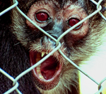
smallmouth posted:I like the extra context of the wall and highlight/shadow. There's enough variation in color to keep it interesting. I love this, mergansers are one of my favorite ducks, especially when they're full plumage. Beautiful birds. Spent yesterday at the Miami zoo with the girlfriend, too bad it was super cloudy.  crocodile by noartificialcolors, on Flickr  IMG_9512 by noartificialcolors, on Flickr  IMG_9060 by noartificialcolors, on Flickr cory ad portas fucked around with this message at 00:21 on Mar 5, 2013 |
|
#
?
Mar 5, 2013 00:17
|
|

|
cory ad portas posted:Spent yesterday at the Miami zoo with the girlfriend, too bad it was super cloudy.
|
|
#
?
Mar 5, 2013 00:21
|
|


|
Baron Dirigible posted:
Thanks. Yeah, it's snow.
|
|
#
?
Mar 5, 2013 00:45
|
|
|
Baron Dirigible posted:
Watermelon City posted:
 (The vignette could use some post to make them symmetrical.) If I had a larger resolution source, I'd probably crop to the Freight House District, but you presumably wanted the entire lot. I'd maybe have stood further to the left (if possible), taking the picture more head-on. There are also spots on your lens you ought to have cleaned. I arrived too late to get to the front, so I tried to be artsier:  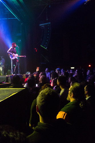 I wish there was more space behind E, but it looked silly with the guitar tech standing there.
|
|
#
?
Mar 5, 2013 17:50
|
|
|
teethgrinder posted:
I think the first is more successful than the second. In the first you have an obvious draw to the drummer. In the second I keep getting drawn to the back of the audience's heads. 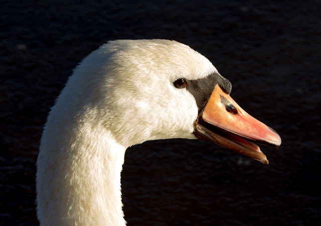 IMG_1464.jpg by jmorris4371, on Flickr  IMG_1523.jpg by jmorris4371, on Flickr Phummus fucked around with this message at 16:04 on Mar 6, 2013 |
|
#
?
Mar 6, 2013 13:56
|
|

|
I think this is effective but would be more so in black and white. My eyes keep going to the little tan shed thing. Phummus posted:
I think I see what you were going for but I feel like the geometry of the shadows could be more interesting from another angle. The angle of the sun kind of makes the texture of the wood look flat too. Maybe a diptych could capture the best parts of both subjects? Baron Dirigible posted:
I agree on the story in the first one. I wasn't sure about the lamp shadow but I think I like that it adds some tension to the frame. I think the processing on the scooter is just fine. The color and shadow detail work well for me but I would probably have tried to shoot from lower. Probably worth at least experimenting with a lens hood for the last one. Not like you're shooting film and paying $ a shot. I love my Yashica. That is all.  Untitled by voodoorootbeer, on Flickr
|
|
#
?
Mar 6, 2013 18:18
|
|

|
You nailed the processing on that, the overall shapes create a feeling of a city street until you take in the details. You need to dig up some model cars and lay them out like they're driving around, really gently caress with people's heads.
|
|
#
?
Mar 6, 2013 18:31
|
|

|
Brewdog posted:
The harsh sun, long shadows and textures make this a great image. B&W was the way to go. thetzar posted:
I love the cinematic feel of this. voodoorootbeer posted:I love my Yashica. That is all. I love your Yashica. Definitely looks like a city scape. Reminds me of some of those run down Chinese apartment buildings.   
|
|
#
?
Mar 6, 2013 19:40
|
|

|
Whitezombi posted:The harsh sun, long shadows and textures make this a great image. B&W was the way to go. First one by far the best. You caught a great moment and he's well lined up with the other kids. The second two are meh, snapshots. First one is awesome. Really love the moment you caught.
|
|
#
?
Mar 6, 2013 20:33
|
|
|

|
| # ? May 12, 2024 02:11 |
|
|
voodoorootbeer posted:I agree on the story in the first one. I wasn't sure about the lamp shadow but I think I like that it adds some tension to the frame. I think the processing on the scooter is just fine. The color and shadow detail work well for me but I would probably have tried to shoot from lower. Probably worth at least experimenting with a lens hood for the last one. Not like you're shooting film and paying $ a shot. I love your "cityscape" photo. I agree with Whitezombi, it really evokes the Walled City of Kowloon. My only query is the shed visible on the right of the frame; I think the reference of scale works against the overall image. There are still hints of scale within the rest of the image, but I think they're less jarring. teethgrinder posted:I think this is a cool shot, but I feel like the shadow on the right side of the building unbalances the photo, like the background should be lighter than the road. Here's another one from me: I went to a real tourist trap yesterday to test out my new tripod and ND-filter.  Waterfall by rstop bstop, on Flickr I can't decide whether to square-crop this, or if it needs the foreground to help frame the waterfall. The flowers at the front already looked bad pre-procressing, and I can't find a way to make them look more natural. I also don't like that the pipe's clearly visible, but that's a bit beyond my editing skills right now.
|
|
#
?
Mar 7, 2013 00:24
|
|