


|
Baron Dirigible posted:Thanks for your thoughts. I agree about the angle on the vespa; I didn't really put much thought into composition and I think if I was taking the shot again I'd take it angled up from the base of the vespa, with the handlebars at the top of the frame. Is that what you meant or did you mean a less-severe front-on view? Which pipe? The one on the rock on the right? Content aware will get rid of that badboy right quick. Do you have photoshop?
|
 #
?
Mar 7, 2013 00:41
#
?
Mar 7, 2013 00:41
|
|


|

|
| # ? May 21, 2024 13:39 |
|
|
Okay I made you a 1 min photoshop video, cause, I dunno, I'm late to go somewhere and decided it was a good idea. Here is how to do it. You could also use a quick mask or the magic wand. Basically you just want to select the area, find "Fill" in the menus, and make sure it says "Content aware". I don't even do a very good job at this, but it's how it works. https://www.youtube.com/watch?v=JsTcIpJMbZ0
|
|
#
?
Mar 7, 2013 00:54
|
|
|
Awkward Davies posted:Which pipe? The one on the rock on the right? Thanks for making the video, though. I do have access to photoshop at work so could probably do a sneaky edit there sometime if that's that simple a job.
|
|
#
?
Mar 7, 2013 01:59
|
|

|
Baron Dirigible posted:Sadly, no. I know it would make things a lot easier but I can't justify the cost for something I'm not doing professionally (I did buy LR but that was an easier sale). You can download the trail for free from Adobe (but it only lasts a month :/)
|
|
#
?
Mar 7, 2013 02:14
|
|
|
Baron Dirigible posted:
I think you would have had a more balanced/compelling first shot if you had taken a step back and to the right while keeping the circle in mid, right now it feels cut off. The second one... if you are using PS you can mask the layers so you can play even further with the contrast without going over. The last photo doesn't really do anything for me. Crosspost from portraits: He wanted lots of PP but refused to smile because of his chipped teeth that I told him no one really cares about.   
|
|
#
?
Mar 7, 2013 05:13
|
|


|
xzzy posted:feeling of a city street Whitezombi posted:Definitely looks like a city scape. Baron Dirigible posted:Walled City of Kowloon Fun story: I got a big box of negatives back from NCPS and after I finished gawking at the strip of Velvia slides I held this one up to the light and said "wait, when the gently caress did I shoot a bunch of high rises at night?" I like the crop idea, improved version now in the flickr stream.
|
|
#
?
Mar 7, 2013 16:28
|
|

|
Oprah Haza posted:Crosspost from portraits: 2nd: My eyes instantly went to the smiley face just south of his crotch. 3rd: I really like this one. The glasses help a lot with his refusal to smile and the color is fantastic.  small-2439 by jankyangles, on Flickr I feel like this is blown out. I spent hours pulling out the more distracting water spray just kinda felt it was done but now that I'm looking at it on a different computer it feels like it's missing punch or something.
|
|
#
?
Mar 8, 2013 18:44
|
|

|
voodoorootbeer posted:Fun story: I got a big box of negatives back from NCPS and after I finished gawking at the strip of Velvia slides I held this one up to the light and said "wait, when the gently caress did I shoot a bunch of high rises at night?" I like the crop idea, improved version now in the flickr stream. I like the cropped version a lot less. I would spend a bit of time removing that house from the fence up. OR make some slight modifications to it to make it look less like a house. 1. The trees(?) coming out of his head are very distracting. So is the way the train track hugs his left leg. 2. Yep - I saw that smiley face before I read Maker Of Shoes post. It's a good portrait. Not sure if I like the rail going through his shoulders. 3. Definitely the best of the three. He seems more relaxed. The tone is great.   
|
|
#
?
Mar 8, 2013 19:58
|
|

|
The idea is interesting, but the execution isn't doing much for me. Try shooting really late or early with the sun coming in at a sharp angle? Some shadows might juice it up.
|
|
#
?
Mar 8, 2013 20:01
|
|

|
Maker Of Shoes posted:
I agree with your assessment of this shot. It is interesting because of the action but the lighting makes it seem somehow kind of flat. There seems to be plenty of contrast so maybe try lowering your contrast to get highlights an shadows back in check and increasing saturation to give it some pop? from the last couple weeks.  Hawks by pboutell, on Flickr edit: cropped more..  Cows by pboutell, on Flickr  Chips by pboutell, on Flickr copen fucked around with this message at 04:58 on Mar 11, 2013 |
|
#
?
Mar 9, 2013 22:05
|
|
|
copen posted:
I love this. The crop is perfect, with significantly more empty space than cow. It almost suggests a really dry kind of quietly humorous dignity about the guy. Reminds me of the Spanish bull without being derivative. copen posted:
This is well shot but my eye wants to find something more interesting somewhere. Maybe it's a white balance thing? Have you tried pressing the levels to blow it out a bit, create some highlights? My taste has gone all funky as of late, though, and I tend to prefer things to look far from realistic in terms of color and contrast. Still like that cow though!  IMG_3148 by janellish, on Flickr  IMG_3144 by janellish, on Flickr Madrile�o mannequins.
|
|
#
?
Mar 10, 2013 14:52
|
|

|
I feel like I know where you're trying to go with this and I like your destination but either you need to photograph it in a different way (earlier/later time of day to emphasize shadow? different plants?) or work with the idea in a different, physical medium because right now it just kinda looks like you photographed garbage. You really need the sense of depth, or at least more organized randomness in the frame. Here's the joy of tule fog (Fujifilm FinePix JV100): 
|
|
#
?
Mar 10, 2013 21:08
|
|

|
Magic Hate Ball posted:I feel like I know where you're trying to go with this and I like your destination but either you need to photograph it in a different way (earlier/later time of day to emphasize shadow? different plants?) or work with the idea in a different, physical medium because right now it just kinda looks like you photographed garbage. You really need the sense of depth, or at least more organized randomness in the frame. I'd agree with this. I think greater contrast / shadow would yield better texture, if that's what you want. What do these look like in B&W?
|
|
#
?
Mar 10, 2013 23:32
|
|

|
Yakult posted:
Thanks for the critique, I agree about the Chips shot. It was really just a test for a lens that I just got. I had a go board, poker chips and an sb-800 at work so I was messing around and kind of liked the result. I think I will try shooting it again with some different elements and maybe doing it in black and white. I like these two shots. The reflections actually work on these and you did a pretty good job keeping them from being in distracting spots. I wish the left side of the frame wasn't going through the model and the M on the sign. The verticals also seem to be a little off straight. all and all these are very complicated compositions and they seem to work out for the most part. Maybe just be a little more careful about the edges of the frames while you are shooting. Magic Hate Ball posted:
Hmm, I don't know about this one. I feel like I could like the mood of this shot with some different post processing. The foreground is very dark but the sky up top is over exposed and there is some digital artifacting going on. The composition is also kind of dull with the horizon going through the middle and no real area of interest or good eye movement through the scene. Cropping off the top portion of the sky would help eliminate the blown out parts and move the horizon up on the shot. Lowering the contrast might help you bring the brightness levels up to where they need to be on the foreground but you will lose some color. But lowering the contrast also allows you to push the color a little harder and still look natural. Also I am no expert or artist or anything so take my critiques with a grain of salt and do what you think looks best! Edit: more photos  Saint Louis Cathedral by pboutell, on Flickr  cold squirrel by pboutell, on Flickr I don't know about this one kind of boring.. but look how cold he is  copen fucked around with this message at 05:22 on Mar 11, 2013 |
|
#
?
Mar 11, 2013 03:11
|
|
|
Magic Hate Ball posted:I feel like I know where you're trying to go with this and I like your destination but either you need to photograph it in a different way (earlier/later time of day to emphasize shadow? different plants?) or work with the idea in a different, physical medium because right now it just kinda looks like you photographed garbage. You really need the sense of depth, or at least more organized randomness in the frame. The bleak, scorched palette and high contrast work well for this, as does the minimal post-processing. I would maybe find a way to provide more separation between the ground and the plant in the lower left, as its getting lost and is therefore distracting. Way back in January I met with a friend, while I was waiting for her some parkour guys rocked up and started to parkour. So I shot them.    More here: http://www.flickr.com/photos/timfpictures/8376071252/in/photostream/lightbox/ XTimmy fucked around with this message at 03:58 on Mar 11, 2013 |
|
#
?
Mar 11, 2013 03:54
|
|
|
copen posted:Edit: I like the processing on the first, but cutting the top of the building off is pretty jarring. The 2nd one is nice too, but you could have stopped down some more to get the whole squirrel in focus. Messing with expired film.  1600superhg050.jpg by MrDespair, on Flickr  1600superhg051.jpg by MrDespair, on Flickr  1600superhg043.jpg by MrDespair, on Flickr
|
|
#
?
Mar 11, 2013 04:06
|
|


|
copen posted:Hmm, I don't know about this one. I feel like I could like the mood of this shot with some different post processing. The foreground is very dark but the sky up top is over exposed and there is some digital artifacting going on. The composition is also kind of dull with the horizon going through the middle and no real area of interest or good eye movement through the scene. Cropping off the top portion of the sky would help eliminate the blown out parts and move the horizon up on the shot. Lowering the contrast might help you bring the brightness levels up to where they need to be on the foreground but you will lose some color. But lowering the contrast also allows you to push the color a little harder and still look natural. Thanks for the advice. Tried out a square crop and mellowed out the levels a bit. Not much I can do about the digital artifacts, the JV100 isn't the happiest customer in low-light situations (or most situations, really), let's just call it "texture":  XTimmy posted:The bleak, scorched palette and high contrast work well for this, as does the minimal post-processing. I would maybe find a way to provide more separation between the ground and the plant in the lower left, as its getting lost and is therefore distracting. What would be a good way to bring the plant out? I love the parts of this photo that are frozen, which makes his hands and feet kind of frustrating. The high-contrast look is fantastic, though. This is great, as is this.
|
|
#
?
Mar 11, 2013 04:34
|
|
|
Magic Hate Ball posted:
Basically what you've done there, though I'm now missing the red tones you had before, maybe try painting areas of the grass with a levels mask, graduating off towards the plant so that it remains separate.
|
|
#
?
Mar 11, 2013 04:39
|
|
|
Mr. Despair posted:I like the processing on the first, but cutting the top of the building off is pretty jarring. The 2nd one is nice too, but you could have stopped down some more to get the whole squirrel in focus. I find the first one too dark to really pull much from. The risk of shooting expired, I suppose. The other, two, have a really nice environmental feel to them. I mean, I'm sort of at a loss for a subject, but the content and treatment reminds me of midcentury, no-budget horror movies. For some reason, I get a vibe from the movie Coven, which was being shot in the Documentary American Movie. Throw these into 16x9 and you'd be there. Not sure if that's where you want to be, but there you go. This here is something I pulled from a portrait shoot with a friend. I worked it over a good bit. I'm afraid it's a little bit halo-y, which I'm working on getting rid of, (I didn't touch Clarity, I swear), but I like where it's living right now:  Untitled by thetzar, on Flickr
|
|
#
?
Mar 11, 2013 17:17
|
|

|
Magic Hate Ball posted:Thanks for the advice. Tried out a square crop and mellowed out the levels a bit. Not much I can do about the digital artifacts, the JV100 isn't the happiest customer in low-light situations (or most situations, really), let's just call it "texture": Cool man I like this a lot better. You can even bump the brightness back down a touch to add some gloominess. Or try what the poster above me said.
|
|
#
?
Mar 11, 2013 17:18
|
|
|
Here's one I took last Summer, around midnight. I'm reasonably happy with it but I wish the star trails were more... homogeneous. There seem to be tiny little breaks that probably resulted from the fact that I pieced this together out of about 10-15 photographs taken at an exposure time of 30-60 seconds each - someone once told me this was necessary to reduce noise, i. e. instead of one 15 minute exposure one should take a bunch of shorter ones and then splice them together in Photoshop. No idea if that's true. Anyway, I'm getting more and more interested in astro-photography / startrails and this my newbie shot. Grateful for any hints and advice ") Equipment used: Canon 7D, EF 50mm 1.8 lens, a tripod Location: Berner Oberland, Switzerland 
|
|
#
?
Mar 11, 2013 22:03
|
|
|
Took my mother to the local zoo yesterday, saw this cool looking sun in the botanical garden right before we left but someone just had to plant a bunch of flowers in front of it.  (Now with crop~) (Now with crop~) e: Whoops, posted in wrong thread! I'm debating on whether to go back and try to get another shot with a different lens (don't take a 105mm for walking around durr!) so that I can get the bricks level in the shot without trampling the garden. snuffles fucked around with this message at 05:55 on Mar 12, 2013 |
|
#
?
Mar 11, 2013 22:57
|
|
|
Mr. Despair posted:Messing with expired film. Thanks for the feedback! I actually really like this shot. The mood is very eerie and obviously it is very dark. But I think the equipment is interesting enough and there is just enough light to give the eye something to see. The perspective and composition also work well. thetzar posted:
Nice, nice. Very well done from the lighting to the posing. If I had to nitpick something it would be his eye being cut off by the frames of his glasses. But really this is quite good. I like the mountain and the light on it quite a bit. It is unfortunate the star trails are so choppy. I don't know much about long exposure star trail stuff, so hopefully someone can chime in. I would think the best way to do this would be using the intervalvometer. I'm not sure if 7d's have this feature but they are pretty fancy and should? (nikon guy). Then you could avoid disturbing your tripod which looks like sort of happened once during the shooting. It should also let you fire them one after another to avoid gaps in the trails. snuffles posted:Took my mother to the local zoo yesterday, saw this cool looking sun in the botanical garden right before we left but someone just had to plant a bunch of flowers in front of it. That is not a critique of your photo or anyone elses  Other people should critique these as well. I am just going to do a bunch of them because I think it will help me look at my own stuff more critically.
|
|
#
?
Mar 12, 2013 02:01
|
|

|
snuffles posted:Took my mother to the local zoo yesterday, saw this cool looking sun in the botanical garden right before we left but someone just had to plant a bunch of flowers in front of it. What would it look like with the flowers in the shot? I bet they were boring-rear end rhododendrons. I like the photo, but maybe crop it shorter at the top and bottom slightly. I find the lines cutting the top left corner and running parallel to the photo's edge are distracting. I dig that it appears the sun is superimposed over the brick with the contrast, and the other lines give a slight implication of upward motion. Caught Spaz playing with Hoosier (a Yorkie mix) for a bit. Hoosier left to go outside and Spaz hung out where he was hiding. He's a pretty patient cat as he sat for this 13 second exposure. The photo is not as sharp as I'd like it to be (13 second exposures will probably do that, right?), and the picture looks better at smaller resolutions in my opinion.  Meanwhile, Back in the Catte Cave... by ryantss, on Flickr 50mm; f/18, 13", 800, no flash. I need to get a new lens to play with. I can't wait. EDIT: Original image had odd/dirty sensor spots (I cleaned the sensor not too long ago, I swear!) Re-uploaded a touched up photo. If you see any spots that I missed, please let me know. Thanks! tau fucked around with this message at 02:47 on Mar 12, 2013 |
|
#
?
Mar 12, 2013 02:02
|
|

|
tau posted:Caught Spaz playing with Hoosier (a Yorkie mix) for a bit. Hoosier left to go outside and Spaz hung out where he was hiding. He's a pretty patient cat as he sat for this 13 second exposure. The photo is not as sharp as I'd like it to be (13 second exposures will probably do that, right?), and the picture looks better at smaller resolutions in my opinion. It seems like a very odd choice of settings for this shot. Why f18? Why a deliberate slow shutter if you're worried about having a sharp image? Just trying to understand the thought process, as it looks like a regular shot of a cat that could have been done with a faster shutter and a wider aperture. The wider aperture would also help to blur some of the background, as it's not very attractive and not adding anything to the picture.
|
|
#
?
Mar 12, 2013 03:01
|
|

|
tau posted:What would it look like with the flowers in the shot? I bet they were boring-rear end rhododendrons. There was one of the gardeners right nearby, don't think they would have taken kindly to me trampling their flowers for a photo.  I agree that the top left was distracting, cropped out it's much more...'even'. Note: don't try to use a 105mm as a walk around lens all day. I agree that the top left was distracting, cropped out it's much more...'even'. Note: don't try to use a 105mm as a walk around lens all day. tau posted:Caught Spaz playing with Hoosier (a Yorkie mix) for a bit. Hoosier left to go outside and Spaz hung out where he was hiding. He's a pretty patient cat as he sat for this 13 second exposure. The photo is not as sharp as I'd like it to be (13 second exposures will probably do that, right?), and the picture looks better at smaller resolutions in my opinion. Your catte's pose tucked into the blanket-thingy is nice, though to repeat what CarrotFlowers said, this would have been a bit better wider open most likely. I think you could have taken the shot to give a little more sense of setting with a little less dof, perhaps by have him taking up a little less of the frame. That or have him take up more of the frame, it just feels a little more snapshot-y than catte portrait.
|
|
#
?
Mar 12, 2013 03:13
|
|
|
CarrotFlowers posted:Just trying to understand the thought process, as it looks like a regular shot of a cat that could have been done with a faster shutter and a wider aperture. The wider aperture would also help to blur some of the background, as it's not very attractive and not adding anything to the picture. snuffles posted:Your catte's pose tucked into the blanket-thingy is nice, though to repeat what CarrotFlowers said, this would have been a bit better wider open most likely. I think you could have taken the shot to give a little more sense of setting with a little less dof, perhaps by have him taking up a little less of the frame. That or have him take up more of the frame, it just feels a little more snapshot-y than catte portrait. Thanks for the insight. I did several variations on the shot. Going through them, these are the only ones that really seem to work out. I'm using back-button to focus the lens, but I can't ever seem to get a good focus in low light. I probably just really need new glasses. I don't want to flood the thread with the same shot over and over, so here are the links to variations that came out well enough to use for comparison. Here's the original image, untouched: http://flic.kr/p/e2v7WD Here's Alt 1 -- f/8, 2", 800, untouched: http://flic.kr/p/e2AMPQ Here's Alt 2 -- f/1.8, 1/10, 800, untouched: http://flic.kr/p/e2vc7H I appreciate the feedback and do agree: the shallower DOF is better for the shot. Alt 2 looks the best. Hopefully I can get this type of shot again sometime.
|
|
#
?
Mar 12, 2013 03:35
|
|
|
copen posted:I like the mountain and the light on it quite a bit. It is unfortunate the star trails are so choppy. I don't know much about long exposure star trail stuff, so hopefully someone can chime in. I would think the best way to do this would be using the intervalvometer. I'm not sure if 7d's have this feature but they are pretty fancy and should? (nikon guy). Then you could avoid disturbing your tripod which looks like sort of happened once during the shooting. It should also let you fire them one after another to avoid gaps in the trails. Interesting, thanks a lot! I'll have to check the manual. drat, this would be pretty cool and I'd feel a little dumb if my 7D can actually do this I didn't touch the tripod but it was situated on a grassy hill and it's quite possible that it moved ever so slightly. drat that mountainous topography with its lack of flat, stable surfaces!
|
|
#
?
Mar 12, 2013 07:47
|
|
|
For good star trails you are probably best off with 15 or 30 second exposures continuously. If you are using an intervelometer (which you basically have to for star trails), you'll set the wait time between photos to be the smallest possible, that will minimized the gaps.
|
|
#
?
Mar 12, 2013 10:18
|
|

|
thetzar posted:This here is something I pulled from a portrait shoot with a friend. I worked it over a good bit. I'm afraid it's a little bit halo-y, which I'm working on getting rid of, (I didn't touch Clarity, I swear), but I like where it's living right now: I like this a lot, very well composed. I think maybe if you take some of the light off of his hands it may help draw more attention to his face, but I know dick-all about photoshopping. Got some glamour shot of my chickens this afternoon, though I wish overall they were a little better lit.  IMG_9977 by noartificialcolors, on Flickr  IMG_9930 by noartificialcolors, on Flickr I'd love to have less distracting green in this one too.
|
|
#
?
Mar 13, 2013 00:02
|
|

|
cory ad portas posted:
The first one is pretty lol. I think the lighting's fine on it, a bit flat, but better than harsh contrasty direct sunlight any day. The second one would have a better flow to it if the chichen had turned its head to the right of the frame. As it is, it feels a bit weird having its face so directly pointing out, and it feels very centred overall. If you want to make the green less distracting, try desaturating just the green. This is really easy in lightroom and should be easy enough to figure out in Photoshop or GIMP. For what it's worth, I like the contrast of the green and red as it is.  DSCF1007.jpg by fuglsnef, on Flickr  DSCF1008.jpg by fuglsnef, on Flickr  DSCF1009.jpg by fuglsnef, on Flickr
|
|
#
?
Mar 13, 2013 00:22
|
|
|
Wow man, love that first one.
|
|
#
?
Mar 13, 2013 01:03
|
|

|
Whitezombi posted:I like the cropped version a lot less. I would spend a bit of time removing that house from the fence up. OR make some slight modifications to it to make it look less like a house. These own. I really really like them. I would maybe wash the colors out even a bit more.
|
|
#
?
Mar 13, 2013 02:28
|
|
|
David Pratt posted:
I love this shot - the reflections really pull me into the central picture and add so much visual interest to it. The colors are well balanced and it really frames itself beautifully. The only thing that detracts to me is the car in the foreground. All of the other lines are very rectilinear and even the bushes point back into the frame. The car pulls my eyes away from the inner reflections. I started on night photography tonight and took the guys out and gave them lightsabers:  LightPainting3 by LibbyCr, on Flickr  LightPainting1 by LibbyCr, on Flickr  LightPainting4 by LibbyCr, on Flickr
|
|
#
?
Mar 13, 2013 02:42
|
|

|
LibbyCr posted:
I feel like there should be a bit more light in the first. It's a big blob of black surrounding a small blob of blue and red in the middle. The trees at least make for an interesting silhouette, but the completely black foreground isn't doing anything. The second has a lot of potential. I love the photos with the lit foreground and the starry sky behind. It looks like this might have been a bit too long of an exposure though, because it looks like the stars were beginning to form trails. I like the third, but the poop squat second from the right is really awkward looking.  ----  Blizzard blew through the other night. After midnight the wind died down quite a lot so I though I'd take advantage of the new snow and go for a walk.  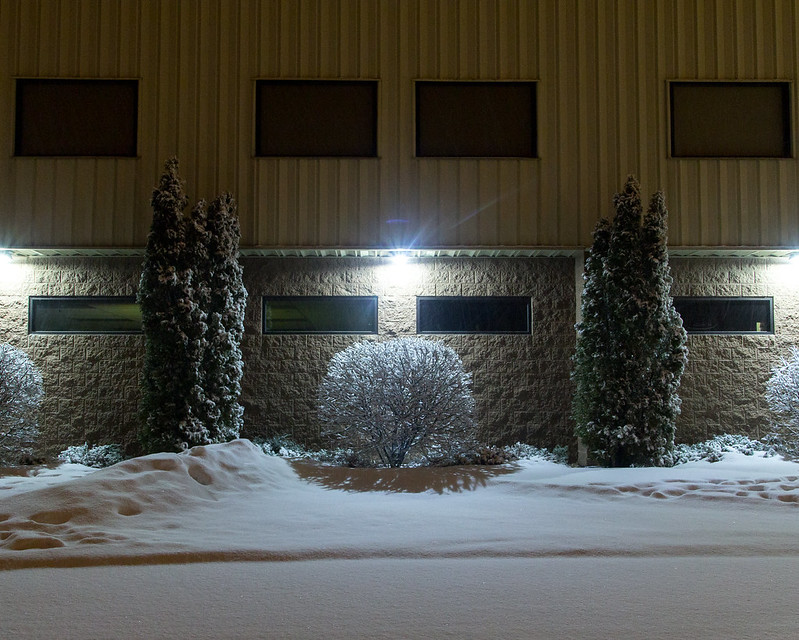
|
|
#
?
Mar 13, 2013 07:25
|
|

|
Saint Fu posted:For good star trails you are probably best off with 15 or 30 second exposures continuously. If you are using an intervelometer (which you basically have to for star trails), you'll set the wait time between photos to be the smallest possible, that will minimized the gaps. Thanks man, my cheapo remote thingy doesn't do intervals, so I just ordered one that does
|
|
#
?
Mar 13, 2013 07:50
|
|
|
cory ad portas posted:I like this a lot, very well composed. I think maybe if you take some of the light off of his hands it may help draw more attention to his face, but I know dick-all about photoshopping. I'd pull up the highlights/white point on this one to give it a little more dynamic range.
|
|
#
?
Mar 13, 2013 16:25
|
|

|
Chitin posted:I'd pull up the highlights/white point on this one to give it a little more dynamic range. David Pratt posted:The first one is pretty lol. I think the lighting's fine on it, a bit flat, but better than harsh contrasty direct sunlight any day. Thanks for the advice, I definitely gotta get over my photoshop phobia.
|
|
#
?
Mar 13, 2013 20:12
|
|
|
 Steel blue by khyrre, on Flickr I'm just starting to get into a serious attempt at photography, and this is one of the first pictures I've taken that I didn't just delete immediately. Since I still don't have an intuitive grasp of exposure settings (and since sunsets are naturally trickier to shoot), I just snapped about a dozen exposures and then threw three of them into Photomatix and got this. I also took it into Photoshop briefly just to heal away a few specks on my lens. I feel like I'm cheating, since I basically just took a bunch of lovely exposures and Photomatix automatically gave me something that looks really cool and way better than anything I've ever photographed before... or maybe, to a more experienced eye, the picture's actually not all that well-executed, composition-/color-/whatever-wise. What could I have done better? Should I spend more time playing around with the Photomatix and/or Photoshop settings, or perhaps just not develop a reliance on HDR to make up for poor exposures?
|
|
#
?
Mar 14, 2013 08:12
|
|


|

|
| # ? May 21, 2024 13:39 |
|
|
404notfound posted:
This photo just feels weird when I look at it. Everything feels slightly blurry when you look at a larger version and it's just lacking any real oomph. I'm trying to find anything that is really sharp, but it feels like the focus is off. Also, it looks like you shot at f/22. I think stopping down that far made your lens do funny things. Overall it is a nice scene, but everything is, I dunno, I feel like someone grabbed the contrast and highlight sliders in Lighroom and yanked them all the way to the left. There's some weird, I dunno if I'd call it haloing or what, thing going on, especially along the treeline. ---- Speaking of HDR, this is the first photo I've ever exposure blended. I think I did alright, but the lens flaring is annoying as hell.   
|
|
#
?
Mar 14, 2013 08:37
|
|