


|
404notfound posted:
Yo unless your lens was horrifically dirty those spots were probably on your sensor. It's really loving hard for stuff on the front of the lens to show up in the final picture.
|
 #
?
Mar 14, 2013 14:47
#
?
Mar 14, 2013 14:47
|
|


|

|
| # ? May 12, 2024 14:01 |
|
|
xzzy posted:The idea is interesting, but the execution isn't doing much for me. Try shooting really late or early with the sun coming in at a sharp angle? Some shadows might juice it up. Magic Hate Ball posted:I feel like I know where you're trying to go with this and I like your destination but either you need to photograph it in a different way (earlier/later time of day to emphasize shadow? different plants?) or work with the idea in a different, physical medium because right now it just kinda looks like you photographed garbage. You really need the sense of depth, or at least more organized randomness in the frame. krooj posted:I'd agree with this. I think greater contrast / shadow would yield better texture, if that's what you want. What do these look like in B&W? beergod posted:These own. I really really like them. I would maybe wash the colors out even a bit more. I shot these around 5 in the afternoon in harsh sunlight. It is grass, leaves and silly string - basically I did photograph garbage.
|
|
#
?
Mar 14, 2013 16:21
|
|

|
Casu Marzu posted:Speaking of HDR, this is the first photo I've ever exposure blended. I think I did alright, but the lens flaring is annoying as hell. I'm not really sure what benefit the exposure blending gets you here. The shadows and midtones seem kind of muted. I do like how the reflection of the green lights divides the pavement. Second one doesn't do much for me. I like the mood that the long exposure brings to the third one but the building doesn't really contribute much to the composition imo. 404notfound posted:
Yeah obviously the scene is really pretty but lock down your composition to make sure that your capture of it is interesting before you start piling on layers of post-processing. I know a lot of people do exposure blending for landscape but I think the scene here could be strong enough to stand with one exposure. Cross-posted from the portrait thread - shot a 9 month old session for my son. Nothing fancy for lighting but it got the job done - SB-700 and a shoot-through umbrella. Thinking I need to be careful with ambient white balance (cfl's in overhead fixture) in the future. 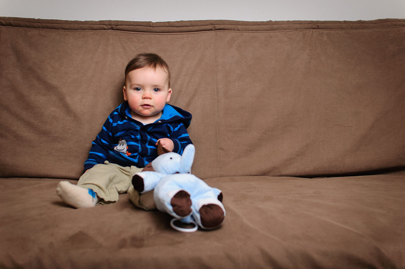 Max - 9 Months by voodoorootbeer, on Flickr 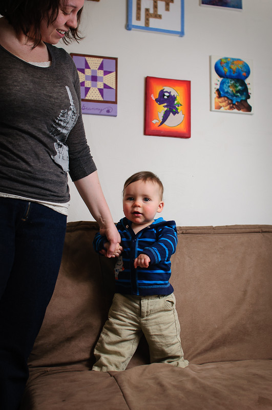 Max - 9 Months by voodoorootbeer, on Flickr 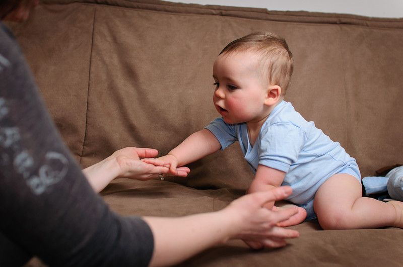 Max - 9 Months by voodoorootbeer, on Flickr
|
|
#
?
Mar 15, 2013 04:12
|
|


|
voodoorootbeer posted:I'm not really sure what benefit the exposure blending gets you here. The shadows and midtones seem kind of muted. I do like how the reflection of the green lights divides the pavement. Second one doesn't do much for me. I like the mood that the long exposure brings to the third one but the building doesn't really contribute much to the composition imo. Thanks. ") The first I tried to expose properly as to how my eyes saw the scene. It was pretty well lit, but I didn't want to wash out the neon too much. I think I should have grabbed one more exposure to really get more going on in the mid and shadows. The first I tried to expose properly as to how my eyes saw the scene. It was pretty well lit, but I didn't want to wash out the neon too much. I think I should have grabbed one more exposure to really get more going on in the mid and shadows.I really like the third and I tried to clone that building out in lightroom to little success. Sooner or later I need to get myself photoshop I think.
|
|
#
?
Mar 15, 2013 06:52
|
|

|
Casu Marzu posted:
Really like the symmetry and subtlety to these. I think the first one could go up a couple stops and still have the barren/silent feel you seem to be going for, while revealing a bit more texture in the blacktop and highlighting the snow. The last one makes me think of Let the Right One In. I've been working on a project documenting squatter villages in Kathmandu. I made this one by stitching together two shots, because I really wanted to capture the texture of the room. But now I'm feeling like the amount of headroom distracts from the subjects. Crop or not? 
|
|
#
?
Mar 15, 2013 12:30
|
|


|
Ricky Christ posted:Really like the symmetry and subtlety to these. I think the first one could go up a couple stops and still have the barren/silent feel you seem to be going for, while revealing a bit more texture in the blacktop and highlighting the snow. The last one makes me think of Let the Right One In. Nah, while the composition doesn't really lead the eye from subject to background the exposure difference privileges the kids enough that it works. Also wish I had your job.
|
|
#
?
Mar 15, 2013 13:49
|
|
|
voodoorootbeer posted:
I feel like the skin tones could be a little bit warmer and the plain, brown couch doesn't do much as a background. I feel like a background with more context (toys, kid stuff) OR a more solid background (no divide between the brown couch and white wall) would be better. The second one has some harsh shadows. The third is my favorite, but I wish he was turned toward the camera more. Went to a long exposure photography meetup.  Long Exposure Meetup by Kiri koli, on Flickr This is my first attempt at panning ever. I think the blurring works somewhat to give the shot a sense of motion, but I can't help but think that a panning shot should be more clean. I also left it mostly uncropped because of the texture on the ground leading up from the corner of the picture, but maybe then the subject gets lost a bit.  Long Exposure Meetup by Kiri koli, on Flickr
|
|
#
?
Mar 17, 2013 01:48
|
|

|
Kiri koli posted:This is my first attempt at panning ever. I think the blurring works somewhat to give the shot a sense of motion, but I can't help but think that a panning shot should be more clean. I also left it mostly uncropped because of the texture on the ground leading up from the corner of the picture, but maybe then the subject gets lost a bit. I would say cleaner would definitely help there. The blur doesn't seem quite like the kind that implies speed to me. The background also seems really busy with all the lights, which I think is also contributing to the subject being kinda lost. I was about to head out of my apartment and go to Starbucks, but then I found this new spiderweb literally right outside my front door.  Curtain by khyrre, on Flickr In retrospect, I probably should have gotten a little higher and angled the camera down to avoid that glaring, direct light from the bulb, but otherwise I think it turned out not horribly. It's now an upcoming photo on 500px, at any rate 
|
|
#
?
Mar 17, 2013 08:53
|
|


|
404notfound posted:I was about to head out of my apartment and go to Starbucks, but then I found this new spiderweb literally right outside my front door. This needed to be macro, IMHO. It's still a cool shot, though. Whitezombi posted:I shot these around 5 in the afternoon in harsh sunlight. It is grass, leaves and silly string - basically I did photograph garbage. Phototroll?
|
|
#
?
Mar 17, 2013 15:23
|
|

|
krooj posted:Phototroll? If I post something in PAD I am very serious about it. I shoot a lot of abstract and odd stuff that doesn't fit into the norm. Some people love it, others think it is garbage. In this case, what I shot was actual garbage on the ground.
|
|
#
?
Mar 17, 2013 17:15
|
|
|
404notfound posted:
On a first glance it looked like a dirty fingerprint on the lenses/sensor/film/whatever, and them BAM! spiderweb. I like it, but agree that the light is a little bit distracting. Kiri koli posted:Went to a long exposure photography meetup. Maybe crop the right side so the sign is centered? It feels like it should be simmetric but isn't. That will also cut the light on the top right which is a little bit distracting. Three from London. I think I can see a pattern to them. 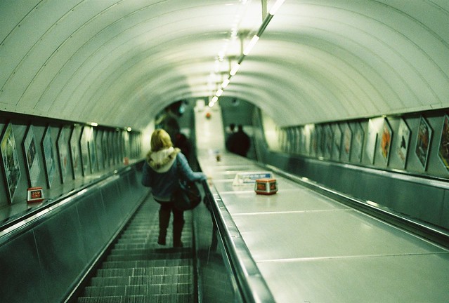 Tube Stairs por primoitcho, no Flickr I can't pinpoint why, but I really like this picture, even considering it's out-of-focus and tilted. I've straightened it but thought that it looks better tilted. Thoughts? 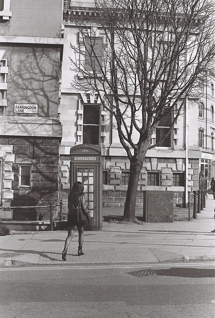 boothlegs por primoitcho, no Flickr I'm having some trouble with this one...I can't figure if it's aligned or not, since it seens that neither the phone booth, the back building or the side building are level with one another...  Sunny London por primoitcho, no Flickr I like the colours but not really sure about the crop or if it is an interesting picture at all. Primo Itch fucked around with this message at 17:47 on Mar 17, 2013 |
|
#
?
Mar 17, 2013 17:44
|
|
|
Primo Itch posted:On a first glance it looked like a dirty fingerprint on the lenses/sensor/film/whatever, and them BAM! spiderweb. I like it, but agree that the light is a little bit distracting. 1) My first thoughts were "I want to see it straightened" - but you've mentioned that, so I'll trust your judgement that it looks better on the angle The in-focus red Stop signs, are stealing a bit too much 'eye-time' for my liking. They're drawing my attention away from the rest of the shot, in an (IMO) negative way. Otherwise I like the Out of Focus look of it all 2) When I have challenging verticals like that, I normally just go by the most prominent, in this case, I think it's the back building and its windows. A couple of degrees anti-clockwise would fix it IMO. Other than that, I like it. 3) The colours are nice, but not enough to save the shot I don't think. It might sound harsh and I apologise if it does, but I think it belongs in the "not interesting enough to keep" category. I can see what you're going for, but it's just not doing it for me, sorry For me, Experimenting with close hard light sources in the absence of a real ring-flash, and my younger cousin who's been begging for photos for a while. Not a model by any stretch, but I think it turned out alright. Yes, I could have photoshopped out the reflections on the glasses, but wanted it as raw as possible. Pretty much SOOC. Maybe I'm not ready for SOOC 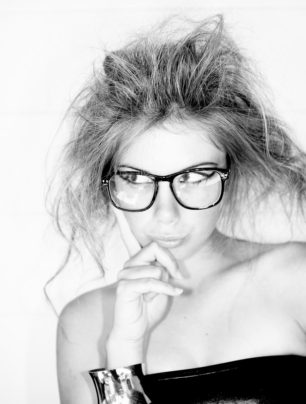 Kass B&W by Rick0r McZany, on Flickr
|
|
#
?
Mar 18, 2013 00:05
|
|
|
Ricky Christ posted:I've been working on a project documenting squatter villages in Kathmandu. I made this one by stitching together two shots, because I really wanted to capture the texture of the room. But now I'm feeling like the amount of headroom distracts from the subjects. Crop or not? Definitely do not. The photo is outstanding as it is. If you really feel that the ceiling adds nothing, then perhaps A couple from today:   I am not totally sure whether the second is too dark. I guess everyone will have monitors that yield different results that range from too dark to acceptable.
|
|
#
?
Mar 18, 2013 01:29
|
|
|
Cyberbob posted:Yes, I could have photoshopped out the reflections on the glasses, but wanted it as raw as possible. Pretty much SOOC. Maybe I'm not ready for SOOC 1. You can pop out the glass from the frames for better results. 2. Do you mean SOOC as in NO tinkering (crop, curves, etc.) or just no touchups?
|
|
#
?
Mar 18, 2013 02:50
|
|
|
Oprah Haza posted:1. You can pop out the glass from the frames for better results. Holy crap, I never thought about popping the glass out. Thanks for that tip! I'll have to try it next time. And I meant "pretty much SOOC" to mean "convert to B&W, curves, done." So, minimal tinkering
|
|
#
?
Mar 18, 2013 03:43
|
|
|
krooj posted:A couple from today: I really like both of these! The contrasts in both of them are really engaging and interesting. The shot in colors between the two halves of the second picture are just really well played; I also don't feel that it's too dark, on my monitor at least. Ricky Christ posted:Really like the symmetry and subtlety to these. I think the first one could go up a couple stops and still have the barren/silent feel you seem to be going for, while revealing a bit more texture in the blacktop and highlighting the snow. The last one makes me think of Let the Right One In. Echoing the sentiments that this picture is fantastic. I think the ceiling being included really helps frame the shot well and it's relative darkness keeps it from being too distracting. I'm curious too, how did you get the opportunity to work on such a project? Is this something yourself or a gig? Did you travel there, or live there already? Hope it's not too much to ask, I just love photo-journalism and it's been one of those things I've always really just wanted to do myself. Mr. Despair posted:
I like the scale in the building in this one a lot. I do think it feels just a bit flat maybe, and that a little more contrast could make the building pop a bit more. Mr. Despair posted:The first and the third don't really have a focus that draws me in. It's a nice overview of everything, but nothing that makes me interested. The 2nd one is close, but I get the feeling that you weren't quite centered on the bridge, and it throws everything off. Maybe if you can shoot it again back off a bit so that the whole walkway/bridge can be in view, and try to center yourself a bit more so that the left and right rails look the same. RangerScum posted:That's really just a long way of saying that after looking through some of your photos, I can see that you've had the opportunity to photograph some really cool, grand settings, and that it's important not to pigeonhole yourself into thinking that everything you shoot should have that look to it. Always try to think about what approach would suit your setting the best. It's a style I am still not fully comfortable with myself, but we grow the most when we're faced with doing something new. I get what you're saying and looking back on that day I can definitely see myself spending too much time trying to to take way too wide of a shot when that neighborhood would probably be better suited looking for and focusing on the smaller details. I think in the end I was just in the wrong frame of mind for what would have best worked in that area. Here's one from an evening walk around my own neighborhood.  IMG_6981 by Opals25, on Flickr And a couple of older shots;  IMG_2430 by Opals25, on Flickr  IMG_3128 by Opals25, on Flickr
|
|
#
?
Mar 18, 2013 04:41
|
|

|
 I was messing around with my camera at a park, and saw this all line up well. Rainy/overcast day. Any recommendations on how to improve? The sky is entirely blown out, regardless of condition.
|
|
#
?
Mar 18, 2013 07:02
|
|
|
It's interesting but I really wish there was a subject in there, right now my eye's just kind of being guided towards nothing.
|
|
#
?
Mar 18, 2013 07:17
|
|

|
Opals25 posted:Here's one from an evening walk around my own neighborhood. These are pretty nice. I like that the verticals are... vertical First one, not much to say - nice colours, nice light. Second one seems underexposed, and the cropping is very tight at the top, if you're including the statue it feels like it needs some headroom. Even though the sky is blown (which isn't that much of a problem because there isn't very much of it), the underside of the bridge is still underexposed. If you're losing the sky anyway, expose for the main subject of the photograph. Echoing Magic Hate Ball - it would be a cool location for a portrait shoot, but without some foreground interest it's a bit boring on its own. I've been lugging around a mirror recently. I don't think the out of focus foreground is working, and I probably should have tried to get back and foreground in focus:  DSCF1040.jpg by fuglsnef, on Flickr  DSCF1044.jpg by fuglsnef, on Flickr
|
|
#
?
Mar 18, 2013 13:58
|
|
|
Primo Itch posted:On a first glance it looked like a dirty fingerprint on the lenses/sensor/film/whatever, and them BAM! spiderweb. I like it, but agree that the light is a little bit distracting. Love this photo. Makes me feel like it's four in the morning and I'm drunk in London. There's a lot about it that's technically "wrong" but it's the perfect example of not being a slave to the rules.
|
|
#
?
Mar 18, 2013 15:31
|
|

|
David Pratt posted:I've been lugging around a mirror recently. I don't think the out of focus foreground is working, and I probably should have tried to get back and foreground in focus: If you're shooting for something like this then yeah, there's got to be some zero-to-infinity DOF going on, I think. If you have a tripod you can probably fudge two shots bended into one if you have to. I'd also try and set the mirror 'out in the world' a bit more as opposed to propped up against a backdrop that covers the whole background. From Saturday night:  I like the colours here, but just about every shot of this set is just a hair off focus - I don't know if it's the lens or body or what but peeping at 100% things ain't pretty; I thought it might have been maybe not having the shutter up quite fast enough, but even this still pose from the end of the performance suffers. Also, this was ISO800 for a dim room and exposed maybe a half-stop under, and the noise is terrible... I think for all the good my 50D does it's showing its age in that particular area. I've cleaned and sharpened what I can, but it'd be nice to not have to 
NoneMoreNegative fucked around with this message at 21:17 on Mar 18, 2013 |
|
#
?
Mar 18, 2013 21:12
|
|


|
I really like the colours. Also how the "wings" are aligned with the spotlights and how she goes from lighter in the right to darker in the left, following the line established by the spots (althought I wish there was a 6th one in there for simmetry). It feels a bit loud with all the shiny detail, but that's probably what you where going for and you've succeded on that. I can see the focus problem on the full picture, but looking at it computer-screen-sized it doesn't looks like a problem for me. A guitar player near St. Jorge's Castle in Lisbon  Viol�o no Castelo por primoitcho, no Flickr
|
|
#
?
Mar 20, 2013 03:13
|
|
|
I like the concept but I wish you had tried to incorporate the umbrella/bag/belongings into the shot rather than hide them off to the side. I think just walking a little more to the left could have helped that and also bringing him just a little bit away from the edge of the frame. As is, there is all this movement going down to the left of the frame and it just abruptly cuts off.
|
|
#
?
Mar 20, 2013 03:27
|
|

|
David Pratt posted:
I really like the idea of what you're doing, but with background completely obliterated, it's just kind of confusing to look at. Also, did you go in and selectively blur around the mirror? The edges seem really jarringly out of focus.   
|
|
#
?
Mar 21, 2013 07:44
|
|
|
Casu Marzu posted:I really like the idea of what you're doing, but with background completely obliterated, it's just kind of confusing to look at. Also, did you go in and selectively blur around the mirror? The edges seem really jarringly out of focus. The edges of the mirror really came out like that, I was pretty surprised how fake it looked too. Those first two are great, the first especially. Composition is spot on in both of them, the slow shutter works really nicely for the snow. The third seems a bit underexposed, and the trees on the left aren't really balanced well by the open space on the right. I think a square crop, removing the trees, or panning the camera right may have worked better.
|
|
#
?
Mar 21, 2013 11:43
|
|
|
rio posted:I like the concept but I wish you had tried to incorporate the umbrella/bag/belongings into the shot rather than hide them off to the side. I think just walking a little more to the left could have helped that and also bringing him just a little bit away from the edge of the frame. As is, there is all this movement going down to the left of the frame and it just abruptly cuts off. Yeah, i see where you're going. Centering him a little bit more and adding those elements in instead of going *lah lah i'm not seeing them i'm not seeing them lah lah" would've made for a feel of a complete picture, and right now if feels like there's something missing to the side or something. Thanks again for your criticism, you're always very helpful I agree with the top poster on the second and third picture, but don't think that cropping the trees out works, since without them the photo looks a little bit too empty. Maybe try more of a panoramic crop, cutting a little bit of the bottom and a large chunk of the sky?  blue por primoitcho, no Flickr
|
|
#
?
Mar 21, 2013 17:04
|
|
|
Primo Itch posted:
I really like this, save for a few things. I don't know a lot about composition and such so I suppose I'll just tell you what simply looks appealing versus not so much. The woman's head sticking out of the car just seems incredibly out of place. Since most of the picture is focusing on sort of inert, lifeless, subjects the woman just sticks out. Unfortunately it's just her head, otherwise it might be more interesting? Possibly. I do however like the colors and tone, although I feel the middle region of the picture isn't as strong as the bottom and top sections. Hopefully any of that was useful. 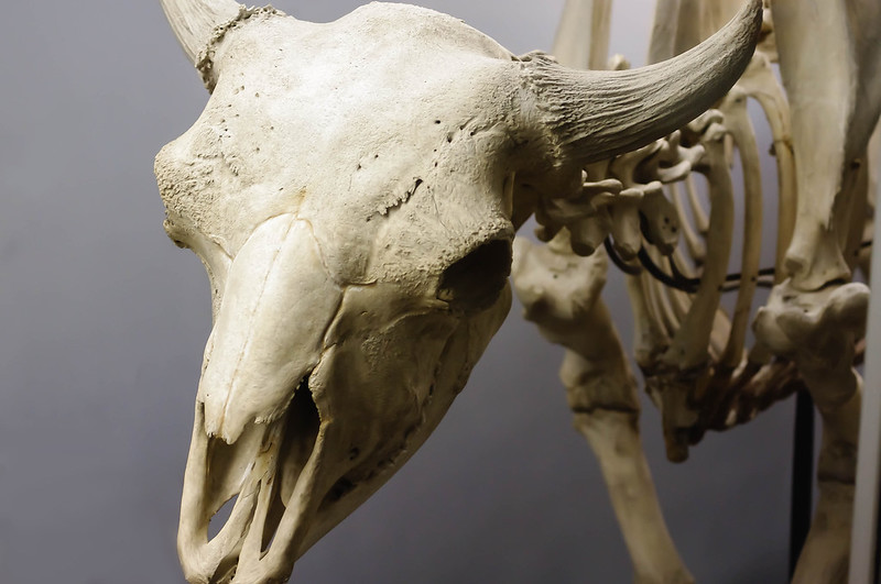 This is probably my favorite picture that I took over spring break, so I figured I owed it to give it a good job in editing. Was wondering how I did. I do have Lightroom, and this represents my first effort in using it. If I could retake the photo I'd probably give the skull a little more room for the horn and jaw bone.
|
|
#
?
Mar 21, 2013 21:19
|
|

|
dragoat posted:
It looks like you shot on the wrong side of the light, worry about editing last, and take your time. The more work you do with your camera the less you have to do on a computer. A couple of photos I took over the last couple of weeks I have questions on.  Part of a story but was wondering if it can stand alone. Can you tell it's three dudes lifting a 500 lbs bomb?  I like the color and the texture, but I feel like im too soft on the eyes for it be a worthwile shot.  I added some heavy vignetting and burning to give it a claustrophobic feel, but does it seem overproduced?
|
|
#
?
Mar 22, 2013 09:55
|
|

|
I think all three of those are fantastic, hands down. The first, at first glance, no, I couldn't tell it was a bomb. After a sec, especially with the EOD patch, yeah, it was pretty obvious. The second would be better if his eyes were in better focus, but it is very strong as is. The third doesn't feel overproduced at all - I think the vignetting serves well to center focus on the soldiers center frame. Incidentally, all three of these are now in my "desktops" folder.
|
|
#
?
Mar 22, 2013 19:14
|
|

|
Primo Itch posted:Yeah, i see where you're going. Centering him a little bit more and adding those elements in instead of going *lah lah i'm not seeing them i'm not seeing them lah lah" would've made for a feel of a complete picture, and right now if feels like there's something missing to the side or something. Thanks again for your criticism, you're always very helpful I like the woman in there. Otherwise it's just pictures of cars. I like how you timed it so that her head sits directly at the intersection of those two lines. I think the woman saved and photo and made it much more interesting.
|
|
#
?
Mar 23, 2013 16:51
|
|
|
The Monk posted:
It seems like you already suspect you've overdone it and that's usually a good sign that you have. It's a great shot otherwise, the high contrast giving it a gritty, movie-like feel. The vignette is too much, especially in the top left - instead of focusing my attention to the centre the vignette itself draws my eye.   Firestarters and Searching for the firestarters by fuglsnef, on Flickr
|
|
#
?
Mar 24, 2013 23:19
|
|
|
The Monk posted:
Personally, I love it! It gives a sense of the fatigue and adrenaline-induced tunnel vision that these guys are experiencing. The mud flying in the air is an excellent touch.
|
|
#
?
Mar 25, 2013 02:09
|
|
|
David Pratt posted:It seems like you already suspect you've overdone it and that's usually a good sign that you have. It's a great shot otherwise, the high contrast giving it a gritty, movie-like feel. The vignette is too much, especially in the top left - instead of focusing my attention to the centre the vignette itself draws my eye. This works really well as a pairing, but I wouldn't ever separate the two.
|
|
#
?
Mar 25, 2013 10:38
|
|
|
The Monk posted:
I think the vignetting in the top left corner is definitely a bit much. The other three corners of the image are already naturally dark, so the vignetting sticks out there, and as a result is just a little bit distracting. I like everything else about the shot though.  Towel ring by khyrre, on Flickr I made this one black and white in Lightroom, but I guess I don't really have an idea of when it's good to do that. In other words, how does monochrome affect the meaning, tension, or significance of a photo?
|
|
#
?
Mar 26, 2013 08:06
|
|
|
The main elements of any photograph are shape (2D), form (3D), texture, and colour. If you make it monochrome you remove colour from that list and are working with the other three. What that means really depends on the photograph.
|
|
#
?
Mar 26, 2013 11:39
|
|
|
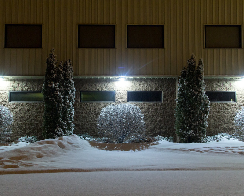
Black and white means it's serious art.The Monk posted:
I agree the first is interesting enough it doesn't matter that it's soft around the eyes. The only suggestion I might have for the second is to make the vignetting match the curve of the tree line. I'd also tone it down a little, but I think it still is a working element of the composition. It's a great motion pic and the boot in the right corner really completes it. Ricky Christ posted:I've been working on a project documenting squatter villages in Kathmandu. I made this one by stitching together two shots, because I really wanted to capture the texture of the room. But now I'm feeling like the amount of headroom distracts from the subjects. Crop or not? I agree to not crop. This is a wonderful photo. I'm starting to think about architecture, patterns, and abstraction.  ross by philip painter, on Flickr  umma interior by philip painter, on Flickr
|
|
#
?
Mar 26, 2013 13:23
|
|

|
I really enjoy this picture on its technical and aesthetic merits. The colors are rich and the lines are framed fantastically. Viewing it full sized, the snow isn't adding anything to the picture and is mildly distracting. I am not sure what you are going for in this picture. If it is abstraction, it would benefit from a more aggressive crop. As it stands, the path my eyes take is starting on the bottom center and following the line of the triangle up to where it meets above the windows then shooting past it to nothing. If you bring the left corner down to the line in the black decorative stonework and over to the right so the triangle terminates at a point and at the end of the frame it would work better for me. I honestly would like to see this shot like 10 different times with varying lighting. Would it look better with hard shadows? How about sunrise/sunset where you can catch the reflection in the windows.smallmouth posted:
At first glance, I love this picture. Seriously, I love it. Then I notice something, and I can't stop seeing it, like that damned FedEx logo. Right where the decorative etching starts on the window, smack dab in the middle of the frame, there's a space where it doesn't line up to the top of the half-wall and this little wedge of black catches my eye. Then I notice the seam in the glass paneling, (which up until then was very well hidden in plain sight) then because of the oof door in the background having a dark line that is parallel to the seam, but not quite hidden by it. It just ends up looking like the seam in the paneling where it meets the half-wall is diffracting. Unfortunately this is something that can't be fixed in post. If you shot this from a different angle of attack (like one step left and six inches lower) I think everything would line up *just right.* smallmouth posted:
I literally sat, trespassing, in this field for an hour waiting for the drat light to break through the clouds like it had been all day while I was at work. No luck on that front, so this is bracketed and masked in in post to get everything looking "right". Please be merciless, it's been 8 or so years since I've even held a camera and I've finally resolved to putting my degree to use instead of it just sitting in a box.  3Q5A0037bw2 by BlasphemousPie, on Flickr Oprah Haza posted:Cliche shot but well executed, I think the halos by the trees are a bit too noticeable though. If you're talking about the last tree on the right, that's a fluffy white cloud. It's not tone-mapped. But I can see where it looks like it. I bumped the curves on the cloud layer and hand masked them in, didn't go near the trees. a man a plan a canal fucked around with this message at 15:06 on Mar 27, 2013 |
|
#
?
Mar 26, 2013 23:00
|
|
|
GBS Till Death posted:I really enjoy this picture on its technical and aesthetic merits. The colors are rich and the lines are framed fantastically. Viewing it full sized, the snow isn't adding anything to the picture and is mildly distracting. I am not sure what you are going for in this picture. If it is abstraction, it would benefit from a more aggressive crop. As it stands, the path my eyes take is starting on the bottom center and following the line of the triangle up to where it meets above the windows then shooting past it to nothing. If you bring the left corner down to the line in the black decorative stonework and over to the right so the triangle terminates at a point and at the end of the frame it would work better for me. I honestly would like to see this shot like 10 different times with varying lighting. Would it look better with hard shadows? How about sunrise/sunset where you can catch the reflection in the windows. Thanks so much for the comments! They're really helpful. The same triangle bothers me in the second. I need to learn to take my time and line things up in the viewfinder better.
|
|
#
?
Mar 26, 2013 23:13
|
|
|
404notfound posted:
Sorry, this doesn't do much of anything for me. GBS Till Death posted:
Cliche shot but well executed, I think the halos by the trees are a bit too noticeable though.   
|
|
#
?
Mar 27, 2013 08:14
|
|
|

|
| # ? May 12, 2024 14:01 |
|
|
I should add this on all my posts, but i've just started out, so take it with a grain of salt. On the first one I really like the lightning, exposition and depth of field and her pose and basically everything, but the coffe cup throws me off. If you're doing portraits like this and want to have her holding something, find something interesting and not "oh, I was drinking coffe on my way here, hold this". On the second the way you've framed her with the tree works really well. I would maybe crop a little bit out of the right to get her face centered in the frame, but otherwise I think it's a solid shot. I also really like the concept on the third one, but i'm not sure about the focusing. Everything in the plastic toy is sharp, but her face is blurred, which draws me to the top hole and the nuts but not her face and the plastic bubble. Maybe you couldn't really focus on her thanks to the old plastic screen, in which case maybe a soft focus would help keeping attention to her and not the toy, but otherwise I'd love to see this with a shallow dof, focusing on her eyes and/or face and letting everything else blur out.  0017914-R1-31-32A por primoitcho, no Flickr  europa 197 por primoitcho, no Flickr Maybe the second needs a square crop? I'm not sure if I should take the dark space in the left out or not... Primo Itch fucked around with this message at 16:30 on Mar 27, 2013 |
|
#
?
Mar 27, 2013 16:23
|
|