


|
PuntCuncher posted:Not everything, but here's a cross section and most shots from their pin-up day. Resurrect the terrible photography thread. I think the key that's making these so awful is that it's too cluttered, and there's no control of the light. That is, everything is lit almost equally. Key on the subject, , bike (  ) at -1, background at -2 and it becomes at least somewhat passable as a 'pinup' photo. Everything about the photos as-is says " ) at -1, background at -2 and it becomes at least somewhat passable as a 'pinup' photo. Everything about the photos as-is says " " The umbrella one could be interesting, if they hid a speedlight in there and used a snoot or something like that for the face. " The umbrella one could be interesting, if they hid a speedlight in there and used a snoot or something like that for the face.Wait, are they putting on a pinup workshop? or is that facebook post unrelated? E: content snype:  Samantha Fitness-1.jpg by Chris Hayden Photo, on Flickr E2: Tried to d/b and retouch, but I only use LR, so I hope that's better. Nothing wider, just beside her knee/ankles are the edge of my backdrop. red19fire fucked around with this message at 04:30 on Mar 18, 2013 |
 #
?
Mar 18, 2013 00:28
#
?
Mar 18, 2013 00:28
|
|


|

|
| # ? Jun 3, 2024 10:26 |
|
|
red19fire posted:Resurrect the terrible photography thread.  But yeah,
|
|
#
?
Mar 18, 2013 03:02
|
|


|
NoneMoreNegative posted:I think the couple shots of the bloke could at least go somewhere with some directional light, a bit grease on his wifebeater and face, some vignette etc in post. At least stick a wrench in his hand, for gods sake Don't forget the look of "surprise". Good as a portrait, fun idea. I would maybe retouch the back of her thigh and d/b her skin to match tones overall. Do you have this any wider at all? My turn:  
Oprah Haza fucked around with this message at 03:42 on Mar 18, 2013 |
|
#
?
Mar 18, 2013 03:33
|
|

|
red19fire posted:
They certainly are putting on a workshop. You're right, will resurrect the horrible photography discussion...
|
|
#
?
Mar 18, 2013 05:12
|
|

|
alkanphel posted:Haha yeah good points both of you, I'll break out the reflector for the next few shots if I can find one. Or maybe I will just change the lighting setup for variation. gently caress that it looks fine without a reflector. I would tone down the highlights a little, but the dramatic lighting is cool. It would look way more generic with a reflector.
|
|
#
?
Mar 18, 2013 06:56
|
|


|
PuntCuncher posted:Not everything, but here's a cross section and most shots from their pin-up day. Can we count on you to go to the workshop and provide us with a trip report? This is important.
|
|
#
?
Mar 18, 2013 07:15
|
|
|
mr. mephistopheles posted:gently caress that it looks fine without a reflector. I would tone down the highlights a little, but the dramatic lighting is cool. It would look way more generic with a reflector. Purchased a cheap, photo umbrella stand to actually use my sb-600. No more excuses!
|
|
#
?
Mar 18, 2013 18:49
|
|
|
 Marissa by xxyzx road, on Flickr
|
|
#
?
Mar 19, 2013 06:33
|
|

|
torgeaux posted:Read up on Rembrandt lighting. It's a classic, it's use able in lots of situations, and you'll see it everywhere. Would these be considered Rembrandt?   
|
|
#
?
Mar 19, 2013 16:26
|
|

|
Crosspost from the awesome format thread.  The Cadet by McMadCow, on Flickr
|
|
#
?
Mar 19, 2013 19:41
|
|

|
Sludge Tank posted:Would these be considered Rembrandt? Yes; Rembrandt lighting is defined by the triangle of light on the darker cheek caused by the nose. If the nose shadow doesn't touch the cheek shadow, this is called "loup" lighting.
|
|
#
?
Mar 20, 2013 17:39
|
|
|
 jessica by francography, on Flickr
|
|
#
?
Mar 21, 2013 00:05
|
|


|
Sludge Tank posted:Would these be considered Rembrandt? Yup. Note, Rembrandt is an easy go to, but for me it is just a jumping off point because it nicely demonstrates how shadow shapes the image.
|
|
#
?
Mar 21, 2013 01:04
|
|

|

|
|
#
?
Mar 21, 2013 12:37
|
|

|
This is extremely well done in the technical sense, but can you talk about what you're going for here? To me it just looks like a commercial photo for a product in a print ad. That's fine and all, but if you're going for something a little more personal I think you missed it in all that gloss.
|
|
#
?
Mar 21, 2013 14:56
|
|
|
I like it a lot but I think it is a bit too busy with the ball and the visor. I think it'd be quite a bit more stronger with just the visor. With the ball it kind of gives of the vibe that it's an ad for space perfume. but yeah nice processing [thumbs up emoticon]
|
|
#
?
Mar 21, 2013 19:39
|
|

|
Yeah I forgot what thread I was in a second and thought it was ad for space yoga. Not that's necessarily a bad thing! If that's what you were going for, that commercial look, you did so wonderfully.
|
|
#
?
Mar 21, 2013 21:56
|
|


|
beergod posted:What kind of off camera lighting did you use? Did you do any processing work? I kind of like the subject and posing but the shadows are way harsh. Sorry for the delay, but it was a lowel constant lighting kit (http://www.lowel.com/kits/superAmbi.html). Pretty sure we had the Rifa eX softlight on the left and an omni on the right. I was only TA'ing the class and snapped a couple pictures in between helping other people. I really hate that light kit, mostly because of the way its all treated by other students, and the stands. Oh, and we dont have any gels for them either, pretty awesome. Edit: Also for post i mostly just cleaned up skin, brightened her eyes a little, fixed the fishnet once or twice, annnnd thats about it? i think, pretty sure. Edit Edit: Just remembered, we shot this in the green screen room on a roll of white paper, and due to the 20 other students around me and the paper not being big enough, I had to fill in some of the edges to get rid of the green screen and such out. Easy little mask, content-aware fill nothing fancy lol. Alcoholic fucked around with this message at 05:58 on Mar 22, 2013 |
|
#
?
Mar 22, 2013 05:51
|
|
|
.....
Erostratus fucked around with this message at 01:16 on Jul 6, 2014 |
|
#
?
Mar 22, 2013 09:29
|
|

|
New stuff. 861001_10151302887893531_2017648986_o by David Childers Photography, on Flickr  erica by David Childers Photography, on Flickr  lauren 2 sample by David Childers Photography, on Flickr  861075_10151302887923531_1938029196_o by David Childers Photography, on Flickr
|
|
#
?
Mar 22, 2013 20:25
|
|

|
Bottom Liner posted:New stuff. really like that one! I'm assuming you used a ladder?
|
|
#
?
Mar 22, 2013 20:36
|
|

|
Thanks! Jumped off a stool actually. No fear.
|
|
#
?
Mar 22, 2013 20:44
|
|
|
 Passerby posed with unknown person's Mustang.
|
|
#
?
Mar 24, 2013 00:29
|
|
|
   I swear I need to start bringing along a chart of expressions.
|
|
#
?
Mar 25, 2013 05:15
|
|
|
I had my first 'outside job' tonight. My friend needed some portraits of a local DJ & producer for his graphic design project, and looks like it'll get used in promo work. I had a nightmare with my lighting, I was really nervous. Suffered some minor blowouts and THE loving DUST !!  But oh well... they were both really happy with a lot of the results. But oh well... they were both really happy with a lot of the results.Here's a few (sorry about the inconsistent cropping and whatever else)  Timmus 1 by Alex Gard, on Flickr  Timmus 2 by Alex Gard, on Flickr  Timmus 3 by Alex Gard, on Flickr The idea from these is my friend is going to make some words out of tape coming out of the cassette, (please do not steal these pictures or whatever because I think they will be used commercially) I didn't like the reflections in the glasses and generally had a hard time getting the light how I wanted it. Looking back I really wish I'd just started with one flash and worked my way up. (he's dressed up as an alter-ego type thingy good tunes too> http://soundcloud.com/timmus1) This was a new experience for me in shooting someone other than myself and also my first time doing anything in a place where I had total control over all the light (dark studio) but it was a lot harder than I thought it would be... I definitely have a lot to learn in this department, nonetheless it was a good learning curve and fun to do. These were just my rough quick edits to see how I felt about them, looking forward to what my friend does with them ") Sludge Tank fucked around with this message at 14:39 on Mar 25, 2013 |
|
#
?
Mar 25, 2013 13:47
|
|
|
Oprah Haza posted:
Exactly what I was about to say. I feel like you could interchange the face on all 3 of these without any loss of quality. That's probably not a good thing. That said, I like the first one the most. Reichstag posted:
Blurry. Sadly, the explanation makes it worse - like, is he trying to be funny posing in front of a crappy car? At least if it was his, it'd be cool to see he's still proud of the beater. Recent two:  
|
|
#
?
Mar 25, 2013 19:57
|
|
|
Hehe, I was totally unaware of the blur, thanks! I asked him to pose there/like that, he was very confused.
|
|
#
?
Mar 25, 2013 20:03
|
|
|
sw1gger posted:Exactly what I was about to say. I feel like you could interchange the face on all 3 of these without any loss of quality. That's probably not a good thing. That said, I like the first one the most. quote:Recent two: (USER WAS PUT ON PROBATION FOR THIS POST)
|
|
#
?
Mar 25, 2013 21:10
|
|
|
Just something for fun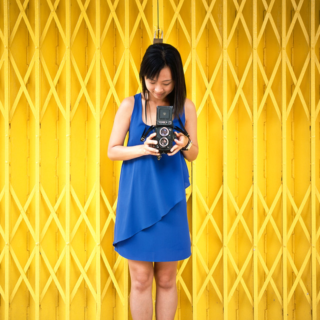 Blue Dress, Yellow Grill by alkanphel, on Flickr
|
|
#
?
Mar 26, 2013 00:09
|
|

|
sw1gger posted:Exactly what I was about to say. I feel like you could interchange the face on all 3 of these without any loss of quality. That's probably not a good thing. That said, I like the first one the most. The processing on the first one makes her legs look like they're super hairy, and the colour doesn't match the rest of her skin.
|
|
#
?
Mar 26, 2013 00:38
|
|

|
CarrotFlowers posted:The processing on the first one makes her legs look like they're super hairy, and the colour doesn't match the rest of her skin. So true. Lesson of the day: Anything full body, use a bigger softbox. I actually have a parabolic - but I'm always too lazy to take it apart and re-set it up. I actually used it for the second one, ha
|
|
#
?
Mar 26, 2013 05:54
|
|
|
Chitin posted:You may wish to check Reichstag's post history... Meh. I experimented a few ways - this was just some custom photoshop brush. I tried making it look "wet" for a considerable amount of time, but was unable to do it against that particular setting. Against white, I was able to do waaay more with the strokes. I got the idea from another photo, but that one was done against an overexposed sky - now I know why (because it looks way more awesome against white) Alternatively, you can do it against a blank canvas, take a photo, and blend it in. ANOTHER way: Get a large canvas of the photo printed, actually paint what you want on it, then pay for a high-res scan.
|
|
#
?
Mar 26, 2013 06:05
|
|
|
sw1gger posted:Recent two: I knew these were yours before I saw your username. I am jealous. I wish I had a style.
|
|
#
?
Mar 26, 2013 06:07
|
|
|
sw1gger posted:I got the idea from another photo, but that one was done against an overexposed sky - now I know why (because it looks way more awesome against white) Alternatively, you can do it against a blank canvas, take a photo, and blend it in. ANOTHER way: Get a large canvas of the photo printed, actually paint what you want on it, then pay for a high-res scan. *which is what I'd assumed was going on at first glance.
|
|
#
?
Mar 26, 2013 07:40
|
|
|
LFK posted:How does it look if the stroke is between the lens and the brush so it looks like she's behind glass*? Painting on glass and taking a photo to composite in wouldn't work because paint tends to bubble/drip too much on glass (atleast for what I wanted to go for). Otherwise, I could do it post but honestly I don't think I even considered using glass instead of something more canvas-y (with regard to the texture). Currently, there are like 3-4 textures (all canvasy). There first one is applied really lightly to the whole image (maybe opacity at like 15%). The next one is a tad stronger, but layer masked in a circular gradiant going from her head (as to not cover her skin/clothing in more canvas textures). The next two textures are really strong (70-100%) but layer masked so that they're ONLY under the sketch. I've never mimicked a glass wall before - certainly an intriguing idea. I wonder if it'd be a similar process only with a glass texture? Also one thing to consider with that idea:, the the brush would have to look somewhat squished to really pull off that effect. No idea how to do that. (Unless you really shoot it and layer mask stuff out). But who knows - you might be right.
|
|
#
?
Mar 26, 2013 08:15
|
|
|
sw1gger posted:Painting on glass and taking a photo to composite in wouldn't work because paint tends to bubble/drip too much on glass (atleast for what I wanted to go for). Otherwise, I could do it post but honestly I don't think I even considered using glass instead of something more canvas-y (with regard to the texture). Currently, there are like 3-4 textures (all canvasy). While you're right that the tip, pressed to glass, would be deformed, the tip would also be obfuscated by the text, and its current shape could be justified just as well by the apparent completeness of the action - "oh, she's done and just lifted the brush" or whatever. I dunno, I'm just having a problem with "where" the text is supposed to be. I do love the texture work, though. For reals.
|
|
#
?
Mar 26, 2013 08:43
|
|
|
LFK posted:I think the texture is fine, it's more the space that this, conceptually, exists in. Her pose has the brush pointed across the axis of the stage, so the tip of the brush is closer to the viewer than her body, but the paint is behind the brush. I don't think the look needs to mimic paint-on-glass, but it was more a reference of space, that the paint would be on an invisible plane that's between the viewer and her. I'm realizing in retrospect that I did a crappy job at communicating that. Totally get it. When I have a minute tomorrow or so I'll show you what the stroke looked like against white (achieving that "breaking of the fourth wall" idea that I think you're alluding to). Because the brush strokes are semi-transparent, against white they had more of a "sheen" and a glimmer of catchlights that made it pop. Applying it to the photo removed that. I couldn't find a way to bring it back That said, I do think the photo looks better bigger. I regret not doing a square crop. edit: 
sw1gger fucked around with this message at 03:10 on Mar 27, 2013 |
|
#
?
Mar 26, 2013 08:54
|
|
|
I'm doing a couple headshot sessions today for some lawyers I know, so I wanted to do a quick Google Image Search for ideas and inspiration. Good idea, right? GOD HOW WRONG I WAS  "Yeah, for this one I really wanted to give the impression that I was stalking you from the bushes."  "I'm really happy with this one, it gives the effect that you're some sort of irradiated zombie, ready to pounce at any moment. I feel that's very metaphorical and analogous to your law career." I really don't know if this makes me more or less confident about my shoot today. I'm used to shooting models, I'm not used to shooting professional headshots!
|
|
#
?
Mar 27, 2013 13:35
|
|

|
This one turned out way off from what I had originally planned, but I like the mood so I think I'm going to keep it:
|
|
#
?
Mar 28, 2013 07:43
|
|
|

|
| # ? Jun 3, 2024 10:26 |
|
|
I did my first "professional" headshot session yesterday, with a couple of local lawyers who are starting a firm together. I'm used to frou-frou shots of models and stuff so I had no idea what I was doing, but just pretended really hard. Not perfect, but I think the clients will be happy! Also, I have no idea how to deal with hair flyaways   
|
|
#
?
Mar 28, 2013 14:41
|
|