|
Primo Itch posted:
IMO when photographing graffiti and street art you need to really capture a lot more of the surrounding area in order to give some context and a more interesting touch to it. In your second, I'm guessing it was a bit of a spur of the moment photo. I love the colors coming off the building and the movement of the road, but wish you had stepped back another couple feet to get the railings on the left and right completely in frame.    Trying different things out. I kinda feel like there's not enough going on in the first and too much in the others though. Casu Marzu fucked around with this message at 08:52 on Mar 29, 2013 |
 #
?
Mar 29, 2013 08:50
#
?
Mar 29, 2013 08:50
|
|


|

|
| # ? May 23, 2024 23:39 |
|
|
Casu Marzu posted:IMO when photographing graffiti and street art you need to really capture a lot more of the surrounding area in order to give some context and a more interesting touch to it. All of these are fantastic. I really like how in the second two the buildings on the horizon are sharp enough to make out. On the third I like the color/texture contrast of the foreground, but I can't decide if it's too powerful or not. All the elements in it are very strong. Maybe crop some of the foreground so it isn't split in two? The first is minimalistic, but I kind of like that. Possibly because it reminds me of where I live. I think the snowfall and the couple layers of trees in the background are enough going on.  IMG_3895 by philip painter, on Flickr  IMG_3905 by philip painter, on Flickr  IMG_3916 by philip painter, on Flickr In the first, I can never decide how much distortion correction is correct. Does it matter that the wall doesn't quite line up on the left side? Should it? Is the photo too boring with to bother fixing? In the second the door was really that warped.
|
|
#
?
Mar 29, 2013 13:21
|
|

|
Casu Marzu posted:IMO when photographing graffiti and street art you need to really capture a lot more of the surrounding area in order to give some context and a more interesting touch to it. The first is sorta, "meh" for me. I don't like the term snapshot, but it just doesn't have the polish the second two have. I'd say the strongest is by far the last. You've got great contrast through texture and colour. Yes, the last photo kicks rear end.
|
|
#
?
Mar 29, 2013 15:07
|
|

|
On the other hand, I like looking at the first one the most. Probably has to do with that it looks the snowiest of the three.
|
|
#
?
Mar 29, 2013 15:48
|
|

|
smallmouth posted:All of these are fantastic. I really like how in the second two the buildings on the horizon are sharp enough to make out. To answer your question very non-definitively - it only matters when it matters. If you think that the distortion detracts from what you are trying to do in the image then it is time to fix it. In your first picture, unfortunately I don't think it matters because it just looks like (based on your title) you decided to get these three things in the frame, measure off an approximate distance from each side of the frame and call it a day. There are so many interesting textures there from the looks of it, and I think your eye was on the right track looking for geometric shapes. It unfortunately does not work as you have presented it though (in my opinion).  DSCF2338 by Paul Hofreiter, on Flickr Without explanation I will post this and very much appreciate any insights. I might elaborate on what I am hoping to do with this kind of thing later on.
|
|
#
?
Mar 31, 2013 08:06
|
|

|
 Untitled by Pliv10, on Flickr  Untitled by Pliv10, on Flickr (USER WAS PUT ON PROBATION FOR THIS POST)
|
|
#
?
Apr 1, 2013 05:11
|
|

|
Bilbo Baggins posted:
I would say you might want to add a crit because rules and all but since nothing has happened yet days later I am thinking that in addition to no occasional effort crits we are now not getting mod visitation. Gas thread etc. First one is fine technically - I don't like that branch in the middle of the frame since it draws attention and it is not that important or interesting vs. what else is going on in that setting. Might not feel the same way if it wasn't centered like it is. The second is fine - looks like a nice place. It is hard for me to judge anything sunset related anymore because I am hard on myself with those shots since they are kind of a "gimme" in terms of getting a nice looking image.  DSCF2446 by Paul Hofreiter, on Flickr  DSCF2443 by Paul Hofreiter, on Flickr  DSCF2274-Edit by Paul Hofreiter, on Flickr
|
|
#
?
Apr 3, 2013 05:24
|
|
|
smallmouth posted:
I don't think the left hand side not lining up doesn't make much of a difference. I like the textured beaten up look, as well as the wealth of rectangles. The black wire hanging down is distracting, as is to a lesser extent the white square reflection in the garage door. Love the colours in the second one, I think a tighter crop to the door on the right side would finish it off. The third one doesn't do a great deal for me. Nixing the poles poking into the frame on the left might help it.  Hafod Meadow by M Walts, on Flickr  Van Tide by M Walts, on Flickr  Ink Trees by M Walts, on Flickr Three very different ones from a recent trip back to the Motherland. (Wales). I know the last shot is cliche, so I aggressively processed it.
|
|
#
?
Apr 4, 2013 23:41
|
|
|
Dalax posted:
The result is very simple and highly effective. It's great.
|
|
#
?
Apr 5, 2013 04:02
|
|
|
rio posted:
When I see flower shots, I think bright and vivid. I like the yellow flower shot the best. The second photo feels dull and blends into the background.
|
|
#
?
Apr 5, 2013 05:08
|
|
|
 This is one of the better shots I have done recently. I know it is just a boat on water, but I like it. The only little minor thing I can tell that I should change is the the little tower poking out on the far left. It's really smaller, but slightly bugs me. Anything else I could improve? T Bowl fucked around with this message at 17:02 on Apr 5, 2013 |
|
#
?
Apr 5, 2013 16:56
|
|

|
rio posted:
What is this angle supposed to show us about the peacock? I don't feel like I'm seeing anything about it beyond "here was a pretty bird and I pointed the camera down and pressed the button." The way the tail is cut off feels careless, which really sticks out because it has the most visual weight in the photo by far. The blue/red contrast between the neck of the bird and the berry it's eating is really interesting/eye-catching, but it gets lost in the scene. There's also an interesting interaction in the curves of the wings and the feathers on its back, but there's just not a central idea that comes through.  Untitled by TheJeffers, on Flickr
|
|
#
?
Apr 5, 2013 21:39
|
|

|
rio posted:
I feel as though my eye enters the frame, loops around the pan drum and ends up in the back crowd without a sense of where to go. I'm assuming I'm meant to end up around the girl with the cello but I feel like she gets lost in the muddle. That may, of course, be what you're going for. Crossposted from the portraits thread: 
|
|
#
?
Apr 6, 2013 04:02
|
|

|
TheJeffers posted:
I like the symmetry of this, the overall subject is pretty boring, but you did well making it work overall.
|
|
#
?
Apr 6, 2013 16:10
|
|
|
rio posted:
My attention is drawn almost entirely to the drum in the bottom right and then the vertical mirrors in the crowd. I eventually get around to seeing the cellist, but I usually wind up looking to see what's in the mirrors or the reflections in the pan drum. Perhaps it's just a side effect of the DoF, but I really like how the people in focus are those looking at the cellist, while those in the back not paying attention are blurred out. Chitin posted:Crossposted from the portraits thread: I really like this shot a lot (and now want a portrait of myself in a similar style). The lighting is fantastic and I like the texture you were able to capture on the wall.  Stream at Bridal Veil Falls by m.clifford82, on Flickr  Strike (Cheetah) by m.clifford82, on Flickr  Grecian Windflower by m.clifford82, on Flickr I'm still a rank noob, so take my words with a saltlick and pepper me with criticisms to make me better. I initially started this photography moneypit to get into wide-angle landscape stuff, but I've found I'm enjoying most any subject (other than people, but I don't enjoy them much anyway). So it's kind of a hodgepodge. Thanks in advance for any crits.
|
|
#
?
Apr 7, 2013 23:09
|
|

|
mclifford82 posted:
The image is tack sharp and that look from the cheetah is wonderful. The only slight issue I have is that the photo seems to be cut too short on the bottom. I would've liked to have seen just a hair more of its body, even though the face is the obvious subject. When I say slight, I do mean slight. A few millimeters perhaps. mclifford82 posted:
No issues with this, just a wonderful shot. A town down the coast commemorated the 200th Anniversary of the British Bombardment there during the War of 1812, so reenactors from Fort McHenry in Baltimore showed up to do some musket drills and chat the tourists up. Unfortunately, I couldn't make it for the cannon demonstration, but I think I got a gem here  DSC_0535 by Mryuck88, on Flickr The local animal shelter recently took in 30 parrots from an owner who couldn't care for them anymore. Unfortunately, some were so stressed by the sudden move and lack of freedom that they defeathered their bellies and other parts of their body. It was heartbreaking to see, but most have been adopted by (hopefully) caring people already.  DSC_0426 by Mryuck88, on Flickr What can you say about rock candy?  DSC_0542 by Mryuck88, on Flickr
|
|
#
?
Apr 8, 2013 00:12
|
|

|
I'm still pretty new to photography so critique is more than welcome. I tend to enjoy taking photos in difficult conditions without really going above ISO 400 if I can help it really. Anyway here are some shots I took walking around Sydney last week. 129.jpg by drgarbanzo, on Flickr  139.jpg by drgarbanzo, on Flickr  152.jpg by drgarbanzo, on Flickr I like how each of these has turned out but I'm not really sure how good they really are.
|
|
#
?
Apr 8, 2013 06:24
|
|
|
mclifford82 posted:My attention is drawn almost entirely to the drum in the bottom right and then the vertical mirrors in the crowd. I eventually get around to seeing the cellist, but I usually wind up looking to see what's in the mirrors or the reflections in the pan drum. Perhaps it's just a side effect of the DoF, but I really like how the people in focus are those looking at the cellist, while those in the back not paying attention are blurred out. The main reason the steel pan is so prominent is because he is the bandleader - the piece was a duet between him and the cellist. I am the bassist and often I will not be playing for a few pieces so I was thinking of starting a series of shots from a performer's viewpoint. In this one, I really liked how, due to space issues, she was out in the room among the audience and liked the mix of her expression while playing among the various reactions in the crowd. TheJeffers posted:What is this angle supposed to show us about the peacock? I don't feel like I'm seeing anything about it beyond "here was a pretty bird and I pointed the camera down and pressed the button." The way the tail is cut off feels careless, which really sticks out because it has the most visual weight in the photo by far. The blue/red contrast between the neck of the bird and the berry it's eating is really interesting/eye-catching, but it gets lost in the scene. There's also an interesting interaction in the curves of the wings and the feathers on its back, but there's just not a central idea that comes through. Thank you for the insight - I got this angle and framing because as the bird was milling about on the grey concrete I wanted to try to have the colors come suddenly into the frame in some way, narrowing until getting to the head making a shape on the pavement. The legs were to give it a sense of still being a creature and add some literal movement. I thought the small bit of color from the tic tac or whatever it was eating helped to tie it together adding some color at the end of the shape made my the bird. If it didn't work then I will try something else next time; I would like to eventually execute the idea effectively. If it comes off as being careless that is good to know.
|
|
#
?
Apr 8, 2013 06:32
|
|
|
Dr. Garbanzo posted:
I like the six-pointed star effects on the lights. Is there a trick to that or is it just a natural property of the lens's bokeh/aperture blades? It was dark and my autofocus wasn't working half the time and it was starting to rain pretty heavily, so these are a bit hurried... but I kinda like them.  crosstalk by khyrre, on Flickr  exit stage right by khyrre, on Flickr
|
|
#
?
Apr 8, 2013 09:35
|
|


|
404notfound posted:I like the six-pointed star effects on the lights. Is there a trick to that or is it just a natural property of the lens's bokeh/aperture blades? No real trick other than having a 200ISO and a 30 second exposure really. The lens might have something to do with it but it's nothing more than the 18-55mm lens that came with the camera when I got it
|
|
#
?
Apr 8, 2013 10:24
|
|
|
404notfound posted:I like the six-pointed star effects on the lights. Is there a trick to that or is it just a natural property of the lens's bokeh/aperture blades? The shape comes from the blades, but it isn't prominent unless you use a really small aperture. Dr. Garbanzo posted:
I especially like this one (although I'm biased, since I walk home that way every day and no one ever posts Sydney shots). Love the motion you captured, and it really works in b&w. I'd try and get the street level next time, though. BrosephofArimathea fucked around with this message at 13:41 on Apr 8, 2013 |
|
#
?
Apr 8, 2013 13:37
|
|

|
dp.
|
|
#
?
Apr 8, 2013 13:38
|
|
|
T Fowl posted:
This is just really flat, needs some levels/curves adjustment and/or contrast boosted, that'd help. If the tower bothers you, then crop it out, it's right on the edge and you wouldn't lose anything else important. If it were me, I would probably also crop up from the bottom and in from the right, so that you lose some water and the boat is more prominent while no longer being centered. This was shot in some harsh light, so the water doesn't look particularly nice and you could afford to get rid of some of it. e: Something like this:  Dr. Garbanzo posted:I'm still pretty new to photography so critique is more than welcome. I tend to enjoy taking photos in difficult conditions without really going above ISO 400 if I can help it really. Anyway here are some shots I took walking around Sydney last week. The second one is soft, nothing is in focus and it's distracting. The third one is sweet, but I feel like I'm falling over. I think it would benefit from being straightened. BobTheCow fucked around with this message at 13:47 on Apr 8, 2013 |
|
#
?
Apr 8, 2013 13:42
|
|

|
BobTheCow posted:
joelcamefalling posted:I especially like this one (although I'm biased, since I walk home that way every day and no one ever posts Sydney shots). Yeah I get what you're saying Bob and that would be the result of not realising that my camera had a delayed shutter setting so I'm planning on going back next week to try again cause I like the intersection quite a bit. Thanks Joel I've spent a fair of time waiting for people watching the people on the intersection and the traffic. A previous attempt gave better motion but was blurry as I forgot my tripod. When I'm back re-shooting things next week I'll try street level rather than sitting on the wall with a tripod. I also have 2 other versions which are in colour which I'll put below.  157.jpg by drgarbanzo, on Flickr I like this more than the b&w version.  051.jpg by drgarbanzo, on Flickr This was the first version and while it works and is level it's blurry as hell so I went back for round 2.
|
|
#
?
Apr 8, 2013 14:00
|
|
|
All your photos would see big improvements if you straightened them out.. vertical lines on buildings and poles really need to be vertical in any photos you upload. If you don't have Lightroom or something similar yet, you can try using Picasa (which is a free download) to do some low level post on your images.. it has a straightening feature. But really, if you're really interested in photography, you should think about investing in a copy of Lightroom.
|
|
#
?
Apr 8, 2013 14:09
|
|
|
I do have a copy of Lightroom but I guess a combination of laziness and me not liking everything dead vertical tends towards me having slightly off kilter photos. It'd help if my tripod was level as well. I will take these ideas on board though because this is some of the most constructive advice I've received to be honest. Another forum binned me for composition and was told they were boring but nothing else.
|
|
#
?
Apr 8, 2013 14:18
|
|
|
You can tilt the camera all you want if you're taking abstract or action shots, but I think landscapes like you're doing tend to work a lot better if everything is straight. Basically there's a time and a place for every technique. And gently caress whatever forum you got banned off, critique is the only way to get better. 
|
|
#
?
Apr 8, 2013 14:25
|
|
|
404notfound posted:It was dark and my autofocus wasn't working half the time and it was starting to rain pretty heavily, so these are a bit hurried... but I kinda like them. Yeah, that fuzzy metal is distracting. A little sharper and this would be perfect. I love those lines.  The "Pella Tulip Girls" reacting to their friend crashing in a driving simulator. Any and all critique is welcome.
|
|
#
?
Apr 8, 2013 15:49
|
|
|
Finklemeyer posted:Yeah, that fuzzy metal is distracting. A little sharper and this would be perfect. I love those lines. This is a really great moment, and it makes me want to know more about the story. Also a really great example of a good time to use canting, re: the discussion above. I almost wish more of the girls were in focus, but that's a personal preference and may not have been feasible given the lighting conditions (IE you might have gotten more blur with a slower shutter speed since they were all moving). Great job! Xpost from the Portrait thread again, from the same set as above:  
|
|
#
?
Apr 8, 2013 18:42
|
|
|
Mr Yuck posted:A town down the coast commemorated the 200th Anniversary of the British Bombardment there during the War of 1812, so reenactors from Fort McHenry in Baltimore showed up to do some musket drills and chat the tourists up. Unfortunately, I couldn't make it for the cannon demonstration, but I think I got a gem here A gem indeed! The third guy from the right has the best "brace for impact" face ever. Great shot. Finklemeyer posted:
I really like this shot, and the excitement and emotion that you were able to capture in the moment. I do find myself wishing that the DoF was less shallow to clearly capture the girl on the left, as I think her expression is the best. But overall I really enjoy this photo. Chitin posted:Xpost from the Portrait thread again, from the same set as above: I enjoy the first shot you posted of this gentleman far more than these two. Honestly, it's all about the amount of smoke around him. Your previous posting makes me want to know more about the guy, where he is and why he's there. The lighting goes a long way to achieve this. These two just say to me: smoke break. I enjoy these next two pictures side by side, the dove on the left and the black bear on the right. I call them Boris and Natasha, though I'm sure the bear has an actual name that's far less cool. 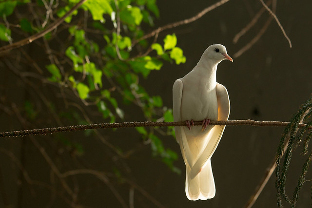 Natasha (Dove) by m.clifford82, on Flickr  Boris (Black Bear) by m.clifford82, on Flickr The following photo has so far been the only one I've taken where I've felt being black and white adds to the mood.  Lonely Road Seeks Traveler by m.clifford82, on Flickr
|
|
#
?
Apr 8, 2013 19:39
|
|
|
mclifford82 posted:I enjoy the first shot you posted of this gentleman far more than these two. Honestly, it's all about the amount of smoke around him. Your previous posting makes me want to know more about the guy, where he is and why he's there. The lighting goes a long way to achieve this. These two just say to me: smoke break. Thanks for the feedback! That was my first inclination as well, but he liked these two so much I was beginning to question my sanity. E: though I do like some of the light that's happening on his cheek.
|
|
#
?
Apr 8, 2013 20:19
|
|
|
Chitin posted:This is a really great moment, and it makes me want to know more about the story. Also a really great example of a good time to use canting, re: the discussion above. Thanks much! I was shooting video of the Tulip Queen using a texting while driving simulator at the Iowa State Capitol. I knew she was about to crash so I swung around, switched to stills and fired away.  The car was in shade and they were not so I had to have the aperture crazy wide open. The car was in shade and they were not so I had to have the aperture crazy wide open.You're spot on with the angle. Fixed:  Thanks for the kind words as well, mclifford82.
|
|
#
?
Apr 8, 2013 23:04
|
|
|
Finklemeyer posted:You're spot on with the angle. Fixed: Actually, I read Chitin's crit as saying your photo was a good use of an odd angle, and I agree. It feels more dead now, with the angle "fixed".
|
|
#
?
Apr 8, 2013 23:21
|
|


|
nielsm posted:Actually, I read Chitin's crit as saying your photo was a good use of an odd angle, and I agree. It feels more dead now, with the angle "fixed". Well now I just don't know what to believe...
|
|
#
?
Apr 8, 2013 23:43
|
|
|
Canting is a dramatic effect, and that's a dramatic moment - it turns a photo of some funny dressed girls giggling at something and makes you go "oh poo poo what just happened?" I'd call it a happy accident if ever there was one.
|
|
#
?
Apr 9, 2013 00:53
|
|
|
Chitin posted:Xpost from the Portrait thread again, from the same set as above: When you're working with hard, directional light, you've got to be careful with your angles. These are nicely done, but you've got light spilling over fabric and facial features. I'd like to see a true short light situation here; the bright spots under his near eye, under and in front of his nose, and on his jacket really busy up the portrait and make the light seem sloppily done. I feel like you could've really polished this a lot with a small light movement. They're nice portraits though. Two from me:  NKNE0090 by nick.kneer, on Flickr  NKNE0526-Edit by nick.kneer, on Flickr
|
|
#
?
Apr 14, 2013 03:06
|
|
|
Mr Yuck posted:A town down the coast commemorated the 200th Anniversary of the British Bombardment there during the War of 1812, so reenactors from Fort McHenry in Baltimore showed up to do some musket drills and chat the tourists up. Unfortunately, I couldn't make it for the cannon demonstration, but I think I got a gem here What a wonderful shot that is made amazing by the great expressions the right most soldiers are making that let you know just how loud those guns are. Mr Yuck posted:The local animal shelter recently took in 30 parrots from an owner who couldn't care for them anymore. Unfortunately, some were so stressed by the sudden move and lack of freedom that they defeathered their bellies and other parts of their body. It was heartbreaking to see, but most have been adopted by (hopefully) caring people already. I hope it has better luck in the future with new care takers. It is a shame how stressed out they have become from the sudden move, you can get the feeling from the bird's climbing of the cage in the photo. I had nothing to do today and it was a very nice day out especially for taking photos so I went around my college campus and took some! I screwed around with the exposure and the aperture setting because I mostly just took photos with the program setting on my canon.   
my buddy Superfly fucked around with this message at 05:02 on Apr 14, 2013 |
|
#
?
Apr 14, 2013 04:56
|
|


|
dakana posted:Two from me: The composition on the first one feels nice. It draws my eye along the length of the handle and back to the head. I feel like the head is just shy of being really white. The highlights on the blades (?) are super white, and it makes the head look dingy/gray. Unless that's the color it's supposed to be, in which case ignore me. The second one is really awesome the first few looks, but at a longer viewing, the stark contrast is almost too much. The dark dark background and blown highlights make it hard to look at. I love the motion of the water, and as a giant nerd I'm torn between liking the shallow DoF and wanting to see more of the patterns/waves moving around the extension in the middle. Here are a few from my latest photo walk today. This is my first ever attempt at B&W, but since it was the lines and shadows that drew me, and adding color was just a yellow wall and concrete steps, I think this was a better choice.  Textures1 by prismaticglasses, on Flickr  Leaf by prismaticglasses, on Flickr  Leaves by prismaticglasses, on Flickr
|
|
#
?
Apr 14, 2013 06:14
|
|

|
Valdara posted:Here are a few from my latest photo walk today. This is my first ever attempt at B&W, but since it was the lines and shadows that drew me, and adding color was just a yellow wall and concrete steps, I think this was a better choice. I like all the repeating lines in this one. My apartment complex has stairs like these, but it's on the north side of the building so I don't get that particular kind of sunlight there. Speaking of black and white, I wasn't sure if I would make these pictures black and white or not. Ultimately I decided the teal and rust tones were part of the visual interest and kept them in color. They're actually from inside my laundry room. I stopped in the middle of doing laundry and ran back to my apartment to grab my camera, because the lines and pattern/texture struck me as interesting. Fortunately nobody was around to see me taking pictures of my laundry room...  laundry room 1 by khyrre, on Flickr  laundry room 2 by khyrre, on Flickr  laundry room 3 by khyrre, on Flickr
|
|
#
?
Apr 15, 2013 03:43
|
|
|

|
| # ? May 23, 2024 23:39 |
|
|
 I like plants.
|
|
#
?
Apr 15, 2013 04:53
|
|