


|
They look really really plastic. They'll look better if you give them their skin texture back. As for flyaways, go in real close with clone & patch. It's tedious, but the more careful you are the nicer it will look. Other than that, the lighting/comp is fine but the lack of skin texture while leaving folds is really off putting.
|
 #
?
Mar 28, 2013 15:27
#
?
Mar 28, 2013 15:27
|
|


|

|
| # ? May 17, 2024 14:33 |
|
|
The backgrounds are super busy for professional headshots. It's passable on the woman, but the guy is really distracting. They'll probably be happy.
|
|
#
?
Mar 28, 2013 15:42
|
|


|
mr. mephistopheles posted:The backgrounds are super busy for professional headshots. It's passable on the woman, but the guy is really distracting. Those are just two shots we did outside. The rest are in front of a plainer background or in front of a backdrop indoors. nonanone posted:They look really really plastic. They'll look better if you give them their skin texture back. As for flyaways, go in real close with clone & patch. It's tedious, but the more careful you are the nicer it will look. Other than that, the lighting/comp is fine but the lack of skin texture while leaving folds is really off putting. Thanks for the feedback, you're absolutely right. Is this better? 
|
|
#
?
Mar 28, 2013 15:50
|
|

|
QPZIL posted:Those are just two shots we did outside. The rest are in front of a plainer background or in front of a backdrop indoors. I'd say between the two, the first is better. The second could be improved a lot if you lightly dodged the darker textured areas.
|
|
#
?
Mar 28, 2013 16:28
|
|

|
QPZIL posted:Those are just two shots we did outside. The rest are in front of a plainer background or in front of a backdrop indoors. I think the woman looked fine the first time. She's starting to look like a chimney sweep now.
|
|
#
?
Mar 28, 2013 16:40
|
|

|
QPZIL posted:Those are just two shots we did outside. The rest are in front of a plainer background or in front of a backdrop indoors. Best clown portrait I've seen in a while.
|
|
#
?
Mar 28, 2013 17:40
|
|

|
QPZIL posted:Those are just two shots we did outside. The rest are in front of a plainer background or in front of a backdrop indoors. You cant edit bad facial expressions. Her face bugs me the most about the photo, not your process.
|
|
#
?
Mar 28, 2013 18:01
|
|
|
I can see the shifty dodging and burning on the face now... some things are tough to pinpoint when you've been staring at the same photo for a while. And yeah, there are better expressions in the set, this is just the first I was editing \/  \/ some people just don't have the best smiles. \/ some people just don't have the best smiles.edit -- for comparison, here's one of the more "standard"/"professional" shots.  Rembrandt lighting (almost) Rembrandt lighting (almost)
Count Thrashula fucked around with this message at 18:46 on Mar 28, 2013 |
|
#
?
Mar 28, 2013 18:03
|
|
|
QPZIL posted:I can see the shifty dodging and burning on the face now... some things are tough to pinpoint when you've been staring at the same photo for a while. For me its her eye squint that kills it for me more than the D/B on her face. Dont mind that you can park a Mini in her gaptoof.
|
|
#
?
Mar 28, 2013 18:08
|
|
|
Trying some B&W. Reagan by xxyzx road, on Flickr
|
|
#
?
Mar 29, 2013 05:43
|
|

|
This is probably the first time I've taken a photo of a person. And using an off-camera lighting setup. Some things I see that I hosed up on, but it was primarily a learning experience and I'm pretty pleased with how it turned out all things considered.  Post-Processing by William T Hornaday, on Flickr
|
|
#
?
Mar 30, 2013 02:55
|
|
|
William T. Hornaday posted:This is probably the first time I've taken a photo of a person. And using an off-camera lighting setup. I love it! Well done, man!
|
|
#
?
Mar 30, 2013 22:49
|
|
|
Can anyone recommend a good primer on make up for photography? I don't need to turn into a make up artist myself, but I'd like to be able to communicate my ideas more effectively and be able to do basic application myself when working alone. EDIT And to contribute a photo: 
Chitin fucked around with this message at 03:58 on Apr 6, 2013 |
|
#
?
Apr 5, 2013 14:19
|
|

|
This is something that is quite different from what I've been doing lately. 
|
|
#
?
Apr 6, 2013 16:45
|
|

|
PushingKingston posted:This is something that is quite different from what I've been doing lately. That's cool.
|
|
#
?
Apr 7, 2013 05:22
|
|


|
Just wandering around trying new stuff Steve by Calypso_Rae, on Flickr
|
|
#
?
Apr 7, 2013 17:28
|
|

|
the hodag posted:Just wandering around trying new stuff that is really sweet.
|
|
#
?
Apr 8, 2013 02:23
|
|

|
 The ~cool lo-fi border~ courtesy of having no flatbed onhand and my inability to hold the camera level.
|
|
#
?
Apr 8, 2013 02:53
|
|

|
PushingKingston posted:This is something that is quite different from what I've been doing lately.
|
|
#
?
Apr 8, 2013 03:22
|
|

|
PushingKingston posted:This is something that is quite different from what I've been doing lately.  I really like it, looks like it could be an album cover.
|
|
#
?
Apr 8, 2013 04:18
|
|

|
QPZIL posted:I can see the shifty dodging and burning on the face now... some things are tough to pinpoint when you've been staring at the same photo for a while. From someone who has absolutely no experience with corporate shots, I think the only thing that I would have tried to do is to do whatever was required to light up his mouth more. Personally - I like it as it. As something to use for business use, though, there is something offputting about the mouth and very specifically the teeth as well as that burst/irritated vessel (the latter which is easy to take out in post). --- Shot this today - trying to practice shooting. It seems like people have a harder time acting unnatural with their poses and smiles when they are moving so I would like to get better at it (i.e. not always be worrying about tripping over something so much that I can't frame effectively, see important details etc.)  spring is here by Paul Hofreiter, on Flickr Also, I would appreciate any advice on this shot (please be harsh if needed). It was for last month's photo contest. It was one of the first times I envisioned something in my head well before having the camera in my hand and tried to recreate it and I would love to work more on that kind of thing where a photo starts coming to being before the camera is even there. The original had her hand uncut on the right but I felt it was stronger cropped.  quiet by Paul Hofreiter, on Flickr
|
|
#
?
Apr 8, 2013 06:49
|
|

|
Sorry if this is not QUITE in context with the thread; Ivan by Alex Gard, on Flickr This is my mate Ivan. I met him on the vessel MV Lindesay Clark, a bulk carrier (ship) when I was a trainee back in 2009. I was the youngest person on that ship by an easy 20 years. I walked past his cabin one day when he had his door open and asked him if he�d join me for a beer in the ships bar. Apparently he was really humbled by being invited to hang out with someone, we spent many long nights in that bar getting hammered, listening to awesome tunes, swapping interests and getting to know one another and soon found out we had a lot in common and got along really well. We hit it off and have been friends ever since. He�s a top bloke and has introduced me a great deal to the Melbourne scene. I have huge respect for him. He�s lived in Melbourne pretty much his whole life, and has been around the arts traps, having a stall at the St Kilda markets many years ago selling his paintings & photos and then to a store. He has seen Melbourne evolve to what it is today and has a great knowledge of the history of the area and is willing to converse over a beer and spin many entertaining yarns. A really genuine and nice dude. Our age difference has never come between us and we�ve always had a great time every time we�ve caught up. This photo was taken by some random drunk chick at the bar we were at today. Even though the photo is a little out of focus, even Ivan said �it probably says a lot about you and me� I�m a bit blurry and you�re in focus.� Massive respect for him. [img[  I can't convey the experience of when we met... the ship was crewed by pretty much a mish mash of seedy old perverted seafarers that had been at sea since they were born, conversation was highly limited and everyone was incredibly isolated. To find someone you got along with on this ship was a huge blessing and especially for someone like me who was young and naive, and it was an awesome experience to meet someone so well rounded and willing to converse in discussions other than stories of days gone by. I really can't say enough for this guy.
|
|
#
?
Apr 8, 2013 11:11
|
|
|
I took a picture of a person. Deadman Pass, I-84, Oregon by Isaac Sachs, on Flickr
|
|
#
?
Apr 8, 2013 16:41
|
|

|
rio posted:Shot this today - trying to practice shooting. It seems like people have a harder time acting unnatural with their poses and smiles when they are moving so I would like to get better at it (i.e. not always be worrying about tripping over something so much that I can't frame effectively, see important details etc.) quote:Also, I would appreciate any advice on this shot (please be harsh if needed). It was for last month's photo contest. It was one of the first times I envisioned something in my head well before having the camera in my hand and tried to recreate it and I would love to work more on that kind of thing where a photo starts coming to being before the camera is even there. The original had her hand uncut on the right but I felt it was stronger cropped. I think the success of this photo depends a lot on what you were going for - it has a tender feeling to it, but I wouldn't say it "looks" posed or professional; for me it much more evokes the feeling of someone with an old film P&S camera who managed to grab a shot of their girlfriend just as she was waking up; part of that is the pose, part of that is the low dynamic range. I like it for what it is. The background is a little busy for me; if possible I would blur it more either by using a faster lens or switching to a longer lens and moving back. Your focus is also a bit soft on her; make sure you focus precisely on her eye, and don't forget to sharpen in post. Her pose is causing a crease where her arm meets her torso; if you were to shoot this portrait again you would want her to push her chest out a little to eliminate that, while keeping her right shoulder angled at the camera. This will be somewhat uncomfortable, but she only needs to to it (and not show it on her face) for the two seconds it takes to get the shot. The bent wrist is also a bit awkward, and makes her hand look stubby; I'd look for a tutorial on hand posing. Finally, her head resting on the pillow is causing the skin around her eye to stretch a bit, making an otherwise really attractive expression look slightly derpy when you notice it. Try messing around with Liquify in Photoshop and see if you can't correct this a bit. The only other thing I would suggest is to experiment with some off-camera flash. A nice big softbox or umbrella could have simulated light streaming in through a window, making this scene really angelic while keeping the "I just had to grab my camera" aesthetic of it. All of these are technical things, but again I really like the feel and thought of this. To contribute, some more from the set I posted earlier:  
|
|
#
?
Apr 8, 2013 18:35
|
|
|
A few recent pics. Amanda by xxyzx road, on Flickr  Amanda by xxyzx road, on Flickr  Ashley by xxyzx road, on Flickr
|
|
#
?
Apr 8, 2013 21:34
|
|
|
MrBlandAverage posted:I took a picture of a person. Did you know this person? I think that would be a cool setting to take a portrait.
|
|
#
?
Apr 8, 2013 21:42
|
|
|
 Untitled by francography, on Flickr somnambulist fucked around with this message at 23:32 on Apr 8, 2013 |
|
#
?
Apr 8, 2013 21:44
|
|


|
TheAngryDrunk posted:Did you know this person? I think that would be a cool setting to take a portrait. It is ~*~ my girlfriend ~*~ and I told her where to stand.
|
|
#
?
Apr 8, 2013 21:52
|
|
|
I took another picture of a person.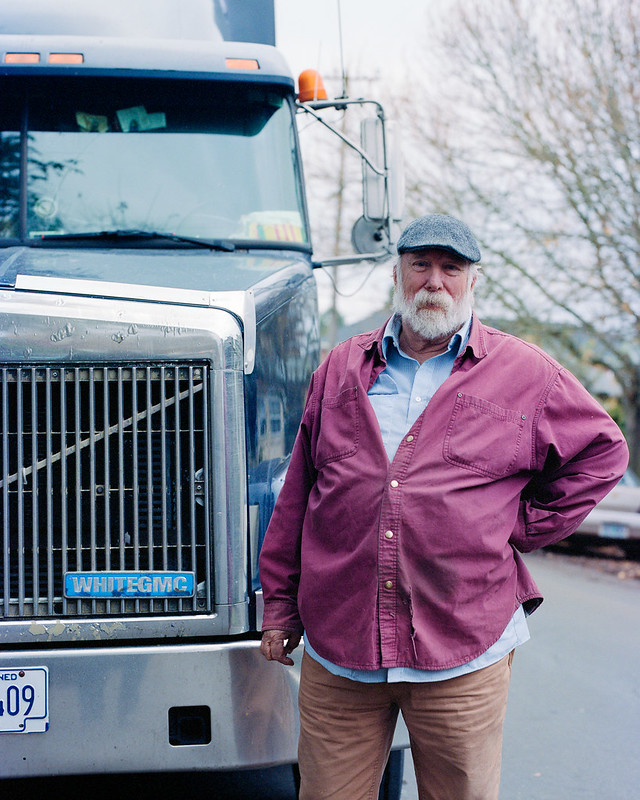 Harvey by Isaac Sachs, on Flickr
|
|
#
?
Apr 9, 2013 04:40
|
|
|
Sludge Tank posted:Sorry if this is not QUITE in context with the thread I'm not fussed if it is or not, thanks for sharing. My mum was friends with some blokes that worked on a ship like that, meeting them through her friend's husband (Jock was his name, appropriately) who worked on one. Jock was pretty rough, as I'm sure many of them were, but he kept good company; some real genuine and friendly people that I'm glad I had the pleasure of knowing, even if it was only once in a while when they docked in Newcastle or wherever else nearby on the NSW coast.
|
|
#
?
Apr 9, 2013 05:57
|
|


|
Chitin posted:Careful - you blew out the baby! Man, thanks a lot for the solid crit; good things to think about and really insightful. You really nailed everything I had questions about while working on the image. I really like your second shot. The various lines from the background, smoke and highlights on the head and even down to the hair and beard play really well together and it is a very cohesive image. Certainly nothing wrong with the first shot - it is strong - but the second really does it for me. somnambulist posted:
|
|
#
?
Apr 9, 2013 08:18
|
|
|
So I found this 'gritty portrait' tutorial and followed it pretty much to the letter. I'm not too sure, I don't think it helps that my friend has a lot of texture in his skin to begin with. What do you all think (sorry if this probably belongs in the post-processing thread?) I'm not sure where in the tutorial you would 'tone down' the sharpness....? which one do you think is better? Also the blur is bokeh from a 1.6 f-stop before Ivan by Alex Gard, on Flickr after 
|
|
#
?
Apr 9, 2013 12:46
|
|
|
Sludge Tank posted:after No. He now looks like a sponge.
|
|
#
?
Apr 9, 2013 14:24
|
|

|
If you're going with that harsh of processing, I'd at least make it black and white to help with the skin tone.
|
|
#
?
Apr 9, 2013 15:21
|
|
|
I think he was pretty "gritty" to begin with; even someplace in between those two versions would have been "whoa, that's really gritty." I think your final version gets into the realm of "this is actually a poorly constructed alien mask that is beginning to melt and bubble off." Make a group of all your edits, and bring Opacity down to like 25%.
|
|
#
?
Apr 9, 2013 16:07
|
|
|
 Here's the shot after I added the edited layers to a group layer down to 25% opacity. I knew it looked well overcooked I just wasn't sure what I should do to fix it. I know NOTHING about post processing for portrait shots so I just tried that one tutorial. I'm mostly going to try for a gritty look with a lot of my people photos so I'd love to know how to do it properly
|
|
#
?
Apr 10, 2013 00:43
|
|
|
Maybe try masking out the bits that aren't in focus. Your DOF is so thin that you are trying to grit the creamy smooth bokey and it just comes out wrong.
|
|
#
?
Apr 10, 2013 01:08
|
|
|
Honestly the best way to get gritty is to do it before you hit post processing. Hard rake lighting often suits that style well. Ideally you'd use a small light source (like a beam of sunlight, a bare flash or a flash with a small modifier, etc) and angle it so that it "rakes" the side of the model so you get hard shadows from pores, facial features, stubble, etc -- it adds a lot of texture to the face. It's usually unflattering unless it's intentional and done well. Most "gritty" portraits use rim lights -- lights from the back that light up only a small portion of the face.
|
|
#
?
Apr 10, 2013 01:22
|
|
|
Got a new lens just for portraits (Old adaptall 90mm 2.5) and hurried and took this. And now that I look at it I see like 4 things right off the bat to make it better. The chair and the window have got to go, the books on the shelf are distracting, I could definitely use some fill flash to light up the right side of her face...
|
|
#
?
Apr 10, 2013 01:31
|
|

|

|
| # ? May 17, 2024 14:33 |
|
|
dakana posted:Honestly the best way to get gritty is to do it before you hit post processing. Hard rake lighting often suits that style well. Ideally you'd use a small light source (like a beam of sunlight, a bare flash or a flash with a small modifier, etc) and angle it so that it "rakes" the side of the model so you get hard shadows from pores, facial features, stubble, etc -- it adds a lot of texture to the face. It's usually unflattering unless it's intentional and done well. Most "gritty" portraits use rim lights -- lights from the back that light up only a small portion of the face. Yeah it was just taken at a bar late afternoon. I guess more than anything I am just asking what kind of post processing I could do to enhance those gritty effects. Perhaps I am asking the wrong questions.
|
|
#
?
Apr 10, 2013 02:00
|
|