|
Sly Deaths Head posted:The dimension known as the late 80's/90s? My favorite Wolverine design (I'm being serious) has always been bone-claw Wolverine's formless blue ninja-turtle bandana-mask. Despite the artists drawing it it always stuck out to me as the least ridiculous outfit Wolverine ever wore.
|
 #
?
Apr 17, 2013 01:09
#
?
Apr 17, 2013 01:09
|
|


|

|
| # ? May 13, 2024 09:35 |
|
|
I preferred the Morrison-era New X-Men Wolverine look. Even shirtless the dude was finally just wearing a jacket and pants.
|
|
#
?
Apr 17, 2013 01:11
|
|


|
mind the walrus posted:I preferred the Morrison-era New X-Men Wolverine look. Even shirtless the dude was finally just wearing a jacket and pants. The design itself was fine, but Quitely made him look like a greasy pedophile porn star. It's like that one hideous Emma Frost panel, except he looks like that throughout the entire run. God, how people can stand that guy's art I'll never know. Edit: Case in point  That is positively revolting. Hakkesshu fucked around with this message at 02:10 on Apr 17, 2013 |
|
#
?
Apr 17, 2013 01:59
|
|


|
Quietly is actually quite an awesome artist even if his peeps' faces are not as aesthetically pleasing as say, Adam Hughes' peeps. The panel you refer to for Emma was a rushed work by Igor Kordey I believe when he had to haul rear end or something.
|
|
#
?
Apr 17, 2013 02:19
|
|


|
Comics don't always need to look pleasant.
|
|
#
?
Apr 17, 2013 02:20
|
|

|
Hakkesshu posted:It's like that one hideous Emma Frost panel, except he looks like that throughout the entire run. God, how people can stand that guy's art I'll never know.
|
|
#
?
Apr 17, 2013 02:21
|
|


|
You're right, my mistake. Still, I don't think asian bodypillow Emma is much of an improvement.
|
|
#
?
Apr 17, 2013 02:25
|
|
|
Overall you've got to give him credit for making the X-Men look like a cohesive team and not a bunch of weirdos with costume fetishes for the first time since like, X-Factor in the 80s. I'll agree that his Wolverine and Emma ended up looking gross most of the time though. At least with other Marvel heroes you can rationalize their goofy costumes away as "oh he's a propaganda relic" or "he's from a god-alien dimension" or "he's a dorky teenager," the best rationalization we ever got for the X-Men was Joss Whedon's "we're trying to look non-threatening and people find superheroes non-threatening" speech which I never really bought.
|
|
#
?
Apr 17, 2013 02:29
|
|
|
Full leather uniforms is by far the most fetishistic look I've ever heard of.
|
|
|
#
?
Apr 17, 2013 02:39
|
|


|
I agree having skintight black leather pants was a misstep, but come the gently caress on. We're talking about the infamous body condom Cyclops outfit, the Wolverine mask that's shaped like his hair, Colossus' strongman onesie, and all manner of wank-fodder the X-women wear. The artists that drew the leather shirt Jean wore as more of a grey T-shirt and the pants as well, fabric pants were on the right track-- as Morrison himself says in his original pitch for the series the X-Men should look more like the Superhero Peace Corps or Red Cross.
|
|
#
?
Apr 17, 2013 02:44
|
|
|
Gorilla Salad posted:I've ever only seen her in the Runaways arc with the hundreds of alternate Wolverines. Don't you mean Exiles? I remember an issue where the Timebroker had a universe where Scarlet Witch merged with Magneto and Wolverine at the end of House of M. They just kept throwing Wolverines at the problem until a team made up of Kid James Howlett (still in frilly nightshirt), "Patch" in his covert Ninja black bodysuit, the aforementioned Elsie Dee and Albert, feral Logan post-mind-dickery from the Weapon X program (naked except for the VR Rig), a Zombie Wolverine, and the grey-haired "Days of Future Past" Wolverine. They had to contend with hundreds of other Wolverines controlled by MagWolverlett Witch. The panels where the team's discovered with all the "Bub." word balloons got a chuckle out of me. ")
Lars Blitzer fucked around with this message at 06:33 on Apr 17, 2013 |
|
#
?
Apr 17, 2013 06:30
|
|


|
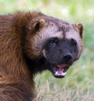
Hakkesshu posted:The design itself was fine, but Quitely made him look like a greasy pedophile porn star. It's like that one hideous Emma Frost panel, except he looks like that throughout the entire run. God, how people can stand that guy's art I'll never know. If Wolverine doesn't look like the last dude you want to gently caress with in a bar then the artist is doing their job wrong.
|
|
#
?
Apr 17, 2013 07:15
|
|

|
Here's a preview page from today's Legion of Superheroes. Usually I like Scott Kolins. Loved him on the old Flash, don't even mind his art on Threshold now, but this is something 
|
|
#
?
Apr 17, 2013 09:43
|
|
|
I want to be killed by a lady with a broken pelvis riding a giant green dick that screams kathooom.
|
|
#
?
Apr 17, 2013 10:10
|
|


|
Hakkesshu posted:The design itself was fine, but Quitely made him look like a greasy pedophile porn star. It's like that one hideous Emma Frost panel, except he looks like that throughout the entire run. God, how people can stand that guy's art I'll never know. Wolverine's supposed to be a short, hairy manimal. Frankly, the disgustingly hairy '80s pornstar with more bodyhair than apes suits him. Not all the X-men have to look like models. Especially when Cyclops is extremely thematically opposite, being tall and slim and handsome.
|
|
#
?
Apr 17, 2013 10:45
|
|

|
Mister Roboto posted:Wolverine's supposed to be a short, hairy manimal. Frankly, the disgustingly hairy '80s pornstar with more bodyhair than apes suits him. Quitely's Cyclops was pretty great too. He was drawn as trim and athletic but slightly... I dunno, gawky? Like the X-Men's dweeby older brother (which is how I've always seen him)
|
|
#
?
Apr 17, 2013 13:44
|
|

|
Lars Blitzer posted:Don't you mean Exiles? Crap, yeah. I got my 'great series that I used to love so much but turned to poo poo' mixed up.
|
|
#
?
Apr 17, 2013 14:27
|
|


|
Hakkesshu posted:The design itself was fine, but Quitely made him look like a greasy pedophile porn star. It's like that one hideous Emma Frost panel, except he looks like that throughout the entire run. God, how people can stand that guy's art I'll never know. The general appeal of Quitely's art isn't his character designs, it's his storytelling.
|
|
#
?
Apr 17, 2013 14:45
|
|

|
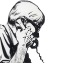
I actually like how he draws superheroes. They're in the business of violence and they all look like prize fighters. They look like they've been punched in the nose and mouth a thousand times. They're not models straight off the catwalk, they're people who go face-to-face with gods. And once you accept that you can throw yourself into his art. Every panel tells a story and the way he puts them together is like nobody else in the business. I fell in love with his work in We3. Nobody was doing stuff like that at the time. (from We3, not sure which one)  Art and story telling that couldn't exist anywhere else except in a comic book. Panels drawn as literally slices in time.
|
|
#
?
Apr 17, 2013 15:16
|
|
|
Gorilla Salad posted:(from We3, not sure which one) I think you could probably do that in a film with some clever fx...
|
|
#
?
Apr 17, 2013 16:01
|
|
|
You could, but the big difference with film is that it is strictly forward - with the pages of a comic (especially crunchy ones like that We3 page, which I love) you're encouraged to just stop and stare at it for a while. You can't do that while watching a film really, you're on the director's stopwatch. Some films like The Matrix try to compromise with cool tricks that do indeed accomplish a nifty thing, but it's still a different thing, not necessarily better or worse.
|
|
#
?
Apr 17, 2013 16:20
|
|

|
Comics can be fuckin' brilliant art like nothing else.
|
|
#
?
Apr 17, 2013 16:51
|
|
|
One of my favourite things about comics is when artists get you to move your eye across the page in the opposite direction it normally does. "Simple" stuff like when Herriman has Ignatz throw the brick at Krazy (the other way around in this case too) from right to left:  or Aja's trick Immortal Iron Fist #3 where he gets you to follow the movement of Danny around the page  or Guice's trick in the first page of Avengers Assemble 14AU that uses the the size of the last panel on the end to get you to loop around to the other side.  It's a really satisfying feeling to read a comics page and feel that's exactly how the artist intended it.
|
|
#
?
Apr 17, 2013 17:49
|
|
|
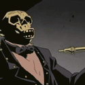
run DNC posted:I want to be killed by a lady with a broken pelvis riding a giant green dick that screams kathooom. Is it juvenile that my first reaction was 'hey that skeleton in the bottom right looks like he has a bone boner'?
|
|
#
?
Apr 17, 2013 22:53
|
|
|
Waterhaul posted:Anyway here's some Bill Sienkiewicz doing some New Mutants. These own so much. This style for me is inseparable from the only comics I read as a kid, those early 90s(?) X-Men subfranchises that were grim and probably too self-serious but loving SURREAL in a way that completely sold it. The color choices & abstraction of shapes &compression of space call back to that old Jack Kirby style but with a sorta Ray Pettibon gritty groundedness. Perfect for gonzo superhero stuff that still makes a stab at real-world relevance.
|
|
#
?
Apr 17, 2013 23:06
|
|


|
swamp waste posted:These own so much. This style for me is inseparable from the only comics I read as a kid, those early 90s(?) X-Men subfranchises that were grim and probably too self-serious but loving SURREAL in a way that completely sold it. The color choices & abstraction of shapes &compression of space call back to that old Jack Kirby style but with a sorta Ray Pettibon gritty groundedness. Perfect for gonzo superhero stuff that still makes a stab at real-world relevance. Bill Sienkiewicz is a true original, what more needs to be said? Hakkesshu posted:
Well composed and interesting portrait of a fictional person that's also ugly.
|
|
#
?
Apr 18, 2013 01:37
|
|

|
Since the last two pages had both Brandon Graham and New Mutants, I thought I would share a Brandon Graham sketch of the New Mutants, from here.
|
|
#
?
Apr 18, 2013 02:03
|
|


|
Gorilla Salad posted:Crap, yeah. I got my 'great series that I used to love so much but turned to poo poo' mixed up. *Sigh* Yeah. The moment I saw Claremont's name on it and Psylocke showing up I knew it was time to drop it from my pull list. It's too bad, really. I would've killed for a team of Hulk (What If Gen. Thunderbolt Ross Was the Hulk), Colonel Logan, Director of S.H.I.E.L.D, Frank Castle (What If the Punisher Got the Venom Symbiote), and Ghost Rider. Would've really turned that variant of the Fantastic Four on its ear. Oh well. [/derail]
|
|
#
?
Apr 18, 2013 04:36
|
|
|
Gorilla Salad posted:I actually like how he draws superheroes. They're in the business of violence and they all look like prize fighters. They look like they've been punched in the nose and mouth a thousand times. They're not models straight off the catwalk, they're people who go face-to-face with gods.  makes use of a flexible type of pacing that doesn't really exist in any other medium. The reader is given very definite, visceral images, but it's entirely up to them how long they linger.
|
|
#
?
Apr 18, 2013 05:53
|
|

|
Mister Roboto posted:I think you could probably do that in a film with some clever fx... The trick lies in the pacing. With a film running at a constant 24 fps every audience member is forced to take in the visual at the same speed. With a comic panel you can skip ahead in panels or "rewind" to an older one or take in the flow at whatever pace you prefer. This is one of the key reasons a lot of great comics can't just be used as storyboards for their filming (though there are exceptions like Sin City).
|
|
#
?
Apr 18, 2013 06:03
|
|
|
swamp waste posted:These own so much. This style for me is inseparable from the only comics I read as a kid, those early 90s(?) X-Men subfranchises that were grim and probably too self-serious but loving SURREAL in a way that completely sold it. The color choices & abstraction of shapes &compression of space call back to that old Jack Kirby style but with a sorta Ray Pettibon gritty groundedness. Perfect for gonzo superhero stuff that still makes a stab at real-world relevance. Yeah Sienkiewicz is one of those guys that's just on another level. If you haven't checked out Elektra: Assassin you should really give it read, he's currently doing Daredevil: End of Days which has some cool stuff in it like this page from issue #7. 
|
|
#
?
Apr 18, 2013 12:25
|
|
|
Waterhaul posted:Yeah Sienkiewicz is one of those guys that's just on another level. Haha, I love that you can see the, like, ten arrows that were drawn originally before the guy just went "gently caress it" and copy-pasted the rest of them. At a glance it looks okay, but some of those arrows are lookin real bad.
|
|
#
?
Apr 18, 2013 15:29
|
|

|
Hakkesshu posted:The design itself was fine, but Quitely made him look like a greasy pedophile porn star. It's like that one hideous Emma Frost panel, except he looks like that throughout the entire run. God, how people can stand that guy's art I'll never know. Oh cool, Paul Stanley is Wolverine. :}
|
|
#
?
Apr 18, 2013 16:42
|
|
|
mind the walrus posted:The trick lies in the pacing. With a film running at a constant 24 fps every audience member is forced to take in the visual at the same speed. With a comic panel you can skip ahead in panels or "rewind" to an older one or take in the flow at whatever pace you prefer. This is one of the key reasons a lot of great comics can't just be used as storyboards for their filming (though there are exceptions like Sin City). Soo...in theory, if film tech advances to the point where pausing/rewinding/ff can be done as easy as moving your eyes...then we may see similar art?
|
|
#
?
Apr 18, 2013 17:09
|
|
|
Mister Roboto posted:Soo...in theory, if film tech advances to the point where pausing/rewinding/ff can be done as easy as moving your eyes...then we may see similar art? I really doubt it'll ever be as natural for most people to rewind/forward a motion graphic as it is to just move your eyes around a page. I still think this kind of thing was done best in the first Matrix film -- and then over-used to the point where it became mundane in the later films. Even then it's not really the same, but I think it was as close as you could hope for.
|
|
#
?
Apr 18, 2013 17:17
|
|
|
I like how the first response to an assertion of the unique joys of reading comics is hypothesizing an expensive and inconvenient way for films to copy it.
|
|
#
?
Apr 18, 2013 17:25
|
|
|
If it were I'd hope comics would be credited with being on the cutting edge of images or ideas or concepts or something that other things mine from. It's the Creative Frontier.
|
|
#
?
Apr 18, 2013 17:43
|
|
|
Waterhaul posted:If Wolverine doesn't look like the last dude you want to gently caress with in a bar then the artist is doing their job wrong. Was going to say he looks like one of the giant slabs of beef from 100 Bullets, but this post covers it
|
|
#
?
Apr 18, 2013 20:04
|
|


|
Okay, I guess my last one was really "Good/Bad Comic Art" since it got such mixed reactions. Here's something I hope I can get a more universal "What the gently caress?" on. Cap, what's wrong with your faaaaaace? Age of Ultron 6
|
|
#
?
Apr 19, 2013 05:30
|
|

|

|
| # ? May 13, 2024 09:35 |
|
|
That's a really good  right there. right there.
|
|
#
?
Apr 19, 2013 05:32
|
|