|
Mans posted:I'm sure a lot of people working at Macdonalds are on foodstamps too. Does this mean Macdonald is unprofitable? No, it means that McDonald's is being subsidized by taxpayers so that they don't need to provide their employees with a livable wage. Kind of like what these guys said: Peanut President posted:The way the coal mines pay, literal poo poo would probably be better. Up until there was a big outcry, a large number of mining towns didn't have running water. Coal is one of the biggest profit generating sectors of our economy yet everyone who digs it up is treated like trash. All Of The Dicks posted:How about "the coal industry in this region does not provide the people involved with it a sufficient income on which to eat, and instead must be subsidised by the state, making it a net loss, and therefore should be reformed or replaced rather than protected in its current form" Kalos posted:The first part of your post is correct, coal doesn't have an inherent magical quality that creates poverty. However the shady-rear end companies that own the mines sure aren't helping the poverty problems in the Appalachians.
|
 #
?
Apr 17, 2013 03:57
#
?
Apr 17, 2013 03:57
|
|


|

|
| # ? May 17, 2024 07:46 |
|
|
dethslayer666 posted:No, it means that McDonald's is being subsidized by taxpayers so that they don't need to provide their employees with a livable wage. That's the point i also wanted to make but probably messed up my wording. Coal mines are probably pretty good places to work on if the workers had actual salaries and livable conditions.
|
|
#
?
Apr 17, 2013 05:28
|
|

|
Mans posted:That's the point i also wanted to make but probably messed up my wording. Coal mines are probably pretty good places to work on if the workers had actual salaries and livable conditions. Eh, probably not, they are always going to be pretty hellish and hazardous to your health. That said, it is a job in an area without any choices.
|
|
#
?
Apr 17, 2013 05:31
|
|
|
Ardennes posted:Eh, probably not, they are always going to be pretty hellish and hazardous to your health. That said, it is a job in an area without any choices. After 20 years working in a mine you can retire at 45 with a full pension if you happen to be a miner in the Rhineland. So not all coal mines are poo poo. It's hard work no doubt, but not everyone can work in an office.
|
|
#
?
Apr 17, 2013 15:24
|
|
|
Rodya Raskolnikov posted:My capstone was 2 years ago and I hope that if I had to make a cartographic product at work it would turn out a lot better. I hate how maps made in ArcMap always look very uniform. Has anyone used any other mapping software oriented towards more manual map creation? It's really easy to dump census data into ArcMap but the labeling engine is terrible about dropping labels if there's the tiniest conflict between two labeled layers. I've used MapInfo which gives you a lot more freedom (especially with manually placing labels) but lacks a lot of the functionality and layout options that are present in ArcMap. If it comes down to it, you can always convert your labels to annotation within the map and manually adjust them there.
|
|
#
?
Apr 17, 2013 15:40
|
|

|
Kurtofan posted:
In Belgium it is once to greet a friend, as the map describes, but three times for a special occasion (e.g. birthday, new year's eve etc)
|
|
#
?
Apr 17, 2013 15:45
|
|


|
Rodya Raskolnikov posted:My capstone was 2 years ago and I hope that if I had to make a cartographic product at work it would turn out a lot better. I hate how maps made in ArcMap always look very uniform. Has anyone used any other mapping software oriented towards more manual map creation? It's really easy to dump census data into ArcMap but the labeling engine is terrible about dropping labels if there's the tiniest conflict between two labeled layers. I didn't get the opportunity to fit it into my schedule, but my university has Cartography I and Cartography II that is all about using Illustrator to make the maps look much better. I was talking with someone who showed me their projects and they'll make the map product in Arc but leave it rather basic then make it look fantastic in Illustrator. Even with maps with "worse" data come out looking better because of the magic they can work. Using IDRISI now makes me really wish I knew Illustrator. It can process data very well but fuuuuuck, it looks awful. 
|
|
#
?
Apr 17, 2013 15:56
|
|

|
GreenCard78 posted:I didn't get the opportunity to fit it into my schedule, but my university has Cartography I and Cartography II that is all about using Illustrator to make the maps look much better. I was talking with someone who showed me their projects and they'll make the map product in Arc but leave it rather basic then make it look fantastic in Illustrator. Even with maps with "worse" data come out looking better because of the magic they can work. I'm reading a basic tutorial about using Illustrator to make nicer-looking maps and the examples look great, but wow the process sounds really intensive and time-consuming - especially if you're working with a large area of interest.
|
|
#
?
Apr 17, 2013 16:27
|
|
|
Panas posted:After 20 years working in a mine you can retire at 45 with a full pension if you happen to be a miner in the Rhineland. So not all coal mines are poo poo. It's hard work no doubt, but not everyone can work in an office.  Sounds like Socialism to me. Sounds like Socialism to me. Next thing you'll be telling us your government won't allow the coal mining companies to create a subsidiary that operates only one old mine, but is responsible for paying all the pensions of everyone who worked at the parent company.
|
|
#
?
Apr 17, 2013 19:37
|
|

 Yes, it's like a lava lamp.
|
PittTheElder posted:
I wouldn't know man, I was just retelling what my relatives told me as we were driving from the airport. Everyone is really proud of being German over there so they really trumpet the good things. It sounds like coal miners in Kentucky are hosed though. How do they traditionally vote? Any chance of a democrat coming in and passing some laws about not treating(miners who will probably be physically broken by the age of fifty) like poo poo?
|
|
#
?
Apr 17, 2013 21:25
|
|
|
Panas posted:Any chance of a democrat coming in and passing some laws about not treating(miners who will probably be physically broken by the age of fifty) like poo poo? Nope, because "laws about not treating your workers like poo poo" are really "job-killing regulations."
|
|
#
?
Apr 17, 2013 21:31
|
|


|
Panas posted:It sounds like coal miners in Kentucky are hosed though. How do they traditionally vote? Any chance of a democrat coming in and passing some laws about not treating(miners who will probably be physically broken by the age of fifty) like poo poo? I'm trying to find anything factual on Ben Chandler's stances, since he lost reelection as Kentucky's 6th district representative last year to Andy Barr in a campaign mostly about coal. There was a back-and-forth slapfight over a CEO playing a miner in a television ad, and that took up a lot of the spotlight. All I can tell is that Chandler voted for ACES in 2009. That alone might be it, honestly. I'm pretty sure the sentiment is that anything but the status quo is a personal attack on coal miners, but I can't make sure since if it isn't about the ad, it's "well Chandler is trying to murder your coal-mining family again!!!" stuff. The 6th district has Lexington and Frankfort, so it's pretty urban. I don't understand my own state sometimes.  The map showing massive mining employment coincides with the 5th district pretty well, it seems:  5th district's representative is Hal Rogers, A Republican who has served since 1981. In 2003 he got 1.3 million dollars funding for the Daniel Boone Parkway, removed the tolls, and then the road was renamed the Hal Rogers Parkway. People were kind of pissed off at him for it, since Daniel Boone is a national icon. Rolling Stone has named Hal Rogers one of the ten worst congressmen for diverting national security funding to his district. I can tell you there is jack poo poo for terrorists to hit over here.
|
|
#
?
Apr 17, 2013 22:21
|
|

|
Guys, I want to create a politically-loaded map of my own! Is there a (free) map template I can use so that I could just press on a country and the whole country will be filled in with the color of my choosing. Let's say I want to show, cartographically, the political landscape of Europe at the moment by coloring in countries with right-leaning governments blue, countries left-leaning government red, and countries with grand coalitions yellow. There are plenty of blank maps online, but jpeg artifacts and the odd borders of some countries - do I really have to fill in Indonesia by clicking on each island? - makes using these maps in Paint a pain in the rear end.
|
|
#
?
Apr 17, 2013 23:27
|
|
|
Edible Hat posted:Guys, I want to create a politically-loaded map of my own! Is there a (free) map template I can use so that I could just press on a country and the whole country will be filled in with the color of my choosing. Let's say I want to show, cartographically, the political landscape of Europe at the moment by coloring in countries with right-leaning governments blue, countries left-leaning government red, and countries with grand coalitions yellow. There are plenty of blank maps online, but jpeg artifacts and the odd borders of some countries - do I really have to fill in Indonesia by clicking on each island? - makes using these maps in Paint a pain in the rear end. You can use the main Wikipedia world map SVG that is the basis for most of the world maps on wikipedia, and is designed to be easy to edit by country.
|
|
#
?
Apr 17, 2013 23:36
|
|
|
Edible Hat posted:Guys, I want to create a politically-loaded map of my own! Is there a (free) map template I can use so that I could just press on a country and the whole country will be filled in with the color of my choosing. Let's say I want to show, cartographically, the political landscape of Europe at the moment by coloring in countries with right-leaning governments blue, countries left-leaning government red, and countries with grand coalitions yellow. There are plenty of blank maps online, but jpeg artifacts and the odd borders of some countries - do I really have to fill in Indonesia by clicking on each island? - makes using these maps in Paint a pain in the rear end. If you do make that particular map, do please look up more than just the name of the political party in power. It's not exactly uncommon for European Social Democrats to be neo-Liberals of the worst kind. (What would be interesting would be a map that shows apparent political affiliation vs. actual political affiliation.)
|
|
#
?
Apr 17, 2013 23:54
|
|


|
Orange Fluffy Sheep posted:I'm trying to find anything factual on Ben Chandler's stances, since he lost reelection as Kentucky's 6th district representative last year to Andy Barr in a campaign mostly about coal. There was a back-and-forth slapfight over a CEO playing a miner in a television ad, and that took up a lot of the spotlight. All I can tell is that Chandler voted for ACES in 2009. That alone might be it, honestly. Wouldn't people be happy they were no longer paying tolls for using the road though? And to be honest you can't blame the guy for pork barrel politics. It's a broken system and good governance is really hard to come by in most societies at least he brings in the jobs. Are the miners unionized in his district? Do they actively fight for better conditions? Or are they just happy to be using food stamps instead of making meth in their kitchens? The only person I know from kentucky got the hell out and moved to galveston to design beach houses so I am ignorant about your state to say the least. Historically is this district so under developed that this is better than the (fill in decade where things were exceptionally poo poo)'s? Also thanks for the detailed reply
|
|
#
?
Apr 18, 2013 00:33
|
|
|
Edible Hat posted:Guys, I want to create a politically-loaded map of my own! Is there a (free) map template I can use so that I could just press on a country and the whole country will be filled in with the color of my choosing. Let's say I want to show, cartographically, the political landscape of Europe at the moment by coloring in countries with right-leaning governments blue, countries left-leaning government red, and countries with grand coalitions yellow. There are plenty of blank maps online, but jpeg artifacts and the odd borders of some countries - do I really have to fill in Indonesia by clicking on each island? - makes using these maps in Paint a pain in the rear end. Try Google Fusion Tables: https://www.youtube.com/watch?v=LJEQtQ8WA_Q
|
|
#
?
Apr 18, 2013 11:45
|
|

|
 Dark Blue - indefinite and definite articles Light Blue - only definite articles Dark Magenta - indefinite and suffixed definite articles Pink - only suffixed definite articles Grey - no articles Internet speeds  I don't know how accurate that is, but check out that north/south divide
|
|
#
?
Apr 18, 2013 16:56
|
|

|
I'd be curious to know about the rural/urban divide of internet connectivity in Latin America, especially Mexico. The richest man in the world got his wealth from telecommunications in Latin America, there's got to be good access in some places. That being said, there are likely a ton of people who still cannot afford it even if it is there.
|
|
#
?
Apr 18, 2013 17:05
|
|
|
I have the impression that map is either inaccurate or simply doesn't have data from the Southern Hemisphere. Checking netindex.com, you can see that Singapore, Chile, Mexico and Brazil are all over the 1000 KBps speeds.
|
|
#
?
Apr 18, 2013 17:16
|
|

|
What's that light blue patch in Eastern Germany?
|
|
#
?
Apr 18, 2013 17:17
|
|

|
Kurtofan posted:What's that light blue patch in Eastern Germany? sorbian
|
|
#
?
Apr 18, 2013 17:19
|
|

|
Kurtofan posted:What's that light blue patch in Eastern Germany? Probably Sorbs http://en.wikipedia.org/wiki/Sorbs Edit: beaten.
|
|
#
?
Apr 18, 2013 17:20
|
|

|
Hip Flask posted:sorbian Danke.
|
|
#
?
Apr 18, 2013 17:22
|
|
|
tetsman posted:I have the impression that map is either inaccurate or simply doesn't have data from the Southern Hemisphere. Checking netindex.com, you can see that Singapore, Chile, Mexico and Brazil are all over the 1000 KBps speeds. Broadband has become cheaper here in Brazil, and a good part of the lower middle class can support it, even if it's a somewhat crappy one. The operating companies are really reviled for their misleading packages though. My internet is supposed to be "10 megabytes" but i can barely download up to 1mbps, and upload speed's atrocious.
|
|
#
?
Apr 19, 2013 01:37
|
|

|
 The world according to ukraine.
|
|
#
?
Apr 19, 2013 05:41
|
|
|
I am sure it's very interesting but most of us cannot read it.
|
|
#
?
Apr 19, 2013 08:08
|
|
|
Riso posted:I am sure it's very interesting but most of us cannot read it. I don't read Russian/Ukrainian and I can't see all the text very well but jesus it's not like it's moon runes:  I'm assuming the arrows mean flow of capital to tax havens? (Virgin Islands, not actual virgins.)
|
|
#
?
Apr 19, 2013 08:33
|
|

|
Riso posted:I am sure it's very interesting but most of us cannot read it. It's literally just place names (besides the arrows ofc, and the explanation is so small I can't figure it out even though I know Russian) and very obvious ones at that if you exclude Seychelles and Virgin Islands. If you really don't recognize Americas, Europe or Australia from that then I have bad news for you.
|
|
#
?
Apr 19, 2013 10:17
|
|

|
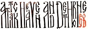
There's a headline, what does it say? And now try the legend.
|
|
#
?
Apr 19, 2013 10:20
|
|
|
Riso posted:There's a headline, what does it say? Pan-Ukraine. The subtitle is (probably) Map of the Ukrainian Empire.
|
|
#
?
Apr 19, 2013 10:37
|
|
|
Jerry Cotton posted:Pan-Ukraine. The subtitle is (probably) Map of the Ukrainian Empire. Yup, though for some reason Ukraine is just actual English "Ukraine". The legend isn't readable at all, so can't help you there. But I'm pretty sure the map is about the amount of Ukrainians in each of these countries, anyways.
|
|
#
?
Apr 19, 2013 12:38
|
|
|
Skeleton Jelly posted:Yup, though for some reason Ukraine is just actual English "Ukraine". I thought it was just a joke like all those "Stupid Americans don't know anything about geography" maps with just Europe, Poland, Oil, Dirty Immigrants, and Here be Black People on them. Also, maybe they used software that doesn't do soft italics and they didn't have an italic cyrillic version of the font?
|
|
#
?
Apr 19, 2013 12:49
|
|
|
Jerry Cotton posted:I thought it was just a joke like all those "Stupid Americans don't know anything about geography" maps with just Europe, Poland, Oil, Dirty Immigrants, and Here be Black People on them. That was what I figured it was when I posted it. I was considering labeling it "the world according to Ukraine (according to Russia)" instead of the "according to Ukraine."
|
|
#
?
Apr 19, 2013 13:09
|
|
|
The two countries on the west of Europe are Belgium and Switzerland, the island next to Italy is Cyprus. The second thing in the key (dots on a dark background) says "Colonies" I think
|
|
#
?
Apr 19, 2013 13:14
|
|
|
reignonyourparade posted:That was what I figured it was when I posted it. I was considering labeling it "the world according to Ukraine (according to Russia)" instead of the "according to Ukraine." It doesn't really have any kind of jokes in any part of it so it would be fairly boring. It's just different countries sized up differently, with lots of kind of weird countries like Seychelles, Bahamas and Panama completely out of proportion. It's also called "Pan-Ukraine", so I don't really see any other option but something like a projection based on Ukrainian immigration. twoday posted:The second thing in the key (dots on a dark background) says "Colonies" I think Good pick, it'd kind of make sense because both Argentina and Brazil are coloured with it. Rest of Americas isn't though and it's kinda weird. The dot to its right also seems to be "cities in Ukraine"
|
|
#
?
Apr 19, 2013 14:04
|
|
|
Skeleton Jelly posted:It doesn't really have any kind of jokes in any part of it so it would be fairly boring. It's just different countries sized up differently, with lots of kind of weird countries like Seychelles, Bahamas and Panama completely out of proportion. It's also called "Pan-Ukraine", so I don't really see any other option but something like a projection based on Ukrainian immigration. Maybe you just have no sense of humour?
|
|
#
?
Apr 19, 2013 19:00
|
|
|
3peat posted:
Cornwall should be light blue because Cornish doesn't have indefinite articles. Just kidding, nobody speaks Cornish anymore 
|
|
#
?
Apr 19, 2013 19:05
|
|


|
Soviet Commubot posted:Cornwall should be light blue because Cornish doesn't have indefinite articles. It's believed that at one point more Yoopers spoke Cornish than people in Cornwall.
|
|
#
?
Apr 19, 2013 20:26
|
|

|
|
| # ? May 17, 2024 07:46 |
|
|
Soviet Commubot posted:Cornwall should be light blue because Cornish doesn't have indefinite articles. So does Bulgarian have some kind of sprachbund thing going on? Why is it the only Slavic language with articles?
|
|
#
?
Apr 19, 2013 22:50
|
|