


|
I think the bottom photo is stunning, but the noise is quite terrible in the bottom-left and under her jaw. It looks great and adds to the photo otherwise throughout.
|
 #
?
Apr 19, 2013 02:35
#
?
Apr 19, 2013 02:35
|
|

|

|
| # ? May 22, 2024 11:39 |
|
|
sw1gger posted:Awesome man - diggin the treatment/film! Can't tell which one I like the most. I'm leaning towards the middle one.
|
|
#
?
Apr 19, 2013 09:14
|
|

|
XTimmy posted:Nice light, I'd like to ferret around in your curve layers. Personally I'd like to ferret around in her curve layers. That's a pretty awesome photo.
|
|
#
?
Apr 19, 2013 13:20
|
|

|

|
|
#
?
Apr 20, 2013 02:52
|
|

|
Took some of a friend of mine. I like the wild hair on the first one, but I need to get better at cloning to fix the errant strands in the second. DSC03129_a by LargeHadron, on Flickr  DSC03063 by LargeHadron, on Flickr
|
|
#
?
Apr 20, 2013 04:06
|
|

|
QPZIL posted:Personally I'd like to ferret around in her curve layers. 
|
|
#
?
Apr 20, 2013 06:06
|
|


|
LargeHadron posted:Took some of a friend of mine. I like the wild hair on the first one, but I need to get better at cloning to fix the errant strands in the second. I really, really like the first one. I really, really dislike the second. The first has great contrast, an intense look, and a good use of depth of field. It feels dynamic and raw. She looks dangerous, and it's great. The second shot, though, just seems meh in comparison. She's extremely yellow, and the shadow of her hair on her face hives her a very oval look, which I don't think does her any favors. It just seems... drab. And now... gels!  Ryan, for the last time by thetzar, on Flickr
|
|
#
?
Apr 20, 2013 17:00
|
|

|
Alternate on last:
|
|
#
?
Apr 20, 2013 23:29
|
|
|
the hodag posted:
This is incredible, the geometric forms... magic. It reminds me of the Echoes (Pink Floyd best-of) album cover.
|
|
#
?
Apr 21, 2013 00:34
|
|

|
I did some more headshots. I decided to go a little more extreme with the processing, does anyone think it's distasteful? DSC03281_a by LargeHadron, on Flickr  DSC03340 by LargeHadron, on Flickr  DSC03357 by LargeHadron, on Flickr
|
|
#
?
Apr 21, 2013 06:34
|
|
|
I like them, they look like they're processed just right to me. The highlights on the third one in the cheek/neck area are a little bright.
|
|
#
?
Apr 21, 2013 17:04
|
|
|
The first one is pretty close to looking like a colorized black and white photo.
|
|
#
?
Apr 21, 2013 23:38
|
|

|
|
|
#
?
Apr 22, 2013 04:41
|
|

|
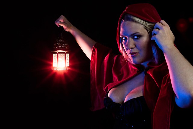
The backlighting on her face is pretty jarring.
|
|
#
?
Apr 22, 2013 11:34
|
|

|
evil_bunnY posted:The backlighting on her face is pretty jarring. It's meant to be - by placing the lantern slightly below her face I get both a kicker and a bit of horror lighting.
|
|
#
?
Apr 22, 2013 13:12
|
|
|
 Ashley by xxyzx road, on Flickr
|
|
#
?
Apr 22, 2013 18:23
|
|

|
TheAngryDrunk posted:
What's up with the skin tones on her calf? It also looks like there is a line extending from the corner of her mouth out across her face... and her skin is kind of yellowish near where her left leg meets her shorts. Otherwise, I like!
|
|
#
?
Apr 22, 2013 18:29
|
|

|
Going through my holiday photos, this one really jumped out Coffee by fuglsnef, on Flickr
|
|
#
?
Apr 22, 2013 22:04
|
|
|
David Pratt posted:Going through my holiday photos, this one really jumped out I like that, it's strangely intriguing. The crazy amount of head room does it for me, I don't know why though.
|
|
#
?
Apr 22, 2013 23:39
|
|
|
RangerScum posted:What's up with the skin tones on her calf? It also looks like there is a line extending from the corner of her mouth out across her face... and her skin is kind of yellowish near where her left leg meets her shorts. Otherwise, I like! Other than the little bit of yellow I don't see any of what you're seeing? I like it too though! Model showed up late and forgot to finish her makeup and had to do it in a car -_-;;;;;;; The thing on her cheek is a Taurus sign. I think I will photoshop it out if I use for my site but haven't decided yet. I also may adopt a policy of chopping off the hands of models who wear hairties on their wrists after I ask them to remove.   
Oprah Haza fucked around with this message at 04:22 on Apr 23, 2013 |
|
#
?
Apr 23, 2013 03:33
|
|
|
Oprah Haza posted:Other than the little bit of yellow I don't see any of what you're seeing? I think the yellow is just from the light coming through her shorts, it's nothing glaring but eh, I noticed it. The bit around the mouth isn't too visible at this size, but I didn't pixel peep the image and it was still noticeable.  I do like the photo though, just a couple quick things to make it better.
|
|
#
?
Apr 23, 2013 14:45
|
|
|
Went out for a walk to test out my new 40/2.8 stm (I do not see myself taking this lens off any time soon) and this guy started talking to me about landscape architecture and astrology. His name is Tom.
|
|
#
?
Apr 24, 2013 00:00
|
|
|
Reichstag posted:Went out for a walk to test out my new 40/2.8 stm (I do not see myself taking this lens off any time soon) and this guy started talking to me about landscape architecture and astrology. His name is Tom. I like the sort-of-ambiguous setting here. I also like how it's closing him in, but not crowding him in. It's a nice picture.  Eleonora by McMadCow, on Flickr
|
|
#
?
Apr 24, 2013 01:51
|
|

|
David Pratt posted:Going through my holiday photos, this one really jumped out I agree - for some reason I am really drawn to this photo. I like it! Trying something new: 
|
|
#
?
Apr 24, 2013 02:58
|
|
|
McMadCow posted:I like the sort-of-ambiguous setting here. I also like how it's closing him in, but not crowding him in. It's a nice picture. As always there's a real sense of unease with this that I find really compelling. The composition feels a little unbalanced with only one corner being black but I guess that's a result of the process.
|
|
#
?
Apr 24, 2013 08:16
|
|
|
A couple that I like from my first paid photo shoot ever DSC03223_a by LargeHadron, on Flickr  DSC03244 by LargeHadron, on Flickr Apparently something from this shoot is going to end up on a CD album insert, no big deal or anything 
LargeHadron fucked around with this message at 17:59 on Apr 24, 2013 |
|
#
?
Apr 24, 2013 17:53
|
|
|
^ Both good but really digging the first one. The eyes are kind of lost in the second shot.  DSCF2874-5 by Paul Hofreiter, on Flickr I have been trying to practice post work on non ideal lighting situations for when they inevitably happen to me, so I sat my daughter down in front of a screen window with the light behind her to put a shadow right on her face. I don't know if I went too far with the processing - I wanted to try to keep it looking fairly natural and not like I was just trying to recover a bad shot. sw1gger posted:Trying something new: Quick thing that I noticed that happens to me sometimes too (but you might be ok with) - it is a bit oversaturated around the ear. It is an easy fix if it bothers you. I like it otherwise - I might have been tempted to tame the neck texture a little bit. rio fucked around with this message at 04:28 on Apr 25, 2013 |
|
#
?
Apr 25, 2013 04:25
|
|

|
Too much eyes. There's also a bunch of blown out pixels on the shirt - bring down the saturation in the reds (and probably overall).
|
|
#
?
Apr 25, 2013 04:35
|
|
|
LargeHadron posted:A couple that I like from my first paid photo shoot ever First is nice, second would have benefited from a reflector perhaps?
|
|
#
?
Apr 25, 2013 04:43
|
|
|
Chitin posted:Too much eyes. There's also a bunch of blown out pixels on the shirt - bring down the saturation in the reds (and probably overall). I was going back and forth on the eyes for a while - I probably should have waited until tomorrow to look at it fresh. You are right, thanks.
|
|
#
?
Apr 25, 2013 04:47
|
|
|
TheAngryDrunk posted:
Please don't think you need to edit out shadows caused by the light or minor skin tone variations. That's part of the deal with shooting outside and what makes location shots more interesting. My only stylistic criticism would be that unless the scenery is as pretty as the girl, you should be filling the frame with her as much as possible. Tighten up the framing unless you have a reason to show background or location.
|
|
#
?
Apr 26, 2013 01:47
|
|

|
Paragon8 posted:Please don't think you need to edit out shadows caused by the light or minor skin tone variations. That's part of the deal with shooting outside and what makes location shots more interesting. Right, while I do appreciate all the feedback, I didn't have the intention to retouch shadows. I agree a tighter crop might be better.
|
|
#
?
Apr 26, 2013 03:44
|
|
|
 Juliette by McMadCow, on Flickr
|
|
#
?
Apr 26, 2013 11:01
|
|
|
McMadCow posted:
I really enjoy how you've burned the outside edges of the frame, so it almost feels like she's emerging from the frame at bottom. That hand pose is also unsettling, along with all the darkness. Nice job!
|
|
#
?
Apr 26, 2013 19:25
|
|
|
I feel like it's a happy accident when I manage to get a decent shot with my new flash. I have no idea what I'm doing. IMG_5096 by philip painter, on Flickr
|
|
#
?
Apr 27, 2013 17:06
|
|

|
Reichstag posted:Went out for a walk to test out my new 40/2.8 stm (I do not see myself taking this lens off any time soon) and this guy started talking to me about landscape architecture and astrology. His name is Tom. 40mm pancakes own.
|
|
#
?
Apr 27, 2013 20:33
|
|


|
Trying my hand at corporate shots for LinkedIn for a client. JB #1 by Rick0r McZany, on Flickr
|
|
#
?
Apr 28, 2013 22:14
|
|
|
Cyberbob posted:Trying my hand at corporate shots for LinkedIn for a client. Would you be ok with critique of this image?
|
|
#
?
Apr 28, 2013 23:00
|
|
|
Oprah Haza posted:Would you be ok with critique of this image? Shoot, I know it's not perfect for a number of reasons, so I'm eager to hear your thoughts. There's more if you follow my Flickr link, but both me and the client thought this was the better of the set.
|
|
#
?
Apr 28, 2013 23:10
|
|
|

|
| # ? May 22, 2024 11:39 |
|
|
sw1gger posted:Trying something new: Now how the heck did you pull that off? Nice job! ...  This was shot with the Pentax 6x7, but I don't remember the film type.
|
|
#
?
Apr 29, 2013 20:37
|
|