


|
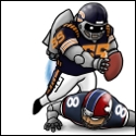
Cap's face gets a lot worse a couple pages later.
|
 #
?
Apr 19, 2013 11:00
#
?
Apr 19, 2013 11:00
|
|


|

|
| # ? May 10, 2024 10:36 |
|
|
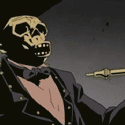
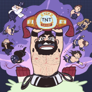
TwoPair posted:Okay, I guess my last one was really "Good/Bad Comic Art" since it got such mixed reactions. Here's something I hope I can get a more universal "What the gently caress?" on. Cap, what's wrong with your faaaaaace? I was really hoping somebody would post this. I crack up every single time I look at it.
|
|
#
?
Apr 19, 2013 16:20
|
|


|
Wasn't sure where else to post this but my second original page came in the mail today, so I'll post it up along with my other page. James Stokoe - Orc Stain - Issue 07, Page 15  Matt Kindt - The Tooth - OGN, Page 29  I would suggest to any comic fan that you buy at least one page of original art if you haven't already. It's amazing being able to see it up close and personal.
|
|
#
?
Apr 19, 2013 23:54
|
|
|
We have an awesome original art thread that could always use more postings. http://forums.somethingawful.com/showthread.php?threadid=3512726 Great buys though. I love the Tooth page.
|
|
#
?
Apr 20, 2013 02:51
|
|


|
Waterhaul posted:Yeah but the main thing is that even Moibius' worst is better than a lot of artists best. This is awesome! I really need to own this. It reminds me of early Sandman somehow.
|
|
#
?
Apr 20, 2013 04:08
|
|


|
Hakkesshu posted:The design itself was fine, but Quitely made him look like a greasy pedophile porn star. It's like that one hideous Emma Frost panel, except he looks like that throughout the entire run. God, how people can stand that guy's art I'll never know. Content: Phil Noto draws Jon Hamm as Superman  ...and I wish this would be a TV show so bad 
Benny the Snake fucked around with this message at 08:59 on Apr 20, 2013 |
|
#
?
Apr 20, 2013 08:57
|
|


|
Benny the Snake posted:Content: Phil Noto draws Jon Hamm as Superman Is it a bird? Is it a plane? No, it's Madman!
|
|
#
?
Apr 20, 2013 09:22
|
|


|
Jedit posted:Is it a bird? Is it a plane? No, it's Madman!   Superman/Madman Hulaballoo by the always amazing Mike Allred.
|
|
#
?
Apr 20, 2013 20:48
|
|

|
TwoPair posted:Okay, I guess my last one was really "Good/Bad Comic Art" since it got such mixed reactions. Here's something I hope I can get a more universal "What the gently caress?" on. Cap, what's wrong with your faaaaaace? Aside from the obvious Cap's face thing, what the gently caress is going on with this panel, is everyone falling out of the sky? Is the reader looking down from above? Everyone's pose and orientation looks like they were cut and pasted from different books, help. VV Okay, that explains why Cap looks like he's about to throw up (he's airsick) but why does Fury look like he's running straight at the viewer, Hulk is doing the limbo on a different plane, Armored Forearms is standing oriented 90 degrees differently doing a martial arts kata, Quicksilver flying smoothly on a totally different axis ... everyone looks completely in control of themselves but they're all just oriented totally randomly. poo poo makes my brain hurt trying to figure it out help. Flesh Forge fucked around with this message at 00:58 on Apr 21, 2013 |
|
#
?
Apr 20, 2013 23:50
|
|

|
Flesh Forge posted:Aside from the obvious Cap's face thing, what the gently caress is going on with this panel, is everyone falling out of the sky? Is the reader looking down from above? Everyone's pose and orientation looks like they were cut and pasted from different books, help.
|
|
#
?
Apr 20, 2013 23:58
|
|
|
Yeah, Storm is blowing everyone.
|
|
#
?
Apr 21, 2013 02:05
|
|


|
Happy Noodle Boy posted:Yeah, Storm is blowing everyone. 
|
|
#
?
Apr 21, 2013 08:06
|
|

|
Rhyno posted:
I did not know this existed, and now must purchase it immediately. Also wanted to add that I agree the Moebius recolors are horrid. If I want to buy English translations of his work, can I get the original, or is only the recolor available? Madrox fucked around with this message at 08:34 on Apr 21, 2013 |
|
#
?
Apr 21, 2013 08:30
|
|
|
Benny the Snake posted:Content: Phil Noto draws Jon Hamm as Superman A good decision to stop just before reaching groin area, otherwise we'd have to see Superman drawn with more than just Jon Hamm's face likeness.
|
|
#
?
Apr 21, 2013 08:32
|
|


|
Heh, heh, heh. Bueno.
|
|
#
?
Apr 21, 2013 09:08
|
|


|
Madrox posted:
The version of the Incal that Self Made Hero published had the original colors. As for wanting to buy English translations of his other works, good luck with that.
|
|
#
?
Apr 21, 2013 10:45
|
|


|
TwoPair posted:Okay, I guess my last one was really "Good/Bad Comic Art" since it got such mixed reactions. Here's something I hope I can get a more universal "What the gently caress?" on. Cap, what's wrong with your faaaaaace? All I can see is a really tiny Iron Man punching Captain America in the jaw while we get an x-ray view of the handpuppet of a blue lady with a gun he's wearing on his other hand. Meanwhile, the Red Hulk has stolen one of Storm, Nick Fury, and a really tiny Quicksilver's legs to affix to his own three stumps; while a man cosplaying as Maria prepares to throw Quicksilver like a frisbee. It makes me want to redraw these characters from a different perspective. Edit: I know what they intended, but this is what I see. 
PoptartsNinja fucked around with this message at 00:16 on Apr 22, 2013 |
|
#
?
Apr 21, 2013 17:32
|
|


|
Madrox posted:I did not know this existed, and now must purchase it immediately. I just got it and here is a link http://www.amazon.com/Superman-Madm...dman+Hulaballoo
|
|
#
?
Apr 21, 2013 19:46
|
|
|
Mister Roboto posted:Wolverine's supposed to be a short, hairy manimal. Frankly, the disgustingly hairy '80s pornstar with more bodyhair than apes suits him. But manimal is quitelys only look. Everyone has a tiny flat face gurning out from a weird potato head. Male or female, bruiser or Beauty. God, when the authority switched over to him was like my least favourite comics moment ever.
|
|
#
?
Apr 22, 2013 08:12
|
|
|
Quietly on X-Man and Authority was horrible but there's something about the guy I like. He's unique and so stylistically defined, and he really does capture bodies and motion so well. His faces range from passable to... well, we all know how bad his faces can be, and his giant bodies don't match every story, but I feel super happy he gets such respect and high-level work despite not being a "sexy" artist. We3 is half his magic, and All Star Supe's tone was very defined by how his art looks. I feel like him and Howard Chaykin should have a potato face drawing fight, though.
|
|
#
?
Apr 22, 2013 14:07
|
|

|
Chinaman7000 posted:Quietly on X-Men and Authority was horrible than this of the Chinaman, seven thousand strong.
|
|
#
?
Apr 22, 2013 15:08
|
|

|
He's really horrible at drawing faces and really, bodies too, but amazing on action, motion and explosions and small details in them.
|
|
#
?
Apr 22, 2013 16:39
|
|

|
TwoPair posted:Okay, I guess my last one was really "Good/Bad Comic Art" since it got such mixed reactions. Here's something I hope I can get a more universal "What the gently caress?" on. Cap, what's wrong with your faaaaaace? All I hear in my head when I see this panel is Captain American saying "G-G-G-G-Ghost!!!!"
|
|
#
?
Apr 22, 2013 16:59
|
|
|
DarkCrawler posted:He's really horrible at drawing faces     Nope.
|
|
#
?
Apr 22, 2013 20:10
|
|

|
I will never understand why some people get such a.... visceral reaction to Frank Quitely faces. I'll be the first to say that his faces and female physiques are his weakest point, but even then he's awesome at telling a story, which is what really matters.
|
|
#
?
Apr 22, 2013 20:16
|
|


|
mind the walrus posted:I will never understand why some people get such a.... visceral reaction to Frank Quitely faces. Because they look weird and he tends to give everyone beestung lips - including the men. When he's on it he's really on it, though.
|
|
#
?
Apr 22, 2013 23:37
|
|
|
mind the walrus posted:I will never understand why some people get such a.... visceral reaction to Frank Quitely faces. I don't think its weak. He just has a different style. They're just not aesthetically pleasing like a Adam Hughes or Bryan Hitch, etc. If he can get body language as expressive as in those in what the Clark vs Superman images show, that much thought put into it, then he has to have a good understanding of how a body functions, anatomy works, and how his designs/styles will interpret it. People are used to idealized images of men and women in comics and that it should be "pretty." Admittedly I don't remember how expressive he can make his characters in terms of expressing emotions in the face vs something like a Kevin Maguire. EDIT: Agree with you on the last part. Gatts fucked around with this message at 00:42 on Apr 23, 2013 |
|
#
?
Apr 23, 2013 00:24
|
|


|
Jedit posted:Because they look weird and he tends to give everyone beestung lips - including the men. When he's on it he's really on it, though. There isn't a single instance of this in the above pictures.
|
|
#
?
Apr 23, 2013 00:42
|
|
|
I was the one who started the whole Quitely tirade (I think?) and in hindsight, I was being too dismissive of his work. I do like some of it, like We3, quite a bit, but I still think he's largely hit or miss. His strength being storytelling is definitely true, but it's not like every issue of New X-Men is as effective as the one where there's no dialogue (which I think is a fantastic issue, for the record). He's still pretty inconsistent and his faces are occasionally so off-putting and gnarly that it can take me out of the comic, which happened multiple times in New X-Men.
|
|
#
?
Apr 23, 2013 00:50
|
|


|
I'm not disagreeing. It's just funny because Quitely really does have such a powerful impact on people. I also agree that his New X-Men and Authority-era work are easily the worst times in terms of potato face. That said check out stuff like Flex Mentallo, it's definitely indicative of an artist who was trying a new style during New X-Men, one that didn't quite work.
|
|
#
?
Apr 23, 2013 00:57
|
|
|
If anyone else complains about Frank Quietly I'm going to suplex them into a canyon. You know who I like? Tim Sale. He's not perfect but I usually enjoy looking at something he's done. Like, Catwoman: When In Rome doesn't make any goddamn sense at all but it's pretty. This is from his issue of Solo with some very nice Cameron Stewart colors.   I like that he draws Catwoman with big gold bracelets even though it doesn't make any sense if you think about it for even a second. Something about it just "feels" right to me.
|
|
#
?
Apr 23, 2013 01:03
|
|

|
Mr Wind Up Bird posted:This is from his issue of Solo with some very nice Cameron Stewart colors. Her pose looks like it's pulled straight from a screenshot of a Pepe le Pew cartoon, and I honestly am not sure whether I like it or not. Also that Stokoe page is awesome, dude's inking is loving crazy.
|
|
#
?
Apr 23, 2013 01:25
|
|

|
Ruin Completely posted:Her pose looks like it's pulled straight from a screenshot of a Pepe le Pew cartoon, and I honestly am not sure whether I like it or not. Personally I love it, that's about the most memorable Catwoman drawing I've ever seen. It's cute without being exploitive and really just charming as hell.
|
|
#
?
Apr 23, 2013 02:58
|
|
|
Rhyno posted:There isn't a single instance of this in the above pictures. To be fair, New X-Men is full of it. It's stylisation, though. Nothing 'weak' or 'bad'. Weather you like it or not, his style defines New X-men in equal portion to Morrison's writing, which is a great thing for an artist. Teenage Fansub fucked around with this message at 03:11 on Apr 23, 2013 |
|
#
?
Apr 23, 2013 03:04
|
|
|
Ruin Completely posted:Her pose looks like it's pulled straight from a screenshot of a Pepe le Pew cartoon, and I honestly am not sure whether I like it or not. The "eeep" dialogue makes me think it's intentional.
|
|
#
?
Apr 23, 2013 03:18
|
|

|
Ruin Completely posted:Her pose looks like it's pulled straight from a screenshot of a Pepe le Pew cartoon, and I honestly am not sure whether I like it or not.
|
|
#
?
Apr 23, 2013 06:23
|
|
|
That Catwoman pose is amazing, because it's the only time in a comic where that arched-back-butt-out-pinup-gal pose actually works, and to hilarious effect. I can't help but read their exchange in these completely bland, conversational tones, as well, which is also great.
|
|
#
?
Apr 23, 2013 08:37
|
|


|
People who aren't Quitely fans because they don't like how he drew the X-Men or JLA should look at Jupiter's Legacy, which just came out.
|
|
#
?
Apr 25, 2013 04:12
|
|

|
Heresiarch posted:People who aren't Quitely fans because they don't like how he drew the X-Men or JLA should look at Jupiter's Legacy, which just came out. Look at it yes. But don't try to make sense of the plot as it's another "Mark Millar barely gives us enough info to make this poo poo interesting in the slightest loving bit" comic.
|
|
#
?
Apr 25, 2013 04:33
|
|
|
|
| # ? May 10, 2024 10:36 |
|
|
Rhyno posted:Look at it yes. But don't try to make sense of the plot as it's another "Mark Millar barely gives us enough info to make this poo poo interesting in the slightest loving bit" comic. So its another Mark Millar is writing for the sole purpose of making it into a movie?
|
|
#
?
Apr 25, 2013 04:35
|
|