|
Valdara posted:Here are a few from my latest photo walk today. This is my first ever attempt at B&W, but since it was the lines and shadows that drew me, and adding color was just a yellow wall and concrete steps, I think this was a better choice. I like all three of these. Good examples of taking what could be boring subjects and making good photos from them. I think the first is the strongest; it works well in black and white, and the rhythm of the repeating lines works for you well. The second is also quite good, the angles make it feel dynamic. The third, well, I really like mostly for the color. Here are a couple crossposted from the portrait thread.  Have Coat, Will Travel 1 by thetzar, on Flickr  Have Coat, Will Travel 2 by thetzar, on Flickr  Have Coat, Will Travel 3 by thetzar, on Flickr  Have Coat, Will Travel 4 by thetzar, on Flickr
|
 #
?
Apr 15, 2013 04:54
#
?
Apr 15, 2013 04:54
|
|


|

|
| # ? May 25, 2024 09:58 |
|
|
rio posted:
This very much draws me to the center point (about where the cellist's hand is) in a lot of different ways. Vertically, it seems to be distributed into about 4 quadrants, the empty top area, the audience's and cellist's heads, the cellist's, and another empty area with the cymbal and part of the steel drum. The pillar in the middle splits the scene into two horizontal sections at the middle, and finally, the depth of field has three sections--drums, cellist and front audience, and back audience, with the middle one in focus. All this together brings a lot of energy into the center point, but there's nothing particularly special there--this lets that energy flow throughout the rest of the scene, escaping up through the cellist's arm, swirling around, and coming back again. I'm trying to get better at photographing shows: 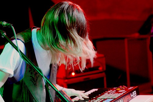  
|
|
#
?
Apr 16, 2013 07:38
|
|


|
fivre posted:I'm trying to get better at photographing shows: The color in all of these is fantastic, the second standing out more than the others.I think these sort of straddle the line between being all about the emotion of the performers, and the performance itself. I'd personally like to see more of the instruments or stage to really give a sense of location or "context". Here are some photos from Shibuya that I took. The first photo has unfortunate focus in my opinion, but I like how it came out.  Untitled by App134, on Flickr  Untitled by App134, on Flickr
|
|
#
?
Apr 17, 2013 10:53
|
|
|
App13 posted:
Late night images like these make me really wish I lived in an area that didn't roll up the street when the sun goes down. The vibrancy of the image just helps capture how alive Shibuya is even at night. Losing my cherry with these images and eagerly awaiting a thrashing so I can learn to not suck.   Weather Vane by Nameless_Photography, on Flickr  Microchip by Nameless_Photography, on Flickr 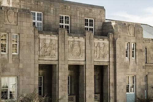 Federal Building by Nameless_Photography, on Flickr
|
|
#
?
Apr 17, 2013 20:56
|
|
|
Kasan posted:Late night images like these make me really wish I lived in an area that didn't roll up the street when the sun goes down. The vibrancy of the image just helps capture how alive Shibuya is even at night. The background of the first one is very distracting, and the focus on the vane itself seems to be off. It looks like a cool vane, but I'd rather see it in context. What type of building is it attached to? Is it on a long pole way up in the air or just inches above the roof? It's too zoomed in to give me a good sense of how it lives in its environment, but not close enough to really see any detail. The composition is not quite centered, not quite rule-of-thirds, feels sloppy and unplanned. Maybe crop out the big branch in the top left corner to zoom in a little more and clone out the big diagonal branch that is an unnecessary element. I really want to like the second one, but I can't see anything. Is it through a microscope? It almost looks like you're looking through a drop of water. Cool effect, but I can't tell whether the effect was intentional or an accident you thought looked cool. The third one has a similar issue to the first one. It needs to be either zoomed in more (I'd love to see more of the carved detail above the door, maybe when the sun is at an angle to really show off the relief) or zoomed out more to show me the whole building. The crop feels awkward and makes it where I can't tell what the subject is supposed to be. You don't show me the top, bottom, or either side of the building, instead just a piece of the middle without anything in particular emphasized. I do like the angles that the entryway creates with the vertical columns and the horizontal carved bits, but give it some foundation. Show me what it's sitting on, where it grows from. I'm guessing you framed it that way to get the shield up in the top left corner, which is a super neat carving, but is also unnecessary and actively takes away from this particular photo. In short, pick a subject. Make your photo enhance that subject while still giving it context. Ignore the extra stuff. If there's too much stuff that's really awesome, take another photo! And another! Do you want a grand photo of a great building, or shots that show off details of the architecture? Photos trying to do both at once do both poorly. You've got a good eye for things that could look really interesting, but the composition isn't quite there. Take more photos. Zoom in on some. Zoom out on some. Shoot from different angles. Try to have a specific subject that pulls the eye in, but give it a reason to be there. I know this is a thousand things to take into account all at once, but you'll get there. ---------------------- Here are a few photos I took of a friend's dad's model rail road. I ended with 11 that I really liked, and I tried for the first time to have a series all with similar post processing. I'll post 3 here, and the rest are on my flickr if anyone wants to see all of them. I'm going to go through again this weekend and find one more to make it an even 12 to turn it into a calendar for him. I'm particularly interested in whether the post processing looks consistent from shot to shot, but I'll take any critique I can get! 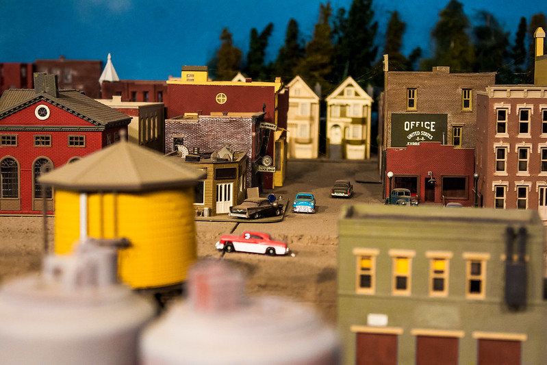 Trains by prismaticglasses, on Flickr 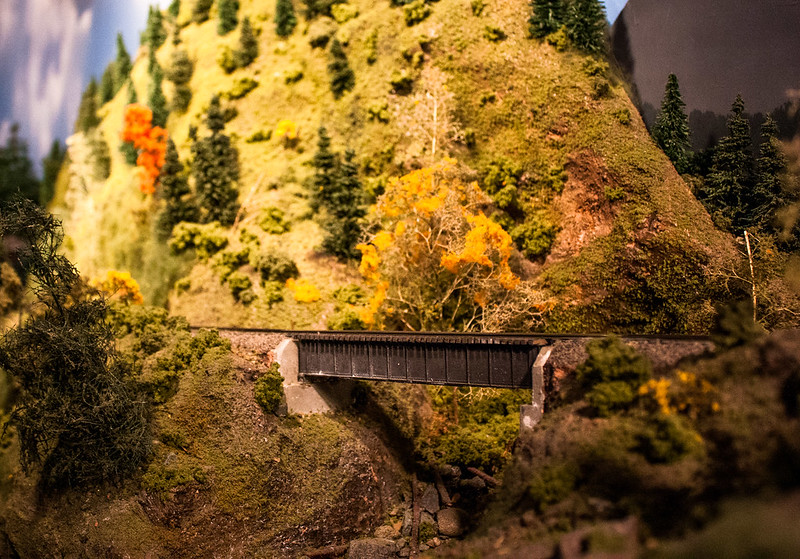 Trains-3 by prismaticglasses, on Flickr 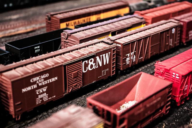 Trains-5 by prismaticglasses, on Flickr I think this last one looks a little too cool compared to the rest. Thoughts?
|
|
#
?
Apr 19, 2013 05:26
|
|

|
Valdara posted:
Man, tilt-shift is so played out!!  The proc looks pretty consistent, but: 1) I'd straighten your horizontals (based on the building with the yellow edge) Are the cars meant to be so dusty / dirty? If not, go at them with some canned air. 2) Put a train on the bridge on the second, it's desperate for a central point of interest.
|
|
#
?
Apr 19, 2013 08:25
|
|


|
NoneMoreNegative posted:Man, tilt-shift is so played out!! As in it looks like I used tilt-poo poo or I should have used it? These were all taken with an 18-55 kit lens in super low light, so I had to keep it wide open at 18mm and get really close. I definitely see what you mean about the bridge photo. When he was explaining it to me, something something lighting something individual shadows something else, so I didn't even think of putting something ON the bridge. I was trying to get the proof of his "according to the magazines impossible" lighting setup. I'll have to start thinking about the entire shot and how it will appeal to people who don't care about something something lighting something else. Next time I get up there (they live in Seattle and I'm in the Bay Area, so it's unfortunately not easy to pop over for another round), I'll see if I can get him to put trains exactly where I want them and maybe do a little dusting. He is pretty protective of his train-babies, though. The focus on this one doesn't seem purposeful. It's mostly down at the bottom tangled in with all the other branches, weaves in an out of the photo as different pieces of the branches come in and out of focus. Very chaotic. I think it would work better if you had the focus on the branches near the top, so there is contrast between the building out of focus and sharp branches, plus that would smooth out the craziness going on at the bottom and make it a little easier to look at. Maybe take a step to the left so the branches are right over the building and clone out the extra tree up in the top right.
|
|
#
?
Apr 19, 2013 16:43
|
|

|
Kasan posted:Late night images like these make me really wish I lived in an area that didn't roll up the street when the sun goes down. The vibrancy of the image just helps capture how alive Shibuya is even at night. On the first one I get that the idea was supposed to be sort of "looking through" the tree limbs but they seem like they are almost too out of focus and like they were bouncing around quiet a bit which is just distracting. The weather vane itself seems to be out of focus and soft. I feel like it may have worked better as a portrait to show more of the vain itself. For the second image, it looks like it could have been interesting but the lack of sharp detail on the chip and the heavy grain makes it just look muddy and "old". The third one is my favorite - I like that you got the saturation and texture of the stone on the building but I agree with Valdara that you either need to pick a subject up closer on the building or pull back further to get the entire building. As it stands right now the crop is sort of awkward and I don't know what I'm supposed to be focusing on aside from aside from a random portion of the building. I've posted some of these types of pics in the Low Effort thread, but I'm hoping to get some feedback on some new ones I took. My girlfriend runs a web based cupcakery and wedding cake business and I took these as part of a new menu. They are lit with a cheap rear end ring flash from the top in a home made lightbox.  IMG_9539.jpg by wildfoxmedia, on Flickr  IMG_9524.jpg by wildfoxmedia, on Flickr  IMG_9525.jpg by wildfoxmedia, on Flickr
|
|
#
?
Apr 19, 2013 20:23
|
|
|
nullfox posted:I've posted some of these types of pics in the Low Effort thread, but I'm hoping to get some feedback on some new ones I took. My girlfriend runs a web based cupcakery and wedding cake business and I took these as part of a new menu. I quite like your second and third ones here the most. Food photography is one hell of a hard thing to get right, and you've done well to make these little cupcakes look pretty yummy. Are they smores? I think if so, they third is the most successful in conveying that since you've got the crackers in there as well, and the toasted bit on the top and all. I wish your ambient / fill lighting was a little stronger so that the shadows thrown from the subject weren't so apparent, but otherwise I think they're not bad for being shot with a home made setup. Both of these were for assignments for school. The first was a "pick a word from the box" challenge, and my word was "texture". The second was just to shoot architecture.  Lonely by eachus, on Flickr 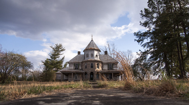 The Little House by eachus, on Flickr
|
|
#
?
Apr 19, 2013 21:33
|
|
|
nullfox posted:
The focus is spot on, and the depth of field is used beautifully. I do wish that in the second photo the entire garnish on top were in focus, but it makes me want to eat the first one AND THE SECOND ONE. The rest is me being exceptionally picky, because they are pretty solid, so fair warning. I like the tiny artfully pile of graham crackers in the first shot better than the pile of grahams themselves in the third. Maybe take a photo with a cupcake sitting on top of the full crackers? Or have a smaller stack of just quarter-sheets instead of giant sheets? They over power the cupcake a bit. I want either more or less toasting on the first one. The second and third have great toasting. I want the background to be white instead of gray. It feels dirty and a little sad. The deep, rich cupcakes would look much better against a bright white background. The slight shadow on the sides of the frosting in the first one would still keep the bright white frosting separated from a bright white background. I want a little bit more fill-light so I can see more delicious details. The exposure on the icing and crackers is great, but I want more cupcake. That drat Satyr posted:Both of these were for assignments for school. The first was a "pick a word from the box" challenge, and my word was "texture". The second was just to shoot architecture. I've been staring at the texture picture for a while, even checked it out in different sizes on your flickr, and I think I've figured out why it's bugging me. It's supposed to be about texture, but everything is a little soft, which takes the texture out of it. For texture, I feel like the focus needs to be tack sharp so the texture comes through. I also like it without the top raggedy bit on the right. If you start the top just above where the green is brightest, it leads your eyes down and points them towards the leaf. Otherwise, my eyes bounced around the top for a while before getting down to the good stuff. You can also cut off some of the darker pieces of the left to keep the same aspect ratio. It keeps the same "lonely" feel with more visual impact. I love the almost metallic sheen that the leaf has, and the bronzed shadow behind it. For the house, I again think it would look better cropped more on the left, then the bottom to even up the pathway. Having that pathway coming at me at the bottom makes the picture a little alarming. I think it's because it takes up the ENTIRE foreground exactly. I again checked the big picture because I wanted to see the detail on the house, and it is phenomenal. It should be showcased. The trees, especially those to the left of the gap, aren't necessary. The ones on the right add a lot of visual weight to that side of the photo, and there's no crop of them that doesn't mess something up, so I think all of them should be kept. Overall, a beautifully photographed house.
|
|
#
?
Apr 19, 2013 23:13
|
|
|
App13 posted:The color in all of these is fantastic, the second standing out more than the others.I think these sort of straddle the line between being all about the emotion of the performers, and the performance itself. I'd personally like to see more of the instruments or stage to really give a sense of location or "context". Buy me one of those Sigma f/2.8 fisheyes, I'll get back to you. (Though for those it half limitations of the crowd density anyway.) quote:Here are some photos from Shibuya that I took. The first photo has unfortunate focus in my opinion, but I like how it came out. The focus on the right girl is fine, and the way she's posed also lends itself really well to a portrait crop/straighten on her only: her outstretched hand is in the middle is guiding you up to her face in the top third via the inward motion blur of her fingers. One of the best venues here is all-ages, and kids wander onto the stage. There was another show I didn't shoot where the lead singer was also an African dancer, and a little girl with a huge fro got on stage and started dancing also; it was great.  Forgot to swith the ISO back down from 3200 after some handheld shots for this, but the chroma noise isn't that bad and Lightroom can take of that pretty well anyway once I have access to it again. For now I'm stuck with AfterShot:  And when I have access to Photoshop, I'd like to take down the brightness of the background here, but who cares, the band managed to somehow line themselves up perfectly along the rule of thirds for a shot I stole over someone else's shoulder: 
|
|
#
?
Apr 20, 2013 11:28
|
|
|
I have a framing question. Here is the uncropped image.  What I want to do is focus on the action and the stare while still somehow preserving the atmosphere of the station. Here's my current effort, which unfortunately crops out the beautiful ironwork :  I'm also open to any criticisms with lighting, colour etc. One thing I'm not happy with is the man's eyes, since the detail of his eyes are largely lost in the brow shadow. Casu Marzu posted:These really aren't doing anything for me. Both the uncropped and cropped photos feel like snapshots. You're not really composing the photograph in an interesting way. You're not personal enough to make this an interesting street shot and you're not showing enough of the surrounding area to give any sort of context. Thank you for your honesty. goodog fucked around with this message at 13:22 on Apr 23, 2013 |
|
#
?
Apr 21, 2013 16:18
|
|
|
 A bit of self-critique: I'm annoyed that it looks like her thumb is cut off. I also wish I had had room to use a longer lens and back up more, since her arms look a bit unbalanced to me.
|
|
#
?
Apr 22, 2013 04:44
|
|
|
That drat Satyr posted:Both of these were for assignments for school. The first was a "pick a word from the box" challenge, and my word was "texture". The second was just to shoot architecture. quote:
 DSC_0191 by jpitha, on Flickr  DSC_0200 by jpitha, on Flickr
|
|
#
?
Apr 23, 2013 00:58
|
|


|
El Negocio posted:I have a framing question. These really aren't doing anything for me. Both the uncropped and cropped photos feel like snapshots. You're not really composing the photograph in an interesting way. You're not personal enough to make this an interesting street shot and you're not showing enough of the surrounding area to give any sort of context. 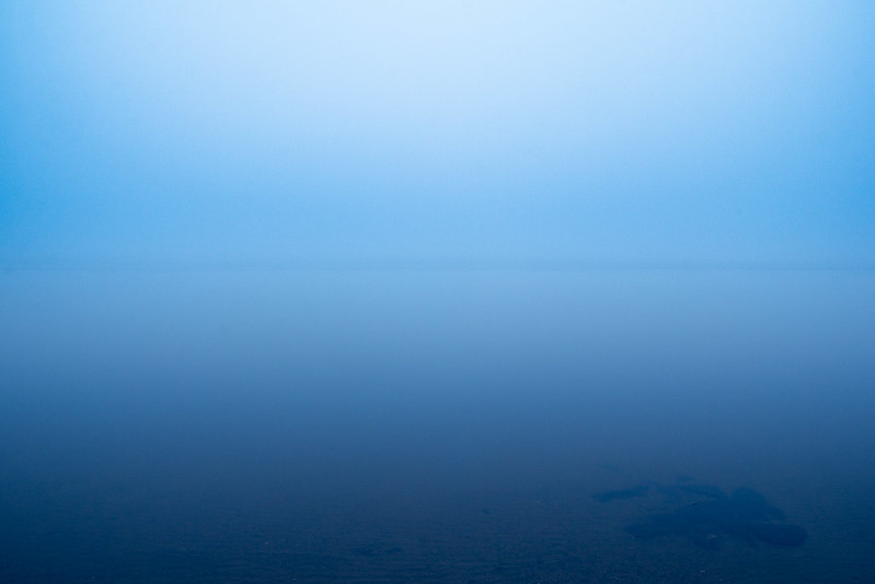 
|
|
#
?
Apr 23, 2013 07:32
|
|

|
thetzar posted:
Fun series. I think the top quoted picture is the strongest, and the bottom quoted picture is the weakest of the group. I agree with your exposure choices and think they are spot on except for the aforementioned weakest photo. The problem I'm seeing is that while the red coat has a bit of punch to it in the other photos, in #3 it's really lacking that. It is still a pretty stark contrast, but due to the underexposure it doesn't seem to contain any highlights and looks muddy. Another thing to watch out for is that it looks like you're starting to repeat your compositions. I tend to do the same thing- on the same side even. I think if you kept the compositions really similar it could actually be a pretty cool thing, but if you go down that route, your first photo won't fit in as well. I think this one is the strongest of the three. However I'd like to address your editing of the spotlight. I don't think that what you did is inherently bad, but you should try playing around with your highlights and see if you can soften it up a bit. I think you can add a lot of great ambience with big soft spotlights casting beams of light. It looks like there might be another one just out of frame near the top right of the photo though, so maybe that interfered too much. I agree that the color in #2 is great. For the third photo, I think the most interesting thing is how you captured the drummer looking out through the center of his drum set like that. However it kind of gets lost since there's some extra space in the photo. This might be a good time to go for a closer crop- I don't think you'll lose anything if you take some off of the top and the left. Kasan posted:
I think this one is the strongest of your three. I think the angle works really well for this building, but it would look better if you were zoomed out a bit more. I think the biggest problem is that you're cutting off the top and the bottom of the building. This also looks like it could be a good candidate for a black and white conversion. I think your microchip shot has potential if the composition can be a bit more spot on and you fix some of the noise. Valdara posted:
These seem okay, but I think if you're wanting you step it up a notch you need to play with some alternate compositions and lighting. I'd go for some strong directional lighting to create some potentially interesting shadows. For a change in composition, can you get your camera lens down on the actual table and shoot it wide- so it'll look like you're actually at the scene itself and not just standing over a model? I don't know what your lens selection is, so I can see how this might not look too great if you don't have anything with a short focusing distance. (I probably wouldn't be able to do those types of shots with my gear.) That drat Satyr posted:
I like this but I think you shot it from too low of an angle. If the grass was all at a uniform height and was blocking your view of the house equally it might work, but just having a tuft obstructing your view here and there detracts from the image. It could also use some distortion correction. Chitin posted:
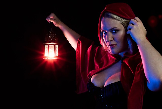
I don't think having the one thumb missing is as bad as you're making it out to be. I think if you don't point it out as a bad thing people won't take it as such, since it's the natural position for her thumb to be in anyhow. I think the lighting in this is executed nicely, but I disagree with the use of the red light. The magenta colors on her face and left arm don't really go with the photo too well. I can't really decide if they don't look good because of the contrast with the blue light, or if it's something else. Also there are a couple of red dots in the top right corner that should probably get cleaned up. This would be really cool in conjunction with a fog machine. This could be cool as a part of a series, but I think by itself it's a bit underwhelming. I think as a standalone photo it would be stronger without the inclusion of that dark blue stuff down in the bottom right hand corner. It kind of disrupts the serene, peaceful vibe of the rest of the photo- but maybe that is the point. Without a series or a title though, I'm going to assume not. ------------------------------------------ I shot this the other day as a part of a series I am working on. I need to clean up some highlights around one of the balloons, but I first wanted to get some critique on the image to see what else might need some adjusting. I suppose one more thing I'd like to point out is that there isn't a better angle to shoot the bridge from due to the really thick vegetation surrounding it. There is going to be some obstruction from the ground level no matter where I stand. I think overall it's fine as the obstruction adds a little mystery to it, but if you feel like there's too much, or that it totally ruins the photo, I'd be interested to hear. As a whole I want the series to have a sort of dream-like cinematic look to it, if that'll help you get an idea of what I'm going for. I don't think this photo is perfect, but I like it a lot, so please destroy it. Thanks! 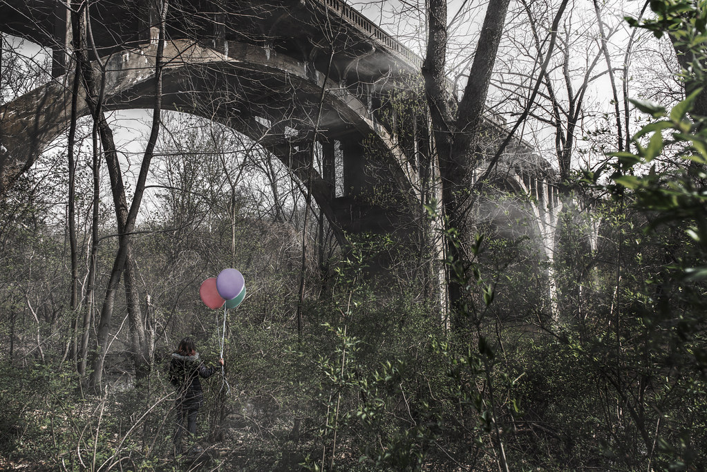 The Bridge to Someplace New by Myotomy, on Flickr
|
|
#
?
Apr 23, 2013 22:23
|
|

|
It looks extremely out of place to have the balloons with the only objects in the scene that don't have branches in front of them. Probably doesn't help that the lighting on them is all wrong and they're clearly pasted in from somewhere else. The shot of the bridge is good to my eye. I think you need to worry more about what's blocking the view of the woman.
|
|
#
?
Apr 23, 2013 22:32
|
|

|
RangerScum posted:I don't think having the one thumb missing is as bad as you're making it out to be. I think if you don't point it out as a bad thing people won't take it as such, since it's the natural position for her thumb to be in anyhow. I think the lighting in this is executed nicely, but I disagree with the use of the red light. The magenta colors on her face and left arm don't really go with the photo too well. I can't really decide if they don't look good because of the contrast with the blue light, or if it's something else. Also there are a couple of red dots in the top right corner that should probably get cleaned up. This would be really cool in conjunction with a fog machine. I think if I had this photo to do again, I would have bought an orange party gel rather than use whatever I had lying around; that would have shifted the transitional areas more white, which would have looked less out of place. Learning to deal with colored light was a big reason for doing this shoot, so thanks for pointing that out for me! quote:I shot this the other day as a part of a series I am working on. I need to clean up some highlights around one of the balloons, but I first wanted to get some critique on the image to see what else might need some adjusting. I suppose one more thing I'd like to point out is that there isn't a better angle to shoot the bridge from due to the really thick vegetation surrounding it. There is going to be some obstruction from the ground level no matter where I stand. I think overall it's fine as the obstruction adds a little mystery to it, but if you feel like there's too much, or that it totally ruins the photo, I'd be interested to hear. I really like this image. I think that if this angle was chosen out of necessity, then it was serendipitous - this isn't a "traditional" angle to photograph a bridge from, but it's compositionally appropriate and makes the whole thing seem really interesting and odd. It makes me want to follow where it's going. I agree with the above posters that the balloons look composited (whether they are or not). I don't think that the obstructions in front of your subject are such a big deal considering the dreamlike feeling of the photo overall, but having your subject wear something more contrasting (a white coat maybe) would have helped make her more of an element in the frame.
|
|
#
?
Apr 23, 2013 22:51
|
|
|
RangerScum posted:I think this one is the strongest of the three. However I'd like to address your editing of the spotlight. I don't think that what you did is inherently bad, but you should try playing around with your highlights and see if you can soften it up a bit. I think you can add a lot of great ambience with big soft spotlights casting beams of light. It looks like there might be another one just out of frame near the top right of the photo though, so maybe that interfered too much. You're correct on both counts. The former is me needing to learn how to do layers in ASP so I can narrow the highlight recovery down to one area, the latter I just overlooked:   RangerScum posted:As a whole I want the series to have a sort of dream-like cinematic look to it, if that'll help you get an idea of what I'm going for. I don't think this photo is perfect, but I like it a lot, so please destroy it. Is there some way you can crank up the "somewhere" sense of it that the mist is giving it? Namely the tendrils of it that are snaking through the trees, it seems like the mist isn't strong enough. This might be incredibly difficult, or it might be possible by selectively upping the exposure in those areas, but it's a thought. The resizing is doing this a great injustice, it looks much better at the larger sizes. That said, even then it still seems a bit "noisy" from the mist--I'm curious if you took any of the same shot at a faster shutter speed to see how that changes it, if at all.    drat light tech: you clearly knew how to light the opener, but then you switched to all red wash for the headliners. What gives? Oh well, let's black and white conversions practice!
|
|
#
?
Apr 24, 2013 08:26
|
|
|
My problem I have with all three is that everything is so drat tight. I'm guessing you were in a small space with a not-wide lens. Also the noise looks pretty bad in the color ones. If I were you, I would do them all in B&W. The noisy look on the B&W one seems fitting, like punk band snapshots from the 80s. Here are a few of my own.  DSC03184 by LargeHadron, on Flickr  DSC03182 by LargeHadron, on Flickr 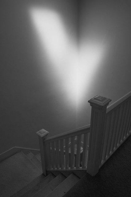 DSC03436 by LargeHadron, on Flickr
|
|
#
?
Apr 24, 2013 23:38
|
|

|
RangerScum posted:I shot this the other day as a part of a series I am working on. I need to clean up some highlights around one of the balloons, but I first wanted to get some critique on the image to see what else might need some adjusting. I suppose one more thing I'd like to point out is that there isn't a better angle to shoot the bridge from due to the really thick vegetation surrounding it. There is going to be some obstruction from the ground level no matter where I stand. I think overall it's fine as the obstruction adds a little mystery to it, but if you feel like there's too much, or that it totally ruins the photo, I'd be interested to hear. Cool stuff, man. I really like the angle of the bridge though the branches may be a bit clutered. The sheen off the bridge is awesome. Personally, and this is just a taste thing, I prefer richer colors over straight up desaturation. I also think more thought could have been given to the outfit of the subject. To contribute (some stuff just playing around):  
|
|
#
?
Apr 25, 2013 00:39
|
|
|
sw1gger posted:Cool stuff, man. I really like the angle of the bridge though the branches may be a bit clutered. The sheen off the bridge is awesome. Personally, and this is just a taste thing, I prefer richer colors over straight up desaturation. I also think more thought could have been given to the outfit of the subject. I really like the bottom two. Sometimes I find your processing can be a little heavy handed, but it looks really nice in these two. I do wish there was eye contact in one of them though - I think it would really add some intensity to the set. And it's more of a hmua thing, but I wish her hair didn't look so slick and gelled. A soft hair look done up like that would have made it a lot better I think. I don't buy the first one. It's pretty cool, but her shirt needs to have some floatiness from the water in it, and the highlights at the top are too muted to give such strong lighting on her. Cool concept though.
|
|
#
?
Apr 25, 2013 06:42
|
|

|
CarrotFlowers posted:I really like the bottom two. Sometimes I find your processing can be a little heavy handed, but it looks really nice in these two. I do wish there was eye contact in one of them though - I think it would really add some intensity to the set. And it's more of a hmua thing, but I wish her hair didn't look so slick and gelled. A soft hair look done up like that would have made it a lot better I think. Meh - I like the hair. Thing is, pinup is usually very bubbly/smiley. This is very obviously not. Underwater lights would make a photo look just like that.... no? (Just like when I use a studio light outdoors, the lighting makes it look like a composite). Natural light underwater stuff is waay more muted than this, I agree.
|
|
#
?
Apr 25, 2013 18:26
|
|
|
sw1gger posted:Meh - I like the hair. Thing is, pinup is usually very bubbly/smiley. This is very obviously not. Also, (not wanting to sound harsh); the thin line of dark from under her ear and along her jaw in the first pic looks a liiitle like a 5 o'clock shadow 
|
|
#
?
Apr 25, 2013 19:15
|
|
|
NoneMoreNegative posted:Well there's the phrase 'neither fish nor fowl'... If you want to shoot pinup, shoot it; but if you have a slicked down hairdo it will look out of place - that look would pair with some rubber really well. Hmm... I'm looking at plenty of pinup photos with slick hair. Also, when you shoot portraits people bring with them a certain set of skills/looks. Why would I force her to be bubbly when she isn't (at all)? So because of this, she should NEVER shoot pinup? What about bringing her style into pinup? Yeesh dude, lighten up. Never realized there was a manual for this. For the second one, yeah I agree with ya. I think I'm gonna lighten that shadow up a bit and desaturate the ear a touch Thanks for the input!! (USER WAS PUT ON PROBATION FOR THIS POST)
|
|
#
?
Apr 25, 2013 19:58
|
|
|
drat dude, you really need to learn how to handle some critique.
|
|
#
?
Apr 25, 2013 20:03
|
|

|
"You can't shoot this because it doesn't follow the rules of pinup" is pretty silly critique sorry. The shots are unique and that's what I like about them.
|
|
#
?
Apr 25, 2013 20:07
|
|
|
I don't think that was anyone's critique.
|
|
#
?
Apr 25, 2013 20:43
|
|
|
Where are the photos in question?
|
|
#
?
Apr 26, 2013 00:39
|
|
|
I'm confused as to when I said she should be bubbly? If anything, I said eye contact would add more intensity. I said a soft hair look, as in, not hard gelled, but I never said the model should look bubbly. I also never said "this doesn't follow the rules of pin up and therefore is wrong". Jeez peeps, try not to read so far into an opinion. Pardon me for critiquing in pad and not fawning over your poo poo.
|
|
#
?
Apr 26, 2013 02:33
|
|
|
CarrotFlowers posted:I'm confused as to when I said she should be bubbly? If anything, I said eye contact would add more intensity. I said a soft hair look, as in, not hard gelled, but I never said the model should look bubbly. You didn't say she should be bubbly. To clarify, casa de mi padre and I were referring to the "If you want to shoot pinup, shoot it" comment made by Negative. I said most pinup is bubbly because, well... it is. I was simply noting another way (aside from the slick hair you said) the photos stray away from the typical vintage-pinup style - not being pissed over a lack of fawnage ") dukeku posted:drat dude, you really need to learn how to handle some critique. drat dude, you really need to learn how to engage in conversation.
|
|
#
?
Apr 26, 2013 08:07
|
|
|
He was saying it's not working as pinup. It violates too many pinup conventions. I agree. It looks nothing like pinup, except for the lingerie. If you want a manual for pinup, that's your manual. As something else, I think it can/does work. As pinup, it's too alienating and plastic to be engaging, particularly because pinup operates on overt sexual objectification. She looks like a doll (especially with her unnatural hand placement). If you're trying to subvert pinup as a genre, you're on the right track but I think you need to establish a stronger link by shooting a series or by not throwing out quite so many conventions right off the bat. Or both.
|
|
#
?
Apr 26, 2013 14:15
|
|


|
sw1gger posted:drat dude, you really need to learn how to engage in conversation. drat dude, you really need to learn to respond to critique less defensively.
|
|
#
?
Apr 26, 2013 17:38
|
|

|
Pin up or not, people are responding with what seems to throw them off about your images Sw1gger. Thats what this thread is for. If you feel they are wrong, good for you. Doesnt make them any less wrong for not liking your images or finding faults in them. Sorry you feel your poo poo dont stink. Dont want crits, post in SAD. Every one of them was trying to engage you in conversations, you just seem to feel that everyone is beneath you and your images. I found them technically fine. You should read up about putting life into your images though. She appears lifeless and flat. Her expression comes off hallow and lacking. I also feel that these lack in the way of Pin-Up that I am used to seeing. Musket fucked around with this message at 17:46 on Apr 26, 2013 |
|
#
?
Apr 26, 2013 17:43
|
|
|
Also please to be not getting mad about valid critique or being lovely when giving critique. Especially the getting mad part though.
|
|
#
?
Apr 27, 2013 19:03
|
|


|
I really like these two. The composition of the first is excellent, and the second is a great contrast and interaction between the characters. I agree the others are framed too tightly.
|
|
#
?
Apr 28, 2013 00:07
|
|

|
LargeHadron posted:Here are a few of my own. I've had this shot sitting around for a while, I'm not so sure about the sky or how dark the rest of the image is. 
|
|
#
?
Apr 28, 2013 03:16
|
|
|
Hotwax Residue posted:I've had this shot sitting around for a while, I'm not so sure about the sky or how dark the rest of the image is. I actually really like the way this photo works. I like the contrast between the sky and the lights in the foreground. I guess the other way of getting a better balance would have been to get bracketed exposures and stitch them together afterwards. I'm a bit of a fan of sunset photo's though so that my skew my opinion a little. Here's two that I took on new years of oddly enough the exact same sunset with the same lighting but just different apature and exposure settings. I like how both turned out but prefer the first one as it seems more dramatic.  042.jpg by drgarbanzo, on Flickr  026.jpg by drgarbanzo, on Flickr
|
|
#
?
Apr 28, 2013 13:46
|
|
|
Dr. Garbanzo posted:Here's two that I took on new years of oddly enough the exact same sunset with the same lighting but just different apature and exposure settings. I like how both turned out but prefer the first one as it seems more dramatic. They both (perhaps coincidentally) have the same sort of composition, but the clouds do lead the eye differently in each shot. The first is too saturated for me, and I don't really like the sun where it is. It is hard to get a sunset that really says something because they are naturally beautiful and inspire us to point a camera at them; I respect that your composition might have been an attempt to do something different but I just don't know about the elements (as interesting as some might be like the horizontal lines of the clouds) supporting or justifying this composition. I like the second more - those kind of mountains and the tones varying between them are always nice. But again, with the comp, I don't know. Feels like you could have just gone 2x3 and got rid of the whole foliage thing on the right. Why did you choose the wide aspect ratio? Hotwax Residue posted:I've had this shot sitting around for a while, I'm not so sure about the sky or how dark the rest of the image is. ----  DSC02828-2 by Paul Hofreiter, on Flickr  DSCF2644 by Paul Hofreiter, on Flickr  DSCF2903-Edit by Paul Hofreiter, on Flickr
|
|
#
?
Apr 29, 2013 03:41
|
|

|

|
| # ? May 25, 2024 09:58 |
|
|
rio posted:
I really like your 2nd photo here. The bloom from the left is just enough to highlight the mushroom terrain without being too much.  _DSF0529.jpg by Bobsledboy, on Flickr
|
|
#
?
Apr 29, 2013 15:24
|
|