|
I actually don't mind the fins unis APART from the font, some neo sans poo poo going on.
|
 #
?
Apr 26, 2013 00:45
#
?
Apr 26, 2013 00:45
|
|


|

|
| # ? May 10, 2024 16:45 |
|
|
Aniki posted:They do have a purple on purple combo. I'm probably the only person who like those, but only for very occasional use. Also, it looks the negative space between the numbers can either be a longship or the bow of a ship depending on the numbers. I guess the sleeve design is more of a sail than the serif on the leading number. It can also look like a whale tail. I guess the designer wanted to play with pareidoliaor something. I'll have to reserve judgement until I see them wearing it because the purple pants do not bother me nearly as much as I thought after seeing Greenway in them. I've never really been a fan of solid color helmet-jersey-pant combos.
|
|
#
?
Apr 26, 2013 02:38
|
|
|
White/white Dolphins uniforms have always been the best uniforms and these new ones are fitting to that legacy.
|
|
#
?
Apr 26, 2013 02:58
|
|

|
The Dolphins font looks like it should be read by Adam Jensen
|
|
#
?
Apr 26, 2013 05:05
|
|

|
When did they start putting pads on butts?
|
|
#
?
Apr 26, 2013 06:36
|
|


|
Volkerball posted:When did they start putting pads on butts? Tailbone pads have always been a thing. I think a lot of NFL guys opt to not wear them because they look stupid.
|
|
#
?
Apr 26, 2013 07:06
|
|

|
Surprised these haven't been posted yet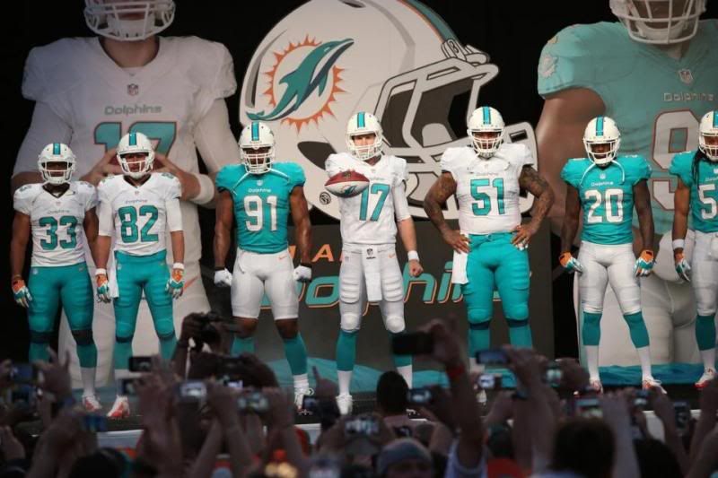 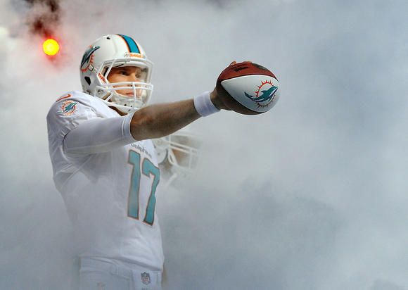
|
|
#
?
Apr 29, 2013 02:06
|
|


|
 
|
|
#
?
Apr 29, 2013 02:52
|
|


|
cocaine-addled fogey says "everything will be fine, just be cool, man"
|
|
#
?
Apr 29, 2013 02:59
|
|


|
Dan is so loving cool
|
|
#
?
Apr 29, 2013 03:00
|
|


|
Except for the grey hair, Griese looks like he could still play.
|
|
#
?
Apr 29, 2013 04:10
|
|


|
Bob Griese .I hope he's doing okay. My dad ran into him in airport and he said he felt he was a little out of it.  . .
|
|
#
?
Apr 29, 2013 04:41
|
|


|
quote:why hasn't anyone learned not to pair same-colored pants and socks together why
|
|
#
?
Apr 29, 2013 04:47
|
|

|
The all whites are so much better than the white jersey/blue pants combo. I like the jerseys overall. The new logo kinda rules I'm not feeling the stripe on the helmet the more I look at it. It's too thick or something schweens fucked around with this message at 04:51 on Apr 29, 2013 |
|
#
?
Apr 29, 2013 04:49
|
|
|
Love the all-whites, don't care for the white with teal pants.
|
|
#
?
Apr 29, 2013 04:49
|
|
|
TheBizzness posted:Surprised these haven't been posted yet
|
|
#
?
Apr 29, 2013 04:49
|
|
|
Don't forget that they have a tramp stamp on the back of the pants, but that's actually pretty fitting for Miami.
|
|
#
?
Apr 29, 2013 04:53
|
|

|
ladies i will fill up your grode jar
|
|
#
?
Apr 29, 2013 04:54
|
|
|
Nice gut, Dan
|
|
#
?
Apr 29, 2013 04:58
|
|

|
They look like they're made of Play-doh
|
|
#
?
Apr 29, 2013 05:02
|
|
|
Gendo posted:These are really, really bad. The more I see of them the more I hate them. I dont mind the all whites, but every other combination is atrocious. The blue is too... pastel-ish? I hate them. edit: I'm REALLY missing the orange. Its absence is probably what makes me despise these so much.
|
|
#
?
Apr 29, 2013 05:25
|
|
|
Schwack posted:I dont mind the all whites, but every other combination is atrocious. The blue is too... pastel-ish? I hate them. There's really just not enough orange.
|
|
#
?
Apr 29, 2013 05:26
|
|
|
Gendo posted:These are really, really bad. The more I see of them the more I hate them. Hahah what? They're perfectly fine.
|
|
#
?
Apr 29, 2013 05:31
|
|
|
I don't really care for the teal pants myself but, like, the uniform itself is pretty much fine. It's not like Bills mid-2000s era jerseys.
|
|
#
?
Apr 29, 2013 05:32
|
|
|
Is it worth getting the Nike limited jerseys over their game jerseys? I don't want to order a Chinese knockoff.
|
|
#
?
Apr 29, 2013 23:13
|
|
|
Aniki posted:Is it worth getting the Nike limited jerseys over their game jerseys? I don't want to order a Chinese knockoff.
|
|
#
?
Apr 29, 2013 23:39
|
|

|
japtor posted:Haven't seen either...but feature wise the big thing is stitched on/embroidered stuff (numbers, name, patches, etc) vs screen printed on. According to this video (Seahawks comparison) pretty much everything else is the same other than flywire. I remember some people saying the fit is weird on the Game ones, and I guess that applies to the Limited ones too. Nike's comparison page lists some other stuff but I don't know how noticeable that stuff is, or how it works with teams like the Raiders which didn't really change uniforms at all. I tried some Nike jerseys on the other day and I did notice that the shoulders fit tight and that I'd probably need to go up a size because of that. I didn't look at any of the other details though, since they obviously didn't have the new Vikings jersey yet. I guess the details shouldn't matter too much as long as the game jerseys don't look cheap or have issues with the numbers peeling/fading.
|
|
#
?
Apr 29, 2013 23:55
|
|
|

|
|
#
?
Apr 30, 2013 00:43
|
|
|
Those white pants are a bit too translucent. I could do without seeing a players business.
|
|
#
?
Apr 30, 2013 02:39
|
|

|
The two color trim on the numbers is ugly. Needs more orange.
|
|
#
?
Apr 30, 2013 05:28
|
|

|
When I think of the ONLY things for the accent color to affect in an effective logo I thing manufacturer's logo, 1mm wide number trim and trampstamp. Great Job Miami.
|
|
#
?
Apr 30, 2013 06:20
|
|
|
jordjevic posted:why hasn't anyone learned not to pair same-colored pants and socks together Just saw these new pics and it reminded me of your question. You can see here on the right that they actually turned the socks into a weird Dolphins Neapolitan thing. 
|
|
#
?
May 1, 2013 12:39
|
|
|
They ain't got a broom at this photo shoot??
|
|
#
?
May 1, 2013 15:25
|
|
|
Ehud posted:Just saw these new pics and it reminded me of your question. You can see here on the right that they actually turned the socks into a weird Dolphins Neapolitan thing. I like the socks on the right ") Rap posted:They ain't got a broom at this photo shoot?? This though. For real. I thought it was just stuff on my screen.
|
|
#
?
May 1, 2013 16:43
|
|

|
Ehud posted:Just saw these new pics and it reminded me of your question. You can see here on the right that they actually turned the socks into a weird Dolphins Neapolitan thing. Something about those white pants really emphasizes one's junk
|
|
#
?
May 1, 2013 18:20
|
|
|
I couldn't find a memorabilia thread, but if I wanted a signed RG3 jersey what's the best way to get one beyond buying my own and having him sign it in person?
|
|
#
?
May 3, 2013 03:21
|
|
|
Beer4TheBeerGod posted:I couldn't find a memorabilia thread, but if I wanted a signed RG3 jersey what's the best way to get one beyond buying my own and having him sign it in person? Forgery!
|
|
#
?
May 3, 2013 03:34
|
|
|
It's really weird because I hate the color orange, but yeah, the Dolphins uniforms are missing it in a major way. The font is terrible and uninspired as well. Also, the tramp stamp is dumb, but college basketball and football uniforms have been doing that for a few seasons now, so I'm used to it.
|
|
#
?
May 3, 2013 04:29
|
|
|
RumbleFish posted:It's really weird because I hate the color orange, It's like every opinion you have is awful.
|
|
#
?
May 4, 2013 01:47
|
|

|

|
| # ? May 10, 2024 16:45 |
|
|
Beer4TheBeerGod posted:I couldn't find a memorabilia thread, but if I wanted a signed RG3 jersey what's the best way to get one beyond buying my own and having him sign it in person? Right now getting it signed in person is your best bet, the ones I'm seeing out there on sites are authenticated by JSA, which if you do a search on them you'll find that in the past they've authenticated autographs of players that died before the card even came out, and $500 is a lot to waste on what could end up being a non-authentic item.
|
|
#
?
May 4, 2013 06:00
|
|