|
Mr. Despair posted:I like (and stole) this idea Hahaha, it was NoneMoreNegative's, but I'm glad you liked it. 
|
 #
?
May 17, 2013 21:30
#
?
May 17, 2013 21:30
|
|


|

|
| # ? May 24, 2024 22:20 |
|
|
Drop Database posted:
To me this image doesn't work all that well because it doesn't bring anything to the picture. It looks like you pointed up at the palace and snapped a picture. Not bad per se but not interesting either. Also, the toning seems to be a little off, it looks kind of washed out or dull. ... 
|
|
#
?
May 18, 2013 10:58
|
|


|
TsarAleksi posted:To me this image doesn't work all that well because it doesn't bring anything to the picture. It looks like you pointed up at the palace and snapped a picture. Not bad per se but not interesting either. Also, the toning seems to be a little off, it looks kind of washed out or dull. I... don't know? How did you took it, thru a slit of some sort or is it photoshop? I like the snapping a private moment feel, like looking thru a peeping hole, but at the same time the really soft borders and the empty space around makes it feel a little bit like a lomo shot that went wrong (or right?) and you've somehow underexposed most of your frame/whatever covering part of the lenses technique people use. I've got three, one from my hometown, one from S�o Paulo and one of the Shard, because it feels that everybody ever has posted a picture of it and I don't want to feel left out   HPS por primoitcho, no Flickr This was taken with a Zeiss Ikon Nettar from 1949 and I'm always impressed with how sharp the glass on the little thing is. (Scan of the print)  Liberdade por primoitcho, no Flickr I wish I had more shadow detail, but I was running this roll the night before at 1600 (Tri-x), so ended up losing detail when shooting it in the day with an ND filter  The Shard por primoitcho, no Flickr A composite of 3 or 4 35mm shots with a 50mm...
|
|
#
?
May 18, 2013 15:36
|
|
|
Primo Itch posted:I... don't know? How did you took it, thru a slit of some sort or is it photoshop? I like the snapping a private moment feel, like looking thru a peeping hole, but at the same time the really soft borders and the empty space around makes it feel a little bit like a lomo shot that went wrong (or right?) and you've somehow underexposed most of your frame/whatever covering part of the lenses technique people use. To me it tells the story of looking through a confession booth while trying to remain hidden. I think the amount of negative space is an important part of the story. quote:
I like shots like this, the overpass interrupts the light, and we get to see a interplay of light and shadow. I would like to have seen more of either the top or bottom (whichever is more interesting). Did you crop, or is it a square format negative?    Working on a new tone curve for street type photos (used in the bottom two). Having a tough time deciding if it's too much or not.
|
|
#
?
May 19, 2013 14:01
|
|
|
Primo Itch posted:
The first one is brilliant, as KRock said the light and shadow is lovely, especially the reflection of the sunlit part on the tiles. The second is a bit too contrasty for my tastes, and there isn't a strong enough figure/ground relationship to make the people stand out. Perhaps if it had been framed more to the right and taken a second earlier to get them against the lighter-coloured background. The third feels quite snapshotty to me. I see what you're going for with the contrast of old and new, but the composition feels rushed. How about going for something less conventional like getting the shard to poke up between the spires of the church? I think a subject as iconic as that needs something more brought to it, since everyone's going to be taking the straightforward pictures of it. When I was in London recently I saw it through the plastic covering of an outdoor car park at Bourough Market, and I think it added a bit of atmosphere. Fake Ken Rockwell posted:
The light in that first one is gorgeous The tone curve does seem a little too much to me, especially the dudes standing against the wall. The contrast between dark skin/white shirts and the dark wall/light pavement is the strongest part of this picture, and it's been de-emphasised by the tone curve.  DSCF2054.jpg by fuglsnef, on Flickr  DSCF1973.jpg by fuglsnef, on Flickr  DSCF1947.jpg by fuglsnef, on Flickr
|
|
#
?
May 19, 2013 16:31
|
|
|
David Pratt posted:The tone curve does seem a little too much to me, especially the dudes standing against the wall. The contrast between dark skin/white shirts and the dark wall/light pavement is the strongest part of this picture, and it's been de-emphasised by the tone curve. Thanks, I'm starting to think you're right. quote:
You are now Ingmar Bergman (which is a good thing) Edit because I originally recommended a crop, but I think I prefer it as is, to better accomodate The Seventh Seal homage. Fake Ken Rockwell fucked around with this message at 17:22 on May 19, 2013 |
|
#
?
May 19, 2013 16:42
|
|
|
Fake Ken Rockwell posted:Thanks, I'm starting to think you're right. Agreed, I think a crop would undermine the feeling of the photo. Fake Ken Rockwell posted:
It works. Feels cheap, honest, the same sort of feeling I get when I see late 70s photos. ---- A house exploded in my town today. Waited for the orange (!) smoke to subside before I ventured too close to take some shots. Only one real accessible angle to take in the destruction. Wondering if my crop was appropriate or not.  Uncropped/processed: 
|
|
#
?
May 19, 2013 19:05
|
|
|
Fake Ken Rockwell posted:
I think it's cool, it has a certain vibe to it. Here's some picture I took today while walking around my city (Cologne). I fondled a bit with it in SilverEfex and liked the result.  (USER WAS PUT ON PROBATION FOR THIS POST)
|
|
#
?
May 19, 2013 23:18
|
|
|
Fake Ken Rockwell posted:
I also think it's a bit too much. I think I get the feel you're going for, but a faded look would still have some reasonably white whites instead of everything being in such a small tonal range. I think you need to bring the brights back just a bit, not necessarily the highlights, but a little more at the top of the curve. David Pratt posted:
I really enjoyed the first one, am ok with the second one (are you going for the vast feel? I get vast, but the birds are more interesting to me than the vastness), but the third one made me catch my breath. Maybe it was seeing the color after two B&W, maybe it's the subject contrast between the close, small, big-looking house against the far, huge, tiny-looking mountains, but this is one I keep going back to look at because it draws me. I apologize for not being able to give a more precise reason for why I like it, but I really, really like it. It has to be in the large size, though. The thumbnail just doesn't have the same impact.
|
|
#
?
May 20, 2013 02:17
|
|

|
Matlock posted:Agreed, I think a crop would undermine the feeling of the photo. I understand the interest in making a PJ image but this one isn't working, either in the original or cropped versions. It's just not compelling at all and feels like a snapshot, something that isn't helped by the fact that the toning is not well executed and there isn't any control on the composition.    "Blood for Blood, Death for Death"
|
|
#
?
May 20, 2013 03:49
|
|
|
After like 6 months of not picking up my camera, I went out since it's spring and thank god winter is over. It's a bird  oiseau 1 version 2 by king colliwog, on Flickr Total lack of originality but you have to get back on the horse somehow.  Quenouille by king colliwog, on Flickr A girl  Clau by king colliwog, on Flickr -- Primo Itch posted:
I like this. The perspective is nice on the "tunnel", I dig how all the lines create this second square frame perfectly in the center of the shot. You kept just enough detail in the "tunnel area" to make it interesting without being distracting. It contrasts nicely with the slightlyover exposed alleyway with the two guys. The color palette works very well too, I like how the green tunnel contrast with the warm walls at the end of it. Really nice picture, I can never do anything interesting with scenes like that and that might be why I like it so much.
|
|
#
?
May 20, 2013 17:22
|
|

|
KingColliwog posted:
Great work with the horizontal/vertical perpendicular lines here, and good expression, not sure if you had any control over her outfit (vs the scenery) but the colors are nice too. TsarAleksi posted:
I want to know more about the context (not as a critique on the photo, the photo is outstanding, I just want to know what group that phrase is associated with and what they stand for or against). I'm sure urbex is real original here, but here goes.  (this is all natural light, I am thinking of going back and putting a strobe in some of the dimmer rooms (not the dark room though)  
Fake Ken Rockwell fucked around with this message at 18:57 on May 20, 2013 |
|
#
?
May 20, 2013 18:55
|
|
|
If you desaturate the reds a bit here the colors will still feel very saturated to the viewer but you'll bring some detail back into that channel - right now the red feels very painted on because it's maxing out all the way across the boat.
|
|
#
?
May 20, 2013 19:07
|
|

|
Fake Ken Rockwell posted:
It's from catacombs outside of Odessa in the Ukraine that were used by anti Nazi partisans during WWII.
|
|
#
?
May 21, 2013 00:49
|
|
|
Turning objects into abstract shapes to create good composition is something that I find really difficult and the second one has more or less nailed it, so good work there, the first one I feel could have done with a step back. Portrait thread is a little light on critique at the moment so I'm putting these up here.  Trying to use direct lighting rather than diffusing or reflecting, big learning experience for someone whose favourite phrase is "Whack a 4' with some 251 on it". Could have moved her out of the mottled leaf cover but I like the patch myself.  And a more generic BW portrait, both were an improv shoot and I probably should have done something with her hands.  'Street' portraiture at a ren fair I was helping some students shoot. Again, trying to use direct light. Really really should have gotten a shot of his eyes as this is a little disengaged. He's a blacksmith!
|
|
#
?
May 21, 2013 11:07
|
|
|
The patch of light works really well. From a lighting perspective, we could use some back-lighting to separate her hair from the leaves of the tree, and to seperate her rear eye from the background. Her brown eye just kind of blends right into the leaves, which is a bit awkward. Your other two pictures look great btw! ") This was my first attempt at making a black-and-white landscape. Also my first outing with my new 24-105 lens! It was late afternoon, the marine layer had just rolled in, bringing overcast skies and fog. I was trying to capture the Santa Monica Pier as well as the general beach activity. I think the 105 mm perspective really helps to compress the scene and emphasize the pier (which is ~2 miles away at this point.) 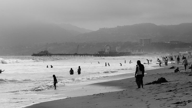 Venice-027 by The original David L, on Flickr INTJ Mastermind fucked around with this message at 15:16 on May 21, 2013 |
|
#
?
May 21, 2013 15:11
|
|
|
INTJ Mastermind posted:The patch of light works really well. From a lighting perspective, we could use some back-lighting to separate her hair from the leaves of the tree, and to seperate her rear eye from the background. Her brown eye just kind of blends right into the leaves, which is a bit awkward. Your other two pictures look great btw! The fog really helps this image. Telephoto compression can crush the feeling of depth in a photo like this and make it sort of boring but here some of the depth is preserved by the fog that gradually swallows things up as they fade into the background. The emptiness of the fog in the top-left also serves to counterbalance the busy beach scene in the bottom-right. You might consider the horizon line of this photo for your flickr or facebook banner. Foggy horizons make excellent skinny, horizontal banners.
|
|
#
?
May 21, 2013 16:16
|
|

|
XTimmy posted:Portrait thread is a little light on critique at the moment so I'm putting these up here. This is really nice. Seems a touch underexposed but at the point where you could either leave it if you want or boost it for a little more impact.
|
|
#
?
May 22, 2013 04:51
|
|

|
The light on the eyes reminds me of a black and white noir movie, very nice. The rest feels a little underexposed, but maybe it has to be to make the contrast with the eyes work... The figure/ground relationship here is excellent, the bright trees behind her upper body framed by the dark leaves, and the bright patches of sunlight on the ground making her dark legs stand out. The contrast does seem a little harsh though - the aforementioned figure/ground is strong enough naturally that it doesn't need to be overly accentuated. Again, the figure/ground is great. And I like that you can't see his eyes in this, makes it more mysterious. INTJ Mastermind posted:
KingColliwog posted:
KingColliwog posted:
KingColliwog posted:
That's great. The off-centre composition is just right, and the natural light is beautiful. I'd have rotated the camera a little to the right to get the horizontals to line up just right, though. It feels like the bottom of the staircase diagonal should intersect at the same distance from the edge of the frame as the top part. I also think there's something in what the previous poster said about taking a step back with this one. Lovely, great texture and a nice balanced composition. Did you try it in colour first, or was it always going to be a black & white?  DSCF1952.jpg by fuglsnef, on Flickr  DSCF1902.jpg by fuglsnef, on Flickr  DSCF2125.jpg by fuglsnef, on Flickr
|
|
#
?
May 23, 2013 14:58
|
|
|
Awesome color/contrast in first shot. It's too bad that cable was dangling in the third shot, kinda messes up the hard angles and shadow/light a bit. Also dandelions are weird, everyone thinks of them as a weed, but they are kinda pretty. I maybe would have cropped them out if they weren't the focus of the shot. To contrib, a little bit of darkening in post to reduce the chaos of tons of little flowers jumbling together 
|
|
#
?
May 23, 2013 20:48
|
|

|
Cru Jones posted:To contrib, a little bit of darkening in post to reduce the chaos of tons of little flowers jumbling together I like how the composition leads the eye down a zig-zag path through the frame, the whole thing is really Zen-like. One suggestion to try is experiment with a shallower DOF next time and try to get one flower in particular really sharp and blur out the rest. Here's my submission. I'm really liking this whole B+W photography thing and especially the ability to selectively darken/lighten specific colors!  Venice-016 by The original David L, on Flickr
|
|
#
?
May 24, 2013 01:47
|
|
|
INTJ Mastermind posted:
I would have stepped back/zoomed out a little so her feet aren't chopped off, especially if you could capture some of the undertow swirling around her feet. I really like everything else about the shot though. I finally finished editing photos from my aunt's wedding back at the start of April. I'm not a professional and I'd never shot anything like this before, so it was quite a challenge. To make matters worse, the ceremony was outdoors and backlit, so I had to do a lot of work (eg dodging up faces) on some of the shots to try and make them not look so flat, something I've never really done before either.  44c by euannz, on Flickr Found myself going with a different approach in the post on this shot, more of an old-fashioned low-contrast feel. I'm not even sure why, but I liked the result and kept it. Perhaps I should have kept it consistent with the rest to give them a more cohesive feel, I dunno.  58c by euannz, on Flickr Also there was a helicopter ride to a nearby mountaintop for a photoshoot with gimmicky props. Not shown here: gimmicky props. I had to go with a square crop here to remove my shadow from the shot so it's a bit of an unorthodox composition but I liked the result.  97c by euannz, on Flickr
|
|
#
?
May 24, 2013 02:43
|
|


|
Cru Jones posted:Awesome color/contrast in first shot. It's too bad that cable was dangling in the third shot, kinda messes up the hard angles and shadow/light a bit. The burning does not come across as natural - I would go back and try to redo it more subtly. Wafflecopper posted:
When you dodge the faces like that you have to watch out for unnatural skin tones. Your first photo is a good example of that - if you are in lightroom, drop the orange and red saturation to taste and boost the luminosity as well. You may need to add contrast or clarity back to the face after this as well. Don't overdo it. The second is overdone on the vignetting. It highlights your washed out processing, which without the vignette could maybe be something your clients might like but as makes it look artificial. Are you using presets? Your 3rd is the strongest. I might have cropped some of the sky, maybe going for a 5x6 crop or 8x10 if they need something standard for print to lose that empty space and accentuate your subjects. David Pratt posted:
Good stuff here. Love the first - took me a minute to see that great reflection If I had viewed it bigger I don't think it would have taken me as long. Second is good but maybe a bit cliche. Third I also really like and disagree about cropping the dandelions as posted earlier or them being the subject - I think you integrated them well and they are a nice contrast from all of the geometry. -------- 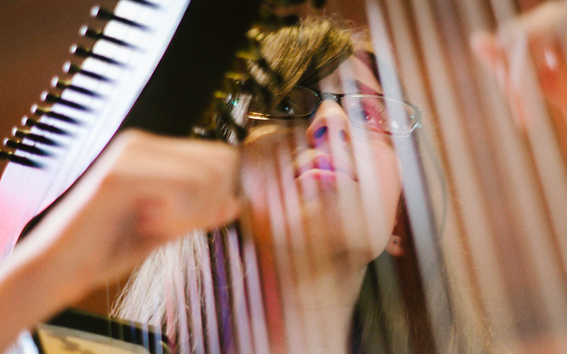 DSC03195-Edit by Paul Hofreiter, on Flickr  DSCF3130 by Paul Hofreiter, on Flickr  DSCF3222 by Paul Hofreiter, on Flickr
|
|
#
?
May 24, 2013 07:18
|
|
|
rio posted:
The framing on the first is fantastic. Maybe it's my monitor, but it seems like it has some magenta push. This makes the first thing I see is her right nostril, which looks a bit discolored. I'm no good with interior shots, but I'll give them a shot. There's a lot to look at in the classroom shot. I'm not sure what the focal point is, honestly. The blue trash can is unusually lit compared to the rest of the room and really stands out in the larger version. Maybe that's how it's supposed to be? The last is a neat shot, a window into a world. Good job getting the exposure correct with so many variables. My only wish is that I could see the head of the woman standing there. Mine from today.  great blue heron by philip painter, on Flickr
|
|
#
?
May 25, 2013 03:42
|
|

|
Fake Ken Rockwell posted:I like shots like this, the overpass interrupts the light, and we get to see a interplay of light and shadow. I would like to have seen more of either the top or bottom (whichever is more interesting). Did you crop, or is it a square format negative? Yeah, it's a 6x6 negative with a folder from the 40's. I cropped it just a little bit to get both sides even. I'd also like to thank everybody for the praise (and the criticism to the other photos). It's really good as a beginner to see that people like one my shots. It's actually the ambulance entrance for a hospital near where I study and I had been eyeing it for quite some time for a picture. quote:Mine from today. I think there's a lack of contrast between the bird and the background. The colours are the same and the background isn't really blurred out. Maybe a wider aperture? Dodge/burn so the bird is a little brighter might help too. Also, the vertical lines right in front of his beak are making me confused... What are they? edit: Took this at a friend's party the other day. God manual focusing at 1.7 is bad for situations where you need speed, this is probably the only shot rightly focused from the whole roll...  Bru por primoitcho, no Flickr Tri-x @1600. Primo Itch fucked around with this message at 21:58 on May 25, 2013 |
|
#
?
May 25, 2013 20:13
|
|
|
I really like this one, but then again I might be totally off here:  (USER WAS PUT ON PROBATION FOR THIS POST)
|
|
#
?
May 27, 2013 14:15
|
|


|
VomitOnLino posted:
I like it, the different lights being close in color has a nice look, might have tried a B/W conversion see if you could have played with the shapes and contrast a bit. Here's one from last fall I've always liked 
|
|
#
?
May 28, 2013 14:12
|
|
|
XTimmy posted:
I really like this overall, although I don't like how the shadows are completely clipped, especially since the transition from detail to complete black is so harsh. Another thing I noticed is that the pattern of her shirt kind of blends in with the background and so it kind of looks like she has an invisible torso. Here are some photos I took last summer. I like them, but I'm not sure why. Please tell me why they are terrible (or not??).  Untitled by explosive_decompression, on Flickr  Untitled by explosive_decompression, on Flickr  Untitled by explosive_decompression, on Flickr
|
|
#
?
May 29, 2013 01:50
|
|

|
Mistook this thread for the terrible thread.. I mean the other terrible thread. Anyway, I guess this is your friendly reminder not to post overly tired. I'll try to reciprocate. Primo Itch posted:
I like this, it shows/has some personality. There's two nitpicks here - one being the plastic cup near the right end of the frame. Two would be that I find the contrast a bit shallow. Now I realize that pulling it down all the way to black may not be very flattering, but I wonder if there is not at least a little bit more that could be done. My point is this: With color hi-key usually works, but with black and white (which we don't naturally see) I feel that the viewer usually needs a point of reference to be able to place the tones. This, too - is kind of nice. I like the shadow across the veranda and the geometry play of the house as well. The thing that bugs me most - is the mowed lawn in front. It somehow seems off. Can't put it in better words, but it kind of clashes with the feeling of the rest of the picture. Other than that the shed on the right is a bit dark, I wish there was a tiny bit more detail there. Also, again personal preference, maybe take down the saturation a notch, it seems very vivid when the subject matter isn't.
|
|
#
?
May 29, 2013 01:58
|
|
|
Primo Itch posted:Yeah, it's a 6x6 negative with a folder from the 40's. I cropped it just a little bit to get both sides even. This just isn't doing anything for me. Her expression is interesting but to me it's not enough to carry the image. If it was taken with an iPhone, I think we'd relegate it to "snapshot" but the medium does not, to me, elevate the image. ...  
TsarAleksi fucked around with this message at 02:25 on May 29, 2013 |
|
#
?
May 29, 2013 02:20
|
|
|
TsarAleksi posted:This just isn't doing anything for me. Her expression is interesting but to me it's not enough to carry the image. If it was taken with an iPhone, I think we'd relegate it to "snapshot" but the medium does not, to me, elevate the image. I disagree, I think it's a neat well executed portrait. I could imagine it being used on the sleeve of a hardback book for the author bio. It has that intellectual look to it.
|
|
#
?
May 29, 2013 02:33
|
|

|
She's straight out of a Woody Allen film. I really like it a lot, she's got a ton of character and the light is terrific but agree that it needs a deeper contrast, right now it kind of looks accidental. Also agreed on the cup - maybe it could be cloned out?
|
|
#
?
May 30, 2013 02:04
|
|

|
could use just a little more contrast to separate the kid from the wall, even if you need to dodge just a hint. The low contrast look is otherwise pretty effective.Subyng posted:Here are some photos I took last summer. I like them, but I'm not sure why. Please tell me why they are terrible (or not??). The second works a little better than the third for me, but I think the subject needs more context in both cases. What's being bulldozed? Are there perturbed row house residents hanging around gawking at the construction? The shadows also suggest that you were shooting at a time of day where black and white tells your story a little better than color. VomitOnLino posted:I really like this one, but then again I might be totally off here: Primo Itch posted:edit: Took this at a friend's party the other day. God manual focusing at 1.7 is bad for situations where you need speed, this is probably the only shot rightly focused from the whole roll... Crossposted from the landscape thread, looking for a little more feedback. All Ektar, all Yashica (Lynx, -D, Lynx).  Zion by voodoorootbeer, on Flickr  in progress by voodoorootbeer, on Flickr  119 N by voodoorootbeer, on Flickr
|
|
#
?
May 31, 2013 17:40
|
|

|
voodoorootbeer posted:Crossposted from the landscape thread, looking for a little more feedback. All Ektar, all Yashica (Lynx, -D, Lynx). The first and the third I dig, they've got those golden late-afternoon-to-sunset tones that I really enjoy at the moment. Middle one, I think the shallow DOF really doesn't play well here; if you're showing me a window and a portal to whats beyond I'd like to see through it clearly.  Blast furnace by NoneMoreNegative, on Flickr Too vignette-y? Was going for a grubby industrial tone but may have overstepped the mark Looking at this again I'm wondering if a square crop of the main structure might work better. 
|
|
#
?
May 31, 2013 22:46
|
|


|
voodoorootbeer posted:could use just a little more contrast to separate the kid from the wall, even if you need to dodge just a hint. The low contrast look is otherwise pretty effective. I agree, the middle shot feels VERY claustrophobic, especially compared to the openness of the other two shots. I've been learning on a Canon S90 for the past few months, reading and taking a ton of bad pictures. I'm starting to get shots I think go past "nice snapshots" but I'm really just looking to document my family in a more beautiful way and grow. It feels weird posting up against people with actual talent/equipment, but I need better feedback than my wife saying, "Oh, that looks nice," to every one I show her. Hopefully this is an appropriate thread for critiquing this quality of work (ie, babies and pets). All of these were shot RAW and fiddled with in CS6, so feel free to pick at what I need to work on there, too.     (USER WAS PUT ON PROBATION FOR THIS POST)
|
|
#
?
May 31, 2013 23:45
|
|


|
voodoorootbeer posted:Crossposted from the landscape thread, looking for a little more feedback. All Ektar, all Yashica (Lynx, -D, Lynx). I really like the colors here. Was this right out of the camera, or was it edited in post? Of the three, my favorite is probably the first one. I really like the big sky that it shows. I can see where you were going with the greenhouse photo, but I'm not sure how well it works. It feels a little disjointed, maybe it's the crop. Still amazing colors though. I'm a fan of the third one as well, it just seems like an edifice to modernity, though I wish there was more of the water in the bottom, but I don't know if there was anything that could be done about that.  DSC_0312 by jpitha, on Flickr  DSC_0607 by jpitha, on Flickr
|
|
#
?
Jun 1, 2013 01:34
|
|


|
NoneMoreNegative posted:The first and the third I dig, they've got those golden late-afternoon-to-sunset tones that I really enjoy at the moment. I love industrial shots, these look really great.I do agree that the vignette is a bit much on the first shot, but I think the crop and composition is better there too. The coal (?) ramp brings me down and off the edge of the frame in the square crop where hitting the background tower in the standard crop pulls me back into the image. It just feels a bit more complete overall. Here's a few old ones from DC. Such a fun city to shoot in.  IMG_8579 by Opals25, on Flickr  IMG_6788 by Opals25, on Flickr  IMG_8611 by Opals25, on Flickr
|
|
#
?
Jun 1, 2013 04:42
|
|

|
The colors in all of those are straight out of camera, North Coast Photo scans, although I did a little light sharpening in Lightroom. I'm really in love with Ektar after those two rolls. I was really going for geometry with the green house shot but only noticed what I should have done with the back window after I got the rolls back. Luckily I'm there every week so I can just re shoot stopped down.
|
|
#
?
Jun 1, 2013 17:17
|
|
|
Huxley posted:
I'll take a stab at these pictures because I am sort of in the same boat as you. I'm new to photography, and my wife is currently deployed so I haven't had many chances to shoot much of anything other than my kids for the last 5 months. As parents, we really like pictures of our kids because we have an emotional attachment to them. The issue with baby/kid pictures and showing other people is that no one outside of your family/close friends really wants to see them, unless they are really really interesting. This is the most important part imo: Try to tell a story with the photo. And that is not always an easy thing to do given that kids are so unpredictable. But that doesn't mean they aren't worth being critiqued. Don't worry about the gear aspect either. Besides, the s90 is a really nice camera. But I will critique what I can and hope someone does the same with my dumb kid pics. First pic: First, it helps to have a photogenic kid, which you do. Nice expression and nice eyes. There looks to be a slight halo-ish effect around her? I don't know if the shutter was too slow or if was an effect of a possible flash, someone smarter than me can tell ya. But it makes it look a little soft around the edge. Also, and this is a personal thing, the very tip of her finger is cut off. Its not a big deal, but looking for things like that will make all your shots better overall. Second pic: I wish the background was more interesting. With so much empty space it makes it look more like a quick snapshot and less like a planned shot. Like I said earlier, kids are unpredictable, but you want to make them look more planned. I want something disconcerting to be happening behind him to make the expression have a meaning. Third: Least favorite of the three, taking pics of kids (or anything) next to a window/door messes up the exposure and darkens the part we want to see (the face). There is also no interaction between the holder and the holdee, at least none that can be seen because his face is cut off. And as always check your verticals. How much did you fiddle with the highlights/shadows? You might be able to balance it out a little more by lowering the highlights/raising the shadows. Fourth: I am not qualified to critique dog shots. Be he/she looks like a GOOD BOY, YES YOU ARE. So some of my kid pics. First shot with a 6d, second with a G15 (which is pretty much the same as your s90) and the last I think was a t2i.  20130401-IMG_2550 by LeeMHarp, on Flickr Should have paid more attention to my cropping/the verticals.  20130515-IMG_0444 by LeeMHarp, on Flickr  Untitled by LeeMHarp, on Flickr Trying to work on black and white conversions. I mean this looks..okay to me, but any help would be appreciated.
|
|
#
?
Jun 2, 2013 02:34
|
|

|

|
| # ? May 24, 2024 22:20 |
|
|
voodoorootbeer posted:
NoneMoreNegative posted:Middle one, I think the shallow DOF really doesn't play well here; if you're showing me a window and a portal to whats beyond I'd like to see through it clearly. Counterpoint: having the focus up front and out of focus beyond the window makes it seem like the greenery is invading into the inside. I think a greater DOF would work well if the frame was just the door/shutter thing and it was around the top too, but as is it's like the window is a portcullis that's failed to stop the ingress of the grass, and establishing the outside as a separate region is important for that.
|
|
#
?
Jun 2, 2013 04:36
|
|