|
Lobok posted:What image is this reminding me of? It's either an iconic poster for another movie or it's a book cover. I know I've seen those clasping hands somewhere. 
|
 #
?
May 19, 2013 23:29
#
?
May 19, 2013 23:29
|
|

|

|
| # ? Jun 7, 2024 18:53 |
|
|
HUNDU THE BEAST GOD posted:Oddly, I think he would make a better Steven Biko. I just had an image of Idris Elba in a biopic titled "I write what I like," and got unreasonably excited.
|
|
#
?
May 20, 2013 01:34
|
|

|
bowser posted:This makes me so goddamn sad. Fast Five needs to be followed up by Furious Six, it just makes sense! 
|
|
#
?
May 20, 2013 02:30
|
|


|
LARGE THE HEAD posted:I watched Chinatown for the first time a couple days ago. These really piss me off, especially the first one. So based on that experience would you define Jack Nicholson's receding hairline as one of the definitive, poster-worthy images from that movie or
|
|
#
?
May 20, 2013 07:56
|
|


|
Red Bones posted:So based on that experience would you define Jack Nicholson's receding hairline as one of the definitive, poster-worthy images from that movie or It's especially grating as the original poster had this wave motif which just looks pleasant and art-deco unless you know that water's a huge plot point.
|
|
#
?
May 20, 2013 09:40
|
|
|
...but why, why would you do this?
|
|
#
?
May 20, 2013 10:36
|
|

|
Jefferoo posted:...but why, why would you do this?
|
|
#
?
May 20, 2013 10:39
|
|
|
Welcome to my nightmares.      
|
|
#
?
May 20, 2013 10:46
|
|
|
This one is a neat concept. Ah yes, that scene where the monkey spontaneously evolves into James Bond and shoots a bad guy was truly the best moment in Skyfall.
|
|
#
?
May 20, 2013 11:26
|
|

|
Jefferoo posted:...but why, why would you do this? Why is it all so grey, why I don't understand why would you take a beautiful photograph of space and make it grey and bland  Jefferoo posted:Welcome to my nightmares. I like the idea of turning the island into a blood splatter and the island and the grid are actually very important motifs to Battle Royale, but the fake poster effects are horrible and while the original poster isn't great, it had a much better idea by using a class photo as the main image. That skyfall one is atrocious, only having a shadow on the last figure and using the evolution of man image for some bizarre reason. When was that ever a part of Skyfall at all? Looking at it again, is it showing bond reaching his peak and then falling down? Because I read it as a really bad representation of that scene from the start where he's fighting another guy and then he falls off a bridge. Of course the best version of the Battle Royale poster is this bad boy 
|
|
#
?
May 20, 2013 11:32
|
|
|
I like how the tag-line is some spark-notes summary of the novel. I also like everything else.
|
|
#
?
May 20, 2013 11:39
|
|
|
You don't get to 500 million friends without receiving one friend request.
|
|
#
?
May 20, 2013 12:34
|
|

|
Lobok posted:What image is this reminding me of? It's either an iconic poster for another movie or it's a book cover. I know I've seen those clasping hands somewhere.  ? ?
|
|
#
?
May 20, 2013 12:51
|
|
|
HAVE A NICE COLT DPINT edit: Directed by EDGAR WRIGNT Saturniid19 fucked around with this message at 15:19 on May 20, 2013 |
|
#
?
May 20, 2013 14:57
|
|

|
Saturniid19 posted:HAVE A NICE COLT DPINT Goddamn, I swear I didn't even notice that, and it's not even a crack at an unreadable font. It literally says that.
|
|
#
?
May 20, 2013 15:12
|
|

|
Nah, that one came up when I tried GIS'ing but there's something about the colour scheme and design that seems to match, too. I dunno, having worked in a bookstore for so long it could be anything from the last sixty years.
|
|
#
?
May 20, 2013 17:00
|
|

|
This one actually works pretty well, because it illustrates two things that are clear points in the film. A)The movie takes place on an island and B)It has a motif centered around killing. There's also the added bonus of the grid being emphasized, indicating that it means something more than "here's a map of the island!" This is probably the best "minimalist" poster I've seen so far.
|
|
#
?
May 20, 2013 17:39
|
|

|
The wrinkled/creased paper texture works for that one because, well, it's supposed to bring to mind the physical map used by the students during the competition. It's probably the only fan-made, minimalist poster I've seen on here that has a legitimate reason to use that motif.
|
|
#
?
May 20, 2013 18:15
|
|


|
Red Bones posted:
Looks like a shoddier version of the first teaser poster for the film.  And Genie is cool. 
|
|
#
?
May 20, 2013 20:51
|
|


|
Two more character posters for The Wolverine Viper  Yukio 
|
|
#
?
May 20, 2013 21:37
|
|


|
Canned Panda posted:Two more character posters for The Wolverine These are still awesome.
|
|
#
?
May 20, 2013 22:04
|
|

|
I can't not think of the black arms being the guys own arms, like hes telling a really bad "What has two thumbs?" joke.
|
|
#
?
May 20, 2013 22:10
|
|

|
Have some terrible minimalist posters.      
|
|
#
?
May 20, 2013 22:50
|
|


|
I got nothing. Was there a Ouija board in Forrest Gump?
|
|
#
?
May 20, 2013 22:55
|
|

|
............. Am I missing something? What even is this?
|
|
#
?
May 20, 2013 22:56
|
|


|
This is almost kind of clever. I don't hate it with a burning passion, just a regular passion. That Karate Kid poster looks like boobies.
|
|
#
?
May 20, 2013 22:57
|
|
|
Forrest Gump and the Deathly Hallows.
|
|
#
?
May 20, 2013 22:58
|
|
|
Is this like a Toblerone mixed with a Toffifay or what.
|
|
#
?
May 20, 2013 23:24
|
|

|
Yodzilla posted:Is this like a Toblerone mixed with a Toffifay or what. It's the Illuminati symbol. fnord
|
|
#
?
May 20, 2013 23:37
|
|

|
quote:
It's probably a CMYK jpeg.
|
|
#
?
May 20, 2013 23:41
|
|


|
Tell me this isn't supposed to be a pea in a pod.
|
|
#
?
May 20, 2013 23:42
|
|


|
Geekboy posted:This is almost kind of clever. I don't hate it with a burning passion, just a regular passion. I hate it cause it looks like the ship is standing on its nose.
|
|
#
?
May 20, 2013 23:43
|
|
|
Darthemed posted:Tell me this isn't supposed to be a pea in a pod. Maybe him and Jenny going together "like peas and carrots?" My god even if that is the explanation that is bad
|
|
#
?
May 21, 2013 00:04
|
|
|
No seriously, what the gently caress is this?
|
|
#
?
May 21, 2013 00:15
|
|

|
Nikaer Drekin posted:Maybe him and Jenny going together "like peas and carrots?" Oh my god. I think you're right. Oh jesus.
|
|
#
?
May 21, 2013 00:23
|
|

|
Oh my god. Oh my god.
|
|
#
?
May 21, 2013 00:28
|
|
|
Darthemed posted:Tell me this isn't supposed to be a pea in a pod. I'm pretty sure this is it. And I loving hate it for that. But they can't all be that bad, right-  GODDAMMIT Nikaer Drekin posted:Maybe him and Jenny going together "like peas and carrots?" No. I refuse to believe this. Nuh-uh.
|
|
#
?
May 21, 2013 00:29
|
|
|
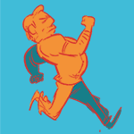
I guess that the Gump poster could represent the running across America bit. The orange triangle is a road and the green circle is Forrest.
|
|
#
?
May 21, 2013 00:30
|
|
|
I don't know, I think this is hilarious. Why why why would anyone think they should make a different Jaws poster? In what universe does the traditional Jaws poster need any improvement or alternative?
|
|
#
?
May 21, 2013 00:35
|
|
|

|
| # ? Jun 7, 2024 18:53 |
|
|

|
|
#
?
May 21, 2013 00:37
|
|