


|
Lance Streetman posted:I'm pretty sure this is it. And I loving hate it for that. But they can't all be that bad, right- Surely, this is a parody of minimalist posters. I refuse to believe otherwise.
|
 #
?
May 21, 2013 00:43
#
?
May 21, 2013 00:43
|
|


|

|
| # ? Jun 7, 2024 00:14 |
|
|
It's very possible that all of these crappy minimalist posters come from crappy technical college Illustrator class assignments.
|
|
#
?
May 21, 2013 00:44
|
|

|
Now I want a Domo-kun movie. 
|
|
#
?
May 21, 2013 00:48
|
|


|
Wow, that could be about anything. Like a giant boulder!  Or a different giant boulder! 
|
|
#
?
May 21, 2013 01:05
|
|


|
 "I creeched louder still, creeching: 'Am I just to be like a box of chocolates?'"
|
|
#
?
May 21, 2013 01:16
|
|
|
TRYYYYYYYYY THE
|
|
#
?
May 21, 2013 01:21
|
|

|
Nikaer Drekin posted:Maybe him and Jenny going together "like peas and carrots?" Hahahahaha, gently caress
|
|
#
?
May 21, 2013 01:38
|
|
|
Geekboy posted:This is almost kind of clever. I don't hate it with a burning passion, just a regular passion. I don't think it's bad at all. And I honestly don't think that "The Room" poster a few posts back is that bad, either. I just can't get past how tonally wrong that kind of minimalism is for the movies they're depicting. That "Matrix" one of the battery is still the worst to me, because of just how off it is in every way. The palette's wrong, the content is inconsequential, nothing in the design speaks to the actual film it represents, aesthetically or tonally. And it's so goddamn easy to make a "Matrix" poster - even a hyper minimal one - that does. Every time new images find this thread, the corpse of Saul Bass manages to cry another tear.
|
|
#
?
May 21, 2013 01:49
|
|


|
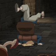
Description from the source:quote:Minimalist movie poster for the movie "Forrest Gump". Ah, now I understand.
|
|
#
?
May 21, 2013 01:57
|
|

|
LesterGroans posted:I don't know, I think this is hilarious. Either way, this thread was a lot better when the ratio of discussion about weaknesses/strengths/trends in real movie posters was higher than the number of "look how bad this minimalist fan poster is" comments.
|
|
#
?
May 21, 2013 02:19
|
|
|
Other than possibly a silhouette of a barney the dinosaur costume, all the interpretations I can form from this poster are horribly, horribly scatalogical
|
|
#
?
May 21, 2013 02:28
|
|


|
Or an asymmetrical Watchmen poster.
|
|
#
?
May 21, 2013 03:01
|
|

|
I thought it was a horrid Jurassic Park poster right until I scrolled down to the title.
|
|
#
?
May 21, 2013 03:06
|
|

|
BOAT SHOWBOAT posted:Don't get me wrong, this poster and basically every minimalist fan poster are horrible. But none of these artists are truthfully trying to "improve" or even make "alternatives" to the real poster. It's just fan art. It's 15 year old kids expressing their enjoyment of a film on their Tumblr. It doesn't make it any less lovely, but talking about them in relation to the real poster is kind of off point. Here are a couple of good ones (in my opinion of course) from movies I've watched recently: Sightseers  Ties in with the story, catches your eye and is humorous so I think it's successful. Take Shelter  You've seen this poster and this movie I'm sure so you know it's good. Shotgun Stories  If you haven't watched this, you should remedy that immediately. I loving hate all laurel leaves though and I think they need to stop using them. Chained  Kinda silly with the scratching effect, but it was a small movie and D'Onofrio is menacing And an 80s as gently caress one from a movie that was funny when I was 6, Joysticks  It's pretty dumb as a grown man but the poster did it's job when I was young and the internet didn't exist.
|
|
#
?
May 21, 2013 03:15
|
|

|
If the text on that Titanic poster were more legible, and they hadn't done the fold-lines I would call it good. As is, it's merely clever but poorly implemented.
|
|
#
?
May 21, 2013 03:42
|
|
|
Here's the best fan poster
|
|
#
?
May 21, 2013 03:52
|
|


|
The Saddest Rhino posted:Here's the best fan poster Fan poster or future Criterion cover?
|
|
#
?
May 21, 2013 03:59
|
|

|
It's a work of art is what it is.
|
|
#
?
May 21, 2013 04:02
|
|
|
Wow, that really is the best fan poster. Who drew it?
|
|
#
?
May 21, 2013 04:03
|
|

|
The Saddest Rhino posted:Here's the best fan poster Animated by Mike Judge?
|
|
#
?
May 21, 2013 04:03
|
|


|
I can't hate this. It's impossible for me to hate this.
|
|
#
?
May 21, 2013 05:32
|
|

|
Wendell posted:Wow, that really is the best fan poster. Who drew it? Some guy called Jimmy Giegerich. I found his website through a GIS search of that poster. http://www.jgillustration.com/
|
|
#
?
May 21, 2013 05:37
|
|
|
Rageaholic Monkey posted:Animated by Mike Judge? Looks like Superjail! to me.
|
|
#
?
May 21, 2013 05:41
|
|

|
MikeJF posted:None of these bother me, but oddly, (Star Trek Into Darkness spoiler) Benedict Cumberbatch playing Khan after Ricardo Montalb�n does bother me. I suppose because ostensibly due to the premise of how the new films relate to the old he's a recast of the same Khan Montalb�n played rather than a reboot. Not to dredge this back up, but rumor has it that there were points in the production where Cumberbatch's character was not Khan and the identity of who he was in the script was in flux. Taking this into context, it makes a lot more sense that they cast somebody who didn't fit the evolving character and tried to create the best story they thought they could rather than rejigger things to fit the actor they had cast.
|
|
#
?
May 21, 2013 06:14
|
|
|
Friends Are Evil posted:Have some terrible minimalist posters. My first thought on this one was something about a GPS, and the green dot was Forrest. Like he was running, or something.
|
|
#
?
May 21, 2013 06:27
|
|


|
Ariza posted:And an 80s as gently caress one from a movie that was funny when I was 6, Joysticks I'm pretty sure that this is the best of all posters. quote:It's pretty dumb as a grown man but the poster did it's job when I was young and the internet didn't exist. Uhhhh.... 
|
|
#
?
May 21, 2013 06:38
|
|

|
Set during the 70s, if you can belive that
|
|
#
?
May 21, 2013 07:15
|
|

|
CPL593H posted:Uhhhh.... We all chose to ignore the implications, man 
|
|
#
?
May 21, 2013 07:55
|
|
|
Red_Museum posted:Set during the 70s, if you can belive that Having never grown up in the 70s all the TV shows and films I've seen from it make me think that it was permanently overcast for the entire decade. If you want critical thinking, I like that poster. I don't know jack poo poo about the film, but the picture and the title tells me there's a guy in a a leather jacket with blood ties to a guy in a suit, there will be shooting because one man is holding a gun, and it is set in/about a city because there's one right there in the background. The small figures (although not too small to recognise the actors) mean that the city is equally dominating in the picture to tell you its important, and the bridge cuts up a lot of the otherwise empty and boring sky and funnels your vision towards the important characters. The white poster around it is simple, doesn't distract and the red/black/white goes well with the colours of the photograph.
|
|
#
?
May 21, 2013 08:17
|
|


|
Canned Panda posted:My first thought on this one was something about a GPS, and the green dot was Forrest. Like he was running, or something. I've figured it out. It's talking about Forrest's low IQ and intellect. Don't you see? He's doing the shape test and trying to fit a cylinder into a triangle shaped hole. It's both a commentary on the character of Forrest and how the poster artist sees these minimalist posters.
|
|
#
?
May 21, 2013 09:18
|
|

|
wigbone posted:I've figured it out. It's talking about Forrest's low IQ and intellect. Plus the cylinder fits into the hole so it's a metaphor for how different people can still find a life in a society that doesn't accept them.
|
|
#
?
May 21, 2013 09:26
|
|
|
Hey, I guess that poster is actually pretty drat good!  It's very layered.
|
|
#
?
May 21, 2013 09:36
|
|
|
Red_Museum posted:Set during the 70s, if you can belive that I haven't seen Crudup or Clive Owen in a while so this looks like a treat.
|
|
#
?
May 21, 2013 17:02
|
|
|
Red_Museum posted:Set during the 70s, if you can belive that
|
|
#
?
May 21, 2013 17:07
|
|

|
Red_Museum posted:Set during the 70s, if you can belive that Whatever the hell this is, I wanna see it now.
|
|
#
?
May 21, 2013 17:24
|
|

|
The trailer, with that music, makes me want to see it all that much more: http://www.youtube.com/watch?v=ONz6R4LF5nY It's refreshing to see a total throwback to 70's era, working class "cool" that isn't a Tarantino wankfest. And this is coming from somebody who's loved every Tarantino movie he's ever seen.
|
|
#
?
May 21, 2013 17:35
|
|

|
Red_Museum posted:Set during the 70s, if you can belive that That's a very good poster to be sure, but I don't think it's minimalist enough to be a great poster.
|
|
#
?
May 21, 2013 17:36
|
|

|
Tewratomeh posted:The trailer, with that music, makes me want to see it all that much more: It's like you're reading my mind. The combination of that poster and trailer has me completely sold.
|
|
#
?
May 21, 2013 17:38
|
|

|
Mechafunkzilla posted:That's a very good poster to be sure, but I don't think it's minimalist enough to be a great poster. Yeah, there's too much going on, it should just be a drop of blood and a bunch of neckties on a folded paper background.
|
|
#
?
May 21, 2013 17:40
|
|

|

|
| # ? Jun 7, 2024 00:14 |
|
|
Tewratomeh posted:The trailer, with that music, makes me want to see it all that much more: Tarantino is more about paying homage to the 70s instead of making movies based in the 70s. Crudup looks like a grown up Russel Hammond Looks like it could be fun!
|
|
#
?
May 21, 2013 17:43
|
|