


|
Huxley posted:I agree, the middle shot feels VERY claustrophobic, especially compared to the openness of the other two shots. Did you crop your photographs to a custom aspect ratio? I was doing that a lot when I first started making photos and it and once I stopped and focused more on composition and framing the photos started coming out a lot better. The first photo is my favorite, cute kid and expression. The hand throws me off a little, it just looks a little to big for a baby. The third photo is way to dark and your subjects are lost in the shadows. Maybe play with the shadow slider a little. Like Claw Massage said, dont worry about gear. Keep making photos and you will see improvement. Shot this the other day when I was dropping off a resume at a pizza place in Oakland.  Untitled by Jake Scallan, on Flickr
|
 #
?
Jun 2, 2013 21:33
#
?
Jun 2, 2013 21:33
|
|


|

|
| # ? May 25, 2024 00:36 |
|
|
Shampoo posted:
I think this would work better with 1/3 of left side of the picture cropped out, so that you see only the crisscrossing lines of the gravestones and the wall into the distance culminating in that spire thing.
|
|
#
?
Jun 2, 2013 22:56
|
|


|
The Sheriff Jake posted:Did you crop your photographs to a custom aspect ratio? I was doing that a lot when I first started making photos and it and once I stopped and focused more on composition and framing the photos started coming out a lot better. I used to do the exact same thing. I realised I needed to stop when I tried to get some prints made.
|
|
#
?
Jun 3, 2013 00:36
|
|
|
I like this one the best of the photos you posted. It's well exposed, well lit, and you captured a nice smile. It's funny that the wide angle distortion makes the baby's hand look enormous. If that wasn't intentional, watch out for it. Opals25 posted:
 House planet
|
|
#
?
Jun 3, 2013 01:24
|
|


|
Huxley posted:
This one just seems like a snapshot. To me, having your face chopped half way is somewhat disturbing and it's just far too dark. But again, the composition is not all that interesting. What in the picture should be interesting to me? While your kid is cute, there are lots of them out there and they by themselves don't make for a super interesting photo. So, now that I have given my critique (hard to do, but .. I see the reason for it) please have at it with me. I am getting back into all of this, starting to enjoy it a lot more. This is from a friends wedding, I did the music for it but also brought my camera. This is the groom perusing the playlist to see what was next. Lighting was super dim, shot with a 50mm @ 1.8. Not sure really what to do with it. I liked the glow of the screen off the face, etc.  IMG_0733.jpg by jarredsutherland, on Flickr mAlfunkti0n fucked around with this message at 19:16 on Jun 3, 2013 |
|
#
?
Jun 3, 2013 17:00
|
|
|
E: Oh hey should probably critique someone else's stuff so I don't get banned: So I like everything about this but maybe it's my eyes; she's not in focus much for the size of the photo? Perhaps it just looks big on my screen. Her blurry hand in the photo kinda distracts away from her face too, though I rarely take photos of kids this young. Please don't hate me. end edit Hey guys, I'm a newspaper photographer (I made a ramble post in the DSLR thread) who is trying to turn full time, and only recently have I started trying to get better, understand terminology and fiddle with my settings. I have a backlog of stuff to critique that I'll post, try to give a picture I'm happy with and a picture I'm not so happy with each day for your enjoyment. I don't have much criticism of my own to give others because I'm still starting out, but I'll do my best: First, a bad one:  0509_SNI_PTPioneer5 by Middleshoes, on Flickr I think what I did wrong was simply not enough exposure. The room was dark and in retrospect I should have focused more on one or two kids instead of trying to catch the group. I think that would have made it stronger with a better point of focus. One I like:  IMG_6274 by Middleshoes, on Flickr This was my first sporty-event, a 5k and I had a blast shooting it. She's a bit out of focus though, more of the water is clearly defined than the girl. A problem when shooting these kinds of events, especially from far away is I have to use the lighting provided. I'm completely unaware of using a flash to break up the shadows on someone instead of washing out their features completely, and need to work on it. crime fighting hog fucked around with this message at 20:07 on Jun 3, 2013 |
|
#
?
Jun 3, 2013 19:07
|
|
|
crime fighting hog posted:First, a bad one: What do you mean by "simply not enough exposure"? What I see wrong there is that you framed a shot with that huge blown out window in the background. In a situation like that you need to either have a fill flash to bring the room up to the level of the giant, bright, distracting window or you need to recompose so that there is no giant, bright, distracting window. I don't like the eye lines either. The kids are all looking off camera at...? Show us (or at least hint at) what they're looking at. Nothing generates internal structure in a photograph quite like an eye line, we are always interested to see what other people are looking at.
|
|
#
?
Jun 3, 2013 20:06
|
|
|
Dren posted:What do you mean by "simply not enough exposure"? By not enough exposure, I mean the photo is dark. I should have just said that. They were looking at a teacher who was standing on the other side of the room. I have other shots (we didn't use this one) where I took it over the teacher's shoulder of the class raising their answers. I'll see if I can find it at home.
|
|
#
?
Jun 3, 2013 20:08
|
|
|
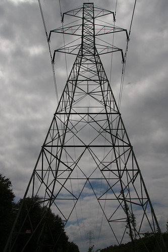
mAlfunkti0n posted:I live under power lines. I feel like it's underexposed a bit, but I'm not sure how to fix that without either blowing out the sky metering elsewhere or making it to dark like this while keeping the sky mostly in check. I agree, the sky is a bit dark, although I like how the tower/trees are nice and black, it helps with the monolithic feel of the picture. I would try pushing the whites and highlights a bit more, or raising exposure and lowering the blacks/shadows to keep the tower dark. It might be worth it to convert to black and white and up the contrast too, you could probably get away with making the sky a bit brighter (and honestly the blue sky poking out seems like more of a distraction than anything else). fake edit: looking at it full size I see that there is a bit of color in the shadows still, so you can either just increase the exposure a bit to make that clearer nad make the colors stand out more, or try going full on black and white. Or somewhere in between! I mean, if your sky was clear and blue and flat I would expose for the trees and tower, but the sky's got some texture and stuff, more so than the trees and tower do here. I am a fan of the blacked out foreground look for that sort of shot though:  _5250407.jpg by MrDespair, on Flickr  _5270451.jpg by MrDespair, on Flickr
|
|
#
?
Jun 3, 2013 21:24
|
|


|
Thanks for the critiques. The dark shot, I was actually shooting for something more in the family of this:mAlfunkti0n posted:
and just missed. The idea was the window was the focus of the picture, but at that angle you can't see anything worth seeing out the window, anyway. And the advice of shooting full-frame and not worrying with a crop is good. My brain tends to say, "Just pull the trigger and worry about composition in crop," but I'm not going to learn much that way. crime fighting hog posted:
Here's some critique very specific to being a newspaper photographer. Edit: which you can ignore if you've been a newspaper photog for 30 years and this comes off like talking down to your experience, which is not my intention at all. I spent 10 years laying out newspaper pages, and I definitely would have run this one in the package somewhere, if just because it had three faces in it. A tighter crop, or a strong focus on one face, may have made a stronger image, but if this was a story that jumped inside or needed multiple pieces of art, a shot like this is completely necessary, and this is a fine example of one. Depending on how big your circulation is, Clara's picture in the back there may move the needle. And a Clara in two packages every paper for an entire year makes a difference. And I promise those are the kinds of things your designers are thinking about. As a person who has pulled, sized and worked with a million of these kinds of shots, this one is just about perfect. I would probably lighten it before using it anyway to account for dot gain depending on if its a color or greyscale page. It could be cropped down and lose the entire window, or Clara could still be cropped out pretty cleanly to fit plenty of shapes and sizes. Your deskers are going to abuse everything you give them, and the kind of flexibility a shot like this gives is going to look a lot better after that abuse. This in comparison to your mudder picture, which is a better executed photo, but is worse from a newspaper perspective because it's inflexible and her face is the darkest part of the photo, which is only going to get worse in four plates of CMYK. Huxley fucked around with this message at 23:25 on Jun 3, 2013 |
|
#
?
Jun 3, 2013 21:55
|
|


|
Huxley posted:I spent 10 years laying out newspaper pages, and I definitely would have run this one in the package somewhere, if just because it had three faces in it. A tighter crop, or a strong focus on one face, may have made a stronger image, but if this was a story that jumped inside or needed multiple pieces of art, a shot like this is completely necessary, and this is a fine example of one. Depending on how big your circulation is, Clara's picture in the back there may move the needle. And a Clara in two packages every paper for an entire year makes a difference. And I promise those are the kinds of things they're your designers are thinking about. It sounds like an interesting world and I for one would love to know more about it. Maybe an A/T thread, I'm sure we have more than a few goons who've worked in the papers. ")
|
|
#
?
Jun 3, 2013 22:22
|
|
|
To quote the editor of the Council Bluffs newspaper: Faces sell papers. I was showing him my portfolio just after I got outta college and each photo without a person's face clearly show he said "why didn't you take a shot when they turned around? Did you get their names?" You want composition, creativity, etc. All that good stuff. The photos that make you go 'wow' and stay with you. But faces sell papers. Mom wants to flip to page 3 and see little Johnny's gap tooth grin with his Eagle Scout project or whatever. Getting someone's face is pretty much key to what we try to do. At my paper our rule is we don't publish a photo unless we have the person's name most of the time. Also, Huxley: that's good advice to hear, and I've only been working out of college for a year and a half now Just trying to keep learning.
|
|
#
?
Jun 3, 2013 22:38
|
|
|
I've been thinking a lot more while looking at things to try to find more interesting shots. It is working out so far. IMG_0924.jpg by jarredsutherland, on Flickr
|
|
#
?
Jun 3, 2013 22:52
|
|
|
Hey let's keep this mediocre train going: Photo I don't like:  0509_SNI_PTcapow05 by Middleshoes, on Flickr So this guy goes around schools doing chemistry 'magic tricks' for kids, really neat stuff. I had no idea what to expect and was just dicking around with my shutter speed. Getting the flame in the air like that was merely luck on my part, but I think I could have done better by changing my angle so the balloon wasn't blocking part of the crowd. Photo I do like:  0516_SNI_BLFair2 by Middleshoes, on Flickr I surprised myself with this one at the Ren faire. Horse looks majestic as gently caress but the color does seem a bit flat. Any ideas what I could have done to improve it?
|
|
#
?
Jun 4, 2013 19:03
|
|
|
crime fighting hog posted:
Looks like you shot in the middle of the day. That's gonna make things flat as hell regardless what you do.
|
|
#
?
Jun 4, 2013 19:44
|
|

|
Casu Marzu posted:Looks like you shot in the middle of the day. That's gonna make things flat as hell regardless what you do. That's true, but as William T Hornaday has shown in his making-zoo-animals-look-loving-amazing tutorial, flat light can actually be a Good Thing if you're willing to put the time in afterwards to make your own light via dodging and burning. In that shot I'd darken the gently caress out of the crowd to highlight the rider, then maybe do some more selective darkening to add a bit more depth to the horse.
|
|
#
?
Jun 4, 2013 21:06
|
|
|
David Pratt posted:That's true, but as William T Hornaday has shown in his making-zoo-animals-look-loving-amazing tutorial, flat light can actually be a Good Thing if you're willing to put the time in afterwards to make your own light via dodging and burning. I was kind of hesitant about bringing up newspaper stuff, since this isn't a photojournalism-specific thread, but people seemed interested. That kind of manipulation is pretty forbidden in news photography in most shops. You can fiddle with sliders, but once you break out a brush tool, you've crossed a line. A rule I've always heard is, "if it didn't happen in-camera, it didn't happen." You'd be amazed how hardcore newspapers are about not doing that kind of stuff. A few years ago, a guy took a really nice "agony of defeat" style shot at a high school baseball game. It was basically perfect aside from a really distracting leg in the background. He clone stamped it out, and when people figured out he lost his job. I think another paper's photographer got a very similar shot standing next to him and it got him busted. Some places will do it as an editorial decision, the NY Daily News took some gore out of a front-page spread after the marathon bombing, but it's always a big deal. crime fighting hog posted:
The pink balloon does kind of lower the impact of the picture, but the real shame is those kids aren't sitting close enough to catch the fire light on their faces. Safety. 
Huxley fucked around with this message at 21:57 on Jun 4, 2013 |
|
#
?
Jun 4, 2013 21:48
|
|
|
How do you feel about the recent world press photo controversy, where the winner seems to have made a composite from a single RAW file? It doesn't seem like its functionally any different from what Hornaday did. One of the experts brought in said "When I compare the RAW file with the prizewinning version I can indeed see that there has been a fair amount of post-production, in the sense that some areas have been made lighter and others darker," but it wasn't a problem because it wasn't composited from multiple exposures or clonestamped etc.
|
|
#
?
Jun 4, 2013 22:20
|
|


|
Casu Marzu posted:Looks like you shot in the middle of the day. That's gonna make things flat as hell regardless what you do. You're right. If I remember correctly I shot it at just after noon when the jousting began. They had more in the evening but I had to run to another shoot at a church.
|
|
#
?
Jun 4, 2013 22:43
|
|
|
crime fighting hog posted:
This one to me is a bit dull, the subject matter is there but the way it's shot does not give the image a clear focus point, in my opinion. It winds up being muddled and I think that, more than the light, is what is making you think it's "flat." ...  A very old image, refound. Edit: To keep the snapshot train rolling... 
TsarAleksi fucked around with this message at 01:49 on Jun 5, 2013 |
|
#
?
Jun 4, 2013 23:08
|
|

|
Cloudy days may give you boring, contrast-less light, but they also make colors look pretty fantastic. And as mentioned, I love doing post on cloudy day photos. William T. Hornaday fucked around with this message at 23:39 on Jun 4, 2013 |
|
#
?
Jun 4, 2013 23:34
|
|

|
Two experiments. Posting here not because they're amazing, but because I'd rather have some feedback and that's not allowed in the low-effort thread. Also I already posted some critique earlier  I recently got a Canon Selphy dye-sub printer, and after the ink spool was done I took it apart. You're left with the bits of ink that weren't printed, so if you overlay the cyan, magenta and yellow you end up with a colour negative of the print. Tried to project it onto the wall but that didn't work (I guess you need a lens to focus the image). Eventually got something working by using baking paper as a diffuser. The first is flash -> diffuser -> negative, the second is flash -> negative -> diffuser. In the process I learned you can invert colours in Lightroom by inverting the tone curve   Colour Negative - test one by fuglsnef, on Flickr  Colour Negative - test two by fuglsnef, on Flickr
|
|
#
?
Jun 5, 2013 00:05
|
|
|
You can also invert by pressing ctrl-i . Cool experiment though!
|
|
#
?
Jun 5, 2013 00:08
|
|
|
crime fighting hog posted:Photo I do like: Their's too much tension right at his head in this one too in my opinion. I feel like he should have some breathing room around his head in the composition. Dren posted:Bell tower from the old post office building, right? It feels a bit unbalanced to me. Too much sky. Btw, did you go to the top of it? Great view from up there. Oh, I honestly didn't know you could go up there! I didn't get to spend a lot of time my last few trips up there looking for pictures. Hope to get there again soon and spend a bit more time with my camera. Out of curiosity, how you play around with the composition? I wanted it to be a bit airy, make the tower stand a lone, but I could have definitely overdone it.  IMG_8278 by Opals25, on Flickr  IMG_8228 by Opals25, on Flickr  IMG_8145 by Opals25, on Flickr
|
|
#
?
Jun 5, 2013 04:37
|
|

|
Spime Wrangler posted:How do you feel about the recent world press photo controversy, where the winner seems to have made a composite from a single RAW file? It doesn't seem like its functionally any different from what Hornaday did. One of the experts brought in said "When I compare the RAW file with the prizewinning version I can indeed see that there has been a fair amount of post-production, in the sense that some areas have been made lighter and others darker," but it wasn't a problem because it wasn't composited from multiple exposures or clonestamped etc. Here's the image in question, for anyone not up on the controversy.  It's an interesting question, and I probably skew more toward purism than most people here (but again, it's a photography thread, not a photojournalism thread). The tiger in Hornaday's tutorial came out beautifully, and it took a ton of work and talent to get it there. It would look amazing on the cover of a zoo brochure or billboard or something promotional (or hanging on the wall in his living room). It's an achievement in photography, but I couldn't call it journalism, and it just has a certain look to it that would stand out in a newspaper or news-focused magazine. And that is fine because he wasn't trying to create journalism. I feel kind of the same way about the World Press Photo. It's an amazing shot, but there's a perfection to it that feels a bit dream-like and inauthentic. The best journalism comes from just getting out of the story's way. It's an amazing image, but it's hard to argue that he's not inserting himself into it with that must post.
|
|
#
?
Jun 5, 2013 15:54
|
|
|
Not the first time it's been discussed here.. I think as long as it's not a composite of multiple images (and it's not) and the edits are basically just dodging and burning it's fair game.
|
|
#
?
Jun 5, 2013 15:59
|
|

|
xzzy posted:Not the first time it's been discussed here.. I think as long as it's not a composite of multiple images (and it's not) and the edits are basically just dodging and burning it's fair game. If the subject got hammered before I got here, I don't mean to de-rail. Like I said, I'm just a bit more of a purist than most other folks.
|
|
#
?
Jun 5, 2013 16:05
|
|
|
I wouldn't say it was "hammered" but there is talk about it.. somewhere. I have no idea what thread it was in though.  Maybe in the awesome photos thread?
|
|
#
?
Jun 5, 2013 16:07
|
|
|
Opals25 posted:
I absolutely love the mood in this one, but the awning is completely distracting, and highlights the fact that the image is shot off kilter, which makes me think more about what's off screen rather than what's on screen. Because of the hard focus which the light beam is creating, I would have liked to see more negative space on the left so that the tree stump becomes a part of the image as opposed to something lurking uncomfortably in the corner, and cropping out the awning would help terrifically. Giving more focus to the lit area would create a nice play between the light, door and tree stump, three parts in a triangle, lit by a cone of light against a brooding brick wall. It's a story right there. The awning and claustrophobic bias to the left makes it come across careless and negates a lot of the impact the shot already has. I really like the shot though, I would just love to see more come out of it.
|
|
#
?
Jun 5, 2013 16:26
|
|
|
xzzy posted:I wouldn't say it was "hammered" but there is talk about it.. somewhere. I have no idea what thread it was in though. Probably the Photojournalism thread.
|
|
#
?
Jun 5, 2013 17:33
|
|
|
sildargod posted:I absolutely love the mood in this one, but the awning is completely distracting, and highlights the fact that the image is shot off kilter, which makes me think more about what's off screen rather than what's on screen. Yeah, you're definitely right about awning throwing it off and the dead space on the right. I tried cropping it down a bit more here. There's not a lot more room on the left side of the exposure but I can bring down the negative space on the right side a bit. The doors is pretty close to the corner and it started to get some light shining on the bushes and wall to the left and that felt a bit distracting, that's why it ended up a bit right heavy instead.
|
|
#
?
Jun 5, 2013 17:47
|
|
|
The Sheriff Jake posted:Shot this the other day when I was dropping off a resume at a pizza place in Oakland. I really like this one. It took me a couple times viewing it to realize this was taken in broad daylight and I like the centering of the worker between the ladder legs. It also makes me question what he was doing and if he was clearly in the middle of any extensive work with enough time to give you a quick glance while you took this photo. Lots of nice little textures and shadows. Nice shot! Content: I took some pictures of the flooding happening downtown last week. I tried to get something a little different for me in that I photographed people instead of just the landscape. I'm limited to my 24-70L version I and would love to play around with a longer telephoto for tighter framing. I would appreciate some feedback.  Cleanup by Guitar Abroad, on Flickr  Cleanup under the giant by Guitar Abroad, on Flickr  Playtime by Guitar Abroad, on Flickr The last one was actually part of a planned panorama but I found it interesting enough to edit it outside the rest of the scene. While editing I regretted not going a little lower with the angle however I think it still works.
|
|
#
?
Jun 5, 2013 18:15
|
|
|
First post in this thread - I'll do my best! This is great and I love the texture - am I wrong in thinking it should be tilted ever so slightly counterclockwise? I really like the colors in this one. I'm thinking I'd love to live there/in that house! The boats are a bit dark for my tastes, though. I like this picture, and was quite please with the BW conversion of it. I'm thinking I should go back and retake the picture from a few meters to my right, though.  AJK_0693-Edit.jpg by SAFistLips, on Flickr I'm quite happy with the lines in this one - with the clouds coming down to the trees. Might have been better with a person in the picture. It's close to me, so definitely going back there, but having the clouds line up like this again is unlikely.  AJK_0575.jpg by SAFistLips, on Flickr In this one I'm thinking I should do something to make her eyes pop some more, but I'm not that well-versed with post-processing yet, so I haven't been able to do it in a way that looks natural. Still trying different approaches!  AJK_1467.jpg by SAFistLips, on Flickr
|
|
#
?
Jun 5, 2013 18:34
|
|


|
Where the heck do you live where they consider a valid method of recovering from a flood to spray more water on it. 
|
|
#
?
Jun 5, 2013 18:50
|
|
|
xzzy posted:Where the heck do you live where they consider a valid method of recovering from a flood to spray more water on it. Heidelberg Germany. In the middle picture to the right near the bottom you can see the big pile of mud that's been deposited on the street from the flood waters. The city workers are cleaning what they can while the waters recede.
|
|
#
?
Jun 5, 2013 18:55
|
|
|
That metal dude, I think you did a fine job working with the focal lengths you had. Each of those images is well composed, even if you'd have liked to have zoomed more. What is the deal with the flooding? First I see your photos then this pops up on my reader: http://www.boston.com/bigpicture/2013/06/flooding_in_europe.html
|
|
#
?
Jun 5, 2013 20:14
|
|
|
quote:I took some pictures of the flooding happening downtown last week. I tried to get something a little different for me in that I photographed people instead of just the landscape. I'm limited to my 24-70L version I and would love to play around with a longer telephoto for tighter framing. I would appreciate some feedback. I like how the worker's orange jumpsuit contrasts with the scenery, and the general composition, but the way the streetlight lines up with the billboard/signs horizontally in the centre is realy distracting, and messes up the lines of this shot. quote:
I really like this one - the colors, scale and everything really works for me! quote:
Is this off-kilter? Or is that just me? I also think this would make for a good crop, of just the girl on the railing (bottom half or so), for a different story Some stuff I took recently:  I know, I know, old people are cliche. I'm more interested in the technical aspects of this one than the artistic message  I don't normally photograph birds, but he was there, and didn't seem to mind me walking around looking for a good angle, so...  I initially had filmgrain added to this, for a more vintage feel, but changed my mind and removed it...
|
|
#
?
Jun 6, 2013 02:18
|
|
|
Dren posted:That metal dude, I think you did a fine job working with the focal lengths you had. Each of those images is well composed, even if you'd have liked to have zoomed more. My German is only so-so but from what I saw on TV earlier this week two superstorms came together over Eastern Europe last week and dumped 2 months of rain in about 4 days over lots of Southern Germany. Combined with melting snow from the mountains (it's only begun to feel like spring in this region since Monday) the waterways have exploded over their normal levels. The worst of the damage is in Bavaria and the Czech at the moment. Passau is probably the one that gets brought up the most, seeing the worst kind of flooding since 1500. The article you linked is full of amazing pictures, thanks for that. I wanted to capture similar situations but the waters here just weren't that exciting. They were pretty drat high though:  Altstadt Hochwasser by Guitar Abroad, on Flickr I also made a short video with my phone: https://www.youtube.com/watch?v=Jp9ZrtnbZyo at 7" mark I zoom in. There is supposed to be a road that goes under the bridge. Drop Database posted:I like how the worker's orange jumpsuit contrasts with the scenery, and the general composition, but the way the streetlight lines up with the billboard/signs horizontally in the centre is realy distracting, and messes up the lines of this shot. The second one is kinda of strange with prospective. As I said it was intended to be a panorama so my framing isn't intentional. Had I been more aware I would have opted for a tighter crop and more of the bridge/sky to the left of the photo. I thought the lines were interesting, drawing you into the muddy water and then you see the girl and pause before continuing into the rest of the photo. quote:
|
|
#
?
Jun 6, 2013 09:16
|
|
|
FistLips posted:
I quite like this as-is. If it was a bit more front-on, her eyes might be a bit more noticeable? Content: I took some photos at a football skills clinic this week. Lots of fun!  20130605-GH8E7957 by efcso1, on Flickr
|
|
#
?
Jun 6, 2013 14:10
|
|

|

|
| # ? May 25, 2024 00:36 |
|
|
I'm still pretty new to photography, but one thing I am finding is I like overexposing the backgrounds on portraits. I think it makes it kind of dreamlike, and it emphasizes the subject. Here's an example. I know focus isn't perfect, but any other critiques?
|
|
#
?
Jun 8, 2013 22:40
|
|