|
To add to these thoughts: Edge feathering is best used subtly; it's meant to make your image blend with the surrounding pixels. If you use so much that it becomes obvious, it's actually more attention-grabbing than not feathering at all. I feel like it's a pretty common beginner's mistake (I know I made it a lot) to be like "hey my edge here is really obvious... better feather more... whoops, still obvious, OK, more feathering..." but this gets counterproductive fast. Your better bet is to feather by a couple pixels at most in most situations where there's an actual edge between things (retouching is a different thing altogether, obvs).
|
|
|
|

|
| # ? Jun 7, 2024 17:48 |
|
Cool, thanks for the help, everyone.
|
|
|
|
Sludge Tank posted:
Seriously digging the chiaroscuro effect here. You could plop him down next to Christ's grieving mother or something in a Renaissance painting and nobody would even blink.
|
|
|
|
 lustful by francography, on Flickr  lustful2 by francography, on Flickr somnambulist fucked around with this message at 00:44 on Jun 9, 2013 |
|
|
|
somnambulist posted:
Very nice! Good makeup, good lighting and great expression on her face. These were some digital pictures that I took, but I spent most of the time shooting film. The lower/right (with the blonde haired model) was I think a test shot prior to me switching over to film. We did a few tests with my digital camera before changing over to film. I think I should probably brighten the shoes so that they're a little more visible. I'm hoping the film shots are much better. We had one or two more wardrobe changes that are not evident here. Mannequin fucked around with this message at 22:56 on Jun 9, 2013 |
|
|
|
Mannequin posted:Very nice! Good makeup, good lighting and great expression on her face. I like them, but 3 and 4 have issues. 3 is a bad facial expression for her, and she needs to pick where she's looking better. 4 screams "bondage glamour" because of her handcuffed hand look. It loses impact, without regard for the bondage issue because they appear too disconnected from each other and you.
|
|
|
|
Well, I shot a bunch of film which hasn't been developed yet. Digital was just secondary and a backup. Hopefully the film will be much better. I didn't have too many digital shots to really pull from. And some were just not that great. The brunette was not the easiest model to work with because she lacked experience. I like #3 even though you think it's a poor look. But to each his own! I appreciate your feedback.
|
|
|
|
Those look very... mid-90s.
|
|
|
|
Mannequin posted:Very nice! Good makeup, good lighting and great expression on her face. Very cool stuff, and it looks like a fun shoot. What would you call the texture of the backdrop you used?
|
|
|
|
So I'm trying to get better at portraiture. Its not something I have a lot of experience or time with but something I want to get better at. I went out with my Fiance today on a pretty bright and sunny day, with some occasional cloud cover, to try and work on some shots. I don't have any lighting equipment of my own, so all of these are just natural sunlight. These are the two I'm most happy with. I feel the lighting plays pretty well and the motion in the poses turned out pretty competent. I like them, but they don't feel quite as polished as a lot of other work I see. I did a good bit of post processing on them, a bit more detailed then I usually do but I'm also not really sure what to look for with portraits either.  IMG_8287-Edit by Opals25, on Flickr  IMG_8289 by Opals25, on Flickr This one I'm less happy with. It was shot in shade as the son got a bit brighter, but it feels like it lost a lot of its definition especially between her chin and her neck. Is there something in posing that could bring that back out, or is it more just a product of poor lighting?  IMG_8311 by Opals25, on Flickr Any tips or things to watch for or just some ideas on posing would be great. I'm going out with another friend of mine on Wednesday to try again and I'd be excited to play around with any feedback.
|
|
|
|
Opals25 posted:
I'm by no means any expert on portraiture, but to me this one seems a little crowded. I reckon it'd look better with a bit more space at the top and bottom. Other than that, I really like it - the pose and the facial expression look natural and relaxed.
|
|
|
|
efcso posted:I'm by no means any expert on portraiture, but to me this one seems a little crowded. I reckon it'd look better with a bit more space at the top and bottom. Other than that, I really like it - the pose and the facial expression look natural and relaxed. Thanks! I see what you mean though. Here's the same shot with a little more breathing room added. How's it compare?
|
|
|
|
I think it's still pretty crowded, that bench is just really imposing and busy. I'd either crop up close and get rid of the bench, or really back out so that the whole bench is in view.
|
|
|
|
Mr. Despair posted:I think it's still pretty crowded, that bench is just really imposing and busy. I'd either crop up close and get rid of the bench, or really back out so that the whole bench is in view. Sadly, I don't think I could have gotten quite far enough back. I could get the whole seat in, but not the legs before a column got in the way. The 50mm is nice, but on a crop body I definitely noticed it getting really tight today. Here's from another shot that's portrait with tighter crop. Edit: This is as wide as I have it and it does still feel busy and cramped in the bottom. Maybe I need to invest in the 40mm pancake sometime soon. Opals25 fucked around with this message at 05:53 on Jun 10, 2013 |
|
|
|
Opals25 posted:So I'm trying to get better at portraiture. Its not something I have a lot of experience or time with but something I want to get better at. I went out with my Fiance today on a pretty bright and sunny day, with some occasional cloud cover, to try and work on some shots. I don't have any lighting equipment of my own, so all of these are just natural sunlight. The first one isn't working for me because the lighting is weird. Her face is cast in shadow, my eyes are drawn to her shirt and im not digging the angle you're shooting at. Portraiture is all about the eyes, make sure they're always lit appropriately for whatever mood you're going for. The second one on the bench isn't bad, her pose looks relaxed, and the lighting is soft. The third one looks a little underexposed, and I can tell she probably had her hands just hanging by her side. Move the arms around a bit, try not to have them just hanging. And most importantly, practice practice practice 
|
|
|
|

|
|
|
|
 DSCF3450 by Paul Hofreiter, on Flickr
|
|
|
|
Reichstag posted:Those look very... mid-90s. Not quite vintage enough for you? Sorry, my bad.
|
|
|
|
Nice. Just nice. It looks like he was leaning pretty far over to get the background that canted.
|
|
|
|
Mannequin posted:Not quite vintage enough for you? Sorry, my bad. Too in focus.
|
|
|
|
This is awesome. Is this background just a result of pretty pretty bokeh, or did you do anything to it?
|
|
|
|
Mannequin posted:Not quite vintage enough for you? Sorry, my bad. No, they have a lighting style very reminiscent of the time-period, and the backdrop seals it. What made you use a patterned backdrop instead of a white?
|
|
|
|
Mannequin posted:Not quite vintage enough for you? Sorry, my bad. Just a typical New York bitch.
|
|
|
|
Mannequin posted:Very nice! Good makeup, good lighting and great expression on her face. I think the biggest thing throwing me off is the dark shoes. They're not lit very well and they're also blending in with the shadows in a lot of the frames. I really like your poses  The background is nice, but I dunno if its suited for full length body shots. The "headshot" seems underlit, and the shadows on her face are aging her and making her look unattractive. Her eyes should pop out in a shot like that. The background is nice, but I dunno if its suited for full length body shots. The "headshot" seems underlit, and the shadows on her face are aging her and making her look unattractive. Her eyes should pop out in a shot like that.
|
|
|
|
I'll brighten the shoes and fix the headshots. I don't have very many digital pictures from the shoot, and some I don't particularly like. Others I like very much. But most were test shots for the lighting before moving over to film.
|
|
|
|
Couple of pictures of people I've scanned recently. Really wish the dandelion in the second one didn't blend into the wind turbines so much, such is life. 
|
|
|
|
Photoshoot this weekend 105A8298_2_web by Breanne Unger, on Flickr
|
|
|
|
CarrotFlowers posted:Photoshoot this weekend Very nice, what sort of light is this?
|
|
|
|
Chitin posted:Very nice, what sort of light is this? Thanks. It's window light 
|
|
|
|
This is such a nice picture to look at. What did you use for this?
|
|
|
|
CarrotFlowers posted:Thanks. It's window light shhh. tell people it's a profoto giant 210
|
|
|
|
Sludge Tank posted:This is such a nice picture to look at. What did you use for this?
|
|
|
|
big scary monsters posted:Couple of pictures of people I've scanned recently. Really wish the dandelion in the second one didn't blend into the wind turbines so much, such is life. This is a pretty well made shot but it's really lacking in tonal range, especially since it's pushed film. It could definitely benefit from some more dynamics.
|
|
|
|
FistLips posted:This is awesome. Is this background just a result of pretty pretty bokeh, or did you do anything to it? Just pretty bokeh I guess. No blurring or tweaking or anything.
|
|
|
|
From last week.  In the Stream Again by McMadCow, on Flickr
|
|
|
|
McMadCow posted:This is a pretty well made shot but it's really lacking in tonal range, especially since it's pushed film. It could definitely benefit from some more dynamics. I disagree, I think the washed out tones really work for it.
|
|
|
|
Paragon8 posted:shhh. tell people it's a profoto giant 210 Actually that brings up something I've been meaning to ask. Living in Canada means we're super limited on daylight hours in the winter. What kind of setup produces similar light? This Profoto Giant plus a AB800? Some kind of giant softbox?
|
|
|
|
Crossposting from PAD; The first two portraits from a new series I'm working on, a feature of local faces and micro interviews with them about who they are. I can't decide if I want to keep the composition really similar throughout (planning 100+ of these) or not. I like it but I would also like to branch out and add environmental portraits depending on the subject.  Fraser by David Childers Photography, on Flickr  Madison by David Childers Photography, on Flickr
|
|
|
|
Those are really harsh and I don't know if that's what you're going for, based on pose and composition.
|
|
|
|
|
| # ? Jun 7, 2024 17:48 |
|
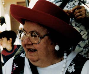
I like the subjects, but you've pushed the sharpening so hard that I can see halos all over the background of each image. Image 2 is the worst offender, especially on the painting to the bottom right of the subject. Portraits don't need to be sharp enough to make you bleed.
|
|
|


