|
 Dani on Orange 1 by Chris Hayden Photo, on Flickr  Dani Nicole on Satin 1 by Chris Hayden Photo, on Flickr
|
 #
?
Jun 15, 2013 17:46
#
?
Jun 15, 2013 17:46
|
|


|

|
| # ? May 15, 2024 19:25 |
|
|
red19fire posted:
Love this. Two things: what is a "90 degree reflector" and also, how did you get the background looking pinkish with 3 CTO, or is my monitor off?
|
|
#
?
Jun 15, 2013 19:32
|
|

|
red19fire posted:
Catchlights are way too big in the glasses and the background is sloppy. Light on her is spot on though. Recalibrated my monitor and went back and redid all of my processing. Really happy with these from yesterday (the theme was apparently beards);  Scott by David Childers Photography, on Flickr  Liv by David Childers Photography, on Flickr  Boot by David Childers Photography, on Flickr Bottom Liner fucked around with this message at 19:44 on Jun 15, 2013 |
|
#
?
Jun 15, 2013 19:41
|
|

|
This was as we wrapped on the last shoot I posted, in the afterglow of the smoke machine. after by thetzar, on Flickr thetzar fucked around with this message at 22:55 on Jun 15, 2013 |
|
#
?
Jun 15, 2013 22:37
|
|

|
Subyng posted:Love this. Two things: what is a "90 degree reflector" and also, how did you get the background looking pinkish with 3 CTO, or is my monitor off? The 90 degree reflector is just the basic silver thing that comes with all PCB lights, they also have 2-4 other reflectors with different degrees of 'throw' to them. I need to experiment some more, but somehow the hotspot of the light is white, and gradually gets more orange radiating outward. In the original only the very corners are orangeish, I had to put in 2 gradients for saturation and burning 2 stops. I think I had the background light too bright, I should have brought it down by a stop or two to get everything evenly saturated. Bottom Liner posted:Catchlights are way too big in the glasses and the background is sloppy. Light on her is spot on though. I agree, I forgot the clamps for the bottom of the background cloth, didn't realize it until I was processing. For the first iteration, I was using a beauty dish, but I did not like how the catchlights came out with it. Personally, I dig huge catchlights in sunglasses. thetzar posted:This was as we wrapped on the last shoot I posted, in the afterglow of the smoke machine. That is awesome.
|
|
#
?
Jun 16, 2013 03:06
|
|
|
red19fire posted:Personally, I dig huge catchlights in sunglasses. Hell yeah. 
|
|
#
?
Jun 16, 2013 05:46
|
|


|
Duuuuuuump.   
|
|
#
?
Jun 16, 2013 07:03
|
|


|
SoundMonkey posted:Hell yeah. Indeed.  146/366 - So Gangsta by fuglsnef, on Flickr
|
|
#
?
Jun 16, 2013 17:45
|
|
|
A few more with another friend. IMG_8476-Edit by Opals25, on Flickr  IMG_8434-Edit by Opals25, on Flickr 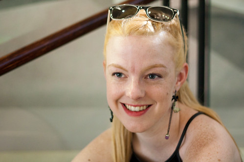 IMG_8383 by Opals25, on Flickr Focus is a little soft on the last one, probably should have dropped the aperture another stop, the 1.8 was probably a little too wide.
|
|
#
?
Jun 17, 2013 06:54
|
|

|
thetzar posted:This was as we wrapped on the last shoot I posted, in the afterglow of the smoke machine. Bit late to the party, but this and the others are really interesting. Good idea and it must've been ace to have a chance to play around in a set like that. Can I ask, what was your approach to the lighting? What did you use and did you balance ambient with flash or just use flash to light the scenes?
|
|
#
?
Jun 17, 2013 08:41
|
|

|
Aperture and sharpness are not your problems, harsh lighting and unflattering angles and light are.
|
|
#
?
Jun 17, 2013 08:41
|
|

|
Opals25 posted:A few more with another friend. I think with portraiture you really have to think less of how you feel about the shot as a photographer and more about how your subject feels about the shot. Like you may look at a shot and think "I like the composition and the color" and stuff, but the most important thing is almost always how the person looks. Basically my rule is "if this were me, would I feel like this shot either accentuated my physical attractiveness or displayed my personality in some meaningful way?" (or is it hilarious) I think looking at the photos you've taken, the answer to all of them should be no. First, everybody either hates their nose or is ambivalent to it. Either way, it's not something you ever want to draw attention to, and having it lit by the sun with the rest of her face in shadow makes it the primary focus of her face. Always make the eyes the focus. There are exceptions obviously, but not really, and especially not when you're just getting your feet wet in a photography style. Additionally her arms are posed really awkwardly and her chin is pulled into her neck for some reason (likely the awkward pose) giving her a double chin. On the second shot, again with the nose. With few exceptions, you almost never want to shoot from below somebody. Nobody wants a shot up their nose. The pose is also awkward again. Why is her chin in her shoulder? Why is she doing that with her hands? The third one is the closest to a decent portrait but the hotspot on top of her head takes away all of the attention that should be on her face and she's got a bit of a hunched posture that she's probably not going to like. Keep practicing. Next time think more about why you're taking each shot.
|
|
#
?
Jun 17, 2013 11:23
|
|
|
Just to reinforce the above: don't ever take a picture of a woman from a low angle unless you have a darn good reason. Also, put some powder on her and figure out your lighting. You're shooting her broad side here which is making her face look wider. Were these shot available light or were you setting stuff up?
|
|
#
?
Jun 17, 2013 15:18
|
|

|
She says she doesn't like how her chin looks in this, but I am not really seeing any problems. Am I blind or is she just being picky about how her face looks. Does her mouth look out of place due to the angle? I guess I can see that, but I don't know if I'm just trying to see something that isn't there. Untitled by TomOlson, on Flickr
|
|
#
?
Jun 17, 2013 15:48
|
|

|
RangerScum posted:She says she doesn't like how her chin looks in this, but I am not really seeing any problems. Am I blind or is she just being picky about how her face looks. Does her mouth look out of place due to the angle? I guess I can see that, but I don't know if I'm just trying to see something that isn't there. I think you were way to close to her for this shot.
|
|
#
?
Jun 17, 2013 16:50
|
|

|
The eyeliner doesn't really play well with the colors of the image, either, but yeah... the shot really accentuates her teeth and chin. I almost wonder if a small amount of keystone shift in PS/LR5 would help help.
|
|
#
?
Jun 17, 2013 16:55
|
|

|
Gazmachine posted:Bit late to the party, but this and the others are really interesting. Good idea and it must've been ace to have a chance to play around in a set like that. Can I ask, what was your approach to the lighting? What did you use and did you balance ambient with flash or just use flash to light the scenes? Thank you! The shot you quoted was all ambient light, but the shoot proper was all lit with strobes. I had two giant softboxes and a couple of bare heads for spots, either in rear corners or above.
|
|
#
?
Jun 17, 2013 17:21
|
|
|
RangerScum posted:She says she doesn't like how her chin looks in this, but I am not really seeing any problems. Am I blind or is she just being picky about how her face looks. Does her mouth look out of place due to the angle? I guess I can see that, but I don't know if I'm just trying to see something that isn't there. She's also tilting her head back, which brings get chin closer to the camera and accentuates it. Next time ask her to drop her chin which will bring her eyes closer to the camera instead.
|
|
#
?
Jun 17, 2013 18:41
|
|

|
RangerScum posted:She says she doesn't like how her chin looks in this, but I am not really seeing any problems. Am I blind or is she just being picky about how her face looks. Does her mouth look out of place due to the angle? I guess I can see that, but I don't know if I'm just trying to see something that isn't there. Use a longer lens for portraits, longer focal lengths don't distort faces as much. Example I snagged from petapixel's video on this here: http://petapixel.com/2012/08/12/how-focal-length-affects-your-subjects-weight-in-portraits/ 
|
|
#
?
Jun 17, 2013 18:49
|
|
|
TheAngryDrunk posted:I think you were way to close to her for this shot. bisticles posted:The eyeliner doesn't really play well with the colors of the image, either, but yeah... the shot really accentuates her teeth and chin. I almost wonder if a small amount of keystone shift in PS/LR5 would help help. CarrotFlowers posted:She's also tilting her head back, which brings get chin closer to the camera and accentuates it. Next time ask her to drop her chin which will bring her eyes closer to the camera instead. echobucket posted:Use a longer lens for portraits, longer focal lengths don't distort faces as much. It was just a snapshot I took yesterday while walking around and checking out a neighborhood so hopefully that explains an overall lack of attention to makeup or lens selections, etc. I just couldn't see anything wrong with the chin and wanted some more eyes to look at it. But thank you for your general advice.
|
|
#
?
Jun 17, 2013 21:08
|
|
|
From a ladies point of view it just kind of looks like she has a bit of a weak chin and is probably very self conscious about it. Some people get surgery to correct that kind of thing, it's a pretty common worry. But I think it looks fine ")
|
|
#
?
Jun 17, 2013 22:25
|
|


|
echobucket posted:Use a longer lens for portraits, longer focal lengths don't distort faces as much. It's subject distance which affects distortion in this case, not focal length.
|
|
#
?
Jun 18, 2013 00:24
|
|
|
Subyng posted:It's subject distance which affects distortion in this case, not focal length. If the aim is to keep the subject occupying most of the frame, those two are very much related.
|
|
#
?
Jun 18, 2013 01:11
|
|
|
Chitin posted:Just to reinforce the above: don't ever take a picture of a woman from a low angle unless you have a darn good reason. All just sunlight on a bright day, I don't have any lighting equipment. I definitely see what you both mean though; I was definitely thinking more about composition as I went through the shots. I'm trying to figure out how to best play lighting in an image and better posing, it's not something I've had a lot of exposure too at all.
|
|
#
?
Jun 18, 2013 01:12
|
|
|
Opals25 posted:All just sunlight on a bright day, I don't have any lighting equipment. I definitely see what you both mean though; I was definitely thinking more about composition as I went through the shots. I'm trying to figure out how to best play lighting in an image and better posing, it's not something I've had a lot of exposure too at all. Just remember everyone started somewhere and not to get discouraged. As long as you get a little better each time you take your camera out nothing you shoot is a waste.
|
|
#
?
Jun 18, 2013 01:26
|
|
|
Opals25 posted:All just sunlight on a bright day, I don't have any lighting equipment. I definitely see what you both mean though; I was definitely thinking more about composition as I went through the shots. I'm trying to figure out how to best play lighting in an image and better posing, it's not something I've had a lot of exposure too at all. Time of day is a huge deal here. When one sets up portrait lighting, in general the key light will be just slightly above the eyeline of the subject. In terms of the sun, that means you're shooting in roughly the hour after sunrise or the hour before sunset. There are other factors at play but generally the closer you get to those times the better. The absolute worst time to shoot is at noon. Everyone gets ghost eyes.
|
|
#
?
Jun 18, 2013 02:01
|
|
|
SoundMonkey posted:If the aim is to keep the subject occupying most of the frame, those two are very much related. True, but I figure it's better to say subject distance rather than focal length, since distortion of that kind is a direct consequence of subject distance. Focal length contributes only indirectly. It reduces the chance for misunderstanding that way (of which there is a lot of on the internet).
|
|
#
?
Jun 18, 2013 02:09
|
|
|
Subyng posted:True, but I figure it's better to say subject distance rather than focal length, since distortion of that kind is a direct consequence of subject distance. Focal length contributes only indirectly. It reduces the chance for misunderstanding that way (of which there is a lot of on the internet). I've been shooting for five years and have a degree in film and I only just kind of learnt this. That may say something about Australian unis but yeah it's a widespread misconception.
|
|
#
?
Jun 18, 2013 04:42
|
|
|
The best example I saw was in Light: Science and Magic, where they took a photo of the same subject from the same distance with a wide and a tele, then cropped the wide shot to match the tele. They looked exactly the same.
|
|
#
?
Jun 18, 2013 10:07
|
|
|
David Pratt posted:The best example I saw was in Light: Science and Magic, where they took a photo of the same subject from the same distance with a wide and a tele, then cropped the wide shot to match the tele. They looked exactly the same. I think you're mis-remembering. DOF isn't a property of distance, it's the property of the magnification of the subject on the focal place. If someone or something is shot at 20 feet with a 28mm and a 200mm at the same aperture, the DOF in both of those shots will be hugely different. However, if the subject was moved closer in to the 28mm so that the subject occupied the same amount of frame as the 200mm shot, THEN the DOF would be identical.
|
|
#
?
Jun 18, 2013 11:15
|
|

|
McMadCow posted:I think you're mis-remembering. DOF isn't a property of distance, it's the property of the magnification of the subject on the focal place. DOF isn't what's being discussed though?
|
|
#
?
Jun 18, 2013 12:10
|
|
|
Chitin posted:DOF isn't what's being discussed though?  I have no explanation for how I did that. I'm going to go with "not enough sleep". I have no explanation for how I did that. I'm going to go with "not enough sleep".
|
|
#
?
Jun 18, 2013 13:04
|
|
|
My tattooist has asked me to take a couple of photos for their website, to link to their artist pages. Went and had a little go after my appointment today and came out with these, any constructive criticism to offer?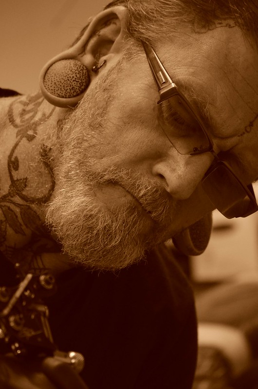 CSC_0025 by Phil Tickner, on Flickr 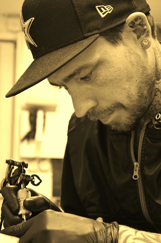 DSC_0008 by Phil Tickner, on Flickr The different tones of sepia were intentional, the third artist wasn't in today so I'm going back tomorrow, and hers will be in a slightly different shade again.
|
|
#
?
Jun 18, 2013 15:03
|
|

|
McMadCow posted:
In fairness, that was really good info that I didn't have before. I knew that DOF became greater both with more magnification and with closer distance but I didn't know much about the relationship between the two. So at least one person learned something anyway! Yay!
|
|
#
?
Jun 18, 2013 16:01
|
|
|
VolumeOverTalent posted:{tatt-guns} If you like B&W stuff, you should buy the NIK Collection with Silver EFX Pro 2; it's fairly cheap and really good for monochrome/toning.
|
|
#
?
Jun 18, 2013 16:43
|
|


|
NoneMoreNegative posted:Any reason why you went sepia..? I link sepia with oldey-worldey photos, I'd like to see them B&W processed with a healthy slice more contrast/vibrance and maybe three light selenium blue tones if you still want to differentiate the pics. He suggested the idea of sepia, he had some photos to show me as kind of inspiration and they were in the same sort of style. I'll certainly give that a go though, see how it looks.  DSC_0024 by Phil Tickner, on Flickr  DSC_0008 by Phil Tickner, on Flickr VolumeOverTalent fucked around with this message at 09:00 on Jun 19, 2013 |
|
#
?
Jun 18, 2013 16:54
|
|
|
VolumeOverTalent posted:He suggested the idea of sepia, he had some photos to show me as kind of inspiration and they were in the same sort of style. I'll certainly give that a go though, see how it looks. I'd like to see more dynamic range in the first pic but that may be a personal preference thing.
|
|
#
?
Jun 18, 2013 23:53
|
|

|
Chitin posted:I'd like to see more dynamic range in the first pic but that may be a personal preference thing. It looks a little dark overall. I like the composition more than the second though.
|
|
#
?
Jun 19, 2013 00:40
|
|

|
So newish to portrait work but here's three of my favorite shots, cause I thought I'd share.  Jessica by vampiressjt, on Flickr  gio in red 3 by vampiressjt, on Flickr  gio in red 1 by vampiressjt, on Flickr
|
|
#
?
Jun 21, 2013 04:33
|
|
|

|
| # ? May 15, 2024 19:25 |
|
|
Portraits are still something very new to me. My youngest kids arrived this week on a holiday from Finland, so I thought I'd have a bash. I like these ones, of course because they're my kids, but I have no idea how they might look to an impartial observer. What, if anything, did I get right. What can I improve upon? Any feedback will be heartily welcomed.  20130619-GH8E2897-2 by efcso1, on Flickr  20130619-GH8E2881-2 by efcso1, on Flickr  20130619-GH8E2741-2 by efcso1, on Flickr Bonus shot: Daddy's little girl has the photo bug too...  20130619-GH8E2939-2 by efcso1, on Flickr
|
|
#
?
Jun 21, 2013 22:38
|
|