


|
mclifford82 posted:
VelociBacon posted:
David Pratt posted:
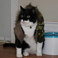
Here's a photo of mine that is bugging the hell out of me. I would have deleted it, but my kid wants to give it to my wife for her birthday, and it's either this or a balloon or a helicopter.  DSC02048 by Kelly_Davis, on Flickr I'm having trouble putting my finger on what, specifically, is wrong. I think it's a lot of little things that add up. The perspective is off - I should have had the camera at eye level with my daughter. The aperture was adequate for getting her head/eyes in focus, but I could have either gone more narrow to get more in focus, or wider for better bokeh. The color lacks punch. It's a bit underexposed, though not horribly so. While there's nothing necessarily wrong with the composition, it's not that interesting unless you know the kid/cat. Anything else? Or am I just being too hard on what's effectively a snapshot with sentimental value?
|
 #
?
Jul 26, 2013 06:51
#
?
Jul 26, 2013 06:51
|
|


|

|
| # ? Jun 3, 2024 16:07 |
|
|
Bob Socko posted:I really like this shot. I love the fast shutter speed, I love that you see fluid frozen mid-flight. The citrus fruit splashing into water seems refreshing. The color is nice. This is the sort of photo I'd like to shoot, assuming I had more time to do fun, creative things. That being said, this also reminds me of testicles. Now, that's not necessarily a bad thing. There's nothing wrong with a little innuendo, a little suggestion. But, yeah. I see a big ol' multicolored pair of nuts. It's a (good) snapshot with sentimental value. I wish that the aperture were wider to blur out some of the visual noise from the background. I think you're right that if you had shot it at her level it would feel less snapshotish. I think the colors are actually pretty good. I love that the cat is just like Ufff fine :3
|
|
#
?
Jul 27, 2013 01:41
|
|
|
Bob Socko posted:Here's a photo of mine that is bugging the hell out of me. I would have deleted it, but my kid wants to give it to my wife for her birthday, and it's either this or a balloon or a helicopter. I'd agree you should have gotten lower when shooting this, and I'd have changed the composition from dead center. However, I'll focus on post processing since it's a gift. I think you could do with a better crop, the empty space at the bottom of the frame and the dead center composition isn't doing much for me. Cropping it up into an 8x10, removing some of the bottom would help a lot too, and depending on how large you are printing it, it's easier to find frames for 8x10. I don't think the colours are bad, but I would go a bit heavier on the processing just to give it some extra punch. It's a really cute picture, though!
|
|
#
?
Jul 27, 2013 05:53
|
|

|
Yeah, the printed version is 11x14 and trims off the top and bottom. Thanks for the feedback (both you and Awkward Davies), I appreciate it.
|
|
#
?
Jul 27, 2013 08:13
|
|
|
mclifford82 posted:
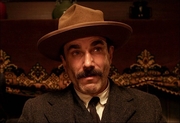
The only thing I can think to say about this one is perhaps you could have used a smaller aperture? The center of the face is sharply in focus, but it becomes less so around the ears. It's barely noticeable unless you really zoom in. I'm interested in how the background seems to have a pronounced vertical "bands" of one shade in parts, if that makes sense. Also, the chin(?) is less well-defined against the background color below it, though that might just be my monitor.  anura by airconswitch, on Flickr Here's some sort of frog I photographed earlier (Rana clamitans?) I cropped this from a larger original; he hopped away before I could get closer. I'm happy with the mixture of light and shadow on the little guy, but I'm not sure the other elements (left lilypad in particular) might distract from him/her as the subject.
|
|
#
?
Jul 27, 2013 13:45
|
|


|
Airconswitch posted:
The lilypad does stick out a bit. Maybe you could do some localized color/curve adjustment to soften it out a bit and maybe match the one the frog is standing on? Not sure what you're working with but I don't think it's too hard with any particular software. I went up to Yosemite last weekend. I went with friends and was basically just trying to get quick handheld pictures while hiking and then running to catch back up with them. I didn't even bother to bring a tripod, so no sweeping vistas or anything.  DSC_4175 by khyrre, on Flickr  DSC_4126 by khyrre, on Flickr  DSC_4043 by khyrre, on Flickr
|
|
#
?
Jul 27, 2013 22:51
|
|


|
404notfound posted:I went up to Yosemite last weekend. I went with friends and was basically just trying to get quick handheld pictures while hiking and then running to catch back up with them. I didn't even bother to bring a tripod, so no sweeping vistas or anything. I love this one in BW. And shooting around the trunk of the tree makes the whole thing look surreal, like some sort of fossilized slime monster. I really want that tree to be larger/centered/in focus. The whole composition, but especially the rail leading up to it, makes it feel like that tree is the subject, which makes it feel like you missed when you didn't. The coloring is really nice, though. Edit: It just occurred to me that the green in the foreground was probably what you were shooting, and my being colorblind may be pulling out some random background feature as opposed to a pop in the foreground that just doesn't pop for me. I borrowed my works's XT and a friend's 50mm this weekend, and went depth of field crazy with the family.  Spotted by mattphilpott, on Flickr  Grass by mattphilpott, on Flickr  Butter by mattphilpott, on Flickr That one's off by a couple of stops, but it still came out pretty sharp. Huxley fucked around with this message at 18:22 on Jul 28, 2013 |
|
#
?
Jul 28, 2013 18:19
|
|


|
Bob Socko posted:Here's a photo of mine that is bugging the hell out of me. I would have deleted it, but my kid wants to give it to my wife for her birthday, and it's either this or a balloon or a helicopter. I think that you're really overthinking things for a photo that your kid wants to give to her mom. It's in focus, it's a cute moment, and the exposure is fine. Up the contrast and saturation a bit and stop sweating it.
|
|
#
?
Jul 29, 2013 14:02
|
|

|
TheJeffers posted:I think that you're really overthinking things for a photo that your kid wants to give to her mom. It's in focus, it's a cute moment, and the exposure is fine. Up the contrast and saturation a bit and stop sweating it. He beat me to it. Also, man that is a CAT. I want to pet that fuckin cat. Huxley posted:
1) Backs of heads are not that interesting. The design of the rug or blanket on the floor looks interesting. It feels a little cramped - pulling back a bit, focusing on the hand or book and a smaller aperture if possible would improve it in my opinion. 3) Pretty. Did you crop it? The composition is not quite doing it for me - the butterfly would look better shifted to the right if you have room on the left to move it over. 404notfound posted:The lilypad does stick out a bit. Maybe you could do some localized color/curve adjustment to soften it out a bit and maybe match the one the frog is standing on? Not sure what you're working with but I don't think it's too hard with any particular software. Some cool stuff but I am not feeling the processing of 2 and 3. Doesn't seem to match the mood of the photos (particularly 3) and looks preset-ish. Some bracketing or something on 1 might be nice, or coming back another day when you have some features in the sky to see other than blown out white or clouds or whatever is going on there. ------ I've been really busy with the whole "parenting" thing. I just barely got a submission into this month's contest (the third one here) but these were three of the four candidates (the fourth is the most recent cat photo on my flickr). I think I entered the weakest one just because that was the first one I edited and time was short, oh well.  DSCF4637-Edit by Paul Hofreiter, on Flickr  DSCF4647-Edit by Paul Hofreiter, on Flickr  untitled by Paul Hofreiter, on Flickr rio fucked around with this message at 03:41 on Jul 30, 2013 |
|
#
?
Jul 30, 2013 03:38
|
|

|
Bob Socko posted:
I personally like it. What I would chane is the crop. You have a fair bit of deck showing on the bottom, which I would crop slightly to lead the eye more towards the child, since the deck is light and patterned. Airconswitch posted:
You have some dramatic shadows here so I would maybe bump contrast up a bit. Darken shadows just a bit and give more pop to the highlights. Not happy with this composition, and I am thinking about accentuating the rose a bit more... suggestions?  _DSC9850-Edit by Stingray of Doom, on Flickr
|
|
#
?
Jul 30, 2013 23:08
|
|
|
Putrid Grin posted:
I don't know, the baby's breath up top is in focus and the cool looking webs draws the eye from the flower to it pretty seamlessly. I think with something like this, the empty space might not be doing much for you around the upper left. Kind of a dead zone. ------------- Sorry to post again so soon but hey, photo a day. Opinions on if I should black out the background here? I kind of like the textures and lines popping out but could also see it a bit cleaner. (it is hard to see the stuff in the dark areas at lower resolution)  DSC04370 by Paul Hofreiter, on Flickr P.s what kind of bug is this? rio fucked around with this message at 07:44 on Jul 31, 2013 |
|
#
?
Jul 31, 2013 07:32
|
|
|
voodoorootbeer posted:
I like this style in general. My instinct is to try and see what is to the left or right of this picture. I probably would have gone with a wider lens and gotten more foreground in the picture. Give the bush on the right room to breathe and let the viewer see more of the strong rectangular shape of the building. Trying some more aggressive processing. Not sure if I over cooked it or not.  Slide! by Winston85, on Flickr
|
|
#
?
Aug 1, 2013 18:12
|
|

|
Mightaswell posted:I like this style in general. My instinct is to try and see what is to the left or right of this picture. I probably would have gone with a wider lens and gotten more foreground in the picture. Give the bush on the right room to breathe and let the viewer see more of the strong rectangular shape of the building. As far as I recall, there was some junk to the left that I didn't want in the frame. I don't really remember about the right hand side but I was shooting a fixed lens TLR so that probably factored in. As for yours, I think the color and contrast both work fine. It's a little weird seeing chunky grain in a daylight shot but it contributes to the overall mood of a family photo shot on cheap film. I like it.
|
|
#
?
Aug 1, 2013 20:24
|
|

|
Mightaswell posted:I like this style in general. My instinct is to try and see what is to the left or right of this picture. I probably would have gone with a wider lens and gotten more foreground in the picture. Give the bush on the right room to breathe and let the viewer see more of the strong rectangular shape of the building. I don't feel that this is overcooked at all. It's saturated, but that's a good thing. There's a lot of grain/noise here, but I don't mind it. It actually feels like film, old Superia 1600 maybe. The fair flaying in front of her face works really well - good work. As for me, I went on vacation recently.  Untitled by thetzar, on Flickr  Untitled by thetzar, on Flickr  heading home by thetzar, on Flickr
|
|
#
?
Aug 1, 2013 21:08
|
|

|
Edit because I'm an idiot who can't read (thanks Mr Despair):rio posted:Sorry to post again so soon but hey, photo a day. Opinions on if I should black out the background here? I kind of like the textures and lines popping out but could also see it a bit cleaner. (it is hard to see the stuff in the dark areas at lower resolution) It's a bit hard for me to give my advice on this since I have basically no experience at all, so here's my naive answer to this; I personally think it should indeed be a bit a cleaner as the background makes it look like this bug is floating dead in some water or is stuck in an amber block of some sort (probably because of the specks of dust). Aboard the USS Alabama. New here and just open to any criticism to help me get better at this. Thanks!  DSC01439 par GoatG, sur Flickr  DSC01447 par GoatG, sur Flickr  DSC01443 par GoatG, sur Flickr SpaceGoatFarts fucked around with this message at 23:46 on Aug 1, 2013 |
|
#
?
Aug 1, 2013 23:11
|
|


|
SpaceGoatFarts posted:Aboard the USS Alabama. New here and just open to any criticism to help me get better at this. Thanks! Hey you should post some critique before you get double super banned or something for not reading the OP because there's a reason the thread title says to read the OP. Hurry, hurry! Before it's too late!
|
|
#
?
Aug 1, 2013 23:32
|
|


|
SpaceGoatFarts posted:Edit because I'm an idiot who can't read (thanks Mr Despair): You got lucky this time, son. 
|
|
#
?
Aug 2, 2013 02:23
|
|


|
SpaceGoatFarts posted:
I really like these. I don't know if it's the processing or if it's the subject matter, but these have a real "Kodachrome taken by a War correspondent in WWII for Time Magazine" feel to them. I'm not sure about the focus in the second one, I see what you're going for but it feels a little off to me. Of the three, the last is by far my favorite.  Parked for the night by jpitha, on Flickr  The Marina by jpitha, on Flickr
|
|
#
?
Aug 2, 2013 19:21
|
|


|
Shampoo posted:
Both of these look pretty flat to me, if you were to shoot the same shot early in the morning or late in the evening I think it would help make them both more interesting. The first one doesn't really look like much more than a picture of some boats that anyone could take as a snapshot. The second one at least has more to look at, but I would probably crop out the people on the left because I don't think they add anything but my eye keeps looking over at them hoping that they are doing something cool. Also one of the masts looks cut off at the top. edit: I actually like the third shot of boats in your photostream that you didn't post more than the two you did. The composition is more pleasing to my amateur eye. First time venturing into the world of speedlites. I have no idea what I'm doing.  Untitled by LeeMHarp, on Flickr  Untitled by LeeMHarp, on Flickr dont hate the playa fucked around with this message at 21:28 on Aug 2, 2013 |
|
#
?
Aug 2, 2013 21:26
|
|

|
Claw Massage posted:Both of these look pretty flat to me, if you were to shoot the same shot early in the morning or late in the evening I think it would help make them both more interesting. The first one doesn't really look like much more than a picture of some boats that anyone could take as a snapshot. The second one at least has more to look at, but I would probably crop out the people on the left because I don't think they add anything but my eye keeps looking over at them hoping that they are doing something cool. Also one of the masts looks cut off at the top. These are both terrifying to me and I like them because of it. Really creepy. edit: I hope that's what you were going for.
|
|
#
?
Aug 3, 2013 00:41
|
|
|
Claw Massage posted:First time venturing into the world of speedlites. I have no idea what I'm doing. I know you're trying to go low key here but these are still way under exposed. I just ran a calibration on my monitor to make sure it wasn't just me.
|
|
#
?
Aug 3, 2013 18:50
|
|

|
SpaceGoatFarts posted:Edit because I'm an idiot who can't read (thanks Mr Despair): I think I'd like this one more if it was shot straight on instead of off to the side. I also find the shadows a little distracting. Not bad though. Here are three from me. I walked the big bridge in town yesterday morning then went downtown later in the day:  Arthur Ravenel Jr. Bridge by Ryan-Tamm, on Flickr  Arthur Ravenel Jr. Bridge by Ryan-Tamm, on Flickr  Horse by Ryan-Tamm, on Flickr Haggins fucked around with this message at 21:39 on Aug 3, 2013 |
|
#
?
Aug 3, 2013 18:57
|
|
|
Haggins posted:I know you're trying to go low key here but these are still way under exposed. I just ran a calibration on my monitor to make sure it wasn't just me. This exactly. Even with the tone of the photos they could be bumped up quite a bit.
|
|
#
?
Aug 3, 2013 19:14
|
|


|
mr. mephistopheles posted:This exactly. Even with the tone of the photos they could be bumped up quite a bit. Thanks I'll give it a try. I keep my monitor probably brighter than I should anyway. But yeah I did want to keep them on the dark side because of the poses they did. dont hate the playa fucked around with this message at 23:47 on Aug 3, 2013 |
|
#
?
Aug 3, 2013 21:19
|
|
|
Claw Massage posted:Thanks I'll give it a try. I keep my monitor probably brighter than I should anyway. But yeah I did want to keep them on the dark side because of the poses they did. I like them underexposed like that. It may not be technically right, but I think it's different and increasing the exposure would change the feel.
|
|
#
?
Aug 4, 2013 05:25
|
|
|
Claw Massage posted:
I think these are amazing, particularly reminds me of some of Mark Peckmezian work, specifically this recent shot of his: http://www.flickr.com/photos/spassk/9411053217/
|
|
#
?
Aug 4, 2013 11:02
|
|
|
Haggins posted:I think I'd like this one more if it was shot straight on instead of off to the side. I also find the shadows a little distracting. Not bad though. These are cool. I very much like the hoof picture, being able to see the nails driven into the horseshoe as well as the wear on the edges of the hooves is very visceral (if anyone wasn't aware and was concerned, that part of the hoof is the same material as nails and they have no feeling there). On the first two - I don't have any comments for the first photo but it would have been nice to have seen the second photo when there was light on the plane of concrete facing the camera. I know this probably wasn't doable unless the opposite side of the bridge had the light but would be interesting to see if you're walking down there again in a different time of day. The 'cracks' in the concrete may have been an interesting feature if you brought the camera closer to the wall with the same perspective. I took this photo tonight after the GF and I went out to practice our night photography across a river and turned around to notice this thing standing maybe 250ft tall (I'm bad at judging this could be more or less) across the street from us. The only processing I've done with this photo is to crop it. I'm not sure I'm really happy with the crop but for something like this with no background besides the sky I thought shooting it along the rule of thirds lines would have lost the emphasis of it's size. What do you guys think? Edit: Should I desaturate it? It seems weird to do that to a photo right out of the camera. 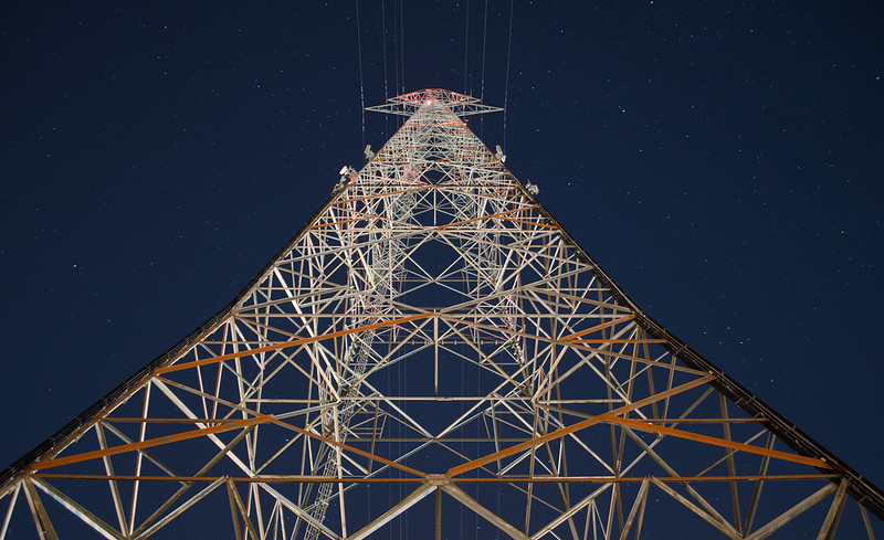 Battlecruiser Operational by TCZPhotography, on Flickr For reference, here's a screenshot of the structure from google maps. 
VelociBacon fucked around with this message at 11:24 on Aug 5, 2013 |
|
#
?
Aug 5, 2013 11:18
|
|

|
 I like the painterly quality of this, but how are the colors? The softening is a result of a cheap camera/lens, not post-processing.  Are the colors too messed up in this? I went a little overboard making it look like an older photo while editing the raw file. I like how the barely visible fishing lines can catch your eye.
|
|
#
?
Aug 5, 2013 15:52
|
|
|
thylacine posted:
All I can look at in this picture is the out of focus bridge. I think a tighter crop on blue jacket using the bridge at the top to anchor it would improve it a ton. I also don't read it as sepia, so much as being off. I think you might have been worried about going too far and didn't go too far enough (if sepia was your goal).
|
|
#
?
Aug 5, 2013 16:25
|
|
|
My problem with the picture is that the only thing that's in focus is crammed up against the edge of the frame. If you're going to take a picture of a fisher, he should at least be along one of the thirds. Ideally you'd want the guy in black that's standing behind him to not be there, as well. The composition you chose might work better if there was no people at all in the frame, though I guess I'm still not sure what you'd want to focus on. Use a tripod and a small aperture, get everything in focus. 
|
|
#
?
Aug 5, 2013 16:29
|
|

|
Mightaswell posted:Trying some more aggressive processing. Not sure if I over cooked it or not. I really love the composition and catch but I'm on the fence about the saturation. It keeps me looking at it for awhile thinking somethings just a little bit off... I don't know. I dig the grain and think it would be a great black and white. 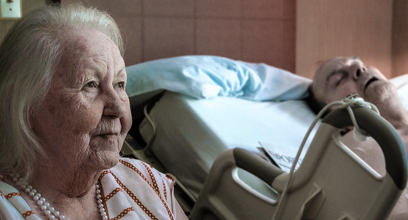 Playing around with trying to get a cinematic-ish look. Completely new to it. I don't know how I feel about the editing or the crop.
|
|
#
?
Aug 6, 2013 19:06
|
|
|
VelociBacon posted:it's size. What do you guys think? I like the colors and perspective. You've made an otherwise boring tower interesting. Ars Moriendi posted:
I think this is great. This photo says a lot and conveys a lot of emotions. The lighting and technical aspects are well done too.
|
|
#
?
Aug 6, 2013 20:08
|
|
|
I've had my camera for a while but have only just had the time to really get into photography. There really isn't much to photograph (That I've found so far) in my small town so I drove out to the field to practice. Lot's of terrible pictures but I ended up with two that I was happy with. This is a canon 400d + kit lens. Corn Field by rosscmpbll, on Flickr  Bee by rosscmpbll, on Flickr VelociBacon posted:
Really liking this shot. I find that a lot of good images come from a different viewpoint than the normal head-height tourist style photo, good job. Catsplosion fucked around with this message at 13:27 on Aug 7, 2013 |
|
#
?
Aug 7, 2013 13:24
|
|

|
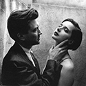
VelociBacon posted:Edit: Should I desaturate it? It seems weird to do that to a photo right out of the camera. Don't desaturate it. The colors you've got there are gorgeous. The only thing I'd do is crop in a couple pixels at the right to make it truly symmetrical, otherwise the framing is good. Ars Moriendi posted:
The giant chunk of empty space in the middle is bothering me a bit. The two focal points of the photo are right up against the opposite edges, so much so that they almost feel like they're falling out of the frame, and then there's this big gaping void between them. The lady is in focus and so she's a pretty solid object, but I feel like I have to mentally drag the man back into the frame lest he start to slip out of view. Or who knows, that could all just end up metaphorically describing what's going on with the couple in the photo; and in that case, props. The processing is good. I'm kinda treating these first three as a triptych. Pretend like they're next to each other.  Flower by William T Hornaday, on Flickr  Flower by William T Hornaday, on Flickr  Flower by William T Hornaday, on Flickr And this one is unrelated. I like the composition, but wanted to do something with the processing but nothing really seemed to work.  Leaves by William T Hornaday, on Flickr William T. Hornaday fucked around with this message at 14:40 on Aug 7, 2013 |
|
#
?
Aug 7, 2013 14:37
|
|

|
Ars Moriendi posted:
I also really like this. As far as cinematic goes, I can totally imagine this coming to life as a heartbreaking scene in a movie. Great lines on the lady's face. The distance between them, while maybe a little odd, really works at conveying that she's thinking about him. Even though she's not looking at the man in this composition, if he were any nearer, it might look a little more like she's looking beyond him. The lines of the pillow kinda connect them too. I very recently got my first DSLR and took it on a trip to Paris. While I was mostly in snapshot / learning mode, I took a few pictures that were a little more considered. Some of my favourites:  Toyshop Window by David Galletly, on Flickr  Alex at Pompidou by David Galletly, on Flickr  Gnome by David Galletly, on Flickr As I'm new to this, I'll try a little self-criticism. The first photo maybe has too much blurry window and too little face. It's also a little cheesy, subject-wise. The leg of the teddy that meets her chin could maybe be darkened a bit too. The second is quite staged looking, even though it wasn't (beyond saying 'look over there') - the people in the background are a bit distracting and I could've probably done something more interesting with the reflections. A hairbrush might've helped too, ha. The third was taken through a window and I like how it's given it an almost film-y grain. I dunno, I'm fond of this one.
|
|
#
?
Aug 7, 2013 23:00
|
|
|
Tenterhooks posted:I also really like this. As far as cinematic goes, I can totally imagine this coming to life as a heartbreaking scene in a movie. Great lines on the lady's face. The distance between them, while maybe a little odd, really works at conveying that she's thinking about him. Even though she's not looking at the man in this composition, if he were any nearer, it might look a little more like she's looking beyond him. The lines of the pillow kinda connect them too. I find the middle one is the strongest... nice way to use the bench to lead to your subject! I feel the editing could have been a bit more tight tho and/or the aperture a bit more open to separate the subject from the background (Especially with the very colorful people walking behind) but other than that the posture and look is what I would have been looking for in a shoot. ")  IMG_9784 by avoyer, on Flickr  IMG_9468 by avoyer, on Flickr  IMG_9340 by avoyer, on Flickr
|
|
#
?
Aug 8, 2013 01:02
|
|

|
xenilk posted:I find the middle one is the strongest... nice way to use the bench to lead to your subject! I feel the editing could have been a bit more tight tho and/or the aperture a bit more open to separate the subject from the background (Especially with the very colorful people walking behind) but other than that the posture and look is what I would have been looking for in a shoot. I know nothing about shooting models so I'm afraid I don't have much substantive critique for you, beyond "Oh god her dress is on fire. Wait, no, it's not, but why did he shoot backlit with a yellow light in a fireplace?"
|
|
#
?
Aug 8, 2013 23:18
|
|
|
Awkward Davies posted:I know nothing about shooting models so I'm afraid I don't have much substantive critique for you, beyond "Oh god her dress is on fire. Wait, no, it's not, but why did he shoot backlit with a yellow light in a fireplace?" I wanted to give some sort of depth, it was quite dark in there (notice the semi-high ISO in the EXIF) and front flash would have given it a nasty shadow... and sadly at that moment shooting with two flashes (one to kill the shadow and one front flash) was not possible so I did what I could there hehe. Only thing that bothers me personally is the way her face is lighted up, I wish I had done a better job with her posture
|
|
#
?
Aug 8, 2013 23:50
|
|
|
xenilk posted:
I like this shot but agree with you on the model's posture/facial expression. Something that jumps out at me when I look at it is that I wonder how the shot would have looked if you had some of the rubble around the model actually on her dress/leaning some boards against her legs to make it look like there was just some explosion or something, might be evocative and possibly would have provided context for the wedding dress + distant/shock expression on her face. The yellow gelled flash could then have been used from a low angle in the front to imply light from a post-bomb blaze? If this was a wedding shoot then I can see how it's not the place or time for it but if this was a professional model I would think she'd be game? I've never shot with a model and have no idea whether this would be cool with them or not so maybe don't listen to me I dunno.  Exploring by TCZPhotography, on Flickr
|
|
#
?
Aug 9, 2013 05:47
|
|
|

|
| # ? Jun 3, 2024 16:07 |
|
|
VelociBacon posted:
 _DSC6416 by Stingray of Doom, on Flickr I am not sure if I like it for what it is or for sheer detail within. Made a 20x30 print of it recently, and its fun let your eyes wander on it. And the color temp seems a bit off, or that might just be me as there are like 3-4 different types of light in that photo. Any ideas?
|
|
#
?
Aug 9, 2013 06:43
|
|