


|
Tenterhooks posted:
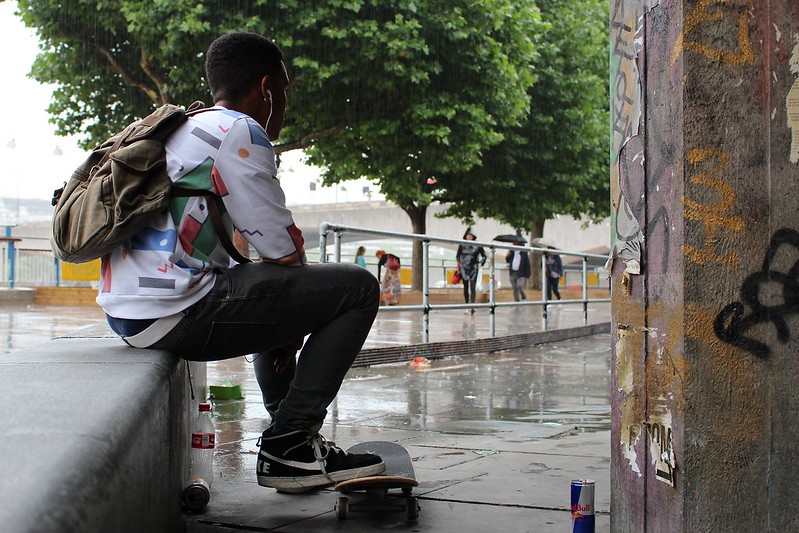
I was going to comment on this photo before but I wasn't sure what to say other than I liked it. You get enough of the skater to show a kind of disappointment or something and the raindrops hitting the puddles are clear. The rain is less visible, but noticeable as you look at it more closely. I like the pillar on the side, the paint and old posters are interesting. I am fairly new as well, I cant think of any different way to frame this to make it better as I think it is good as is. The only thing I would change would maybe to get more of the skaters face, just slightly turned toward you.  IMGP3670 by RedlegSA, on Flickr The last 3 days I have been dragging my wife out to get shots and I finally got the light right I think. Tried a variety of fill flash powers and this seems to be right to me. I also just picked up a polarizing filter and that helps alot. I shot this with a Pentax 50mm manual at f2, its widest - I wanted to get the blurry background. Just printed out the Zeltsman Guide to Classic Portraiture and trying stuff from that as well as experimenting with fill flash. Redleg fucked around with this message at 01:30 on Sep 28, 2013 |
 #
?
Sep 28, 2013 01:27
#
?
Sep 28, 2013 01:27
|
|


|

|
| # ? May 26, 2024 00:21 |
|
|
Redleg posted:I was going to comment on this photo before but I wasn't sure what to say other than I liked it. You get enough of the skater to show a kind of disappointment or something and the raindrops hitting the puddles are clear. The rain is less visible, but noticeable as you look at it more closely. I like the pillar on the side, the paint and old posters are interesting. I am fairly new as well, I cant think of any different way to frame this to make it better as I think it is good as is. The only thing I would change would maybe to get more of the skaters face, just slightly turned toward you. Remember when shooting or in post that you typically don't want to have a subject in the dead center, especially not just off to the left of center. You could try cropping this shot to meet the rule of thirds. I'd try cropping it out from the right side of the photograph where you have featureless green. Other than this I would like to see the same shot, but from a different angle so as to not have the subject backlit. Backlighting your portraits has the effect (to me) of drawing attention away from the subject's face and in this shot, to the totally blown out area over the subject's right shoulder (I realise this is probably intentional). The lack of natural lighting/shadows on the face serves to flatten it all out to me and remove interesting contrast that would otherwise draw your eye to it. I do like how you captured the light coming off the rustic fence! I bet you could get a very interesting shot of her leaning on it/over it with the same lighting but shooting away from the sun a bit. Edit: Looking closer at it I actually wouldn't recommend your wife to lean on a barbed wire fence, I thought there were wooden uprights at first. VelociBacon fucked around with this message at 03:06 on Sep 28, 2013 |
|
#
?
Sep 28, 2013 03:01
|
|

|
Redleg posted:I was going to comment on this photo before but I wasn't sure what to say other than I liked it. You get enough of the skater to show a kind of disappointment or something and the raindrops hitting the puddles are clear. The rain is less visible, but noticeable as you look at it more closely. I like the pillar on the side, the paint and old posters are interesting. I am fairly new as well, I cant think of any different way to frame this to make it better as I think it is good as is. The only thing I would change would maybe to get more of the skaters face, just slightly turned toward you. You have a very common issue with color balance here. Using a fill flash, you have created a conflict with the natural light - the sterile look of the flash vs. the natural gold cast of the sunlight. It is almost like two completely different photos - one which has some nice hues and bokey and something approaching a "feeling" and then something that looks less appealing and like a snapshot. You could gel your flash in the future, although you would still have the direct flash look. You could try for two exposures and blend them. You could apply some brush work in lightroom to balance it out - a number of options. Just try to keep in mind the balance of colors and lighting in your images. Trying to fix it in post could be valuable both to try to fix shots and also more clearly understand what you should do when shooting next time. Composition - too much headroom. It is not like the photography police are going to come get you if you break a rule, but at least until it is very innate and comfortable try to keep to the rule of thirds. Here you might have aligned her eyes or eyebrows on the top horizontal line. A simple but effective starting point. Look at the head movement and try to see which way it wants to go in the frame. I hope you don't mind - here is a very quick edit. Easier to do that than try to stumble over myself talking about composition and color.  Not anything close to a final product (probably two minutes in lightroom) but hopefully it might help. It is really hard to tell when to use a on camera flash until you try it a bunch and have it not work, try to fix it in post and imagine how you can shoot it better next time. Dr. Garbanzo posted:
I honestly liked the thumbnail more because I was thinking - what a cool macro that looks like a twilight cityscape. Full size I find myself wanting the majority of the image in focus - there is so much out of focus and not a clear enough subject to justify it. If you stopped down more and got more focus I think it could be really cool - the thumbnail is awesome! -------------- I haven't posted for a while here - busy busy. I am going to be entering a low key photo contest at a local orchard. Based on past winners, they are not as impressed with *~ART~* as much as things that evoke a feeling that is complimentary to what they are trying to put out as their image - friendly, pretty location, "small business", family friendly etc. I entered a couple shots last year that (I am not kidding) most of the staff complimented me on and was not sure why the shot did not win. It was a shot of one of their farm kittens reaching out towards the camera - the shot that won was a dirtly looking, crooked shot of their pond during and event day (apple day, butterfly day and the like). A winner from a couple of years ago looked like it was an instagram filter on a unthought snapshot, I kid you not. I do not mention this to be a snob at all! I want to win because it is free groceries for my family and we could definitely use that, plus it is hard to afford good vegetables sometimes. So I took this one during an event day this past year. I was trying to go a bit over the top to make it pop - these will be 8x10 images on a wall judged by the owners. I was hoping to get some feedback with all of that backstory in mind.  DSCF3657-Edit-Edit-Edit-4 by Paul Hofreiter, on Flickr I can submit two images total but I feel like this is one I have to include in addition to whatever I choose as a second to try to win since it features - 1) a double rainbow seen by tons of people that day and 2) their farm store prominently in the shot.
|
|
#
?
Sep 28, 2013 06:34
|
|


|
Redleg posted:
I don't think I really agree that you got the light just right here -- the fill flash is flat and unflattering -- I think if you had gotten the right angle on the natural light you would have been much happier with it. The flash is making a shadow under her chin that makes it look as though she has a double chin. If you made the light a bit more angular it would be much more flattering, I think. Also, the fence or whatever it is on the left side is a bit distracting in the way that it blurred out. ...   
|
|
#
?
Sep 29, 2013 00:45
|
|

|
rio posted:
I really like this picture given that you captured both rainbows. The second rainbow in a double rainbow is usually faint to the point where its hard to see them with your eyes but either this one was really prominent or you managed to capture it despite it being faint. If I was that store owner I would definitely want that photo on my wall. The only things I would change would be to include the rest of the building on the left and include the bottom of the potted plants on the bottom unless there were other things out there that would have prevented that. I really appreciate the suggestions on my photo. I have been misunderstanding rule of thirds with people - I was trying to put borders of things (the edge of the face) on the thirds line and it looked weird - but after the suggestions here and looking at photos of other portraits, I can put eyes or other features on the thirds line and it does not necessarily have to be an intersection of thirds so I think I have a better understanding of that rule now. Also, I am seeing the different lights as well - it looks like gels are inexpensive and I can avoid direct flash with a reflector. I got a plain white sheet I can get one of my kids to hold up to bounce off of. I may not even need flash with a reflector actually. I was going for backlit with a sort of halo effect going on (she was shading the camera with full sun behind) but I can shift myself to the left and shoot lower to put less sky in the shot and make this better I think. There are a ton of other angles I can try with a reflector and flash/no flash halo/no halo too.
|
|
#
?
Sep 29, 2013 16:02
|
|
|
I really, really like this one. The only thing that I would like would be if the stern of the other ship wasn't cut off. The sky is just a tad too bright over that ship as well. (At least on my monitor.)  Officer's Row by benruset, on Flickr I took this the other day. I'm happy with my crop and subject, but the B&W conversion seems a little too artificial. But maybe I'm being too harsh a self-critic.
|
|
#
?
Sep 30, 2013 23:58
|
|

|
ZippySLC posted:I really, really like this one. The only thing that I would like would be if the stern of the other ship wasn't cut off. The sky is just a tad too bright over that ship as well. (At least on my monitor.)
|
|
#
?
Oct 1, 2013 00:19
|
|

|
Redleg posted:I was going to comment on this photo before but I wasn't sure what to say other than I liked it. You get enough of the skater to show a kind of disappointment or something and the raindrops hitting the puddles are clear. The rain is less visible, but noticeable as you look at it more closely. I like the pillar on the side, the paint and old posters are interesting. I am fairly new as well, I cant think of any different way to frame this to make it better as I think it is good as is. The only thing I would change would maybe to get more of the skaters face, just slightly turned toward you. As other mentioned I think the fill flash made it a bit unexciting. The back light is nice, and to solve the issue where she would have been dark you could ask to her to hold a reflector horizontally (a bit tilted toward her face) or have a flash (not popup and not attached to your camera, since that's rarely flattering) in an angle towards her; I think it would have made a much flattering picture. That being said you nailed getting the environment/idea of how the light would appear on the final picture so it's just a matter of tweaking how to properly light up your subject with that kind of light. Here's what I've been up to.  IMG_6842 by avoyer, on Flickr  IMG_6821 by avoyer, on Flickr  IMG_6402 by avoyer, on Flickr
|
|
#
?
Oct 1, 2013 00:59
|
|

|
Dr. Garbanzo posted:
Of all of these images, I like the last one the most. The depth of field makes it more interesting than the others. I'm not really a huge fan of Urban Ex / Urban Decay, but I also think it's cool that you got up close to the elements of decay itself. I think this series would benefit from having more photos that shows it's from a racetrack. As it stands, it's just "deteorating things that are outside" as a series. --- Alright, so I have this picture. I ended up taking this picture through a very dirty window of a storefront. I figured I'd actually do something with it as an experiment in texture. Does the texture give an "old world" feel to this? I'd like to know if it adds to the photo or if this whole thing's a bomb.  _9283859 by Kiwithing, on Flickr
|
|
#
?
Oct 1, 2013 02:05
|
|


|
quote:
 The Maw by Ben Boshart, on Flickr I wish i could include a sense of scale in this shot, because it's huuuuge! it felt like the mines of moria.  Chasm by Ben Boshart, on Flickr getting a good exposure with just one flashlight and a 480ex ii was pretty challenging, because inside was reeeeally devoid of light.  Threshold by Ben Boshart, on Flickr my only gripe about these is that my most interesting shots were the straight forward symmetrical ones.
|
|
#
?
Oct 1, 2013 04:06
|
|

|
beneatsfood posted:last weekend I took a bit of a road trip to an abandoned train tunnel tucked away in the blue ridge. (the Crozet Tunnel for anyone curious) Getting a dude to stand in there would give a good sense of scale, as well as make it a stronger picture overall (depending on how you do it).
|
|
#
?
Oct 1, 2013 05:41
|
|

|
I really like the rolling feel of this one and am going to assume the slightly off horizon is deliberate because I like it.beneatsfood posted:
I think this last one is by far the strongest because it gives you that sense of depth you were missing in the others just by being able to see something. If you tried it from further down the tunnel so you could see the top edge of the tunnel or orientated it differently it might be interesting too.  P9210965 by SEJRamsay, on Flickr  P9210967 by SEJRamsay, on Flickr These first two I'm quite happy with, it's not something I do a lot of but I had an opportunity to visit some unused government buildings and I think it turned out alright.  P8020585 by SEJRamsay, on Flickr I can't figure out what I don't like about this one. I think it is okay but maybe the composition just isn't there.
|
|
#
?
Oct 1, 2013 09:30
|
|

|
Laser Cow posted:
I feel like it's not really getting close enough. Focusing on the couple on the right side, or the guy on the left talking to his friend (I'm assuming that white bit above the crook of his arm is his friend's sleeve) would make for a more intimate picture. I guess a stronger composition would also improve the picture, but it feels like there are stories in there that are just being glossed over.  DSC_4771 by khyrre, on Flickr I think I got a nice balance of the blue sky against the lighter yellow brush. I tried playing with the orange on the rock, but that's seriously just how it looks. I was gonna say something here about the crushed blacks/slight fading, but looking again at the exported JPEG and the exact same picture in Lightroom as I exported it, the final JPEG seems to have brought back some of that contrast... 
|
|
#
?
Oct 1, 2013 10:06
|
|


|
beneatsfood posted:
I have taken a ton of shots in the woods of things that are really interesting in person but I can't get a good picture from. Looking at deer trails with sunlight filtering in is just gorgeous in person but the pictures I take of these are nothing like what I see. The last picture is the most interesting to me of those three as it invites me to explore that area, but with my limited experience in this I know this is a challenge to get something you like even if its stunning looking at it with your eyes. For that first picture, I wonder if catching it sunrise/sunset - coming off center a bit, and putting a flash inside the cave out of sight to simulate sunlight going in the cave somehow? That may be an experiment I would try. Actually I have an old rail tunnel in the woods near me I can experiment with.
|
|
#
?
Oct 1, 2013 13:34
|
|
|
Laser Cow posted:
Would love to see one with the wire edited out, I think it would give it the ideal "clean" look.
|
|
#
?
Oct 1, 2013 15:14
|
|
|
xenilk posted:Would love to see one with the wire edited out, I think it would give it the ideal "clean" look. I was going to suggest flipping it over to make it look like a flower and a stem, but when it did it something was way off about it. The shadows somehow got worse upside down. No matter which way I turned it, it was worse than the original. I think it's pretty amazing as it is, cord and all. E: "Amazing" might be overselling it a bit for what it is, but I'm going to leave it. I dunno, it speaks to me somehow. Huxley fucked around with this message at 16:19 on Oct 1, 2013 |
|
#
?
Oct 1, 2013 15:23
|
|


|
Laser Cow posted:
I see what you're going for here but I think the composition is just too busy / cluttered to work really well -- I think it needs some stronger elements to pull the eye towards the subject so that the clutter / scene frames them and helps tell the story rather than detracting from it. ZippySLC posted:
I think I see what you're talking about in terms of the conversion, the look is a little odd but not really off putting, I think. I'm seeing a bit of blow out in the whites but it might be this monitor being too bright. Not sure about the crop/framing though, but the more I think about it the more appropriate it seems. I like the way the houses are in such perfect order then are broken up by the trees on the left side. . . ...   
|
|
#
?
Oct 1, 2013 21:59
|
|
|
This is great but there's a bit of banding in the clouds around the moon. Don't know if that's something you can fix with less jpeg compression but I bet it would look way sweeter as a print.
|
|
#
?
Oct 1, 2013 23:09
|
|
|
Laser Cow posted:
Something that I noticed that may detract from the shot is I feel like the symmetry of the way the people are seated feels unnatural. I feel like they're sitting in a perfect square (were you to look down on them from the top and draw a line between them). Was this a candid or posed shot? I love the venue.
|
|
#
?
Oct 1, 2013 23:37
|
|
|
1) I do see the banding mentioned but it is really minimal on my lovely monitor. I think it would probably not show up in print. I like it but even as faint as it is I wish the horizon was level! 2) Could have gone for a more cinematic crop - I like the scale but feel like it might be too unbalanced. The sense of emptiness is great but for me it is just a bit too much. 3)I like it - good shot, well processed. Did you drop out some yellows or something else to get that look? It really suits the image. --  Untitled_1-2 by Paul Hofreiter, on Flickr Have some thoughts of my own about this but would love some feedback.
|
|
#
?
Oct 2, 2013 04:30
|
|
|
rio posted:
I like the effect you are going for but something doesn't quite sit right with the crop I think. A tighter crop with less of the sky or the water would suit it a little more. There's a fair bit of dead space at the top and the bottom with only the thin strip of land. I love taking photo's of interesting skies and I'm not even fully sure how to get the best out of them. -- More photo's from the racetrack this time showing what is actually left rather than just decaying fences. This is the straight after the first corner  023.jpg by drgarbanzo, on Flickr Further round the track  059.jpg by drgarbanzo, on Flickr  035.jpg by drgarbanzo, on Flickr This is possibly my favourite shot from the day and I have an idea why but I'm not entirely sure why.  048.jpg by drgarbanzo, on Flickr
|
|
#
?
Oct 2, 2013 05:39
|
|
|
Dr. Garbanzo posted:
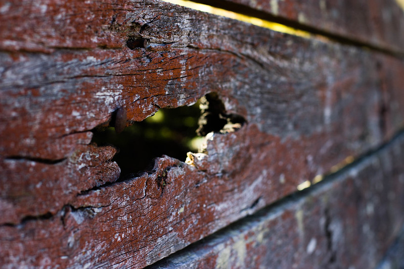
Please read the OP. First is really boring, there's no real subject. Second is also boring, and the horizon feels crooked. Third, I see what you were going for with the perspective along the rail, but perspective alone isn't really a good enough subject in this case. If it was leading to something, maybe. The out-of-focus background also doesn't work because there is no subject to isolate, this would have worked better a larger depth-of-field. Fourth, you've used a shallow depth-of-field for no good reason again. Fair enough, getting the background visible through the holes in the rust out of focus looks good, but you've got bits of the rail itself on the right of the frame out of focus and it's not helping. A more dead-on angle would have helped with this. Also, if the idea is to show the texture of the rust, compose only on that, leave out the bit of background at the top.
|
|
#
?
Oct 2, 2013 14:25
|
|
|
David Pratt posted:Please read the OP. Garbanzo, With the first two what were you trying to capture? Was it the light doing something interesting? I can imagine these scenes and they are probably really interesting with your eyes. I have a capturing sunlight issue often - I see something that is just beautiful with my eyes but the photo is totally uninteresting even if its a correct exposure. I have close to a hundred exposures like this that I am not capturing the light as I see it. As an example, I have taken a few hikes and seen meadows with sunlight filtering in beams but I have been unable to capture this even with a variety of fstop and shutter speed settings. Deer trails that are really interesting in that they are like tunnels under the trees and the light is really spectacular there too - just with my eyes and not in the camera. Is this something that filters or HDR or something can capture? I did recently get a circular polarizer that has improved the sky blue in sunrise/sunset shots - just waiting for nice clouds now.
|
|
#
?
Oct 2, 2013 15:52
|
|
|
Going in with the understanding that it's an overgrown / abandoned race track, the first two have the potential to be fairly interesting, but there's still not enough there on its own to convey anything more than trees and an old road. If there's a way to get a shot that shows the current state while still conveying that "hey, this used to be something!" it might be kinda interesting. Wario In Real Life fucked around with this message at 04:01 on Oct 3, 2013 |
|
#
?
Oct 3, 2013 03:59
|
|

|
rio posted:1) I do see the banding mentioned but it is really minimal on my lovely monitor. I think it would probably not show up in print. I like it but even as faint as it is I wish the horizon was level! Hi, posting my first feedback...been lurking for a while and would like to start getting involved & getting feedback! Love the clarity and serenity here, but I'd like to see a wider/landscape format crop. I don't think the square format really does it justice. Square formats are a bit of a trend, but not necessarily a good one. With a great scene like this, and great composition, I don't think you can go past traditional landscape/portrait format and in my opinion either would work better than square with this image. Perhaps a little less cyan and a little more blue in the sky, to tie it to the water a little more? But that's just a personal preference of mine.
|
|
#
?
Oct 4, 2013 10:26
|
|
|
-- More photo's from the racetrack this time showing what is actually left rather than just decaying fences. This is the straight after the first corner 023.jpg by drgarbanzo, on Flickr Further round the track 059.jpg by drgarbanzo, on Flickr 035.jpg by drgarbanzo, on Flickr This is possibly my favourite shot from the day and I have an idea why but I'm not entirely sure why. 048.jpg by drgarbanzo, on Flickr [/quote] Nice management of the light/dark areas in full sunlight in the bush. I like the third one more; it leads the eye into the picture but then lacks a place to go. You're obviously having a lot of fun with this beautiful area, and with a little more thought could make some really great images. When you're photographing in the bush, you do need to think really carefully about your focal point and what you're trying to say with and about the image. Otherwise you end up with a correctly exposed but meaningless tangle of messy branches; the aussie bush is visually messy if shot haphazardly. I would suggest backing up a bit, including more sky and the tops of trees to add some 'closure.' Right now your eyes follow the trees up and then....nothing. The same with the track, and with the bit of iron railing. Your eyes follow the path and the railing to nothing. This is frustrating for the viewer and can be solved by something happening on or at the end of the path/rail. Perhaps look around for an interesting tree, animal, rock, or anything really to give your eyes a place to go. I get what you're liking about the last one, but I'd like to see it taken further. Right now there's a bit of texture, but not enough to be really interesting. Again, an interesting insect could help, as then something would be happening other than just a piece of rusty tin.
|
|
#
?
Oct 4, 2013 10:36
|
|
|
Ok, posting my first for critique. Please be as harsh as you like, I'm not precious and would love any criticism/advice to help improve. I shoot raw with Nikon full frame, and edit lots, so if you see stuff I've done wrong with either, or could do better, let me know!   Thanks in advance!
|
|
#
?
Oct 4, 2013 11:35
|
|
|
Monstera posted:Ok, posting my first for critique. Please be as harsh as you like, I'm not precious and would love any criticism/advice to help improve. I shoot raw with Nikon full frame, and edit lots, so if you see stuff I've done wrong with either, or could do better, let me know! The first photo is so high-key that the woman's dark hair dominates the picture, while her skin and the dress get washed into the background. It looks like a mass of hair hovering over a rose at first glance. Even if it's easy to distinguish her face upon further examination, it still looks like it's hovering in a white void. The second is unpleasant to look at because of the nearly blown highlights on the woman's skin and the entirely blown highlights in the sky. I also don't like the overly cold white balance, since it makes the scene seem uninviting and causes the subject to look corpselike. The third is the best lit and exposed of the three. The white balance is more in line with what I would expect to see for a picture of a person and you aren't blowing any highlights. If you were to use a similar white balance on the first two photos, they'd probably be a lot more pleasant to look at.
|
|
#
?
Oct 4, 2013 12:53
|
|


|
I am really, really enjoying this, both the composition and the pop of colors. The red hits so very hard, and there's even detail in it. Fantastic.
|
|
#
?
Oct 4, 2013 18:51
|
|

|
TheJeffers posted:The first photo is so high-key that the woman's dark hair dominates the picture, while her skin and the dress get washed into the background. It looks like a mass of hair hovering over a rose at first glance. Even if it's easy to distinguish her face upon further examination, it still looks like it's hovering in a white void. Thanks for taking the time to critique, that's very helpful ") yes I am still working on/thinking about the tones in the second one, and as for the first one....I'm trying to take myself out of studio a but and practise my natural light shooting a bit. Still some things to learn there! Any time after 10 in Australia the light gets very harsh and bright, but I aim at developing the skill and technique to work well in any light. Any tips ere? yes I am still working on/thinking about the tones in the second one, and as for the first one....I'm trying to take myself out of studio a but and practise my natural light shooting a bit. Still some things to learn there! Any time after 10 in Australia the light gets very harsh and bright, but I aim at developing the skill and technique to work well in any light. Any tips ere?
|
|
#
?
Oct 5, 2013 22:48
|
|
|
Monstera posted:
I love the colors in this photo
|
|
#
?
Oct 6, 2013 03:27
|
|
|
Monstera posted:Ok, posting my first for critique. Please be as harsh as you like, I'm not precious and would love any criticism/advice to help improve. I shoot raw with Nikon full frame, and edit lots, so if you see stuff I've done wrong with either, or could do better, let me know! 1) I don't know if I agree about the hair dominating the shot. It seems to extend pretty naturally into the flower and down into the stem. However, if this was something planned out and not shot spur of the moment, you could have handled the lighting more gracefully I think. The dress is not at all my thing, but while I don't like it for subjective reasons I really don't like how it draws me to her shoulders which look messy because of something like either freckles or strange lighting or something - it is not flattering and almost reminds me of hair. The nice flower in the hair could bring things together nicely but gets lost being blown out like your background and shoulder. I think one other thing worth mentioning is that your focus and composition make it more about the flower than the girl - might be intended, but everything about the shot accents the flower and takes the focus away from the girl. 2)I like the shapes and form here but it is still kind of confusing, and I in conjunction with the first shot suggest that blowing out the highlights might not be totally intentional or at the least not something that is considered much when shooting or processing. Some blue from the sky could have brought your cold color balance towards relevance. 3) The color balance is better, and it looks better in terms of processing but I don't "get" it - I don't see any reason for what is going on in your subjects, background, composition or whatever. Your treatment of the skin and also highlights is much better here than in 1 & 2.
|
|
#
?
Oct 6, 2013 05:42
|
|
|
Monstera posted:
I like what I think you're getting at. I have a bunch of photographs of things like this; mostly old roads going through the woods. The problem is that they never end up being as interesting in photo form as they are when you're there. Something like this would be better if there was something in the scene. The track and the fence don't really carry the shot. Here's a shot that I did this morning. It a pretty rainy, foggy, dreary day so far.  Carousel House & Power Plant by benruset, on Flickr Edit: Here's another one I did today that I am pretty happy with.  Grand Ave. Bridge by benruset, on Flickr I was trying to get a sort of Monet's Houses of Parliament feel. ZippySLC fucked around with this message at 00:49 on Oct 7, 2013 |
|
#
?
Oct 6, 2013 16:23
|
|
|
Drop your shutter speed, you have falling helicopter syndrome.
|
|
#
?
Oct 7, 2013 08:32
|
|
|
rio posted:1) I don't know if I agree about the hair dominating the shot. It seems to extend pretty naturally into the flower and down into the stem. However, if this was something planned out and not shot spur of the moment, you could have handled the lighting more gracefully I think. The dress is not at all my thing, but while I don't like it for subjective reasons I really don't like how it draws me to her shoulders which look messy because of something like either freckles or strange lighting or something - it is not flattering and almost reminds me of hair. Thanks for taking the time to critique so thoroughly! That definitely gives me something to think about and work on; I think I'll try some warmer tones on that second one and see how it looks then!
|
|
#
?
Oct 7, 2013 10:17
|
|
|
rio posted:
I'm torn on this one. I think you did a nice job making a "pretty" picture in the sense of capturing the way the sky is reflected in the water, but it seems like there's not enough going on to make the image. With basically three bands of color making up the image it's like there isn't really anywhere to look. Also it looks like you jacked the clarity slider over a bit too far, there is something wonky going on with the coloring. ZippySLC posted:Here's a shot that I did this morning. It a pretty rainy, foggy, dreary day so far. These are doing a great job presenting that image of a dreary rainy day, the mood is perfect, I think. The first one, though, I think the tone balance between the sides and center of the photo are a bit off, the result is that it's not drawing us to look at the subject of the photo. Maybe this was your intention but the title says otherwise. The second is nice, I think in this case the emptiness becomes the subject in a manner of speaking, which works very well. The Monk posted:
Unfortunately the angle prevented a lower speed with the helo crossing me at probably 50 yds out. The low speed shots were a blurry mess. ...   
|
|
#
?
Oct 8, 2013 01:39
|
|
|
TsarAleksi posted:I'm torn on this one. I think you did a nice job making a "pretty" picture in the sense of capturing the way the sky is reflected in the water, but it seems like there's not enough going on to make the image. With basically three bands of color making up the image it's like there isn't really anywhere to look. Also it looks like you jacked the clarity slider over a bit too far, there is something wonky going on with the coloring. 1: I think this could use a square crop. 3: I don't think you're doing yourself any favors by hiding the action in the top right corner of the scene.
|
|
#
?
Oct 8, 2013 04:13
|
|
|
The shot looks a bit "bland" of course it's in black and white but it could use some more contrast especially in the sky other than that I like it. 
|
|
#
?
Oct 8, 2013 19:31
|
|
|
BreakingDolphins posted:The shot looks a bit "bland" of course it's in black and white but it could use some more contrast especially in the sky other than that I like it. I really like this one, from how it's centered to the exposure and all. Where is this? My only personal thing is I would crop off a bit of the pure black at the top, but it's fine as is. The other day I got to go to the Ponce de Leon Inlet Lighthouse, which proclaims itself as the second tallest lighthouse in the US. It was very cool, and I'm going to make a return trip at sunset someday to get some better shots. Here's what I got.  Stairwell2 by Middleshoes, on Flickr  Stairwell by Middleshoes, on Flickr  IMG_0008.CR2 by Middleshoes, on Flickr I couldn't stand dead center at the bottom of the stairwell, they blocked it off (how dumb!) so I had to lean over for those first two shots.
|
|
#
?
Oct 8, 2013 21:40
|
|
|
|
| # ? May 26, 2024 00:21 |
|
|
crime fighting hog posted:I really like this one, from how it's centered to the exposure and all. Where is this? My only personal thing is I would crop off a bit of the pure black at the top, but it's fine as is. It was taken from the Empire state building in New York, I was balancing my camera true the fence on the edge of the building risky shot but worth the result! Here's two more from my trip to New York: (high quality: http://500px.com/photo/48561788 // http://500px.com/photo/48561872 )  
BreakingDolphins fucked around with this message at 23:06 on Oct 8, 2013 |
|
#
?
Oct 8, 2013 23:04
|
|