|
I haven't posted in here before, so I thought I'd rather not talk out of my rear end about somebody else's work for my first post. I slowed down a bit on vacation and tried to really focus on composing my images. I looked at a lot of work from my past and a lot of them weren't very strong and looked more like snapshots. I struggled for a bit with the crop on this image. The bottom right corner has some distracting pontoons and I tried my best to minimize them and draw focus to the buildings, but I'm not sure if this image could benefit from more sky to push the buildings closer to the bottom of the image.  Willemstad by SuicidalSmurf, on Flickr In hindsight I really wish I had more DOF in this image. The iguana ended up being more washed out than I'd like due to the shadow.  Keeping An Eye on Things by SuicidalSmurf, on Flickr I'm pretty pleased with this shot. I like the contrast of the palm against the sky. I don't know if this image would benefit from having the trunk less exposed making the whole tree a silhouette.  Sunset by SuicidalSmurf, on Flickr
|
|
|
|

|
| # ? May 25, 2024 18:41 |
|
1) Pretty nice. If you're concerned about the pontoons, you can always (carefully!) clone stamp them out. I'm in agreement with you that you should get a little more sky and push the buildings more towards the bottom of the picture. If possible, try to get more of the ship on the left side. It feels like a part of the subject, but doesn't really get enough attention. 2) I personally like it the way it is, but if you don't like the color, maybe desaturate the background a bit? Depth of field doesn't seem like too big of a concern here, everything important is in focus. I think if you'd had the background more in focus, it would have drawn the eye away from the subject of the picture. 3) This one feels a little under-exposed to me, the sky is really dark once you get away from the sun, and it doesn't capture the vibrance or intensity of a tropical sunset. Compositionally, it feels a little boring - it's more of a postcard shot than anything, which is fine if that's what you were aiming for! -- Some shots from Nashville: I like the subject of this one, but the perspective feels a little wonky.  No Entry by venusian-weasel, on Flickr Wanted to try my hand at high-key night shots, not sure how well I accomplished that:  Railyard by venusian-weasel, on Flickr  Shelby Street Ped Bridge by venusian-weasel, on Flickr
|
|
|
|
SuicidalSmurf posted:I haven't posted in here before, so I thought I'd rather not talk out of my rear end about somebody else's work for my first post. I slowed down a bit on vacation and tried to really focus on composing my images. I looked at a lot of work from my past and a lot of them weren't very strong and looked more like snapshots. Check your vertical lines, all the buildings look like they're leaning to the right. Talking composition, I think I'd prefer more sky than water because the water isn't very interesting. If it was still water and you got reflections of the houses, sure. But the lumpy water just doesn't have much going on for it. quote:I'm pretty pleased with this shot. I like the contrast of the palm against the sky. I don't know if this image would benefit from having the trunk less exposed making the whole tree a silhouette. Yeah it's pretty cool. It might have worked better to get more of the tree in and maybe some beach, but I wasn't there so can't say if that was possible or not. Like Venusian Weasel said, it does feel a little dark. But it also manages to capture the "cool summer evening on the beach" feel so maybe it's okay as a memory shot.
|
|
|
|
Venusian Weasel posted:I like the subject of this one, but the perspective feels a little wonky. It might be hitting it the head a little much, but I think a square crop cutting everything above the sign would draw a little more focus to the joke. As is it's obviously still there, but with something like this, it's a kind of hammy joke anyway, so I would really drive it home. I don't mean any of that in a bad way, I love hammy jokes. I got my mirrorless and manual 50/1.4 this week and have been having a ton of fun and experimenting. Here's the best of the bunch, so far.  Morning by mattphilpott, on Flickr It was still dark out at breakfast so I had to shoot wide open. I love her face being in, but having the focus drop out on the pattern on the left is a little wonky, right?
|
|
|
|
SuicidalSmurf posted:I haven't posted in here before, so I thought I'd rather not talk out of my rear end about somebody else's work for my first post. I slowed down a bit on vacation and tried to really focus on composing my images. I looked at a lot of work from my past and a lot of them weren't very strong and looked more like snapshots. I like this! You could darken the tree down, and I think it could have benefited from a slightly wider crop; for me the sunset is just a tad too far to the right, but thats more of a personal preference I think.
|
|
|
|
Some shots from Nashville: I like the subject of this one, but the perspective feels a little wonky.  No Entry by venusian-weasel, on Flickr Yes the different lines are a bit distracting, I agree on the advice to crop in more. Is there a little lens distortion happening? I don't know, I tend to suck at handling lots of different lines going different ways. Wanted to try my hand at high-key night shots, not sure how well I accomplished that:  Railyard by venusian-weasel, on Flickr This one is overall ok, but the bright area to the left is a little too bright and has lost some detail because of it. I'd be inclined to expose slightly lower and then edit up the dark areas later. I remember being told that digital is the opposite to film in handling under/over exposure; with film underexposed areas lose detail and lightening won't work as there's just nothing there, and with digital it's the overexposed areas that lose the detail. So I tend to err on the side of slightly darker, as I know that I can bring it back up a little and the detail will still be there.  Shelby Street Ped Bridge by venusian-weasel, on Flickr [/quote] I like this one a lot, the only niggle is that light under the bridge in the middle, which you can't really do anything about that can you!
|
|
|
|
I was one of many photographers last weekend photographing the Brisbane Zombie Walk, run here to raise money for the Brain Foundation. It's a photographer's wet dream, and we all turn up in droves. It's one of the few events I shoot where I have good contact with other photogs; a lot of events are very 'my lens is bigger than yours' and people don't talk to each other unless they're part of the same clique. I love the Zombie Walk because it's just so much drat fun pretensions get dropped for a while, and there's a large number of amateurs/pro-amateurs and they are usually all really nice and enthusiastic and having fun. Here are a few of my favourites, more are up on flickr and my website, now hack away!  Brisbane Zombie Walk 2013 by redbootsphoto, on Flickr I love this family, but I'm not sure about the tones and my crop; lines going all different ways and that; I'm not sure about the white picket fence on top. It seems a little dull and pinkish to me, but the screen I'm working on today is crap so It's hard to tell.  Brisbane Zombie Walk 2013 by redbootsphoto, on Flickr Argh lensflare! There was no way to avoid it, I had the hood on and I couldn't miss the expression on the cop's face. Some of the other cops were treating the walkers like a bunch of dangerous meth addicts who might go crazy any moment and kill someone, so I was happy to run into a nice one.  Brisbane Zombie Walk 2013 by redbootsphoto, on Flickr This one's possibly my favourite as it says a lot about the day in one shot. Should I crop in a little more though? Yes I missed a bit of his hand on the left, which shits me. Monstera fucked around with this message at 04:03 on Oct 11, 2013 |
|
|
|
Monstera posted:I was one of many photographers last weekend photographing the Brisbane Zombie Walk, run here to raise money for the Brain Foundation. It's a photographer's wet dream, and we all turn up in droves. It's one of the few events I shoot where I have good contact with other photogs; a lot of events are very 'my lens is bigger than yours' and people don't talk to each other unless they're part of the same clique. I love the Zombie Walk because it's just so much drat fun pretensions get dropped for a while, and there's a large number of amateurs/pro-amateurs and they are usually all really nice and enthusiastic and having fun. Go to the arrow button on the bottom right area of the flickr photo detail page. Select "Grab HTML/BBCode" Select size, copy BBCode, paste into forums post. Code should look like this: code:Awkward Davies fucked around with this message at 01:12 on Oct 11, 2013 |
|
|
|
Awkward Davies posted:Go to the arrow button on the bottom right area of the flickr photo detail page. Select "Grab HTML/BBCode" Select size, copy BBCode, paste into forums post. Code should look like this: Thank you 
|
|
|
|
Monstera posted:
I am not bothered by that you missed a bit of the hand, there is enough information there to connect the hand to the person. I believe it works as there do not have to be that much information and it could have been an idea to cut the hand if you had the possibility to do so. The hand is close to the camera and in my face, I believe that is a good thing. Perhaps gradually blur more of the hand? The focus is on the face where the interest in the picture is. And the the soft parts of the picture not to blurred out so the context of all those people add to the chaos that the image gives me. The right side of the picture gives me more trouble than the hand.  IMG_2150 by dabrovnijk, on Flickr  IMG_2155 by dabrovnijk, on Flickr  IMG_2158 by dabrovnijk, on Flickr I like the colors of those pictures. I would have liked to have more space around the car farthest away from the camera (but that will bring more disturbance into the picture with the road and sky). That car is not noticeable right away, is that a good thing? The whole picture does not get delivered right away. The third picture I choosed to have a short dept of field, Perhaps it would have been better to have the burnt out interior in focus and only the background trees out of focus. I tried to portray a kind of apocalyptic feel that the burnt out cars and the autumn ending the summer gave me. (Apocalyptic is a bit stretching but I can not find a fitting word.) Edit: Did not realize that the links would be broken when replacing the pictures on flickr. erephus fucked around with this message at 00:43 on Oct 13, 2013 |
|
|
|
erephus posted:I am not bothered by that you missed a bit of the hand, there is enough information there to connect the hand to the person. I believe it works as there do not have to be that much information and it could have been an idea to cut the hand if you had the possibility to do so. Dang I wrote a whole thing and it disappeared: Pic 1: So much visual noise the car bleeds into the grass and it's a big ol noise fest and I can't understand what's going on. Pic 2: The most apocalyptic. I like it. However, very yellow. Reprocess so the car doesnt bleed into the background so much. Pic 3: Uneven/missed focus. Burnt junk to the left of the wheel is in focus, which doesn't make much sense. I post critique here occasionally but almost never any pictures, which doesnt seem fair. I bought a medium format camera and I've begun to experiment with taking portraits. I've already gotten some great feedback from the medium format thread, but really suck at this and could use some more. 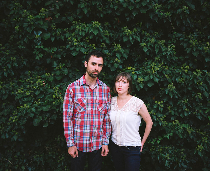 Band: The Future Scares Me by spikespikespike, on Flickr  Band: AK by spikespikespike, on Flickr 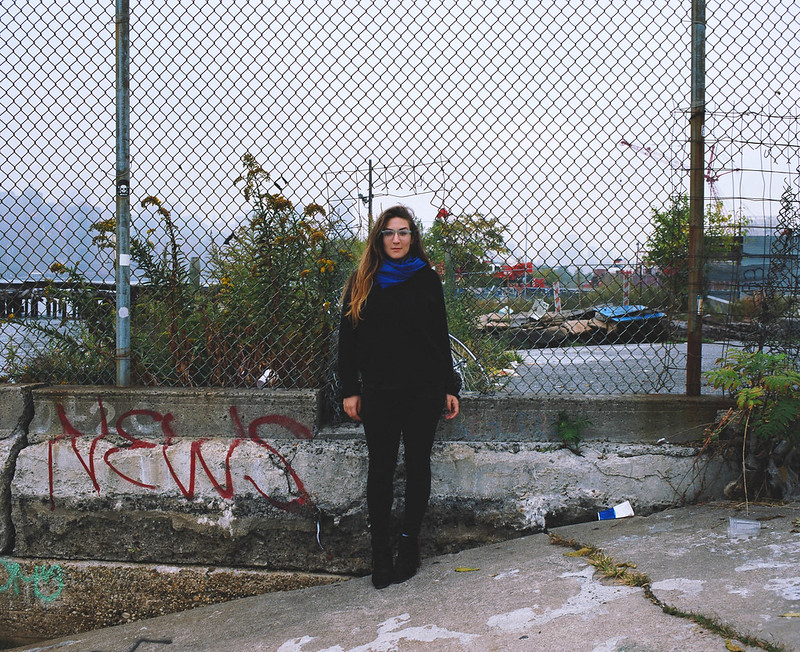 Band: AK by spikespikespike, on Flickr
|
|
|
|
Awkward Davies posted:Dang I wrote a whole thing and it disappeared: I have turned down the saturation on the yellow color and lessen the luminance. For me they feel slightly colder but I assume that is because my eyes got so used to the yellow tone and warmth in the former pictures. I have to go back in a few days and compare again. I tried to look on the road and when the yellow tone there was gone I stopped. But I am undecided between the warmth of the previous versions and the slightly colder new versions. Not that they are cold now, just more than before. (If you do not recognize them to have as much yellow in them that is because I have changed them on flickr.) erephus fucked around with this message at 00:45 on Oct 13, 2013 |
|
|
|
Awkward Davies posted:Dang I wrote a whole thing and it disappeared: Your pictures look like Mannequin's pictures (whatever people here will say I'll stand to say that it's a compliment.)
|
|
|
|
^ I don't see it - maybe superficially but I haven't seen many shots posted by Mannequin that looked like these. Regarding the photos - why are you leaving so much head room? I like 3 as is. 2 I think that it could be leveled and cropped down - bring it in from the upper left a bit. It just kind of looks like a snapshot as it is right now. 1 - bring it down from the top to a normal 3:2 format (again, the headroom just doesn't seem to be called for)
|
|
|
|
xenilk posted:Your pictures look like Mannequin's pictures (whatever people here will say I'll stand to say that it's a compliment.) Technically, that's because I believe I bought the same medium format camera he uses. Stylistically, skill-wise, artistically, I don't even approach him. But thanks! rio posted:^ Yeah you're right about the headroom. That's something I'll keep in mind.
|
|
|
|
erephus posted:
I like these photos, the second one in particular. I feel that's the strongest of the three. I think it's good that there weren't many extremely orange trees, because I think it would have clashed with the bottom portion of the photo. I also like that the road is in view. It adds to the, "this car's done for real" feeling. (That's the best way I can describe it.) I'm not quite sure if I think having the car on the upper right "feels right" in that first photo. The last photo's cool in that it shows off some of the interior and the decay. A part of me also feels the same way you do about the depth of field. I think having a bit more of the rusty dashboard and innards in focus would be pretty cool. I like the vibe these photos are giving off.
|
|
|
|
erephus posted:I am not bothered by that you missed a bit of the hand, there is enough information there to connect the hand to the person. I believe it works as there do not have to be that much information and it could have been an idea to cut the hand if you had the possibility to do so. Very Cool shots. I like the desolation they represent, and it looks almost post-apocalyptic. I got a shot of a kind of oldish looking thing as well:  IMG_6705.jpg by jmorris4371, on Flickr
|
|
|
Phummus posted:Very Cool shots. I like the desolation they represent, and it looks almost post-apocalyptic. I feel a little awkward giving critique of other people's work because I'm a total beginner but here goes. I like how the object stands out from the background, but I can't make sense of the lines of it. Parts of the object feel like they need to be rotated a few degrees counterclockwise and parts of it look aligned just right as it is. Did you run it through a sepia filter? It looks like you did and I don't think I like it. I feel like it would be better served using the original colors, whatever they may be. -- So I've just been experimenting for the last few months and I decided to try out baby's first lighting setup. One cheap light shoot-through umbrella, one reflector, and a few friends that were willing to humor me. I enjoy playing around with gender expression and this ideally is going to be part of series of photos where I have women (and possibly men) doing things that violate gender norms. Please rip them apart so I know what to do better next time!  IMG_2314 by step_aside, on Flickr I think I should have cooled down the colors a good amount, but I didn't want to lose the vibrancy of her hair, and I felt that keeping that while toning down the rest would have looked unnatural. That belt should be white, for reference.  IMG_2163 by step_aside, on Flickr Probably should have moved the reflector both up and closer to catch more of her face and the inside of her jacket so it's less of a dark mass.  IMG_2188 by step_aside, on Flickr Mimicking the Jay Z portrait on the cover of this month's issue of Vanity Fair. Wooden beam in the background is casting an awkward shadow behind her head.
|
|
|
|
|
step aside posted:
Overall tip I would say is pay more attention to whats going on in your backgrounds. the background is going through her head and body in so many places and/or it doesn't really relate to what you are trying to portray. Secondly, her face is exactly the same in every picture. On purpose? Or does she need more direction with expressions? First - I don't really understand. Why the sledgehammer? Is the dart board significant somehow? Its growing right out of her head. I can see that it is a picture that you wanted to tell a story with, but I don't know what that story is. Second - I don't have any feeling either way other than I don't understand her clothing but then again I'm a goon who doesn't understand clothing/fashion. Third - The only thing I noticed that mimic's the vanity fair cover is I guess her hand placement? If you want it to mimic it, make her stance as close as possible to his. His body is turned more to the side, his mouth has expression. Haven't been able to shoot much lately, so here are three older photo's that I know what my issues are (and there are plenty) but always helps to see what others say.  20130619-IMG_6217 by LeeMHarp, on Flickr  20130625-IMG_6624 by LeeMHarp, on Flickr  20130802-IMG_8897 by LeeMHarp, on Flickr dont hate the playa fucked around with this message at 18:14 on Oct 15, 2013 |
|
|
|
I'm a newbie with DSLR photography, but I learned a ton just from watching my ex-girlfriend with a fine art photography degree do her stuff. Anyway, here are some shots I've taken recently and I'd really like some tips on improving. I'm using a Nikon D3200 with a 35mm f/1.8 lens mostly (I don't really use the kit 18-55mm lens much yet) I'm going for a bit of a stark, harsh look with this one. I feel like I should have controlled the f-stop better though, this is at f/5.60 so I didn't really get the depth of field I think would have looked better--I think I'd accidentally switched the camera into an auto mode. How can I improve on that while still having the signs mostly clear? Just better manual control of it? Do I even have the right idea?  I'm pretty happy with this one, but I'm wondering if there would be a way to make it pop more. Shallower depth of focus (this is at f/4)? Did I do my color correction very well?  I took this one at the zoo, through some thick glass. I'm actually really happy with it, but I'm sure I could have done it better and would love some suggestions for improvements. This was at f/1.8, 1/4 second exposure. Am I focusing at the correct part of the lizard? Is there anything I can do to compensate for some of the reflections I'm getting off the glass (particularly in the right side of the image)? 
|
|
|
|
step aside posted:
------------------------------------------------ Long absence: Went back home for a week, moved house, work got to me excuses excuses.  Them Arches-1 by TimFPictures, on Flickr Trying more post work than usual, this is a snapshot taken while walking that I tried to turn into something a bit more. Wanted a vibe of a shrine or sacred place.  Cronulla-1 by TimFPictures, on Flickr Quickie from an assisting gig. <3 me a 2.35 crop.
|
|
|
|
XTimmy posted:Trying more post work than usual, this is a snapshot taken while walking that I tried to turn into something a bit more. Wanted a vibe of a shrine or sacred place. Mission accomplished, that looks awesome.
|
|
|
|
XTimmy posted:
Didn't I go here in Skyrim? Looks great, I love it.
|
|
|
|
I don't quite know how to approach some of your questions, but I'll try. Don't hesitate to correct me if I'm wrong / full of terrible ideas or whatever. This photo looks like you switched to Auto by accident as you said before. I'm not quite sure about how to salvage this to what you had originally wanted it to look like, but it'd be helpful to know what exactly you meant by a 'stark, harsh look'. Did you mean that you wanted the signs to stand out (pop?) more? A more defined seperation from the background? I like this, although the edges of the petals look strange to me (like color fringing). I would bump up the contrast on the petals a wee bit, personally. Kenshin posted:Am I focusing at the correct part of the lizard? Is there anything I can do to compensate for some of the reflections I'm getting off the glass (particularly in the right side of the image)? This is something I've been wondering for a while. I believe that throwing on a polarizing filter solves the glass reflection issue. (A second opinion on this would be great.) It looks like the focus on the head / upper body of the lizard is off. It seems to be very soft. Then again, that could also be the haze of the glass and reflection. Here's some pics I've taken at a nature museum from this past weekend. Any pointers? My last photo was ignored for some reason, so I hope that I at least get some sort of critique for this stuff.  _A123981-2 by Kiwithing, on Flickr  _A123898 by Kiwithing, on Flickr  _A123929 by Kiwithing, on Flickr EDIT: Forgot to actually delete a 4th image. Sharizard fucked around with this message at 02:17 on Oct 21, 2013 |
|
|
|
Sharizard posted:I don't quite know how to approach some of your questions, but I'll try. Don't hesitate to correct me if I'm wrong / full of terrible ideas or whatever. I am friendly suggesting you to reread the rules. What I think that could have made your photos better: 1. A polarization filter could remove that reflection on the glass, perhaps not completely and a picture taken with a polarization filter could very well end up looking like that. There is nothing telling that the reflection is not already lowered and some of it removed. The head of the turtle should have been more in focus, without make the rest of the turtle soft it could be done with more DoF. The black thing in the lower left could perhaps be left out of the photo. And perhaps the turtle is a bit to dark, especially on the back of it. 2. I think that is good as it is and I can't find anything that could make it better. 3. The noise in the background. I can guess that is due to sharpening the photo? Add a bit noise reduction so the soft out of focus part of the picture do not get sharpened/over sharpened or if you can mask the picture. Or less sharpening. The bird feels like it is "spot on". 4. It took me a moment before I realized that the animals where stuffed. Perhaps if it would be framed differently, moving the family more into the middle or if all paws should have been in the frame.  bed by dabrovnijk, on Flickr  desk by dabrovnijk, on Flickr  standing by dabrovnijk, on Flickr At a "hotel"... I had nothing more than the clothes I was wearing, in the backpack I had my camera, the tablet and the needed power adapters. It was just one night and was getting home after dinner the following day. I am trying to convey a bland feeling. I had nothing more to do other than browsing through dorkroom, watching a few episodes of Revolution and going out doors to get a smoke from time to time. Just spending enough time so that I would be tired and be able to go to sleep. It is just that ordinary room and the rest of the group is stuffed up in their respective rooms and the day is over. erephus fucked around with this message at 17:06 on Oct 20, 2013 |
|
|
erephus posted:
erephus posted:
erephus posted:
|
|
|
|
|
Is there somthing that I could have changed? To make them portray what I intended and make them better, beside doing the opposite of what you wrote?
erephus fucked around with this message at 19:11 on Oct 20, 2013 |
|
|
erephus posted:Is there somthing that I could have changed? If you want things to look extremely ordinary, try avoiding strange angles. Eye level perspective, don't bank the camera. For the sitting-at-desk picture, you could have tried a straight-on perspective from behind. Similar for the first one. The third, no idea, maybe just don't take the picture.
|
|
|
|
|
nielsm posted:If you want things to look extremely ordinary, try avoiding strange angles. Eye level perspective, don't bank the camera. For the sitting-at-desk picture, you could have tried a straight-on perspective from behind. Similar for the first one. The third, no idea, maybe just don't take the picture. (The last option is always valid.) Tilting a picture is not really a good way to make an uninteresting picture interesting. I am not sure how to put it in words but it the picture would be "made" for it. If I got that right? I appreciate for straight on telling me it did not work and thanks for the ideas/tips.
|
|
|
|
erephus posted:I am friendly suggesting you to reread the rules. Thanks for the advice and the note on the extra image. I accidentally put in one that I didn't want to get critiqued. (The one with the finch.) I think it's about time I invest in a polarization filter. For the forth one, that's a crop. I should have known it would have been better to get the entirety of the foxes in frame.
|
|
|
|
Claw Massage posted:
I really like the setting of this, but the subject is so far out there that the two girls have become irrelevant and more noise than actual subjects. If she was in the foreground with the statues off to the side forcing some perspective, it would make more sense and be more interesting. Something like a telephoto lens which compresses depth would be appropriate for this kind of shot. Also, your picture is not centered horizontally (your subject may be in the middle, but the two statues not being equidistant to the edges throws that off). Here's a quick cellphone picture I took yesterday. I'll get my hands on a D3200 soon...  My immediate self critique is that the sky needs to be fixed in post because the bad dynamic range of the camera makes it completely white instead of blue. Also, I think I'm 1-2 degrees off horizontal level here but I may just be going crazy.
|
|
|
|
quote:My immediate self critique is that the sky needs to be fixed in post because the bad dynamic range of the camera makes it completely white instead of blue. Also, I think I'm 1-2 degrees off horizontal level here but I may just be going crazy. In a bright sunlight it's going to be hard to capture the sky and shaded area regardless of camera. For still subjects like that, you can try some HDR and use that to subtly bring the sky back without being obvious THIS IS HDR! edit: content, here's a picture I'm working on fro my younger sister's senior photos. 
Cru Jones fucked around with this message at 14:56 on Oct 25, 2013 |
|
|
|
Awkward Davies posted:
So I never do portraits and I need practice. In my photog class I'm forcing myself to do portraits of random people on my campus for the final.  backyard by Jordan_t_Brown, on Flickr I forgot to crop the film edges out of this one. oops.  cafe by Jordan_t_Brown, on Flickr
|
|
|
|
Cru Jones posted:In a bright sunlight it's going to be hard to capture the sky and shaded area regardless of camera. For still subjects like that, you can try some HDR and use that to subtly bring the sky back without being obvious THIS IS HDR!  MEMENTOMORI-1 by TimFPictures, on Flickr Hate the fact that jpeg compression kills the detail on the tip of the wing.
|
|
|
|
Im That One Guy posted:I really like this one. I'm starting to like more and more really simple subject placement. I feel like centering her makes her more important and more of a focal point than if you followed thirds. The diagonal sidewalk makes it feel more dynamic but I just wish it didnt make her feet diagonal. I think you could afford to stop down a bit. The first picture the depth of field is too small. I'm not sure anything is in focus in the second picture. If you're trying to emphasize "these are random people in various parts of campus", it may be helpful to include more of their surroundings. If you're purely focused on their physical features, then ignore this advice.
|
|
|
|
Claw Massage posted:
"Looking through the pilings of a pier onto the open ocean" is a photographic clich�. The blurry foreground is not supporting the rest of your composition, and the leading lines you've established with the pier don't take us anywhere or invite us to consider anything. This isn't a bad picture, exactly, but you haven't done anything with your composition that causes it to transcend the clich�, which makes it forgettable. Played around with medium format this weekend:  Untitled by TheJeffers, on Flickr  Untitled by TheJeffers, on Flickr
|
|
|
|
Cru Jones posted:In a bright sunlight it's going to be hard to capture the sky and shaded area regardless of camera. For still subjects like that, you can try some HDR and use that to subtly bring the sky back without being obvious THIS IS HDR! I like the color/toning of this, but I don't like her pose. You've shot her dead on, making her look a whole lot bigger than if you've had her turn a bit, and hold her right arm a bit further back. You've also almost shot up her skirt, wich I don't find very flattering - maybe would look better with her legs to one side? A friend took me to an art exhibit in a building that is scheduled to be demolished. Took a few pictures. I wasn't at all prepared, so I only had my 60mm with me, and that was a bit too long, but got a few pictures I liked from it at least.  AJK_3299 by SAFistLips, on Flickr  AJK_3300 by SAFistLips, on Flickr
|
|
|
|
As a new photographer I've been trying to experiment and find what works and what doesn't. I like that digital makes experimentation so cheap, and it allows me to learn from my mistakes without breaking the bank. Once I kinda figured out how to focus and set the exposure I took my model out to a wooded area on a farm a few weeks ago on an overcast day. It was cold as poo poo and we had to work fast because she was freezing. I wanted to show exposed, yet coldly defiant in the image. We went for minimal makeup, hair, and a really simple wardrobe. I figure having some sort of plan or idea before you start is smart, that way you can maximize your time and not spend a lot of time farting around trying to think of something interesting. Although I do see the benefit of just dicking around sometimes too.  The image is kinda  so I'm linking it just in case: Forest 2 so I'm linking it just in case: Forest 2 Things that were good: Shooting up on her looks a ton better than shooting down. I tried both, but shooting down gives her stumpy legs even though she's tall. I think I also lucked out with the light since I was at the mercy of what the sun was giving me. I did splurge and spend $18 on a reflector. I think that was a good buy. Things that were bad: Not crazy about the cropping on her thighs. Wish I had gotten a little more of them. Maybe just above the knees? I also have to learn how to direct and pose people better. They can't see what I see through the viewfinder and that's to communicate. Any pointers you guys can offer would be welcome. EDIT: step aside posted:
BigBoss fucked around with this message at 20:28 on Oct 31, 2013 |
|
|
|
Claw Massage posted:
Someone earlier had said that photo is a bit clich�d, but clich�s are that way for a reason, and I think this is a pretty well done version. I wish you had gone for a more hyperfocal shot, I think the blurry foreground here takes away from the impact of the image, but I like the framing, the coloring and the processing. If I took it, I'd be happy with the result. XTimmy posted:
I like this one a lot. These kinds of shots are right in my wheelhouse. I wish there was more sky though in it. It might be a limitation of the crop you selected, but I think more sky would help make the photo seem bigger. The whites are a little blown out too, but that might be a limitation of shooting into (or close to) the sun. My eye just keeps on getting drawn to the big expanse of white where the sun is though, it's distracting somewhat.  Garden Door by jpitha, on Flickr  DSC_0372 by jpitha, on Flickr
|
|
|
|

|
| # ? May 25, 2024 18:41 |
|
Shampoo posted:
This is pretty cool, though maybe next time getting a little bit lower to the ground (maybe only 6-12 inches?) may give a better sense of being encompassed by the flowers, if you will.  
|
|
|


