|
Photos are serious. Old houses are serious. Pleasure is a myth.
|
|
|
|

|
| # ? May 21, 2024 01:29 |
|
the hodag posted:I did a shoot with a bride after her wedding at a cool old house. All of these feel more influenced by the location than by the the subject or context, which I feel is the oppposite of how you should approach portraits. The bride is the point of the wedding photos, not brooding window dressing for a cool setting.
|
|
|
|
mr. mephistopheles posted:All of these feel more influenced by the location than by the the subject or context, which I feel is the oppposite of how you should approach portraits. The bride is the point of the wedding photos, not brooding window dressing for a cool setting. I would second this. You have a good sense of location but direction is often lacking I think. It's OK to have interesting "uncomfortable" portraits but these smack more of her being acutely aware of the camera and just feeling a bit awkward. There's a shot in that set where you've positioned her really far away, framed by the doorway. The comp is fantastic but the pose is totally at odds with what you've set up, which is a shame because it was almost really good. Now I sort of want to see you do a big, coherent photo series of unhappy brides in isolated settings.
|
|
|
|
Gazmachine posted:Now I sort of want to see you do a big, coherent photo series of unhappy brides in isolated settings. It's the only way to save them. He has no choice now.
|
|
|
|
I made a ghetto-as-gently caress Peter Hurley headshot lighting rig last weekend out of cardboard and tinfoil. P1120624.jpg by fuglsnef, on Flickr  Villi by fuglsnef, on Flickr  Anne by fuglsnef, on Flickr
|
|
|
|
David Pratt posted:I made a ghetto-as-gently caress Peter Hurley headshot lighting rig last weekend out of cardboard and tinfoil. catch eye is awesome! I've never been a huge fan of white background, always find it hard to look at the subjects but that's just a personal opinion. I've been trying some new basic lightning techniques myself.  IMG_9037-Edit by avoyer, on Flickr  IMG_9003 by avoyer, on Flickr  IMG_8973-Edit by avoyer, on Flickr
|
|
|
|
xenilk posted:catch eye is awesome! I've never been a huge fan of white background, always find it hard to look at the subjects but that's just a personal opinion. That first one's a bit blown out in the highlights to my eye, but I am perversely sensitive to that and my style has evolved into a sort of low contrast thing that some people hate, so maybe I'm being picky. Processing-wise, I think the bottom two could do with the blacks upped by 2 (if you're using Lightroom) or 2% in selective colour in PS. Maybe just 1 notch on the bottom one. Maybe get rid of that crease in the bg on the second one? I also have an aversion to studio where you can see the creases / folds in the curtain etc. Picking aside, good stuff. Good posing and comp on that dude.
|
|
|
|
Gazmachine posted:That first one's a bit blown out in the highlights to my eye, but I am perversely sensitive to that and my style has evolved into a sort of low contrast thing that some people hate, so maybe I'm being picky. I'll test out the black upped by two in LR when I come home!  I kind of like the crease/imperfection of the studio I thought it was giving it a bit of texture, do you think it makes sense ? I'll try cleaning it up to see the difference. I kind of like the crease/imperfection of the studio I thought it was giving it a bit of texture, do you think it makes sense ? I'll try cleaning it up to see the difference.First one is definitively blown up, thanks for pointing it out. I will try to retouch it, I liked the lightning feel but I'll give it another run at post-processing, see how I can make the vibe a bit better.
|
|
|
|
Yeah I mean it's not "wrong", I'm just forcing my personal tastes upon you, ha. Same with the bg: I just feel like it looks like a mistake. Like if it was all textured like that then it would be clearer to the viewer that it was on purpose, if you get me? To me, it seems like an accident. Again I'm just nitpicking to gently caress 
|
|
|
|
Gazmachine posted:
What kind of pose would you have gone with in that image? I mostly shoot weddings so I'm used to posing two people together and I struggle when it's just one person.
|
|
|
|
Well the setting is so unusual that I feel like the pose should match. Something more head on than what we have there to complement the composition; I'm seeing one large frame then a smaller frame within in which our subject is placed. If she was facing us dead on, that would add a third symmetrical structure to the pattern and would make the comp feel stronger and more satisfying. The feeling I get from that shot is that she's being shot by someone else in that room and you're taking a candid from far away. It's a cool idea though, and makes me realise I need a remote trigger. Again, it's not wrong,but I personally don't feel as if there was a clear idea with this shot. If you WERE set on this pose, I think it would have worked perfectly if she were further to the left, looking into the frame. Basically, that lit area is your frame.
|
|
|
|
Ive been using a bare flash, in your face technique, its working out quite well.  7/13/2003, Lake Oswego by Ashade76, on Flickr
|
|
|
|
 2013-872 by Tom Rintjema, on Flickr  2013-873 by Tom Rintjema, on Flickr  2013-876 by Tom Rintjema, on Flickr  2013-879 by Tom Rintjema, on Flickr  2013-874 by Tom Rintjema, on Flickr I'm having a hard time picking the good ones out. Granted this is my Daughter and I like almost all of the photos I take of her.
|
|
|
|
I'd say 1,3 and 5 are the strongest. In general I'd pull back a little on the dodging/burning, especially on her eyes and in #3 where the dodging on her dress is pulling focus away from her face. I think for the look you're trying to achieve with these, muting the tones that aren't important to the focal points will go a long way: right now her socks are brighter than her face and it's pretty distracting.
|
|
|
|
Compositionally all really nice and they are full of character and capture the spirit of her, which is what you want. I immediately noticed the overdone eyes, before I'd finished scrolling the images into view. You don't need to do it, or, if you do, you only need a third of that dodging at most. In fact, sack most of the processing off completely.
|
|
|
|
Were you using a reflector at all, or is all the lighting work done in post? The first one is great.
|
|
|
|
It was all post. I didn't bring anything with me, just went for a walk with her and she wanted me to take her photo. I should train her brother to be an assistant and hold the reflector, ha ha.
|
|
|
|
All those resources and you ain't using them! Get him to work.
|
|
|
|
Musket posted:Ive been using a bare flash, in your face technique, its working out quite well. Is it? Can you elaborate?
|
|
|
|
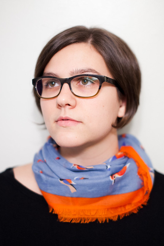 Untitled by Isaac Sachs, on Flickr
|
|
|
|
Eyes aren't in focus mang. That's a dope scarf.
|
|
|
|
Dumb beginner question: when both eyes aren't in the focus plane, what should one do? Get one in focus? The closest one? Make sure the focus plane is deep enough to hold both?
|
|
|
|
bolind posted:Dumb beginner question: when both eyes aren't in the focus plane, what should one do? Get one in focus? The closest one? Make sure the focus plane is deep enough to hold both? I think there will be some personal preference on this, but I think a photo is usually stronger when both eyes are in focus. If that doesn't jive with your shallow depth of field concept or whatever, I think it generally looks best if the closest eye is in focus.
|
|
|
|
evil_bunnY posted:Eyes aren't in focus mang. Close enough, okay??
|
|
|
|
bolind posted:Dumb beginner question: when both eyes aren't in the focus plane, what should one do? Get one in focus? The closest one? Make sure the focus plane is deep enough to hold both? Do whatever you think looks cool. Who cares.
|
|
|
|
If only one eye is in focus I think it usually looks strange if the one closest to the camera is oof.
|
|
|
|
Your focus should be such that people are more like abstract human-shaped blobs of color. Look at those loving branches. Way more interesting than an eye. Everybody has eyes, who cares.
|
|
|
|
aliencowboy posted:Do whatever you think looks cool. Who cares. I second this motion.
|
|
|
|
McMadCow posted:Is it? Can you elaborate? aliencowboy posted:Do whatever you think looks cool. Who cares.
|
|
|
|
Well I care, tbh. Because in a thread dedicated to the discussion and criticism of portrait photography I like to hear about the concept that lead up to the execution. v
|
|
|
|
Does the chin squished like this ruin the photo for you? I didnt realize she was posed like this until it was too late. Just wanted the dorkrooms thoughts. Sarah by francography, on Flickr
|
|
|
|
somnambulist posted:Does the chin squished like this ruin the photo for you? I didnt realize she was posed like this until it was too late. Just wanted the dorkrooms thoughts. It's a loving kid, it's okay. If the subject is an adult and is going to dislike it, then maybe worry about it, but if someone that kid's age is already worrying about it, I feel bad for her.
|
|
|
|
RangerScum posted:It's a loving kid, it's okay. If the subject is an adult and is going to dislike it, then maybe worry about it, but if someone that kid's age is already worrying about it, I feel bad for her. I....think I hit a nerve. Haha. I'm talking about portraiture in general, I'm not suggesting her mom is going to hate the photo because of it. My question is more about general posing and if things like this ruin a portrait to you. I'm not suggesting she looks awful or anything :p
|
|
|
|
somnambulist posted:I....think I hit a nerve. Haha. I'm talking about portraiture in general, I'm not suggesting her mom is going to hate the photo because of it. My question is more about general posing and if things like this ruin a portrait to you. I'm not suggesting she looks awful or anything :p Oh, well if you are doing beauty shots then people usually don't like their necks to look fat. I was just trying to say that yes, people don't usually like it, but hopefully kids aren't aware enough to care, and ditto for their parents. It'd be a different story if the girl was overweight like that little Michelin Man girl who was on the Ricky Lake show forever ago that blew up on the internet. I think it seemed like I was more angry because I used "loving" because I hadn't hit my quota for swears for the day, I don't really care much at all. 
|
|
|
|
Something I shot this week  Untitled by Back to You Photography, on Flickr  And when the dust all settles and the story is told History is made by the side of the road by Back to You Photography, on Flickr
|
|
|
|
Brodieanalog posted:Something I shot this week I really like your color palate in the second one, but you're having some real issues with the model existing in the location. I think she's sitting on a rock, but I only sort of guessed that by process of elimination because the foreground is obscuring her so much. Also it rather looks like her legs are floating/composited into the background. Now that I mention it, you've got the same issue in the first one as well. As a pair, these are far too similar to work together. I don't know if a pair was your intention but it's what you posted so that's all I can go by. Her pose very close in both, only mirrored. Even her hand position is the same, can't see her feet, etc. These are strong in technique, but you're missing a lot of details that would elevate them imo. My biggest piece of advice would be to let the model exist in and interact with the location. Going on location isn't just a substitute for a seamless backdrop, it's an element of the narrative- an element that feels missing from these. EDIT: I like the lighting in the second one, it works really well in the scene and adds drama without overpowering the scene. The lighting in the first one is way harsh and definitely overpowers the scene. McMadCow fucked around with this message at 19:29 on Nov 22, 2013 |
|
|
|
I dislike the second for the reasons above, but I like the first one a lot. And I like the harsh lighting in the first, although it could maybe be toned down slightly. The second feels like all of the highlights are smashed down into nothing and it feels really flat and her eyes are almost completely lost.
|
|
|
|
 IMG_5086.jpg by Brian.M.K, on Flickr
|
|
|
|
I spent a few weeks reading through most of this thread, there is some great stuff in here. My main goal for now is to spend much more time shooting people and really working on improving the portrait skills. With that in mind, harsh CC is welcome. There is so much to learn, not just about the lighting but your interaction with the subject and directing poses etc. For me the latter is the hardest so far... Luckily I have one willing model but will have to start hassling friends to get some variety.  Portrait-2 by s d photo, on Flickr Missed the focus on the eye closest to the camera on this one.  Portrait-3 by s d photo, on Flickr  Portrait-1 by s d photo, on Flickr
|
|
|
|

|
| # ? May 21, 2024 01:29 |
|
deaders posted:I spent a few weeks reading through most of this thread, there is some great stuff in here. These are generally nice, but you sure do like to have your model looking in camera out of the extreme corner of her eye. It's really awkward. A good guideline to use is that you should be able to see whites of the eyes on either side of the iris. Of course rules are made to be broken, but it's not working here- especially the last two.
|
|
|


