


|
rcman50166 posted:Funny you should say that. I did take quite a few like that but I didn't feel it had the same context or effect: Well, I like that one better! ")
|
 #
?
Nov 26, 2013 13:57
#
?
Nov 26, 2013 13:57
|
|


|

|
| # ? May 27, 2024 13:53 |
|
|
rcman50166 posted:Funny you should say that. I did take quite a few like that but I didn't feel it had the same context or effect: I actually like the other shot more. I think the vertical crop and the stump add context to the photo. Plus. I like the colors and clarity in the first one more, but I can't say it's technically "better" or anything, just a different aesthetic. I do wish you put the whole flickr link though, I like reading the EXIF info for photos I like to see how they were taken   Brooklyn Bridge detail by jpitha, on Flickr It is extremely difficult to get a shot with all these straight lines to not look wacky, even when straightened to within in an inch of its life in Lightroom. You wind up second guessing yourself and doing strange things like putting a ruler up on the monitor.
|
|
#
?
Nov 26, 2013 21:06
|
|


|
I once put a level on a line because I was convinced my monitor was leaning and throwing off my guides in Photoshop.
|
|
#
?
Nov 26, 2013 21:22
|
|


|
TheJeffers posted:
This one's not really doing it for me. I get the tourists/skyline contrast with the water, but there's nothing grabbing focus. I hope this is alright, I found this photo from a trip to San Fransisco last year that I hadn't paid attention to. I wish the balcony was sticking out a bit less so I could've framed the circle base of that tower better.  Japantown, San Francisco by DAMNNIGERIAN, on Flickr
|
|
#
?
Nov 27, 2013 14:27
|
|


|
Shampoo posted:
I love the lines and the textures, but the bridge feels underexposed. I'm sure that bumping the exposure starts to blow out the sky and lose the textures and clouds, but maybe pop it into photoshop and composite that sky with a brighter bridge or bump the exposure of the whole thing and mess with the curves until there are no blown highlights. Those clouds look like they have a little room to be brightened. This is the first time I have posted pictures in months, but yesterday I did a ridiculous amount of post and now it's time to get the bad news. From the Monterey Bay Aquarium:  MontereyBayAquarium-7 by prismaticglasses, on Flickr  MontereyBayAquarium-20 by prismaticglasses, on Flickr And from a day of wandering around San Francisco.  SF_June_2013-8 by prismaticglasses, on Flickr I know that the left one is getting lost in the trees and the background is super distracting, but I really liked those three lifts. Is it beyond hope?
|
|
#
?
Nov 27, 2013 18:12
|
|

|
TheJeffers posted:
I like this. It feels like an advertising shot, a lot going on, a lot to draw your eye. I think there's an interesting distinction between the city on the left curving down towards the middle, with the buildings in the background curving down to the people in the middle foreground showing a human busy-ness. Contrasting that on the right seems to be a very industrial scene, the busy highway and the wheel in the background show humanity but really the flatness of the buildings and the sea, especially with the port cranes in the background showing the more industrial side. I also like the contrast between the left foreground with the colour of all the people's clothes and the grey-blue of the right background, and also the reflection of the buildings in the left background against the grey concrete of the highway. I think it's a nice shot capturing an interesting view of a multi-faceted city. Shampoo posted:I actually like the other shot more. I think the vertical crop and the stump add context to the photo. Plus. I like the colors and clarity in the first one more, but I can't say it's technically "better" or anything, just a different aesthetic. I do wish you put the whole flickr link though, I like reading the EXIF info for photos I like to see how they were taken I'm not a fan of this. It's too dark for me, while I can make out everything it looks too gloomy. One the one hand this could work if you had an imposing structure view against an impressive sky, but by throwing in the lines it detracts from this and the perspective doesn't work for "imposing" either, for which I'd imagine you'd need to stick closer to traditional compositional rules. The lines also don't work on their own because there's nothing leading them into the picture (again traditional composition.) I think you've gone halfway between two shots here and not succeeded in blending them. One the one hand you could have an abstract shot with the lines, or you could have the imposition of the structure, but neither work together. This is the first image I've tried processing from a scan. I'm a bit unsure about the colours, if it's too muddy in general (although the original buildings are in a very muddy brown brick setting.)  This is of a set of old council flats in my town. Right around the corner from here is some very run down flats, lots of graffiti about heroin addicts, rubbish/trash everywhere and they're in the same style of council flat as these. Contrary to that these flats come across as quite well looked after. I wanted to get across an image that would be recognisable to many people as a poor area but one that's quite calm in setting and with a level of dignity. I'm worried that the photo means more to me due to my familiarity with the area than anything that comes across in the photo.
|
|
#
?
Nov 28, 2013 19:56
|
|

|
Mrenda posted:This is the first image I've tried processing from a scan. I'm a bit unsure about the colours, if it's too muddy in general (although the original buildings are in a very muddy brown brick setting.) I would prefer this with gamma adjusted to brighten the midtones. Right now it's a pretty sad dark-ish gray, raising the gamma a bit should enhance the brickwork and other textures a bit. Otherwise if you prefer it this dark, see if you can rescue some detail out of the sky, even just a slight bit would give some more life to the picture. And yes, by itself the picture doesn't mean much. I think it could work if you have a small series of related pictures (same neighborhood or otherwise), and with an appropriate title for it.
|
|
#
?
Nov 28, 2013 20:23
|
|


|
I really like the quiet, serene atmosphere in this shot. The soft, warm light really works for it. That said, I'd like to see it with slightly darker shadows to accentuate the way the light spills across and illuminates the bridge, and maybe juuuust a touch more warmth to give it more of that "almost sunset" vibe. I've finally started shooting more and even actually editing some stuff since burning out doing my aunt's wedding photos a few months back. 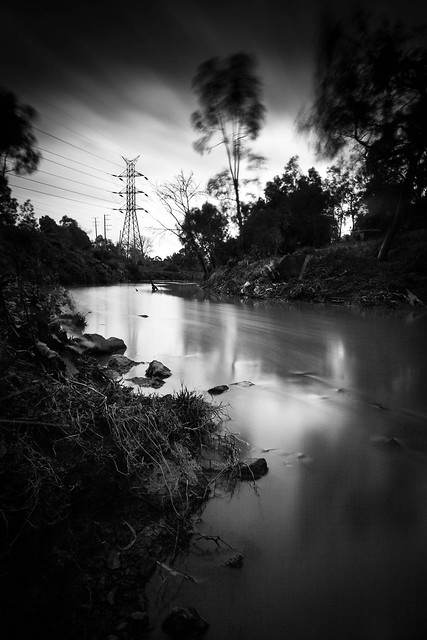 Merri Creek by ejtors, on Flickr Wafflecopper fucked around with this message at 03:28 on Dec 3, 2013 |
|
#
?
Nov 29, 2013 10:10
|
|


|
Shampoo posted:
The attention to detail shows, the symmetry of this is really apparent. If I had to give any feedback, the stonework on the bridge could be exposed slightly more, but that's a minor nit. Great shot! Thankgiving Panorama:  The tripod was bumped the last 1/4 second of the far right frame. The trees in the foreground were avoidable, but I'm not hauling a step ladder. drat white balance:  Shot from a moving, foggy ferris wheel. The windscreen added some distortion, but I'm happy with the perspective. 
|
|
#
?
Nov 29, 2013 22:14
|
|
|
Valdara posted:
I like this a lot. The fact that there's more visual space on the right bugs me though. The last lift does get lost in the trees, but I think it's still a very strong photo. I always see those sorts of lifts and want to take a shot that evokes their weirdly animal nature, and I think you've done that here. They have personality.
|
|
#
?
Nov 29, 2013 22:41
|
|
|
Shampoo posted:
I'm going to echo what people have said and say that this is pretty underexposed. I really like the shot and composition otherwise, but it looks like it is somewhere between a silhouette and a well lit subject, so I find that my eye just tends to gravitate towards the sky. You might also want to try a black and white treatment, since that would not only bring out the detail in the stonework, but also make the bridge more of a focus without having the sky act as a distraction. Valdara posted:From the Monterey Bay Aquarium: I'm really digging those colors, although I may be a bit biased towards aquarium shots. And as someone who has also tried to shoot at that aquarium, the sharpness and clarity of the picture there is really stellar. I also really like the lift shot, but Awkward Davies articulated it way better than I could have ever hoped to. Here is my own shot taken at the Monterey Bay Aquarium that is super grainy because who would have thought jellyfish rooms would be dark as hell. I was also free handing this, so I didn't get the sharpness that I wanted.  Drinking With Jellyfish by Spiff11, on Flickr An accordian player in Barcelona.  An Accordian Player in Park Guell by Spiff11, on Flickr A medina in Morocco. I am really iffy on this photo, since I think that there's a lot of blown out details (like in the blowing, uh, curtains?), but I wanted to see what other people think since I tend to overthink flaws in things I stare at for an hour.  The Medina of Rabat by Spiff11, on Flickr
|
|
#
?
Nov 29, 2013 23:34
|
|

|
GrandpaPants posted:An accordian player in Barcelona. The aspect that sticks out most for me here is the pattern of the stone and the pattern made from the different colour "blocks" in the image. With that, the door/gate throw off any symmetries going on in the image. I think you either need to cut out the door on the side or have composed with the pattern from the door taking up equal importance with the accordion box and player. I don't think there's enough going on for a tighter square crop to work. quote:A medina in Morocco. I am really iffy on this photo, since I think that there's a lot of blown out details (like in the blowing, uh, curtains?), but I wanted to see what other people think since I tend to overthink flaws in things I stare at for an hour. This doesn't do anything for me, nothing catches my eye. It seems to clean in general, the blown cover on top is a big portion of the image with nothing going on and there's no event in the rest of the image to hold your attention. I know I posted only a day or two ago but these are the last of my scanned images I'm happy to post. All from a Paddy's Day parade a few years back.   
|
|
#
?
Dec 1, 2013 01:34
|
|
|
I love the look on the little girl's face, she just looks so disinterested and grumpy at the same time. Only too bad we can't see the woman's face, but I imagine there wasn't much you could do about that in that situation. I took this picture of a mean cow this summer.  AJK_1983 by SAFistLips, on Flickr
|
|
#
?
Dec 1, 2013 08:07
|
|
|
FistLips posted:I love the look on the little girl's face, she just looks so disinterested and grumpy at the same time. Only too bad we can't see the woman's face, but I imagine there wasn't much you could do about that in that situation. It's hard to see any expression on the cow. It's a very interesting scene, but the subject feels confused with the cow's face obscured by the fence. Seeing the cow's body may help capture that attitude, too. I'm sure it's incredibly hard working with livestock. Dirt bikes are always fun to shoot:    I having trouble with the new flickr UI, but here is the set
|
|
#
?
Dec 3, 2013 05:08
|
|
|
I really like this shot. It's maybe not the most exciting of the set (and I clicked through to see some of the others on Flickr) but the colours and composition really work for me. Here are two photos I'm not sure about. I've been trying to take more casual shots while out and about, and try different things in post-processing, but I obviously don't have the instincts or confidence you get through experience -- so I don't know if these photos work at all, or if they're over-processed, or what I should take from them.  Of the two I'm happier with this one -- I think there's enough in the image to draw the eye in without overwhelming with too many details, though it's still a very busy image and I don't know if it would be improved by cropping the centre third into a portrait and focusing on the three guitars. But then, I do like the signs on the right...  I kind of like this one for the mood / feeling, and I've tried to reflect that in the processing, but I don't know if it just comes off as instagram wank. Thoughts would be really appreciated!
|
|
#
?
Dec 3, 2013 10:13
|
|

|
Wafflecopper posted:
Yo dawg, I think this is p tight. Just wanted to give you a shout out. Gullous posted:Shot from a moving, foggy ferris wheel. The windscreen added some distortion, but I'm happy with the perspective. I like this, and I think you should fix the vertical distortoin a bit. If you have to do some crazy photoshoppin to make the picture taller and do some comp poo poo with the sky it would be worth it. I personally like the hazy feel the ferris wheel's glass adds.
|
|
#
?
Dec 4, 2013 21:49
|
|

|
RangerScum posted:Yo dawg, I think this is p tight. Just wanted to give you a shout out. Thanks! I was happy to get anything out of the shot, the wheel was moving like crazy. Here's an attempt at correcting the distortion and some other stuff: 
|
|
#
?
Dec 5, 2013 07:32
|
|
|
RangerScum posted:Yo dawg, I think this is p tight. Just wanted to give you a shout out. +1 that's a great photo
|
|
#
?
Dec 5, 2013 07:48
|
|
|
Baron Dirigible posted:
I don't think it's too busy. My eye is immediately drawn in by the three guitars in the middle and then wanders around taking in all the little details. The details are spread all around evenly so as to add interest to the shot without drawing the eye away from the main subject to any one part of the photo. However, the bar down the left hand side is very distracting. I'd consider cropping out everything left of that bar. This would also leave you with the two "accordion repair" signs on opposite edges of the photo, which I think would be nice. Only other thing is that to my eye it's little on the dark side. I'd try bumping up the mid tones a little but I'm no expert on curves and stuff so take that with a grain of salt. Baron Dirigible posted:
I like the processing. Composition is nice too and the palette is fantastic, with one caveat - the yellow lids on those bins are really distracting as they really stand out from the muted blues, whites and reds in the rest of the shot. Try desaturating the yellow and see how it looks. You could even go back and move them out of the frame for a reshoot, I don't imagine anyone would mind too much as long as you put them back. A bit of a nitpick, but I also find both bottom corners a little distracting. The bottom left because the curved line is jarring when the rest of the shot is straight lines everywhere. The bottom right because the side of that bin makes a big bright square right in the corner which pulls the eye away from the rest of the composition. RangerScum posted:Yo dawg, I think this is p tight. Just wanted to give you a shout out. Thanks.  Had a weekend away and for the first time managed to drag my lazy arse out of bed early enough to try some sunrise photography. I can't decide which of the first two I prefer. Also I'm especially keen to hear any critique on the processing, the sunrise was amazing but the white balance and contrast were different to what I'm used to working with, in particular when the sun first crested the horizon, ie. the first two shots. I found it really difficult to bring out the warmth of the first light without the contrast with the cooler areas (shadows and water) being too strong and the warm areas being too yellow, especially the naturally yellow grass. Now I'm worried I've gone too far the other direction and the image is too flat or too desaturated but I've been staring at them for so long now I can't tell any more.  Castle Point Sunrise 1 by ejtors, on Flickr  Castle Point Sunrise 2 by ejtors, on Flickr  Castle Point Sunrise 3 by ejtors, on Flickr Wafflecopper fucked around with this message at 08:14 on Dec 5, 2013 |
|
#
?
Dec 5, 2013 08:12
|
|
|
I'd like to say that I don't feel I'm in any position to be critiquing others work. The first 2 don't do much for me, they look like simple snapshots with a bit of post. With that being said the 3rd I really like; the contrast between the biker/bike and the blue-grey sand is great. Also the distance in which the photo appears to have been taken really gives it a sense of voyeurism. I almost get the vibe that you happened across a man on a solo adventure and happened to take an amazing picture. I'm a month into actually taking pictures (been interested for years) and here are a couple that I'm really proud of. Really looking forward to all critique. I feel like I'm doing something 'wrong' with leaving as much empty space at the top as I have, but I really feel like it shows how small the people are compared to the mountain vista.  One of the first photos I took getting into photography. I like the idea but again I feel like I've left too much space at the top and in this case doesn't fit. I've also been told that centering the focal point detracts from the rest of it.  A very recent photo that I'm quite proud of and can't think of anything I'd like to change about it; but please, tear it apart. 
|
|
#
?
Dec 6, 2013 12:36
|
|

|
Ark posted:I'd like to say that I don't feel I'm in any position to be critiquing others work. Thanks for the feedback. I agree, the last is the most visually striking. My goal was recreate this style of work; capture the action of the riding and the character of the terrain. Your first shot is impressive. The dead space helps the vibe; two people overlooking a vast area. With that being said, I'd be interested in seeing what a landscape crop would look like. The fogginess of the mountains goes along with the mood. Good job! The 2nd feels like a great snapshot; His rigid posture and the consistent gradient of light work well together. Removing the people from the foreground would help, either by asking them to move and/or narrower depth of field. The last pretty awesome, there are a lot of interesting details that are complemented by the sharp contrast of black and white. Convergence of buildings and train is appealing appealing.
|
|
#
?
Dec 6, 2013 16:07
|
|
|
Ark posted:
The first one is alright. I don't think there is anything wrong with how the shot is framed in regards to the amount of sky. It allows some breathing room as the bottom is pretty busy. It also adds to making those people feel smaller, than with a cramped in crop on the mountain. I do wonder what it is gaining from it being BW and want to see the color version. The second one: I think the leaves in the top right are a bit distracting since they are in sharp focus with your subject but are bright against a washed out sky. They should be pretty easy to clone out. I'm going to agree with the last poster, especially regarding the last photo. It is by far the better of the two. Everything on that photo is working, the mood, the content, and it converted well / worked well as a BW photo. ------------------------------------------------------------------------------------------------------------------------------------------------------------------------ This one was taken from a moving vehicle, and I think the ISO was a bit high to account for needed shutter speed  Not sure how "cheesy sunrise/ sunset" this is, but I felt Like i had to shoot it with the ice all over the trees  I think the bench in the middle of the field adds a nice "human" element to this photo 
|
|
#
?
Dec 6, 2013 17:07
|
|
|
Wafflecopper posted:
This is beautiful! Might be my eyes or my monitor, but is it just a taaaad bright? Also - I like the flare I took some pictures of a co-worker. Does anyone have any suggestions about this? In particular regarding processing, as I'm not 100% happy with it.  AJK_3333 by SAFistLips, on Flickr Edit: Tried my hand at sharpening! FistLips fucked around with this message at 20:44 on Dec 8, 2013 |
|
#
?
Dec 6, 2013 22:06
|
|
|
Wafflecopper posted:I don't think it's too busy. ... I've gone ahead and re-processed the two shots based on your thoughts. The new pictures are here and here if you're curious. I cropped the music shop photo to a 4x5, so hopefully the left of the image is less distracting now. I'm still in two minds about whether the pale guitar should be centred or not, though -- and I'm worried that the guitar on the right is now cut off too awkwardly. (Though before it was a violin being cut in two, so I lose either way.) For the 'residential area' shot, I desaturated the yellow, clone-stamped out the car on the bottom left (and along the bottom of the frame) and slightly lowered the exposure of the bottom-left bin. I think it's now a much stronger image overall, but I'm sure even an untrained eye could spot my various clone-brush foibles... Of your lighthouse pictures, I think I like the first the most. It could just be my monitor but the sky in the second is very distracting -- it seems very streaky, for which I'm sure there's a better word. The first photo seems to have more contrast to me, as well. The third photo is lovely. I'd love to see it larger than my laptop screen would let me.
|
|
#
?
Dec 7, 2013 10:15
|
|
|
FistLips posted:I took some pictures of a co-worker. Does anyone have any suggestions about this? In particular regarding processing, as I'm not 100% happy with it. The link is broken. Did you edit/reupload the photo?
|
|
#
?
Dec 8, 2013 20:33
|
|
|
David Pratt posted:The link is broken. Did you edit/reupload the photo? I did. Tried fixing it now.
|
|
#
?
Dec 8, 2013 20:45
|
|
|
FistLips posted:This is beautiful! Might be my eyes or my monitor, but is it just a taaaad bright? Also - I like the flare The processing is inconsistent. The hood looks out of this world, her face looks extremely de-clarified/airbrushed with the hands sort of matching and the jacket is super crisp. I would suggest taking a look at the face and hand retouching and pulling back a bit. I am assuming there is some skin fixing going on here, so maybe getting in really close and taking care of those little issues one at a time would yield a cleaner result. The (same?) effect on the hood looks really cool.
|
|
#
?
Dec 9, 2013 18:23
|
|

|
notlodar posted:I really like this photo. You captured the right moment, and the capture itself seems on the nose. Mostly the effect is due to me absolutely sucking at post processing. I'm thinking of starting completely over, and probably will, but won't have time until this weekend.
|
|
#
?
Dec 9, 2013 19:05
|
|
|
FistLips posted:Mostly the effect is due to me absolutely sucking at post processing. I'm thinking of starting completely over, and probably will, but won't have time until this weekend. Also, if the image looks pretty good from the get go, you don't have to process every part of the image. Take a look at the original and think about what you would change, not what you could change.
|
|
#
?
Dec 9, 2013 20:21
|
|
|
notlodar posted:Not sure if it will help you, and I'm only guessing based on the image, but just get in really close and take your time. Figuring out that shortcut magic for one image can take hours to get right, but you could have spent that time using the clone/heal brush. Super tedious, but the time can be worth it. Yeah, I haven't really done that much to this image, actually. What I HAVE done, and failed at, is sharpening. But I have found some sweet Phlearn videos about just that that looks promising and I'll try my hand at those this week or weekend. And if I'm happy, I'll post here or in the post processing thread!
|
|
#
?
Dec 9, 2013 20:49
|
|
|
FistLips posted:This is beautiful! Might be my eyes or my monitor, but is it just a taaaad bright? Also - I like the flare I'd change the cropping. If you have more of the lower part of the photo, show it you can see the bottom of her elbows. You should also crop off some of the empty space on the sides. See if that changes how you feel about the photo. It often makes a huge difference for me.
|
|
#
?
Dec 10, 2013 20:01
|
|
|
Wafflecopper posted:
Off the first two pictures I would choose the first one If I had to. With more details about the stairs, how I goes down and takes up a larger piece off the photo makes it a nice foreground, with the lighthouse in the middle and the peninsula as the background. What I would like to have seen after seeing the second picture is that I the scene would have been moved to the left with the lighthouse more in the left third giving me more off the peninsula, similar as on the second picture. The second and third are great as well. After seeing the stairs on the first and slightly more off the peninsula on the second I want more off both in the photos. I think both pictures would have had a benefit off showing more from the peninsula in the background shifting the view towards the right. I feel a bit as a part off the ocean is somewhat wasted space. All good things comes in triplets and that is done with those three great pictures. erephus fucked around with this message at 00:38 on Dec 11, 2013 |
|
#
?
Dec 11, 2013 00:15
|
|
|
FistLips posted:This is beautiful! Might be my eyes or my monitor, but is it just a taaaad bright? Also - I like the flare Echoing what someone else said, I'd much prefer to see a tighter crop on her face. There's too much background that isn't really adding anything to the photo.  Home 2 by benruset, on Flickr  Home 3 by benruset, on Flickr  Home 4 by benruset, on Flickr Here's a few that I took in my apartment tonight. I was aiming for somewhat somber looking long exposures. I feel like the kitchen shot might be a little blown out behind the window. I don't really think I got the curves right on the last two, and I feel like I lost a lot of definition between the brightness of the light and everything else. My K-5 seems to not like really bright light in an otherwise dark scene.
|
|
#
?
Dec 11, 2013 04:45
|
|

|
ZippySLC posted:
I really like the look that you've captured in the three photos (specifically the last of the three). The reason I'm quoting out this one shot is that I feel like without the red light source in the frame this kind of looks like a scene shot in normal light with a big red filter put over it. I wouldn't have known otherwise without seeing the third pic which I'm guessing is the source of the red light. I feel like capturing some gradient to the light (as you have in the first and third pictures) really gives the image more depth. I also would have cropped the reflection out on the very top of your first picture as I find the hard edges of the light to distract me and draw my eye to it. Here's a shot I took this past weekend (crossposting from landscape thread), it's my first landscape shot I've really done anything with in lightroom and would love some feedback both on editing and on the actual frame. One potential thing I feel should be different is the gradiated exposure filter in the sky might be too bold. 
|
|
#
?
Dec 11, 2013 04:58
|
|

|
VelociBacon posted:the gradiated exposure filter in the sky might be too bold It is. I see this effect overdone everywhere, particularly on the BBC, and it looks dreadful. At least you've kept yours away from the ground, though.
|
|
#
?
Dec 11, 2013 12:29
|
|
|
VelociBacon posted:One potential thing I feel should be different is the gradiated exposure filter in the sky might be too bold. I'll disagree with David Pratt. I don't think it's too bold. I do believe it's done everywhere, and I agree that the BBC is a big fan of it, but I like it. I also have no class, so take my opinion as you will. I think it lends a cinematic feel to the image, helps make it feel broad. (The crop and the subject help too naturally.) I enjoy the look, the processing helps to reinforce the cold feeling that the image gives off. This is one that it might be worth exploring how it would look in black and white.
|
|
#
?
Dec 11, 2013 16:38
|
|
|
ZippySLC posted:
I think the contrast and saturation could be pumped up to give it more depth. Try messing with those and see what happens. It might give the photo more mood.  I'm not really sure why, but I like this image. It seems very...soft, but fresh? I think the light makeup and natural light help. I did crop it to eliminate a lot of unneeded crap on the sides and back, but I'm always nervous about where I'm cropping on a person. I'm tempted to crop it even more. Maybe a 1:1? EDIT: vvvvvvvvvvvvvvv You're right, vertical looks so much better.  Also tried it in B&W to combat the wall/skin color issue Also tried it in B&W to combat the wall/skin color issue 
BigBoss fucked around with this message at 05:57 on Dec 13, 2013 |
|
#
?
Dec 13, 2013 00:19
|
|
|
BigBoss posted:
I like the pose, but I think this would be better served with a more contrasting background color. Her skin tone seems pretty similar to the wall coloring, and my eye isn't exactly drawn to her as she blends in with the background. Also, there seems to be a bit of clutter, regarding the jewelry case, the lamp, and the mirror. I think that if the lamp was taken out and she was on the right side of the frame with the jewelry case and mirror off focus on the left it would have been better. I don't mind the softnesI think her facial expression is good. I think if you tried a vertical crop to cut out the jewelry case and lamp the vertical would further accentuate her long neck and would look very good. She seems like she's got a slender figure, and I think a vertical would highlight that.  DSC_0034 by thedoablebill, on Flickr I was out shooting a power line right of way when this plane came into view. For as much as I liked this shot I'm still not sold that I got the sky right. I was trying to accentuate the evening light, but I'm not sure I was effective there as the top of the image seems overly purple. The more I look at it, the more it seems too pastel.
|
|
#
?
Dec 13, 2013 01:49
|
|
|
GunForumMeme posted:
The airplane and unusual sky colors go well together. The color looks natural and unedited, I wouldn't worry. The branches at the top could be cleaner but it's hard to control that, especially with a surprise Airplane flying in frame. I was hoping to shoot at sunrise, but I missed it by an hour, losing the sun behind the clouds. I'm happy with the results, but I plan on heading back for that shot.  CR7A3796 by BHlavka, on Flickr  CR7A3804 by BHlavka, on Flickr  CR7A3668 by BHlavka, on Flickr The complex in the center shot is the Monroe State Prison.
|
|
#
?
Dec 15, 2013 01:16
|
|
|

|
| # ? May 27, 2024 13:53 |
|
|
BigBoss posted:EDIT: vvvvvvvvvvvvvvv You're right, vertical looks so much better. I actually think the photo loses something in black and white -- which isn't common for me to think. Perhaps it's because you crushed the blacks; the loss of detail in the hair is painful. The increased contrast also makes the flyaway hairs more noticeable; I didn't mind them in the color at all. And it's such a shame to waste blue eyes. GunForumMeme posted:
I find the sky gradient to be lovely. The black of the trees contrasts with the white of the Gullous posted:
Of the three you posted, I think this one works the best, but they're all kind of... boring. But look down! I feel like if you were to crop this photo to just the bottom quarter, or even half, there's something really interesting there. It might be the city slicker in me speaking, but I love seeing trees in low fog. Get down into it! Myself, I've been thinking a lot about texture recently.  the end of the road by thetzar, on Flickr  Untitled by thetzar, on Flickr  Untitled by thetzar, on Flickr  tacking by thetzar, on Flickr  united nations by thetzar, on Flickr
|
|
#
?
Dec 16, 2013 01:07
|
|
