

|
I like it. Wish the Dolphin's rebranding went that well.
|
 #
?
Feb 21, 2014 03:03
#
?
Feb 21, 2014 03:03
|
|


|

|
| # ? May 14, 2024 02:20 |
|
|
I love everything about it except the size of the logo
|
|
#
?
Feb 21, 2014 03:07
|
|

|
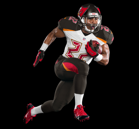
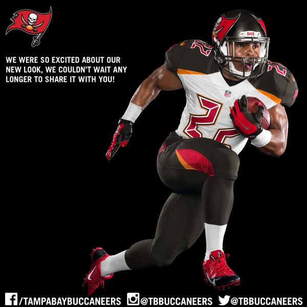
https://www.buccaneers.com just updated with it as well: It looks awesome, I like it.
|
|
#
?
Feb 21, 2014 03:10
|
|
|
  
|
|
#
?
Feb 21, 2014 03:13
|
|
|
I don't like the size of it,but I appreciate the effort to try something new with a helmet logo. Edit: they also have one of the better logos in the league and I'm glad they stuck with that theme.
|
|
#
?
Feb 21, 2014 03:14
|
|
|
New ship logo: http://twitter.com/Shiphead00/status/436684911358255105/photo/1 The old red flag logo was left off the old jerseys because they were red too. The black ship logos were used instead. With them both being red now, I'm guessing the jersey colour will change slightly.
|
|
#
?
Feb 21, 2014 03:19
|
|
|
These make it look better, actually. The scaling up of the size is a strange move, but I honestly kind of like it. Its different and unique without being too out there like the Jags one. Straight profile view is still goofy but the rest of the angles make it look cool. The front looks awesome.
|
|
#
?
Feb 21, 2014 03:20
|
|
|
It does make them more distinct from the 49ers, which I like. As to the white helmet thing, it's probably good to remember they only found out they couldn't do throwbacks back in the fall, and that this has probably been in the making for over a year. Might have been too late in the process to make as big a change as helmet color.
|
|
#
?
Feb 21, 2014 03:39
|
|


|
I like the size. It's different than just "insert logo here" on the side of the helmet.
|
|
#
?
Feb 21, 2014 03:42
|
|
|
Andio posted:New ship logo: http://twitter.com/Shiphead00/status/436684911358255105/photo/1 Love that logo, especially the design of the waves breaking on the ship.
|
|
#
?
Feb 21, 2014 03:42
|
|
|
Here's a video of it. I like it when seeing it under the lights when they zoom out. The whole helmet including facemask looks really metallic pewter. I even like the larger logo although I think it would be a little better at about 80% of that size.
|
|
#
?
Feb 21, 2014 04:12
|
|

|
I can't watch the video so I can't really tell, but if that grill is silver, that helmet looks awful. If it looks pewter, it is pretty sweet. Logo will probably look good from camera crew angles.
|
|
#
?
Feb 21, 2014 04:35
|
|

|
Volkerball posted:I can't watch the video so I can't really tell, but if that grill is silver, that helmet looks awful. They said it's chrome in the video.
|
|
#
?
Feb 21, 2014 04:46
|
|

|
TheBizzness posted:I love everything about it except the size of the logo Yeah, it should really be bigger imo.
|
|
#
?
Feb 21, 2014 05:01
|
|

|
The logo itself is a sidegrade, in my opinion. I think I preferred the previous, but it's not a huge change in the long run. I really like the new workmark and I think the oversized helmet logos are really cool, I like to see teams try different stuff (it's why I like the Seahawks' current set). We'll see how things look with the uniforms but I'm down with this so far.
|
|
#
?
Feb 21, 2014 05:31
|
|

|
It almost looks like it could work as an asymmetric helmet design from this shot. Make it bigger ( ) and extend it around just a bit more. ) and extend it around just a bit more.Also it reminds me of those oversize logo New Era hats 
|
|
#
?
Feb 21, 2014 06:31
|
|

|
japtor posted:It almost looks like it could work as an asymmetric helmet design from this shot. Make it bigger ( One side can be the flag, one side can be Bucco Bruce.
|
|
#
?
Feb 21, 2014 06:49
|
|

|
I like it. You rarely see a helmet in practice from super close up. Makes sense to supersize the logo and make it visible from more angles.
|
|
#
?
Feb 21, 2014 07:05
|
|
|
I would think that all but the most casual of fans could identify team logos based on looking at the helmets they're watching on TV though, even granting that point. I guess it's a little too ostentatious for me. If the facemask really is pewter that's cool though and I support that part for sure.
|
|
#
?
Feb 21, 2014 07:19
|
|

|
I love everything about it: May be biased.
|
|
#
?
Feb 21, 2014 08:20
|
|
|
All I can see is that they gave the skull a five-head
|
|
#
?
Feb 21, 2014 09:54
|
|

|
I'm all on Baird for the giant logo after seeing the 360 view of the helmet. Really gives it a different and more realistic example.
|
|
#
?
Feb 21, 2014 13:45
|
|

|
All I see in that skull is Murray from the Monkey Island games. Helmet looks nice though.
|
|
#
?
Feb 21, 2014 14:14
|
|

|
I'm still holding out hope they go back to the creamsicles full time eventually. We used to live down there and I still have those "The Bucc stops here, here on 44!" commercials stuck in my head 20 years later. But biohazard red is more fitting, I suppose. The huge logo on the helmets is awesome.
|
|
#
?
Feb 21, 2014 15:58
|
|

|
Alouicious posted:All I can see is that they gave the skull a five-head Thought for a second Febreeze made an update to the Manningface logos
|
|
#
?
Feb 21, 2014 22:47
|
|

|
Wario Kart 64 posted:Thought for a second Febreeze made an update to the Manningface logos 
|
|
#
?
Feb 21, 2014 23:51
|
|
|
lol
|
|
|
#
?
Feb 22, 2014 06:54
|
|
|
Sapp was right this logo owns
|
|
#
?
Feb 22, 2014 20:26
|
|
|
 UniWatch 
|
|
#
?
Mar 3, 2014 15:05
|
|


|
Well, um. That's something. 
|
|
#
?
Mar 3, 2014 15:06
|
|
|
That's fake, right?
|
|
#
?
Mar 3, 2014 15:13
|
|
|
The Bucs posted it on their instagram. lol
|
|
#
?
Mar 3, 2014 15:18
|
|

|
|
|
#
?
Mar 3, 2014 15:19
|
|

|
Hmm. Those don't look very good. It's just not a very cohesive look.
|
|
#
?
Mar 3, 2014 15:20
|
|


|
Totally diggin' the digital font E: Didn't an XFL team have uniforms like that?
|
|
#
?
Mar 3, 2014 15:22
|
|

|
When I think pirates I think alarm clocks. Really I think the number font is the thing that's bugging me the most. The rest is, I dunno, uninspiring at worst.
|
|
#
?
Mar 3, 2014 15:22
|
|
|
Hahaha they really are alarm clock style numbers.
|
|
#
?
Mar 3, 2014 15:23
|
|
|
The tweaks to the helmet were fine, but wow, that's some arena league poo poo. Thank god Nike hasn't touched our uniforms.
|
|
#
?
Mar 3, 2014 15:49
|
|
|
I think it's ugly but at least it's a distinctive look.
|
|
#
?
Mar 3, 2014 15:50
|
|


|

|
| # ? May 14, 2024 02:20 |
|
|
Tampa Bay Buccaneers posted:Today the Tampa Bay Buccaneers and Nike unveiled the team's new NFL Nike Elite 51 Uniform design for the 2014 season. The uniform is a completely integrated system of dress with a new design that honors the Buccaneers' rich tradition while boldly bringing the team into the future through a modern industrial design aesthetic.
|
|
#
?
Mar 3, 2014 15:50
|
|