|
grack posted:The first one the framing is fine, you can tell it's a swan because the shape is very distinctive. However I don't think it really works because there's so little detail on the bird's body. I like the concept of this. I think you have an eye for things that make good photographs. That said, I think this image would be better served with a square crop. The extra bricks on the sides (and a bit to the top) are a tad distracting and IMO they don't really serve to frame the face. Also, the face itself seems a little flat. Maybe you could play a little bit with contrast/vibrance/saturation to get the stones to be a little bit more distinct from each other.  Speaking of proper cropping, this picture leaves me so torn. Whenever I cropped out the open space/horse butt on the right, I thought that it was lacking the background that gave the image a bit of location character, but whenever I left it uncropped I thought that it was too distracting and too wide. No matter what the focus seemed to be still in the eye, but no matter the crop the grass was always greener on the other side. Clarity is maxed, but I think with the reduced vibrance it works. I could be wrong though. Edit: Same image, with minimal processing. 
GunForumMeme fucked around with this message at 01:14 on Mar 11, 2014 |
 #
?
Mar 6, 2014 02:39
#
?
Mar 6, 2014 02:39
|
|


|

|
| # ? May 21, 2024 13:30 |
|
|
GunForumMeme posted:I like the concept of this. I think you have an eye for things that make good photographs. That said, I think this image would be better served with a square crop. The extra bricks on the sides (and a bit to the top) are a tad distracting and IMO they don't really serve to frame the face. Also, the face itself seems a little flat. Maybe you could play a little bit with contrast/vibrance/saturation to get the stones to be a little bit more distinct from each other. That eye is so strong, I didn't even notice horse butt at first glance. Dead center and wide is perfect, I think.
|
|
#
?
Mar 6, 2014 02:48
|
|


|
grack posted:
I would also agree with the above that the horse butt is not a problem. It would be more distracting if it were dead-on or profile but here it has just the right silhouette that you know what it is and where but not so striking as to be distracting. As an aside, given my experience getting close up to bugs I think this would be a really fun shooting opportunity I should try, as I have an uncle who keeps horses. grack posted:These are both quite decent for macro shots but you need to crop waaaay tighter because in both instances the backgrounds detract from the subject. Another idea would be to shoot with a wider aperture to separate the subject better. I normally don't love square crops but for the spider it seems to fit well with the web detail. That being said they are reposted in case there is additional critique to be had.  
|
|
#
?
Mar 6, 2014 16:43
|
|

|
GunForumMeme posted:
") I like this, and the horse-rear end doesn't really bother me - the processing does, though. That horse is like kaWHAM. It's an HDR horse. Way too sharp, I'd tone it down a bit. The main problem with both of these is your background, it's really distracting. Next time try to shoot that grasshopper from an angle that gives you only grass or ground in the background - anything but that siding. The spider is fine shot against that fence like that, but try to get him where he's not bisected by that gap. Or, if you can't get the shot without the gap, shoot him centered in it, to bring attention to him. Also, check out http://photojojo.com they sell macro lenses for the iphone and they're fun as poo poo. A little hard to use (you have to be really, really close, and your depth of field is really, really shallow), but definitely fun.    Didn't mean to cut the drat dog's feet off. 
|
|
#
?
Mar 6, 2014 17:15
|
|

|
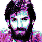
GunForumMeme posted:I like the concept of this. I think you have an eye for things that make good photographs. That said, I think this image would be better served with a square crop. The extra bricks on the sides (and a bit to the top) are a tad distracting and IMO they don't really serve to frame the face. Also, the face itself seems a little flat. Maybe you could play a little bit with contrast/vibrance/saturation to get the stones to be a little bit more distinct from each other. In this case I think it's a good example of technicals actually overpowering the image -- if the eye is going to be the focal point, it should be in focus. If it was sharply focused it would have the light really sharp and standing out and I think it would make the photo much much stronger. Overamping the clarity isn't really working it too well and it just makes the issue more obvious. ...   
|
|
#
?
Mar 6, 2014 21:41
|
|

|
The centre crop works quite fine, but I'll echo what a few others have said - over processed. It's looks almost unreal. Also, TsarAleksi is right, if you're going to make the eye the centre of the image you need to make sure it's the point of focus. Switching to a centre-point focus on your camera should help with this. I quite like the first, but what's the big dark splotch in the upper left corner? Are you getting a vignette due to a filter/hood? Second is well framed and well composed. Colours are quite nice as well. However, the shadowed cliff area in the centre of the town really compromises the image. If you could lighten that up with some dodging it would work better. The third is awesome but I would probably crop away the trees on the right. Anyways, for my contribution: I went back and shot some of the tiles today with an eye specifically to a square crop. It feels a little weird because I've never done square crops before. Also, boosted the contrast/saturation just a touch to make the mask stand out a little more.  The Second Mask X by jkostashuk1, on Flickr
|
|
#
?
Mar 6, 2014 23:36
|
|

|
grack posted:
I really wish this had been taken long-exposure while it was still snowing, so we had more atmosphere heading back down the path. jackpot posted:
I really enjoy this first shot, being a sucker for light like that. I can't help but think that this is one of those shots that everyone takes, though. Find some tall grass, open up all the way, and you've got an instant music video. As for the dog; that's a great looking dog, with a great bandana. There's a series in there, somewhere. Here's a couple people shots I took while at the office playing around. Some are also in the portraits thread. I really need to get around to fixing all the flyaways in the hair on some of them -- does anyone have a good technique for that?  Untitled by thetzar, on Flickr  Untitled by thetzar, on Flickr  Untitled by thetzar, on Flickr  Untitled by thetzar, on Flickr  Untitled by thetzar, on Flickr (USER WAS PUT ON PROBATION FOR THIS POST)
|
|
#
?
Mar 7, 2014 14:10
|
|


|
thetzar posted:
On the second, I hate to say it, but it kind of looks like she was supposed to be looking through the centre of the donut but one or both of you screwed up. If you were going for a "durr" type of photo I think it works well in that respect but I don't think that was the intent. It kind of looks like she's mashing it into her face at that angle. The view through the hole doesn't add much so consider what it would look like if it was the kind of donut with no hole. I'm also not crazy about the pinky ring but that's more of a matter of taste.
|
|
#
?
Mar 7, 2014 16:37
|
|
|
thetzar posted:
Um... the hair is really the least of the problems in these pictures. I really don't have any way to sugar coat my critiques, so here goes: 1. You totally blew the highlight on the fluffernutter and it's incredibly distracting. I don't mind the arm out of frame because the hand is still connected visually. 2. The composition is off (eye should be through the doughnut) and the model's incredibly obvious fake smile kills the picture anyways. 3. One of her eyes is in focus, the other isn't. The expression is good but still seems forced. 4. Expression-wise this is the most interesting but the model has a serious googly-eyes thing going, exacerbated by the lighting placement and severe red channel clipping. It looks like her right eye is trying to wander off. 5. Again, the eye isn't in focus. The coat is nice and all but it's not the interesting bit in the picture. On top of all that, you managed to blow out the red channel in every_single_picture you posted. Anyways, for mine:  Shadow_Club X by jkostashuk1, on Flickr This one I pushed to come out harsh in B+W. I thought it suited the subject a little better. grack fucked around with this message at 22:52 on Mar 7, 2014 |
|
#
?
Mar 7, 2014 22:39
|
|
|
grack posted:Anyways, for mine: I don't know if it is just an illusion caused by some of the different vertical lines, that the building itself is crooked and that is what you are presenting as a point of interest or what but as someone who constantly trying to keep conscious of not leaning photos I can't *not* see it as just an off level photo. If the building itself is crooked and you are playing it against the lines in the road, more context would help by showing some of the surroundings. I see a crooked building starting to show in the left of the frame that could help maybe, possibly able to help portray crookedness not as a mistake but something interesting in the image (not sure what is actually over there of course) and that tattered canadian flag looks like it could provide some sort of interest too if it was more part of the scene. As it is, though, you are just presenting this building that is honestly not all that interesting to me. thetzar posted:I really wish this had been taken long-exposure while it was still snowing, so we had more atmosphere heading back down the path. Just to add to what has already been said, you said you were just "playing around" and they do come off that way. Not quite playful enough to be genuine, not "bad" but also not compelling to look at. Good practice, though, if you want to consider it that and always worth shooting to learn of course. ---------- (if you just see branches in this one look at a larger version) 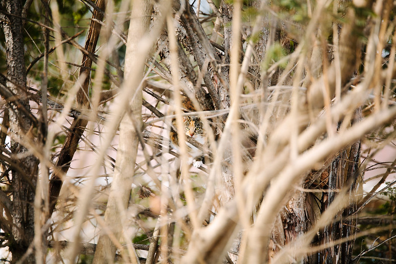 IMG_6353 by Paul Hofreiter, on Flickr  IMG_5126 by Paul Hofreiter, on Flickr 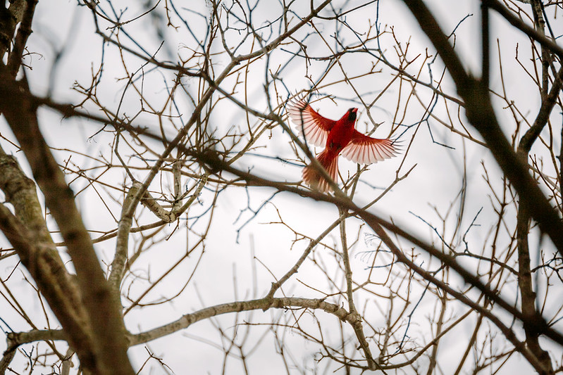 IMG_6492 by Paul Hofreiter, on Flickr
|
|
#
?
Mar 8, 2014 03:59
|
|

|
rio posted:
I don't know.. the first one is just way too busy, I think a tighter crop might help. The cardinal... I know it is noisy as hell, but I love it. The sharpness of the wings and the blurred branches, the eye-catching color. ---------------------------- This drat thing was making a racket in my yard this morning. Grabbed my camera and ran outside and it was at the top of one of my palms. Got a couple of shots before it left, but I was concentrating on focus and forgot the ISO at 800, so it is a little noisy. Canon T5i w/ 70-200 F4L Straight out of the camera  With a tight crop and a touch of clone cleaning for the tips of the palm leaves that showed. [ 
|
|
#
?
Mar 8, 2014 17:13
|
|

|
DILLIGAF posted:I don't know.. the first one is just way too busy, I think a tighter crop might help. I was wondering about cropping the first one - as is it is uncropped at all and I had left it that way to make the cat get more lost in the trees since that is what it was like in real life. Camo cat waiting for birds in a tree. But a worry was that as a photograph it would be just too much with the surrounding branches. For the cardinal, I had to bump up the exposure a lot in post because I had to shoot so quickly that I didn't have time to set exposure compensation to offset the backlighting from the sky. I am considering trying something like noise ninja, which I hear is awesome. Right now I have only run noise reduction from Photoshop, and it did help. I don't know if it is worth it or not - if the noise doesn't come off as too distracting then I can just leave it like this. As for your shots, the only critical thing I might say is that the sky is so blue that it takes away from the interesting coloring of the bird. If you mask out the bird and lower the sky's saturation just a little it could help really bring out the bird more.
|
|
#
?
Mar 8, 2014 19:14
|
|
|
grack posted:
What was compelling about this subject + lighting combination such that you wanted to make a photo of it? The lighting is flat and cold, and there aren't any interesting interactions among any of the color fields in the subject other than the strong black/white contrast. The radial elements are effective for leading the eye into the center of the picture, but there's not much of a reward for staying there. If your goal was simply documentary, it's effective. If your goal was abstraction, there isn't any going on; it's still obvious what this object is. Can you explain your motivation/goal in making this shot?
|
|
#
?
Mar 8, 2014 23:38
|
|

|
TheJeffers posted:What was compelling about this subject + lighting combination such that you wanted to make a photo of it? The lighting is flat and cold, and there aren't any interesting interactions among any of the color fields in the subject other than the strong black/white contrast. The radial elements are effective for leading the eye into the center of the picture, but there's not much of a reward for staying there. If your goal was simply documentary, it's effective. If your goal was abstraction, there isn't any going on; it's still obvious what this object is. Can you explain your motivation/goal in making this shot? I wanted to try a subject with a square crop, which I stated quite clearly in my post.
|
|
#
?
Mar 9, 2014 01:59
|
|
|
rio posted:
The cat is a little too much. I think without that first layer of OOF branches it would've worked better, they're just too bright. The idea was well represented, though. The cardinal is awesome, and the contrast and framing are great with bright red and the trees. Don't worry about the noise, it really doesn't distract or detract from the subject in this case.  Winter Wonderland X by jkostashuk1, on Flickr It's been raining so badly the last few weeks I'm starting to run out of stuff to post. I'm not sure of this one, but I did like the different layers of dark and light.
|
|
#
?
Mar 9, 2014 05:20
|
|
|
grack posted:
It's a good composition and the eye is drawn to the opening in the center, with the lone, short pine tree. Perhaps you can try cropping it square so that the focal point is on the bottom left or right third. It could also emphasise the relationship between the shortest and tallest pine tree.  Not sure about the post processing, is it over done? Are the clouds too dramatic to detract from the subject matter? (links to larger version)
|
|
#
?
Mar 9, 2014 06:07
|
|

|
indigoe posted:
The processing looks natural, I wouldn't worry about that. While the morning clam is well represented and the clouds are a large component of that mood, I'd argue the boats aren't a large factor. If they were logs, ducks, or completely gone, the shot wouldn't change dramatically. I only go into this because your question implies the boats are the subject on hand. If you want to focus on the crew team, ask to go out on one of the power boats! Or wait for a less choppy day and look for a sole-wake type photo.
|
|
#
?
Mar 9, 2014 18:01
|
|

|
grack posted:Um... the hair is really the least of the problems in these pictures. I really don't have any way to sugar coat my critiques, so here goes: Hey, I'm back now from probation due to posting too many images in this thread (sorry about that!). I want to thank you guys (not just grack) for giving real, and harsh feedback. That's what I come here for. I have two questions about this feedback, though! 3 and 5. I don't see where the second eye is out of focus, could you help me out? Also, your comment about the red channels. I'm not seeing blown reds either on my monitor at home or work, and the histogram reads clean. Could you point out what you're referring to? Thanks again!
|
|
#
?
Mar 9, 2014 18:50
|
|
|
thetzar posted:Hey, I'm back now from probation due to posting too many images in this thread (sorry about that!). I want to thank you guys (not just grack) for giving real, and harsh feedback. That's what I come here for. I have two questions about this feedback, though! Picture 3: One of two things is happening here re: the right eye. It's either out of focus, or your lighting is too harsh and it's killing all the fine detail. Taking a second look I'm not entirely sure which one it is. Can you elaborate on the lighting setup used? Picture 5: Compare the detail from the coat to the left eye - the eye is lacking in comparison. Again, it could be the lighting that you're using, but in this case I think focus is likely the problem. As for the red channel clipping, are you looking at the composite histogram or the channel histogram? Because when I look at the single channel histograms I get stuff like this:  It's quite noticeable in the pictures as well. For example, the pic above the model has really, really red skin tones. The model in pick 4 looks like she's got a terrible sunburn.
|
|
#
?
Mar 9, 2014 21:35
|
|
|
indigoe posted:
PP is fine. It looks natural. The clouds do detract from the subject (I'm assuming it's supposed to be the rowers) because in all honesty, the rowers aren't that interesting. They're too small and lacking in detail due to the distance to really draw the eye. For me, the vegetation in the background is what draws the eye, and the river/rowers are more incidental.  Watchmaker X by jkostashuk1, on Flickr Meet Tim. Tim is the watchmaker I've used for more than a decade. I wish I could've gotten rid of all the extra watches at the bottom to focus on the work being done but I couldn't, so I decided to make the face his face the subject.
|
|
#
?
Mar 9, 2014 22:01
|
|
|
I have 100% no idea what I'm doing. I've had a decent camera for a while, and am just now getting around to trying to learn and use it properly. Going to critique my own work for a little bit since I really don't know what to look for in regards to composition, exposure, subject matter, post-processing, etc etc. (also because it's scary to post in this thread  ) )These shots are from various lawn-art around the house we are renting...figured that was a good way to practice composition. They were taken during some nice, strong morning light.  Oil Lantern by zacharytong, on Flickr I liked the contrast between the bright, sun-lit lantern right next to the dark shadows enveloping the pots. I also liked the detail on the lantern itself. Unfortunately, the lantern is a bit out of focus and so I had to sharpen more than I probably should have. I'm thinking I should have included a bit more of the chain that the lantern was hanging from. That would have given a little more surrounding context, some nice wood grain and maybe be a bit more interesting. Also there is a funky highlight on the milk can in the top left, which really bothers me  Decrepit Dolphin by zacharytong, on Flickr I really liked the texture on this. But I think the crop is too close, the DOF is too short and it's not really clear what the hell it is (it's a big, decaying foam dolphin thing). I think it would have been a lot better if more of the dolphin was in focus and the whole shot was backed up a few feet to show the dolphin's tail.  Hiding Buddha by zacharytong, on Flickr I liked how dirty the little, ceramic buddha was, how jolly he appears and the fact that's he's "hiding" behind all the other garbage. I think a little more exposure to show the wood grain would help. Also, the blob of out-of-focus stuff in the right foreground is very distracting. I should have either croped it out, or back up and include it in the shot. As a general critique, I think I lean on post-processing too heavily. These shots were meh before Lightroom. I could use some more practice in getting good shots without the help of computers
polyfractal fucked around with this message at 22:42 on Mar 9, 2014 |
|
#
?
Mar 9, 2014 22:39
|
|

|
grack posted:Picture 3: One of two things is happening here re: the right eye. It's either out of focus, or your lighting is too harsh and it's killing all the fine detail. Taking a second look I'm not entirely sure which one it is. Can you elaborate on the lighting setup used? Huh, for the eye sharpness, I was going to have to go with it being light, as I was seeing roughly equivalent sharpness against both. On taking a closer look though, I think you're right, things are starting to blur on the left eye in particular. I'm surprised you managed to pick that up from a flickr-resolution JPG! The lighting is a bit harsh, though. Let me show you a cut from the full res:  For the red channel, I see a bit of clipping up there, but whatever software you're using (what is it?) shows the histogram much more harshly than Photoshop/Lightroom is for me:  I see what you mean with the general red/warm twinge there, though, but I really wasn't seeing it as harsh on my screens. I suppose I really ought to look into calibrating. Thanks again for helping me out and taking the time, btw. polyfractal posted:
I really think this is quite playful and fun. I didn't mind the OOF object on the right until you pointed it out -- now I kind of can't un-see it.
|
|
#
?
Mar 10, 2014 03:31
|
|
|
thetzar posted:For the red channel, I see a bit of clipping up there, but whatever software you're using (what is it?) shows the histogram much more harshly than Photoshop/Lightroom is for me: Lightroom's histogram doesn't show the clipping for me either, but Acdsee Pro, Faststone and even my ancient copy of Olympus Master 2 all show serious red channel clipping. Like, this is what I get in Faststone:  I've no idea why Lightroom is showing what it is, but I would have to conclude it's wrong.
|
|
#
?
Mar 10, 2014 04:10
|
|
|
grack posted:Lightroom's histogram doesn't show the clipping for me either, but Acdsee Pro, Faststone and even my ancient copy of Olympus Master 2 all show serious red channel clipping. I got it! It's the export! My histograms were based off of the original file, yours are based off of the JPG that Lightroom output to Flickr. Now I just need to track down whether Lightroom or Flickr is responsible for this bumfuckery. Thanks!
|
|
#
?
Mar 10, 2014 04:15
|
|
|
I've posted crit a few times since I posted, so I'll just say:jackpot posted:I've got an 11 month old kid, so I've been boring the absolute poo poo out of my wife and facebook ever since he was born; it's time to start boring the poo poo out of PAD for a while. I like to check out people's Flickrs, especially when they put kid pictures, and the third one over, of your son in his crib, I like better than the 3 you posted in the post I'm quoting. I really dug that one, but I tend to like a good non-staged shot over an amazing one that looks set up. For that same reason, of the three you put up I like the one where he's looking up, away from camera, most. More of my nonsense:  Window by mattphilpott, on Flickr  Work by mattphilpott, on Flickr
|
|
#
?
Mar 10, 2014 05:17
|
|
|
Huxley posted:
Erm, I know what the first one is but the shadow is really distorted. Like, it kind of looks like a shadow from a horror movie or something similar. Probably not the effect you were going for. The second picture is cute but the giant blurry whatever-it-is in the bottom left is really messing with the shot.  Junk Man x by jkostashuk1, on Flickr This dude really wanted to sell me the awesome painting on velvet in the lower right.
|
|
#
?
Mar 10, 2014 20:58
|
|
|
grack posted:Erm, I know what the first one is but the shadow is really distorted. Like, it kind of looks like a shadow from a horror movie or something similar. Probably not the effect you were going for. It's actually a second-story window that shines down onto the first-story floor. I liked it because she kind of had a Nosferatu claw going on my face. You should have bought that crazy-eyed dude's painting.
|
|
#
?
Mar 11, 2014 00:59
|
|
|
Thanks Huxley, Kenny Logins, jackpot, and TsarAleksi re: horse pic. I appreciate your critique. One thing I was wondering about his how to fix the eye focus. I actually had center point focus, grabbed the eye (back button) and then recomposed for the shot, so after racking my brain I'm at odds on how to fix it to make the eye sharper. I edited my original post with a much much less processed image if you would like to take a look. Once again, thank you for your time. polyfractal posted:
I would disagree with the DoF concerns. I think if the whole dolphin were in focus, it would be a touch distracting. I think with softness after the head is sharp enough to show what it is, but shallow enough to lead the eye to the face. I like it.
|
|
#
?
Mar 11, 2014 01:23
|
|
|
 How.... how did you manage to do this?
|
|
#
?
Mar 11, 2014 07:19
|
|
|
grack posted:
GunForumMeme posted:
|
|
#
?
Mar 11, 2014 16:22
|
|


|
rio posted:I don't know if it is just an illusion caused by some of the different vertical lines, that the building itself is crooked and that is what you are presenting as a point of interest or what but as someone who constantly trying to keep conscious of not leaning photos I can't *not* see it as just an off level photo. If the building itself is crooked and you are playing it against the lines in the road, more context would help by showing some of the surroundings. I see a crooked building starting to show in the left of the frame that could help maybe, possibly able to help portray crookedness not as a mistake but something interesting in the image (not sure what is actually over there of course) and that tattered canadian flag looks like it could provide some sort of interest too if it was more part of the scene. As it is, though, you are just presenting this building that is honestly not all that interesting to me. I get the idea of the cat one, and its pretty neat but I just don't like it as a photo. I can't get past the clutter even though that was the intent of the photo. Good job nailing focus though. The other two are much better. Love the car shot, looks like something out of a Stephen King movie. The cardinal's composition doesn't feel right but I'm not sure you could have done anything different judging by the cluttered overhead.  The idea was to capture that the old run-down lighthouse had been replaced by the new bridge that spans the ocean to the island in the distance. You used to only be able to get there by ferry and boat but since the bridge's construction, many of the old lighthouses on the shore have gone to ruin. The birds were a lucky coincidence and they were flying away from the bridge in the RAW but I flipped them so they look like they are also abandoning the lighthouse.
|
|
#
?
Mar 11, 2014 22:44
|
|
|
GunForumMeme posted:Thanks Huxley, Kenny Logins, jackpot, and TsarAleksi re: horse pic. I appreciate your critique. One thing I was wondering about his how to fix the eye focus. I actually had center point focus, grabbed the eye (back button) and then recomposed for the shot, so after racking my brain I'm at odds on how to fix it to make the eye sharper.
|
|
#
?
Mar 11, 2014 22:59
|
|
|
whaam posted:
I don't like the vignette on this one. It's too strong, and I think that the cool tones of the shot would look better without it. I liked that the birds led my eye to the lighthouse, but I'm not sure how I feel about knowing that you flipped 'em around to make that happen. The perspective of the bridge tapering off into the distance is nice, too.
|
|
#
?
Mar 12, 2014 00:27
|
|
|
whaam posted:I get the idea of the cat one, and its pretty neat but I just don't like it as a photo. I can't get past the clutter even though that was the intent of the photo. Good job nailing focus though. I really like this photo, it has a ominous, dreamy atmosphere. But I feel that I like it for reasons unrelated to your stated intentions. If your intentions were to contrast the lighthouse to the bridge, the bridge is not a strong enough visual element. I didn't notice until my eyes had lingered on the photo for a while. It's nice composition, receding into the distance, but not a major component of the image. Also, I don't know if it is the vignette or just the clouds, but the clouds feel too bright to me. The first thing I noticed was a giant, bright cloud, then the lighthouse, then down to the ground and finally the bridge. Maybe there is just too much sky, and if it was cropped down a little it would focus the image more?  Lizard by zacharytong, on Flickr As for me, here is a lizard. Technically the shot is rather crap (hurrr focus), but I really like how the image came out of post-processing. The grain is a bit much, but some of that is just high-iso noise unfortunately polyfractal fucked around with this message at 01:12 on Mar 12, 2014 |
|
#
?
Mar 12, 2014 01:10
|
|
|
jackpot posted:Don't worry about the eye focus, it's fine. It's not pixel-perfect, but it's not affecting the quality of the image, either. I'll put it this way: the rear end in the background is a lot more noticeable than the horse's eye. How far away were you? Keep in mind, the closer you are, the more likely you are to lose focus when you recompose. The only way to beat it, really, is to decrease your aperture so that you've got more room for error, and practice more. The more time you spend on areas like composition, the more things like focus will become second nature.
|
|
#
?
Mar 12, 2014 01:20
|
|
|
polyfractal posted:I really like this photo, it has a ominous, dreamy atmosphere. But I feel that I like it for reasons unrelated to your stated intentions. If your intentions were to contrast the lighthouse to the bridge, the bridge is not a strong enough visual element. I didn't notice until my eyes had lingered on the photo for a while. It's nice composition, receding into the distance, but not a major component of the image. I'm actually really really far from the bridge. I wish I could get it to show better, I agree, but it just wasn't possible. The bright cloud is a bit extra bright thanks to post processing, maybe a mistake on my part. Shellman posted:I don't like the vignette on this one. It's too strong, and I think that the cool tones of the shot would look better without it. I liked that the birds led my eye to the lighthouse, but I'm not sure how I feel about knowing that you flipped 'em around to make that happen. The perspective of the bridge tapering off into the distance is nice, too. The vignette does appear strong especially in thumbnail form. I think its more due to the darkened clouds in the top corners than the vignette itself. I considered not using it and now you have me thinking I should have followed through with that. As for the birds, things rarely just happen like that, capturing birds randomly flying in a landscape. I flipped them so I could crop the image tighter and remove some of the boring foreground bush, also them flying away towards the bridge seemed right. I don't think its an ethics violation or anything since its just a landscape, but to each their own.
|
|
#
?
Mar 12, 2014 01:23
|
|
|
whaam posted:
I think the atmosphere you were going for is there, but the picture really suffers from too much processing, especially the bunch of really bright clouds right in the middle of the frame. The vignette also doesn't help much. Honestly, I don't think they add much to the picture as the general composition is strong enough on it's own. I think the bird bit is fine, it doesn't look unnatural and it helps create a pointing line to the lighthouse.  Glasses by jkostashuk1, on Flickr
|
|
#
?
Mar 12, 2014 06:33
|
|
|
GunForumMeme posted:Thanks Huxley, Kenny Logins, jackpot, and TsarAleksi re: horse pic. I appreciate your critique. One thing I was wondering about his how to fix the eye focus. I actually had center point focus, grabbed the eye (back button) and then recomposed for the shot, so after racking my brain I'm at odds on how to fix it to make the eye sharper. If you've got Photoshop, you could try doing a high pass filter and using a mask to have it only apply to the area of the eye. That could help a bit. You should have used a Lytro.
|
|
#
?
Mar 12, 2014 15:37
|
|

|
polyfractal posted:
This picture shows some rather interesting personality and the composition is good. However, the focus and the noise really mess with it, the noise really makes the background distracting. What ISO was this taken at?  In to the Green X by jkostashuk1, on Flickr Continuing work with pathways and curves. A little bit more of a square crop than I'm used to, but I think it works nonetheless.
|
|
#
?
Mar 13, 2014 19:54
|
|
|

|
| # ? May 21, 2024 13:30 |
|
|
grack posted:
I really like this shot, that small smirk is a great moment to have captured. The eyes are too dark though, especially the left one.  _MG_8596.jpg by Photografaffer, on Flickr This was taken for a school photography project where I had to use direct lighting. Not too sure about the crop.
|
|
#
?
Mar 14, 2014 07:48
|
|