


|
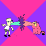
The art in this thread is absolutely fantastic. In my demoscene days we would've killed for pixels like these ")
|
 #
?
Mar 16, 2014 13:45
#
?
Mar 16, 2014 13:45
|
|

|

|
| # ? May 10, 2024 00:10 |
|
|
Shoehead posted:Some experience? Don't be modest Sup, you're the Open Xcom guy! However he's pretty bad at Xcom so I think it's a fair to say 'some experience'. 
|
|
#
?
Mar 17, 2014 01:01
|
|


|
SupSuper posted:Very nice work, it's like some kind of monster Advance Wars. Wow thanks! I'm going to see if I can get this game playable with the guy I teamed with. Hopefully we can get something interesting out. Ever thought of how to do a co-op strategy / tactical game? Cuz that's something I'd love to see come to life.
|
|
#
?
Mar 17, 2014 02:41
|
|


|
 hope you guys don't mind some animes. Also now this base has a neck and I like it a lot more.
|
|
#
?
Mar 19, 2014 02:40
|
|

|
Everything about those sprites is an unpleasant reminder of Miis
|
|
#
?
Mar 19, 2014 03:26
|
|
|
I did another 8-colour portrait thing This one is somewhat cooler: 
|
|
|
#
?
Mar 19, 2014 03:51
|
|

|
You do a good job with that limited palette, NK. What is your approach for drawing something like that?
|
|
#
?
Mar 19, 2014 03:55
|
|

|
Actually, a lot of these pictures were drawn in full-colour first, from paper to photo to image editor, and then I remove layers of colour and convert it to 3-bit RGB (or really, I emulate it with an index). From there, I re-shade it with dither and highlights. This is the original image! Edit: of course, my 8-colour sprites are all done by hand though (well technically this is but it's basically a long-winded recolour) Noyemi K fucked around with this message at 04:33 on Mar 19, 2014 |
|
|
#
?
Mar 19, 2014 04:29
|
|
|
I'm curious to what you guys think of this: I've attempted to boil down the pallet as much as possible, but I feel like there are still too many colors (15) and most of them are shades of gray. I'm also not happy at all with the lines or dithering. Overall I'm somewhat happy with the piece as a whole, but fairly dissatisfied at the same time and I can't put my finger on why or how to make it better without disastrous results to the overall form.
|
|
#
?
Mar 19, 2014 08:10
|
|

|
It's pretty good, don't knock it too hard. Can you post a 1:1 scale copy of the picture so that I can show you how I'd make some changes? First things that jump out at me are errant pixels that can be removed or repositioned. The palette can probably be reduced a bit, and most definitely can be bumped up in contrast and vibrancy. I'm assuming you used a photo as reference? That's a great way to get proportions and lighting that feel correct. A trade-off is that you can have sections that feel 'jaggy' or noisy even though they make sense strictly by geometry.
|
|
#
?
Mar 19, 2014 13:35
|
|
|
The shadows are a lot better but everything is still the wrong size relative to everything else. The face is notably too small for the head which in turn is distorting everything from the cheekbone to the ear into a big blob. The neck is huge and shaded like it's flat. The whole shape of the head especially the hair is off. Work from general to specific, don't start shading stuff until you've got the proportions and shapes down. Your tower is cool and any of those palettes would work, depending on what other colors are around it.
|
|
#
?
Mar 19, 2014 23:39
|
|

ExtraNoise posted:I'm curious to what you guys think of this: Dithering is texture, and cars have zero texture. Get rid of all the single dots unless you're trying to indicate texture. Also, highlights and reflections are pretty important. Metal and glass both lend themselves to this really well, and if you're still unhappy with stuff like color count, you can reuse the same high sheen colors in reflections and highlights for different surfaces. Without the shine you're gonna have three blues for the car, four greyscales, random colours for lights, and that's already at ten. Reflections are mostly about the amount of light, not the colour of the light, so you could maybe get away with eleven colours total?
|
|
|
#
?
Mar 20, 2014 04:14
|
|
|
Exploring some of the advice given thus far. Time to try my hand at something with rounder edges. I'm thinking... RX-7?
|
|
#
?
Mar 20, 2014 07:08
|
|
|
swamp waste posted:The shadows are a lot better but everything is still the wrong size relative to everything else. The face is notably too small for the head which in turn is distorting everything from the cheekbone to the ear into a big blob. The neck is huge and shaded like it's flat. The whole shape of the head especially the hair is off. Work from general to specific, don't start shading stuff until you've got the proportions and shapes down. Thanks for the advice. I'll probably give it another go eventually. Here's an update on the tower: Three ones, blank one for comparison, 2nd one with the advice in mind and 3rd one with darker shadow's. Edit: Removed broken link, apologies! Ash Crimson fucked around with this message at 08:58 on Mar 27, 2014 |
|
#
?
Mar 20, 2014 09:31
|
|

|
ExtraNoise posted:Exploring some of the advice given thus far. I don't have any advice for you, but I think this is a big improvement and looks really nice.
|
|
#
?
Mar 20, 2014 12:37
|
|
|
Could I have some feedback on this? I've only just started it and I know its pretty bad. Its gonna be a gif of the guy running whilst taking bites of his burger:
|
|
#
?
Mar 20, 2014 17:22
|
|
|
ExtraNoise posted:Exploring some of the advice given thus far. That's definitely an improvement. I didn't get a chance to finish my ideas for revision but here's where I was taking it: 
|
|
#
?
Mar 20, 2014 18:10
|
|
|
Doakes posted:Could I have some feedback on this? I've only just started it and I know its pretty bad. Its gonna be a gif of the guy running whilst taking bites of his burger: More contrast in the shorts, skin, sandals, glasses, lips etc. Squint your eyes and you'll see how it becomes hard to make those elements out vs the background / each other.
|
|
#
?
Mar 20, 2014 18:12
|
|
|
Uhhhh re:Doakes You are a far better artist than any of us. Please don't ever change a single thing you do. Unless you want to. I have no advice besides make more and that's more selfishness on my end than advice for you.
|
|
|
#
?
Mar 20, 2014 19:45
|
|
|
Really appreciate all the help and ideas on technique, guys. I'm pretty happy with these so far.
|
|
#
?
Mar 21, 2014 01:03
|
|
|
ExtraNoise posted:Really appreciate all the help and ideas on technique, guys. I'm pretty happy with these so far. I love the hatchback, but the colors on RX-7 (?) look like they're a bit too much of a linear ramp, and it's making it look a bit flat. Maybe try adding a little bit of sky blue to the highlight color, and brightening it a bit? Making the dark red a little more orange may help as well.
|
|
#
?
Mar 21, 2014 05:55
|
|


|
welp.
|
|
#
?
Mar 21, 2014 15:47
|
|
|
Doakes posted:welp. The arm looks like it's uh made out of rubber and is stretching? Might want to make sure he moves the entirety of his arm. Although im not any good with anatomy so don't take my word for it.
|
|
#
?
Mar 21, 2014 16:01
|
|
|
Last one today 
|
|
#
?
Mar 21, 2014 19:29
|
|
In speaking of walk-cycles, I have some Non-RPGmaker stuff I did it's a little wonky but the style is cute it's a little wonky but the style is cute Not sure if I already posted this or not Not sure if I already posted this or not A bare "isometric" projection and now for more RPGmaker stuff (8-colours):  A world hub for the game Nightmare castle  A Xanadu homage  A hospital area  A field of green with trees, fences, and flying frypans
|
|
|
#
?
Mar 21, 2014 20:15
|
|
|
Doakes posted:Last one today
|
|
#
?
Mar 21, 2014 20:16
|
|
|
Doakes posted:Last one today I'm afraid this is very bad in most every way.
|
|
#
?
Mar 21, 2014 21:30
|
|

|
I'd be willing to buy someone platinum for an avatar of a dog in a suit in congress.
ScienceAndMusic fucked around with this message at 22:45 on Mar 21, 2014 |
|
#
?
Mar 21, 2014 22:35
|
|

|
A further update, I'm trying to create a piece showing a village. Not sure if i'll complete it, more of a practise i guess than anything else. Here:  I'm a bit iffy on the buildings (other than the tower's) roofs. Clouds will probably change as well, think of them as placeholders for the moment. Ash Crimson fucked around with this message at 23:28 on Mar 21, 2014 |
|
#
?
Mar 21, 2014 22:51
|
|
|
This week's compixellated challenge. E: The more I look at this the more I see wrong with it, hopefully I'll have time to revise it before the deadline. Humboldt Squid fucked around with this message at 09:53 on Mar 22, 2014 |
|
#
?
Mar 22, 2014 09:49
|
|

|
Doakes posted:Last one today Perfect
|
|
#
?
Mar 22, 2014 11:42
|
|
|
Doakes posted:Last one today Where's the Kickstarter link.
|
|
#
?
Mar 22, 2014 14:52
|
|

|
so this is a little sprite I've been working on. I kind of like it considering my skill level with this stuff but I'm sure it could be a lot better, and after staring at it for so long I'm not even sure what works and what doesn't. although I am now noticing that the skirt or whatever is longer in the profile picture than in the front view, whoops. if anybody has tips on how to improve it I'd love to hear them 
|
|
#
?
Mar 23, 2014 18:27
|
|

|
Noyemi K posted:and now for more RPGmaker stuff (8-colours): I usually just browse the thread since I don't really make pixel art but I want extend my compliments to this. This really looks like the real deal when it comes to a lost game from an old system making the best use it can out of limited resolution and palette, and that's a great thing in my opinion.
|
|
#
?
Mar 23, 2014 20:58
|
|
Rita Repulsa posted:I usually just browse the thread since I don't really make pixel art but I want extend my compliments to this. This really looks like the real deal when it comes to a lost game from an old system making the best use it can out of limited resolution and palette, and that's a great thing in my opinion. Thank you! I always do homages to PC-88 games, and I copy a lot of techniques those artists used to beat limitations and create wonderful-looking artwork. I do a lot of low-colour, high-resolution artwork and sprites. Most of my games' tilemaps in my non-tribute games have palettes of usually less than 30 colours. My general advice for new pixel artists is to show as much as you can with as few colours as possible, because it makes a nice, bright look that works well with low-fidelity games. And another thing�I usually do detail lighting right on tilemap objects rather than handling them with a script or light engine (of course, this isn't to knock people that do�it takes a lot of guts to set up something so complicated).  A hallway with detail lighting on the floors and walls  A room with large, bright objects  A room with painted-on reflections and shadows  Previous, but taken to the logical extreme
|
|
|
#
?
Mar 23, 2014 23:57
|
|
|
Doing a lil thing for a jam, another 13 colour palette.
|
|
#
?
Mar 24, 2014 00:25
|
|

|
Wow, that's only 13 colors? Amazing! My only issue with this and the last few shots you've posted is I'm starting to think screenshake is being overused lately. Dunno, maybe it's just me. Can you post one without screenshake just to see what it looks like?
|
|
#
?
Mar 24, 2014 01:58
|
|
|
 I love this series by Nina Geometrieva and did a small 8bit version for practice.
|
|
#
?
Mar 24, 2014 03:53
|
|

|
I've always avoided pixel/retro style art because I find it really frustrating, so I've been limiting myself to portrait type stuff and some static enemy sprites for a game I'm programming. Actually having a lot of fun with it, and pushing really hard to maintain my regular drawing style in pixel form. I know the line-work is kind of shoddy, but I sort of like it. Do you guys think the thicker lines work in this style, or would it be better to thin it out and work with some anti aliasing? 
|
|
#
?
Mar 24, 2014 05:23
|
|

|

|
| # ? May 10, 2024 00:10 |
|
|
Orzo posted:Wow, that's only 13 colors? Amazing! Nah, I think it needs the screenshake. That gif has like 5 weapons stacked on top of each other, the screenshake comes from the 2 explosive weapon types. It just feels less powerful without it. Baldbeard posted:I've always avoided pixel/retro style art because I find it really frustrating, so I've been limiting myself to portrait type stuff and some static enemy sprites for a game I'm programming. Actually having a lot of fun with it, and pushing really hard to maintain my regular drawing style in pixel form. I know the line-work is kind of shoddy, but I sort of like it. Do you guys think the thicker lines work in this style, or would it be better to thin it out and work with some anti aliasing? If you dig it and you can keep the visuals consistent throughout the game, it works. You know what you're doing, the colours are awesome, I'd say just keep going with it. I've noticed that when it comes to pixel art, it's really only other pixel artists who give a gently caress about details and "rules".
|
|
#
?
Mar 24, 2014 11:48
|
|