|
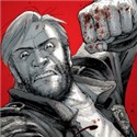
Metal Loaf posted:That kind of style was all over Marvel in the late 1990s but I'm not sure how to describe it; It looks like a tabloid cover.
|
 #
?
Apr 1, 2014 06:35
#
?
Apr 1, 2014 06:35
|
|


|

|
| # ? May 12, 2024 17:50 |
|
|
Mister Kingdom posted:I don't think Jubilee was ever a bad-rear end. In the GenX run, she got about a half-dozen makeovers by different artists. She looks about ten years old here. Jenny Sparks. Until Hitch started drawing her anyways.
|
|
#
?
Apr 1, 2014 06:56
|
|

|
Silhouette posted:It looks like a tabloid cover. THAT'S IT!
|
|
#
?
Apr 1, 2014 09:57
|
|

|
 Those eyes...  edit: Phone posting an image is hard. itskage fucked around with this message at 05:40 on Apr 4, 2014 |
|
#
?
Apr 4, 2014 05:35
|
|


|
Put this in the main chat thread, but it may go better here. I didn't think this warranted it's own thread. But, I know how much BSS loves Rob Liefeld. I went to see the new Captain America movie last night, and on the way out, spotted this mini poster he apparently did for Noah. Here it is in all it's glory. 
|
|
#
?
Apr 4, 2014 18:33
|
|
|
This is actually amazing. I like how Noah looks nothing like the movie version the poster is for. Actually the longer I look at it the better it gets. Wolves are little grey tigers right? Polar bears are just angry white gorillas right? What is the snake hanging from? Why is the ostrich so disgusted? great art As many questions as it answers.
|
|
#
?
Apr 4, 2014 19:05
|
|
|
Also where are Noah's pouches and why isn't he grinding his 5000 teeth. What has happened to Mr Liefeld and what the gently caress were the producers thinking to use him for a poster for that particular movie?
|
|
#
?
Apr 4, 2014 19:07
|
|

|
The best known part of the Noah story involving animals is that they were brought on board in pairs, so naturally Liefeld drew them solo.
|
|
#
?
Apr 4, 2014 19:10
|
|

|
Also Noah's about to command those animals to RIP OUT YOUR BLOOD
|
|
#
?
Apr 4, 2014 19:16
|
|

|
My favorite is the Ostrich. It looks like a sock puppet made of flesh.
|
|
#
?
Apr 4, 2014 19:27
|
|

|
Rotten Red Rod posted:My favorite is the Ostrich. It looks like a sock puppet made of flesh. thank GOD E.T. made it on the boat.
|
|
#
?
Apr 4, 2014 19:29
|
|
|
Rotten Red Rod posted:My favorite is the Ostrich. It looks like a sock puppet made of flesh. That's one shifty-looking ostrich.
|
|
#
?
Apr 4, 2014 19:56
|
|
|
That giraffe's all "That's right, Noah is an old Asian dude. What are you gonna do about it?" Content:  Daredevil v1 371
|
|
#
?
Apr 4, 2014 20:50
|
|
|
Why does Matt look so girly in the left panel?
|
|
#
?
Apr 5, 2014 00:44
|
|
|
I'm relatively new to comics so I gotta ask: what's up with every comic from like 4+ years ago (and DC comics today) coloring all their stuff using gradients? It looks awful and everything is so drat shiny. Everything looks pillow shaded.
|
|
#
?
Apr 5, 2014 02:12
|
|
|
SMP posted:I'm relatively new to comics so I gotta ask: what's up with every comic from like 4+ years ago (and DC comics today) coloring all their stuff using gradients? It looks awful and everything is so drat shiny. Everything looks pillow shaded. From a colorist's perspective, it's a really easy way to give objects volume, but without good direction it craps up the composition of the whole page, likely because they focus on individual people and not their positions in relation to each other. DC constantly fucks up their stories with unnecessary gradients; the closest series that's saved from gradients is Batman, since it practically reads on the tin that modern Gotham is a monotone kind of place. Marvel learned smartly about this sometime around when the Marvel movies made their initiative toward comics, and some of their more memorable serieses in recent history (Hawkeye, Superior Foes of Spider-man) don't use gradients at all, but go instead for block shading which preserves the original art much more.  Or Thor: God of Thunder, which breaks some dark shades up with lighter shades, all at different thicknesses. 
|
|
#
?
Apr 5, 2014 02:48
|
|

|
SMP posted:I'm relatively new to comics so I gotta ask: what's up with every comic from like 4+ years ago (and DC comics today) coloring all their stuff using gradients? It looks awful and everything is so drat shiny. Everything looks pillow shaded. It's very easy to impress an employer with little artistic knowledge by creating realistic looking depth with gradient mapping, while actually good colorists make much simpler images and are assumed to be lazy and unskilled and aren't hired. Adobe products have made both techniques very easy to do, but only one is impressive to a moron.
|
|
#
?
Apr 5, 2014 02:51
|
|

|
SMP posted:I'm relatively new to comics so I gotta ask: what's up with every comic from like 4+ years ago (and DC comics today) coloring all their stuff using gradients? It looks awful and everything is so drat shiny. Everything looks pillow shaded. It's a combination of DC having a terrible house style which they try to keep books in line with and DC not caring about colorists. Yanick Paquette recently called DC out on it on a creator feedback survey they sent out. quote:My final statement for the DC Survey. Copy/Pasted here:
|
|
#
?
Apr 5, 2014 11:06
|
|

|
Next-Jin Engine posted:From a colorist's perspective, it's a really easy way to give objects volume, but without good direction it craps up the composition of the whole page, likely because they focus on individual people and not their positions in relation to each other. DC constantly fucks up their stories with unnecessary gradients; the closest series that's saved from gradients is Batman, since it practically reads on the tin that modern Gotham is a monotone kind of place. Marvel learned smartly about this sometime around when the Marvel movies made their initiative toward comics, and some of their more memorable serieses in recent history (Hawkeye, Superior Foes of Spider-man) don't use gradients at all, but go instead for block shading which preserves the original art much more. Marvel really is doing an amazing job. Thor: GOT is gorgeous, as is every other Marvel book I'm reading (Black Widow, Ms. Marvel, All-New Ghost Rider, Moon Knight, the list goes on.) For content: here's a preview of the upcoming Elektra book.   Look at those loving colors. scary ghost dog posted:It's very easy to impress an employer with little artistic knowledge by creating realistic looking depth with gradient mapping, while actually good colorists make much simpler images and are assumed to be lazy and unskilled and aren't hired. Adobe products have made both techniques very easy to do, but only one is impressive to a moron. Waterhaul posted:It's a combination of DC having a terrible house style which they try to keep books in line with and DC not caring about colorists. Yanick Paquette recently called DC out on it on a creator feedback survey they sent out. This is incredibly disappointing to hear. I'd thought an industry based on it's artwork would have higher standards than that. Is there any reason why DC is like this besides general incompetence? I don't really know much about them besides the general receptions they've gotten around here.
|
|
#
?
Apr 5, 2014 12:23
|
|
|
Jesus that is some good looking art.
|
|
#
?
Apr 5, 2014 12:30
|
|


|
It's definitely not all great, especially in the middling books* - Swamp Thing looks depressingly bland for it's quality right now - but there is definitely good color work going on. Batman during Zero Year is ridiculously vibrant  When Jae Lee is on Batman/Superman it pops   Action Comics right now is really bright and fun  Love this from the last Wonder Woman.  Animal Man with Rafael Albuquerque got good stuff  Justice League 3000's really fits that odd, creepy linework  Detective this week was a knockout (though I think the artists do their own colors on that one.)  e: and have a dream sequence page from Batwoman they guested on ")  *aaaaand their highest profile event title 
Teenage Fansub fucked around with this message at 15:35 on Apr 5, 2014 |
|
#
?
Apr 5, 2014 13:30
|
|

|
Manapul is a rarity in the DC line and I hope he never changes. Dude's loving awesome and I kept up with Flash entirely because of the art. From #2  And #4   
Happy Noodle Boy fucked around with this message at 15:35 on Apr 5, 2014 |
|
#
?
Apr 5, 2014 15:25
|
|


|
Rick Grimes posted:Put this in the main chat thread, but it may go better here. The ostrich is a frog on a neck. The ostrich has no beak. The ostrich.
|
|
#
?
Apr 5, 2014 18:00
|
|

|
The best part of that Noah poster is how for some reason all the animals are ready to tear the viewer's guts apart. Except for the walrus, who is perfectly dopey trying to squeeze into the picture.
|
|
#
?
Apr 5, 2014 18:12
|
|

|
SMP posted:Marvel really is doing an amazing job. Thor: GOT is gorgeous, as is every other Marvel book I'm reading (Black Widow, Ms. Marvel, All-New Ghost Rider, Moon Knight, the list goes on.) Man that is an awesome example of why comics can do things with storytelling that movies or really any other media never can.
|
|
#
?
Apr 5, 2014 19:52
|
|
|
Lobok posted:The best part of that Noah poster is how for some reason all the animals are ready to tear the viewer's guts apart. Why would a walrus need to go on the ark.
|
|
#
?
Apr 5, 2014 21:36
|
|

|
Walruses spend a lot of their time out of the water. They're not actually very good divers.
|
|
#
?
Apr 5, 2014 21:55
|
|


|
SMP posted:I'm relatively new to comics so I gotta ask: what's up with every comic from like 4+ years ago (and DC comics today) coloring all their stuff using gradients? It looks awful and everything is so drat shiny. Everything looks pillow shaded. Short answer: Photoshop. SMP posted:
Holy poo poo, that's really good.
|
|
#
?
Apr 5, 2014 22:27
|
|

|
Ed Piskor of Hip-hop Family Tree fame did a cover for Tom Scioli's GI Joe/Transformers crossover portraying a bboy battle between franchises
|
|
#
?
Apr 6, 2014 08:18
|
|

|
Bloody Holly posted:Wolves are little grey tigers right? That's a wolf? I thought it was an extremely angry raccoon.
|
|
#
?
Apr 6, 2014 21:44
|
|


|
SMP posted:
That's awesome. I'll take "Terrible Things I Bought in the 90's" for 500, Alex.     
|
|
#
?
Apr 7, 2014 01:39
|
|


|
The 90s: The Decade of Teeth.
|
|
#
?
Apr 7, 2014 02:07
|
|

|
a kitten posted:I'll take "Terrible Things I Bought in the 90's" for 500, Alex. I liked Dale Keown's art on Hulk, but I honestly hadn't a clue he'd done one of the really early Image books. Learn something new every day.
|
|
#
?
Apr 7, 2014 02:27
|
|
|
Metal Loaf posted:I liked Dale Keown's art on Hulk, but I honestly hadn't a clue he'd done one of the really early Image books. Learn something new every day.  I kind of like his take on the Hulk; he does huge and pissed off pretty well. Pitt is just so...spikey and chainy and toothy.
|
|
#
?
Apr 7, 2014 03:02
|
|
|
a kitten posted:I'll take "Terrible Things I Bought in the 90's" for 500, Alex. I have a superhero who has no nose. How does he smell? Terrible! I have all those Pitt comics, too. They're going on ebay soon. What's everybody's opinion on Sam Kieth? I really enjoy his work, but I'm weird that way.
|
|
#
?
Apr 7, 2014 03:16
|
|

|
Mister Kingdom posted:What's everybody's opinion on Sam Kieth? I really enjoy his work, but I'm weird that way. I don't think anyone can rightfully talk poo poo about The Maxx, but some of his other work is kind of shaky.
|
|
#
?
Apr 7, 2014 03:24
|
|


|
Mister Kingdom posted:What's everybody's opinion on Sam Kieth? I really enjoy his work, but I'm weird that way.
|
|
#
?
Apr 7, 2014 03:47
|
|

|
Mister Kingdom posted:
I love Kieth. His style can get weird and some of his more recent stuff is very shakey but I love his cartoony dark stuff. I always picture his stuff as an Avery cartoon pulled through someone's nightmares.
|
|
#
?
Apr 7, 2014 04:03
|
|
|
It's probably time to rethink your character when his arms and his chest have to pass through each other to exist in the same space. Doctor_Fruitbat fucked around with this message at 10:11 on Apr 7, 2014 |
|
#
?
Apr 7, 2014 10:08
|
|
|

|
| # ? May 12, 2024 17:50 |
|
|
Emma Rios/Jordie Bellaire from Pretty Deadly #5
|
|
#
?
Apr 7, 2014 17:52
|
|