


|
deaders posted:You clipped the gently caress of your blacks. Yep. And I meant to
|
 #
?
Mar 29, 2014 03:09
#
?
Mar 29, 2014 03:09
|
|


|

|
| # ? May 25, 2024 19:10 |
|
|
I'm going to agree with tropical here and say that I wish you had cropped in a little bit on the left. The reflection and corner and shadow over there just seems noisy. Otherwise, I really dig this setup � I kinda want to see the person in it doing something slightly, ever-so-slightly more expressive. Flipping a page or something. I present two different kinds of snapshot.  
|
|
#
?
Mar 29, 2014 23:34
|
|


|
thetzar posted:I'm going to agree with tropical here and say that I wish you had cropped in a little bit on the left. The reflection and corner and shadow over there just seems noisy. Otherwise, I really dig this setup � I kinda want to see the person in it doing something slightly, ever-so-slightly more expressive. Flipping a page or something. The first one, I really, really wish you'd have taken those one or two steps to the right so the girl's boots aren't covered by the bikes. I like it otherwise. The second... not doing much for me. The focus is good, the composition is decent, but your subject is kinda sitting there like a lump.  Debated posting this one. Another picture I stupidly took at 2.5MP. The trees in the back are a little hosed but I like anyways.
|
|
#
?
Mar 30, 2014 01:47
|
|
|
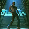
Twiin posted:Hello friends! I bought a NEX and went to a concert. It is the first time I've ever taken photos at a concert with something that wasn't a Powershot. I don't really know what I'm doing so any and all feedback is welcome, especially when it comes to what settings I should be using and that kind of thing. These are sweet. The first one I like the most, the colour, lighting, expression, everything is terrific. The second one, I do wish there wasn't such a heavy shadow from the mic but the framing is fantastic. The third one I don't like as much because I can barely see anything and it doesn't seem as expressive as the other two, but still, a pretty good photo.  Trying my hand at some more landscape-y stuff close to home. I was going for kind of a layered look but couldn't get the darker clouds on top and the water to all fit in the frame. Another attempt: 
|
|
#
?
Mar 30, 2014 02:12
|
|


|
grack posted:
Going by the title I presume the contrast here is supposed to be the pawn shop next to the church. The church isn't interesting enough as the lead in to the image and the hoarding on the pawn shop is not distinct enough to stand out as relief to the church. It looks like a photograph of a street rather than a photograph of two contrasting buildings. I think to get the pawn shop to stand out it needs to be far more central with the hoarding far more of the subject of the shot. A straight on shot might work but then you're left seeing if the buildings are interesting enough in their own right. I'd try and see if a straight on shot of the pawn shop with only half the church in frame would work. So the Pawn Shop being the main subject and just including as far as the cross on the church. Right now at least half the contents of the frame add nothing to the image. grack posted:
This is a confusing image. On the one hand you have the man in the middle who I presume is the focus of the shot but then you have the woman in the background. I think the man on his own could be enough to validate the image but the darkened woman in the background just adds confusion. She's definitely very much a part of the photograph as she's so central, but she doesn't add anything and actually takes away from the man. Maybe you've tried to darken her out but unless you had an amazingly shallow depth of field I'm not too sure how you could avoid her distracting from what seems to be the subject. If you're going for a stepped feel, where your eye is lead from the man to the women in the background then she's too dark to be viewed properly. Also if this was what you were going for I'd have cropped out the detail at the front and try to just have the contrast of the two people, especially as it's only their heads and upper torso that can be seen. All that being said I quite like this image. The amount of detail and elements of the shot means it's quite a thematically vibrant image. My images:  With this I'm concerned about the negative space on the left and right. While I think a crop this close is necessary, I'm left wondering about whether I've left too little space on the right to cater for the man, it might seem a little like he's leaving the frame. Really though it's the toddler who is the subject, so with them I think I have the right balance between the space on the left and  With this I'm concerned about the tilt/rotation on the image. The guy in the image was really tall, and he had a bend in his back to reach the butcher's table. However without anything to give reference to that it might look a little like the image is not straight. This is especially noticeable when the foreground elements were all curved on a corner. I'm also worried a little about his positioning in the frame. While I'd like to have him on a third line I also want to include the "Sunday Roast" text and the detail from the awning at the top. Any closer crop to achieve the positioning of the man on the third line would mean losing both of those. And I'd love to hear any other comments or issues people have with these two images. Edit: Changed to a better rotated version of the second image. (No-one had commented on it yet.) Mrenda fucked around with this message at 17:00 on Mar 30, 2014 |
|
#
?
Mar 30, 2014 16:49
|
|


|
Geektox posted:
I really like how this is framed. I agree that a layered look would work better, but you could probably mask the bottom, and make the top pop a little more (drop the highlights down, up the contrast a bit?) That would help layer the sky some. I do like the muted colors, though, it feels quiet. quote:Another attempt: From a framing standpoint, I feel like this one was a little more successful, but I don't know how much I like it in Black and White. A color version might give it more visual impact, OR up the contrast and really bold the different shades. Here's some of mine  
|
|
#
?
Mar 31, 2014 00:09
|
|


|
Mrenda posted:My images: The first picture is pretty good, with nice detail, good framing and some personality. However, you really needed to take that one extra step to the right so the kid's head wasn't cut off because of the arm. Doing so shifts the focus away from the kid to the father, and I don't think it works as well that way. The second one just totally falls flat for me. The subject is too small and too dark, and is just overwhelmed by the big blob of unfocused area on the top and bottom of the frame. The natural draw for the eye is the big bright spot a third of the way up in the middle of the frame (camera flash?) and there's literally nothing there. I would be tempted to completely cut off everything in the bottom up to the white-ish bar on top of the case.  The way this turned out confused me a touch because it looks very HDR-ish but it's not HDR. I've shot this particular farmhouse before but in B+W, thought I'd give it a try in colour with slightly different framing.
|
|
#
?
Mar 31, 2014 00:56
|
|
|
grack posted:
Not sure I see the "HDR" you're afraid of, I think it looks nice. But I'd either crop out the tree on the right completely or get all of it in. 
|
|
#
?
Mar 31, 2014 19:09
|
|

|
FistLips posted:Not sure I see the "HDR" you're afraid of, I think it looks nice. But I'd either crop out the tree on the right completely or get all of it in. I really would've liked to have seen the cabin off centre to the left, and maybe more of the sunny field on the right. I think the 50% horizon works well, but the photo in general needs to be a touch brighter.  Same old farmhouse as before, taken 10 minutes later from a different angle. Just realized it probably would've worked as a diptych.
|
|
#
?
Mar 31, 2014 20:49
|
|
|
grack posted:I really would've liked to have seen the cabin off centre to the left, and maybe more of the sunny field on the right. I think the 50% horizon works well, but the photo in general needs to be a touch brighter. I tried brightening it a tad, but I felt I really liked the dark and gloomy version ") Edit: I also tried darkening the field a bit but then I felt I lost the contrast between light and dark...
|
|
#
?
Mar 31, 2014 21:11
|
|
|
FistLips posted:Not sure I see the "HDR" you're afraid of, I think it looks nice. But I'd either crop out the tree on the right completely or get all of it in. I like the colours and the composition but I find my eyes drawn to the field in the background due to it being the brightest area in the image. Try some dodging?
|
|
#
?
Mar 31, 2014 22:16
|
|
|
indigoe posted:I like the colours and the composition but I find my eyes drawn to the field in the background due to it being the brightest area in the image. Try some dodging? I did try that, but I couldn't quite get it to look "right". Plus, like I commented above, I kind of like the contrast between the light in the center and the brightness on the edge. I will try it processing it again though, as well as maybe making the picture as a whole a tiny bit lighter. Another picture from the same day: 
|
|
#
?
Apr 1, 2014 07:22
|
|
|
While tires piled up in front of an apparently abandoned gas station seems like it could be cool, this picture just feels like it's missing something. Maybe I'm way too used to seeing abandoned buildings, but there's nothing that draws me in here. There's not a particular part of the picture that my eyes jump to when I look at it. If those street lights come on at night, maybe you could get something really eerie looking there, especially with some fog or snow or something. Maybe this could be better in black and white - the colors in this don't make the image as far as I'm concerned. If there's nothing immediately next to the gas station on either of the sides, a less tightly cropped composition might work better here too. Here's a moose. 
|
|
#
?
Apr 1, 2014 08:31
|
|

|
RazalasSol posted:While tires piled up in front of an apparently abandoned gas station seems like it could be cool, this picture just feels like it's missing something. Maybe I'm way too used to seeing abandoned buildings, but there's nothing that draws me in here. There's not a particular part of the picture that my eyes jump to when I look at it. If those street lights come on at night, maybe you could get something really eerie looking there, especially with some fog or snow or something. Maybe this could be better in black and white - the colors in this don't make the image as far as I'm concerned. If there's nothing immediately next to the gas station on either of the sides, a less tightly cropped composition might work better here too. And it is truly a lovely moose. I have to ask though, why did you make it B+W? The photo is nice but it kind of lacks contrast, something that colour would have provided. 
|
|
#
?
Apr 1, 2014 18:49
|
|
|
In terms of composition, I feel like the vertical line of the sunglass display is too close to the edge of the frame; I wish it was a bit more of it visible and less relative space between it and this guy. Also, I think a lower depth of field would have made the emphasis on the subject stronger, and downplaying those pesky 'other people' in the background there. 
Obama 2012 fucked around with this message at 23:14 on Apr 1, 2014 |
|
#
?
Apr 1, 2014 22:53
|
|


|
Obama 2012 posted:In terms of composition, I feel like the vertical line of the sunglass display is too close to the edge of the frame; I wish it was a bit more of it visible and less relative space between it and this guy. Also, I think a lower depth of field would have made the emphasis on the subject stronger, and downplaying those pesky 'other people' in the background there. I like the composition and I like the expression on the subject's face. I do think that the unfocused face on the left side needs to be darkened out some, as it takes away from the subject. Especially the left side of his face as it's lit fairly brightly. 
|
|
#
?
Apr 2, 2014 07:16
|
|
|
I think this image would have been better served to put her on the left edge of the frame. She's obviously emotional about something (or maybe just tired), but the facial expression of the man on the left kind of takes away from her. It also seems a touch distracting. Aside from that, I like the picture. She's got emotion going on and it's a good perspective of her face. Also, the background is clean. I think there's a bit too much of the shore between the bottom of the frame and the father. I think I might be splitting too many hairs, but the background doesn't seem clean to me. I think if you would have lowered your point of view and shot a little bit up, the tall grass in the background would have shifted just enough to take out the fencing/kid on the other shore, or perhaps going with a larger aperture might have allowed the background to ease up a bit. The image itself tells a good story. There's a good degree of concentration of the father's face and I like the father and son position relative to each other. Here's three I did as part of a series.   
|
|
#
?
Apr 2, 2014 23:13
|
|
|
I think the subject matter for these three is fantastic, and the signage is definitely interesting. However, cropping in the middle of the signs on top in the first two pics really compromises them. I think you should either keep the entire sign or crop it out completely like the third picture. 
|
|
#
?
Apr 3, 2014 19:34
|
|
|
I'm not sure I get the reason you took this photo. It's... just kind of not that interesting. The store by itself doesn't really have enough interest to draw the eyes to it and clipped black tires don't help. A little more of the rusted out gas pump and light pole would probably make the picture more interesting. 
|
|
#
?
Apr 4, 2014 21:36
|
|
|
I'm kind of rubbish at critiquing but I'm going to try anyways. I like the subject of this picture; I'm a big fan of barns and sheds as photography subjects. I feel like the greens are too bright, though, like it takes away from the "old ramshackle" feel of the building. There's also a lot of dead tree going on above the barn that I feel like is distracting. I kept scrolling up to cut off about half of it because it was easier to look at that way. This one I really like. I'm not quite sure how to judge a "good" B&W, but I enjoy how the line of fishermen leads my eye up and down the edge of the water and the logs behind them keep that corner of the picture from feeling particularly empty. I think this one has just the right amount of dead tree along the top to add some balance and frame the rest of the picture. For myself, I've had my camera for about a year and half and have been shooting off and on. Only recently did I start lurking in this thread and others to try and get an idea of what I actually wanted to accomplish. As an overall self-critique I can say that I get pretty heavy-handed on the post-processing and I'm trying to move away from that, but at the same time I think what I want to get out of my pictures is that sense of unreality that some posters have pointed out as a negative. I find if I take pictures that look "just" real they aren't as exciting to me. Posting these in roughly chronological order, to see if I'm actually developing any sort of eye for things.  This is one of the earliest pictures I shot, of the stream that runs through downtown Seoul. It took me probably about twenty shots to get one or two that I liked of the sunset here. This is an example of the kind of Lisa Frank unreality and excessive colors that I, personally, really enjoy. Mainly what I'd like to know about this one is, is this something that has any actual merit or is this like a kid being really proud of their finger-paint zebra?  I realise after taking this one that I probably should have tried to include whatever it was he was pointing at, but at the time I was more interested in capturing this adorable old couple sharing a moment together.  This is probably one of my favorites of the "I have a new toy but I don't know what to do with it" phase of my photography. I love the shading on the trees/mountains in the background and the way the rocks lead the eye along the water. Of course, I only just now noticed the big blurry rock in the very foreground and I'm kicking myself for that. One last thing I'd like to ask about : I'm really torn on the watermarks. I haven't seen anyone else use them in the thread so that should probably be enough to tell me to get rid of them, but I've had a couple blogs take some of my pictures and post them without any sort of link back to me, so I added those on to at least give myself some attribution. Is that just the price of having pictures on the internet?
|
|
#
?
Apr 5, 2014 01:48
|
|
|
Pucklynn posted:
Hit the nail right on the head for me. Looks like overprocessed fingerpainting to me. That sort of aesthetic isn't hugely popular here in Dorkroom. Pucklynn posted:
I quite like this actually. Couple isn't placed dead center, the pointing to a Pucklynn posted:
Is the subject the rocks in the foreground? If not, why are THEY in focus and not the city? You also blew highlights on the water something fierce, and it sounds like you're already aware of the big blurry rock (although that could be fixed with cropping). Pucklynn posted:One last thing I'd like to ask about : I'm really torn on the watermarks. I haven't seen anyone else use them in the thread so that should probably be enough to tell me to get rid of them, but I've had a couple blogs take some of my pictures and post them without any sort of link back to me, so I added those on to at least give myself some attribution. Is that just the price of having pictures on the internet? I personally hate watermarks. If someone wants to steal your image, they will do it with or without watermark, and if you make your watermark big enough to prevent that, it is SUPER obnoxious. A couple shots that I've been playing around with:  Pretty sure that the shadow detracts from this one--anyone else agree?:  And actually took this one last summer and have been sitting on it for a while, since I am POSITIVE I've seen an exhibition that someone did that played around with the same idea. Can't for the life of me find who it might have been with my google-fu, though, and I'm having fun imitating the hyper-straight building facade style: 
|
|
#
?
Apr 5, 2014 02:39
|
|
|
quote:
The shadow makes this one.
|
|
#
?
Apr 5, 2014 12:47
|
|
|
Sorry, that was referring to the tile one. Obviously need the shadow on the first one!
|
|
#
?
Apr 5, 2014 14:59
|
|
|
grack posted:I'm not sure I get the reason you took this photo. It's... just kind of not that interesting. The store by itself doesn't really have enough interest to draw the eyes to it and clipped black tires don't help. A little more of the rusted out gas pump and light pole would probably make the picture more interesting. Looking at it again now, I guess it's more interesting for me since I know the place really well. I'm going back again for easter, and will try taking a few more pictures and maybe even one that's more interesting to others! Shellman posted:And actually took this one last summer and have been sitting on it for a while, since I am POSITIVE I've seen an exhibition that someone did that played around with the same idea. Can't for the life of me find who it might have been with my google-fu, though, and I'm having fun imitating the hyper-straight building facade style: I saw this on my phone first and had no idea what I was looking at. Seeing it again now on a bigger screen it looks really cool, at the same time it hurts my eyes. But in a good way!
|
|
#
?
Apr 5, 2014 17:30
|
|
|
Shellman posted:
I would like to commend you on actually photographing the Hermann illusion.
|
|
#
?
Apr 5, 2014 18:27
|
|
|
Pucklynn posted:Posting these in roughly chronological order, to see if I'm actually developing any sort of eye for things. 1. This one does look a little bit overprocessed, like it's a scene from a video game and not a picture. That said, I have taken pictures of sunsets with some incredible colours (including two I posted in this thread) so I can understand the appeal. 2. This one is the best of the lot. The couple makes a lovely subject and they're framed well by the steps. Don't worry about what the old man is pointing towards, it's not that important. 3. The third falls flat for me, sorry. The rocks simply aren't that interesting to look at compared to the background and the big blurry lump at the bottom doesn't much help.  Lots of fishermen today.
|
|
#
?
Apr 5, 2014 23:44
|
|
|
Shellman posted:A couple shots that I've been playing around with: I'll be honest the first two do nothing for me. Just kinda boring. The third is cool for the illusion aspect, though. 
|
|
#
?
Apr 6, 2014 21:16
|
|
|
Dalax posted:I would like to commend you on actually photographing the Hermann illusion. Glad someone else noticed this. 
|
|
#
?
Apr 6, 2014 22:20
|
|
|
grack posted:I'll be honest the first two do nothing for me. Just kinda boring. The third is cool for the illusion aspect, though. I think you straightened it on the wrong plane. You have the fence in the back kinda leveled, but the ground and table are leaning right. Missed the focus a bit too, but I can't complain about that 'cause I did as well.  Went down to the beach by the Marina today. This is with the 70-200 f4L w/ 2.x (II) extender. I liked this one in a "Miami Lifestyle" kinda way. 
|
|
#
?
Apr 6, 2014 23:23
|
|

|
Well, I pooched the focus a little (first time with an old Sigma APO) but the ground and the picnic table are actually on a slope leading down towards the water. I tried straightening the picture to the ground and all the people had a noticeable lean.
grack fucked around with this message at 23:45 on Apr 6, 2014 |
|
#
?
Apr 6, 2014 23:42
|
|
|
grack posted:Well, I pooched the focus a little (first time with an old Sigma APO) but the ground and the picnic table are actually on a slope leading down towards the water. I tried straightening the picture to the ground and all the people had a noticeable lean. Ah... my bad. My eye kept trying to follow one line and then the other. The people do look right though, so it's my head that is crooked.
|
|
#
?
Apr 7, 2014 00:14
|
|
|
DILLIGAF posted:I think you straightened it on the wrong plane. You have the fence in the back kinda leveled, but the ground and table are leaning right. Missed the focus a bit too, but I can't complain about that 'cause I did as well. I feel like if you had shot this at a lower angle, it would have been more engaging. Still with the boat in the background, just without the negative space. 
|
|
#
?
Apr 7, 2014 03:04
|
|
|
I'll put up some of my newer shots for critique later today but wanted to do an omnibus of critique as I catch up on the thread.Mrenda posted:
FistLips posted:Another picture from the same day: GunForumMeme posted:Here's three I did as part of a series. Magic Hate Ball posted:This is a bit of a "why?" photo for me. The subject doesn't do anything for me, and neither does the lighting or framing. It's sort of broad and flat. What about the building compelled you to take a photo? Twiin posted:Hello friends! I bought a NEX and went to a concert. It is the first time I've ever taken photos at a concert with something that wasn't a Powershot. I don't really know what I'm doing so any and all feedback is welcome, especially when it comes to what settings I should be using and that kind of thing.
|
|
#
?
Apr 7, 2014 16:10
|
|


|
A week ago we had a mild ice storm in my area, and I went out on April Fool's (in the fairly loving cold) to try to get some interesting shots with my S110. That day I learned that I should invest in some fingerless gloves because digital numbness and dialing in manual settings is a tough combo. After the fact I realized that my camera has a ND filter that I probably should have been using as I was at the high end of shutter speed trying to avoid overexposure due to the crazy amount of light that day. I had posted to the Low Effort Thread, and there's a few (4) more in my Flickr set, but these are the ones I singled out.  I am pretty happy how with this one turned out, as it was at a busy intersection with a lot of very bland but distracting houses in the background. After taking some more straightforward shots, but just before I had to jump in the car to warm up again, I thought of an interesting angle which managed to capture all of the icicles. Afterwards, I am also happy that I didn't blow out the sky as the clouds' texture adds something. The only processing I did was to clone out a little bit of a treetop in the lower left corner. Maybe I didn't do such a great job with that but still learning.  This is another one that I am pretty happy how it turned out but I'm conflicted on the edge presence of the treetops. I guess it's not that distracting but it's difficult to clone out- I might just do the little isolated twig in the lower right corner. The left side is a little underexposed but I suppose I could have done worse. Compounding the cold on this one was the fact that the wind was causing the branches to sway quite a bit. Thanks to the high shutter speed and some cropping I think I made out all right in that sense. It did make it hard to frame the clouded-over sun properly however. 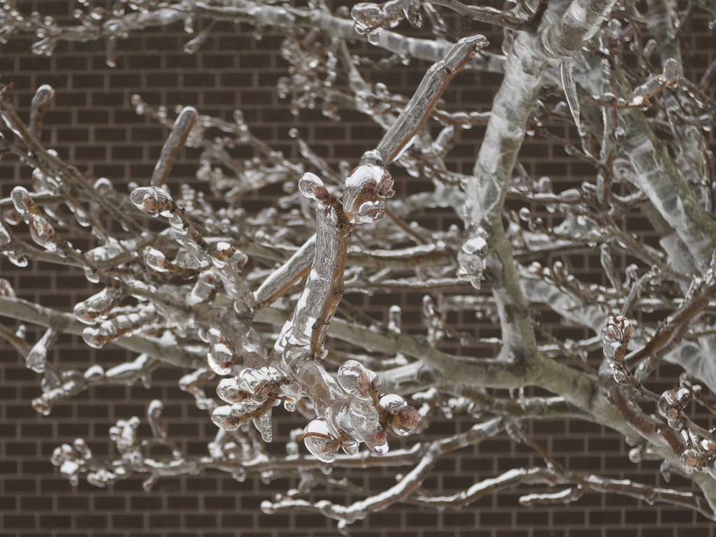 I have a few shots of this tree, including one where I basically maxed out the shallow depth of focus that the S110 can bear but this one I think turned out best. Still had the swaying problem but I did like how the subject branch has a curve and looks like a right arm pointing a finger at the viewer. It could probably use a little straightening due to the brick background but I've been putting off processing time in favor of trying use the time to shoot more as I learn.
|
|
#
?
Apr 7, 2014 16:33
|
|
|
I wanted to like this photo, I really did. It's technically very well done - the subject matter looks interesting, it's well lit and I like the composition. However, the expression (or lack thereof) on the face of your model just kills it dead. He's kinda got a "let's just get this over with" face going. 
|
|
#
?
Apr 7, 2014 17:48
|
|
|
This is one of those subjects that looks awesome in real life, but hasn't translated well in the photograph. You need to consider what's happening to the scene when you photograph it:
If there was a squirrel or something poking its head out of that hole it would have been great. In the absence of a subject like that I would maybe have gone for a purely abstract close crop. To use your original as source (hope you don't mind): 
|
|
#
?
Apr 7, 2014 18:11
|
|
|
Kenny Logins posted:
I like the general direction of these pictures and the first two are well done, but in this one the in-focus portion just get lost in among the rest of the branches. A step back and using a longer focal length may have helped here. David Pratt posted:This is one of those subjects that looks awesome in real life, but hasn't translated well in the photograph. You need to consider what's happening to the scene when you photograph it: I definitely understand what you mean, thanks for the feedback. 
|
|
#
?
Apr 9, 2014 06:17
|
|
|
Twiin posted:Hello friends! I bought a NEX and went to a concert. It is the first time I've ever taken photos at a concert with something that wasn't a Powershot. I don't really know what I'm doing so any and all feedback is welcome, especially when it comes to what settings I should be using and that kind of thing. I know this is a bit while back, but I really wanted to say I love these. I've been shooting a LOT of concerts lately (which may have landed me an internship!) and have new-found respect for concert photogs. Here's a couple concert shots I took. I rented a 50mm f1.8 then a f1.4 to help with the low light and to experiment with.   The thing I'm trying much harder to learn is avoiding the goddamn microphone when I can. Many shots I had were the colors and exposure are perfect but there's a stand in the way or another bandmember is making a stupid look (even blurred out) detracts from the overall picture. Like the first photo, he's not actually eating the mic but that's all I think when I see it now. It's something I've only started to learn because of realizing my mistakes. And here's a jellyfish from yesterday. 
|
|
#
?
Apr 9, 2014 14:16
|
|
|
grack posted:I like the general direction of these pictures and the first two are well done, but in this one the in-focus portion just get lost in among the rest of the branches. A step back and using a longer focal length may have helped here. I'm not sure if I'm straddling the rules with the above so I'll do a little critique to be safe: crime fighting hog posted:
The jellyfish is really cool, and really pops with that orange on blue. If I can say anything it might be to crop in a little tighter since you've already got tentacles that are cut off and leading us out of the shot. The extra breathing room above and below it doesn't really add too much so wouldn't be much of a loss.
|
|
#
?
Apr 9, 2014 15:58
|
|
|

|
| # ? May 25, 2024 19:10 |
|
|
crime fighting hog posted:I know this is a bit while back, but I really wanted to say I love these. I've been shooting a LOT of concerts lately (which may have landed me an internship!) and have new-found respect for concert photogs. The first one is... well, almost there. The look is great, the hair is great but the microphone placement (and the subsequent shadow from the mic) just kills the shot. The second one is better composition wise but the luminance noise is a killer. I'd say leave it a little darker either OOC or tone down the post-processing a little. Converting it to black and white could work as well. 
|
|
#
?
Apr 10, 2014 22:58
|
|