


|
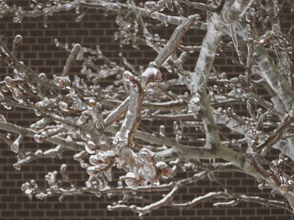
Kenny Logins posted:Thanks for the feedback, grack. Just as some follow-up in case you or others would care, I did do one with your advice (I think?) here which I don't dislike, and I went the other direction here. I'm a little conflicted on the latter as I ever-so-slightly blew the focus, but it's at least a good proof-of-concept for shallow depth of field on my S110. Any further comments welcome, of course. Outside of blowing the focus a little, I think the second does show what the camera is capable of a technical standpoint. I think, though, that with the subject matter being the iced over branches an evenly focused shot showing a pattern is probably a better choice. One branch doesn't particularly stand out more than any other to the viewer. On the plus side, is does make a really interesting pattern against a solid backdrop.  The Psychic X by jkostashuk1, on Flickr The Psychic X by jkostashuk1, on FlickrOh good, looks like Flickr put some of the BBCode back in
|
 #
?
Apr 12, 2014 01:08
#
?
Apr 12, 2014 01:08
|
|


|

|
| # ? May 25, 2024 23:24 |
|
|
Kenny Logins posted:
I love icy branches but I think your last photo doesn't work well. I think it would be improved by including more negative space, like beyond where the branches end. I don't like the brick background. For both those reasons, I think the previous photo works a lot better. grack posted:
I like this. I think the contrast and value are very good. I think it should include more space left and right of the subject trailer, as it feels cramped to me this way. And when I started typing, I was thinking it might have come out better photographed from a mirror angle nearer the right side of the trailer, so that the perspective makes the sign more prominent. But actually I think I like looking almost right up the stairs.  NYC Pre-Sunrise by MatthewKSears, on Flickr NYC Pre-Sunrise by MatthewKSears, on FlickrI spent a lot of time editing this (after auto-merging, there was a big difference in exposure and tone split vertically in line with the left uprights of the bridge) and I feel like it shows, but I like it enough that I really want to know how to shoot it better and edit it better next time.  NYC Sunrise by MatthewKSears, on Flickr NYC Sunrise by MatthewKSears, on FlickrThis one's almost straight from the camera, stitching-together aside, and I'm much more pleased with it. But anything to make it even better.  Snowy Peak by MatthewKSears, on Flickr Snowy Peak by MatthewKSears, on FlickrSome snowy peak out in Oregon. While I was out visiting my brother, the clouds were being amazing and I got a number of shots featuring them.
|
|
#
?
Apr 12, 2014 08:11
|
|


|
Hydrocodone posted:
I quite like the panoramas, but you are right in that the exposure difference between the left and right hand sides of the images is a problem. For the second one I'd be tempted to cut out everything from the right hand side, including the entire bridge because the left side of the photo would be fantastic on it's own. There's also the issue of some slight (but still noticeable) banding in the sky directly above the bridge. As for the clouds.. eh, not really enough contrast and it could stand to be a touch brighter. I mean, they're clouds - you could probably clip the highlights a bit without really harming the picture.  Umbrellas X by jkostashuk1, on Flickr Umbrellas X by jkostashuk1, on Flickr
|
|
#
?
Apr 12, 2014 21:11
|
|
|
grack posted:I like the general direction of these pictures and the first two are well done, but in this one the in-focus portion just get lost in among the rest of the branches. A step back and using a longer focal length may have helped here. To give an example of what I'm talking about :   Same guy, same party, same five seconds, dull split tone VSCO post processing. The second photo is, to me, much more worthwhile and is the one I'm putting on my social media right now, because the cigarette, the smirk, the look in his eyes tells me about him. It's not much, but it's a little story. Shoot for yourself certainly, but present for others. EDIT: Is this interesting? 
XTimmy fucked around with this message at 10:19 on Apr 13, 2014 |
|
#
?
Apr 13, 2014 09:59
|
|

|
XTimmy posted:This is probably going to be sound pretty harsh but what's your reasoning for posting this? Not to rip on two cool dudes out for an evening stroll but I'm not feeling that you have anything to say or a story to tell with this. Aesthetically it's dull, which is fine, but it doesn't make up for it with interesting content. The subjects are contextless and just kind of present. If you don't like the picture that's fine. I was trying to play up the differences between the father and son - size, expression, colour of their clothing, what they're holding in their hands etc combined with a unposed shot. XTimmy posted:To give an example of what I'm talking about : Okay, I'm honestly trying to figure out what you're attempting to demonstrate here because I really find nothing interesting about these pictures. It seems like you were intentionally trying to make them look harsh and it's totally unsuitable for your subject.  Smokin' on the Dock X by jkostashuk1, on Flickr Smokin' on the Dock X by jkostashuk1, on Flickr
|
|
#
?
Apr 13, 2014 22:28
|
|
|
grack posted:If you don't like the picture that's fine. I was trying to play up the differences between the father and son - size, expression, colour of their clothing, what they're holding in their hands etc combined with a unposed shot. grack posted:
It's an average example, it's just what I had on hand. My intention was to show how two images of the same subject in the same context, shot in the same fashion could show a considerable difference in...engagement, I guess. While the first is an okay portrait, the second is more engaging because it gives us glimmers of his personality. I'm concerned you find the aesthetic unappealing and mis-matched. Personally I think a punky artist at a house party shot against a roller door is allowed to be a bit harsh, but perhaps more importantly it's what he asked for  EDIT:VVVVVV We are in Australia, I think things get confused crossing the ocean. XTimmy fucked around with this message at 00:47 on Apr 14, 2014 |
|
#
?
Apr 14, 2014 00:14
|
|
|
To each his own, I guess, but he's got a buzzcut and is wearing a button-up collared shirt and a jacket my 70 year old Chinese aunt would love. Doesn't quite scream "EDGY!" to me.
|
|
#
?
Apr 14, 2014 00:37
|
|
|
Hydrocodone posted:
When I see this I want the clouds to be purple and for there to be more contrast in everything. The forms are great but it doesn't jump at me the way I expect it to. 
|
|
#
?
Apr 14, 2014 01:49
|
|

|
Hello the Dorkroom, I picked up a NEX-3N and some cheap manual focus lens and I've been trying to be a photographer. Here are a couple of pictures that I liked and my thoughts on them, would love some feedback. drastic measures by lightningbones, on Flickr I can't quite pinpoint why I like this one. The colours turned out quite nicely and I think there is a good balance between the yellow, red and green. I feel like maybe it suffers from not having a strong central subject.  sausage face by lightningbones, on Flickr I walk by this statue every day and tried to take pictures a couple of times and found they were pretty boring, came back at night and I think it makes a much better picture. I think it's a bit busy maybe especially in the body and it doesn't really stand out from the background as much as I'd like.
|
|
#
?
Apr 14, 2014 03:37
|
|

|
XTimmy posted:To give an example of what I'm talking about : I get what you mean about these two photos. The second does have more character. It's way better and I think it's a very good photo. Peter Radiator posted:
I like this too, I also can't pinpoint why, and the colors do look good. I think it might have come out better if you'd included some more at the bottom so we can see where the stairs touch the ground, since it looks like there's only 3-4 of them, unless that would add a lot of clutter on the floor. Peter Radiator posted:
This is a really interesting statue and a pretty good photo, but is there an angle to shoot it from that makes the wings more clear? They look like they've pulled it in to avoid the edge of the frame here. Some I took on MLK Day and just got back to reviewing:  I Am a Man by MatthewKSears, on Flickr I Am a Man by MatthewKSears, on Flickr Arrest by MatthewKSears, on Flickr Arrest by MatthewKSears, on Flickr Arrest by MatthewKSears, on Flickr Arrest by MatthewKSears, on Flickr
|
|
#
?
Apr 14, 2014 04:16
|
|
|
Peter Radiator posted:
The first one isn't that interesting to me, I think you're right in that it needs a subject that can draw the eye to something. Right now, it's just a bunch of objects that my eye jumps around from. The colors are nice however. I really liked the second one, it's visually interesting and creepy as gently caress. You really got it right coming back there and getting a shot of it at night. The only thing I'd change is probably a tighter crop, I don't know if all the empty space to the right of the statue is adding anything to the picture. Crossposting these from the portrait thread because I'd like more critique: These are from my portrait photography class, the first is from some headshots I took, and while I didn't use it for my final print it's the one I liked the best. I don't know if her pose is much of an issue, but she was comfortable doing it and I think it looks alright. The second was a classic studio portrait, and I really like how it turned out.  _MG_9002.jpg by Photografaffer, on Flickr _MG_9002.jpg by Photografaffer, on Flickr _MG_8779.jpg by Photografaffer, on Flickr _MG_8779.jpg by Photografaffer, on Flickr
Chekans 3 16 fucked around with this message at 04:53 on Apr 14, 2014 |
|
#
?
Apr 14, 2014 04:25
|
|


|
Chekans 3 16 posted:
On my monitor her face is fairly blown out. Do you have a histogram of this?
|
|
#
?
Apr 14, 2014 04:41
|
|

|
Hydrocodone posted:
I love these Chekans 3 16 posted:The first one isn't that interesting to me, I think you're right in that it needs a subject that can draw the eye to something. Right now, it's just a bunch of objects that my eye jumps around from. The colors are nice however. I like the your composition in the first one, but I think maybe your whites need to come down a little. The second one seems a little dark.  DSC_8103 by MEGAmurp, on Flickr DSC_8103 by MEGAmurp, on Flickr DSC_8102 by MEGAmurp, on Flickr DSC_8102 by MEGAmurp, on Flickr
|
|
#
?
Apr 14, 2014 04:42
|
|

|
VelociBacon posted:On my monitor her face is fairly blown out. Do you have a histogram of this? I'm at work but I'll grab one when I get home, it looks blown out on my monitor here as well.
|
|
#
?
Apr 14, 2014 04:44
|
|
|
murp posted:I love these These are neat. I like the first one more because of the tension, the shapes and the absence of a face keeps it abstract. The can is driving me crazy though. Hydrocodone posted:I get what you mean about these two photos. The second does have more character. It's way better and I think it's a very good photo. Yeah these are good; stronger as a series. The last one would be the weakest if presented alone, but in the company of the first two it works. Peter Radiator posted:Hello the Dorkroom, I picked up a NEX-3N and some cheap manual focus lens and I've been trying to be a photographer. Here are a couple of pictures that I liked and my thoughts on them, would love some feedback. Congrats. The color and light are nice and everything in the first picture but there is too much going on (and not anything going on at the same time). If you like that spot then focus on individual elements of the scene, or step back and show more context or make some shapes out of things. Think about composition - where things are in the frame - and deliberately place things you want to bring out in spots that work. The second picture is cool/that is a cool statue. Night time was a good choice. Why are you doing square crops? ---  IMG_7380 by Paul Hofreiter, on Flickr IMG_7380 by Paul Hofreiter, on Flickr IMG_7357 by Paul Hofreiter, on Flickr IMG_7357 by Paul Hofreiter, on Flickr DSCF9471 by Paul Hofreiter, on Flickr DSCF9471 by Paul Hofreiter, on Flickr
|
|
#
?
Apr 14, 2014 06:39
|
|

|
 So yeah, not completely blown out but still probably too much towards the white side.
|
|
#
?
Apr 14, 2014 06:56
|
|
|
rio posted:
I love the detail and color between the brick and sky! Were you using a polarizer? I rented a canon 70-200 mk1 this weekend. It's conspicuous as hell; everyone is always looking at it. Considering how how freaking huge that lens is, it's hard to blame people...   
GI Joe jobs fucked around with this message at 07:28 on Apr 14, 2014 |
|
#
?
Apr 14, 2014 07:21
|
|
|
Gullous posted:I love the detail and color between the brick and sky! Were you using a polarizer? No polarizer, just dicking around in lightroom. I like your photos - I was considering the 70-200 IS mark 1 (did you rent the IS one?) but ended up with the Tamron. I love the look of that lens though.
|
|
#
?
Apr 14, 2014 22:58
|
|
|
murp posted:
This is definitely the stronger one of the two, and since there are less spark trails over the can, it would also be easier to clone it out. I also like the framing and how the sparks obscure the guys face through the mask.Peter Radiator posted:
I stared at this one a long time, trying to figure out if it was sharp all the way around, I thought there was some softening around the conduit, but after squinting at it for a full 3 minutes, I'm willing to say it's probably not soft, it might be the grain. That said, I very much enjoy the lighting and colors here. It's well composited but I don't know if it needed anything that wasn't there for a focus. My eye is drawn to the phone box, so some cropping might assist there.  Craggy Orchard by jpitha, on Flickr Craggy Orchard by jpitha, on Flickr Rainy Road by jpitha, on Flickr Rainy Road by jpitha, on Flickr
|
|
#
?
Apr 15, 2014 00:07
|
|


|
Shampoo posted:
I quite like both of these, but every time I look at them I somehow just want a touch more. A touch more contrast or a touch more colour, but I can't really peg what I would exactly want to change with them. The composition and the framing a both fantastic, though.  On the Bench X by jkostashuk1, on Flickr On the Bench X by jkostashuk1, on Flickr
|
|
#
?
Apr 15, 2014 00:37
|
|
|
Woo, lots of new activity in the thread!Peter Radiator posted:
I think this would have been much stronger if you took a few step to the right, and only kept the phone box, stairs and fire extinguisher. For something with strong horizontal and vertical lines like this I personally prefer a dead on view where everything is nice and straight. sausage face by lightningbones, on Flickr [/quote] This is cool. Was it possible to take this from the other side of the statue? the right wing looks awkward from this angle. But the lighting and tones are great. And yeah, square crops really don't work for these (I was doing them at first too because of Instagram's influence when I first got into photos, but there's a definite time and place for square crops and these are not it.) Hydrocodone posted:
This one is my favourite. What was happening here? What was the protest for? murp posted:
Echoing that this one is much stronger and full of energy. I didn't even notice the can until somebody mentioned it. rio posted:
These are rad. I love the three L-shapes at play in the second, great framing and lovely colours. Gullous posted:I love the detail and color between the brick and sky! Were you using a polarizer? These look like it came from a music video for a cool hip band. Did you mess with the colours at all? Been trying more landscapy stuff.  DSCF3818.jpg by Geektox, on Flickr DSCF3818.jpg by Geektox, on Flickr DSCF3767.jpg by Geektox, on Flickr DSCF3767.jpg by Geektox, on FlickrI way blew the highlights on that one.  DSCF4204.jpg by Geektox, on Flickr DSCF4204.jpg by Geektox, on FlickrAny tips for taking hot pics of the moon? Especially since I'm hoping to catch the eclipse tonight.
|
|
#
?
Apr 15, 2014 01:19
|
|

|
Geektox posted:Any tips for taking hot pics of the moon? Especially since I'm hoping to catch the eclipse tonight. Real long lens, a good tripod and a remote release. Focus manually using a (hopefully magnified) live view, spot metre on the moon. Shoot RAW and expect to spend some time post-processing  P4221309Moon by jkostashuk1, on Flickr P4221309Moon by jkostashuk1, on Flickrrio posted:
The colours here are fantastic, and I really like the geometric shapes going on the second picture. The only thing I'd say is that in the third with the flower, your eye keeps getting drawn to the unfocused centre with the stems and not the flowers themselves. grack fucked around with this message at 01:39 on Apr 15, 2014 |
|
#
?
Apr 15, 2014 01:32
|
|
|
grack posted:Real long lens, a good tripod and a remote release.  Nikon D3200, Sigma 120-400mm @ 400mm,, ISO 320, f/8, 1/500th sec exposure I think I slightly underexposed it, and it took a lot of adjustments in Lightroom to get it looking like this.
|
|
#
?
Apr 15, 2014 02:07
|
|

|
Geektox posted:Been trying more landscapy stuff. I only cropped and lightly adjusted the shadows on the first two, the last one has heavier adjustment to balance the cars/sky. I dig your set! The layering of foothills and progressive haze give a sense of distance, taking it beyond your average "here's is a mountain" shot. Similar with the water, the near-stillness of the reflected moon adds subject matter to void. rio posted:No polarizer, just dicking around in lightroom. I rented the IS Mk1, which is underwhelming in comparison to the Mk2. I'm happy with the results, but I had trouble with AF accuracy to shoot moving subjects at f2.8 and the highlights felt a bit washed out. That washout contributes to the aesthetic in some shots, but detracts here: 
|
|
#
?
Apr 15, 2014 02:58
|
|
|
Geektox posted:
For pictures where you want to have some level of light/detail in the surroundings (like this one), I imagine the proper way to do it is to have Photoshop and just take 2 shots, where one is properly exposed for the detail in the moon, one for everything else, and then just copy the moon from the first into the second. The Dollar Tree-like method that I end up using is to just make sure the moon is not totally highlight clipped, and then just paint an adjustment brush on it in Lightroom to knock down highlights/exposure/whatever you need to recover some detail.  Other than coming back at sunset (well, sunrise from this angle) on a less hazy day, what do you guys think I could do to improve the composition on this one? I feel like it's got potential to be strong, but not quite where it needs to be.
|
|
#
?
Apr 15, 2014 04:45
|
|
|
Thanks all for the feedback!Hydrocodone posted:I like this too, I also can't pinpoint why, and the colors do look good. I think it might have come out better if you'd included some more at the bottom so we can see where the stairs touch the ground, since it looks like there's only 3-4 of them, unless that would add a lot of clutter on the floor. Everything right of the stairs was pretty boring/empty. For the statue, I took a couple of angles but from the other side you get a couple of lit up windows in the background that were distracting. Chekans 3 16 posted:The first one isn't that interesting to me, I think you're right in that it needs a subject that can draw the eye to something. Right now, it's just a bunch of objects that my eye jumps around from. The colors are nice however. I redid the second with a tighter crop and I agree, it's better that way. rio posted:Congrats. For the first one there was a lot of empty space on the right and square seemed like the best fit. I agree that it's kind of busy/lacking coherence. I don't know if there's a crop that would make it better. Maybe a wider angle would be more interesting. Shampoo posted:I stared at this one a long time, trying to figure out if it was sharp all the way around, I thought there was some softening around the conduit, but after squinting at it for a full 3 minutes, I'm willing to say it's probably not soft, it might be the grain. That said, I very much enjoy the lighting and colors here. It's well composited but I don't know if it needed anything that wasn't there for a focus. My eye is drawn to the phone box, so some cropping might assist there. I tried a few tighter crops but didn't come up with anything I liked better. It looked pretty sharp to me, but I don't really have a great eye for that, so I could be wrong. Geektox posted:I think this would have been much stronger if you took a few step to the right, and only kept the phone box, stairs and fire extinguisher. For something with strong horizontal and vertical lines like this I personally prefer a dead on view where everything is nice and straight. I'm already as far to the right as I can go without being in a metro tunnel, but probably a good suggestion. The wings were kind of tough because they're angled quite far forward it was hard to find a great angle for both at the same time. I like squares for dumb reasons. No one made any comment on the focus/exposure/colour, should I take that to mean that the pictures are good on that front? Seemed to be kind of a consensus on the first picture, which matched how I felt about it. I'm quite happy with the second one but I think there's a better picture I could get out of the statue, I'll probably give it another shot in the near future.
|
|
#
?
Apr 15, 2014 06:23
|
|
|
single-mode fiber posted:
It's pretty close but my suggestion would be to put the bridge closer to the bottom right, just off of centre. The water doesn't really do much for the picture since it's not very pleasant looking while the green of the grass and the stones are more interesting.  Urban Sunset X by jkostashuk1, on Flickr Urban Sunset X by jkostashuk1, on FlickrHaven't had a sunset like this in a couple of months, but this is what I got for about 60 seconds a few days ago. Almost SOOC oustide of cropping out and ugly lamp post and burning the houses a little.
|
|
#
?
Apr 15, 2014 20:27
|
|
|
Thanks, people who liked my protest photos.Geektox posted:This one is my favourite. What was happening here? What was the protest for? Those were all MLK Day of this year. It was a protest at LaGuardia of subcontractors that airlines hire to provide food, security, and other things. The protest was on behalf of the subcontractors' employees. I used to do admin work for the union that organized it and I'd bring my camera to every event I could. single-mode fiber posted:
I agree with grack about moving the bridge away from center and also that including more sky, rather than more river, probably being the right option. Sunrise/sunset would probably be beautiful, but you might do well on a day with bigger, billowing clouds too, particularly if you have a polarizing filter. grack posted:
This is very pretty. Is it possible to take wider shots where you are, with a different focal length or stitched together? Maybe the clouds were no more interesting outside of frame but I feel like a little more variation in them, if that was available with a wider shot, and it would be more stunning. Also, at first I thought the porch lights�I assume they're porch lights�should be cloned out and the bird too because it's small and the shape is unclear. But now I think it'd look fake without them. Go find a bird with a good silhouette from another photo and put it in here.  These are from what might be the last older photos (less than a year) I add to flickr. They're probably at least the last older ones I'll post here. Must move forward and all that:  Ferry by MatthewKSears, on Flickr Ferry by MatthewKSears, on Flickr Bee by MatthewKSears, on Flickr Bee by MatthewKSears, on Flickr House and Tree by MatthewKSears, on Flickr House and Tree by MatthewKSears, on FlickrThe last is a really different one for me, I think. I usually just mess with temperature and then bump the contrast and sometimes the vibrance up. I think of this style as "over-processed," but for a minute I decided that maybe it would work for that photo.
|
|
#
?
Apr 15, 2014 21:15
|
|
|
Hydrocodone posted:
Hydrocodone posted:
Here is one of mine:  _DSC5866 by Stingray of Doom, on Flickr _DSC5866 by Stingray of Doom, on Flickr
|
|
#
?
Apr 15, 2014 22:40
|
|
|
Putrid Grin posted:Most of this photo is composed of one solid color, so I would play around with cropping it. A square crop would make the boat more prominent and a focal point. I like this, it kinda reminds me of fp-3000. Just wish there was more detail in the white building.  _DSC6662 by Dingus Falcon, on Flickr
|
|
#
?
Apr 15, 2014 23:14
|
|
|
murp posted:I like this, it kinda reminds me of fp-3000. Just wish there was more detail in the white building. I really quite like this but I would consider cutting out the entire right third of the photo and just concentrate on the graffiti (and maybe a little more of the pavement) as it's a strong enough subject on it's own. The bike kinda sticks out like a sore thumb to me.  The Canoe X by jkostashuk1, on Flickr The Canoe X by jkostashuk1, on FlickrTrying my hand at something architectual-esque. Also, my XF1 apparently has a really weird green cast indoors at times.
|
|
#
?
Apr 16, 2014 07:59
|
|
|
grack posted:I really quite like this but I would consider cutting out the entire right third of the photo and just concentrate on the graffiti (and maybe a little more of the pavement) as it's a strong enough subject on it's own. The bike kinda sticks out like a sore thumb to me. Is this Surrey Central ?
|
|
#
?
Apr 16, 2014 09:40
|
|
|
murp posted:I like this, it kinda reminds me of fp-3000. Just wish there was more detail in the white building. This owns, but I disagree with grack and say the composition makes it. Rather than documenting the wall, I get a sense for the environment. The stationary bike and angle on the ramp hints at the crazy poo poo goes down here, but for now it's calm. GI Joe jobs fucked around with this message at 14:47 on Apr 16, 2014 |
|
#
?
Apr 16, 2014 14:43
|
|
|
VelociBacon posted:Is this Surrey Central ? Yes
|
|
#
?
Apr 16, 2014 17:31
|
|
|
Hydrocodone posted:
I really like this one, and I also like the negative space on top, but I think it's just a taaaad too much. I'd agree with what others have said about cropping it, but not cropping it that much - I think it'll look nice with some space around the boat. I took a picture of a friend. Edit: Switched it with a picture taken a few moments later!  AJK_3938-Edit-Edit by SAFistLips, on Flickr AJK_3938-Edit-Edit by SAFistLips, on Flickr
FistLips fucked around with this message at 17:48 on Apr 17, 2014 |
|
#
?
Apr 17, 2014 07:35
|
|

|
FistLips posted:I really like this one, and I also like the negative space on top, but I think it's just a taaaad too much. I'd agree with what others have said about cropping it, but not cropping it that much - I think it'll look nice with some space around the boat. She gon' kill you for that picture, apparently. Well framed, and your subject definitely shows some personality. The picture does have a really cold cast to it, which works okay but I'd like to see it warmed up just a touch.  Artiste X by jkostashuk1, on Flickr Artiste X by jkostashuk1, on Flickr
|
|
#
?
Apr 17, 2014 22:46
|
|
|
Picked up some cheap Superia 800 to try it out. Unfortunately, my first opportunity to go mess around with it was a bright and sunny day, so the 800 speed and added grain was totally unnecessary.  Overall I'm satisfied with the results, though I think I'll stick to Portra/400H and Ektar. Overall I'm satisfied with the results, though I think I'll stick to Portra/400H and Ektar. superia-800-003 by khyrre, on Flickr There's this nature preserve near me built on some marshlands. It's a very flat place, and I tried to convey that by exaggerating the negative space on the top. Does it work or is it too much?  superia-800-006 by khyrre, on Flickr While I was there, I also spotted this guy at the end of this little pier, sitting in a chair and reading. I suspect I should have gone in for a closer crop, but it was either the 50mm I had on the body or a 135mm that wouldn't have shown enough of the surroundings. Hopefully there's still enough focus on the guy to evoke the same sense of curiosity I had when I stumbled across him. Also, I had some trouble leveling out the picture. I think I leveled it along the tops of the trees since it was the most distinct line I saw, but would it have been more correct to go by the base of the treeline? 404notfound fucked around with this message at 00:01 on Apr 20, 2014 |
|
#
?
Apr 19, 2014 23:57
|
|

|
404notfound posted:Picked up some cheap Superia 800 to try it out. Unfortunately, my first opportunity to go mess around with it was a bright and sunny day, so the 800 speed and added grain was totally unnecessary. Too much. There's really no subject because the buildings in the distance take up so little of the picture and there's nothing interesting in the sky. 404notfound posted:
This one is better because the blue of the water sets off the white/grey of pylons in the foreground. The guy on the chair is an extra visual element at best, though. That said, it doesn't really hurt the photo in any meaningful way. As for leveling, horizon (base of the treeline) is generally fine, though in this case you could've used the verticals from the pylons.  Surrey Lake 2 by jkostashuk1, on Flickr Surrey Lake 2 by jkostashuk1, on FlickrAnyone got any good tips for getting rid of the annoying cyan cast in the sky? I've been shooting with (and loving) my Fujifilm X-A1 otherwise. Fine-tuning white balance and messing around in Gimp haven't really given me satisfactory results.
|
|
#
?
Apr 20, 2014 06:01
|
|
|
But... the sky is cyan 
|
|
#
?
Apr 20, 2014 18:22
|
|
|

|
| # ? May 25, 2024 23:24 |
|
|
David Pratt posted:But... the sky is cyan Okay, lemme rephrase that - it wasn't *that* cyan when I was shooting.
|
|
#
?
Apr 21, 2014 07:41
|
|