


|
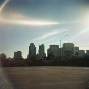
I heard you guys like terrible, derivative photos. Here's a question. My incident meter for this photo says f/11 at 1/250, iso 200, since I'm using flash that's my max sync. I take a test shot, and it's all white. Even at f/22, it's only slightly less white. It was driving me nuts, until I put on a 2-stop ND filter, CPL, dropped to ISO 100, and take off a stop of exposure in LR to get the above. I know shutter controls ambient, but shouldn't f/22 or f/11 kill the ambient light? There's no way my meter is 4 stops off, and Joe McNally/Strobist/Zack Arias pull this shot off at something like f/8, 1/160, ISO 400 with the same camera. What did I miss? red19fire fucked around with this message at 06:11 on Apr 16, 2014 |
 #
?
Apr 16, 2014 05:54
#
?
Apr 16, 2014 05:54
|
|


|

|
| # ? May 21, 2024 09:54 |
|
|
red19fire posted:I heard you guys like terrible, derivative photos. If you're using an incident meter to read the light level of the subjects face, it would definitely cause the sky to blow out depending on what time of day you're trying to shoot the photo. The first step I would have taken would have been to just meter the shot using the camera's (reflective) metering system in order to get proper exposure on the sky, then figure out my camera/flash settings from there. If you're trying for that shot mid-day, you're either going to need a really powerful strobe when using a modifier in order to overpower the sun, or just use a bare flashgun that's really close to the subject.
|
|
#
?
Apr 16, 2014 06:09
|
|
|
You don't even need a meter to tell you that the sky'll blow out. Presuming bright sun, sunny 16s would dictate a stop of f/16 if you're at 1/200th, ISO 200. That's for a subject standing IN direct sun, not the sun itself, unless you have superb dynamic range you're not going to get the sky in there too. F11 at 1/250th, ISO 200 sounds about right to be, your meter is fine.
|
|
#
?
Apr 16, 2014 13:58
|
|
|
 Gabriella by SPV Photo, on Flickr TheAngryDrunk fucked around with this message at 21:07 on Apr 16, 2014 |
|
#
?
Apr 16, 2014 21:05
|
|

|
TheAngryDrunk posted:
I dunno why but the lump from the tag near her waist is really buggin' me. It's always the small poo poo.
|
|
#
?
Apr 16, 2014 22:01
|
|


|
thetzar posted:There's a lot I like about this photo, but I don't understand why you overlaid a Saint Patrick's Cross on top of it. That processing must be heavier than I intended. Was aiming for a lighter touch than that. Oops. As for everyone else, I'm guessing snarky = doing nothing for you? Rote? Boring? Seen it before too many times and done better?
|
|
#
?
Apr 17, 2014 14:35
|
|

|
 Serena by SPV Photo, on Flickr TheAngryDrunk fucked around with this message at 20:04 on Apr 17, 2014 |
|
#
?
Apr 17, 2014 18:06
|
|
|
Gazmachine posted:As for everyone else, I'm guessing snarky = doing nothing for you? Rote? Boring? Seen it before too many times and done better? That's probably a remarkably accurate interpretation of that, yeah. Just consider snarky as "you should take another look at this one."
|
|
#
?
Apr 17, 2014 18:14
|
|
|
TheAngryDrunk posted:
That second one is unreal, love it.
|
|
#
?
Apr 17, 2014 18:24
|
|


|
Quantum of Phallus posted:That second one is unreal, love it. Thank you kindly.
|
|
#
?
Apr 17, 2014 18:34
|
|
|
I never take pictures of people but a friend of mine was around yesterday and I thought I'd try for some "candid" stuff. goof by PC-P, on Flickr goof by PC-P, on Flickr
|
|
#
?
Apr 17, 2014 20:14
|
|
|
SoundMonkey posted:That's probably a remarkably accurate interpretation of that, yeah. Just consider snarky as "you should take another look at this one." Haha, got it.
|
|
#
?
Apr 18, 2014 11:21
|
|
|
 Serena by SPV Photo, on Flickr
|
|
#
?
Apr 18, 2014 21:50
|
|
|
This was a pretty funny sketch about couples/portrait/wedding photography on Amy Schumer's show on Comedy Central.
|
|
#
?
Apr 19, 2014 02:06
|
|
|
 _MG_9384.jpg by Photografaffer, on Flickr _MG_9384.jpg by Photografaffer, on FlickrTook this for my portrait class, the assignment this time was an environmental portrait. I convinced my friend to let me take his picture at the comic book store he works at. I can't decide whether I like it in color or not, the colors of the comic books may be a bit too much.
|
|
#
?
Apr 20, 2014 06:07
|
|


|
Chekans 3 16 posted:
I like the B&W better. The only reason I can verbalize why, is that it has a better "feel" to it.
|
|
#
?
Apr 20, 2014 19:41
|
|
|
Chekans 3 16 posted:
I find them both too distracting, honestly. I'm not an expert but I'd like to see either a color version but with colors under control (i.e. not random and/or randomly placed) or a b/w version with more focus on the person. For a start I'd place his head on the hole in the wall so that he doesn't have anything behind him, making the head more recognizable.
|
|
#
?
Apr 20, 2014 23:16
|
|
|
maxmars posted:I find them both too distracting, honestly. Yeah, I probably should have had him sit in that center area. I told him to just sit how he normally does when he's bored and no one comes in, and I should have recognized the better separation there. Probably would have helped hide the shadow from his head a bit too. Also we couldn't really arrange the books up there since they're all the high-priced ones and the owner would have freaked, so I don't know how I could have altered the color arrangement. VendaGoat posted:I like the B&W better. The only reason I can verbalize why, is that it has a better "feel" to it. I think I'm leaning towards the B&W one now too, I think the print will turn out alright, and I can re-shoot it later if I want to try and compose it a bit better.
|
|
#
?
Apr 20, 2014 23:24
|
|
|
I think using lots of colors in an image can work, but you need to give the eyes a place to "rest" as it wanders across the image. If there were more parts of the image that weren't as busy I think it would work better. I like the idea though. I'll bet you can find a better composition in the shop that still conveys the same sense of place.
|
|
#
?
Apr 21, 2014 01:09
|
|
|
The color one is much better. The pose is nicer, the light is better on the subject, and the color actually adds interest to the setting. The B&W one does have that cool juxtaposed joker head going for it though.
|
|
#
?
Apr 21, 2014 01:19
|
|


|
I prefer the colour one, too. That space would have been a great place to put his head, though. Also, give landscape orientation a shot, too.
|
|
#
?
Apr 22, 2014 11:13
|
|
|
the black and white processing is very flat and could use a bit of an adjustment to make it pop more.
|
|
#
?
Apr 22, 2014 11:46
|
|

|
Gazmachine posted:I prefer the colour one, too. That space would have been a great place to put his head, though. Also, give landscape orientation a shot, too. Paragon8 posted:the black and white processing is very flat and could use a bit of an adjustment to make it pop more.
|
|
#
?
Apr 22, 2014 21:54
|
|
|
A friend of mine swung by last night to take some pictures. He wasn't feeling well, though, and looked like hell. So we moved fast, and decided to see how insane of a look we could get. Untitled by thetzar, on Flickr 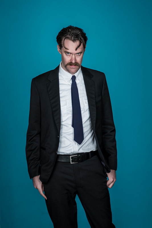 Untitled by thetzar, on Flickr  Untitled by thetzar, on Flickr 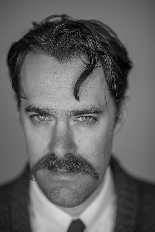 Untitled by thetzar, on Flickr thetzar fucked around with this message at 13:10 on Apr 23, 2014 |
|
#
?
Apr 23, 2014 13:01
|
|

|
thetzar posted:A friend of mine swung by last night to take some pictures. He wasn't feeling well, though, and looked like hell. So we moved fast, and decided to see how insane of a look we could get. I Have No Neck, and I Must Leer. I think it works okay in the first and last one, but that 3/4 shot just looks awkward.
|
|
#
?
Apr 23, 2014 13:28
|
|
|
thetzar posted:
Yes.
|
|
#
?
Apr 23, 2014 14:18
|
|
|
Dude reminds me of the main character in the Irish film Charlie Casanova.
|
|
#
?
Apr 23, 2014 20:34
|
|
|
thetzar posted:A friend of mine swung by last night to take some pictures. He wasn't feeling well, though, and looked like hell. So we moved fast, and decided to see how insane of a look we could get. Awesome, more fuel for my D800 bloodlust. I must know everything about this. Were you the goon that built that homemade Peter Hurley rig?
|
|
#
?
Apr 23, 2014 22:07
|
|
|
I like the overall look, the sharpness is a tad overdone for my taste but not by much. His tie should also be longer. It should hit your belt buckle.
|
|
#
?
Apr 23, 2014 22:08
|
|
|
Thanks for the feedback, all!8th-snype posted:I Have No Neck, and I Must Leer. I think it works okay in the first and last one, but that 3/4 shot just looks awkward. Jeeze, I didn't even notice that I selected neckless shots until you pointed it out. I was bokeh-hunting early on, and went for the head-forward picks. I may show some of the alts when I get home. Verman posted:I like the overall look, the sharpness is a tad overdone for my taste but not by much. I swear to god, Flickr adds sharpening to their files. It's quite noticeable on the match. You're right about the tie, but he's a very tall dude, and that's how he wears it. I dug it. red19fire posted:Awesome, more fuel for my D800 bloodlust. I must know everything about this. Were you the goon that built that homemade Peter Hurley rig? Honestly, there's nothing in these shots that's uniquely D800-level. A D600 could take the exact same photos. And with the 85mm 1.8 wide open (as it usually was) showing some slight softness, you'd probably be unable to see any difference even in large prints. And while I'd love to have built a Hurley rig, that wasn't me. I was inspired by these uncredited shots here (anyone know who took these?) and decided to do a modified version of that light. The office has a couple of 4'x8' sheets of white and black foamcore used for presentations and occasional photography use. One of the white ones is cut in half, to make two 2'x8' planks. I stood each one up next to me, and bounced a hotlight off of each one. For the more directional light in the match shot, I turned one light off, and moved the other reflector off to the side a bit more.
|
|
#
?
Apr 23, 2014 23:41
|
|
|
thetzar posted:Honestly, there's nothing in these shots that's uniquely D800-level. A D600 could take the exact same photos. And with the 85mm 1.8 wide open (as it usually was) showing some slight softness, you'd probably be unable to see any difference even in large prints. Martin Schoeller! I knew that look was familiar. I have no idea how to get that much sharpness, somehow all my portraits like that just look soft.
|
|
#
?
Apr 24, 2014 00:26
|
|
|
red19fire posted:Martin Schoeller! I knew that look was familiar. I have no idea how to get that much sharpness, somehow all my portraits like that just look soft. Pretty sure Schoeller shoots those on medium format.
|
|
#
?
Apr 24, 2014 18:25
|
|

|
1st AD posted:Pretty sure Schoeller shoots those on medium format. According to this 2008 interview, he uses a Mamiya RZ67, Fuji 6x9s, and a Sinar 8x10" and exclusively shoots film. Cool to know, I've seen his work everywhere and had no idea.
|
|
#
?
Apr 24, 2014 18:49
|
|

|
Form today's photoshoot 5D3_7379-Edit by capacity4action, on Flickr
|
|
#
?
Apr 28, 2014 05:47
|
|
|
I know newborn photography is less than popular here, but it's my new cousin so whatevs 105A4062_web by Breanne Unger, on Flickr 105A4062_web by Breanne Unger, on Flickr
|
|
#
?
Apr 28, 2014 05:56
|
|

|
I tried to do some newborn stuff for my nephew but he was being a little squirmy bitch and it was probably the most frustrating experience. Last time I ever offer to do that.
|
|
#
?
Apr 28, 2014 06:21
|
|

|
CarrotFlowers posted:I know newborn photography is less than popular here, but it's my new cousin so whatevs This is solid but maybe up the saturation on the cloth or pick something a little less rough next time. Cool idea it just seems a little bit off to wrap a baby in cheesecloth to me. CROSS POSTIN' FROM PAD! Three from a more unconventional headshot shoot I did yesterday. Guy is selling himself as an actor for aggressive characters, and wanted something to fit that.  RossieFull-8171 by TimFPictures, on Flickr RossieFull-8171 by TimFPictures, on Flickr RossieFull-8137 by TimFPictures, on Flickr RossieFull-8137 by TimFPictures, on FlickrBit annoyed at the background in that. May rework it.  RossieFull-8197 by TimFPictures, on Flickr RossieFull-8197 by TimFPictures, on Flickrhttp://whenileftmybed.tumblr.com/post/84104098907/talent-ross-bussie-ross-met-me-at-a-party-where I'd appreciate an rear end tearing since I haven't done this in a while.
|
|
#
?
Apr 28, 2014 07:24
|
|
|
Duckjob posted:Form today's photoshoot I really like this, I just feel like it's oversharpened by a hair. XTimmy posted:This is solid but maybe up the saturation on the cloth or pick something a little less rough next time. Cool idea it just seems a little bit off to wrap a baby in cheesecloth to me. The posing is all right, I think you needed more props or more lighting for your location. There looks like a ton of stuff going on but it's consumed in a sea of darkness.
|
|
#
?
Apr 28, 2014 07:30
|
|
|
I crushed out alot of the background detail to provide separation, as lighting wasn't really an option in this case, you'd recommend more of the graffiti in 1 and 2? It's a murky mess in 3 due to the 200mm.
|
|
#
?
Apr 28, 2014 07:35
|
|
|

|
| # ? May 21, 2024 09:54 |
|
|
XTimmy posted:This is solid but maybe up the saturation on the cloth or pick something a little less rough next time. Cool idea it just seems a little bit off to wrap a baby in cheesecloth to me. I would try making it completly black in the background... the grey spot doesn't add anything to the picture imho. Light is pretty interesting by itself ")
|
|
#
?
Apr 28, 2014 14:21
|
|
