|
JacquelineDempsey posted:Yeah, as a big Sandman fan, that was a big thing that awakened me to coloring's influence, the re-prints of that. Thanks for the tips (and sorry for any derail)!
|
|
|
|

|
| # ? May 10, 2024 05:02 |
|
Isn't that based on some kind of all-encompassing 'look' that DC comics are/were supposed to have? I think it was mentioned either somewhere here or in a GBS mock thread comparing Marvel to DC inking and DC comics all that had kind of weird and bad gradient-style thing everywhere.
|
|
|
|
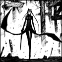
Pierson posted:Isn't that based on some kind of all-encompassing 'look' that DC comics are/were supposed to have? I think it was mentioned either somewhere here or in a GBS mock thread comparing Marvel to DC inking and DC comics all that had kind of weird and bad gradient-style thing everywhere. Quite probably. I've always been a DC fan based just on my love of the characters, so most of my Marvel exposure comes from threads like this one, Funny Panels, Ruin the Moment and other such "greatest hits" BSS threads. Which brings me back to my point: I don't know why I like Marvel's color better, but I know lovely color when I see it, and DC's got it in spades. I was so psyched to see Travel Foreman on Birds of Prey based on this:  And then when I got the issue it looked like this:  Bleah, the color sucks the life right out of the drawing. I just want to learn how to avoid that if/when I add color to my own art. Also, Black Canary's outfit being blue and not, oh, I dunno, black, is definitely Bad Art imho, so hopefully I'm not still derailing. fake edit: oh god Katana's glistening boobs in that first panel, I'm surprised there's not some lens flare thrown on 'em for good measure
|
|
|
|
After reading so many volumes of Essential, Showcase, comic strips, and manga, I'd be happy if Marvel and DC went totally black and white.
|
|
|
|
I just lucked into this archive of cover scans from the old Brit comicbook Starblazer, there's some fantastic artworks inside (and a few duff ones) that are making me feel all nostalgic  https://plus.google.com/photos/114465960270072175545/albums/5659912859652586929 A lot of familiar names in the uk comic world got early gigs producing work for SB
|
|
|
|
JacquelineDempsey posted:I was so psyched to see Travel Foreman on Birds of Prey based on this: It is not even the worst thing that has been done to his art   Not a surprise that he has burned the bridges with Big Two and is doing his own comics now:   
|
|
|
|
How to color the Marvel/DC comics way -Pick the far extreme of every color palette. Cool colors are metallic and warm colors are saturated as gently caress. -Default Photoshop round brush and smudge tool. Nothing else. -Everything is shiny. Non-reflective surfaces like wood? Shine it up. You're on your way to making comics like the pro, kid.
|
|
|
|
fatherboxx posted:Not a surprise that he has burned the bridges with Big Two and is doing his own comics now: Oh cool. Had no idea what he's been up to.
|
|
|
|
NoneMoreNegative posted:I just lucked into this archive of cover scans from the old Brit comicbook Starblazer, there's some fantastic artworks inside (and a few duff ones) that are making me feel all nostalgic So good. I had tons of those. Years ago, someone gave me the first 30 or so and I built up quite the collection. I know Grant Morrison did a few (five I think). Algol the Terrible was his first. Will have to try and track those down again
|
|
|
|
I kinda wanna read the New A-Holes, featuring World Heavyweight Champion Drunk Panda.
|
|
|
|
Been reading Brubaker's Captain America run, mostly good art but then some random issue will pop up with terrible, terrible art. Some early issue (mid 20s I think) where everything in this universe is made of metal.  From #601 
|
|
|
|
Agreed on the first one, but...SMP posted:From #601 C'mon. It was drawn by a dying 82 year old. Edit: Just looking it up now, I think the raw pencils look especially great.    Edit Edit: For a showcase anthology, Vetrigo Quarterly: Cyan had a few terrible looking stories. Check out these amazing textures in the very first one.  Teenage Fansub fucked around with this message at 16:20 on May 3, 2014 |
|
|
|
Sadly most of Brubaker's run had that regrettable dark metallic coloring to everything.
|
|
|
|
SMP posted:From #601 Gene Colan was a master. That's not his best work but he was also in his 80's with cancer and practically blind when he did it so y'know deserves a pass.
|
|
|
|
That wooden floor fill is awful. It's not even the right perspective.
|
|
|
|
goatface posted:That wooden floor fill is awful. It's not even the right perspective.
|
|
|
Snowglobe of Doom posted:Bad coloring is bad art so the derail re-railed itself. Holy poo poo, there's lensflare in the recolor!
|
|
|
|
|
goatface posted:That wooden floor fill is awful. It's not even the right perspective. redbackground posted:She and the couch are also hovering about 50 feet above it. They also didn't adjust the perspective on the wallpaper pattern so wherever you stand in the apartment all the walls are on the same plane. Edit: I just noticed in the final panel that the floor is also on the same plane as the three walls.
|
|
|
|
This isn't so much bad art as it is unfortunate, but the Free Comic Book Day Power Rangers comic has the Yellow Ranger get clipped by a car. The Yellow Ranger's actor died in a car accident.
|
|
|
|
I am still not over them making the yellow ranger asian, the black ranger black, and the red ranger native american.
|
|
|
|
|
Lurdiak posted:I am still not over them making the yellow ranger asian, the black ranger black, and the red ranger native american. ...I never noticed that 
|
|
|
Sanguinary Novel posted:...I never noticed that By all accounts the producer of the American localization was a huge rear end in a top hat. He probably thought it was really funny.
|
|
|
|
|
I actually didn't realize that the Red Ranger was native american.
|
|
|
|
Sanguinary Novel posted:...I never noticed that Seriously? How have you not? I mean, it's easy to miss when you're a kid, but it's like, number one on all those "Weird Facts about your favorite old shows" lists that goddamn everybody links from Cracked/Buzzfeed/hack comedians on Facebook.
|
|
|
|
I had noticed the Yellow and Black ranger, but never made the connection with the Red.
|
|
|
|
Tommy was the Native American, but it only came up in an episode where they traveled to the past and met their ancestors. He was the Green and White ranger, then became a Red Ranger after the Asian Yellow Ranger and black Black Ranger left.
|
|
|
|
And the Blue Ranger would always tell The Aristocrats jokes.
|
|
|
|
Snowglobe of Doom posted:
I'm clearly dense or something, but I don't see the problem. Neither image seems as special/poor as made out. Which is odd, because most times I see the issue even if I don't understand the vehemence.
|
|
|
|
Mostly the fact that someone felt the need to change it at all to suit modern trends (grey instead of color, flat coloring replaced by gradients) is the problem. Preserving the integrity of the coloring should be as important as the line work when re-issuing a comic. e: Unless maybe there's an old printing error to correct. Teenage Fansub fucked around with this message at 06:28 on May 5, 2014 |
|
|
|
Bloodly posted:I'm clearly dense or something, but I don't see the problem. Neither image seems as special/poor as made out. Which is odd, because most times I see the issue even if I don't understand the vehemence. Look at the thumbnails. In the original piece you can make out the three distinct elements: guy falling, buildings, and balconies. In the recolor you can make out the guy's shirt and nothing else. That's the importance of good coloring and why the recolor is poo poo. I should be able to follow the action with my eyes half closed.
|
|
|
|
El Gallinero Gros posted:I actually didn't realize that the Red Ranger was native american. If you're talking the original set (with St. john) its usually that Jason was the redneck.
|
|
|
|
al-azad posted:Look at the thumbnails. In the original piece you can make out the three distinct elements: guy falling, buildings, and balconies. Ohhh, I see now. I admit I was also being dumb and not completely understanding the problem. Which is the point, I suppose! Good coloring accentuates the art and furthers it, not complicates it. But it should do so subtly.
|
|
|
|
The gradients mostly don't seem to be indicating any particular light sources, either. They're just sort of defining some sort of roundness. The original doesn't have a whole lot of shading but the lighting you can see generally has a few uniform light sources.
|
|
|
|
al-azad posted:Look at the thumbnails. In the original piece you can make out the three distinct elements: guy falling, buildings, and balconies. It is ironic that the classic Moebius comics (Long Tomorrow, Incal, Airtight Garage) inspired the washed-out, rusty look of the original Star Wars and the recolor resembels the prequels' endless shiny plastic and metal spheres.
|
|
|
|
Waterhaul posted:Gene Colan was a master. That's not his best work but he was also in his 80's with cancer and practically blind when he did it so y'know deserves a pass. I didn't know who the artist was until I saw the pencils, and it reminded me of a Gene Colan Daredevil where someone aimed a searchlight at Daredevil and it was drawn similarly to that panel of Cap caught in the light. I haven't seen that DD comic since the 1980s but the memory jumped right out. He definitely liked people a little squashy but that penciling is really cinematic. EDIT: Did some searching and it was DD 154. Can't find the panel though.
|
|
|
|
God drat. Talk about lovely coloring. JacquelineDempsey posted:
Start with the dark and light. The contrast that defines shapes. Forget about putting lines around everything and only draw what you can see, if that makes any sense. Forget that Daredevil's costume is RED and that Spiderman's suit is red and blue but think about when you'd be able to see those things depending on the lighting. Stay away from the intensity and vibrant hues that are the default PhotoShop palette when you can. STUDY THIS GUY: https://www.google.com/search?q=Rem...biw=960&bih=500 It's hard to explain without citing examples of really good color but that link Teenage Fansub posted is a perfect example of how to gently caress up everything with bad color.
|
|
|
|
Redeye Flight posted:Ohhh, I see now. I admit I was also being dumb and not completely understanding the problem. I am not super good about color sense myself but yeah the Incal recoloring was pretty blatant even to me. The originals are bright, crisp and fun to look at, while the redone versions are muddy and just not nearly as engaging. BiggerBoat posted:God drat. Talk about lovely coloring. And yes, while I don't really like the super-heavy brushstrokes of the inking there, what's really nasty is the coloring.
|
|
|
|
Jae Lee seems to have improved quite a bit since this... How do those shoulders even work?
|
|
|
|
Just vortexes of cloth. Are his armpits sucking in his coat at an extremely high pressure?
|
|
|
|

|
| # ? May 10, 2024 05:02 |
|
Even back then Jae Lee was critically acclaimed. People ate that poo poo up.
|
|
|


