


|
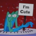
New designs. Shoutout to Scut.
|
 #
?
May 3, 2014 18:48
#
?
May 3, 2014 18:48
|
|


|

|
| # ? May 10, 2024 15:28 |
|
|
the chaos engine posted:New designs. Shoutout to Scut. Super great colors as usual, but I have to say I love the noodly little arms on these guys. One of my favorite things in pixel art is when there's a high enough resolution to actually give definition to contours like that, it's just really satisfying.
|
|
#
?
May 3, 2014 19:47
|
|


|
Heavy Lobster posted:Super great colors as usual, but I have to say I love the noodly little arms on these guys. One of my favorite things in pixel art is when there's a high enough resolution to actually give definition to contours like that, it's just really satisfying. Also really fun to animate, I'm finding out. Just really alive and fun.
|
|
#
?
May 3, 2014 22:11
|
|
|
Shoehead posted:
Given his facial proportions I'd love to see what a pair of his sunglasses look like.
|
|
#
?
May 4, 2014 09:32
|
|


|
I'm probably spending too much time on this single piece. Decided to try to make a more realistically proportioned base (the tallest blue one), also changed various aspects of the bases; some of the proportions (mostly shoulders) for all of the bases looked a tad wrong, especially for the fat and short versions. Added more shadows underneath the left arm, made small edits to the chest such as adding more shadow to hopefully reinforce the fact they're turned slightly, made the short base's shoulders a bit broader, widened fat base's legs, as well as his hips, which looked a bit odd in comparison to the torso. Also tried to add more depth to the groin and legs.  Not sure what else to do at this point now. For context: 1 = Original 2 = New edit
|
|
#
?
May 4, 2014 09:51
|
|

|
Chipp Zanuff posted:I'm probably spending too much time on this single piece. I don't know what kind of specific feedback I can give you on everything now, but the one thing I can say is that over time your sprites have gotten significantly "softer," if that's the right word for it. Like, they've gotten less jagged and pixel-y and have, with each iteration, seemed rounder and fuller, and it's really fun to see that kind of progression in an artist's work. Regardless of whether or not that's been your intent, you've been making a lot of noticeable progress in grasping some of the underpinnings of pixel art, and it's really cool to see you grow like this!
|
|
#
?
May 4, 2014 10:50
|
|
|
Heavy Lobster posted:I don't know what kind of specific feedback I can give you on everything now, but the one thing I can say is that over time your sprites have gotten significantly "softer," if that's the right word for it. Like, they've gotten less jagged and pixel-y and have, with each iteration, seemed rounder and fuller, and it's really fun to see that kind of progression in an artist's work. Regardless of whether or not that's been your intent, you've been making a lot of noticeable progress in grasping some of the underpinnings of pixel art, and it's really cool to see you grow like this! Thanks! I feel like i have improved, at least in comparison to last year at least. Anatomy is still a bugbear for me, but i do feel more confident this time around attempting characters, at least in the style i have done so far.
|
|
#
?
May 4, 2014 12:01
|
|
|
I've been super sick today so this was all I could manage to do..
|
|
#
?
May 4, 2014 23:43
|
|

|
Seeing some really fantastic stuff posted recently. I love pixel art but unfortunately don't have an ounce of artistic talent. I occasionally try and make stuff but it always comes out lovely, even with guides in hand. This thread is definitely inspiring though. I'll probably never give up.
|
|
#
?
May 5, 2014 07:58
|
|

|
Bo Jackson posted:I love pixel art but unfortunately don't have an ounce of artistic talent. I occasionally try and make stuff but it always comes out lovely, even with guides in hand. This thread is definitely inspiring though. I'll probably never give up.
|
|
#
?
May 5, 2014 09:20
|
|
|
Bo Jackson posted:Seeing some really fantastic stuff posted recently. When I started out 14 year old me was copy\pasting rpgmaker sprite parts and pallete swapping. Everyone sucks at the start, you just gotta stick with it!
|
|
#
?
May 5, 2014 10:14
|
|
|
Bo Jackson posted:Seeing some really fantastic stuff posted recently. I was like this at the start, look at some of my stuff a few months compared to now: Now:  Few months ago:  Characters at the start:  Characters now:  As long as you can take criticism, be willing to change things when they're wrong (even if you're not sure why they're wrong). Last year i thought i was ready to give up, but now? I'm going to continue. Just takes time.
|
|
#
?
May 5, 2014 10:30
|
|
|
Jackard posted:You can try starting small, like 16x16; less overwhelming that way Just my two cents, not that I'm any sort of established artist, but 16x16 is small enough that it was equally overwhelming to me. I suggest finding some middle ground at 32x32 or 64x64, and just trying to recreate any sort of sprite. Modifying existing sprites will get you far enough that you can start managing to draw your own at those sizes, and then you can start pushing to either smaller or larger sizes. Past that, feedback is holy. Listen to what people say, even if you think it looks worse with someone's advice, try it, and post both attempts after you receive some bit of advice. Sometimes people can then start pointing out how the initial one is flawed (or admit that their own advice didn't work in that case) and you'll end up noticing those flaws in future drawings whether you want to or not.
|
|
#
?
May 5, 2014 11:08
|
|
|
Yeah don't be afraid to post stuff here, I don't think anyone (in this thread at least) will be jerks about it. Also check out this: http://www.pixelprospector.com/the-big-list-of-pixel-art-tutorials/
|
|
#
?
May 5, 2014 12:00
|
|
|
I started out by copying sprites pixel by pixel until I started to understand why things work the way they do. So like I'd browse through Pixeljoint or the "show us your pixel art" thread on TIGsource, save any piece that stood out to me and seemed basic enough to recreate (so not a huge scene but usually a single sprite), open it up in Photoshop and just pixel the exact same thing right next to it. It feels kinda dirty, like you're stealing someone's work I guess, but after a while you start to pick up on things like "oh the outline on the arm is brown instead of black so the arm looks thicker, neat" and from there you'll feel more confident making your own pieces happen (at least it did for me, ymmv) EDIT: Also this thread is the nicest pixel art thread on the entire internet. Pixel artists can be snobbish arrogant purists fucks, everyone here is chill ")
|
|
#
?
May 5, 2014 12:00
|
|
|
Gotta do his arms next but I thought I'd share.
|
|
#
?
May 5, 2014 14:41
|
|
|
I made two little pixel food for Compixellated, but never got around to submitting them, so I figured I put them here, just so somebody saw them.   I'm pretty happy with how they turned out, it's pretty true to what I had in mind and that can be tricky for me. I'm still really new to this so it feels good to do something I'm proud of.  fakeedit: also sharks are hella rad
|
|
#
?
May 5, 2014 14:56
|
|
|
Heeyah! Did some smear frames to add speed to his jabs. Mostly experimenting at this point and kind of going off track, but having fun.
|
|
#
?
May 5, 2014 17:17
|
|

|
Baldbeard posted:Heeyah! Waaaaa atatatatatatata! Got his arms in, might make him bounce a few more times..  And this is for Gaspy, because I know he will enjoy it 
|
|
#
?
May 5, 2014 17:41
|
|
|
Baldbeard posted:Heeyah! The illustrative quality to your work has me imagining these characters in an interactive fiction type of game. Like King of Dragon Pass.
|
|
#
?
May 5, 2014 19:20
|
|

|
So... I'm in a bit of a pickle; I've been told that preportions of the hips and chest are weird, compounded by the shading, as well as that i have been told i should check and use some references. I've tried to deal with the chest first before i go onto the hips   The reference i'm trying to use is this one below (the first chest) http://fc05.deviantart.net/fs71/f/2012/020/3/4/_body_type_study__by_jinx_star-d4n0r6t.jpg I've tried to replicate shading and markings on the chest, but i've hit a point where i just feel like it detracts from it and looks worse off. I feel like the answer is obvious but for the life of me it eludes my mind.
|
|
#
?
May 5, 2014 19:56
|
|
|
Look more at the chest in the middle there, that one is in a similar sort of pose to what you're going for. Right now your bodies look like they're dead-on to the camera, when they should be to the side.
|
|
#
?
May 5, 2014 20:30
|
|
|
The symmetrical shading of the chest and sides gives the impression his chest is facing directly towards us, where the head and arms are in 3/4ths profile. It should be following something more akin to this line: Another problem is the legs also convey a front-on stance. I would really recommend taking a figurine or something and rotating it slowly to see what covers up what by how much
|
|
#
?
May 5, 2014 21:26
|
|


|
oddium posted:The symmetrical shading of the chest and sides gives the impression his chest is facing directly towards us, where the head and arms are in 3/4ths profile. It should be following something more akin to this line: Something like this? Or did i follow your advice too literally? 
|
|
#
?
May 5, 2014 22:00
|
|
|
Scut posted:The illustrative quality to your work has me imagining these characters in an interactive fiction type of game. Like King of Dragon Pass. I've never been so in the mood for art as these last few days. Sorry for the image dump here -- I'm sure I will burn out real soon. Round 2 for environments.   Also, a few mobs.  
Baldbeard fucked around with this message at 04:46 on May 7, 2014 |
|
#
?
May 5, 2014 23:57
|
|
|
So i tried 4 variations; first row has the chest pixeled in, 2nd doesn't, first column has the shading based around the curvature of the body, the second doesn't:
|
|
#
?
May 7, 2014 08:08
|
|
|
Just FYI Chipp it's way easier to see what's going on with these sprites when they're blown up to this size. Your stuff is dope as hell and I can't wait to see it in a game!
|
|
#
?
May 7, 2014 09:03
|
|
|
dizzywhip posted:Just FYI Chipp it's way easier to see what's going on with these sprites when they're blown up to this size. Apologies! Hope this helps:  I keep forgetting SA forums don't have the same thing as the PJ forums, where you can click on the image and it gets bigger.
|
|
#
?
May 7, 2014 09:14
|
|
|
The fourth guy (wearing blue, kind of chunky) looks weirdly pinched at the waist to me.
|
|
#
?
May 7, 2014 09:18
|
|

|
Chipp Zanuff posted:Something like this? Or did i follow your advice too literally? This is what 3/4 view looks like. The line he drew is showing you where the center line on the person's body should be, not just where the shading should go. So, for example, the middle line between the guy's pecs should be where the line he drew is; but you didn't move that center point, you just moved the shadinw. Your drawings still look almost like the body is facing straight forward; you made the "far" shoulder smaller and have the far arm going behind the body a bit, but it still looks really off. It looks almost like the main mass of the body is pointing straight forward, but the limbs are twisting around at more of (but still not quite) 3/4 view. 
angel opportunity fucked around with this message at 14:00 on May 7, 2014 |
|
#
?
May 7, 2014 13:57
|
|

|
Chipp Zanuff posted:So i tried 4 variations; first row has the chest pixeled in, 2nd doesn't, first column has the shading based around the curvature of the body, the second doesn't: I'd really like to see these guys swinging a sword or thrusting a spear. Cool stuff. the chaos engine posted:...Also this thread is the nicest pixel art thread on the entire internet. Pixel artists can be snobbish arrogant purists fucks, everyone here is chill Baldbeard fucked around with this message at 17:02 on May 7, 2014 |
|
#
?
May 7, 2014 16:43
|
|
|
Changed the chest, does it still look like it's faces straightforwards? Another edit:  Sorry for bothering you all with such a trivial matter! Ash Crimson fucked around with this message at 21:07 on May 7, 2014 |
|
#
?
May 7, 2014 19:22
|
|
|
Decided to stop making bigger characters until i have a better understanding of anatomy and human form. With that said, i also decided to make the previous base slightly bigger and applied what i learnt to it:  Trying to go down the Shining Force Route, so may eventually make a behind version. Ash Crimson fucked around with this message at 22:30 on May 8, 2014 |
|
#
?
May 8, 2014 22:26
|
|
|
Chipp Zanuff posted:Decided to stop making bigger characters until i have a better understanding of anatomy and human form. The more dynamic poses look a lot better. Especially the sword and staff guys. Nice work. I'd just say the thumb is toward the body when the palms are outfacing. Unless I'm looking at it wrong, it looks like the hands are backwards.
|
|
#
?
May 9, 2014 01:52
|
|
|
Watching this thing spawn body parts is loving freaky. 
|
|
#
?
May 9, 2014 14:02
|
|
|
the chaos engine posted:Watching this thing spawn body parts is loving freaky. Cool! I wish i had your skill with colours and their placement. Really reminds me of stuff made from DawnBringer's Palette! Further edit, with some more examples of the characters. Tried: Making the shoulders more visable. Making the chest more visable. Showed collarbone. Made arms more accurate in terms of length, especially with hand placement.  Hopefully this is an improvement. Ash Crimson fucked around with this message at 18:44 on May 9, 2014 |
|
#
?
May 9, 2014 18:33
|
|
|
WIP
|
|
#
?
May 9, 2014 19:01
|
|

|
Chipp Zanuff posted:Cool! I wish i had your skill with colours and their placement. Really reminds me of stuff made from DawnBringer's Palette! DawnBringer is a boss, if I end up 1/100th as good as that dude I can die happy. Also, I kept forgetting to tell you to make the arms on your sprites longer and now you did, looks way better to me. Do me a favour though- try flipping the direction of the heads on the top row? The body stance feels to me like that's the direction they're going in.
|
|
#
?
May 9, 2014 22:27
|
|
|
Yeah they look like they are in an old timey heroic stance.
|
|
#
?
May 9, 2014 22:47
|
|
|

|
| # ? May 10, 2024 15:28 |
|
|
Not really comfortable going small, so I got a little practice in.
|
|
#
?
May 9, 2014 22:59
|
|