|
Casu Marzu posted:Convert it to black and white, instant art. On that note, Putrid Grin, I'd be really curious to see a full-color (and then edited for color) version of that shot. I'm sure it would lose a lot of the emotional impact but I'm guessing it would also be a beautiful contrast to the black-and-white.
|
|
|
|

|
| # ? May 26, 2024 09:02 |
|
Magic Hate Ball posted:
These are all gorgeous. I can't even believe the colours in them. The top one looks like an illustration, everything's so perfectly clean and sharp. It was a foggy night tonight.  
|
|
|
|
Love that glow in the air/fog from that light
|
|
|
|
I love the windows, too. There seem to be just the right number of them lit to balance the picture out. Very very nice.  Eye by mattphilpott, on Flickr I've cropped this one a dozen different ways and never settled on anything, really. Placing the V dead center felt right enough, but it does push the balance a bit high.  Peek by mattphilpott, on Flickr Not sure if this one works, really. It's a very small part of the shot in focus and there's not much leading to it, but the yellow kind of works as negative space I think to push the eye upward. Or maybe not.  Look by mattphilpott, on Flickr
|
|
|
|
Huxley posted:I've cropped this one a dozen different ways and never settled on anything, really. Placing the V dead center felt right enough, but it does push the balance a bit high. If you crop it a bit tighter it makes a nice v for a letters-made-of-things-that-are-not-letters series
|
|
|
|
I like this, but I also think it's kind of awkward looking. I think shooting at a wider angle would have helped. I dug up my old 20D from my closet and went to Joshua Tree this week. Figured I'd relearn everything on the fly. 
|
|
|
|
Magic Hate Ball posted:
This one floored me. I'm sure that to the casual observer, this is a fairly unremarkable building. You captured it in just the right way to make it look awesome. Macintosh posted:I like this, but I also think it's kind of awkward looking. I think shooting at a wider angle would have helped. I don't know if it's from cranking the clarity slider too hard, some other post or in-camera effect, or just my brain � but that black branch looks to be glowing. I love the red of the rocks, though. I wish I had a desert nearby to shoot in. I do also wish that I could see the photo larger, though. It's hard to get the wide-angle effect with the small image size. For me today, some diptychs I shot for a friend's new kitchen-based business. She needed some profile shots, some work-in-progress shots, and some workspace shots. The assemblies are my own thought.  Kitsune Bitters 1 by thetzar, on Flickr  Kitsune Bitters 2 by thetzar, on Flickr  Kitsune Bitters 3 by thetzar, on Flickr
|
|
|
|
Actually now that I look at it, you're right it does appear to be. Didn't notice that, definitely too much on the definition slider. Thanks!
birds fucked around with this message at 06:33 on May 4, 2014 |
|
|
|
thetzar posted:For me today, some diptychs I shot for a friend's new kitchen-based business. She needed some profile shots, some work-in-progress shots, and some workspace shots. The assemblies are my own thought. I like the first and third ones, the lighting is really nice in the first one especially. The third one could use a better crop, though. The second one isn't doing it for me. I think the expression on her face is super distracting if you're trying to make the focus the pouring, even if it is out of focus. I think it would have been better with her and the bottles in focus with the background blurred. The second images in each are good, especially in the first since they seem connected since she's chopping something. My next assignment for my commercial lighting class was glassware, so I borrowed an old christmas present for one of my friends and shot it in my apartment. It turned out better than I thought, but I'm unsure about the white line. The line it created when I minimized it looked a lot worse though.  _MG_9500.jpg by Photografaffer, on Flickr _MG_9500.jpg by Photografaffer, on Flickr
Chekans 3 16 fucked around with this message at 08:57 on May 6, 2014 |
|
|
|
thetzar posted:
I find this crazy awkward that she's not looking where she's chopping.
|
|
|
|
Casu Marzu posted:I find this crazy awkward that she's not looking where she's chopping. Yeah that, plus -- although the lighting is pleasant throughout, it's a little weird that the light in the prep lamp isn't lit.
|
|
|
|
Casu Marzu posted:I find this crazy awkward that she's not looking where she's chopping. My immediate question was similar. Where IS she looking? She's just staring off at this weird angle, at nothing. It's a bit disconcerting, like she's a robot or something.
|
|
|
|
Maybe I'm just a sucker for these kinds of photos but I love this, the way the light emanates into the fog is really effectively eerie. thetzar posted:
This one works the most for me, though, god, that dress is eye-searingly blue. Also, what on earth is she making?  dying light by difficult listening  the peaks by difficult listening  the eye in the sky by difficult listening
|
|
|
|
Magic Hate Ball posted:
Yeah of I had one complaint it'd be the colors are way too vibrant. She's probably making bitters, given the title of the photo. Are her bitters any good?
|
|
|
|
Magic Hate Ball posted:
Alcohol infusion/extract of botanicals http://en.wikipedia.org/wiki/Bitters Wormwood is one of the flavors in Absinthe. I have been trying for a few years to get some growing since it is a natural parasite inhibitor for livestock. For that set of photos, from a laypersons perspective, they all look magazine quality - as in the colors, setting, and sharpness look great to me. I think the blue works for a set like this just because its bold and attention getting. I think for your intent the colors work, even if its too much for some other type of shoot. The first two have the problems others have pointed out - her looking off while cutting things is distracting, second one would be great if she was in focus I think. Third one I like.
|
|
|
|
Geektox posted:Yeah of I had one complaint it'd be the colors are way too vibrant. Thanks a lot to everyone for the feedback. As for the quality of the product: No idea. Haven't tried em yet!
|
|
|
|
Macintosh posted:I like this, but I also think it's kind of awkward looking. I think shooting at a wider angle would have helped. Yeah, I agree. I bought a wider angle lens + ultra wide adapter, but I didn't have it on me that night. Do people usually carry more than one lens on them? I bought the lens I took those shots with so I could keep my camera in my bag and have something for most situations.
|
|
|
|
 A last-minute landscape for a photography class I'm taking. I may have fiddled with it in Lightroom and Photoshop a little too much. That cross was not actually on that building, but I do think it was an actual church, appropriate for the god rays. Teacher suggested shopping the cross on it, so I did. Taken with a nikon d5100 with a 35-105.
|
|
|
|
thetzar posted:
I like the second and third but not so much the first, for the same reasons people have brought up. I think the colors are good as vibrant as they are, seeing as it's advertising. The vibrancy is attention-getting and fun. But this last one I think needs more depth of field. I'd like it more if the curls of her hair were all in focus or close to it. Given the title, I think the lighting and mood achieve what you were aiming for. Makes me feel like it's a calm evening in a country garden. But I want something for my eyes to settle on and I want it to be the blossom aiming almost at the camera, not the two that seem to be in focus, maybe because each of those is somewhat blocked. I photographed my friend blowing glass for a few hours, after which I realized I'd seen almost exactly what I'd taken a million times before. The photo students at the school have taken photos of the glassblowing students forever. So I'm down on these, but I don't know if they're weak or my eye is calibrated funny.  CX0A8991 by MatthewKSears, on Flickr CX0A8991 by MatthewKSears, on Flickr CX0A9087 by MatthewKSears, on Flickr CX0A9087 by MatthewKSears, on Flickr CX0A9492 by MatthewKSears, on Flickr CX0A9492 by MatthewKSears, on Flickr
|
|
|
|
Hydrocodone posted:
My first time posting on this forum and I am kind of a photography newbie. That said, I would love to improve my ability to appreciate photographs so I will attempt to offer critiques. Overall I liked how you took a mundane scene and used composition to make it look more interesting. Specifically, for the first photograph, your friend is in focus, the flame thing looks cool, and the background is blurred so it doesn't distract from the action. I think the blur was necessary here, good job using it. My least favorite is the second one because the first one is kind of similar, but is more well composed. The third one is pretty cool and looks like a title picture for a news article. Here's some of mine up for criticism: Picture of a fountain at my friend's apartment complex. f/1.8. Tried to capture the details in the water.  IMG_3169 by kgao1989, on Flickr IMG_3169 by kgao1989, on FlickrDad. Taken to test out my new prime lense. f/1.8  IMG_3122 by kgao1989, on Flickr IMG_3122 by kgao1989, on FlickrBirdhouses near my school. Taken with my mediocre kit lense.  IMG_3051 by kgao1989, on Flickr IMG_3051 by kgao1989, on Flickr
|
|
|
|
lollybo posted:Picture of a fountain at my friend's apartment complex. f/1.8. Tried to capture the details in the water. I like this shot. Do you think you'd like it more if the edge of the fountain didn't butt right up to the edge of the hedge (I would). When linking from imgur you can choose the size you want the image to show - usually we'll pick one of the medium ones so people don't have to click your links to flickr to actually see the shot.
|
|
|
|
lollybo posted:Here's some of mine up for criticism: I like the first picture but I wish there was more of the fountain and there isn't much detail in the water. I think you need a faster shutter speed here. The birdhouses are nice but the stuff on the right is unnecessary. There's a fat guy eating a donut and a UPS truck and the bottom row of birdhouses are cut off. Try a different angle maybe? Take my criticisms with a grain of salt because I'm new to this too
|
|
|
|
VelociBacon posted:I like this shot. Do you think you'd like it more if the edge of the fountain didn't butt right up to the edge of the hedge (I would). To add on to this, it seems like you either failed to focus on the fountain, or introduced a fair amount of shake due to the low-ish shutter speed. Try using a tripod next time! Also, don't be so insistent on the LARGEST POSSIBLE APERTURE, that's something I did when I first started out. Most glass out there looks not that great wide open. Drop it down to f/2.8 next time, you'll still get your blur and DOF, don't worry.
|
|
|
|
lollybo posted:Picture of a fountain at my friend's apartment complex. f/1.8. Tried to capture the details in the water. The water is ok, but as a general rule with water you either want a particularly fast shutter, to catch detail, or a slow speed to focus on the movement of the water. You're sort of in the middle of the two, so it's not really getting either effect across super well. I kinda like the birdhouse shot, but it should definitely be a vertical shot and maybe a bit wider. If possible I'd say try it with a smaller aperture and from farther back.
|
|
|
|
Hydrocodone posted:I like the second and third but not so much the first, for the same reasons people have brought up. I think the colors are good as vibrant as they are, seeing as it's advertising. The vibrancy is attention-getting and fun. But this last one I think needs more depth of field. I'd like it more if the curls of her hair were all in focus or close to it. These are lovely (So is she)! I absolutely love the shot with the flame! I'm not too great with words, so I can't really explain all the technical reasons I like it, but they all have a nice "pop".
|
|
|
|
The only one of the set I have a problem with is the last one. It's just not a good moment.. she looks bored or annoyed to have someone pointing a camera at her. The technical aspects don't help either, composition isn't very interesting and the huge depth of field makes it feel like a snapshot. A tighter crop would probably help, get rid of the junk on the left and maybe try a square crop and see where it goes.
|
|
|
|
Hydrocodone posted:I like the second and third but not so much the first, for the same reasons people have brought up. I think the colors are good as vibrant as they are, seeing as it's advertising. The vibrancy is attention-getting and fun. But this last one I think needs more depth of field. I'd like it more if the curls of her hair were all in focus or close to it. I feel like you missed a typical angle I expected to see w/ the furnace fire showing,  If you can get them to turn out the lights in there so everything is lit only by the fire/hot glass that would be a bonus. Something where you drag the shutter to capture motion as she spins the glass or something would have been good too.
|
|
|
|
Johnny Reb posted:
Well here goes for my first attempt at a critique. I like the mood the picture set with the light rays, but I feel like there is not enough separation between the dark background and the dark cross to make the cross pop. I think if you upped the exposure slightly it might pop more. Or if you are good with dodging and burning, dodging the background a bit might make the subject pop more. Also I think that the tree in the bottom right hand corner is a bit distracting. And here is my first offering for critique. I liked this one because I don't see too many shot of the capitol dome with the lamps in the foreground, which is too bad because i think they are pretty cool structures. Unfortunately I think I cut their bases off at a bad place in an attempt to preserve negative space at the top of the dome.  CapitalWLamps by noonebutme2010, on Flickr CapitalWLamps by noonebutme2010, on FlickrAnd this one I feel like should work because elements are there, but just doesn't somehow.  Girders by noonebutme2010, on Flickr Girders by noonebutme2010, on FlickrFinally this one I took after one of the Keystone protest on the mall (this one is 35mm Film). I wanted him to look menacing in front of the carousel, but it didn't seem to come out.  MrBigPig by noonebutme2010, on Flickr MrBigPig by noonebutme2010, on Flickr
iammeandsoareyou fucked around with this message at 02:37 on May 10, 2014 |
|
|
|
iammeandsoareyou posted:And here is my first offering for critique. I liked this one because I don't see too many shot of the capitol dome with the lamps in the foreground, which is too bad because i think they are pretty cool structures. Unfortunately I think I cut their bases off at a bad place in an attempt to preserve negative space at the top of the dome. I like this one, but like you said, maybe a litte too high crop. It is also kind of distorted at the bottom I think? - if you have Lightroom (or download the trial), try playing with the perspective correction tool - it is awesome! iammeandsoareyou posted:Finally this one I took after one of the Keystone protest on the mall (this one is 35mm Film). I wanted him to look menacing in front of the carousel, but it didn't seem to come out. I like this one as well, but I feel there should be a bit more separation between the man and the background. If you had moved a bit closer, used a longer focal length or a larger aperture he might have stood out a bit more? Two from me, the first one taken on film. I'm not sure if I should try upping the contrast a bit on this one or if the kind of muted tones adds to the calm of the rest of the picture?  fisker by SAFistLips, on Flickr fisker by SAFistLips, on FlickrAnd the second one is all digital, but still somehow ended up both black and white and square cropped:  isabel_bw by SAFistLips, on Flickr isabel_bw by SAFistLips, on Flickr
|
|
|
|
iammeandsoareyou posted:And here is my first offering for critique. I liked this one because I don't see too many shot of the capitol dome with the lamps in the foreground, which is too bad because i think they are pretty cool structures. Unfortunately I think I cut their bases off at a bad place in an attempt to preserve negative space at the top of the dome. I don't know about this one. It feels composed ok, but I keep having my eyes drawn to the clouds rather than the building. Perhaps if you brightened up the building a bit, and maybe even left some more of the sidewalks in at the front of the building. I'm really not entirely sure what it is, but it almost feels like the building is in the way of what you meant to photograph.
|
|
|
|
iammeandsoareyou posted:Well here goes for my first attempt at a critique. I like the mood the picture set with the light rays, but I feel like there is not enough separation between the dark background and the dark cross to make the cross pop. I think if you upped the exposure slightly it might pop more. Or if you are good with dodging and burning, dodging the background a bit might make the subject pop more. Also I think that the tree in the bottom right hand corner is a bit distracting. Do you live in DC? If so - hey neighbor! Re: the Capital; I feel like the clouds dominate the image. Have you tried layer masks to up the exposure a bit on the capital and possibly get it to pop a bit more / draw attention to it? I'm still new at this; but go hog wild on critque:  Shot for a Brussels Sprouts article on one of my websites. I feel like the skewer could have been more parallel with the base of the fence in the background, and I'm not sure on the color largely because I need to calibrate my monitor.
|
|
|
|
Walked posted:Do you live in DC? If so - hey neighbor! You say it's for your website, what is the topic? If it's a recipe for skewered brussel sprouts, maybe you should present it on a plate or something? (Or take a page from Reichstag and put it in the toilet). The picture really doesn't convey much information. Other than that, it looks like you missed focus. Out of the four sprouts I think only 2 are in focus. Your DOF is too shallow, step the aperture down a few stops and move the camera further away, you can crop it down later. You've got some blown highlights, as well. Also, if your fingernails are going to be in the picture (with food), they should look impeccable, but that's just my own personal nitpick.
|
|
|
|
All the photos I have seen with green foods are in white dishes or bowls, or on wooden cutting boards with the wood being a lighter color. The green on green I think gets lost.
|
|
|
|
 fisker by SAFistLips, on Flickr fisker by SAFistLips, on FlickrI like the flatness of this one, but while you get a sense of peace from it, I actually get a little bit of a sense of unease. I think it comes from how I'm perceiving the convergence of the pier -- it looks like you were in the middle of the pier, but aimed just slightly to the right of center which when combined with the half shadow on the right side does...something to me. Note that I'm not saying that I don't like it, because I really like it...  isabel_bw by SAFistLips, on Flickr isabel_bw by SAFistLips, on FlickrI believe you were going for an emphasis on texture in this image which I like for the blanket and pillow/couch/whatever is behind her head; however, I don't care for how her hair came out. It makes it look like she's burnt her hair out from dying and redying too often giving a rough, unpleasant texture to what I would expect to be a textural balance (smoothness) to the roughness of the blanket. In that same vein, I might consider doing a little smoothing on her skin as well as the hair (not early 2000s Playboy level, but just a little). The full resolution version of the image: http://upisdown.co/wp-content/uploads/2014/05/fdjask-9.jpg edit: it's been too long since I've used forum code. siloxr fucked around with this message at 10:34 on May 11, 2014 |
|
|
|
Straighten that horizon.
|
|
|
|
I took this one a long time ago, within a couple months of getting my camera. It still probably holds up as one of my best shots, honestly I seem to be degrading as a photographer a little bit.  This one I really like, and I'm not sure why. It's a pattern of rust that looks a bit like a flower. It was taken on a location of a feature I was doing PA work on.  This one was one of my first assignments for my photography class. The assignment was simply "Use depth of field to take a picture of something you would sell on ebay". I really like how it turned out.  iammeandsoareyou posted:Finally this one I took after one of the Keystone protest on the mall (this one is 35mm Film). I wanted him to look menacing in front of the carousel, but it didn't seem to come out. Thanks for the critique! I like the other two photos in this post, but I'm not sure about this one. It might just be that I'm dumb, but I don't see what you're trying to say with it. I dunno, maybe it's too wide for my tastes. Johnny Reb fucked around with this message at 21:44 on May 11, 2014 |
|
|
|
Johnny Reb posted:
I really like the model's relation to the background. The lights in the background give it a sci fi movie feel and give the model a bit of a life like appearance rather than just looking like a picture of a toy,. I do think that it would have looked a little better if you had pulled back a little bit so the model wasn't so crowded in the frame. Your not dumb. The idea I had when I took it was that he looked sort of menacing standing in front of the carousel,sort of like a pig monster that the riders weren't aware of. I was vaugely thinking that it would really come across in black and white. Unfortunately I didn't work with him or anything. I had my camera set at F8 with a 50mm and I just took a quick shot and went on my way. I think the suggestion that it would have been better with a tighter shot and shallow depth of field is probably spot on. Since the guy was probably standing there for the express purpose of getting his picture taken by people walking by I probably should have just walked over and composed more carefully. Pictures of people, at least strangers, is a particular weak point for me. Speaking of which  RiverGirl by noonebutme2010, on Flickr RiverGirl by noonebutme2010, on FlickrI like this because of the way the girl is looking off in the distance, like she just read something amazing and is having to pause to take it in. I think the obvious problem is the pole, but cropping it out seems like it would jam her unnaturally to the edge of the picture.
|
|
|
|
David Pratt posted:Straighten that horizon. drat. Thanks. One of my multitude of problems is missing obvious things like that.
|
|
|
|
siloxr posted:
David Pratt already mentioned the horizon. I really love the layout of this with the clouds and the water, but either I've got computer eyestrain really bad this morning (possible) or nothing's really in focus in the picture. It makes it hard to take anything in beyond the general colors and shapes which I like. I wish it were in sharper focus. Focus is something I struggle with a lot. iammeandsoareyou posted:
I agree the pole is distracting, but I don't agree that you couldn't find a good crop to help it. It you cropped to the pole and also brought the bottom up so you couldn't see as much of her heap of jackets and things that miiight do it. As for me, I've just taken my camera out again after almost a year of doing nothing with it. I'm trying to fix my issues with focus and depth of field. Here's my one of my favorites from a trip to the local park (the only one I have with me at this computer):  Fence at the Park by Hunter SA, on Flickr Fence at the Park by Hunter SA, on FlickrThis one's a tight crop to remove visible parked cars. Kind of a generic picture and not perfectly framed by any means but I think I'm getting the hang of it again.
|
|
|
|
|
| # ? May 26, 2024 09:02 |
|
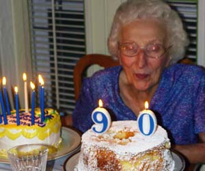
Huntersoninski posted:David Pratt already mentioned the horizon. I really love the layout of this with the clouds and the water, but either I've got computer eyestrain really bad this morning (possible) or nothing's really in focus in the picture. It makes it hard to take anything in beyond the general colors and shapes which I like. I wish it were in sharper focus. Focus is something I struggle with a lot. That said, I do kind of struggle with focus in general because I'm not particularly sure if I have my OVF in focus. There's a disturbingly large range through which I can roll the diopter adjustment wheel and see absolutely no changes. I think I need to see an optometrist. quote:I agree the pole is distracting, but I don't agree that you couldn't find a good crop to help it. It you cropped to the pole and also brought the bottom up so you couldn't see as much of her heap of jackets and things that miiight do it. quote:As for me, I've just taken my camera out again after almost a year of doing nothing with it. I'm trying to fix my issues with focus and depth of field. Here's my one of my favorites from a trip to the local park (the only one I have with me at this computer): I would have preferred to see either dof thinner or balanced more around the post you focused on. It might be just the angles involved, but it appears that your focal falloff is longer on the railing toward the back of the frame than it is on the railing toward the front. Beyond that the only real problem I have with the composition is what appears to be a sign framed by the top rail and the nearest post in the far left of frame. On the attached image, I've got my first real attempt at doing a composite image. Light was really crappy when I went out -- really overcast. It wasn't a full on sky swap. I cut out the original sky and put it in another layer, then used it as an overlay to the sky I cut from another image on a much better day. This caused me a lot of fun as I got to spend around an hour playing with masking and levels to finally get rid of the random bit of dark gray in the left close to the horizon (I ended up not even masking, just sliding up the black point of both the blue channel and the RGB channel) and to be frank, I'm still not sure if it works. I don't think I have it looking fully realistic, but erring more on the side of "overcooked" than the "put in new sky".
|
|
|


