

|
I think it's more the red, yellow, and orange as "high-contrast attention colors" that's doing it. That's why I was suggesting going with just the yellow.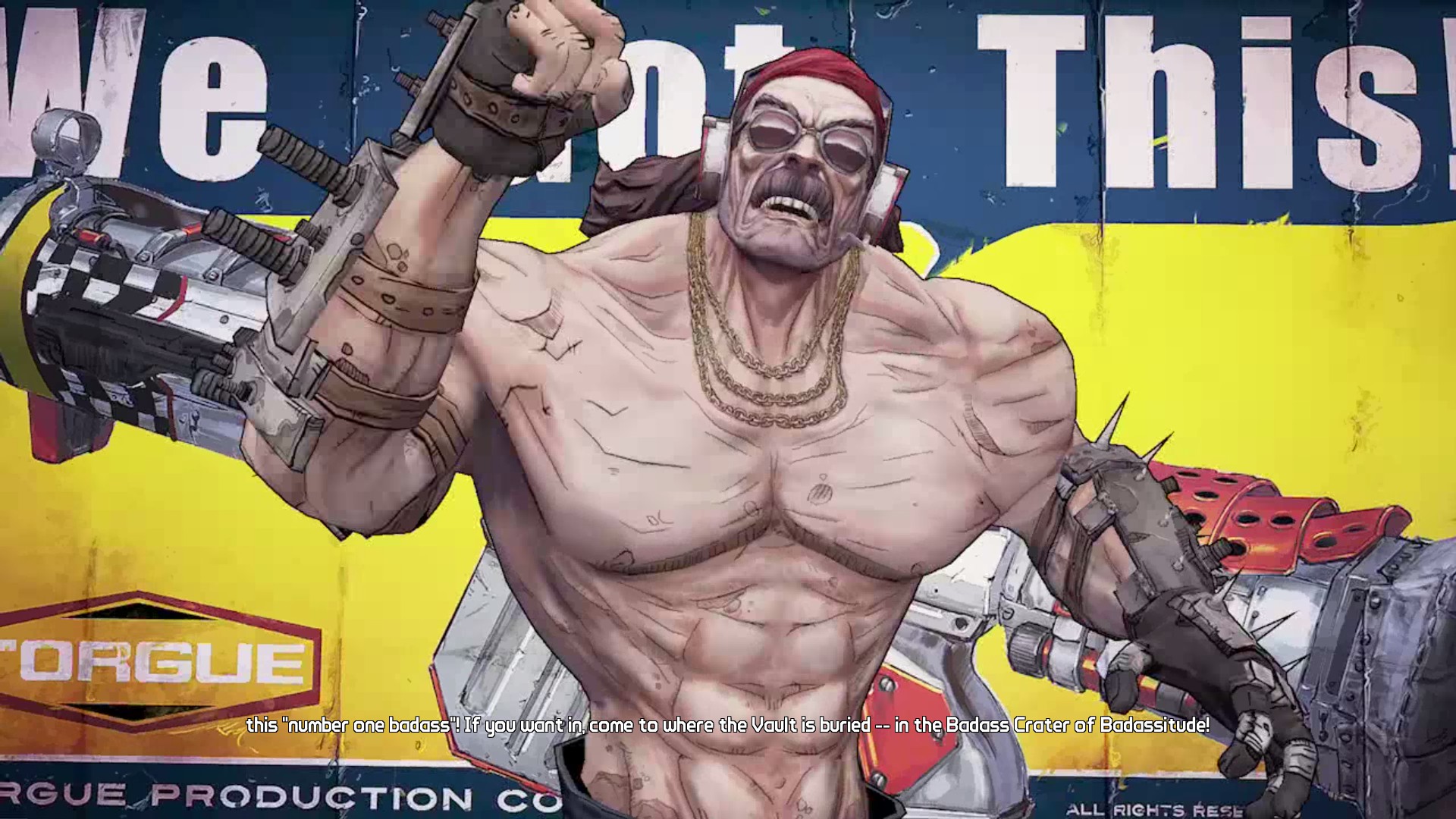
|
 #
?
Jul 9, 2014 01:46
#
?
Jul 9, 2014 01:46
|
|

|

|
| # ? Jun 7, 2024 16:47 |
|
|
So what should the jacket be? I am seriously deficient at this Maybe that blue color? I can't see doing the whole jacket yellow. Or maybe I should I dunno   
signalnoise fucked around with this message at 02:04 on Jul 9, 2014 |
|
#
?
Jul 9, 2014 01:47
|
|
|
I like the yellow more, but yellow can be a tough one to try (I recommend layering yellow on over a leather brown type colour).
|
|
#
?
Jul 9, 2014 02:18
|
|


|
My photoshop isn't great, but maybe something more like this?
|
|
#
?
Jul 9, 2014 02:40
|
|
|
I do like that. It actually took me a second to spot the orange, but I think that's a good touch. I like the idea of having ridiculous colored stuff from time to time but it was driving me nuts imagining painting like 50 dudes in a laughable color scheme. Surely there's a guide for picking colors outside of kuler. I mean I understand, color theory and all that, but I'm aiming at cartoonish. Maybe it still applies, but when I look at, for instance Bachtere's work, I appreciate the subtle palette he uses most of the time, but one time I asked him for pictures of his stuff that wasn't on the cool end of the color spectrum and I really, really liked what he had to show for a cartoonish style. I really wish I had the knack for using really bright colors well. signalnoise fucked around with this message at 03:05 on Jul 9, 2014 |
|
#
?
Jul 9, 2014 03:02
|
|
|
I think you need to focus on specific parts of the models that you want to have cartoony bright colors, and then unify the tone on the other details. Based on your first picture, with orange and yellow where they are, my gut instinct would be to paint the rest in earthy colors, metallic colors where appropriate, and then unify it all with a Devlan Mud equivalent wash on those details. The bright colors will pop out, but overall the models will have more balance. More quickies! Got through all the Bones minis I had sitting on my desk, and the Slave Drones and Daydreams have been sitting around forever:           
|
|
#
?
Jul 9, 2014 03:19
|
|

|
Bachtere posted:I think you need to focus on specific parts of the models that you want to have cartoony bright colors, and then unify the tone on the other details. Based on your first picture, with orange and yellow where they are, my gut instinct would be to paint the rest in earthy colors, metallic colors where appropriate, and then unify it all with a Devlan Mud equivalent wash on those details. The bright colors will pop out, but overall the models will have more balance. Alright. I think I know what needs to be done to retain that then, and it definitely involves not having bright orange shin guards. Also quote:
|
|
#
?
Jul 9, 2014 03:23
|
|
|
It's entirely possible to borderlands cartoony without tons of primary colors:
|
|
#
?
Jul 9, 2014 03:28
|
|


|
BULBASAUR posted:It's entirely possible to borderlands cartoony without tons of primary colors: Oh gently caress yes, tutorial please? I'm loving the poo poo out of that faux-cell shaded look. Reminds me of a Hierophant bio-titan I saw once.
|
|
#
?
Jul 9, 2014 03:49
|
|

|
BULBASAUR posted:It's entirely possible to borderlands cartoony without tons of primary colors: Teach me please I promise to try signalnoise fucked around with this message at 03:58 on Jul 9, 2014 |
|
#
?
Jul 9, 2014 03:55
|
|
|
Bachtere can I ask what shades of brown that is on your base and base rims?
|
|
#
?
Jul 9, 2014 04:06
|
|


|
BULBASAUR posted:I am really weird and do a color analysis to determine my color palette, then tweak it so the colors are complemntary. That builds my particular color theme: I may have asked this a while ago but what do you do for your Iron Warriors again? I'm having trouble being creative with 'silver, black, and hazard stripes'.
|
|
#
?
Jul 9, 2014 04:17
|
|

|
Quick question on air brushing, I have a bunch of wraith guard pinned to corks by one foot, and I don't know whether it's easier to paint them like that or set them onto bases and base them then paint... Arms are all magnetised and will be painted separately either way. Thought I'd ask first before shooting myself in the foot, never painted troop models by airbrush before and want a hopefully easy go off it.  Sort of stalled out on these guys after a fiasco of trying to do their feet, but that's solved and they're getting more details again finally, just need to fabricate some chaosy things to stick to them now! And come up with some bases that'll probably be immense as well. Like poo poo they turned out to be huge but they're more in line with being to scale with other troop sized models now I think.
|
|
#
?
Jul 9, 2014 05:19
|
|
|
VolatileSky posted:Quick question on air brushing, I have a bunch of wraith guard pinned to corks by one foot, and I don't know whether it's easier to paint them like that or set them onto bases and base them then paint... Arms are all magnetised and will be painted separately either way. Keep them off their bases. It's easier to spray at angles and get into all the hard to reach parts with a brush plus you won't have to repaint the base when you're done.
|
|
#
?
Jul 9, 2014 05:32
|
|

|
Bachtere, your stuff owns like always.HiveCommander posted:Oh gently caress yes, tutorial please? Hah, I'm nowhere near that level of painting. Here's the guys blog with tons of cool pictures: http://40khobbyblog.blogspot.com/ What you're seeing is an effect called 'color modulation', an airbrush technique. It's pretty simple really- you highlight all of the flat edges of a model, separately, and with different levels of highlight (as if lights are hitting the model from a ton of different angles). The goal is a bunch of different gradients going in different directions. This looks cartoony because it's not at all how light works in real life. The cell shaded effect comes from the high contrast- instead of edge highlighting, he's weathered the corners of the tank with a dark color, which gives it that black outline effect. He also uses pin washes, which really up the contrast level of any model:  Here's a tutorial. SUPER NEAT TOY posted:I may have asked this a while ago but what do you do for your Iron Warriors again? I'm having trouble being creative with 'silver, black, and hazard stripes'.  Here's the streamlined version: code: This one isn't mine, but its my favorite Iron Warrior color theme around. His recipe, which is mostly GW, is drat simple: code:
|
|
#
?
Jul 9, 2014 07:02
|
|
|
I'm starting to get really annoyed with Fantasy Flight's lovely plastic. We get some slightly hot weather and all the spears I painstakingly straightened out goes right back to looking like limp noodles. Is there any way to keep this junk from warping as soon as it's 30o outside.
|
|
#
?
Jul 9, 2014 10:23
|
|


|
I started buying some Reaper paints because I like the triad system but - does anyone else have problems with the bottles fouling something fierce? I use VMC mostly and they get gummed up sometimes but it seems like every pot of Reaper I picked up is hideous. Is there a trick for clearing them out or am I just having bad luck here?
|
|
#
?
Jul 9, 2014 12:27
|
|

|
Yes, Reaper bottles have something to stop their stirrer balls/skulls from blocking the tip. Unfortunately it's poo poo and tends to clog the bottles. You might try removing that block with a knife or clippers.
|
|
#
?
Jul 9, 2014 13:49
|
|
|
Cool, good to know. Time to do some surgery.
|
|
#
?
Jul 9, 2014 14:04
|
|
|
Pierzak posted:Yes, Reaper bottles have something to stop their stirrer balls/skulls from blocking the tip. Unfortunately it's poo poo and tends to clog the bottles. You might try removing that block with a knife or clippers. I used to keep a 3/32 brass rod around for exactly this purpose
|
|
#
?
Jul 9, 2014 14:05
|
|
|
signalnoise posted:I used to keep a 3/32 brass rod around for exactly this purpose VVV: I'll try that with a paperclip then. Pierzak fucked around with this message at 14:28 on Jul 9, 2014 |
|
#
?
Jul 9, 2014 14:10
|
|
|
Pierzak posted:Oh? Tell me more. Do you just force it through the tip to break the stirrer trap (seems kinda thick for that), or what? Yeah basically. gently caress that thing, I want my paint. My memory might be wrong about the size. signalnoise fucked around with this message at 14:19 on Jul 9, 2014 |
|
#
?
Jul 9, 2014 14:16
|
|
|
Okay, so. I'm thinking I want to magnetize some of my models (Specifically, Tau Crisis Suit weapons). I do not have tools for this. Any recommendations on what I should get for drilling the holes for the magnets, and any tips on the process? Thanks! EDIT: I don't plan on doing much in the way of metal, so I've been told a pin vise is the way to go. What's a good one? Esser-Z fucked around with this message at 15:28 on Jul 9, 2014 |
|
#
?
Jul 9, 2014 15:23
|
|

|
quick airbrushing question. so I'm doing a paint job on a Nerf gun, and threw on some white Vallejo primer through my brush so the eventually purple paint would stick to it. At this point its not perfectly white and you can still see some of the underlying plastic colors, but if I'm going over it again with the purple, and I do a good job with that should it matter?
|
|
#
?
Jul 9, 2014 16:06
|
|


|
I guess how many coats you plan on putting down will matter, but usually a pure white/grey surface is good to see mold lines and other imperfections. Esser-Z posted:Okay, so. I'm thinking I want to magnetize some of my models (Specifically, Tau Crisis Suit weapons). I do not have tools for this. Any recommendations on what I should get for drilling the holes for the magnets, and any tips on the process? Thanks! large guns/arms can use up to 6mm x 2mm or 6 x 3mm magnets, smaller items like heads & backpacks you can go down to 3mm and even 2mm if you have the patience. Just get a drill bit the right size: 6mm, 3mm, etc. You shouldn't need an actual drill if you're going into plastic (your fingers will be strong enough), but a pin vise for a 1mm bit will be very helpful to get things going.
|
|
#
?
Jul 9, 2014 16:30
|
|

|
krushgroove posted:large guns/arms can use up to 6mm x 2mm or 6 x 3mm magnets, smaller items like heads & backpacks you can go down to 3mm and even 2mm if you have the patience. Just get a drill bit the right size: 6mm, 3mm, etc. You shouldn't need an actual drill if you're going into plastic (your fingers will be strong enough), but a pin vise for a 1mm bit will be very helpful to get things going. Thanks! I may have a proper drillbit already, if I don't need a drill for it; gotta go look through the tools in the basement what were my grandfather's! I'm just planning to magnetize weapons so far, but who knows what the future holds?
|
|
#
?
Jul 9, 2014 16:37
|
|
|
Just think ahead about what you need to magnetize - when I did my Forgefiend so I could convert him to a Maulerfiend I did every leg when I didn't need to. I even magnetized my Heldrake's head so it could split apart and change weapons! But the Baleflamer always stays in.
|
|
#
?
Jul 9, 2014 16:56
|
|
|
signalnoise posted:So what should the jacket be? I am seriously deficient at this one issue is that you're using very very saturated colors for each choice. You could easily get away with a varied scheme but without approaching some portions a little more subtly it'll be a big garish blob. Pick a major color (probably Yellow/Orange checkerboarding) a bright accent (red) and then muted tertiary colors (green skin) and a dark dark purple for things like leather pants.
|
|
#
?
Jul 9, 2014 17:12
|
|

|
signalnoise posted:So what should the jacket be? I am seriously deficient at this Unless you want your guys to look like clowns, pick 1 or 2 main colors that are really vibrant then tone back the rest of them. With the exception of SRM's 80's marines pretty much everyone else here should have some good examples throughout the thread of this.
|
|
#
?
Jul 9, 2014 17:25
|
|
|
w00tmonger posted:Unless you want your guys to look like clowns, pick 1 or 2 main colors that are really vibrant then tone back the rest of them. With the exception of SRM's 80's marines pretty much everyone else here should have some good examples throughout the thread of this. He's going for an over-the-top Borderlands look. With some cleanup and washes he'll be okay looking. Has anyone pointed out that painting checkers, hazard stripes, and a dozen colors on Orks is going to burn you out? I'm too much of a Downs baby to have read how many you're making, if it's for Mantic or a Killteam, if that's the case you'll be fine.
|
|
#
?
Jul 9, 2014 17:29
|
|
|
krushgroove posted:Just think ahead about what you need to magnetize - when I did my Forgefiend so I could convert him to a Maulerfiend I did every leg when I didn't need to. I even magnetized my Heldrake's head so it could split apart and change weapons! But the Baleflamer always stays in. Of course. I'd be doing arm weapons and maybe a shoulder mount (I tend to prefer grabbing a different piece of gear to a third weapon mount, but it could be used if I wanted to take a TL something and another gun), so that I could use my suits in different roles for different armies. Nice and simple, just need to be able to stick a thing onto the exterior of the mini.
|
|
#
?
Jul 9, 2014 17:49
|
|
|
Post 9-11 User posted:He's going for an over-the-top Borderlands look. With some cleanup and washes he'll be okay looking. That's definitely a concern. I only have like 10 minis for marauders right now, but I will have another like 50 in a few days. I know I can stomach a set of like 5 to 10 of these dudes, but it's definitely not worthy of an entire army
|
|
#
?
Jul 9, 2014 17:53
|
|
|
Could just put the fancy patterns on the vehicles and Deadzone/Elite units and not on the rank and file infantry.
|
|
#
?
Jul 9, 2014 17:56
|
|
|
w00tmonger posted:Unless you want your guys to look like clowns, pick 1 or 2 main colors that are really vibrant then tone back the rest of them. With the exception of SRM's 80's marines pretty much everyone else here should have some good examples throughout the thread of this. 
|
|
#
?
Jul 9, 2014 18:15
|
|
|
How did I never see the bolter on the bottom of that guitar before? Amazing.
|
|
#
?
Jul 9, 2014 18:28
|
|


|
SRM posted:Even then, my dudes stick to two main colors and a spot color. You can do bright colors and have them still look good, but using more than 2 or 3 colors and a spot color will make your stuff look busy and crowded. Unless you're a really good painter and trying to pull off an intentionally excessive scheme like the old Noise Marines, keep it simple: Plus, keep in mind, that figure is riding a tight line in several ways. One, there is a lot of black and white to ground and isolate the other colors. Two, that's not blue and green, it's desaturated lime and cyan, associating them, somewhat, with the yellows. Even the red is an orange-red. Finally, it's composed so that contrasting colors aren't just willy-nilly in there, they're confined to spots where they work; the green feet are next to the yellow-orange leopard print. The cyan hands are next to the reddish orange guitar. Sure, his greek mane is green yellow and red, but it's right *next* to the backpack that has elements of those colors in it! The whole model is composed well, colorwise, too. The reds line up in 2 horizontal stripes. The leopard print grounds the blues on the right arm and left hand--He didn't split it vertically as left-blue, right-leopard, or top-blue, bottom-leopard. He also didn't match the shoulders or use different designs on the left shoulder and legs. There's a ton of *restraint* going on in there. If you try to form a palette out of it with that tool, you miss how well executed it really is. The SRM Ultra squad is similar. Sure, it's bright blue, yellow, and Red. But it's also *none* of those things to excess. Most of the old ultras with red either used it in a unified way as their accent color, or very sparingly as a tertiary element to enhance yellow. The greens were bluish greens. The flesh was generally desaturated. Even hair was painted to recede under white highlights to a large degree. I think the palette thing is cool as a way to get oriented, but it doesn't help you establish composition. A well composed palette can end up looking muddy if it's used without an overall theme, or in opposition to the natural tendencies of the eye to 'read' elements with similar color as being unified. Think of that palette exercise as step *2*, not step 1. Step one is looking at the composition and getting a look you like. Then, you derive a palette *out* of that to formalize, either, a color scheme for a variety of related minis, or a refinement to what you already see working. One of the biggest differences between the Borderlands deal and the treatment here is that the borderlands girl is A) blacklined by a rendering pass for the comic book effect B) desaturated and C) not a person with vividly green skin. It also doesn't hurt that she's in vastly different proportions. Her purple jacket has the orange stripe, but they're kept at similar values so that they don't contrast. Effectively, that orange is the purple with the blue taken out, and then dimmed so as not to be too obvious. The yellow on her legs it he only other major color change, and it picks up the orange on the jacket, the browns on her gear, and even the green on her glasses. The lunchbox and glasses are tiny in comparison to the rest of the model. She's effectively just 2 colors; yellow and purple, with some well done approaches to 'push' that relationship in unusual ways. The purple/orange thing, in particular, is subtle because those are naturally contrasting colors, but have been approached to minimize the effect of that contrast--having your cake and eating it too, in terms of color theory. Your ork is green. That's a huge problem, but not insurmountable. You want to stick with that, start by making the weapon mostly a bright reddish orange like the guitar on the noise marine, and then look at his coat and so forth, and find ways to make it subtle. For instance, you could make it olive-drab highlighted into paleness, or you could go for the old field-gray look some orks used to have in the GW stuff. You can then add elements of orange-brown, or even push some of it into yellow so you can have your hazard stripes, but maybe only start on that once you've got the basics figured out and dip or ink the guy enough that you get some color isolation. The other thing to think about here is war paint or tatoos on the arms to try to break up how crazy it looks. You could either do braveheart light-blue to tone down the green, or you could do white to minimize it and give you more freedom with other colors.
|
|
#
?
Jul 9, 2014 18:41
|
|

|
That right there is basically everything I want my not-orks to be, but can't technically achieve yet. So I need to pull away at least a color or two, replacing them with more neutral colors, and actually break down the figure as what parts actually need to be highlighted vs main color areas.TheCosmicMuffet posted:Your ork is green. That's a huge problem, but not insurmountable. You want to stick with that, start by making the weapon mostly a bright reddish orange like the guitar on the noise marine, and then look at his coat and so forth, and find ways to make it subtle. For instance, you could make it olive-drab highlighted into paleness, or you could go for the old field-gray look some orks used to have in the GW stuff. You can then add elements of orange-brown, or even push some of it into yellow so you can have your hazard stripes, but maybe only start on that once you've got the basics figured out and dip or ink the guy enough that you get some color isolation. I like all of these ideas and thanks everyone for the genuine advice. I'll figure this color thing out yet. I will probably get a finished mini out of it tomorrow. signalnoise fucked around with this message at 19:17 on Jul 9, 2014 |
|
#
?
Jul 9, 2014 19:12
|
|
|
Bought 2 shades of purple at the store thinking it would be a main color and a highlight to go with it. Taking a closer look it lines up better with my vision if its a main color and a shading. Would anyone have a link to this sort of technique, as I've always worked from dark to light and not the reverse. To blow open the floodgates, I'm aiming for this sort of a color scheme.  Vallejo Blue Violet  Vallejo Royal Purple  If I'm totally wrong and the colors would fit the scheme as a main and a highlight, feel free to knock me down a peg. w00tmonger fucked around with this message at 19:34 on Jul 9, 2014 |
|
#
?
Jul 9, 2014 19:26
|
|
|
I wasn't expecting that well-composed an analysis on painting space Barbies today. Thanks for that!
|
|
#
?
Jul 9, 2014 20:06
|
|

|

|
| # ? Jun 7, 2024 16:47 |
|
|
Are you back? Like, really back? Because I hope you're back. Tell me you're back!
|
|
#
?
Jul 9, 2014 20:35
|
|