


|
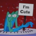
Ulta posted:I was trying to make a sneaky rogue today, but I can't get it to express right. Any tips on getting that WoW rogue crouch sneak?  
|
 #
?
Aug 9, 2014 07:05
#
?
Aug 9, 2014 07:05
|
|

|

|
| # ? May 9, 2024 22:36 |
|
|
Thanks for the suggestions guys, how's this? 3x 3xI made the frame where he's half exploded transition smoother, added in more spark effects and added more frames to slow down the fade out at the end. - I also slowed the frames down a bit as he coils back. I don't want to have him fade to white and explode because the blue and yellow represents him throughout the game , plus the background will fade to white. edit- here's a quick example of how it'll look in game 
.TakaM fucked around with this message at 10:08 on Aug 9, 2014 |
|
#
?
Aug 9, 2014 07:53
|
|

|
Scut posted:Hey that's pretty good! Love the popping background. If I could offer some constructive advice, make your darks darker on the figure, try shifting them into a slightly more saturated cooler tones as well. It will make the shading work better in my opinion. Thanks I'll try to put an emphasis on it. It seems I habitually don't push the contrast enough. Also, I'm colorblind/red-weak and my screens aren't calibrated well so it's difficult for me to tell how the image carries over.
|
|
#
?
Aug 9, 2014 12:35
|
|
|
Jackard posted:Not too familiar with that animation. How about having him lean forward with his head lowered, something like this That helped! Whats the source on that?  stab stab stab 
|
|
#
?
Aug 9, 2014 14:06
|
|
|
Travis343 posted:When the player gets about midway through the side, a couple of tiles past those side steps, they are moved to the backyard map which is all top down. Trying to do something fancy like scale the player during the move is probably beyond the scope of RPG maker and my skills. Oh okay. That seems like it might feel weird, like the hill is disappearing when you get close to it? I don't know i'd have to see it in motion. RPG Maker is pretty limiting it's true but if you want to scale the player you could do that in increments with scaled-down sprites. I feel like some 90s RPG did that.
|
|
#
?
Aug 9, 2014 17:29
|
|
|
Ulta posted:That helped! Whats the source on that? 
|
|
#
?
Aug 9, 2014 17:49
|
|
|
.TakaM posted:Thanks for the suggestions guys, how's this? Hmm...slowing it down towards the end did give it more impact, but it might have actually made it worse overall because it's pretty stuttery. I'd either go back to the way it was before, speed it up at the beginning instead of slowing it down at the end, or ideally draw more frames to smooth it out again. I'm being nitpicky though, it looks great, especially in game. I've seen gifs of this game posted a couple times throughout the thread and it's honestly some of my favorite 2D animation I've seen in a game.
|
|
#
?
Aug 9, 2014 20:25
|
|
|
I'm not too experienced at pixel art, but I made this as an early attempt. On the top I have a tiny screen capture from one of my Minecraft maps, I used the colors provided and the textures already present in the image and just sort of fleshed it out. I think its alright but I want to try some of the tips from the thread. I'll take any advice. 
|
|
#
?
Aug 9, 2014 21:02
|
|

|
Do you have a non-jpeg version?
|
|
#
?
Aug 9, 2014 21:19
|
|
|
Yeah, sorry, here you go.
|
|
#
?
Aug 9, 2014 21:27
|
|
|
The scene has interesting composition, but using computer-generated brush stroke blending means it's not really pixel art. Here's the go-to definition< my further advice would be to work from a pre-defined color palette until you get a better handle on colors, and reference some examples of how people do pixel-art water (yours needs love).
|
|
#
?
Aug 9, 2014 22:10
|
|
|
poemdexter posted:And in game... Loving it! But, it's a little hard to see what's going on, especially if it's smaller than that - are you planning on adding any punch effects, like, colored 'energy' impact effects when you land a hit?
|
|
#
?
Aug 10, 2014 05:28
|
|


|
Ulta posted:That helped! Whats the source on that? Jackard fucked around with this message at 05:38 on Aug 10, 2014 |
|
#
?
Aug 10, 2014 05:36
|
|
|
McKilligan posted:Loving it! But, it's a little hard to see what's going on, especially if it's smaller than that - are you planning on adding any punch effects, like, colored 'energy' impact effects when you land a hit? The sprite sheets are still a work in progress but it's a priority that things are very readable especially the punches. We'll probably have some effects a little later to help punch it up (pun intended).
|
|
#
?
Aug 10, 2014 05:42
|
|


|
I'm still troubled by the perspective, so i've been working on it: First is a straight on view, the middle two are the original perspectives. 1 = Update 2 = Original and the last is a side on view.  I hope the update conveys the perspective, since i'm at a loss as to what to do, especially with the chest and hips. I tried shading them to look like they're turned, but i can't escape from the fact that they look like they're being seen in a straight on view.
|
|
#
?
Aug 10, 2014 10:27
|
|

|
swamp waste posted:Oh okay. That seems like it might feel weird, like the hill is disappearing when you get close to it? I don't know i'd have to see it in motion. RPG Maker is pretty limiting it's true but if you want to scale the player you could do that in increments with scaled-down sprites. I feel like some 90s RPG did that. The screen fades to black on the transition so hopefully it's not so jarring, like the hill just vanishes. I can already think of the events to switch the player to a smaller sprite as they go farther up the hill, but you'd have to either make it a short cutscene where the player loses control of the character or do some event wizardry where the sprite scales back to full-size if the player should decide to turn around and walk back towards the front yard mid-way up the hill. It's doable, but I don't think it's really worth it for something that's probably not going to come up much in the rest of the game.
|
|
#
?
Aug 10, 2014 11:12
|
|


|
poemdexter posted:The sprite sheets are still a work in progress but it's a priority that things are very readable especially the punches. We'll probably have some effects a little later to help punch it up (pun intended). I recommend making the movement much more dramatic than one pixel back and forth. Especially for a pixel-art graphic you need actions to be very exaggerated. Keep in mind the principles as per the Animator's Survival Kit: weight, anticipation, exaggeration, contrast. So, for the turtle to stab maybe have him pull back the sword to the point of turning around backwards and then whip forward changing overall shape/silhouette from contracted to extended.
|
|
#
?
Aug 10, 2014 11:17
|
|
|
Chipp Zanuff posted:
Move the back foot up a pixel or two?
|
|
#
?
Aug 10, 2014 11:33
|
|

|
I think the real problem is that you've mirrored the arms and copied the legs, it makes it kinda look like an egyptian hieroglyph. I suggest something like this: I made parts of his legs thicker, pulled his left arm up one pixel and pulled it in closer- these changes give it more perspective and depth, I also changed the angle on his right foot. It's a nice sprite though, I think you've got everything at a good size and it looks in proportion, but I think you're taking a very systematic approach which results in things looking a bit awkward. Copying one limb to be the other isn't a bad way to work, especially for animations, but you can't just leave it as a perfect copy. It creates a repeating silhouette effect that is hard to ignore, you need to spend extra time to make the limb closest to the camera appear more dominant and just move pixels around on the other. Keep it up, it's coming along very well dizzywhip posted:Hmm...slowing it down towards the end did give it more impact, but it might have actually made it worse overall because it's pretty stuttery. I'd either go back to the way it was before, speed it up at the beginning instead of slowing it down at the end, or ideally draw more frames to smooth it out again.  Definitely less smooth, but maybe more painful?
|
|
#
?
Aug 10, 2014 11:51
|
|
|
McKilligan posted:Loving it! But, it's a little hard to see what's going on, especially if it's smaller than that - are you planning on adding any punch effects, like, colored 'energy' impact effects when you land a hit? He was missing a few frames too  In my crappy prototype I had little smack effects coming off his fists when he connected a punch and they'd also pause slightly while they connected, it looked.. ok?
|
|
#
?
Aug 10, 2014 13:07
|
|

|
Chipp Zanuff posted:I'm still troubled by the perspective, so i've been working on it: When you're at 3/4 the back shoulder isn't going to be visible, and depending on how big his chest is, a good chunk of the upper arm will be obscured, too. The hips will be the same in regards to the back leg. .TakaM posted:I think the real problem is that you've mirrored the arms and copied the legs, it makes it kinda look like an egyptian hieroglyph. Like this, but probably even more so.
|
|
#
?
Aug 10, 2014 14:40
|
|

|
Jackard posted:Also this shading looks quite flat (partly due to your palette) nothing appears to be in the foreground or background I think this is better but the body feels flat to me. Also the arm could better but I don't know how 
|
|
#
?
Aug 10, 2014 15:05
|
|
|
Ulta posted:I think this is better but the body feels flat to me. Also the arm could better but I don't know how Jackard posted:Not too familiar with that animation. How about having him lean forward with his head lowered, something like this
|
|
#
?
Aug 10, 2014 15:48
|
|
|
.TakaM posted:I think the real problem is that you've mirrored the arms and copied the legs, it makes it kinda look like an egyptian hieroglyph. Thanks so much for the edit! I'll incorperate aspects of it in to future edits (as well as the one in this post) but i am hesistant to simply copy verbatim your edit. I definitely see your point about making the side facing the viewer more prominent in terms of limbs. I really appreciate your advice and taking the time to help me, especially given the quality of your own work which always seems very fluid. I was also wondering, how many frames do you usually do per animation on average? dupersaurus posted:When you're at 3/4 the back shoulder isn't going to be visible, and depending on how big his chest is, a good chunk of the upper arm will be obscured, too. The hips will be the same in regards to the back leg. Something like this?:  Two different versions. I'm a bit hesistant to add extra pixels to the arms and legs as they (for me at least) would look odd and out of proportion but i did give it a try in both variations. Tried taking your advice with the hips for the back leg, but couldn't make it look satisfactory. Ash Crimson fucked around with this message at 15:52 on Aug 10, 2014 |
|
#
?
Aug 10, 2014 15:50
|
|
|
Chipp Zanuff posted:Something like this?: #1 is spot-on. Stand in front of a mirror and stick your chest out, and you'll probably see something like that. #2's a little far forward, as if he was pushing his arm forward some (so maybe part of a walk). But yeah, doing the same with the legs might be tricky since they're so skinny, there's not much to occlude with.
|
|
#
?
Aug 10, 2014 17:11
|
|
|
Variations on a theme! I like the second column the best I think.
|
|
#
?
Aug 10, 2014 17:53
|
|
|
dupersaurus posted:#1 is spot-on. Stand in front of a mirror and stick your chest out, and you'll probably see something like that. #2's a little far forward, as if he was pushing his arm forward some (so maybe part of a walk). But yeah, doing the same with the legs might be tricky since they're so skinny, there's not much to occlude with. My only worry is trying to animate it now. My attempt at animating the one-handed attack with the perspective fixed:  Comparison to the previous version:  Not sure if it's any better or any worse. Ash Crimson fucked around with this message at 21:08 on Aug 10, 2014 |
|
#
?
Aug 10, 2014 18:19
|
|
|
Travis343 posted:The screen fades to black on the transition so hopefully it's not so jarring, like the hill just vanishes. Still sounds weird. You're walking towards a hill -- fade to black -- now there is no hill (because you're on the other side of it? On top of it?) I don't know if scaling is the right solution, but it's easier than you think; you have two rows of events for each transition, the top one being the one that scales the next step down, the bottom one being the one that scales back up. If RPG Maker lets you get the direction the player's moving and use it in an if-then type statement it's even easier. The thing is, when you have a cool ambitious idea like the hill scene, it ends up being a lot of extra work in ways you couldn't have foreseen. Go for it! Or abandon it! just don't half-rear end it! RPG Maker is tough for this; what makes it such a good learning tool is that it helps you recreate conventional RPG things you've already seen, teaching you how they work, but the flip side of that is it fights you when you want to do something new or unusual.
|
|
#
?
Aug 10, 2014 21:15
|
|
|
.TakaM posted:Are you just talking about the timing on the frames where he coils back? I think it looks smooth enough, I was thinking maybe a way to get more mileage out of the frames would to have him stutter back and forth as he coils back. Yeah, to me it seemed like there was too much time between the frames when it slowed down towards the end, which made it seem a little too jerky. I really like this version though, it's unique, and it does look more painful.
|
|
#
?
Aug 10, 2014 21:33
|
|
|
dizzywhip posted:Yeah, to me it seemed like there was too much time between the frames when it slowed down towards the end, which made it seem a little too jerky. I really like this version though, it's unique, and it does look more painful. Definitely agree here. Sorry that i'm going over the same things over and over again, just trying to perfect the perspective. Here's another quick update: Two-handed attack following the fixed perspective:  And the previous version for comparison:  I'm hoping it looks just as good as the previous version (although i am aware there's not much noticable difference), otherwise i fear having altered the perspective would be redundant and a waste of time. I probably have the arms wrong, but it'll take some time to get used to it. Updated walk animation:  Again, not sure if it's any better this time. Here's the previous for comparison: 
Ash Crimson fucked around with this message at 22:43 on Aug 10, 2014 |
|
#
?
Aug 10, 2014 21:46
|
|
|
Perspective still doesn't work, in my opinion, the legs specifically. One leg being higher by one pixel just looks weird like that, because it's as if you're looking from slightly above the character. Otherwise, the leg would still go down to the bottom. Shoulder looks better, in that you can't see it any more, and the chest probably looks better, but my colour-anomalous eyes refuse to focus and let me see it properly, so right now his body looks like a weird sausage to me.  Not generally a problem, but maybe you could include a 2x or 3x version if it's not too difficult to make for you. Not generally a problem, but maybe you could include a 2x or 3x version if it's not too difficult to make for you.Unrelatedly, the sword trail looks a bit...odd to me, in the sense that it's almost as if it appears too late somehow. It looks less like a sword trail and more of a 'shockwave' after the attack. It's not wrong necessarily, just can't put my finger on what's off about it. Chipp Zanuff posted:Updated walk animation: The perspective is okay in this, but you might want to remove the stiffness from the upper body. When someone walks, their body doesn't just go up and down while remaining static. The chest turns slightly to the left and then to the right, and the head bobs slightly.
|
|
#
?
Aug 11, 2014 06:33
|
|
|
Red Mike posted:Perspective still doesn't work, in my opinion, the legs specifically. One leg being higher by one pixel just looks weird like that, because it's as if you're looking from slightly above the character. Otherwise, the leg would still go down to the bottom. Shoulder looks better, in that you can't see it any more, and the chest probably looks better, but my colour-anomalous eyes refuse to focus and let me see it properly, so right now his body looks like a weird sausage to me. Thanks for the advice! I'll fix the legs right away and work on making the walk less stiff. Apologies for the issues the various colors cause.
|
|
#
?
Aug 11, 2014 09:28
|
|
|
.TakaM posted:Are you just talking about the timing on the frames where he coils back? I think it looks smooth enough, I was thinking maybe a way to get more mileage out of the frames would to have him stutter back and forth as he coils back. I like this stuttering version a lot more then the earlier one you posted. It really emphasis the 'pop', looks awesome!
|
|
#
?
Aug 11, 2014 15:55
|
|
|
Did the portrait for player 3 today.
|
|
#
?
Aug 11, 2014 22:09
|
|
|
_jink posted:Tales From My Imgur Folder: here's some scraps from a little game-jam game that went so fast off the deep end into cobbled-together mess that I lost heart: This looks amazing and that premise sounds :kickin rad:. I hope you pursue it someday!
|
|
#
?
Aug 12, 2014 13:57
|
|

|
GBS regular Moola "died" and was resurrected as a Space Marine Dreadnaught, affectionately known as a Threadnaught, Postnaught, etc. Are there regulars in this thread active on SA Mart that would be up for doing an avatar?
|
|
#
?
Aug 12, 2014 17:02
|
|
|
I'm not active on SA Mart but what did you want?
|
|
#
?
Aug 12, 2014 17:18
|
|

|
I was thinking something like this: With this things head:  Sitting at a computer postin'
|
|
#
?
Aug 12, 2014 18:03
|
|
|
Whatever Scut asks for, please pay it because I need to see a Scut drawn pelvic thrusting Dreadnaught.
|
|
#
?
Aug 12, 2014 18:51
|
|
|

|
| # ? May 9, 2024 22:36 |
|
|
Just an update on Non-Human/Enemy units, with previous versions for comparison: Bottom row is the latest update.
|
|
#
?
Aug 12, 2014 19:10
|
|