|
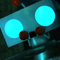
Chipp Zanuff posted:Just an update on Non-Human/Enemy units, with previous versions for comparison:
|
 #
?
Aug 12, 2014 20:38
#
?
Aug 12, 2014 20:38
|
|


|

|
| # ? May 10, 2024 17:58 |
|
|
Orzo posted:I still think they would look way better without those black outlines. I'm aiming for readability and the sprites may not always be placed against a single-colour backround. But i did give it a go and here it is, for comparison's sake: 
|
|
#
?
Aug 12, 2014 22:00
|
|

|
Shoehead posted:Whatever Scut asks for, please pay it because I need to see a Scut drawn pelvic thrusting Dreadnaught. I think he just wants that dark souls' guy's head... but now that you mention a monitor-humping dread....
|
|
#
?
Aug 12, 2014 22:47
|
|

|
Chipp Zanuff posted:I'm aiming for readability and the sprites may not always be placed against a single-colour backround. This is an enormous improvement. To be honest, I wouldn't really be interested in a game from a visual standpoint with the outlined sprites, but these would catch my attention. Dark outlines are so overpowering when the sprites are that small. Your characters' forearms are only one pixel thick, but there's one pixel of border on either side of them, so two-thirds of the space taken up by their arms is just for the border. You can still get readability by being careful about the colors you use in the background. Use one palette for your foreground objects and another for the background. If you keep the background generally dull and desaturated and the foreground bright and vibrant, there won't be any problems with readability.
|
|
#
?
Aug 13, 2014 00:35
|
|
|
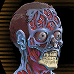
Sorry to interrupt Chipp Zanuff's awesome progression but I just have some sprites that I was hoping I could get some feedback on. My main concerns are that the head around the first bald dude has too strong of a border and that the dude on the far right has too much noise going on.
|
|
#
?
Aug 13, 2014 01:28
|
|

|
Chipp Zanuff posted:I'm aiming for readability and the sprites may not always be placed against a single-colour backround.
|
|
#
?
Aug 13, 2014 01:28
|
|
|
Definitely chiming in to say that I like the borderless look better. While I'm a big huge fan of black borders on sprites, dizzywhip is right in that they just don't work all that well on smaller sprites, or rather ones with lots of small details that kind of blob together when a border collides with itself.
|
|
#
?
Aug 13, 2014 01:35
|
|


|
Orzo posted:Hopefully you recognize how amazingly better these look. I couldn't agree with this more. Don't just accept our word for this, you should be able to see yourself how much better they look without the outlines. Part of your progression needs to not just be doing what people in here suggest until it looks right, it has to be understanding why you're making these changes in the first place. This thread can't become a crutch or essential to your creative workflow. (Not that it hasn't been cool seeing all your progress)
|
|
#
?
Aug 13, 2014 01:53
|
|


|
MONKET posted:
I'd say your instincts are correct. Use a lighter shade for the top of the bald guy's head, and for the noise on the green one, simply let your gut decide which pixels to remove, paint them over with a neighboring colour.
|
|
#
?
Aug 13, 2014 02:06
|
|
|
reading posted:This looks amazing and that premise sounds :kickin rad:. I hope you pursue it someday! thank you! MONKET posted:Sorry to interrupt Chipp Zanuff's awesome progression but I just have some sprites that I was hoping I could get some feedback on. I think the far-right monster looks fine, the bigger problem is that bald dude doesn't mesh. here's an edit:  � detail+ on face, he looked like emoticon in comparison to the level of detail on the monsters. � (same with clothes) � dropped saturation on his jeans. Everything else is in warm red/green tones -- in that lighting blue would appear grey � I subconsciously made him slightly isometric, oops � I just learned alt-0149 makes bullet points
|
|
#
?
Aug 13, 2014 07:18
|
|
|
I've been playing around with "pixel-art-like" images on and off for some time yet. Don't really want to call it pixel-art just yet since I usually don't adhere to a strict palette and don't follow a lot of conventions, although I try to learn more and more with each round. I started off with pixelating some of my coworkers from my old job and their desks.   If the character style seems familiar, it's because I cribbed the style from Coldrice's Interstellaria Characters. I usually start making assets for game dev projects that I start and never finish, mostly due to my inability to program. So I thought I'd just paste my latest bits and pieces here for criticism. Try guessing which series I've been binging through lately. First draft: (Still using Coldrice's Character Design as template)  Second Go: - or, how I tried to stop worrying and tried to come up with a more original character design (In case I manage to get a working game out of this some time)   Trying to translate the scene into a top down view:  Other assets: (Case Files start new missions/document progress)   The start of an object/tileset for a different project:  Maybe one day I can get over myself and actually seek out a programmer to work on these things, but so far I keep banging my head against the wall until I lose interest and move on to other things. My excuses in advance if the images show up blown up in size, I saved them as 600% sized up pngs but imgur seems to blow them up for some reason. Hope the tImgs show up fine enough. :/
|
|
#
?
Aug 13, 2014 17:22
|
|

|
Professor Shark posted:I was thinking something like this: Excuse my shameless self promotion. I've been following this thread and posting here and there, mostly lurking. However, I do have a SA Mart thread where I do avatars and stuff so you can check it out if you want. Some folks here exceed my skill I'm sure but if no one picks up the glove I'll be happy to do the work.
|
|
#
?
Aug 13, 2014 20:40
|
|


|
Zackarotto posted:Here's some stuff I did recently! It seems like Mozilla is making use of the dog-spinning pixel art. 
|
|
#
?
Aug 13, 2014 20:59
|
|


|
SystemLogoff posted:It seems like Mozilla is making use of the dog-spinning pixel art. It's pretty crazy to see them right on a popular browser's start page. (I use Chrome.  ) )
|
|
#
?
Aug 13, 2014 22:23
|
|

|
Cheap Shot posted:I couldn't agree with this more. Don't just accept our word for this, you should be able to see yourself how much better they look without the outlines. Part of your progression needs to not just be doing what people in here suggest until it looks right, it has to be understanding why you're making these changes in the first place. This thread can't become a crutch or essential to your creative workflow. (Not that it hasn't been cool seeing all your progress) Thanks guys, i definitely see that it's better without the outlines. I also agree with you Cheap Shot, i need to try to be more independent and rely on my own sense of what it is right or wrong with a piece rather than just asking whenever i get into difficulty. I know it can be annoying to open this thread and see that basically every piece i make requires a post. Decided to spruce up one of the attack animations as practice as well as to make it look less stock:  Tried sub-pixelling but i still haven't got the concept down. Also practiced showing different sides/perspectives in a rotating base: 
|
|
#
?
Aug 13, 2014 23:40
|
|
|
Me and my friend participated in GBJam3 this past week. We watched a marathon of Philip Seymour Hoffman films, and made a short tribute to him called Philip. I did all the art for it. Made some pixel stuff for the first time in a while. The limitations were to make a Game Boy-themed 160x144 game that uses only four colors (at a time).   
|
|
#
?
Aug 14, 2014 00:44
|
|

|
Alright, I spent a few days on and off with this one. Criticism is welcome.
|
|
#
?
Aug 14, 2014 03:12
|
|

|
_jink posted:thank you! Thanks! Your rendition is much more detailed for sure, but the game that this character will be in is supposed to feel have a somewhat Earthbound-like, even Nintendo-ish feel to it. So I want to keep the 2px-tall eyes if possible for style's sake. But, I do agree with you on the detail, so I took some of your elements into consideration:   I gave him a more detailed body and less colorful pants like you said, and gave his face actual features instead of a flat '_' on an oval like before. Also spruced up greendude so his body's more consistent:  
|
|
#
?
Aug 14, 2014 05:34
|
|
|
Chipp Zanuff posted:Thanks guys, i definitely see that it's better without the outlines. That rotation is extremely well done. There seems to be a stray pixel floating up from the feet though making them look off but otherwise super solid for such a tiny sprite. Edit: actually now that I look closer, it's not a stray pixel, the feet are just wiggling all over the place. He's got wiggle foot, and will probably be discharged from battle soon. Cheap Shot fucked around with this message at 05:54 on Aug 14, 2014 |
|
#
?
Aug 14, 2014 05:50
|
|
|
after making that tiny rear end font the other day I said 'what better way to try it out then make a video game to put it in'  unsurprisingly it's slightly terrible.  Oh well! It was fun to make, and I might finish off the game anyway just to finish something. Oh well! It was fun to make, and I might finish off the game anyway just to finish something. Lanth posted:Maybe one day I can get over myself and actually seek out a programmer to work on these things, but so far I keep banging my head against the wall until I lose interest and move on to other things. that top-down view + case file stuff is interesting! I was in a similar situation, and unless you're completely opposed to programming you should try out Gamemaker. Here's the youtube channel I used to get off the ground. Even with no programming experience, if you start really, really simply you can frankenstein a game together fairly quickly. the one artistic piece of advice I'd give is to avoid mixing resolutions (ie using big obvious pixels for the legs, blowing them up, then adding a smaller row of pixels for the feet). You blithely called it 'not following conventions', but its a convention because mixed resolution looks like rear end
|
|
#
?
Aug 14, 2014 07:07
|
|
|
_jink posted:I was in a similar situation, and unless you're completely opposed to programming you should try out Gamemaker. Here's the youtube channel I used to get off the ground. Even with no programming experience, if you start really, really simply you can frankenstein a game together fairly quickly. Thanks, I've actually done one or two very simple games so far (one using gamesalad and one using unity), but they are nothing at all to write home about. GameMaker is what I've been trying to get into for the last couple of months, along with short excursions into Construct. Contrary to how most people probably do games, I start by making assets or pieces like the above first, so I can try to get the feel of the game right. I tried going the route of using placeholder/programmer art at first, but that makes me give up even faster for some reason. I guess I should just keep powering through and hopefully break through the wall some day. The reason I insist on finishing a proper game by myself is so I don't fall into "Ideas guy" syndrome. As for the mixed resolutions thing, that's the one convention I try to always follow. It *DOES* look like rear end when using different pixel sizes. Thanks for your input, and do finish the game!
|
|
#
?
Aug 14, 2014 09:33
|
|
|
Scavanna posted:Alright, I spent a few days on and off with this one. Criticism is welcome. You've got a lot of values that are rubbing against each other too closely. I'd say you either need to bring down the dark beige or the bright red, because every colour feels like it's insisting it's at the front simultaneously.
|
|
#
?
Aug 14, 2014 13:22
|
|
|
Cheap Shot posted:That rotation is extremely well done. There seems to be a stray pixel floating up from the feet though making them look off but otherwise super solid for such a tiny sprite. Wasn't sure how to properly convey the change of perspective for the feet, but i'll review it later on. An update on the attack sprite, added more frames, increased duration of idle animation and made sure he's holding it with both hands when he's lifting it up and down his shoulder. I'm thinking of keeping him holding it with both hands after he's done his action/taunt.  I feel it looks a bit stiff during the idle animation, but im not sure how to make it look more fluid or natural. Current frame rate is 44. I sort of feel that it's lost something from the previous version, but im not sure what. I'm also considering removing the taunt, as i feel it detracts/distracts from the whole thing. Ash Crimson fucked around with this message at 14:12 on Aug 14, 2014 |
|
#
?
Aug 14, 2014 14:06
|
|
|
More pirate game
|
|
#
?
Aug 14, 2014 14:09
|
|
|
That swing has been looking way better in the last couple versions, I've gotta say.Chipp Zanuff posted:I'm also considering removing the taunt, as i feel it detracts/distracts from the whole thing. Supernorn posted:More pirate game
|
|
#
?
Aug 14, 2014 15:00
|
|
|
Zackarotto posted:That swing has been looking way better in the last couple versions, I've gotta say. I might have misunderstood what you said, but do you mean the previous versions were better? For context i added another frame after he swings, because i felt that swing a sword as heavy and long as the one he's holding would tire you out after swinging, but if it takes away from the animation i will remove it. Definitely going to remove the taunt then. I agree with what you've said about the sword on the shoulder, in the edit i'm currently making i'm having him rest after the swing, with sword on shoulder, holding it with one hand whilst his other arm drops down.
|
|
#
?
Aug 14, 2014 15:11
|
|
|
Chipp Zanuff posted:I might have misunderstood what you said, but do you mean the previous versions were better? Lanth posted:GameMaker is what I've been trying to get into for the last couple of months, along with short excursions into Construct. Lanth posted:As for the mixed resolutions thing, that's the one convention I try to always follow. It *DOES* look like rear end when using different pixel sizes. It's still loving funny to me when I see some Mega Man sprite in Barkley: Shut Up and Jam Gaiden getting scaled up 10x more than the sprite next to it, though. Wouldn't have it any other way.
|
|
#
?
Aug 14, 2014 15:25
|
|
|
Zackarotto posted:No: the last couple have been a big improvement over everything before! Thanks man! Hope this is an improvement:  Tried playing around again with sub-pixelling, I hope it looks like he's actually breathing this time. Updated version:  Tried to make the leap between idle and attack less uh pronounced and increased wind-up, hopefully it adds more impact. Ash Crimson fucked around with this message at 22:45 on Aug 14, 2014 |
|
#
?
Aug 14, 2014 15:28
|
|
|
Lanth posted:Contrary to how most people probably do games, I start by making assets or pieces like the above first, so I can try to get the feel of the game right. I tried going the route of using placeholder/programmer art at first, but that makes me give up even faster for some reason. nah I'm the exact same way. Though less efficient, its way more engaging to work on a game that looks like something early on. If you're making a game with complex enough systems that it requires prototyping you've almost left the hobbyist zone already. Supernorn posted:More pirate game really pretty! Not sure I'm feeling the light rays though. I thought they were mist at first glance, and only figured out what they were when I saw it thumbnailed. Did you try them as solid pixel blocks with transparency cranked first?
|
|
#
?
Aug 14, 2014 16:12
|
|
|
Are there any tips for making old school ANSI/ASCII art? Specifically a program or utility for it beyond just hours on the command line? Stuff like this: 
|
|
#
?
Aug 14, 2014 16:59
|
|
|
For ASCII / ANSI stuff check this out: http://forums.tigsource.com/index.php?topic=14588.0
|
|
#
?
Aug 14, 2014 17:08
|
|
|
Scut posted:You've got a lot of values that are rubbing against each other too closely. I'd say you either need to bring down the dark beige or the bright red, because every colour feels like it's insisting it's at the front simultaneously. How do you mean bring down the dark beige or bright red? I suppose the value that I'm trying to bring to the front is the dark beige, I reckon I should darken the forward facing arm a little more, and pull a lot of the bright beige from the arm.
|
|
#
?
Aug 15, 2014 01:23
|
|
|
Here's my quick edit: I just altered the red and one beige. The colour edit hosed with the scope so I swapped its highlight for a different colour. Overall reads much better now.
|
|
#
?
Aug 15, 2014 02:48
|
|
|
 I don't know what I'm doing Edit: Oh I should have him arc back a bit. I knew this was missing something. More edit: 
Shoehead fucked around with this message at 03:31 on Aug 15, 2014 |
|
#
?
Aug 15, 2014 02:48
|
|

|
Scut posted:Here's my quick edit: Hmm, I was just doing my own edit, Sort of went the opposite direction though; did a slight red and green hue shift. Cleaned up some parts, took out a lot of the contrast, made a less drastic shift from lowlight to highlight, Added better trigger discipline.  I can see that doing what you did would have taken a lot less effort.
|
|
#
?
Aug 15, 2014 04:05
|
|
|
Is your monitor calibrated? 
|
|
#
?
Aug 15, 2014 04:09
|
|
|
Scut posted:Is your monitor calibrated? How do you mean?
|
|
#
?
Aug 15, 2014 04:13
|
|
|
While I think your edits to the form of the drawing helped, your colours have gotten even worse. There's even less contrast now, which leads me to guess that either you are intentionally trying to make a piece that strains the eye or your screen is showing you wildly different colours than what most other people will see.
|
|
#
?
Aug 15, 2014 04:17
|
|
|
Ok, I don't like sharp contrast, but I'll use a darker shade of brown instead of beige for the shadows, and I'll figure out some way to dither it.
|
|
#
?
Aug 15, 2014 04:41
|
|
|

|
| # ? May 10, 2024 17:58 |
|
|
 Decided I should actually learn to art, tried to make a spaceman with dawnbringer's 32 color palette. Critique welcome.
|
|
#
?
Aug 15, 2014 04:53
|
|