

|
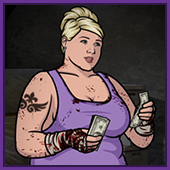
Cream-of-Plenty posted:This last tattoo looks strangely pixelated, which is weird because the rest of the photo doesn't seem to be. I think the camera/lovely instagram filter just has issues with really soft edges, the shadow on her shirt/bra strap is the same way.
|
 #
?
Aug 16, 2014 09:07
#
?
Aug 16, 2014 09:07
|
|

|

|
| # ? May 26, 2024 13:04 |
|
|
Well, gently caress. It's not like I wanted to be on a watchlist or anything.
|
|
#
?
Aug 16, 2014 11:38
|
|


|
The White Dragon posted:It's, uh, classy as hell, but at the same time, I can really appreciate the sentiment. Don't get me wrong, I love my friends (most of whom I did indeed meet in middle/high school), but a list of names is boooooring. Also, the probability that you'll have some kind of massive falling out with at least one of them is pretty high.
|
|
#
?
Aug 16, 2014 14:38
|
|
|
HelloIAmYourHeart posted:Don't get me wrong, I love my friends (most of whom I did indeed meet in middle/high school), but a list of names is boooooring. Also, the probability that you'll have some kind of massive falling out with at least one of them is pretty high. I assumed they were all dead.
|
|
#
?
Aug 16, 2014 14:41
|
|


|
I appreciate that this guy has chosen to get a list of his friends' names tattooed on himself, rather than choosing some arbitrary symbol/letter/number combination and convincing the entire reluctant group to get matching tattoos.
|
|
#
?
Aug 16, 2014 14:43
|
|
|
Istari posted:I appreciate that this guy has chosen to get a list of his friends' names tattooed on himself, rather than choosing some arbitrary symbol/letter/number combination and convincing the entire reluctant group to get matching tattoos. What makes you think that not everyone on that list has a similar tattoo with one name changed?
|
|
#
?
Aug 16, 2014 16:39
|
|
|
dpack_1 posted:What makes you think that not everyone on that list has a similar tattoo with one name changed? I'm choosing to believe.
|
|
#
?
Aug 16, 2014 17:16
|
|
|
Istari posted:I appreciate that this guy has chosen to get a list of his friends' names tattooed on himself, rather than choosing some arbitrary symbol/letter/number combination and convincing the entire reluctant group to get matching tattoos. Text is just really boring looking though. Especially names, at least with a quote you can make a judgment about the person. I mean, when someone asks if he has any tattoos he's going to lift his pant-leg and say "these are my friends". The only real response is "oh, cool". If it was a hit-list or something, that would be different.
|
|
#
?
Aug 16, 2014 17:49
|
|

|
I thought it was a list of dead buddies. Meth is a hella of a drug.
|
|
#
?
Aug 17, 2014 00:20
|
|


|
This just showed up on my Facebook feed. It is atrocious.
|
|
#
?
Aug 18, 2014 04:30
|
|

|
He should get his own Purple Heart for having to live with that tattoo. 
|
|
#
?
Aug 18, 2014 05:00
|
|

|
Bitchkrieg posted:This just showed up on my Facebook feed. It is atrocious. I've seen so many tattoos in this thread slathered with that shiny poo poo, what is it? Every piece I've had, the artist put saran wrap over it after grabbing a photo. PS goddamn that thing is atrocious.
|
|
#
?
Aug 18, 2014 05:30
|
|


|
HelmetCheese posted:I've seen so many tattoos in this thread slathered with that shiny poo poo, what is it? Every piece I've had, the artist put saran wrap over it after grabbing a photo. It's probably panthenol cream which most tattooists recommend applying to your tattoo for the first few days to keep it moist and prevent scabbing. I imagine most people go home, take the saran wrap off their new tattoo, wash it, slather it in panthenol and then snap a photo for facebook so they get that nice shiny reflection and totally obscure all the details off the tattoo.
|
|
#
?
Aug 18, 2014 05:45
|
|
|
Pretty sure this is a joke. But, having seen what has been posted, I'm not sure.
|
|
#
?
Aug 18, 2014 10:11
|
|

|
maybe it's not your style? the line work seems good fwiw
|
|
#
?
Aug 18, 2014 17:11
|
|
|
I just don't think you appreciate the freehand style.
|
|
#
?
Aug 18, 2014 17:13
|
|

|
Plus, it is clearly not finished yet.
|
|
#
?
Aug 19, 2014 01:12
|
|
|
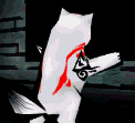
 e: Actually I forgot that this one came up in a hackey thread a few days ago:  it's not a toilet, it's a poorly drawn Stanley Cup Cocaine Bear has a new favorite as of 18:59 on Aug 19, 2014 |
|
#
?
Aug 19, 2014 18:57
|
|
|
JoelJoel posted:
Is... is that supposed to be the Minnesota Wild logo on her shirt? (Wiki says they've never won the Cup, which makes this even worse if so.)
|
|
#
?
Aug 19, 2014 19:20
|
|


|
Zamboni_Rodeo posted:Is... is that supposed to be the Minnesota Wild logo on her shirt? (Wiki says they've never won the Cup, which makes this even worse if so.) Yes, though I cannot shed light onto why her stick is blue (not one of their colours), where her hand and the rest of her butt are, what the gently caress is wrong with her FAAACE and other hand, and the crazy magic her feet are doing (let alone the cup she's setting in) or pretty much anything else going on in this tattoo. e: for those curious, the logo is supposed to look like this:  (yes, it's the head of some ambiguous animal and also a forest scene, or something the mouth is a stream)
|
|
#
?
Aug 19, 2014 19:25
|
|
|
I wonder if the vague cock and balls shape was intentional.
|
|
#
?
Aug 19, 2014 22:44
|
|
|
kinmik posted:I wonder if the vague cock and balls shape was intentional. Wouldn't surprise me. My mentor had an apprentice in the past who he booted out on his rear end for being a skeevy gently caress, then found out after the fact that he had hidden a dick or three on nearly every piece he had done when he began working on customers. My mentor found this out because a different customer would show up in a rage every so often for several years as they slowly all discovered the phallic imagery. Though as testament to the guys skill, some of the dicks were masterfully hidden. I was kind of impressed.
|
|
#
?
Aug 19, 2014 22:52
|
|

|
JoelJoel posted:
I actually think that's kind of clever.
|
|
#
?
Aug 20, 2014 00:46
|
|
|
Istari posted:I actually think that's kind of clever. If you think that's cool, you should watch hockey!
|
|
#
?
Aug 20, 2014 03:06
|
|
Zamboni_Rodeo posted:Is... is that supposed to be the Minnesota Wild logo on her shirt? It looks very much like a (blue) waffle with a pat of butter melting on it. The real logo, which someone posted, does not look much better.
|
|
|
#
?
Aug 20, 2014 03:19
|
|
|
Istari posted:I actually think that's kind of clever. I love the Wild logo. It's a really nice piece of graphic design. I don't give a poo poo about the team, but the logo is really nice.
|
|
#
?
Aug 20, 2014 03:47
|
|

|
Esroc posted:Wouldn't surprise me. My mentor had an apprentice in the past who he booted out on his rear end for being a skeevy gently caress, then found out after the fact that he had hidden a dick or three on nearly every piece he had done when he began working on customers. My mentor found this out because a different customer would show up in a rage every so often for several years as they slowly all discovered the phallic imagery. I knew a kid who got a tattoo of a torch to celebrate graduating highschool. It looked totally normal (if not terribly done) until he rolled his sleeves up to about elbow height. Then it looked like a giant black dick, vein and all.
|
|
#
?
Aug 20, 2014 03:51
|
|
|
A couple from facebook, not the worst but still pretty crappy: Patchy crow, misquoted lyrics for the Beatle's song Blackbird(albiet slightly), and text outside of the scroll.  This one isn't particularly offensive, just weird placement and incredibly boring, plus how tiny it is makes me think it's going to be Psychobabble! has a new favorite as of 05:05 on Aug 20, 2014 |
|
#
?
Aug 20, 2014 05:01
|
|
|
Blade_of_tyshalle posted:I love the Wild logo. It's a really nice piece of graphic design. I don't give a poo poo about the team, but the logo is really nice. Agreed, and being a Blackhawks fan I love having a decent team back in MN. Another couple of playoffs and we'll hopefully have the old rivalry back.
|
|
#
?
Aug 20, 2014 05:15
|
|
|
The Hartford Whalers logo is the best, by far.  
|
|
#
?
Aug 20, 2014 11:51
|
|
|
Its got a tail, an H, and a W in it! Simple and genius. They really should just bring back all the old teams from my youth. I miss the Nordiques too.
|
|
#
?
Aug 20, 2014 13:48
|
|
|
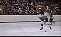
Bad hockey tattoos? Okay!     And one for the ol' home team.  Al looks
|
|
#
?
Aug 20, 2014 15:36
|
|

|
 
|
|
#
?
Aug 20, 2014 16:16
|
|

|
Esroc posted:Wouldn't surprise me. My mentor had an apprentice in the past who he booted out on his rear end for being a skeevy gently caress, then found out after the fact that he had hidden a dick or three on nearly every piece he had done when he began working on customers. My mentor found this out because a different customer would show up in a rage every so often for several years as they slowly all discovered the phallic imagery. Looked for Robin Williams memorial tattoos. Initially I just got results for some   They're technically not bad, but I'm just wondering how the people with Ryan Dunn tattoos feel now, three years after the fact.
|
|
#
?
Aug 20, 2014 17:21
|
|
|
kinmik posted:
Why Flubber? Are there any other tattoos out there of his lame movies, like Bicentennial Man or Popeye?
|
|
#
?
Aug 20, 2014 17:32
|
|

|
kinmik posted:This is legitimately the best tattoo story I've heard to date. Yeah, because the impact that Ryan Dunn had on people's lives is equivalent to that of a first class entertainer of nearly 40 years.
|
|
#
?
Aug 20, 2014 17:46
|
|

|
canyoneer posted:Why Flubber? Popeye was awesome! You take that back!
|
|
#
?
Aug 20, 2014 17:49
|
|
|
As someone who recently watched that terrible movie, I can confirm that Robin Williams did indeed play Captain James Hook.
|
|
#
?
Aug 20, 2014 18:00
|
|
|
exempt posted:Yeah, because the impact that Ryan Dunn had on people's lives is equivalent to that of a first class entertainer of nearly 40 years.  
|
|
#
?
Aug 20, 2014 18:17
|
|
|

|
| # ? May 26, 2024 13:04 |
|
|
JoelJoel posted:As someone who recently watched that terrible movie, I can confirm that Robin Williams did indeed play Captain James Hook. Bad form! Hook was bangarang.
|
|
#
?
Aug 20, 2014 18:18
|
|