


|
deaders posted:Is the purpose of photography to create pictures that are super exciting? Or to be appealing to you personally? I would argue that, yes, the purpose of photography is to create pictures that are personally appealing to many different people.
|
 #
?
Jul 29, 2014 21:46
#
?
Jul 29, 2014 21:46
|
|


|

|
| # ? May 21, 2024 21:21 |
|
|
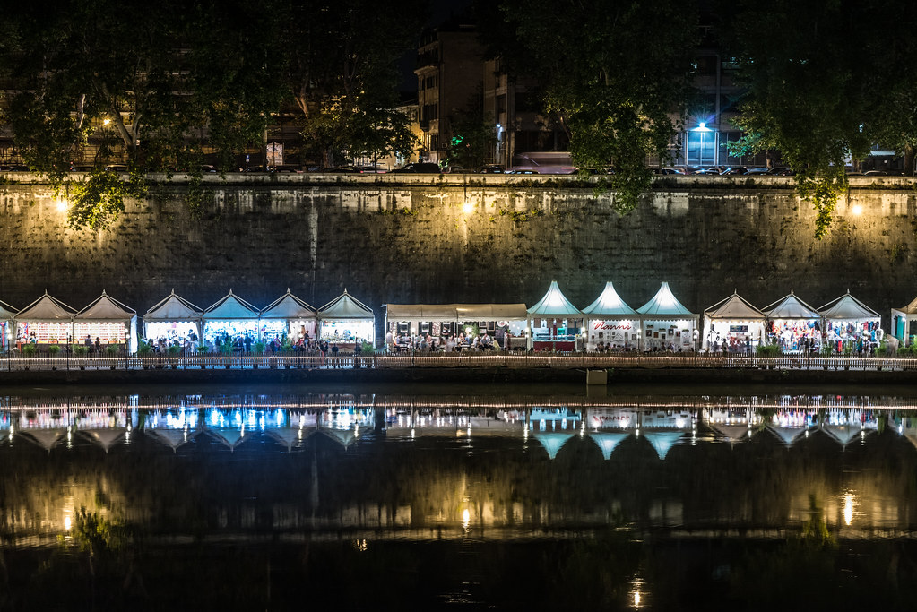
Don't worry about it being crooked by a little. I like this shot, but I want to see more of the context happening at street level. The reflections on the water are just sprinkles to me. Entenzahn posted:I'm very inexperienced so I mostly go out shooting stuff to see what works. This was the original bridge photo: It's a nice background for something. Any chance some small boat or something might pass by? --- I've been out of town since last weekend, and I'm just now getting my bearings back. I took a trip to NYC, saw a show, and worked on set for a GQ editorial which was a really great experience. I also met this guy. When I asked for his name he says "Complexity". All I could say was "drat..." He was sitting on the Brooklyn Bridge with his python charging people for their picture with the snake. I got him to pose for a portrait. He took one of me with my camera for free, which was awesome and I felt like a pro wrestler or drug dealer.  DSC01117 by Ben Boshart, on Flickr DSC01117 by Ben Boshart, on FlickrThe Antlers  DSC01322 by Ben Boshart, on Flickr DSC01322 by Ben Boshart, on FlickrAs for that "information" on Crewdson, it's right here on his aperture page. Look under Post-Production. http://www.aperture.org/crewdson/
|
|
#
?
Jul 29, 2014 22:03
|
|

|
 It's A Real Dog, And It's Really Talking by difficult listening on flickr  so happy birthday by difficult listening on flickr  we were in a large room by difficult listening on flickr Genderfluid posted:I'm really enjoying the aesthetic you have going on here. The grain is a great stylistic element in these photos and it can be pretty awful easily, and the subjects are nicely isolated and framed. Nice tones too. Going back a few pages but I just wanted to throw some appreciation out for this, the textures and tones are gorgeous. You could probably lose about half of the sand, though, it might work better as a narrow base, particularly since it's the brightest part of the picture already. beneatsfood posted:
This is fun, but it's too bad those folks in the background are there - you can't really do anything about them, but they attract attention.
|
|
#
?
Jul 30, 2014 07:37
|
|


|
beneatsfood posted:
I love the colors and lights in this, especially how the orange cones in the background complement the blue spots. The singer is well-lit and I think you've captured him in a good pose. On the downside, the guy right behind him is distracting. I'd also consider cutting off some the black empty space on top since he looks a little lost in all that empty space. Magic Hate Ball posted:
The balance is odd in the first one. Maybe that was your intention, and I don't think it outright ruins the shot, but it doesn't sit well with me how the head ends at the vertical middle of the picture. There's very few elements in the shot and I think it would benefit from a more formulaic arrangement according to the rule of thirds (cut off part of the sky). You've got some nice colours in the background and I like how you can make out some features of the person if you focus hard enough. The second shot is cool. I absolutely love how the tones and different variations of brown colors work in this one. It's again a very simple composition, but this time your arrangement strikes a chord with me, maybe because the open door and hallway make up about a third of the picture. Only caveat is that the right part still contains some lighted wood while the left is pitch black, so it looks like all your information is on one side of your picture, and that's bad for the balance. ---------------------  The frame ratio is kinda odd for this one. I considered cropping in tighter and making it square. Thoughts?  
|
|
#
?
Aug 3, 2014 12:48
|
|
|
Entenzahn posted:
I like the first one though I feel that there is too much going on with the bottom half. The post is the main focus of the shot though the cross bar is easily lost in the buildings and tracks of the background. I agree with you on the second one. The framing is odd, though after looking at it for a while I think trying to crop it any more would hurt the main focus of the structure. How much did you crop out of the original picture? Would it be possible to re-crop a square from the original so the framing wouldn't feel so odd? The third one I am having mixed feelings about. I'm not sure what I should be focusing on, my eyes keep bouncing from the raft type thing in the front to the city in the background. ------------------------------------  girl with bird by cha_reckoning, on Flickr  little caterpillar by cha_reckoning, on Flickr
|
|
#
?
Aug 4, 2014 01:25
|
|

|
I really like the first one. The second one, while people will generally say the eye doesn't know where to focus, that's the part I like about it. There's so many lines going all which ways, the bikers and the runners are all very cool. (And whatever the guy on the middle floor is doing, biking?) Not sure what's going on here. Are you doing a comparison of sorts of the trashiness of the foreground to the classiness of the background? As for my pictures: I think the first one is the extent of my star shooting abilities at this point. My next purchase will be a tripod so that I can get something in the foreground.  I tried to shoot sports photography for the first time. I missed a few of the opportunities to get some good shots but I think this turned out well overall. I wish the players were a bit sharper but I feel like the focus here, the ball, was sharp. Also, I've been trying to get more storytelling going on in my shots and I think I got that pretty well here.  I've been working on the bokeh, I think that is still relevant for this picture? I wanted to focus on the person watching the game instead of the players. I'm thinking maybe I could have applied the rule of thirds a bit better. 
|
|
#
?
Aug 4, 2014 03:02
|
|

|
huhu posted:I tried to shoot sports photography for the first time. I missed a few of the opportunities to get some good shots but I think this turned out well overall. I wish the players were a bit sharper but I feel like the focus here, the ball, was sharp. Also, I've been trying to get more storytelling going on in my shots and I think I got that pretty well here. Black and white might not be the best choice for this. Figure/ground isn't great so a lot of the players get lost in the image (exception being the guy in the white shirt).
|
|
#
?
Aug 4, 2014 03:35
|
|
|
-CHA posted:
I like your first picture. There's something interesting to me about the idea of a person taking the time and effort to craft what is ultimately a short-lived moment - a child, holding a bird in a field - and then someone else photographing that "moment." I like also the purple stains on the statue, matching the lavender. Finally, I also like the obvious weathering and age of the statue. It's a nice juxtaposition between the aged texture and the "young" subject. I would've liked more separation between the top of the frame and the bird. There's an implied line from the child to the bird, and from the lavender stalks to the bird, but the bird imo is too close to the top. Also, not really liking how the girl's other hand is cut off at the knuckles, but not a big deal. huhu posted:I've been working on the bokeh, I think that is still relevant for this picture? I wanted to focus on the person watching the game instead of the players. I'm thinking maybe I could have applied the rule of thirds a bit better. Job accomplished. I think the composition is good, personally. There's nothing jutting out of the background through the kid's head or anything, and he's not centered, so that's good. I would've liked a little more detail on the players I think, and finally I would like to see this photo in colour. The kid's clothing and hair is all very dark, and I would like more contrast.  DSC_0364-Edit.jpg by badmountain, on Flickr DSC_0364-Edit.jpg by badmountain, on Flickr DSC_0467-Edit.jpg by badmountain, on Flickr DSC_0467-Edit.jpg by badmountain, on FlickrI edited this really quickly, and decided to really contrast the foreground with the background. Not sure if I went too far or if I should've even tried to do that.  DSC_0429-Edit.jpg by badmountain, on Flickr DSC_0429-Edit.jpg by badmountain, on Flickr
|
|
#
?
Aug 6, 2014 00:34
|
|
|
iammeandsoareyou posted:BW400CN Subject is pretty great. Wish the walls were in focus. The distortion serves well here. Where is this? Very nice, I love everything about it.   NSFW for HANDBRA 
|
|
#
?
Aug 6, 2014 18:21
|
|


|
Thanks, I appreciate it. It was taken at the National Building Museum in DC. They had been setting up a mini golf course in their atrium, but this summer they decided to build an indoor maze. There are some digital shots on my Flikr page that show the maze in the context of the larger atrium.
|
|
#
?
Aug 6, 2014 20:29
|
|
|
huhu posted:I think the first one is the extent of my star shooting abilities at this point. My next purchase will be a tripod so that I can get something in the foreground. You did that handheld?  Assuming that's a 1 second exposure or longer it's pretty darn sharp. Or did you just crank the ISO up to ridiculous levels? A good foreground will definitely help, other than the technical feat of photographing stars without a tripod the photo doesn't have much to grab a viewer. quote:
Not a fan of the way the players blend into the trees, especially the person wearing black. You're on the right track for "storytelling" but it feels like half the story is getting lost in the background. Also working against it is the fact that the only people in focus are the two guys in the background that aren't involved with the game at all. quote:I've been working on the bokeh, I think that is still relevant for this picture? I wanted to focus on the person watching the game instead of the players. I'm thinking maybe I could have applied the rule of thirds a bit better. This is the best of the three by a long shot, I feel like it might be stronger if you'd taken a couple steps back and gotten the person's feet into the frame but it's not bad like it is. Similar to the other person who commented about the contrast, it might be a better image if you tweaked the curves to brighten the subject up a bit. I really like the DOF you ended up with. Some different photos from the ones I posted in the sports thread, I keep coming back to these pictures because I like the moments they portray, but I can't shake the feeling they're just not good enough (compositionally and/or technically) to hang on to. I'm curious what other people think:  (the rider in the camouflage gear is an American who's retiring this year, this is after finishing his last race in America and is giving props to a guy he'd been battling with in the race)  (a big goal for the weekend was to get two riders in the middle of a pass, this is just about the best I got all weekend, turns out catching passing is hard)  (the eventual race winner going close to 200mph, I really want to like it.. it just feels off)
|
|
#
?
Aug 12, 2014 22:01
|
|

|
Skizzzer posted:
I really like this one. The gradient in the sky looks really cool and I love the fog with the sun shining on it. Here are my first three photos. I got my father's old 500D for christmas and I have been practicing a lot since then. I took these in our garden with his 60mm Canon macro. I also used his external flash+remote trigger.  ant on the edge by arnesander, on Flickr I just love that you can see the shadow. How often do you see the shadow of an ant?  Ameise auf Zweig by arnesander, on Flickr  Bl�te & Monster by arnesander, on Flickr I hope I didn't gently caress up my first post in this thread  . .
Popelmon fucked around with this message at 22:20 on Aug 12, 2014 |
|
#
?
Aug 12, 2014 22:08
|
|

|
Popelmon posted:I really like this one. The gradient in the sky looks really cool and I love the fog with the sun shining on it. My contribution:  I was looking through some old pics as I'm trying to organize about a decade's worth of photos on Picasa (ugh). Ran upon this picture of my ex when she was acting super distant during our last beach walk. In retrospect, it at least makes for a good photo with the foggy beach & rough waves.
|
|
#
?
Aug 13, 2014 12:57
|
|

|
Skizzzer posted:
Balance feels a little odd for this. With only the rock and the bigger stump as points of interest (and two thirds white fog) I think they should be more symmetrically arranged. It's a cool pic otherwise. I like your idea of a simple black-creme composition, the colors work well. This is caught in just the right moment. The guy in the middle is the main focal point but he's too bright, especially in comparison to the better exposed audience. xzzy posted:Some different photos from the ones I posted in the sports thread, I keep coming back to these pictures because I like the moments they portray, but I can't shake the feeling they're just not good enough (compositionally and/or technically) to hang on to. I'm curious what other people think: I think a lot of your problems come down to the way you arrange your points of interest. I like your first pic best, but you can cut off part of the top to move the bikers more towards the middle. For your second pic I'd crop vertically, especially to get rid of the guy on the left. Your last picture is pretty cool for the motion you manage to convey but I'd crop out some of the asphalt at the bottom or go in even closer with a landscape-ish aspect ratio that emphasizes your horizontal movement and puts focus on the biker and the blurred Red Bull ad in the background. ---------------------------------   
|
|
#
?
Aug 13, 2014 23:51
|
|
|
Entenzahn posted:I think a lot of your problems come down to the way you arrange your points of interest. I like your first pic best, but you can cut off part of the top to move the bikers more towards the middle. For your second pic I'd crop vertically, especially to get rid of the guy on the left. Your last picture is pretty cool for the motion you manage to convey but I'd crop out some of the asphalt at the bottom or go in even closer with a landscape-ish aspect ratio that emphasizes your horizontal movement and puts focus on the biker and the blurred Red Bull ad in the background. The first one might just be a dud.. when I try out your suggestion it feels lopsided because only one of the riders is in focus. It's an improvement, but not enough to save the picture. The second one I can't do a vertical crop, I don't have enough spare pixels to really frame it properly. A square crop is interesting though, I'm still playing with it. Going to a 16:9 on the third feels like a huge improvement.. 12:6 also works. Any narrower and it feels like a banner. Now I just gotta pick which I like best. thanks
|
|
#
?
Aug 14, 2014 02:19
|
|
|
Popelmon posted:Here are my first three photos. I got my father's old 500D for christmas and I have been practicing a lot since then. I took these in our garden with his 60mm Canon macro. I also used his external flash+remote trigger. I really love the diagonal lines in your first two photos. The shadow cast by the ant in the first one paired with the contrast between the different surfaces of the wood is awesome and shows that you are really grasping the more abstract elements of macro photography. The lighting on the second one is good too, but I feel like you might get more separation between your subject and background if you waited for the ant to get to a spot where it was silhouetted by the background and not the stem. The photo of the fly is well framed and sharp but the way the light is reflecting off it's body is distracting and loses a lot of detail. I like your first photo, it's cliche but it's exactly the kind of photo where black and white is appropriate and your conversion was good. Your second photo is interesting, but it's waaay over saturated. Your third photo is really boring and looks like the kind of throw away photo you might take to test the auto focus on a lens. Keep shooting! 89 posted:That lens is awesome, I'm jealous. I think some post processing on the ant photo could really make it pop. I love the framing on it, I just think maybe there should be more of a distinctive difference in the two sides of it. Maybe it's just me. There are some amazing textures in the sand here, and I think the processing goes great with the super low and foreboding clouds. Good shot. ------ Today it was raining.  Rain Walk-11 by cclunie, on Flickr Rain Walk-11 by cclunie, on Flickr Rain Walk-13 by cclunie, on Flickr Rain Walk-13 by cclunie, on Flickr Rain Walk-14 by cclunie, on Flickr Rain Walk-14 by cclunie, on Flickr
|
|
#
?
Aug 14, 2014 03:18
|
|

|
Entenzahn posted:Balance feels a little odd for this. With only the rock and the bigger stump as points of interest (and two thirds white fog) I think they should be more symmetrically arranged. It's a cool pic otherwise. I like your idea of a simple black-creme composition, the colors work well. The problem with all of these to me is that they are just things that where close by and "easy" to shoot. Unfortunately like most things when you are lazy it has a direct effect on the outcome of what you have done. In this case they all feel boring to me. The first one feels poorly composed with the lower right corner feeling way to cramped (you are nearly cutting off the "subject") and if feels there is too much empty space in the top left. The 2nd one is probably the strongest but once again feels a bit lacking, if you are going to do something with a shallow focus remember that the background is nearly as important as the object you are focusing on. You want to try and avoid an overly busy background, in the case of this photo it is the other flowers that I find overly distracting. The 3rd one is probably the weakest of the 3, if feels like you just just pointed a camera with a narrow depth of field at something. It does not really convey anything as there really is no subject. If that coke can is so interesting you need to show the viewer why it is so interesting and in this case I just can't seem to find that. ----- Might as well post a photo from tonight. 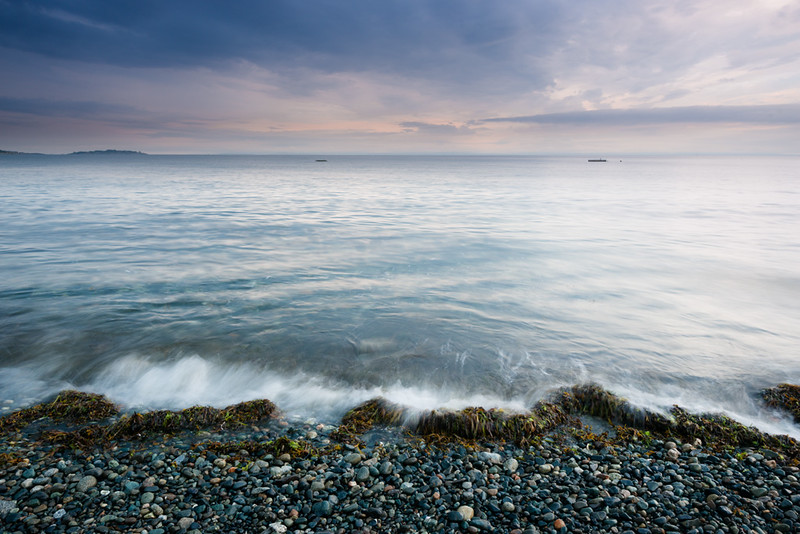
|
|
#
?
Aug 14, 2014 08:02
|
|

|
Dread Head posted:
I love the colours and the movement in this, but it feels kinda empty. I guess maybe that's something you were trying to capture, but for me it really needs a more concrete subject or at least a more interesting foreground. The boats in the distance are too small to add interest and instead distract from the rest of the scene.  Church of the Good Shepherd by ejtors, on Flickr  Hooker Valley by ejtors, on Flickr  Mackenzie Country by ejtors, on Flickr
|
|
#
?
Aug 14, 2014 09:49
|
|


|
Dread Head posted:
Rather than setting up high and tilting the camera down, get low and shoot over the waves etc, it'll help give it more of a sense of scale.
|
|
#
?
Aug 14, 2014 13:22
|
|
|
Popelmon posted:
Ew, this fly is a lot uglier than the fly I snapped recently. Your picture is gorgeous, though, I love the colors!  I've been getting into long exposure light stuff, recently, too. I really liked how this one turned out, I was in a truck driving in the rain at night.  I was on a set recently, snapped this during our lunch.  Wooten posted:
Not a huge fan of this last one. I'm not sure exactly what it is, it might be a little wide for my taste, I tend to like frozen in time water with a shallow DOF; the angle also kinda makes it boring for me, it just feels kinda flat. The other ones I do like, though. Johnny Reb fucked around with this message at 18:46 on Aug 14, 2014 |
|
#
?
Aug 14, 2014 18:35
|
|
|
I know this is not the right place for this, but I don't have PM's and I've been meaning to ask you about places to shoot on the island. If you want you could email me? d.dallas.yuan@gmail.com I love your long exposures of the water usually, but I feel that the title of your shot is at odds with how the water is portrayed here. I would expect the water to be more foreboding and fierce. Maybe getting lower like what the other guy said, or a faster shutter speed? Colours are beautiful, as usual. Wafflecopper posted:
This is my favourite out of the 3 you posted. Don't have a critique for it, but I just love the mountains with the snow blowing off the peaks. Looks like a painting. Your third pic I feel has too many elements in it. I'm not sure what the subject is. Is it the wedding couple, the man watching them, the observatory, etc? I've been waffling on this shot for a while. My friend was in it, told him to be still but he started moving before the shot was done. I don't really like it, but I've been experimenting in photoshop with it and I'm hoping to get some opinions on it. Or should I just give up on it?   
|
|
#
?
Aug 14, 2014 19:19
|
|
|
Skizzzer posted:
Keep going! I think it looks pretty neat! Very ghostly.
|
|
#
?
Aug 14, 2014 19:33
|
|
|
") Thanks! Which one do you like more? Thanks! Which one do you like more?
|
|
#
?
Aug 14, 2014 19:37
|
|
|
It's lovely how dead this thread is all the time. Some people in the Low Effort thread need to cut the poo poo and get in here. Come on low effort people, your photos are good, you are just a bunch of lazy assholes.Skizzzer posted:
I like the second one. It's a good compromise between visibility of the "ghost" and moodiness of the sky and waves. Johnny Reb posted:Ew, this fly is a lot uglier than the fly I snapped recently. Your picture is gorgeous, though, I love the colors! The fly is well composed but it could be a little sharper, I like the fade in color between the foreground and background. Your second photo is a little too abstract for my taste. It looks like an accidental exposure. Keep working on long exposures, imho they are one of the most rewarding kinds of photography. I really like your last photo. It's tight on the action and has nice, directional light, and the pool stick makes a good diagonal line through the frame. My only complaint is it could benefit from being straightened. Wafflecopper posted:
Your first photo is beautiful. The church is an interesting subject in an interesting landscape, I love the little bit of blue that finds it's way into the middle of the frame. My only complaint is the that foreground is a little boring and I think you could have gotten a little closer to the church. Your second photo captures the back lit snow blowing off the mountains in amazing detail, and you managed to get blue skies even though the sun is IN the shot, and the mountains themselves perfectly frame the sky. This is some National Geographic poo poo and I have nothing negative to say. Your third photo has some great color and, again, you amazingly captured the detail of the sky even with the sun in the shot, but the two most interesting things in the frame are the observatory and the mountains in the distance, neither of them take up enough space in the frame to keep my interest though and I find my eye bouncing around looking for a subject. ---- Some more from my rainy walk the other day.  Rain Walk-16 by cclunie, on Flickr Rain Walk-16 by cclunie, on Flickr Rain Walk-18 by cclunie, on Flickr Rain Walk-18 by cclunie, on Flickr Rain Walk-9 by cclunie, on Flickr Rain Walk-9 by cclunie, on Flickr(USER WAS PUT ON PROBATION FOR THIS POST)
|
|
#
?
Aug 18, 2014 14:09
|
|
|
Wooten posted:It's lovely how dead this thread is all the time. Some people in the Low Effort thread need to cut the poo poo and get in here. Come on low effort people, your photos are good, you are just a bunch of lazy assholes. Not everyone wants or requires others input about their photography. This thread is just a honeypot for poo poo anyways 
|
|
#
?
Aug 18, 2014 20:30
|
|
|
I posted a bunch in here for a while, then got enough feedback that I could pretty much predict it. Not that it didn't make me better, and I guess "being able to predict feedback and adjusting to it in anticipation" is the definition of improving.Wooten posted:
On the other hand from previous posters, I like this because it's kind of gross and it makes me laugh. You probably could have ARTed it up a bit, but I'm not sure that would have made it any funnier, which is what I like about it. Did you try shooting it straight on? The action might be lost from that angle, just thinking about it out loud. I'll still pitch in some fodder for the thread.  Visitor by mattphilpott, on Flickr  Eat fresh. by mattphilpott, on Flickr 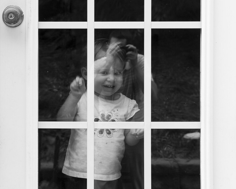 Pair by mattphilpott, on Flickr Huxley fucked around with this message at 21:00 on Aug 18, 2014 |
|
#
?
Aug 18, 2014 20:47
|
|


|
Wooten posted:
I like this, it's cool to see scars on buildings and imagine what used to be there. quote:
I wonder what this would have looked like with a long tele, and if you'd positioned yourself to be inline with the wall so that the pipe protruded directly out of the side.
|
|
#
?
Aug 18, 2014 22:15
|
|

|
Wooten posted:It's lovely how dead this thread is all the time. Some people in the Low Effort thread need to cut the poo poo and get in here. Come on low effort people, your photos are good, you are just a bunch of lazy assholes. There is a slim but very real chance that the best way to encourage people to participate is not to call them lazy assholes. If the thread is dead, post more in it.
|
|
#
?
Aug 18, 2014 22:54
|
|


|
Reading this book should be mandatory before posting critiques: http://www.amazon.com/The-Nature-Photographs-Stephen-Shore/dp/071484585X The problem is that this thread is mainly for inexperienced people posting not very good photographs (which is fine, we all started there) but they then get not very good critiques, then start giving critiques themselves in the same not very good manner. deaders fucked around with this message at 01:28 on Aug 19, 2014 |
|
#
?
Aug 19, 2014 01:22
|
|

|
deaders posted:Reading this book should be mandatory before posting critiques: http://www.amazon.com/The-Nature-Photographs-Stephen-Shore/dp/071484585X Honestly people are probably not going read a book like that starting out. You don't really need to know much about photography in order to provide useful feedback, I think a lot of people get too caught up in the technical aspects. It could be as simple as saying what you do an do like about an image "I like how the duck stands out from the background, but I don't like how you can't see the feet". You don't need to know any "rules" to say why you do or do not like a photo, I mean understanding certain "rules" will make it easier to have an image that will likely come out "better" but I think of a lot of people that just comes over time and trying different things and is not something that is required to provide useful feedback on an image.
|
|
#
?
Aug 19, 2014 02:34
|
|
|
Dread Head posted:Honestly people are probably not going read a book like that starting out. You don't really need to know much about photography in order to provide useful feedback, I think a lot of people get too caught up in the technical aspects. It could be as simple as saying what you do an do like about an image "I like how the duck stands out from the background, but I don't like how you can't see the feet". You don't need to know any "rules" to say why you do or do not like a photo, I mean understanding certain "rules" will make it easier to have an image that will likely come out "better" but I think of a lot of people that just comes over time and trying different things and is not something that is required to provide useful feedback on an image. Clearly you haven't read the book because it's absolutely not about what makes a photo technically good or "rules"
|
|
#
?
Aug 19, 2014 02:44
|
|

|
ansel autisms posted:Clearly you haven't read the book because it's absolutely not about what makes a photo technically good or "rules" I have not read the book but I really dont think reading a book is a requirement to be able to provide some kind of useful feedback on a photo. I do agree that when you had a more diverse crowd of people posting in here I think it was a better environment for critiques.
|
|
#
?
Aug 19, 2014 02:58
|
|
|
Hello dorkroom. I've recently come into possession of a friend's old Rebel T3, and I've been playing around with the kit lens, trying to see how things turn out. My fiancee is a semi-professional photographer and it's been pretty fun having her teach me some basics. Hopefully I do this right -- I'm going to critique my own pictures this time around since I'm still getting the hang of things... We went to the fair at night the other night:  IMG_0308 by Yuravian, on Flickr IMG_0308 by Yuravian, on FlickrI'm actually pretty happy with this one, although looking at it now I could probably crop it a bit, and the focus is possibly a little off. The light in the bottom left is a bit distracting, as well -- it was pretty hard to find spots without distracting spotlights in the frame.  IMG_0373 by Yuravian, on Flickr IMG_0373 by Yuravian, on FlickrAgain, focus problems. I'll need to go on manual next time -- in my naivety I thought auto would do OK. Also, there was moisture on the lens at this point and it was difficult getting it off since it was so humid.  IMG_0485 by Yuravian, on Flickr IMG_0485 by Yuravian, on FlickrThis picture I'm most proud of. We took a flight in her dad's plane and I was able to get a bit of landscape out the window. I don't like how blown out the windscreen is, but I'm not sure I know how to fix that and still get a good exposure inside the plane as well. I've also got a 50mm prime lens that I haven't even tried, since I'm still getting the hang of it and want to stick with an 18-55 until I get that worked out.
|
|
#
?
Aug 19, 2014 03:16
|
|

|
MindSet posted:Hello dorkroom. I find your first photo to be the best since the rest of the shot is more or less in focus (the static elements) and the lights create an interesting geometry. The framing could have been a little different to avoid all the black featureless space at the top of the frame. To fix the windscreen you could adjust your 'highlights' slider in lightroom (if you're using it).
|
|
#
?
Aug 19, 2014 03:48
|
|

|
VelociBacon posted:I find your first photo to be the best since the rest of the shot is more or less in focus (the static elements) and the lights create an interesting geometry. The framing could have been a little different to avoid all the black featureless space at the top of the frame. Thanks. I agree about the first one. After I posted this I realized I was only really happy with the plane pic on a sentimental level -- it came out well and I'm proud of small achievements, but it's not very interesting. The seatbelt doesn't do much for it either. I played around in adobe RAW with the last one and the only thing I could do without ruining the other highlights was to set up a masking layer -- and with frizzy hair like that it becomes difficult to get a pleasing mask that doesn't look like a halo. Oh well, I'll just keep taking more photos 
|
|
#
?
Aug 19, 2014 04:07
|
|
|
Dread Head posted:I have not read the book but I really dont think reading a book is a requirement to be able to provide some kind of useful feedback on a photo. I do agree that when you had a more diverse crowd of people posting in here I think it was a better environment for critiques. It shouldn't be required but it's literally a book on analyzing photographs. It's not technical in the least.
|
|
#
?
Aug 19, 2014 04:40
|
|
|
As already pointed out, I recommend that book because it is in no way technical nor is it about rules of photography. And it's $15... if you are at all interested in photography then why wouldn't you want to learn more about how to look at them and interpret them?
|
|
#
?
Aug 19, 2014 07:52
|
|
|
MindSet posted:I've also got a 50mm prime lens that I haven't even tried, since I'm still getting the hang of it and want to stick with an 18-55 until I get that worked out. You should. I learned more about perspective in the first few weeks sticking to a 35mm than I did in years using a zoom.
|
|
#
?
Aug 19, 2014 14:42
|
|
|
Thanks for all the feedback everyone (I'm going to count the probation as feedback too).SoundMonkey posted:There is a slim but very real chance that the best way to encourage people to participate is not to call them lazy assholes. If the thread is dead, post more in it. You're right, I was being overly abrasive, I just miss when this place was more than "a honeypot for poo poo". I remember learning from other people's mistakes and triumphs and learning the language that photographers use to talk about photos. When it's nothing but the inexperienced beginners not very much is learned. Sorry for calling everyone a lazy rear end in a top hat. I will take your invitation to post more to heart. MindSet posted:
I like this photo. While I'm not usually a fan of photos of the backs of people's heads, I feel like this one captures a moment. It feels like I'm sitting in the back of that tiny plane when I look at this photo. And, ultimately, seeing interesting places and experiences through the eyes of someone else is what photography is all about. I actually like the processing you used, it feels very true to life while still having great contrast. Huxley posted:I posted a bunch in here for a while, then got enough feedback that I could pretty much predict it. Not that it didn't make me better, and I guess "being able to predict feedback and adjusting to it in anticipation" is the definition of improving. I like the first photo, that catte wants in so bad but you're like "no way friend, I'm taking pictures instead"  Your second photo is also entertaining. I feel like someone made that note while they were shaking with rage. I also like to imagine that they meant to put it on the subway ad. Your last photo is my favorite of the three. Seeing you reflected in front of your daughter (I'm assuming she's yours) is really sweet, its a good moment of seeing someone's life through their eyes. The doorknob tucked in the corner along with the centered winder is also some nice use of the frame and makes the photo feel thought out and not just a snapshot. deaders posted:Reading this book should be mandatory before posting critiques: http://www.amazon.com/The-Nature-Photographs-Stephen-Shore/dp/071484585X I'm happy about the discussion going on in this thread, and I actually just ordered this book off Amazon based on your recommendation. ---- This last week I've been taking a lot of Macro photos. 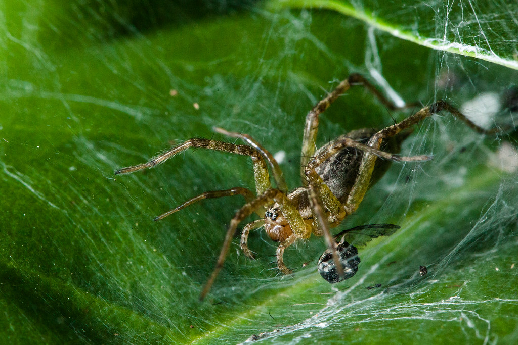 Grass Spider Chillin by cclunie, on Flickr Grass Spider Chillin by cclunie, on Flickr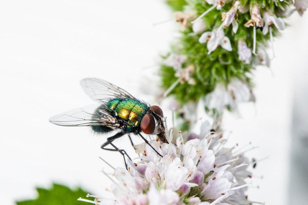 Portrait of a Fly by cclunie, on Flickr Portrait of a Fly by cclunie, on Flickr
|
|
#
?
Aug 19, 2014 23:38
|
|
|

|
| # ? May 21, 2024 21:21 |
|
|
Wooten posted:This last week I've been taking a lot of Macro photos. The second is far more successful than the first and I'm guessing you already know why. *also, crop out or clone out that greyish crap in the bottom right of the fly photo
|
|
#
?
Aug 20, 2014 02:51
|
|
