


|
Pukestain Pal posted:showing the legs and getting rid of that dumb bush would have at least made for a more interesting photo. I don't get the bush hate. It's an interesting and colorful backdrop. I'd say move the frame down, though: lose the sky, show at least half of her calves. The bubbles would work much better in-focus, too.
|
 #
?
Aug 28, 2014 17:43
#
?
Aug 28, 2014 17:43
|
|


|

|
| # ? May 21, 2024 17:03 |
|
|
Still not settled on a cropping for this one, but had a quick session with a local musician last night
|
|
#
?
Aug 28, 2014 17:58
|
|

|
bisticles posted:Still not settled on a cropping for this one, but had a quick session with a local musician last night Somethings seems weird about the right (his left) eye. Did you try removing glare or something?
|
|
#
?
Aug 28, 2014 19:55
|
|
|
sw1gger posted:Somethings seems weird about the right (his left) eye. Did you try removing glare or something? I think it's just the diffusion fabric from the moon unit in reflection, I didn't do any real selective touch-up on this.
|
|
#
?
Aug 28, 2014 20:32
|
|
|
triplexpac posted:
thetzar posted:I don't get the bush hate. It's an interesting and colorful backdrop. I'd say move the frame down, though: lose the sky, show at least half of her calves. The bubbles would work much better in-focus, too. Yeah seriously - leave that drat bush alone. It's nice. I actually think the legs shouldn't be in the photo at all- I'm not sure showing to the calf would actually help. Regarding the blurry bubbles, I can go either way. Processing wise, it's a bit average. If you're doing a tumblrcore-themed shoot, might as well go all the way with it. On a side note, whoever did the makeup did a really nice job.
|
|
#
?
Aug 28, 2014 21:11
|
|

|
 amro3 by PC-P, on Flickr amro3 by PC-P, on Flickr
|
|
#
?
Aug 30, 2014 13:48
|
|
|
 
|
|
#
?
Aug 31, 2014 08:25
|
|

|
.
Chill Callahan fucked around with this message at 23:08 on Aug 31, 2014 |
|
#
?
Aug 31, 2014 21:38
|
|
|
I like his photo, but not really hers. The lighting is really unflattering on her face.
|
|
#
?
Aug 31, 2014 21:50
|
|


|
 The Woods in Stratford by McMadCow, on Flickr The Woods in Stratford by McMadCow, on Flickr
|
|
#
?
Aug 31, 2014 21:54
|
|

|
McMadCow posted:
Nice, I always like how you let the blacks in your prints actually go to black, gives them such a rich feeling.
|
|
#
?
Aug 31, 2014 22:02
|
|
|
mr. mephistopheles posted:I like his photo, but not really hers. The lighting is really unflattering on her face. Do you have any suggestions for more flattering lighting? Would a more straight-on angle that didn't put so much of her face in shadow do better? I know it's pretty subjective, but I'm still trying to learn how to best use my flash off camera. This is another one from the same shoot, for comparison. 
|
|
#
?
Sep 1, 2014 01:45
|
|
|
The shadows make her face look lumpy. I think some straight on fill would help.
|
|
#
?
Sep 1, 2014 01:50
|
|

|
Breadnought posted:Do you have any suggestions for more flattering lighting? Would a more straight-on angle that didn't put so much of her face in shadow do better? I know it's pretty subjective, but I'm still trying to learn how to best use my flash off camera. I would have tried to bring the light around more to the front as much as I could without getting into the angle of view of the lens; that would have helped to get more light on the right side of her face. If there was an available corner of the room, you could have had the subject stand close enough to the wall to act as a reflector to get fill light on the opposite side of her face from where the light is set up. Alternatively, you could use some white poster board and hold it up next to the subject's face to act as the reflector. See example below:  No Reflector vs. Reflector by jemuelb, on Flickr Left photo was shot using no reflector and if I remember correctly, a 60" umbrella. The right photo was shot exactly the same way, except I had another friend hold up a white piece of poster board to act as a reflector to add fill light to the right side of the subject's face.
|
|
#
?
Sep 1, 2014 03:25
|
|
|
this guy seemed fun
|
|
#
?
Sep 1, 2014 07:56
|
|

|
 DSC_1330 by El Squared, on Flickr DSC_1330 by El Squared, on Flickr DSC_1335-5 by El Squared, on Flickr DSC_1335-5 by El Squared, on FlickrIt feels like the second picture has the highlights a little blown out.
|
|
#
?
Sep 4, 2014 00:04
|
|
|
Blacksofa posted:It feels like the second picture has the highlights a little blown out. There are some unfortunate shadows going on in the front of her dress in the first one as well. Shooting under harsh sun usually creates all sorts of issues if you're not modifying the light in some way. Speaking of shooting under natural light: Photographer friend let me point the camera at her while we were on a shoot.  And this is the model we were shooting: 
|
|
#
?
Sep 4, 2014 08:52
|
|

|
McMadCow posted:And this is the model we were shooting: Dig this, but dat border....
|
|
#
?
Sep 4, 2014 08:56
|
|

|
What bothers you about "dat" border?
|
|
#
?
Sep 4, 2014 20:23
|
|

|
I get the feeling he thinks it's a photoshop preset
|
|
#
?
Sep 4, 2014 22:08
|
|
|
wet process: #nofilter.
|
|
#
?
Sep 4, 2014 22:44
|
|
|
Just to clarify, I printed both of those shots in the same session, by chance the same orientation in the same negative carrier. So the pattern of the border is pretty similar. Funny, it's never happened that it turned out so close before. There's usually so much random stuff happening during my printing that things naturally differentiate.
|
|
#
?
Sep 4, 2014 22:49
|
|
|
Do you just dodge the whole image and let the boarders burn in?
|
|
#
?
Sep 5, 2014 00:43
|
|
|
Spedman posted:Do you just dodge the whole image and let the boarders burn in? 8 seconds main frame, 8 minutes for the border. The paper comes off the easel smoking a bit, but the developer puts that out, so nbd.
|
|
#
?
Sep 5, 2014 02:41
|
|
|
Finally got around to scanning some photos of friends. I've decided I really like photographing people in their homes. img009 by LargeHadron, on Flickr  img006 by LargeHadron, on Flickr  img003 by LargeHadron, on Flickr  img005 by LargeHadron, on Flickr  img002 by LargeHadron, on Flickr
|
|
#
?
Sep 5, 2014 03:44
|
|

|
LargeHadron posted:Finally got around to scanning some photos of friends. I've decided I really like photographing people in their homes. Love how this one looks. Was it processed at all or is that just the film "talking"?
|
|
#
?
Sep 5, 2014 04:19
|
|

|
TheAngryDrunk posted:Love how this one looks. Was it processed at all or is that just the film "talking"? It's all the film. The only thing I did to it was remove about 938443572 dust spots.
|
|
#
?
Sep 5, 2014 04:29
|
|
|
Now we know why they make film presets.
|
|
#
?
Sep 5, 2014 04:31
|
|
|
LargeHadron posted:
neat
|
|
#
?
Sep 5, 2014 04:45
|
|
|
 Erica-portrait by sensitometry - Steven Harris, on Flickr
|
|
#
?
Sep 5, 2014 05:01
|
|
|
Tigertron posted:
I loving love that background. Is it a chalkboard? Her arms make the photo pretty unflattering and you should have straightened her collar. Do some more with that background, it's great.
|
|
#
?
Sep 5, 2014 05:22
|
|
|
|
|
#
?
Sep 5, 2014 05:24
|
|
|
Pukestain Pal posted:I loving love that background. Is it a chalkboard? Thanks I appreciate that. It happened to be a Thai resturant we were eating at but I definitely would love to recreate a space like that.
|
|
#
?
Sep 5, 2014 06:21
|
|
|
365 Nog Hogger posted:this guy seemed fun He is but unfortunately didn't want that picture on the internet. 
|
|
#
?
Sep 5, 2014 15:04
|
|
|
byob.jpg
|
|
#
?
Sep 5, 2014 20:50
|
|
|
Chill Callahan posted:He is but unfortunately didn't want that picture on the internet. I really cannot imagine why.
|
|
#
?
Sep 6, 2014 01:14
|
|
|
 
|
|
#
?
Sep 6, 2014 03:59
|
|
|

|
|
#
?
Sep 7, 2014 17:47
|
|

|
Same story as in a couple of other places: scanning pop's old slide film (Koda/Ektachrome c. 1965-75).  Jesus by mattphilpott, on Flickr 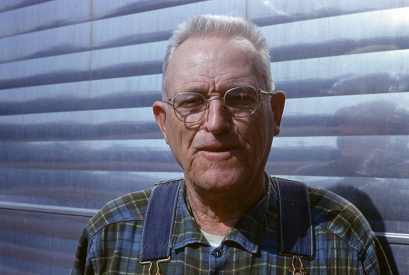 Pop by mattphilpott, on Flickr
|
|
#
?
Sep 8, 2014 17:54
|
|


|

|
| # ? May 21, 2024 17:03 |
|
|
Huxley posted:
Hell yeah
|
|
#
?
Sep 8, 2014 23:39
|
|