|
The Monk posted:
You should post this in the contest thread.
|
 #
?
Sep 12, 2014 16:56
#
?
Sep 12, 2014 16:56
|
|


|

|
| # ? May 27, 2024 15:19 |
|
|
huhu posted:As for your picture, I think it's pretty well shot. I like the grey at the top and the area of the tree which you decided to capture. I've had an idea like this in my head for awhile to try and shoot without success and I think you nailed it. Thanks. I wish I could take all the credit but all I really did was grab the camera. The image was already there, it just needed to be captured. Sometimes it just works out that way. I have a whole series of that day. Edit: Here are a couple more. I'm interested in what folks think about the exposure given all the snow, as well as general composition.  Snow-Day-6 by Jack_Lord, on Flickr Snow-Day-6 by Jack_Lord, on Flickr Snow-Day-5 by Jack_Lord, on Flickr Snow-Day-5 by Jack_Lord, on Flickr
Lagrange fucked around with this message at 15:17 on Sep 17, 2014 |
|
#
?
Sep 17, 2014 13:22
|
|
|
CommunistCow posted:
I agree with your thoughts on the crop, and I would've lost the mountains as well, or recomposed to make them an element of the photo. Very cool subject, though, and with those changes I think you'd have something even more interesting.
|
|
#
?
Sep 17, 2014 15:26
|
|

|
Hi. I've only recently started spending more time on photography and learning post processing. Here are a few shots I'm personally quite happy with but I'm wondering what I could've done better. Yamdrok Lake, Tibet, China. Single (RAW) frame with a point-and-shoot. I cranked up clarity, vibrance, etc. in Lightroom. I wish I had more photo to work with and perhaps extended to the left and turned it into a panorama as the lower half (lower-right especially) isn't very interesting. Also the shadow on part of the road sucks. What do you think? Five bracketed frames using D800E on a tripod. HDR.  Empire State Building, NYC. Two concerns I have here are: - Isn't the sky to "dirty"? Or HDR-y? - I left the leaves ghosted on purpose. The "star" of the photo is the Empire State Building, so I don't think it's a problem. What about you? Last but not least, baby goose:  Canadian Goose in Hoboken, NJ. by SimplyPeter.com, on Flickr Also D800E but this time 80-200 handheld. Two problems here are: - Stupid grass is too high. I was so excited when I was taking this photo that I didn't even notice it. - Is it me or is the eye not sharp enough? It's a crop and hand-held but still. f/3.5 at 165mm at 1/640. Your feedback would be appreciated. I'll try to provide some too and there's a 50/50 chance that I won't sound like a retard. Thanks. Unexpected fucked around with this message at 05:59 on Sep 20, 2014 |
|
#
?
Sep 20, 2014 05:32
|
|

|
CommunistCow posted:Some more burning man photos. Let me know if you guys think the composition is better on these. Photo 1: I think this could look even more interesting if exposure was much lower. You could even make it "grungy" in post. It's a tree made of skeletons after all. Photo 2: This doesn't really do anything for me... What would it look like in black & white? Photo 3: You could crop it from top-right, getting rid of the flower on the right and some sky. Similarly to photo #1 though, I think it's overexposed. A matter of taste though. My first critique. Apologies if I'm retarded.
|
|
#
?
Sep 20, 2014 05:54
|
|


|
Unexpected posted:Single (RAW) frame with a point-and-shoot. I cranked up clarity, vibrance, etc. in Lightroom. Don't do this. On this photo it isn't terribly offensive but on the next one in the album of the Qilin/Lion it looks like idiot piss garbage. The quality of the photo doesn't go up the more you crank the meter. The composition is fine, I think. Unexpected posted:HDR. Definitely don't do this. The Empire State is a rather bland, as well as extremely over-photographed building. By HDR-ing the photo, how have you improved it? To me, it's still just the same picture of the Empire State that's been taken a million times. The leaves are also incredibly distracting, it doesn't really matter that the ESB is "supposed" to be the focal point. Unexpected posted:Also D800E, handheld. Two problems here are: It's fine sharpness wise, the grass isn't that distracting either. It's really easy to fall in the clarity-slider/HDR hole when first getting into post-processing. HDR rarely, if ever, needs to be used in average photography, and it 100% never improves a photo that was bad or boring to begin with. Clarity and vibrance needs to be used sparingly, if at all. Same thing goes for B&W conversions (I'm still guilty of using this one sometimes.) Post-processing shouldn't be thought of like a crutch. Apologies if the post came off harsh. I'm curious why you thought these were good post-processing techniques to use? Geektox fucked around with this message at 06:03 on Sep 20, 2014 |
|
#
?
Sep 20, 2014 06:00
|
|

|
Geektox posted:Apologies if the post came off harsh. I'm curious why you thought these were good post-processing techniques to use? That's why I posted - everyone I know keeps saying "oooh", "aaah", "you're amazing" and I really wanted objective, constructive feedback. I wouldn't ask goons if I wanted flickr-like responses ") Regarding "why" - I simply like the effect. I didn't follow any "guide" if that's what you're asking. Here's the unedited raw file by the way: 
|
|
#
?
Sep 20, 2014 06:17
|
|
|
You have to be careful with the clarity slider in Lightroom, it "flattens" the character of the image. I understand that when you play around with it seems like magic, the image seems to get more detail from nothing. You just have to keep in mind that this is impossible.. a simple slider can't "create" information. All it's really doing is squashing the histogram.. if you want to adjust levels, tone curves are an infinitely better tool. HDR is the same, if you enjoy it, go right ahead. Everyone in here will give you poo poo for it, but it's your picture. Just keep in mind that pictures are interesting when they have both light and shadowed areas. HDR tends to remove shadows and makes pictures look really flat.
|
|
#
?
Sep 20, 2014 06:47
|
|

|
The Monk posted:
I love the first two. The last one is lame. I think it lacks emotion because it has two people and one is looking at the camera while the other appears to be looking past the guy he's standing next to at something out of frame. If they were interacting with each other it could have some emotion. I guess the one guy could be smiling at the guy sitting there, but that's not how it looks. Lagrange posted:Thanks. I wish I could take all the credit but all I really did was grab the camera. The image was already there, it just needed to be captured. Sometimes it just works out that way. These are pretty bland. I actually think color would give it a better sense of that darkness and bleakness. When it's a black and white photo you expect it to be dark and colorless, but if we had the muted brown of the wood surrounded by white and gray it would communicate that better. I do think the one with the blown out whites works better than this one where you've crushed the highlights into that gray color. Unexpected posted:That's why I posted - everyone I know keeps saying "oooh", "aaah", "you're amazing" and I really wanted objective, constructive feedback. I wouldn't ask goons if I wanted flickr-like responses It did turn out well on that photo, but Geektox is right in that people new to photography tend to fall into using clarity too much. I personally had that problem so bad when I started that once I realized how lovely it looked I was afraid to even touch clarity for like a year. As said, it's fine on that shot but looks terrible on the lion and the temple shots. He's also 100% right on the ESB shot.
|
|
#
?
Sep 20, 2014 06:51
|
|


|
  I've been kind of fascinated with the Terry Richardson method of shooting. Which I don't even know if he should be credited with the idea of aiming a flash at somebody but... whatever. I did these as test shots with a friend for a shoot that I have coming up next month for another friend. Used my 6D and my 430ex with a box diffuser which was at lens level. - Her eyes are not in focus in the first shot, and the pose looks uncomfortable in the second shot. - I think I'm having trouble finding that balance of good exposure but pushing that over exposed look. - Is this just gimmicky bullshit that should be left alone anyway? I'm REALLY digging the look right now.
|
|
#
?
Sep 22, 2014 07:29
|
|

|
iSheep posted:- Is this just gimmicky bullshit that should be left alone anyway? I'm REALLY digging the look right now. What? If you like it then loving shoot it and stop giving a drat what other people think. The first one is the better of the two because you are right, the second pose kinda sucks. The first photo might have been better if she'd kept her hand down, but no biggy, it at least gives me context that your friend that you wanna boink is married, you scandalous bastard.  If you want to make sure your subject's eyes are in focus next time, what you have to do is change your autofocus setting to the one where you can select the specific area of focus, and then place it over her eye. It's that simple! I think your exposure for both of these is fine, but you might want a bigger flash modifier, maybe a decent sized beauty dish for that contrasty look. I think with your current diffuser the light falloff going from the face to the arms, hell, even to the neck- is too drastic, especially in the second shot.
|
|
#
?
Sep 22, 2014 15:04
|
|

|
RangerScum posted:What? If you like it then loving shoot it and stop giving a drat what other people think. I am literally terrified of the Dorkroom hivemind.  quote:The first one is the better of the two because you are right, the second pose kinda sucks. The first photo might have been better if she'd kept her hand down, but no biggy, it at least gives me context that your friend that you wanna boink is married, you scandalous bastard. Yeah I love it because it was a genuine candid moment which I think works much better with the style. quote:If you want to make sure your subject's eyes are in focus next time, what you have to do is change your autofocus setting to the one where you can select the specific area of focus, and then place it over her eye. It's that simple! I have been using single point focus exclusively for a while (Focus, recompose). But I'm also using back button focus, so when I saw the opportunity for the good shot I just snapped away before refocusing  . Maybe should reconsider what auto focusing method I use for sessions like this where spontaneity is key. . Maybe should reconsider what auto focusing method I use for sessions like this where spontaneity is key. quote:I think your exposure for both of these is fine, but you might want a bigger flash modifier, maybe a decent sized beauty dish for that contrasty look. I think with your current diffuser the light falloff going from the face to the arms, hell, even to the neck- is too drastic, especially in the second shot. I definitely see what you mean with the falloff. I think Mr. Richardson doesn't even use a modifier with his flash. Just points it directly at the subject and snaps away, maybe I should try that next opportunity I get.
|
|
#
?
Sep 22, 2014 16:31
|
|
|
iSheep posted:I am literally terrified of the Dorkroom hivemind. Earning your name! iSheep posted:I definitely see what you mean with the falloff. I think Mr. Richardson doesn't even use a modifier with his flash. Just points it directly at the subject and snaps away, maybe I should try that next opportunity I get. I believe this is exactly what he does. For what it's worth (nothing probably!) I dig the style as something to have in your bag of tricks and I think you've applied it well but I'm not sure how much staying power it has beyond something different for an occasional portrait. And just don't start a conversation about Richardson himself if you wanna avoid cans of worms.
|
|
#
?
Sep 22, 2014 17:13
|
|
|
Could I get some C&C on these? I've been shooting as a backup photog for some local events (beer money) and I tried to get a little artsy with the composition. IMG_0014.CR2 by Middleshoes, on Flickr IMG_0014.CR2 by Middleshoes, on Flickr IMG_0022.CR2 by Middleshoes, on Flickr IMG_0022.CR2 by Middleshoes, on Flickr IMG_0019.CR2 by Middleshoes, on Flickr IMG_0019.CR2 by Middleshoes, on FlickrI guess I was worried if I zoomed out too much to get the whole wall of em it would be difficult to tell that they were little salad shakers. I boosted the light a bit in post, that's about all I could think of doing. Any suggestions?
|
|
#
?
Sep 22, 2014 19:55
|
|
|
crime fighting hog posted:
I like this one the best, and honestly if you hadn't said they were salad shakers I probably wouldn't have figured it out anyway. Actually I still don't know what a salad shaker is. I'd have shot them straight on if that was possible, but I think showing more of them increases the effect of the installation or whatever you call it.
|
|
#
?
Sep 22, 2014 20:28
|
|
|
RangerScum posted:I like this one the best, and honestly if you hadn't said they were salad shakers I probably wouldn't have figured it out anyway. Actually I still don't know what a salad shaker is. You shake them up to spread the sauce or whatever. And I did some straight on shots, I'll post them tomorrow. The whole night was a lot like this and I had fun shooting it, but I mostly was there to get photos of people shaking hands and drinking wine.
|
|
#
?
Sep 22, 2014 20:31
|
|
|
crime fighting hog posted:You shake them up to spread the sauce or whatever. Hahaha that's stupid as gently caress
|
|
#
?
Sep 23, 2014 01:33
|
|

|
iSheep posted:- Her eyes are not in focus in the first shot, and the pose looks uncomfortable in the second shot. They look fine from here, or am I missing something? Agreed about the pose though, the first one is much more natural and flirtatious 
|
|
#
?
Sep 23, 2014 09:21
|
|

|
crime fighting hog posted:Could I get some C&C on these? I've been shooting as a backup photog for some local events (beer money) and I tried to get a little artsy with the composition. The three things I perceive as most important here are (in no particular order) the repeating pattern, the anthropomorphic feature (hand), the content of the balls and would give priority to those, perhaps in different images. I would try to keep many balls in focus to reinforce the pattern. Probably for a shot of the pattern I would keep the horizontal form factor (maybe try the square?) while I'd try the vertical for a detail shot -- keeping a whole hand+shaker in the frame and letting bits of a couple more creeping in.
|
|
#
?
Sep 23, 2014 09:42
|
|
|
maxmars posted:They look fine from here, or am I missing something? If you compare it to the second photo, you can see a bit less detail in her irises.
|
|
#
?
Sep 23, 2014 17:03
|
|
|
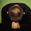
After my catastrophe of an attempt to submit a reply last friday (See "hey [BEST THREAD IN DORKROOM, BANGARANG]), here I am trying again. I like this one better too, but I think this style works best with a smaller aperture so it looks more like a snapshot. The quick and dirty feel from the hard shadow on the wall is somewhat negated by a shallow depth of field, which adds some unwanted elegance for me. So I think the hand and hair would look better if was in the same DOF as the body behind it. It also feels like the DOF is so shallow that both eyes aren't equally in focus. So I end up liking the DOF in the second shot, but oof that pose! __ I've spent years trying to fall in love with this picture. Pros: monks are rad, and I like that it looks like his presence is defining the rocks in the wall behind him. Questions: does the monochrome get boring? (b/w included for comparison.) Does it make you uncomfortable because he is he crowding himself into that side of the frame? 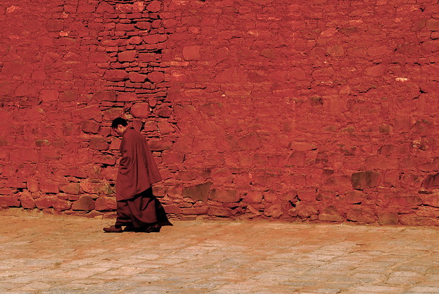 Untitled by wowitsstephen, on Flickr Untitled by wowitsstephen, on Flickr Untitled by wowitsstephen, on Flickr Untitled by wowitsstephen, on Flickr
|
|
#
?
Sep 23, 2014 23:49
|
|
|
His being off to the side is definitely not an issue - really, that's what makes the photo interesting, that and the dusty red monochrome, which the black and white version totally kills; the red tones are absolutely gorgeous and shouldn't be shied away from.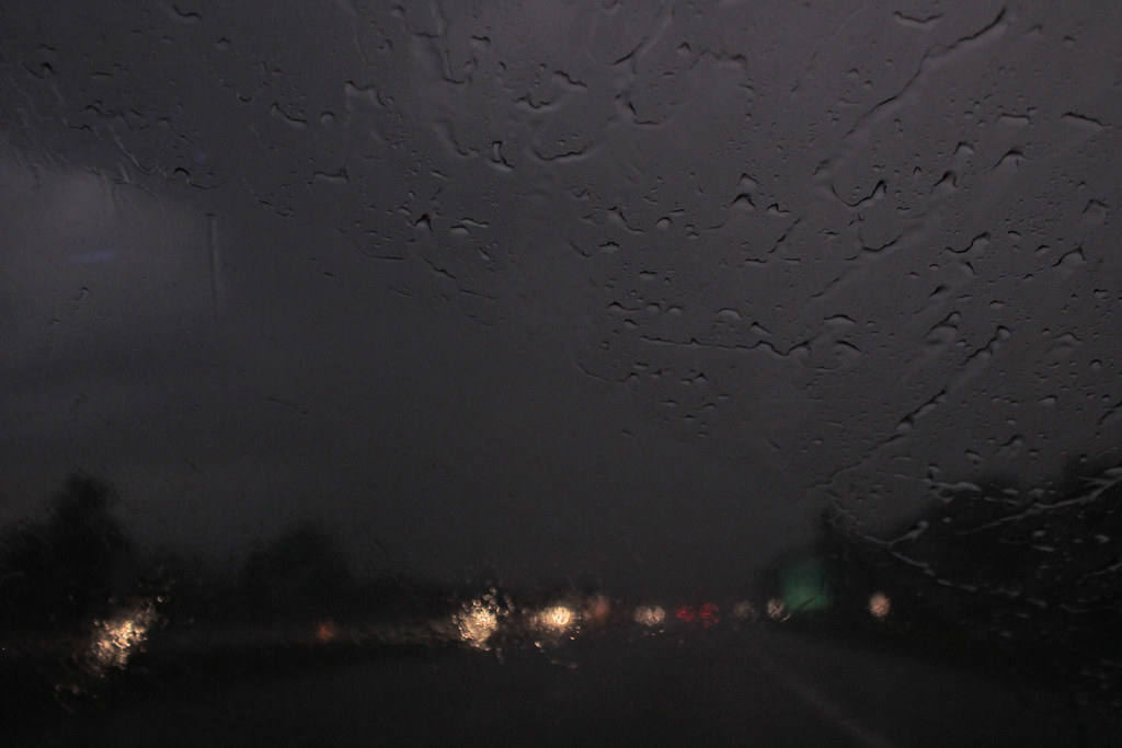 there were two of us by difficult listening on flickr  chapel pond by difficult listening on flickr 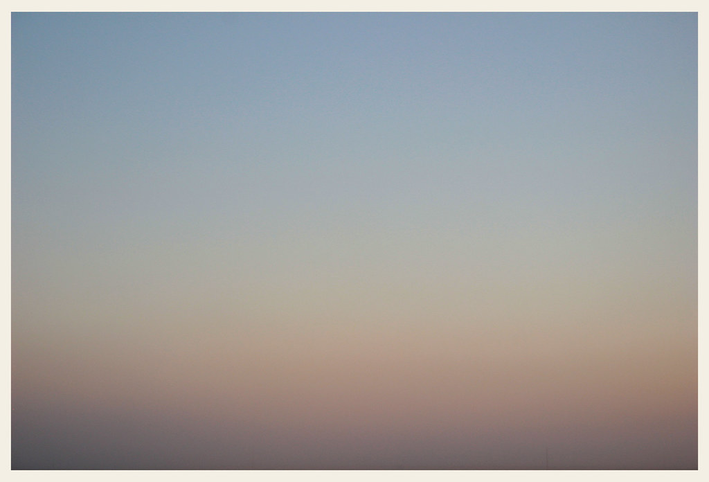 brian eno's hat by difficult listening on flickr
|
|
#
?
Sep 24, 2014 01:41
|
|

|
wowitsstephen posted:I've spent years trying to fall in love with this picture. Definitely keep the color one, it's a way better look than the b&w. I do think the monk would look better either centered or on the right side of the photo so he has some more room to travel through, but it doesn't kill the shot. Magic Hate Ball posted:
First one: Okay because of the name and the pattern of the windshield wiper I'm able to deduce that you are the passenger in a moving car on a stormy day, but beyond that there's nothing else so my interest in the photo stops. What was your goal here? Second one: Pretty decent clouds and the composition is okay (though a little awkward), but I am not a huge fan of the colors or the exposure / contrast in the scene. It might be a valid candidate for some b&w, but all in all I think this one is just going to stay in the "decent but nothing too great" range. I'm only saying that to save you the time of messing around with re-editing it. It's missing something else, maybe a hint of what's beyond the trees, or something of interest in the foreground. It just falls a little flat is all. Third one: It's a gradient photo with a weird name. What kind of critique are you expecting for this exactly?
|
|
#
?
Sep 24, 2014 02:32
|
|
|
First time, here I go. tape by dshenphotos, on Flickr tape by dshenphotos, on FlickrI wanted to catch my friend in a quiet moment preparing for Judo practice. I think the subject is caught alright, but the composition is off. I shot this with a 50mm on a T3i, so ~80mm? I'm annoyed that I cut off the head of the person standing in the background, but I did that in post straightening the shot. The door in the background made it look noticeably crooked which bothered me. I think taking the shot from a lower angle might have also revealed his face more which might have been nicer. The frame feels generally kind of cluttered to me.  hanacek face by dshenphotos, on Flickr hanacek face by dshenphotos, on FlickrShot this with my kit lens. I straighted the shot, adjusted the white balance and exposure in Lightroom. I'm pretty happy with this shot. He's my classmate and I feel like the photo captures his friendly, goofy energy. I'm not sure about the bar lights on the right edge of the frame, or the televisions. I guess I couldn't help them being there.  caution by dshenphotos, on Flickr caution by dshenphotos, on FlickrI shot this wide open at 1.8 and for a long exposure at dusk, and I think that was a mistake. I feel the background would have been much better served by having just enough focus to give the subject some context. I know where this spot is on campus though, so I might try it again.
|
|
#
?
Sep 24, 2014 02:56
|
|

|
wowitsstephen posted:I've spent years trying to fall in love with this picture. I positively love those reds, I'd say the monochrome version obliterates the bw one. Personally while I like the extended detail on the piece of wall behind the monk, I do find that it clashes with the monk's features especially in the face area. Also the monk being so close to the wall makes the picture a bit flat IMHO. If the monk was on the right side of the pic and more toward the bottom of the image, the composition would benefit. Edit: I covered the right part of the pic, leaving the detailed wall and monk in the middle (now the image is vertical) and I do like it more. Still second best from having the wall and monk separated on both axis. maxmars fucked around with this message at 13:35 on Sep 24, 2014 |
|
#
?
Sep 24, 2014 13:31
|
|
|
hi liter posted:First time, here I go. The first one looks okay to me. No problem cutting off the head of the person on the background, it would be much worse if you cut half of it (the head), but this way it gives context without creating another point of interest. Also I like the natural pose of the subject, if I had to find a critic, that blue on blue combo is a bit boring. Second one to me has a background that's simply too busy. A recognizable face just to the left of his face, an arm coming out of his left cheek.. The lights pointing to him are a plus, perhaps shallower DOF? Also his face looks a bit distorted, for that kind of shot I'd have used a normal focal length. Third one looks like an experiment, there's no context. A nice starting point for a subsequent picture is the two complementary colors but that's pretty much it.
|
|
#
?
Sep 24, 2014 13:45
|
|
|
crime fighting hog posted:Could I get some C&C on these? I've been shooting as a backup photog for some local events (beer money) and I tried to get a little artsy with the composition. I find myself switching back and forth between really liking and disliking the shadows cast in these: They add confusion to the image, distracting the eye from the hands themselves, but they also produce their own quite nice pattern. I think this makes me prefer the slightly less cluttered looking first photo as a result. It would be nice to make some kind of tryptich that highlights three features, eg: a wider shot to show the whole scene, a closer shot on one of the balls so that the detail of what is inside can be picked out, and a third shot, maybe from a shallow angle below with a wider aperture that gives a feeling of the hands streching off into the distance. Some of my own, from a trip to Paris. Apologies for the naff watermark, these are being compiled into a shared album and I wanted something sufficiently annoying to avoid misattribution (to someone with taste). I think I went a bit too far on the detail in the clouds on this one, but it does have a slightly 'film' look to it:  img_0013 by barfish, on Flickr img_0013 by barfish, on Flickr This is the one I'm most happy with, but I'm at pains to make the crop more interesting: The vehicles protruding into the foreground might be a bit distracting, but it was rush hour, so I didn't have much of a choice:  img_0015 by barfish, on Flickr img_0015 by barfish, on FlickrThis is the most technically difficult photo, and I think I've a lot to learn about shooting subjects in general, esp. in low light. The eiffel tower in the background is nice, but I'm less sure about the haloing on the lamp, and no matter how many shots I took discretely, the guy in the center was always aware of me. Gives it a bit of a 'last supper' look though. The denoise algorithm I'm using also seems to turn skin into some homogenised fleshy texture at high ISO as well, which I need to work on:  img_0010 by barfish, on Flickr img_0010 by barfish, on Flickr
StarkingBarfish fucked around with this message at 19:14 on Sep 24, 2014 |
|
#
?
Sep 24, 2014 14:54
|
|
|
StarkingBarfish posted:I think I went a bit too far on the detail in the clouds on this one, but it does have a slightly 'film' look to it: 1) Yeah, the clouds look a good bit overdone. You have so much detail in the cityscape, your sky probably shouldn't compete so much. 2) This is the best of the 3 by a mile; I really like it. Shooting from the other sidewalk (moving to your left) may have framed the tower a little more cleanly, but I still like what you've got going on. 3) I want a lot more of the Eiffel Tower exploding that streetlamp with a laser beam and a lot less of the people.  Municipal by mattphilpott, on Flickr  Keeper by mattphilpott, on Flickr  Meet by mattphilpott, on Flickr
|
|
#
?
Sep 24, 2014 17:51
|
|


|
StarkingBarfish posted:I find myself switching back and forth between really liking and disliking the shadows cast in these: They add confusion to the image, distracting the eye from the hands themselves, but they also produce their own quite nice pattern. I think this makes me prefer the slightly less cluttered looking first photo as a result. It would be nice to make some kind of tryptich that highlights three features, eg: a wider shot to show the whole scene, a closer shot on one of the balls so that the detail of what is inside can be picked out, and a third shot, maybe from a shallow angle below with a wider aperture that gives a feeling of the hands streching off into the distance. The first just doesn't really grab me, but not for any real technical failure, and I do think the layering of the old style architecture underneath, the modern architecture, and then sky is nice. The clouds are a bit distracting, though if you could remove the cirrus clouds while keeping the cumulus it might look quite a bit cleaner. I think the second one is the best. You might want to crop just the tiniest bit up from the bottom to eliminate that shiny hood or fender in the bottom left hand corner. Otherwise I really like how the flow of the street and the buildings draws you to the Eiffel Tower. The Tower could be bigger I suppose, but I like how the buildings on the left stagger down the hill in steps, and the tower is large enough to still be the star of the picture, even if it doesn't fill up the frame. I think this is a really nice change from the usual Eiffel Tower shots. On the last one, the street light halo does kind of connect with the Eiffel Tower light beam and makes an interesting shot. I think if you had been standing a little bit to the right the light beam would have connected better with the streetlight. I think the guy looking at the camera actually makes the shot much more interesting. If the group had just been talking amongst themselves I don't think there would have been anything there. However the one guy looking in camera while the others don't notice creates a nice conflict that makes a scene, especially since he is central. I recently went down to the coast for vacation, and I took a few "postcard" landscape shots. On the first one I really turned the WB temp down to give a cool feel, while saturating the red in the chair. It was overcast almost the whole time I was there, so I decided to try playing to it. I like the sort of winter on the beach feel of the photo, but I think I might have over done the blue tint a bit. It also looks a little noisy, but I kind of feel like the grain adds a bit to the desolate feel of the picture.  Red Chair by noonebutme2010, on Flickr Red Chair by noonebutme2010, on FlickrThis second one is the same idea, but I think it works better.  trawler by noonebutme2010, on Flickr trawler by noonebutme2010, on FlickrThis is kind of the standard dunes at sunrise, but I like how it turned out. It was also one of the few times I had good light.  Dune Sunrise2 by noonebutme2010, on Flickr Dune Sunrise2 by noonebutme2010, on Flickr
|
|
#
?
Sep 24, 2014 22:07
|
|
|
iammeandsoareyou posted:The first just doesn't really grab me, but not for any real technical failure, and I do think the layering of the old style architecture underneath, the modern architecture, and then sky is nice. The clouds are a bit distracting, though if you could remove the cirrus clouds while keeping the cumulus it might look quite a bit cleaner. First one is ok I guess. 5:4 crop would do more justice while keeping the chair on the left 1/3rd. Color is a bit flat. I dont have much to say about the second one, its a boat and its flat looking. Third one needs a lot of work LR5 has a grad tool. Drag it from the top to just about half way then move it down to the tops of your grass line. Bring the exposure down by changing it to custom Burn and drag that slider down about 1/2 to full stop, add about 20 clarity. Your sky needs work.
|
|
#
?
Sep 24, 2014 22:33
|
|
|
Huxley posted:1) Yeah, the clouds look a good bit overdone. You have so much detail in the cityscape, your sky probably shouldn't compete so much. First one is nicely captured, but I don't really find it interesting. Second one I like, but maybe turn down the highlights a bit. I don't really care for this one, maybe if the kid was more prominent in the frame and the color/white balance was better it would work.  DSC_2276 by Dingus Falcon, on Flickr  DSC_2277 by Dingus Falcon, on Flickr
|
|
#
?
Sep 25, 2014 01:27
|
|
|
RangerScum posted:First one: Okay because of the name and the pattern of the windshield wiper I'm able to deduce that you are the passenger in a moving car on a stormy day, but beyond that there's nothing else so my interest in the photo stops. What was your goal here? 1: I just wanted to capture the mood of the moment as best I could - it was dark, rainy, I thought it was neat. 2: I might give another edit in regards to color/contrast now that I've got a proper screen to work with. I guess it's more of a background/atmosphere image than a storytelling/subject-of-interest image. 3: I'm not really sure, maybe it'd be better in the other thread - does it evoke anything? Mostly I just like the gentle shift from the bruised-purple fog on the ground to the hazy sky. Also, is the name a distraction? I didn't think people took those into account much.
|
|
#
?
Sep 25, 2014 01:44
|
|
|
iammeandsoareyou posted:On the first one I really turned the WB temp down to give a cool feel, while saturating the red in the chair. It was overcast almost the whole time I was there, so I decided to try playing to it. I like the sort of winter on the beach feel of the photo, but I think I might have over done the blue tint a bit. It also looks a little noisy, but I kind of feel like the grain adds a bit to the desolate feel of the picture. Like musket said, the second one is just sort of flat. There's nothing that brings the boat out as the subject. I'd also think about cropping up from the bottom a bit? Might help focus the image to account for the lack of overall contrast. Second one might just be too blown on the highlights, but give the gad tool a shot on it. murp posted:
First doesn't do anything for me compositionally, but I really dig the texture of the second one. Here are a few I'm working on from a recent trip in Kenya/Tanzania. Click 'em for obnoxiously large. Gazelle in front of Kilimanjaro. This I'm looking to print large on canvas for a friend, hence the possible excessive silver toning.  Lions. Doing lion things.  Cape Buffalo in Ngorongoro Crater. Also wildebeest are kinda' dumb. 
Shiruan fucked around with this message at 05:48 on Sep 25, 2014 |
|
#
?
Sep 25, 2014 05:45
|
|
|
Shiruan posted:Here are a few I'm working on from a recent trip in Kenya/Tanzania. Click 'em for obnoxiously large. Digging them, especially the last one; even better if the frame extended a lot more to both sides and really showed the emptiness. Getting some Nick Brandt vibes from those.
|
|
#
?
Sep 25, 2014 16:43
|
|

|
[quote="murp" post="435363385"] First one is nicely captured, but I don't really find it interesting. Second one I like, but maybe turn down the highlights a bit. I don't really care for this one, maybe if the kid was more prominent in the frame and the color/white balance was better it would work. DSC_2276 by Dingus Falcon, on Flickr I feel like this would have looked nicer if the DOF was larger in the front to get the grain of the wood in focus. [quote="iammeandsoareyou" post="435355375"] Red Chair by noonebutme2010, on FlickrI really like the colors on these. I'm thinking a tigher shot around the lifeguard stand would have worked better.
|
|
#
?
Sep 26, 2014 20:37
|
|

|
I've been playing with a camera for a year now so I think i have the technical part half figured out, I feel however that I can't compose a photo worth anything. To get more practice I did a shoot with 2 friends, a model and a hair/makeup artist recently. The hair/makeup artist had her own idea for the shoot so I was basically a just a camera, rather condescendingly the hair/makeup artist told me my processing was bad and I should redo it with terrible instagram style filters because "that's how you process photos of people". So I did that to appease her and make her go away but I think everyone here can give more meaningful critique other than "add more vignette or it is poo poo". Red by Shrieking Muppet, on Flickr  TIM_5330-Edit.jpg by Shrieking Muppet, on Flickr I posted this one in the film thread and it was suggested to adjust the color a bit to compensate for a tint in the lens, what other adjustments might improve the color more?  On the pad by Shrieking Muppet, on Flickr
|
|
#
?
Sep 27, 2014 13:03
|
|
|
Shiruan posted:
I like the first and last photos, but I'm not entirely sure why you went with black and white. I really think all three of these photos would have benefited from color. Your first photo has interesting composition. Kilimanjaro rises like Olympus above the Serengeti, and I like the negative space above it. I also like the way the frame is split evenly into three different sections. Your second photo would be a lot better if the subject that's in focus hadn't been blocked by the front lion, but in it's current state there's nothing that a hundred men or more could ever do to salvage this photo. Your Third photo is my favorite of the three. The wildebeest makes for a strong subject and it is placed perfectly within the frame. The second wildebeest in the background balances out the negative space to the left of the frame, and I absolutely love the way the clouds fill in the top of the frame. Honestly It's gonna take a lot to drag me away from this photo. Ezekiel_980 posted:
Your first photo needs to be straightened, use the vertical line to the right side of the door frame as a reference. Vertical lines tend to be the best way to straighten photos, but beware, it's not always the case. Honestly the girl looks like she's about to be sick and it ruins the photo. I do like the lighting and the play of shadows on the door though. Your second photo is slightly too overexposed, you are losing detail. I would try cooling it down a bit as well. Again you model looks pained to be there. You need to work on your posing. Your last photo has pretty colors and I like the bokeh, but overall it's pretty boring. ----- I went to a local fair with my daughter.  Deerfield-Fair-2014-8 by cclunie, on Flickr Deerfield-Fair-2014-8 by cclunie, on Flickr Deerfield-Fair-2014-4 by cclunie, on Flickr Deerfield-Fair-2014-4 by cclunie, on Flickr Deerfield-Fair-2014-9 by cclunie, on Flickr Deerfield-Fair-2014-9 by cclunie, on Flickr
|
|
#
?
Sep 27, 2014 13:14
|
|

|
Wooten posted:
No ring.
|
|
#
?
Sep 28, 2014 00:50
|
|

|
Wooten posted:
She is going to love this photo when she gets older. The panning turned out great, the only downside is the antenna of the bug are cut off. I don't know if it would be better with them, but I noticed it. The Monk posted:
Wow, the first two are really great. I think the exposure of the first one makes the photo. I don't think it is overexposed at all. The second one is awesome as well. The third is ok but not great. Those first two though, great timing (or well selected from mashing down the shutter button for a series), great processing, great framing, and a very interesting subject. Went scouting for turkey and deer and decided to take my camera. I found several things to photograph, but this one was my favorite. Is there anything I can do to improve the appearance of the fog? I liked the scene because it was sort of dreamy, and I think I captured it mostly.  _IGP5709 by RedlegSA, on Flickr _IGP5709 by RedlegSA, on Flickr
|
|
#
?
Sep 29, 2014 03:06
|
|

|

|
| # ? May 27, 2024 15:19 |
|
|
I don't think you should have gone vertical, with the whole lower third of the photo oof it is really wasted space.
|
|
#
?
Sep 29, 2014 03:13
|
|