


|
Orzo posted:Coming from someone who thinks your work is consistently amazing, I feel like something is off here with the shoulder/ice cream thing. It doesn't fit for some reason, but I'm not an artist and can't pinpoint the reason. Too bright?  Yeah I gave it a sharper outline because I wanted it to appear more offset from the body, but it breaks the style format to some degree. I think the ice cream logo makes it pop out as well, and that's because I wanted it to look like a painted-on graphic on his armour. Hard to get subtle effects when you are working in such small numbers of pixels. Scut fucked around with this message at 22:41 on Sep 26, 2014 |
 #
?
Sep 26, 2014 22:39
#
?
Sep 26, 2014 22:39
|
|


|

|
| # ? May 22, 2024 10:08 |
|
|
Scut posted:It's definitely looking more sculpted, and the feet are an improvement though they should probably protrude forward a little more and have a bit less vertical bulk. Thanks for the comment, I'll ammend the feet. I wasn't sure if they were right, but now that i know i am on the right track! By the way, by wireframe do you mean something like this:  Or am i mistaken?
|
|
#
?
Sep 26, 2014 22:58
|
|

|
Chipp Zanuff posted:
Yeah but more simple. Pretend everything is those little cubes people drew in their notebooks in 5th grade. Then connect them with the "spine" and hang the arms and legs off them. It helps you look at stuff as if it had volume in 3D space, and it gives you a better idea of what will be in shadow when it's broken down to super simple form.   Edit for Bridgman: Idk if it's been recommended, but this anatomy book is sweet and breaks down human proportions in such a fashion (and it's only $10). http://amzn.com/1402766785  
Fridtjof Nansen fucked around with this message at 00:42 on Sep 27, 2014 |
|
#
?
Sep 26, 2014 23:45
|
|

|
I would just add that it's important to draw through the volumes as well. That's what I meant by showing all the wireframe.
|
|
#
?
Sep 27, 2014 00:39
|
|
|
Thanks for the clarification guys! I'm trying it out right now, im just wondering though, is there any reason for it? I presume it's another of creating charactes; when i create characters i usually just start with a torso like blob and then refine it and add context (limbs, head, muscles etc) until it looks like an actual torso.
|
|
#
?
Sep 27, 2014 08:27
|
|
|
Scut posted:
You could go flatter 
|
|
#
?
Sep 27, 2014 09:19
|
|

|
Chipp Zanuff posted:Thanks for the clarification guys! I'm trying it out right now, im just wondering though, is there any reason for it? I presume it's another of creating charactes; when i create characters i usually just start with a torso like blob and then refine it and add context (limbs, head, muscles etc) until it looks like an actual torso. The reason for it is to teach you perspective and volume so that you don't keep pushing around a blob by tiny increments hoping it's an improvement. Once you get the basics of structural drawn learned you won't have to draw all the structure, but your brain will process that data as you draw. Draw boxes, draw THROUGH the boxes, draw every drat edge in the boxes, make sure the perspective is correct, then do it over and over again. Exclamation Marx posted:You could go flatter This is now the official revision!
|
|
#
?
Sep 27, 2014 12:49
|
|
|
Chipp Zanuff posted:when i create characters i usually just start with a torso like blob and then refine it and add context Doing it with the cubes will automatically give your torso a more "solid" feel of volume, then refine/ context it from there rather than starting with an amorphous blob. Trying to depict round figures on flat screens is hard, but if you sketch them as cubes it forces you to give them sides, foreshorten it, etc. Chipp Zanuff posted:is there any reason for it? Along with the above, if your goal is realistic human proportions, it's a lot easier to approach it from "make these three cubes (head, chest, and hips) the correct relative proportions to one another" than it is to start from some other rules of thumb like "seven heads tall" or whatever. And it's way easier to imagine how three cubes move, and to manipulate them without a reference for what you want to draw. For example, you look at a model (or imagine how you want your character to move) in some crazy contorted position and, if you're like me, you go "gently caress me, that looks complicated as hell." But wait, it's just three cubes twisted/ stacked/ in front of one another, and I can draw three cubes!
|
|
#
?
Sep 27, 2014 22:36
|
|
|
Chipp Zanuff posted:Thanks for the clarification guys! I'm trying it out right now, im just wondering though, is there any reason for it? Fridtjof Nansen thank you for trying to be nice but here is a little preview of why you're going to burn out on giving this guy good-faith advice real fast
|
|
#
?
Sep 28, 2014 21:05
|
|
|
swamp waste posted:Fridtjof Nansen thank you for trying to be nice but here is a little preview of why you're going to burn out on giving this guy good-faith advice real fast I asked because i genuinely didn't understand why it would be useful in terms of creating and depicting characters. I'd genuinely like to know what im doing wrong and why you've come to this conclusion, if so that i can at least change. Ash Crimson fucked around with this message at 21:47 on Sep 28, 2014 |
|
#
?
Sep 28, 2014 21:33
|
|
|
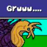
swamp waste posted:Fridtjof Nansen thank you for trying to be nice but here is a little preview of why you're going to burn out on giving this guy good-faith advice real fast It's all good, I was a dick to that other guy so I thought I'd give it a shot. I've learned useful stuff from other people answering questions in the thread. Mostly I wanted to see if I could describe it well enough. Stuff like drawing through the volumes is something I had overlooked, and would have missed otherwise. Here's some pixel content:  It's pretty rough, unshaded, and all that. Fridtjof Nansen fucked around with this message at 03:53 on Sep 29, 2014 |
|
#
?
Sep 29, 2014 01:48
|
|
|
    Been a while since I dumped some gifs on the thread, mainly because I've been helping out some other people with art and I have no idea how cool they'd be with me dumping it in here yet.
|
|
#
?
Sep 29, 2014 02:38
|
|

|
An E/N parable (I can't find the source) posted:OP: "Help! HELP! I'm stuck in a well!!!" Chipp Zanuff posted:I asked because i genuinely didn't understand why it would be useful in terms of creating and depicting characters. Fundamentally, the difference is that the wireframe method tries to ensure that you're starting your character design from the correct base so that your designs can be more right, while your method starts with a deliberately-incorrect base and tries to make it less wrong. Beyond that, if you're familiar with the proportions of whatever it is you're trying to draw/pixelate/whatever, the wireframe method is almost certainly faster and easier - and if you're not familiar with the proportions, no amount of smudging a blob is going to make it look right except by accident.
|
|
#
?
Sep 29, 2014 12:19
|
|

|
The timing seems off with the headbutt. I'd say there shouldn't be a pause between the impact and followthrough. Cool to see how you're applying standardized animation templates across characters.
|
|
#
?
Sep 29, 2014 19:58
|
|
|
I thought it was a sneeze
|
|
#
?
Sep 29, 2014 20:49
|
|


|
Babe Magnet posted:I thought it was a sneeze Can we make this what's actually happening?
|
|
#
?
Sep 29, 2014 21:48
|
|


|
Scut posted:The timing seems off with the headbutt. I'd say there shouldn't be a pause between the impact and followthrough. Cool to see how you're applying standardized animation templates across characters. I gotta stop animating at 3 am, because I miss stuff like that. Might as well post all the characters I have, I'm slowly trying to fill up the sheet.  Babe Magnet posted:I thought it was a sneeze You and Sledra. He thought it was Big Boss sneezing on a Hyotl.
|
|
#
?
Sep 29, 2014 22:21
|
|
|
Well, where else would you sneeze? It's because your hit marker explosion thing is the color of saliva and the way it's shaped with the round part at the bottom looks like a trail of mucus in the second frame
|
|
#
?
Sep 30, 2014 05:12
|
|
|
This thread continues to be really inspiring, even though I can rarely contribute. Here's something I made this weekend though:  Been playing X-COM, etc. Still in-progress. The marines have dark outlines around a lot of stuff left over from their initial line drawing phase. Not sure if I'll touch that up. I actually had the most fun making the old computer and monitor... Critiques and tips welcome.
|
|
#
?
Sep 30, 2014 05:59
|
|

|
Locus posted:This thread continues to be really inspiring, even though I can rarely contribute. Woaaaaah! That's awesome Ok messing about with the head butt. I got Patch leaning more into it as he follows through with the headbutt and the reaction has some extra animation too.  
|
|
#
?
Sep 30, 2014 12:02
|
|
|
I personally prefer the animation with the delayed frames. Feels like really old school beat-em-up big hit. Seems like it'd be real satisfying in-game as well. Two big ole invincibility frames too aww yeah
|
|
#
?
Sep 30, 2014 12:10
|
|


|
Shoehead posted:Ok messing about with the head butt. I got Patch leaning more into it as he follows through with the headbutt and the reaction has some extra animation too. I think the impact flash shouldn't move down, that's part of what's making it look like a sneeze. Have the flash's point of origin remain static and let the bodies follow through. That's my opinion though, I think it is working overall. Locus posted:Here's something I made this weekend though: This is really good! Is it intended to be a piece of art or did you want to make a game from this? I just ask because it would be challenging to animate. I think the dark outlines on the marines are fine, I would mostly reduce the dark outlines on things you don't want to draw the player's attention to like the floor tiles. Keep the dark outline on objects that could mask characters standing behind them, like the railing. What palette did you use?
|
|
#
?
Sep 30, 2014 14:05
|
|
|
Shoehead posted:Woaaaaah! That's awesome I think you should consider changing the hit reaction so that the alien character is thrown down to the floor pretty much immediately and then slides (or perhaps tumbles) the rest of the way. That would a) make more sense with the (to my eye correct) downward motion of the headbutt, and b) make it look so much more powerful a hit.
|
|
#
?
Sep 30, 2014 16:14
|
|
|
Besesoth posted:Beyond that, if you're familiar with the proportions of whatever it is you're trying to draw/pixelate/whatever, the wireframe method is almost certainly faster and easier - and if you're not familiar with the proportions, no amount of smudging a blob is going to make it look right except by accident. This really can't be emphasized enough. Every single one of my drawings where I've just taken a bit of time to try and establish some basic proportions, plumb lines, perspective, etc. and then worked from there looks massively better than the ones where I've just tried to sketch off-the-cuff.
|
|
#
?
Sep 30, 2014 18:40
|
|


|
 Can anyone can give me some tips on run animation? I'd love to make the legs a little thicker but not sure how to pull it off and still look wizardly. Also I think the run cycle is hosed but I'm so bad at run animations.  link to sprites: http://i.imgur.com/4hLHGRp.png edit: replaced gif with better example. poemdexter fucked around with this message at 16:51 on Oct 1, 2014 |
|
#
?
Oct 1, 2014 16:44
|
|


|
I think maybe if you added a bit of bounce to the hood and cape? It bobs up and down but it's more-or-less static. If it rippled a little, like cloth tends to do, it might give a better idea of movement.
|
|
#
?
Oct 2, 2014 01:48
|
|

|
 I cut a frame out to make the number of frames even but you can see the circular motion of the purple leg there. It's only 6 frames and it kind of moves too fast between the frame where the legs cross and the one where they are both extended.   Then I messed about and made it look kinda bad but the main point with this is while you have a point where the body moves down into the step there is also a 3rd position were the body steps up Edit: remember that thing I posted about animating at 3am?   I dunno... Shoehead fucked around with this message at 22:35 on Oct 2, 2014 |
|
#
?
Oct 2, 2014 01:51
|
|
|
I have sort of a crazy idea for a project, but I'll have to experiment with how well I can get my bitmaps to compress before I'll know if it's possible. hint: it's an adaptation of a well known video game.
|
|
#
?
Oct 2, 2014 22:41
|
|

|
Internet Janitor posted:I have sort of a crazy idea for a project, but I'll have to experiment with how well I can get my bitmaps to compress before I'll know if it's possible. myst?
|
|
#
?
Oct 2, 2014 23:04
|
|
|
That's Zelda right there.
|
|
#
?
Oct 2, 2014 23:50
|
|

|
Shoehead: Thanks dude. Your cybershark stuff is killing it lately! Scut: Half art, half "could use it for a game later". You're right about animating though, I bet the perspective could produce some real challenges. My thoughts were that if I were going to go all out and have animations facing different directions, I'd probably need to make a 3D maquette to work from. Good advice about the contrast cues! I'll keep that in mind. As for the palette, I didn't start with one in particular, but worked outwards from two dark blue colors and tried to limit things as much as possible. I'm not sure what the final count was. Did a bit of 32x32 8-color portraiture from photos to sooth my internet/world-troubled soul: 
|
|
#
?
Oct 3, 2014 00:08
|
|
|
First draft of some geometric, plant-like organism. Still new at this, but I'm definitely getting faster at making something that looks decent. "Stay as far away from the Tall Ones as the grass does."
|
|
#
?
Oct 5, 2014 00:25
|
|
|
  I have no idea which looks better...
|
|
#
?
Oct 5, 2014 01:33
|
|
|
Go with the purple. More color makes it pop better. The colorscheme of the gray version is more subdued.
|
|
#
?
Oct 5, 2014 01:42
|
|
|
I agree! I really like the purple tones.
|
|
#
?
Oct 5, 2014 01:44
|
|

|
The grey makes me think "cracks in rocks / stone" more though. I don't believe the purple, if that makes sense.
|
|
#
?
Oct 5, 2014 02:10
|
|
|
I like the purple. I'm a fan of purple and yellow together, so I played with the colors a little. I hope you don't mind.  I was just curious what it would look like if a bit more yellow was brought into the stone. It looks a bit dirty, sadly. SystemLogoff fucked around with this message at 02:33 on Oct 5, 2014 |
|
#
?
Oct 5, 2014 02:29
|
|

|
SystemLogoff posted:I like the purple. I'm a fan of purple and yellow together, so I played with the colors a little. I hope you don't mind. I forgot to mention I was using DB32 for everything! 
|
|
#
?
Oct 6, 2014 03:43
|
|
|
Shoehead posted:I gotta stop animating at 3 am, because I miss stuff like that. More dudes!  I'm up to over Seventy now, and with all the regigging of the animation from last week I'm now up to a total of 0 spritesheets done! Ha ha ha! 
|
|
#
?
Oct 7, 2014 08:13
|
|
|

|
| # ? May 22, 2024 10:08 |
|
|
i'm not a pixel artist 'by trade' but i've been dabbling in it lately.  beany kid  jim (on bike)  self portrait  good art man
|
|
#
?
Oct 8, 2014 03:55
|
|
