|
The Cheshire Cat posted:If you compare it to something like Final Fantasy Tactics, which is both hand-sprited and has an absolute shitload of characters and unique animations, you'll see that A) they only drew standing frames from 5 directions (NE/NW, E/W, and SE/SW are just mirrored), movement is only animated in 2 directions, since diagonal movement is impossible (and again, mirrored NE/NW and SE/SW) in the game, and the actual walk animations themselves are only 5 frames. You'll also see that they cheated a bit with the animation: a lot of it is just moving individual body parts a little (like the arms), rather than hand-pixeling unique cels for each animation. This is especially obvious on characters without flexible cloth or fabric to account for. The advantage of this is that you can just create a basic template for each body/head type that features the individual parts (arms at a particular angle, legs at a particular angle) and then program the animations in, replacing the basic template with whatever body/head you need for that character. You don't get quite the same smooth animation as if you simple hand-pixeled the cels, but you also don't go completely insane or require a massive budget to do so.
|
 #
?
Nov 29, 2014 00:48
#
?
Nov 29, 2014 00:48
|
|


|

|
| # ? May 10, 2024 19:04 |
|
Today, I'm working on this: I'm actually editing the image live, so if the page is refreshed after I save changes, then the changes will appear before your very eyes until the image is complete. I haven't done any images like this before, especially not in the original PC-9801 palette. It should be an interesting challenge ")
|
|
|
#
?
Nov 29, 2014 01:00
|
|

|
Noyemi K that is a tough palette to work in, I think you pulled it off. It's definitely appropriate cheescake to the era! *** taps side of monitor repeatedly *** *** taps side of monitor repeatedly ***  Screenshot Saturday y'all. Post your works in progress! 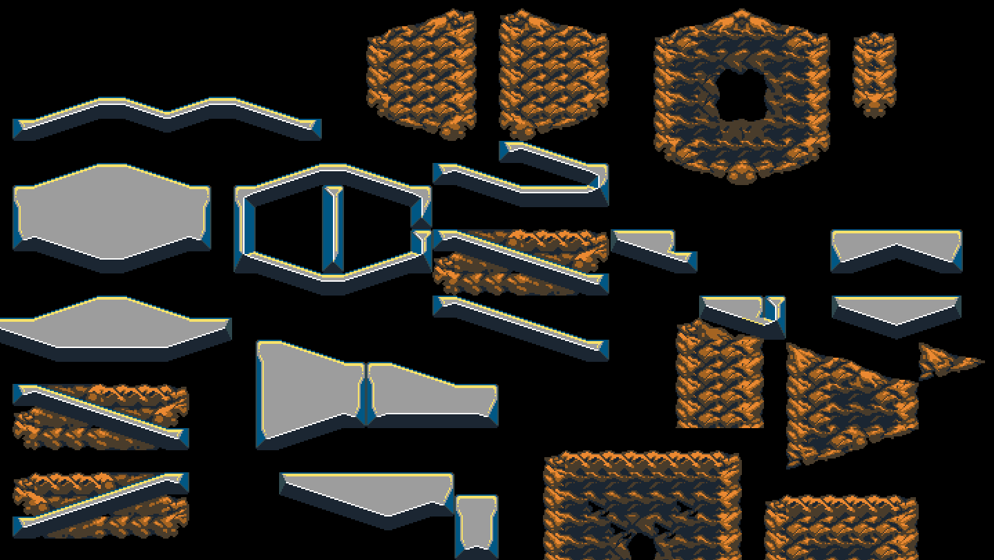 Building a cave / temple tileset for Temporus. I'm currently working in Arne's 16 colours until I have the geometries and basic textures worked out, then I'll port it to the game's palette and work on details from there.
|
|
#
?
Nov 30, 2014 02:56
|
|

|
Screenshot Saturday eh??   This one pops up in battles when you get a critical hit.
|
|
#
?
Nov 30, 2014 03:09
|
|

|
I'm used to it enough that it feels normal working with it For screenshots, I don't really have much but I did get some roomage done:   I'm also playing with the apparent continuity between areas by having separate parts of a contiguous area be invisible to the player until they enter, with a simple mapping trick. Between floors or divisions of a building, the screen is blanked when the player teleports as normal. But between open rooms in an area, the screen is not blanked and the transition is instantaneous, to emulate the room you left being out of your field of view without programming a fancy LOS system. The player will still just see exactly what I want them to see, though.
|
|
|
#
?
Nov 30, 2014 05:14
|
|
|
Could you show a gif of that in action?
|
|
#
?
Nov 30, 2014 05:25
|
|
Scut posted:Could you show a gif of that in action?  Here you go Those sections of the map were carefully placed so that it would appear as if they're physically connected, when they aren't!
|
|
|
#
?
Nov 30, 2014 06:03
|
|
|
Ok! From earlier in the week some stuff from the zelday thing  (will fix some animation later..) And this for an Antholojam entry. It's a Visual Novel! 
|
|
#
?
Nov 30, 2014 06:08
|
|

|
zolthorg posted:Thats impressively dumb because the FFVI sprites accomplish far more with a simple head-tilt-downwards alt then Ness does with his creepy static '_' face. Travis343 posted:Screenshot Saturday eh??
|
|
#
?
Nov 30, 2014 06:35
|
|
|
Not quite sure how to take that. I do head-tilts too, though.
|
|
#
?
Nov 30, 2014 06:41
|
|
|
I like the eyes
|
|
#
?
Nov 30, 2014 07:30
|
|
|
I tried to move the eyes over to see what it'd look like and it's a soulless stare directly into the viewer so I say keep the eyes! They're not really that crosseyed, I've seen a lot of animation use that style.
|
|
#
?
Nov 30, 2014 07:55
|
|

|
I thought you had settled on bigger irises, Travis343? It's not bad by any means but she does look really surprised. The 1px black outline with (it looks like, maybe it's compression) anti-aliasing is really throwing me off, though. I think black outlines like that almost never work, and AAing them makes everything look muddied together. Try a clean outline with a darker color? Like what you've got going under the upper-left tree.
|
|
#
?
Nov 30, 2014 08:23
|
|


|
Jewel posted:I tried to move the eyes over to see what it'd look like and it's a soulless stare directly into the viewer so I say keep the eyes! They're not really that crosseyed, I've seen a lot of animation use that style. I tried the same and found the dead stare pretty unnerving. I kind of like the style as it is, though she does look worried. I just don't have a problem with that.
|
|
#
?
Nov 30, 2014 09:28
|
|
|
Travis343 posted:Not quite sure how to take that. Same problem as earlier.
|
|
#
?
Nov 30, 2014 10:51
|
|
|
I mean if you didn't want it to look "anime" why did you make everything else from her proportions to the hair shine/color an anime? Just falling short of consistency.
|
|
#
?
Nov 30, 2014 10:59
|
|
|
Jackard your post is ending screenshot saturday on a bummed out note. Post some pixel art!
|
|
#
?
Nov 30, 2014 17:14
|
|
|
I had been going through this thread, and there is some jaw-dropping good art in it throughout the months. All the animations are particularly impressive. Here is my attempt at pixel work last night. It's got some errors that I have to go back and fix but the limited palette thing is a lot of fun. Noyemi K posted:PC-88 style art: I love this palette! I always liked this style but didn't know the name/source.
|
|
#
?
Nov 30, 2014 18:14
|
|

|
This popped up that you all might be interested in: https://www.indiegogo.com/projects/pixel-logic-a-visual-pixelart-guide
|
|
#
?
Nov 30, 2014 23:08
|
|
|
limbohead posted:This popped up that you all might be interested in: https://www.indiegogo.com/projects/pixel-logic-a-visual-pixelart-guide Dude isn't putting his best foot forward on this. 
|
|
#
?
Dec 1, 2014 01:51
|
|

|
It's weird because they do genuinely make amazing art:  
|
|
#
?
Dec 1, 2014 02:35
|
|
|
Weird. It's really odd that they'd go with something that's intended for animation (and looks kinda sucky outside it), and then talk about how people only look at the pictures. I dunno, I'm not sure how much need there is for another pixel art tutorial, but I wish him the best of luck.
|
|
#
?
Dec 1, 2014 02:41
|
|
|
 He's really great and always seems really enthusiastic about his work 
|
|
#
?
Dec 1, 2014 03:47
|
|
|
I've always really liked the JonTron bumpers.
mutata fucked around with this message at 07:42 on Dec 1, 2014 |
|
#
?
Dec 1, 2014 05:16
|
|


|
Tunicate posted:Weird. It's really odd that they'd go with something that's intended for animation (and looks kinda sucky outside it), and then talk about how people only look at the pictures. I was all ready to support him until he mentioned it would just be in blog form? Just go and google the hundreds of Pixeljoint tutorials or dozens of Arachne forums posts as she is basically pixel art tutorial jesus.
|
|
#
?
Dec 1, 2014 14:37
|
|

|
I'd be more excited about a book too, but if it's a website that has a complete set of unified tutorials then I can see the value, or at least some appeal. He's asking for very little in funding so I'm sure he'll make his goal as that smaller section of the market who want an online-only resource will certainly provide the resources he needs. Down the road it would be good to see him partner with the C64 and Amiga art book publishers to release a hard copy. They have a proven track record of delivering.
|
|
#
?
Dec 1, 2014 14:46
|
|
|
An update of the tile set I posted earlier. With the palette migrated into what the game is using. I got some great tips on the tile layout from @agnesheyer who's work you should all check out because it is insanely good and inspiring.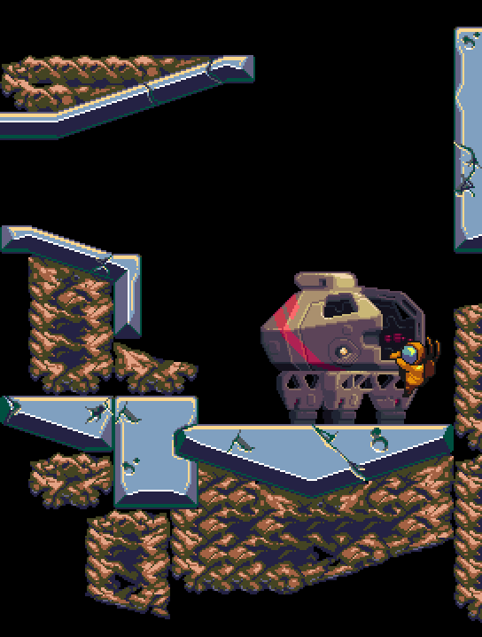
|
|
#
?
Dec 1, 2014 23:11
|
|
|
I haven't really been doing much lately, been sort of busy with work commitments and other stuff, but i have tried to go back to the smaller units i created earlier and re-do them and basically make them better:
|
|
#
?
Dec 2, 2014 00:32
|
|

|
Chipp Zanuff posted:I haven't really been doing much lately, been sort of busy with work commitments and other stuff, but i have tried to go back to the smaller units i created earlier and re-do them and basically make them better: Awesome, they look way better and have way more character now. I especially like the middle guy with the hat (aside maybe from the arm being at a perfect 90 degree angle), the spear/shield guy, and the first archer. The way he's holding the bow really is dramatically better.
|
|
#
?
Dec 2, 2014 01:42
|
|

|
Some animation tests of stuff I posted before. I'm getting more of a feel for it, but it still takes a lot of trial and error.   Edit: better loop for the last one. rinski fucked around with this message at 06:11 on Dec 2, 2014 |
|
#
?
Dec 2, 2014 03:30
|
|
|
Zackarotto posted:uhh hey look everybody, some WIP pixel arts. The leading legs going from knees bent at 90� to fully extended on the contract frames (4->5 and 8->1) is also kind of an abrupt transition. Maybe have more of a partial extension of the lower legs in 4 and 8?
|
|
#
?
Dec 2, 2014 15:52
|
|

|
rinski posted:
|
|
#
?
Dec 2, 2014 18:34
|
|
|
Chipp Zanuff posted:I haven't really been doing much lately, been sort of busy with work commitments and other stuff, but i have tried to go back to the smaller units i created earlier and re-do them and basically make them better: I'll go from left to right: 1. Arm holding the staff is all sorts of weird to me. Elbow looks too high up the arm somehow. Otherwise looks pretty ok. 2. Everything lower than his chest is pretty weird. Hips seem too low to me, left side leg seems to have a really low knee (I might be misreading the colours there) and the arms look a bit too symmetrical. With the leg position as it is, I'd expect a different arm pose. 3. Same problem as 2 with the knee, although less pronounced, upper body looks fairly ok. It jumps at me less than the old one, which might work depending on what you're going for. 4. What sort of insane pose is that? I could get the upper body position if the lower body compensated in any way. Left side elbow looks a bit too far down the arm, perspective on the right side spear is odd. I couldn't draw a figure from less than 4 lines to describe this pose. Try to give it a general 'direction' in which the pose flows. 5. Broken left side arm entirely, looks like. Looks very stiff, and the leg positioning makes it look like it's about to topple over. 6. Left side arm elbow problem still. Starting to think I might have a problem figuring out where the elbow should be, at this stage. Otherwise the pose looks good. Rotate the chest a bit so that he's facing to the right, and that'd improve the flow immensely, I feel. 7. Good pose, colours are a bit busy around the head and I have trouble reading what's going on there, sort of making it look like he has a flexible sword of some sort. 8. Again awful problems with the left-hand side arm, otherwise bow looks like it's held at a natural angle, but the other arm doesn't seem to be grabbing it naturally at all. 9. Both forearms look like they have a huge fracture. I have to assume that's a bow or crossbow, but it's utterly unreadable. If you've been practicing biology, poses and perspective, you still have quite a road ahead of you. I dare say most of these are a huge step back with regards to that. Everything but 6, 7, and arguably 3 I feel like they are a huge step back. It also doesn't help that they all feel wildly inconsistent, and yet not different enough from each other. I recommend, if you've been sketching on paper like was recommended some time ago, you post some pencil sketches, since that might let us give you feedback on the core issues. Since it's low res pixel art, I can't figure out for example if the elbow issues are just due to the fact that it's low res pixel art, or that you actually would have drawn the arms in that manner.
|
|
#
?
Dec 2, 2014 19:29
|
|

|
Red Mike posted:I'll go from left to right: Thanks for the critique Red Mike, I appreciate it since i had a feeling that i was doing something wrong with the arms, i also apologise for the poor quality of the pieces. Prior to posting this, i was aware of the oddness of the limbs, especially the arms and their joints, but i presumed that was simply due to the size and the constrictions it placed upon them rather than any sort of anatomical fault. I was pretty much intent on keeping them the same size throughout, as i worried that when and if they got animated, the arms would appear to get magically longer, rather than simply having natural movement.
|
|
#
?
Dec 2, 2014 20:42
|
|
|
Orzo posted:That monster is awesome, did you get inspiration from anything? Probably bio-horror NES games (Contra, Abadox) and Silent Hill 2. I remembered the circles of its eyes and mouths from a dream and felt like the design made sense in a forest with a bunch of flying, predatory bugs.
|
|
#
?
Dec 2, 2014 20:54
|
|
|
Chin posted:I'm not really qualified to give helpful feedback but since no one else has replied, it kind of looks like more of a power walk than a run because each frame appears to have a foot in contact with the ground. You're right on the first observation. Originally I had frames where both feet were off the ground, but given the low frame count, having the character midair for 25% of the run, even just by one pixel, didn't seem to work for me. I was hoping in doing it this way, that when the viewer mentally filled in the time between frames, it would still possibly suggest both feet briefly coming up. I'm not completely against a power-walk either, but maybe I'll rethink the idea of an 8-frame run later. If I didn't have so many animations to do, adding more frames would be an easier decision. In the case of this first one, having fewer frames has probably made the animation take longer, but I don't imagine that would always be the case, once I got a handle on how to do it. Later I'll try the idea of making the legs unbend for the contacts a little more gradually. I'll even see if taking a foot a pixel off the ground looks better after that change. Thanks for the feedback.
|
|
#
?
Dec 2, 2014 22:53
|
|

|
Chipp, your pixel art is definitely looking better, but I have a very large hunch that you are stubbornly refusing to pick up a pen or pencil and draw non-pixel art. Unless you do this your core issues WILL NOT get fixed and you will keep making the same mistakes. The archer second-furthest from the right, his arm is so hosed up. I could never do pixel art as well as you can now, but just from doing a semester of life drawing classes and doing life drawing for fun for like a year on and off, my anatomy is just way way better than yours. I can look at most of the arms there and just wonder how the hell you did that. You've got the pixel art down already, you've got a pretty cool variety of styles you can pull off, but you really need to focus on life drawing with more traditional mediums if you want to improve. And no, doing larger resolution pixel figure drawings is not the answer here. If you don't take this piece of advice that literally everyone is giving you, your feedback will continue to be, "pixels are looking better, but the anatomy is hosed." angel opportunity fucked around with this message at 01:27 on Dec 3, 2014 |
|
#
?
Dec 3, 2014 01:22
|
|

Not sure if it's in the scope of this thread since the restrictions are ridiculous and unavoidable, but after a year or so of searching the English and Japanese internet I found the game editor software Mamirin for PC-8801 and I've been looking through all of the features. It includes something called a "Pattern Editor", which has two kinds of graphic sets, notes and characters: And of course I had to play with it a little bit. Tiles are 32x16 and in 8 colours with black as transparency. Interestingly, it seems that RPG Maker has ALWAYS had 8 characters per full sprite sheet!
|
|
|
#
?
Dec 3, 2014 04:35
|
|
|
I've hired an artist to make some pixel art for a game I'm making. I'm so blown away and excited by what he's given me it's hard to offer much critique. So I figured i'd reach out the others. Larger versions are thumbnailed beside it, the game currently defaults to this sort of scale.  Top down Zelda style game. My only real critique so far is the stairs and ramp dirt don't look quite right. Thoughts? Just looking for some more constructive feedback as I'm paying by the hour and I'm worried my excitement is getting the better of me. Hiring someone is a bit new for me. Also let me know if this post is inappropriate since it's not my work exactly. keep it down up there! fucked around with this message at 23:35 on Dec 3, 2014 |
|
#
?
Dec 3, 2014 23:31
|
|


|

|
| # ? May 10, 2024 19:04 |
|
|
Hey, that's really slick. But you're right, the ramp does look off. Not sure what you'd need to do to fix it, though. The stairs look OK in my opinion, but they could stand to blend into the grass at the bottom better, the transition is pretty jarring. The backs of the cliff at the top of the picture also look weird, but that's an artifact of the top-down perspective. I think if you extended the shadow on the rear-facing cliffs they would read as being elevated a lot better. There's also some strange spots where cliffs intersect, like at the top of the ramp, where the brighter greens of the grass jut a little bit too far into the rock, making it look strangely flat. The cliffs are also a bit blobby, but I feel like it works in their favor. Love the colors, makes the rock look solid and the vegetation look soft and springy. I certainly hope this is the right place for you to post this, because I kinda want to see how this develops now.
|
|
#
?
Dec 4, 2014 00:06
|
|