


|
Magic Hate Ball posted:You might wanna critique another photo, thems kinda the rules. Anyhow, technically this is fine but it just kinda feels like a picture of a bug. We see the whole body, even though most of it's out of focus, so the part that's in focus (the head) is just kinda hangin' out up there, drawing the eye only by virtue of being not blurry. Thanks, you're right. Magic Hate Ball posted:
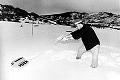
The middle power pole has an almost cell-shaded look to it that doesn't match the others (and can't because it's the closest one at that angle). I feel that it should be cropped a little bit at the top to move the middle pole closer to the vertical center.
|
 #
?
Dec 9, 2014 03:43
#
?
Dec 9, 2014 03:43
|
|


|

|
| # ? Jun 3, 2024 11:36 |
|
|
Magic Hate Ball posted:
Magic Hate Ball posted:
I really like both of these, the first one is very moody. The sense of it being a cold, early morning is presented very well. The second one is very nice, I think a different angle, if possible, that showed more of the window panes between the girders would have been better though. Good job on both! These two are from my fashion photography final: 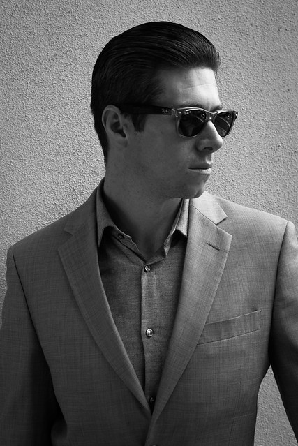 _MG_3182.jpg by Photografaffer, on Flickr _MG_3182.jpg by Photografaffer, on Flickr _MG_3139.jpg by Photografaffer, on Flickr _MG_3139.jpg by Photografaffer, on Flickr
Chekans 3 16 fucked around with this message at 03:29 on Dec 10, 2014 |
|
#
?
Dec 9, 2014 18:20
|
|


|
Chekans 3 16 posted:These two are from my fashion photography final: The first portrait I think could stand to have greater contrast and shadow, as it stands right now the light isn't very flattering and it doesn't evoke any feeling. The second is a much better catalog type of pose and look, but the janky lines in the lower quarter of the image from the offset corner just sit funny with me and are distracting. I think if you're going to sell me on those corner lines, you need to step back and include his feet as well. I just got back from the Dominican Republic, which is an incredibly photogenic country, it feels like cheating.  Dominican Republic, 11/2014 by Trip Sixes, on Flickr Dominican Republic, 11/2014 by Trip Sixes, on Flickr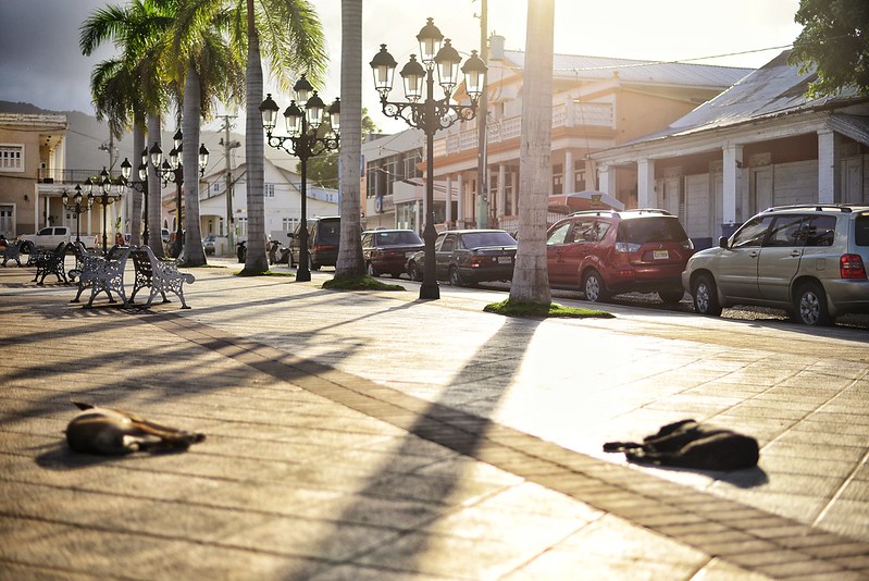 Dog Days by Trip Sixes, on Flickr Dog Days by Trip Sixes, on Flickr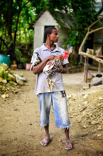 The Fighter by Trip Sixes, on Flickr The Fighter by Trip Sixes, on Flickr
|
|
#
?
Dec 10, 2014 02:17
|
|

|
krackmonkey posted:The first portrait I think could stand to have greater contrast and shadow, as it stands right now the light isn't very flattering and it doesn't evoke any feeling. Hmm, I cropped the 2nd one a bit but I don't know what I could do about the bottom corner other than cropping it more to 2/3rds. Also fixed some lens distortion I didn't notice the 1st time going over it. 
|
|
#
?
Dec 10, 2014 03:35
|
|
|
krackmonkey posted:
For the second one I'm torn on what's the subject. The lights, palm trees, and cars lead me in to the picture but then there's nothing there at the end. As for the sleeping dogs, I wish that they were in focus. I also feel that there are two potential subjects, one created by the dogs and the other by the leading lines. I'm a bit distracted. As for the third picture, love it. Reminds me very much of where I live. (Panama countryside) I think it could have been a little bit better if you setup the shot so that the right side of the frame was to his and the rooster's backs. Then you could follow their eyes a bit more and wonder what they are looking at. Having them in the center works great as well though. And for my pictures...  Panama 129 by esa_foto, on Flickr Panama 129 by esa_foto, on FlickrI'm a bit disappointed I didn't get my camera ready in time to take this shot and my friends had already walked out of the frame. However I really like the yellow flowers on the ground that I think really helped the picture. There's some very rough leading lines that pull the viewer into the picture and on and out of the frame... as if you were on the hike.  Panama 127 by esa_foto, on Flickr Panama 127 by esa_foto, on FlickrI was trying to imitate stuff I see here in The Dorkroom and think I nailed it pretty well.  Panama 126 by esa_foto, on Flickr Panama 126 by esa_foto, on FlickrIf only the plant was turned a bit more to get a better view of the leaves. The subject of the picture is almost hidden.
|
|
#
?
Dec 16, 2014 02:48
|
|

|
Chekans 3 16 posted:I really like both of these, the first one is very moody. The sense of it being a cold, early morning is presented very well. I'm not a huge fan of these, I'm not sure if it's just the style of fashion photography or what, but it just feels like a school portrait assignment. There's nothing I can really point out that's technically wrong, they're just... there. There's not a lot of pop in them. But again, that might be the style you went for. krackmonkey posted:I just got back from the Dominican Republic, which is an incredibly photogenic country, it feels like cheating. God drat, those are amazingly textured. Huhu, I like your first one, though I'm not usually a fan of aspect ratios with that much headroom and that little width. It shouldn't feel as good as it does, but it works for me. This thread is pretty difficult for me to do, to be honest, because almost all of the work in here is amazing and I feel lil' old me has no ability to criticize this amazing stuff. 'Cause even the stuff I'm not a fan of is pretty good.  Now, since I can criticize my own work and it counts, I can already point out I'm not a huge fan of the angle I chose, and I might have benefitted from putting the focus on the drill, if I was gonna have the smoke that sharp. But other than that, I DO kinda like how the background turned out, it's there without drawing attention to itself.  I like the angle on this one better, and the focus turned out well. I just wish I had the smoke in it.  I took a trip to a beach near me, and some of the bird shots turned out okay.
|
|
#
?
Dec 16, 2014 19:07
|
|

|
huhu posted:And for my pictures... The first one is a big could-be. If they were closer to you, if the flowers in the foreground where in focus, if you dodge and burned to get more textures on the forest, could be a very nice picture. As it is, it doesn't do much to me. Second one is pretty baller. It just feels like you weren't perfectly straight with it. Maybe some perspective/horizont fix? I like the textures and colour, but it does feel a little bit too yellow. And what the hell is that? Third is a little boring, your subject isn't separated enough. Maybe if you shot it from a lower angle so that the leaves wouldn't mix with the moss/whatever the green thing growing on the stump is. But I don't feel the subject is particularly engaging. You could make it better, but ultimately I think it's a bit boring. Those three are from a series I'm working on based on patagonian landscapes. They're mostly straight on horizon shots, throwing some human elements here and there. I have the whole series more or less ready, but am really shy of showing it to anybody and printing them large as I want, with the whole dunning-kruger poo poo that could be going on. Flickr also sharpened them eveeen more  Rain in Natales by Hernando Rosa, on Flickr I think the clouds and rain here make for a dramatic contrast with the small boat  Sunset at Punta Arenas by Hernando Rosa, on Flickr Clich� as hell but i like how the water and sky blend. Also dropped a lens while trying to be sneaky/fast to take it, so drat if I'm not trying to use it.  Rio Gallegos seaside by Hernando Rosa, on Flickr This is me wanting to do landscapes like a lot of people here do and I love and failing at it. Primo Itch fucked around with this message at 20:20 on Dec 16, 2014 |
|
#
?
Dec 16, 2014 20:16
|
|
|
Thanks for the tips. As for what it is, I'm guessing some sort of a frame that held something at sometime.
|
|
#
?
Dec 17, 2014 20:41
|
|
|
Primo Itch posted:The first one is a big could-be. If they were closer to you, if the flowers in the foreground where in focus, if you dodge and burned to get more textures on the forest, could be a very nice picture. As it is, it doesn't do much to me. I like the shots but in all of them there's a bit of distortion - the horizon bows down at the middle and back up at the sides. It's not huge but it caught my eye immediately. I took a screencap with the top of a window to serve as a straightedge: 
|
|
#
?
Dec 18, 2014 03:04
|
|

|
VelociBacon posted:I like the shots but in all of them there's a bit of distortion - the horizon bows down at the middle and back up at the sides. It's not huge but it caught my eye immediately. Well caught. That must be some lens distortion. I guess I'm so used to it I didn't notice. Now to try to figure how to fix it in photoshop. Thanks.
|
|
#
?
Dec 18, 2014 17:41
|
|
|
Here are two shots from my half-frame camera. I have been trying to work on composing an image across multiple frames. Then, when I scan the film, I can scan in sets of neighboring frames as one image. Sometimes, like in the first one, I try to capture the same subjects through time. Other times, I try to capture a subject and then use the neighboring frame to give more of a sense of the background. img310 img310 I think I'll just have to live with this one being totally underexposed. I didn't really like the results from digitally bringing the exposure up further.  img169 img169This one has a weird line that spans both frames. I think either the film was bent or hadn't dried all the way when I scanned it. I think it's kind of cool in a lo-fi way, so I haven't bothered trying to fix or re-scan it. mulls fucked around with this message at 02:53 on Dec 19, 2014 |
|
#
?
Dec 19, 2014 02:48
|
|
|
mulls posted:Here are two shots from my half-frame camera. I have been trying to work on composing an image across multiple frames. Then, when I scan the film, I can scan in sets of neighboring frames as one image. Sometimes, like in the first one, I try to capture the same subjects through time. Other times, I try to capture a subject and then use the neighboring frame to give more of a sense of the background. The first one I really want to like but the last frame is weird - after the first two where the woman's facial expressions as she looks at the man really convey something of her personality and the conversation they are having, in the third they're suddenly looking at you, the photographer and/or me, the viewer and for me it's jarring. It feels like the fourth wall just got broken and it's the punchline to a gag. Maybe you were going for something along those lines but I don't quite get it. I do really enjoy the transition from the first frame to the second though. The second I don't think I'd have understood if you hadn't explained it. The first frame doesn't really have anything in it to link it to the second or indicate that it's supposed to be setting the scene. It doesn't really have a scene, it's a flag with some kind of logo on it and a cloudy sky more or less identical to the one in the second frame, and it tells me very little at all about the location. I hope I'm not coming across too harsh, what you're doing is way more ambitious and creative than anything I've ever attempted, they're interesting photos and I think you have some great ideas. Looking forward to seeing more.
|
|
#
?
Dec 19, 2014 10:18
|
|


|
Chekans 3 16 posted:I really like both of these, the first one is very moody. The sense of it being a cold, early morning is presented very well. I think these are great portraits of the model, but not great pictures of the clothing. The lighting is kind of moody and cool, but, especially in the second shot, a lot of the detail is hidden in shadow.
|
|
#
?
Dec 20, 2014 01:47
|
|
|
 light up by difficult listening, on Flickr mulls posted:
This is a case of "I get what you're going for", and I kinda like it but it's not quite all there for me. Diptychs and triptychs are almost as old as art itself but you're not building enough out of the series, it doesn't feel like I'm getting an impactful conclusion out of the juxtaposition or narrative here. Out of all of them on your Flickr, I think I like these two the most, just out of some aesthetic gut reaction (or maybe I just like flags). More than the ones you posted , they feel like they're building up to make an impression of an event, which is important in these kinds of photos. Still, though, neat idea!
|
|
#
?
Dec 20, 2014 18:36
|
|

|
Magic Hate Ball posted:
I love, love, love the graphical quality of this. It's on the edge where it's barely really 'photography' any more, and I dig it. Crossposted to the portraits thread, I've gone back to manually loving with color temperature. I cool the whole photo, then paint in warmth on the face. It was cold, I wanted it to feel cold. Don't really know if it's cheesy or not.  Untitled by thetzar, on Flickr Untitled by thetzar, on FlickrEdit: slightly de-vignetted  Untitled by thetzar, on Flickr Untitled by thetzar, on Flickr
thetzar fucked around with this message at 14:09 on Dec 23, 2014 |
|
#
?
Dec 22, 2014 16:10
|
|

|
thetzar posted:Crossposted to the portraits thread, I've gone back to manually loving with color temperature. I cool the whole photo, then paint in warmth on the face. It was cold, I wanted it to feel cold. Don't really know if it's cheesy or not. I'd say it's almost cheesy to a little too cheesy depending on taste. You are almost into selective color territory here, but I think the colors you chose and their spacial relationships work well. I'd tone it down personally but I'm sure there are a bunch of people who wouldn't even notice anything had been edited at all.  2014-802 by Tom Rintjema, on Flickr
|
|
#
?
Dec 22, 2014 16:16
|
|
|
krackmonkey posted:The first portrait I think could stand to have greater contrast and shadow, as it stands right now the light isn't very flattering and it doesn't evoke any feeling. I actually enjoy how the dogs are out of focus. It gives them a real feeling of laziness on a warm sunny day without a care in the world.
|
|
#
?
Dec 23, 2014 07:25
|
|


|
Arrgytehpirate posted:I actually enjoy how the dogs are out of focus. It gives them a real feeling of laziness on a warm sunny day without a care in the world. Thanks for noticing that, I was wondering if anyone else was going to cue into that. The heat and humidity in the Dominican Republic was pretty intense, and I really wanted to capture that dreamlike feeling that just laying down or grabbing a seat on those benches would be a wonderful moment of escape.
|
|
#
?
Dec 23, 2014 20:51
|
|
|
Magic Hate Ball posted:
This is really cool. I also notice that my eyes start at the bottom and move up and to the left, which is unusual. I think part of what makes this great is that the figure leans diagonally, which is a lot more interesting tracing a path straight upward. My one critique is that the perspective makes it feel like the shape is falling away as I move up because it starts to get narrower towards the top. I wonder if it would be less unsettling if taken from a taller vantage so you get less of that "looking up from below" effect. Magic Hate Ball posted:This is a case of "I get what you're going for", and I kinda like it but it's not quite all there for me. Diptychs and triptychs are almost as old as art itself but you're not building enough out of the series, it doesn't feel like I'm getting an impactful conclusion out of the juxtaposition or narrative here. Out of all of them on your Flickr, I think I like these two the most, just out of some aesthetic gut reaction (or maybe I just like flags). More than the ones you posted , they feel like they're building up to make an impression of an event, which is important in these kinds of photos. Still, though, neat idea! Thanks for the critique. I agree I still need to think more about how to compose across multiple frames for more impact. I think it's kind of telling that your favorites were the ones that were totally accidental and hadn't been consciously framed. Here're a portrait I took with a 1990s point and shoot. 
mulls fucked around with this message at 03:14 on Dec 24, 2014 |
|
#
?
Dec 24, 2014 03:08
|
|
|
mulls posted:This is really cool. I also notice that my eyes start at the bottom and move up and to the left, which is unusual. I think part of what makes this great is that the figure leans diagonally, which is a lot more interesting tracing a path straight upward. dust yo negs, man
|
|
#
?
Dec 24, 2014 03:20
|
|


|
Mr. Despair posted:dust yo negs, man Usually I would either re-wash or at least digitally edit negs that came out that dusty, but I think it goes with the aesthetic here.
|
|
#
?
Dec 24, 2014 03:30
|
|
|
Magic Hate Ball posted:
I really like this photograph. It is a really eerie atmosphere. Love the clouds in it particularly. Is this a long exposure at dusk?
|
|
#
?
Dec 24, 2014 06:34
|
|

|
There are some old rusty bridges in my area so I wanted to get some shots of those. I took some ok ones, but nothing I really liked, but it did give me some ideas on how to do something different next time. I wanted to capture the rusty texture and scale of the bridge but I don't think I succeeded. One photograph I liked, posted below, but I liked it because the sun was reflecting off the creek and made a light pattern on the bridge supports. I tried to do a bracket set with Luminance HDR, but I couldn't get it to align the three photos taken from a tripod, so it ended up with weird shadowy things all over.  _IGP5855 by RedlegSA, on Flickr _IGP5855 by RedlegSA, on Flickr
|
|
#
?
Dec 25, 2014 20:57
|
|
|
I think I may have to give up on getting good at using the Lomo LC-A. It's such a fun and convenient pocket-sized camera, but I'm not sure I'm really getting it. Part of it is that you only have a small area in the center that's remotely sharp, so subjects have to go in the middle of the frame. I think a bigger issue is that 32mm is just too wide for the way I think about composition. Is there some trick to using wide lenses other than to stand way closer to my subject than I do? img420 img420 img413 img413
mulls fucked around with this message at 03:43 on Dec 28, 2014 |
|
#
?
Dec 28, 2014 02:55
|
|
|
Mulls: sorry to 'skip' critiquing your photos - I don't do that style of photography at all and don't have any valuable criticism. I think the one of the yard is the more interesting shot.Redleg posted:There are some old rusty bridges in my area so I wanted to get some shots of those. I took some ok ones, but nothing I really liked, but it did give me some ideas on how to do something different next time. I wanted to capture the rusty texture and scale of the bridge but I don't think I succeeded. One photograph I liked, posted below, but I liked it because the sun was reflecting off the creek and made a light pattern on the bridge supports. It's weird that your shots wouldn't line up but it could be the water reflection/water surface being too 'different' in each shot for the algorithm. There should be an option in the software for when you've shot with a tripod that turns off the auto-align. My criticism of this shot is that I think the bridge is the most interesting part of the scene and it's positioned mostly out of frame. I get that you were aiming for the water reflection to be your subject here but my eye really isn't drawn to that area with the current framing. I think the shot would be stronger cropped like this, or shot angled up to catch more detail from the bridge. My eye doesn't find the water or shoreline/woods interesting and I feel like those areas dominate the photograph. This is a shot near an airport.  Sharpening by TCZPhotography, on Flickr Sharpening by TCZPhotography, on Flickr
|
|
#
?
Dec 30, 2014 08:25
|
|
|
VelociBacon posted:It's weird that your shots wouldn't line up but it could be the water reflection/water surface being too 'different' in each shot for the algorithm. There should be an option in the software for when you've shot with a tripod that turns off the auto-align. I hadn't been able to express it, but this is how I feel too. The diagonal lines in the photo (the bridge and its shadow) draw the eye toward the edge of the frame, and it never occurs to you to look at the reflection in the water, which was intended to be the subject. I actually find my eye following the shadow to the left edge of the frame and then just stopping there, meaning I don't really look at the bridge either. I like your crop. VelociBacon posted:
I really like the colors here. What is casting the orange light at the bottom of the frame? Is that post processing?  img431 img431Here's another shot from that same roll through my LC-A. I'm also wondering if these wouldn't all be better in color. I feel like the color stuff I've put through the LC-A all came out better.
|
|
#
?
Dec 30, 2014 15:37
|
|
|
mulls posted:I really like the colors here. What is casting the orange light at the bottom of the frame? Is that post processing? The color/light there is from a sunset in beautiful Vancouver BC. In post I just cropped and aligned. I like the B+W for these kind of shots - otherwise bland color shots gain a lot of drama in grayscale. This is obviously well known for street photography and I think the one you posted of the sunglasses guy would be a really uninteresting shot in color. If the camera you're using is limited in sharpness to just the center it probably favors the user to keep the elements of the shot as simple as possible (no distracting color to accentuate the limitations of the camera in the peripheries, etc).
|
|
#
?
Dec 30, 2014 18:09
|
|
|
Redleg posted:
I like the colours on this photo but due to its fov i feel constrained on where my eyes can look. Also, with so many lines in the picture (shadows, trees), those light patterns under the bridge are hard to see. One other thing i like is that it gives me a HL 2 vibe ") I think black and white is fitting for this picture, reminding me of the famous Raising the Flag on Iwo Jima (albeit, a little less epic  ). ).I just got a new camera this Christmas (an Olympus XZ-2), my first camera in years (i had a Canon A590IS before) and i'm really excited with it, learning things every day. Here are three seasonal pictures, the beautiful, the fight and the desolated.   
|
|
#
?
Jan 2, 2015 20:29
|
|

|
squirt the daisies posted:I like the colours on this photo but due to its fov i feel constrained on where my eyes can look. Also, with so many lines in the picture (shadows, trees), those light patterns under the bridge are hard to see. One other thing i like is that it gives me a HL 2 vibe Perhaps this is some kind of amazing art but I can't say anything about it. A dog, this is something you show people and say "look at a picture of my dog". It is a pretty nice dog and you got a photo of it. When I look at the picture I tend to look at the dog's butt when I should be looking at the dogs head and what it is doing. Focus, composition, angle and what is the dog doing down there? I like the color and contrast, composition ~ok~you gave some thought into that so the composition feels "calm" but it is annoying that it is leaning to the right. The photo tells me some story of that kids have had a fun time there, it is definitely not abandon though. The margin on the left feels slightly tight.  Harrods by dabrovnijk, on Flickr  Untitled by dabrovnijk, on Flickr  Silage by dabrovnijk, on Flickr erephus fucked around with this message at 00:27 on Jan 3, 2015 |
|
#
?
Jan 3, 2015 00:17
|
|
|
squirt the daisies posted:I like the colours on this photo but due to its fov i feel constrained on where my eyes can look. Also, with so many lines in the picture (shadows, trees), those light patterns under the bridge are hard to see. One other thing i like is that it gives me a HL 2 vibe find a copy of understanding exposure and read it, and then don't bother naming all your pictures cause man it's weird and if your picture needs a name to explain what's going on then it's probably not doing it's job your snow looks really blue on my screen too, might want to check your white balance  PC230055.jpg by MrDespair, on Flickr PC230055.jpg by MrDespair, on Flickr PB090156.jpg by MrDespair, on Flickr PB090156.jpg by MrDespair, on Flickr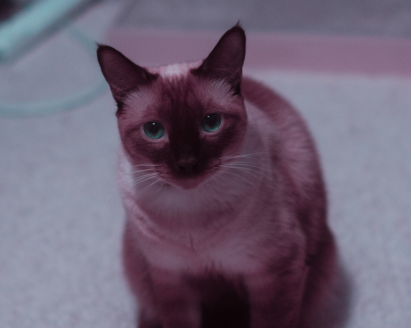 _MG_0757-Edit.jpg by MrDespair, on Flickr _MG_0757-Edit.jpg by MrDespair, on Flickr
|
|
#
?
Jan 3, 2015 01:14
|
|
|
Mr. Despair posted:don't bother naming all your pictures cause man it's weird  Pretty much anything past an informational title is almost always pretty 
|
|
#
?
Jan 3, 2015 02:17
|
|

|
erephus posted:
This is my favorite from your set. The tractor one, and I love tractors, I think would be better with more of the tractor and maybe trample down the high grass in front of it to show your dominance over the plant kingdom and get it out of the way. Its blocking the bales and is distracting to me. The silage one is a really pretty pattern and lovely greens. The sky maybe could benefit from contrast or a little more blue to bring out the clouds. It is a strong photograph as is though and I really like it.
|
|
#
?
Jan 3, 2015 02:56
|
|
|
erephus posted:
Super into this. The white objects regularity gives a very intuitive sense of how far the field goes back and a very nice set of visual lines to follow, then there's a clearly established horizon line that's broken up just enough by the curvature of the mountain line and the forest in front. Very well composed. I wish the sky was a bit more dramatic but you're not exactly in charge of that.
|
|
#
?
Jan 3, 2015 21:56
|
|

|
erephus posted:
I don't really know much but I do really like the colors and how it draws my eyes farther and farther back. Would love to visit a place like that one day. Ended up picking up a DSLR (Pentax K5-iis) after years of wanting to get into photography. I don't really have a clue what I'm doing but I'm trying to read a lot, and I have a copy of Understanding Exposure I'm going to begin reading next week. These will probably come off really point and shooty but have to start somewhere!  IMGP0326.jpg by alexmthorpe, on Flickr IMGP0326.jpg by alexmthorpe, on Flickr IMGP0303.jpg by alexmthorpe, on Flickr IMGP0303.jpg by alexmthorpe, on Flickr IMGP0371.jpg by alexmthorpe, on Flickr IMGP0371.jpg by alexmthorpe, on FlickrI have a copy of Lightroom and I'm mostly just moving sliders and seeing what they do so the PP is probably weird. So much to learn but I'm having a blast so far.
|
|
#
?
Jan 4, 2015 01:48
|
|
|
Thorpe posted:Ended up picking up a DSLR (Pentax K5-iis) after years of wanting to get into photography. I don't really have a clue what I'm doing but I'm trying to read a lot, and I have a copy of Understanding Exposure I'm going to begin reading next week. These will probably come off really point and shooty but have to start somewhere! 1st photo: The lights are blown out and kind of ugly. Compositionally, you have a lot of dead space in the upper left where nothing is really happening. I think by shooting straight up from below, you tried to give an impression of peering upward at something very large, but using a wider angle and getting more of the neck in frame would give a better sense of scale and make the subject more impactful. This would also have the advantage of making the head take up less of the frame, meaning that you could have it fill more of the top and left without having any parts cut off. In short, the really interesting part of the subject is out of frame to the bottom and to the right. 2nd photo: I think you missed focus slightly because the wall to the right of the medallion is blurry. That could also be hand shake. Shooting from an angle instead of dead on distorts the subject. This is useful if you are trying to lead the eye towards whatever is revealed to the left of the subject, but what's there is an empty doorway and then a few inches of what might be some wood. To a certain extent, this is the same as the problem with the first photo. In both, the entire left third of the photo isn't much to look at. 3rd photo: This is great. The exposure is mostly right, but I would err on underexposing a tiny bit in order to tame the lights, or you could selectively bring down the highlights. The symmetry is nice. Overall, I like it. Photography is mostly very frustrating, but it's also really fun, so definitely stick with it. I haven't developed any new film in a while, so here's an old shot from a while ago. Looking at it again, I should probably crop out that blown out billboard in the top right.  img051 img051
mulls fucked around with this message at 03:46 on Jan 4, 2015 |
|
#
?
Jan 4, 2015 02:55
|
|
|
Thorpe posted:I don't really know much but I do really like the colors and how it draws my eyes farther and farther back. Would love to visit a place like that one day. First two are fine snapshots of stuff in a museum for you to file away then one day when you're looking through your photos be like "Oh hey yeah I remember that time I went to the museum and saw the mastodon skeleton and the Teddy Roosevelt bas relief. That was a nice day." The third one is a nice photograph though I wish it weren't cropped so much. Seems like you did a really nice job of standing right in the middle and getting the symmetry perfect. When I look at it big on flickr it could be a little sharper. Might be camera shake, try using a faster shutter next time. 1/25 is a little slow for 18mm on a crop body. There's also some distortion evident in the ceiling that's being held up by those two big columns. Do you have Lightroom set to correct the distortion from your lens? All in all though it is a nice composition and a pleasing subject. It's a bit more interesting than the first two pictures.
|
|
#
?
Jan 4, 2015 04:00
|
|
|
Dren posted:First two are fine snapshots of stuff in a museum for you to file away then one day when you're looking through your photos be like "Oh hey yeah I remember that time I went to the museum and saw the mastodon skeleton and the Teddy Roosevelt bas relief. That was a nice day." I agree about the first two, definitely still in the new camera honey moon stage! The third one I cropped a little bit but nothing good was lost, I was standing on top of a bench that was against a wall. I would have loved to get a bit farther back. I used lens corrections in Lightroom, the ceiling held up by the columns is cylindrical so that may be what you're seeing. I also wish it were a bit shaper. I was shooting on aperture priority mostly because I seem to have the best luck so far on that setting. I can't wait to get out an shoot more! It's such a good excuse to go do fun stuff too. Thanks for the constructive criticism.
|
|
#
?
Jan 4, 2015 05:20
|
|
|
Thorpe posted:I also wish it were a bit shaper. I was shooting on aperture priority mostly because I seem to have the best luck so far on that setting. While aperture priority is great, shooting this kind of static stuff is a really good time to get used to manual settings on your camera.
|
|
#
?
Jan 4, 2015 05:54
|
|
|
I don't know how auto ISO works on Pentax but if it's like Nikon you can set a minimum shutter to make sure you don't get camera shake while shooting in A. Or use manual like Velocibacon suggests.
|
|
#
?
Jan 4, 2015 06:01
|
|
|

|
| # ? Jun 3, 2024 11:36 |
|
|
If you still want automatic exposure, switch to shutter priority and pick the slowest shutter speed that you're confident won't be shaky.
|
|
#
?
Jan 4, 2015 06:19
|
|