


|
this is lovely  , there is an extreme amount of visual depth and range to it which appeals to me, it feels like it really captured a vibe, the only issue is as you mention the blown out billboards kinda screwing with the composition, it seems that you'd lose a lot of real estate by cropping it out entirely though. , there is an extreme amount of visual depth and range to it which appeals to me, it feels like it really captured a vibe, the only issue is as you mention the blown out billboards kinda screwing with the composition, it seems that you'd lose a lot of real estate by cropping it out entirely though. click for full  click for full these are both forgettable but i've been workin a lot with color so that i can pull more photos out like the first one, so this is more of a technique/post thing for me right now
|
 #
?
Jan 4, 2015 23:34
#
?
Jan 4, 2015 23:34
|
|


|

|
| # ? May 27, 2024 12:32 |
|
|
Mido posted:
I don't think this one is bad at all. I think its a fascinating photo, the haze obscuring wherever the lift is going to makes this interesting to look at for me.
|
|
#
?
Jan 5, 2015 04:48
|
|

|
Mido posted:this is lovely The second one is kind of interesting but the banding and dust kill it for me.
|
|
#
?
Jan 5, 2015 07:18
|
|

|
grack posted:The second one is kind of interesting but the banding and dust kill it for me. time to start using Flickr instead of letting imgur wreck poo poo
|
|
#
?
Jan 5, 2015 11:05
|
|
|
Thorpe posted:I agree about the first two, definitely still in the new camera honey moon stage! A good rule of thumb is 1/60 or faster for hand-held shots. On the staircase photo, you're at 1/25, which will introduce some camera shake. This will all be explained in Understanding Exposure, but you'll either have to have a lower f-stop which sacrifices depth of field, or increase ISO, which adds noise. Try to keep your hand-held shots above 1/60 (or even faster if you really want sharpness).
|
|
#
?
Jan 5, 2015 19:54
|
|

|
totalnewbie posted:A good rule of thumb is 1/60 or faster for hand-held shots. On the staircase photo, you're at 1/25, which will introduce some camera shake. This will all be explained in Understanding Exposure, but you'll either have to have a lower f-stop which sacrifices depth of field, or increase ISO, which adds noise. I think a more useful rule of thumb is 1/focal length, so if you're using a 300mm lens you want to shoot for 1/300, if you're shooting a 15mm lens you can probably get away with 1/15. That's assuming you're shooting 35mm, so on crop you might be a little worse off, but still, it's a good starting point.
|
|
#
?
Jan 6, 2015 03:25
|
|


|
Mr. Despair posted:I think a more useful rule of thumb is 1/focal length, so if you're using a 300mm lens you want to shoot for 1/300, if you're shooting a 15mm lens you can probably get away with 1/15. That's assuming you're shooting 35mm, so on crop you might be a little worse off, but still, it's a good starting point. 1/(focal length * crop factor) works for me
|
|
#
?
Jan 6, 2015 04:58
|
|

|
Dren posted:1/(focal length * crop factor) works for me For me too. And then of course there are some lenses with image stabilization that works like magic.
|
|
#
?
Jan 6, 2015 07:34
|
|

|
Popelmon posted:For me too. And then of course there are some lenses with image stabilization that works like magic. Totally. I took a 1/3 shot at 300mm on a crop sensor with the VC from my tamron 70-300 and it's sharp as hell. It's a fanstastic lens.
|
|
#
?
Jan 6, 2015 09:01
|
|

|
Yeah, I'm gonna need proof of that.
|
|
#
?
Jan 7, 2015 13:08
|
|

|
William T. Hornaday posted:Yeah, I'm gonna need proof of that. I went back to screenshot the lightroom info but realized it was actually at 1/6, so I grabbed my camera and took these just now, all of these at 300mm on a crop sensor, 1/3s. I guess they're not as sharp as I expected.    E: these aren't actual PAD submissions just academic fluffing of tamron's VC VelociBacon fucked around with this message at 12:28 on Jan 8, 2015 |
|
#
?
Jan 8, 2015 03:54
|
|
|
Mido posted:
This is real nice, but it's too bad about the Imgur banding. I wish there was a little more grey space at the bottom of the frame mulls posted:I haven't developed any new film in a while, so here's an old shot from a while ago. Looking at it again, I should probably crop out that blown out billboard in the top right. Great sense of space and place and I loooove these deep, rich tones, but yeah, the billboard should go.  IMG_5653 by difficult listening, on Flickr
|
|
#
?
Jan 10, 2015 03:49
|
|

|
Magic Hate Ball posted:This is real nice, but it's too bad about the Imgur banding. I wish there was a little more grey space at the bottom of the frame Thanks for the critique. I actually have the same comments for yours. The sense of space and tones are great. I love how the sky and water and almost the same blue and are differentiated by texture. You get a really good sense of emptiness and distance. Here are two from the roll I developed today. I shot both with a late 90s point and shoot. I think I want to go back to where that statue is with an SLR. I wish I could control my DOF so I could get better bokeys to separate the face and background.  img453 img453 img439 img439
|
|
#
?
Jan 10, 2015 04:43
|
|
|
Magic Hate Ball posted:
This is lovely, and annoying as hell. I many times SEE beautiful landscape skylines or sunset lighting situations, take a picture, and come back realizing I've taken a useless photo -- some nice colors or tones, but no subject, nothing to draw the eye � just boring (to me at least). This, however, works really well doing what I can't. I'm going to say the reasons for this are: (1) There's a subject, the ships. They're clustered closely enough that the line of them forms a single frame-spanning 'object.' (2) The sky and sea merge together tonally to create a single field, focusing the eye even more on the subject. This also works well with... (3) While the ships are obviously varied in distance, they all sit in a single row/line. This gives them a wonderful graphic quality. Very nice, overall. A series of these would make a great oversized wall. mulls posted:Here are two from the roll I developed today. I shot both with a late 90s point and shoot. I think I want to go back to where that statue is with an SLR. I wish I could control my DOF so I could get better bokeys to separate the face and background. You're on the mark with the first one. I tend to try and avoid photographs of art, simply because it feels like cheating. This changes when there's something interesting happening with the environment around it, but I don't get that here -- and the crispness of the context is exactly what's distracting/bland here. The second one works better for me because of the three hands � mostly because it appears that the mother-to-be appears to be about to slug her prodder. I've got something a bit different today. I thought I posted these a while back, but not in this thread, and not with the entire series online. A friend of mine put together a prompt he sent to a bunch of people who to different types of creative things � music, video, installations, printing, photography. The prompt was a box that contained three objects: a strange white disc with a solar system engraved on one side and an atom on the reverse; a metal ruler that was marked in phases of the moon; and a cryptic telegram dated to the 60s. Each person responded differently, radically so. My response was to create scenes from a non-existent movie, and generate visual ephemera for an uncertain narrative. The idea was to give the view the same vague impression as a movie that you're aware of, but haven't seen. Due to life pressures, I had to work very/too fast. I shot 95% of what ended up being 80+ frames in a single weekend in a blitz I'm not eager to repeat. Many things went wrong. My brainstorming ended up being extremely abbreviated. There are classes of shots I didn't have any attempt to even attempt. Therefore, similar framing is repeated over and over, and I had to constantly try to remind myself to not just execute on that list of 'i know this will work' that we carry around in our heads -- and usually I fell back into those same footsteps constantly. I also used Modelmayhem for the first time, with some ups and downs to that experience. Nevertheless, I came out rather happy with what I had done. I shot color 'film stills,' black and white 'promotional photographs.' and some portrait-like 'movie posters.' I haven't had fun like this since school. The full set is not on flickr. It's here: http://omnoculus.com/albums/and-then/  And Then... by thetzar, on Flickr And Then... by thetzar, on Flickr And Then... by thetzar, on Flickr And Then... by thetzar, on Flickr And Then... by thetzar, on Flickr And Then... by thetzar, on FlickrPlease do take a look at the full set and let me know what you think.
|
|
#
?
Jan 10, 2015 21:17
|
|

|
I've had a DSLR (Canon Rebel EOS XS, I believe) for a few years but until a few weeks ago was just using the kit it came with (I had no idea how much lenses actually matter). I've since then picked up a "EF-S 17-55 f/2.8 IS USM" and have taken a few shots recently that I am happy with the composition, but I have no idea how to effectively use Photoshop/Camera Raw to finish it up. Here's one of my niece, I really had no idea what I was doing here in terms of taking the RAW and mashing buttons on the computer, but I played with the sliders until it felt like it looked right. The foreground is a bit blurrier than I realized after taking the shot, too, which is disappointing, but I'm happy with how opening up the aperture ended up.  Niece-12-30-2014 by boostphoto, on Flickr I've previously posted this in AI, but I'd really like to be able to take good shots of cars more than people. I don't know what "ethics" rules of photography I broke here, but I spent a few hours in Photoshop on this merging together two versions (high and low saturation, mostly) of the shot from Camera Raw and polishing up some gross spots (e.g. writing on the ground). I don't know how to take good outdoor photos where the trees/grass aren't too overpowering, that's why I spent some time desaturating nature. I imagine if I used a lower F-stop here it would've put the background out of focus?  Car-1-10-2015 by boostphoto, on Flickr
|
|
#
?
Jan 11, 2015 23:53
|
|

|
POKEMAN SAM posted:I've had a DSLR (Canon Rebel EOS XS, I believe) for a few years but until a few weeks ago was just using the kit it came with (I had no idea how much lenses actually matter). I've since then picked up a "EF-S 17-55 f/2.8 IS USM" and have taken a few shots recently that I am happy with the composition, but I have no idea how to effectively use Photoshop/Camera Raw to finish it up. This shot looks wildly oversharpened, and the overall color cast is off-puttingly cold for my taste. Your subject looks cute, but the colors of the shot suggest a chilly, aloof atmosphere that's not really consistent with the subject matter. Before you start mashing buttons and sliding sliders, you should ask yourself what feeling or message you're trying to convey with your post-processing decisions. For reference, a redder/yellower color balance is generally understood to suggest warmth and livelihood, like this:  This is a quick, slapdash edit, and it's probably too far in the other direction, but I feel like it demonstrates my point. Most people don't want to look chilly and corpselike in pictures. quote:I've previously posted this in AI, but I'd really like to be able to take good shots of cars more than people. I don't know what "ethics" rules of photography I broke here, but I spent a few hours in Photoshop on this merging together two versions (high and low saturation, mostly) of the shot from Camera Raw and polishing up some gross spots (e.g. writing on the ground). I don't know how to take good outdoor photos where the trees/grass aren't too overpowering, that's why I spent some time desaturating nature. I imagine if I used a lower F-stop here it would've put the background out of focus? Unless you're aspiring to be a photojournalist, you don't need to worry about the amount of post-processing that goes into a final image. The result is all that matters. Do whatever you need to do so that the final picture represents the image you want to see. This picture is better than your first photo, but it suffers from a couple of issues, regardless. I know that it's hard to find level places to photograph cars, but the trees, pond, and horizon in this picture are tilted too much in this photo to allow for the suspension of disbelief. You could crop the picture more tightly so that the distracting elements in the background aren't as prominent in the frame, but the tilted horizon is really something that you need to fix in the pre-shot phase. That orange paint does stand out wonderfully against the green background, though. You could try to use a wider aperture to defocus the background more, but you have to balance that against the need to maintain enough depth-of-field so that the entire car is sharply in focus. My approach would be to find a level surface and a less distracting background, but I don't know the circumstances or purpose of your shot. TheJeffers fucked around with this message at 02:58 on Jan 12, 2015 |
|
#
?
Jan 12, 2015 02:52
|
|

|
thetzar posted:
I like the movie posters placed throughout the series. They break up the story into smaller 'episodes'. However, on fixed-posters-3, the quote reads "Touch. Taste. Touch. Smell. Hearing." so either it's a mistake or I'm missing the quirk there. The processing is lovely with a range of styles on display without being gratuitous. and-then-32 looks somewhat overexposed and has what appears to be a bit of motion blur, looking as if you've tried to save it in post. But this is the only image which stood out to me as inconsistent. The poses of the models and the angles you shot from really lend to the cinematic theme of the series. I really enjoy and-then-21 with the leather-jacket-man backed up against the wall. I guess the red-headed lady came out on top in the end. The final few images do a great job in wrapping up the story, however I'd love to see a super dramatic photograph at the very end such as the brilliant and-then-66 which conveys a sense of victory. This is my first critique here and although I didn't get very technical I wanted to offer my thoughts as I'm a fan of your work.
|
|
#
?
Jan 12, 2015 13:26
|
|
|
thetzar posted:This is lovely, and annoying as hell. I many times SEE beautiful landscape skylines or sunset lighting situations, take a picture, and come back realizing I've taken a useless photo -- some nice colors or tones, but no subject, nothing to draw the eye � just boring (to me at least). This, however, works really well doing what I can't. I'm going to say the reasons for this are: (1) There's a subject, the ships. They're clustered closely enough that the line of them forms a single frame-spanning 'object.' (2) The sky and sea merge together tonally to create a single field, focusing the eye even more on the subject. This also works well with... (3) While the ships are obviously varied in distance, they all sit in a single row/line. This gives them a wonderful graphic quality. I like all the shots and I really like the cinematic theme. My only quibble is that towards the end of the series that you have posted on your web page some of the shots feel like they are not capturing the sense a cinematic scene but rather look like posed photographs. I felt that way about the two shots of the models pointing and the two shots of the redhead at the beach at dusk. All the others I felt like the models conveyed the sense of actors ins a scene or otherwise had a cinematic feel, but those four felt like models being posed for unrelated photographs rather than something cinematic. I don't think there are any bad shots in that series, but the four I mentioned felt to me like they broke the cinematic theme. I hope that makes sense. I really do like the set, and I can really tell you (and the models) were having were having a lot of fun with the concept. I have been getting into a landscape rut, and I really need to start breaking out of it, but since that is what I have been doing lately I could use some critique.  Green Saucer by noonebutme2010, on Flickr Green Saucer by noonebutme2010, on Flickr Air Force Memorial1 by noonebutme2010, on Flickr Air Force Memorial1 by noonebutme2010, on Flickr Carrillon Lions BW by noonebutme2010, on Flickr Carrillon Lions BW by noonebutme2010, on Flickr
|
|
#
?
Jan 12, 2015 23:11
|
|
|
I'm a newbie and can't really offer much except the film stills reminded me of Pictures Generation type stuff. Most of my photos are going to be of artworks, exhibitions, architecture, things other people made, etc. which is fine because I'm learning how to do this as part of a research project into museum exhibitions of contemporary art. I just want to do it well and would appreciate some feedback on technique. I'm still learning some of the basics, my success rate for photos is only just steadying. They look okay to my eyes but a lot of the keepers so far probably aren't textbook exposures. I was trying to work on my composition this time, I did much less cropping than I have been doing. I think I got that into most of my pictures. I think I need to work on lighting, I was struggling with the lighting in the darker parts of the building and some of the edits involved a lot of saving over or under exposed areas. I like the processing but I don't know if it's a little heavy and less is more? It's just tempting having so much control using Lightroom over VSCO. I dulled the colours on this, not beyond recognition but enough to make a difference. I don't know if I'm distorting it by taking that liberty?  20150114-P1140969.jpg by saladdays0, on Flickr 20150114-P1140969.jpg by saladdays0, on FlickrI always thought this building was cool. It was really difficult getting an unobstructed angle but I thought the reflection turned out well and the composition is emphasised. It just looks a little bit off and I can't tell why.  20150114-P1140856.jpg by saladdays0, on Flickr 20150114-P1140856.jpg by saladdays0, on FlickrIn this one I kept the blurred people in the middleground because I liked the contrast with the clear foreground and background. I wanted to get the full circle in but my lens wasn't wide enough, but the composition is still good.  20150114-P1140922.jpg by saladdays0, on Flickr 20150114-P1140922.jpg by saladdays0, on Flickr
|
|
#
?
Jan 15, 2015 05:19
|
|

|
number one pta fan posted:I'm a newbie and can't really offer much except the film stills reminded me of Pictures Generation type stuff. number one pta fan posted:I always thought this building was cool. It was really difficult getting an unobstructed angle but I thought the reflection turned out well and the composition is emphasised. It just looks a little bit off and I can't tell why. number one pta fan posted:In this one I kept the blurred people in the middleground because I liked the contrast with the clear foreground and background. I wanted to get the full circle in but my lens wasn't wide enough, but the composition is still good. On to my own photos. I've been shooting for roughly a year now on a secondhand D300, but it's hard for me to come up with stuff to shoot (partly because it's not exactly a system I can just whip out of my pocket when I come across something I want to shoot), and people mostly bore the hell out of me. I'll try to post pics that roughly show my developing myself.  Made this after buying a 35mm, about 6 weeks after I bought the camera. I was still shooting in jpg like a silly gently caress back then.  T+6 months. Had a thing in a park with a group of friends. This was obviously shot spontaneously, but I think it worked out nice.  Last week. I was wasted, rode my bike back home after deciding in the dead of night that I wanted to photograph an old locomotive (I'll post it tomorrow or something, maybe), and came across this ridonkulously bright construction light with a bunch of traffic things casting a bunch of shadows. Yeah, I went pretty nuts in post (did it immediately after arriving home). Seemed like a good idea at the time and I still like it.
|
|
#
?
Jan 17, 2015 20:49
|
|

|
Leandros posted:
Not really sure what you're going for here aside from 'a snapshot of my friends'. You've got one prominent guy taking up a lot of space out of focus and not looking at the camera, and the guy with the flower crown making an awkward expression (mid-talking) and some sort of gesture that is cut off from the frame. You have another half person on the left side of the frame. If you were telling a story about the prince of the flowers, a wider shot with more context would have helped slightly, but that doesn't solve the problem of it ultimately being cluttered and not telling me anything about the characters. Leandros posted:
This looks incredibly over-processed/sharpened(?)/HDR'd(?), and combined with the dutch angle (or were you just too drunk to hold the camera level?) it comes across as trying to create excitement out of nothing to me. It's possible that you could have created a nice, moody image with less heavy-handed processing and a more level shot detailing the barriers and shadows. If I was shooting this, I think I would have worked the scene more and looked for a better angle (lower?) to accentuate the shadowing.
|
|
#
?
Jan 17, 2015 21:12
|
|

|
Shellman posted:Not really sure what you're going for here aside from 'a snapshot of my friends'. You've got one prominent guy taking up a lot of space out of focus and not looking at the camera, and the guy with the flower crown making an awkward expression (mid-talking) and some sort of gesture that is cut off from the frame. You have another half person on the left side of the frame. If you were telling a story about the prince of the flowers, a wider shot with more context would have helped slightly, but that doesn't solve the problem of it ultimately being cluttered and not telling me anything about the characters. Shellman posted:
")
|
|
#
?
Jan 17, 2015 22:06
|
|
|
Leandros posted:The angle is because I wanted to capture both the majority of the flare as well as the entire shadow of the traffic sign (plus some padding) and I was fully zoomed out, standing on the edge of an overpass.  Sometimes you just can't get the shot. In those cases it's better to curse your luck and wait for the next one.
|
|
#
?
Jan 18, 2015 03:58
|
|

|
Magic Hate Ball posted:
This is so cool. I can tell that it isn't something from Tetris or Pac-Man but I can't really tell what it actually is either. What I'm saying is I like the abstraction! Three very different pictures:  DSCF4860-Edit by SAFistLips, on Flickr DSCF4860-Edit by SAFistLips, on Flickr DSCF4992-Edit by SAFistLips, on Flickr DSCF4992-Edit by SAFistLips, on Flickr DSCF5010-Edit by SAFistLips, on Flickr DSCF5010-Edit by SAFistLips, on Flickr
|
|
#
?
Jan 18, 2015 08:26
|
|


|
Beige posted:I like the movie posters placed throughout the series. They break up the story into smaller 'episodes'. However, on fixed-posters-3, the quote reads "Touch. Taste. Touch. Smell. Hearing." so either it's a mistake or I'm missing the quirk there. number one pta fan posted:I'm a newbie and can't really offer much except the film stills reminded me of Pictures Generation type stuff. Thanks all for the feedback, it's great to hear how other people view the set; and good catch on that poster. Thought I had fixed it... Also, it's amazing to hear my stuff related to the Pictures Generation. You're right in that the story is a bit ambiguous, especially at the end, and more than I would have liked.
|
|
#
?
Jan 18, 2015 16:06
|
|
|
Alright, new stuff It was misty as gently caress yesterday, and I had a day off so I grabbed a random train and ended up in a coastal town with this weird mobile lighthouse. I turned up the saturation a bit but it was mostly just red as all hell, and the mist subdued a lot of the stuff in the background. Only when I got home did I notice I missed the top of the mast, which was dumb, but it's a 2 hour ride so gently caress redoing it. Cropped the bottom left corner in an effort to get a pleasing ratio of width and height which didn't allow for the mast.  Took this a while back, there was dew on a fence of my house and saw the moon reflect in the drops, reminded me of a spider's eyes or some poo poo. I'm not sure about the aperture. I made another shot with f/8 and the DoF on this was preferable, but the bokeh on this lens is not ideal. The yellowish light is from the light in my room, also took a shot while it was off and this looked nicer.  Also a while back, all the line-y goodness sent my spergbrain into a frenzy and I took this shot quite quickly. Tried this with f/14 and the overhead lines were clearer and it was horrible. In fact this might've been better with the focus a bit further.
|
|
#
?
Jan 20, 2015 19:01
|
|
|
Leandros posted:Alright, new stuff I would like to see a version of this without the sliders set to 11
|
|
#
?
Jan 20, 2015 19:11
|
|
|
Dren posted:I would like to see a version of this without the sliders set to 11 Apparently I didn't save the psd, but you can have a look at the RAWs, if you want.
|
|
#
?
Jan 20, 2015 20:05
|
|
|
Leandros posted:Apparently I didn't save the psd, but you can have a look at the RAWs, if you want. What was causing all of that vignetting? I can't tell if you were using a DX lens on an FX body or added a filter. Here are two recent shots. The first is loving around with a big rear end manual 100 to 300mm zoom for all the bokeys.  and this one was cool because the rail and ceiling obstructing the frame give a natural panoramic crop and because of all the shapes. 
mulls fucked around with this message at 20:54 on Jan 20, 2015 |
|
#
?
Jan 20, 2015 20:46
|
|
|
number one pta fan posted:I always thought this building was cool. It was really difficult getting an unobstructed angle but I thought the reflection turned out well and the composition is emphasised. It just looks a little bit off and I can't tell why. After considering the shot, I think maybe it would be better suited portrait rather than landscape. If you're looking to capture the building itself, rather than it's place within the area, it would be better to cut out the surrounding buildings and distractions around the sides and capture a bit of "Padding", as others have called it, at the top and bottom of the frame. As for me, I am new to this forum. I'll go more in depth about my work, gear, experience, etc. later, as I want to get some first impression feedback beforehand.  FINAL-1448 by Tyler M. Simpson, on Flickr I was riding in the passenger seat with my camera out as this man, crossing the street, caught my interest. I didn't have a lot of time, so I raised my camera and caught this one frame. We we're traveling at about 40-50 MPH in the opposite direction at the time, so I didn't have much time to frame.  FINAL-0218 by Tyler M. Simpson, on Flickr I met this woman at the park, she was fishing while waiting for her grandchildren, of which she has 13, to get out of school. I spoke with her a while and asked is she would consent to a portrait, and she gave me her permission. I showed her the preview afterwords, and she remarked,"Hell that ain't a half bad looking lady!".  Furniture Apocalypse by Tyler M. Simpson, on Flickr This last photo was taken as I was, again, riding shotgun in a moving vehicle. I thought the man looked interesting as he sat, waiting for the bus. He was wearing pink shoes.
|
|
#
?
Jan 23, 2015 21:24
|
|
|
Tsimp posted:As for me, I am new to this forum. I'll go more in depth about my work, gear, experience, etc. later, as I want to get some first impression feedback beforehand. Your gear really doesn't matter
|
|
#
?
Jan 23, 2015 22:51
|
|

|
FistLips posted:
This is a great shot and I love the colors. How much planning was this, and how much luck? Did you see the sky and know where to run out to? I'm seeing some haloing along the ridge-line; possible oversharpening?
|
|
#
?
Jan 24, 2015 03:16
|
|
|
thetzar posted:This is a great shot and I love the colors. How much planning was this, and how much luck? Did you see the sky and know where to run out to? I was home for christmas and out walking with a friend. We were just getting home when this happened so I just ran in and got the camera - this picture is taken about 20 meters from my father's house. And yes - I see the haloing too - will have to see if I can't fix that somehow!
|
|
#
?
Jan 24, 2015 10:11
|
|
|
FistLips posted:I was home for christmas and out walking with a friend. We were just getting home when this happened so I just ran in and got the camera - this picture is taken about 20 meters from my father's house. Did you use a tripod, or was it handheld?
|
|
#
?
Jan 24, 2015 18:27
|
|
|
Tsimp posted:After considering the shot, I think maybe it would be better suited portrait rather than landscape. If you're looking to capture the building itself, rather than it's place within the area, it would be better to cut out the surrounding buildings and distractions around the sides and capture a bit of "Padding", as others have called it, at the top and bottom of the frame. This is great. I especially like the composition. It's important that the subject is traveling from the edge into the center of the frame. Also, I think the vertical lines on the right side help give a sense of scale and perspective. Here are two portraits with my 35mm point and shoot. 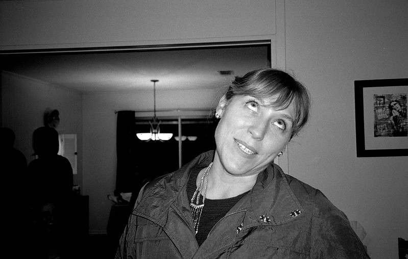 img523 img523 img508 img508
|
|
#
?
Jan 25, 2015 05:01
|
|
|
ansel autisms posted:Your gear really doesn't matter I've been realizing this more and more, as I learn. mulls posted:This is great. I especially like the composition. It's important that the subject is traveling from the edge into the center of the frame. Also, I think the vertical lines on the right side help give a sense of scale and perspective. Thank you, I really like it as well. I think it was a combination of instinct and luck that helped capture it, to be honest. I quite like this portrait as well, it has a really nice feel to it, if you know what I mean. The only criticism I would have is that the necklace she is wearing leads the viewers eye away from her face. However, I am not sure that the picture isn't her reaction to what appears to be her necklace breaking... Oh, and your second portrait is listed as private.
|
|
#
?
Jan 25, 2015 17:55
|
|
|
Tsimp posted:I've been realizing this more and more, as I learn. That's a good catch on the necklace. I didn't even notice that when I was editing. Here's another attempt at showing the second one. I wish that wire weren't growing out of his ear.  img508 img508
mulls fucked around with this message at 19:13 on Jan 25, 2015 |
|
#
?
Jan 25, 2015 19:11
|
|
|
mulls posted:Here's another attempt at showing the second one. I wish that wire weren't growing out of his ear. Yeah,that tangent is really unfortunate. Personally I don't know if you should have shot him with the tree in the background at all, it sort of competes with the central framing of the subject. It might have been stronger to have more empty space behind him and use a slightly shallower depth of field to separate him from the crowd. Here's some shots from me.  Smoker3 Smoker3  Thaimassage Thaimassage  Jay Jay
|
|
#
?
Jan 25, 2015 20:12
|
|


|
Tsimp posted:Did you use a tripod, or was it handheld? Handheld. Exif: ISO 400, 25.4 mm, f/14, 1/125 sec.
|
|
#
?
Jan 25, 2015 21:08
|
|
|

|
| # ? May 27, 2024 12:32 |
|
|
I've been mucking about with my NEX-5T for a while now, I originally picked it up for a trip to Vegas last March and have been trying to develop some skills (I don't have any previous photography experience).I originally was shooting all in JPEG but after getting some help from a few friends I've recently switched to RAW and started using Lightroom for post-processing. On Veteran's Day I drove past this guy on a highway in rural Virginia, apparently he's out there every year.  Rider-2579 by Viper_X83, on Flickr Rider-2579 by Viper_X83, on FlickrI like the backlit nature of this, but I don't think it quite works and there's probably a better position I could've been standing in that would've silhouetted him (and especially his horse) more effectively.  Rider-2565 by Viper_X83, on Flickr Rider-2565 by Viper_X83, on FlickrLooking at this now, I'm really not sure why I pushed in so far. I think if I pulled back just a little bit this could've been much nicer. I do still like it, but I think the fact that the horse's head is cutoff and that his backside is missing takes away from things.  Rider-2552 by Viper_X83, on Flickr Rider-2552 by Viper_X83, on FlickrThis is my favorite of the three, the guy who came up was one of many who wanted to shake the rider's hand, and I think I captured the moment fairly well. JohnClark fucked around with this message at 21:37 on Jan 31, 2015 |
|
#
?
Jan 31, 2015 21:32
|
|
