


|
RangerScum posted:
Not a bad gif, it's an iconic movie scene that will land with most of the audience and the quality is alright (is the aspect ratio right?). The timing on the text is kind of a weird choice though. There's not much point to having the "you have chosen" fade in word by word, it's just the premise and we all knew those words as soon as we saw the old dude. The dramatic tension is all on whether he's gonna say "wisely" or "poorly", so instead you could have "You have chosen" be already there at the start of the gif or soon after, and then a couple of beats to build the tension (maybe even a zoom in on old dude's face to be cheesy) before "poorly" fades in. Also you could show a quick shot of the other dude getting all hosed up which brings in the idea that this poor choice has dire consequences.
|
 #
?
Feb 1, 2015 17:22
#
?
Feb 1, 2015 17:22
|
|


|

|
| # ? May 17, 2024 21:44 |
|
|
JohnClark posted:I've been mucking about with my NEX-5T for a while now, I originally picked it up for a trip to Vegas last March and have been trying to develop some skills (I don't have any previous photography experience).I originally was shooting all in JPEG but after getting some help from a few friends I've recently switched to RAW and started using Lightroom for post-processing. On Veteran's Day I drove past this guy on a highway in rural Virginia, apparently he's out there every year. I think you're dead on. The middle one is weakest because the composition looks a little haphazard and the shadow over his face isn't so attractive. I think the first is the strongest because the gestalt silhouette is the most dramatic. Here's a pretty river. Usually when Portra fades out, it just kind of washes out, but sometimes you get really placid pastels. 
|
|
#
?
Feb 3, 2015 01:43
|
|


|
mulls posted:I think you're dead on. The middle one is weakest because the composition looks a little haphazard and the shadow over his face isn't so attractive. I think the first is the strongest because the gestalt silhouette is the most dramatic. I haven't posted in this thread in years so take my advice with a grain of salt. Portra rules and the color you got in the water is fantastic, and it balances really well with the sky. Flickr raped your sharpening, which is unfortunate, but the flickr way. Watch your edges though, the out of focus tree on the right isn't doing the photo any favors. But I would also challenge you to look outside of the pretty river. Don't get me wrong, if your goal was to take a well exposed photo of a river while you were walking/driving across the bridge, than I think you have rocked it, But proper exposure doesn't really make the photo interesting, and this is just a photo of a river, a river where upper class folks live on its banks, which in my opinion is kinda boring, at least when the only view is of their houses from afar. Get closer, the whole sweeping painterly landscape thing isn't necessarily the end all be all of landscape photography (look at the landscape thread for plenty of evidence). It's a finely exposed photo, but something tells me you can do more. Keep shooting, focus on composition and what is in your frame and rather or not the information matters. Pay attention to light and where it is falling as a scene will look dramatically different if taken at a different time of day. But definitely keep shooting film. I haven't posted my own work for critique in a long time and I desperately need to, so I hope some people come out and tear my poo poo to pieces. I have started (keyword is definitely started) shooting a project on the contemporary south. Mostly it's a reflection of myself through the southern landscape that I live in, but who loving knows if any of that is successful and is coming through. 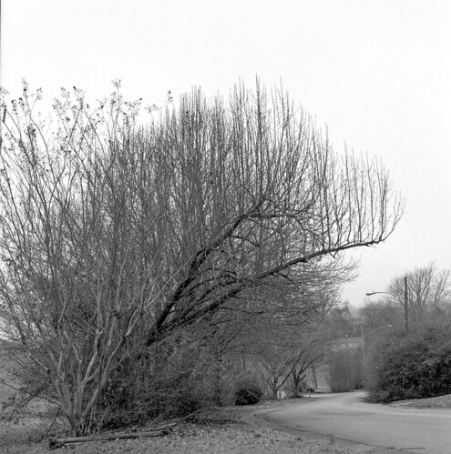 Untitled by Dev Luns, on Flickr Untitled by Dev Luns, on Flickr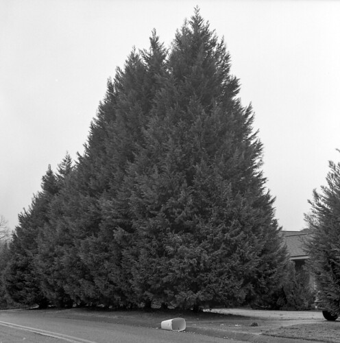 Untitled by Dev Luns, on Flickr Untitled by Dev Luns, on Flickr  Untitled by Dev Luns, on Flickr Untitled by Dev Luns, on FlickrThis is just a bit of what I have started, and I am going to be working on this through the rest of the year. Please rip it to pieces and feed me any and all sorts of feedback. I am shooting daily/nightly so there is more that is coming out, but I would like someone else's view on this and what they see and any advice that can be given. EDIT: hosed up and didn't read the op so I removed a bunch, not trying to bogart the thread. pootiebigwang fucked around with this message at 08:22 on Feb 3, 2015 |
|
#
?
Feb 3, 2015 04:41
|
|

|
Been a while since I posted here. Excuse the FB compression   (USER WAS PUT ON PROBATION FOR THIS POST)
|
|
#
?
Feb 5, 2015 01:59
|
|
|
Long enough to forget the rules apparently!
|
|
#
?
Feb 5, 2015 02:34
|
|

|
pootiebigwang posted:I haven't posted in this thread in years so take my advice with a grain of salt. What you're doing here strikes me as one of those things that works better as a series than as singles. I feel like you're going for a Bernd & Hilla Becher sort of thing. If that's true, great, keep going -- but keep going. The only one of these that stands out to me as a single is the middle one, with the tipped-over trash can. There's a hint of a story/context there that I like. The first one has a tree in a nice shape, but I'm looking more a the road. The third is severely cropped� in an interesting way with the secondary branches framing the center tree � but very different than the others.. I think you should consider whether you want these to be singles � in which case they need to have the strength to stand on their own � or as a set, in which case more similarity needs to be sought (I think). The Bechers were rigorous about consistent framing and choice in subject. That rigor turned their work from 'here are a bunch of random photos of blast furnaces' into 'whoa, this has impact.' So my team ended up working out of a partner's nearly deserted cubical farm this week. Managed to snag an hour to do these sorts of things.  things to do in san jose when you're dead inside 1 by thetzar, on Flickr  things to do in san jose when you're dead inside 4 by thetzar, on Flickr  things to do in san jose when you're dead inside 9 by thetzar, on Flickr The full set is over here.
|
|
#
?
Feb 8, 2015 22:44
|
|

|
 IMG_6360 by difficult listening, on Flickr  IMG_6415 by difficult listening, on Flickr  IMG_6366 by difficult listening, on Flickr thetzar posted:So my team ended up working out of a partner's nearly deserted cubical farm this week. Managed to snag an hour to do these sorts of things. These are fun, and I really dig the clean, powdery look. Looking at the whole set, I think the only thing I want is more of a specific focus. You've got a lot of hands, and then you have a couple other things, and if it were just the hands or a more even mix then it would feel a little more cohesive. The only one that really doesn't work for me is number 6, which doesn't have the same abstracted, puppet feel as the others do. You sense too much that she's a human with her face down, which breaks the spell of the other images, which imply a lifelessness (it's also a completely different lighting style). I think if you clumped together all the hand photos with the thumbs up at the end you'd have a really funny set.
|
|
#
?
Feb 8, 2015 23:21
|
|

|
Magic Hate Ball posted:
This... is some of the best, most useful feedback I've ever gotten. Thank you. Can you provide a little bit of context around your images? I'm very curious as to what's going on there.
|
|
#
?
Feb 9, 2015 00:03
|
|
|
Hooray, I love being useful! And sure, it's actually an exhibition by Ann Hamilton at the Henry Art Gallery called The Common Sense. It was neat, like walking through a Peter Greenaway film - she scanned in something like a hundred animal corpses and printed the scans on reams of newsprint for guests to tear off and take home, with the caveat that the prints aren't replaced. On its own it probably would've come across as a sort of thuddingly obvious allegory about the fragility of life and ecological damage but there was also a section on commonplace books, and there were printouts of guest-submitted literary passages that you would take and put in your folder with the animal scans, so there was a kind of stereo effect and it became about memory and loss as well. I probably sound like a shill but it was just really neat.
|
|
#
?
Feb 9, 2015 01:27
|
|
|
thetzar posted:What you're doing here strikes me as one of those things that works better as a series than as singles. I feel like you're going for a Bernd & Hilla Becher sort of thing. If that's true, great, keep going -- but keep going. The only one of these that stands out to me as a single is the middle one, with the tipped-over trash can. There's a hint of a story/context there that I like. The first one has a tree in a nice shape, but I'm looking more a the road. The third is severely cropped� in an interesting way with the secondary branches framing the center tree � but very different than the others.. I think you should consider whether you want these to be singles � in which case they need to have the strength to stand on their own � or as a set, in which case more similarity needs to be sought (I think). The Bechers were rigorous about consistent framing and choice in subject. That rigor turned their work from 'here are a bunch of random photos of blast furnaces' into 'whoa, this has impact.' Thank you for the write up. Yeah these are all a part of a series and not really meant to be singles. I posted more before I edited it down but pretty much anything in my flickr from the last 2 months is in consideration, with the exception being some of the portraits, so please look through those as well as I would love to get more insight into what you think. I wanted it to be a reflection of myself and how I feel/see in my environment. Long story short I was looking for a more melancholic/quiet tone with a sense of isolation to be present throughout them but don't really know if any of that was achieved. I am also painfully bad at self editing (obviously), which I really don't know how to work on. I just keep shooting and hoping to start finding a common thread. I do love the Bechers and am a big fan of anyone involved in the New Topographics, so I would say that group is definitely an influence, though I don't know if I am looking to do a typology in the way the Bechers did, although this isn't the first time I have had my stuff compared to them and wonder now if it is a direction I should head in. As for yours I completely dig the feel and look that you have achieved. The lifeless rooms compliment the stiff parts of the body incredibly well. I do agree that the one portrait of the figure looking down doesn't fit as well with the rest of the series, mostly due to it having the outside world visible where the rest of the series is so focused on the lifeless work area. I would also say the thumbs up one doesn't work as well in my opinion as it feels lighter in tone to the others which have a haunting quality to them. I do love the consistent lighting in all of them and the work flows really well together. I don't think the mixing of the body parts is a bad thing, just as long as they have that puppetry look that Magic Hate Ball referenced (and they all do). Cool stuff. pootiebigwang fucked around with this message at 06:32 on Feb 9, 2015 |
|
#
?
Feb 9, 2015 03:09
|
|
|
   Some things i liked. (USER WAS PUT ON PROBATION FOR THIS POST)
|
|
#
?
Feb 9, 2015 11:41
|
|
|
sajobi posted:
|
|
#
?
Feb 9, 2015 11:53
|
|
|
sajobi posted:drat, sorry, will post thumbnails from now on better post critique too 
|
|
#
?
Feb 9, 2015 21:30
|
|


|
sajobi posted:
The first one is the best of these three. The second one is almost good but the flare is killing it for me, but i like the "zig zag" of the pale concrete cuttin' through your composition like that. The last photo is pretty forgettable and/or bad, red background, blue shirt, cold light that is barely illuminating your subject (compared to the background and even his blue shirt). I've been shooting 120 lately and doing my own dev, I'd love technical feedback on top of final product feedback.  hostel bulbs by mydoski, on Flickr hostel bulbs by mydoski, on Flickr old town deer by mydoski, on Flickr old town deer by mydoski, on Flickr sound check by mydoski, on Flickr sound check by mydoski, on Flickr
|
|
#
?
Feb 17, 2015 13:40
|
|


|
Mido posted:
I don't think the low angle works particularly well with all the vertical lines going on in this. It looks like an interesting wall for a subject. I don't know how much room is behind you but I would take a few steps back and shoot it straight on.
|
|
#
?
Feb 17, 2015 15:18
|
|
|
Thoogsby posted:I don't think the low angle works particularly well with all the vertical lines going on in this. It looks like an interesting wall for a subject. I don't know how much room is behind you but I would take a few steps back and shoot it straight on. I suspect that shot is doomed then, you can't tell but it's a normal height shot of a very tall ceiling. Good feedback
|
|
#
?
Feb 17, 2015 18:48
|
|
|
 IMG_6989 by difficult listening, on Flickr  IMG_6729 by difficult listening, on Flickr  IMG_6781 by difficult listening, on Flickr Mido posted:
I really appreciate the tones of these - the airy, light quality of the first and the dark, huddled quality of the second - but the subject and framing don't really thrill me. In the first, there's no focus, it's just a bunch of stuff, subjectless and meandering. I get the tone, or at least I feel a mood, whether I'm creating it for myself as a reaction or it's necessarily imbued in the photograph doesn't matter, I'm feeling something, but that's about it. I get this sense cloud and then there's nothing else, and I wish there was, like, a person there, or something to tie it together. The second one has a great dark tone, but I wish you were either further back or angled to the right, because by cutting off her back you're making me feel claustrophobic - even if it's just dark space behind her, that'd be fine because it'd still be breathing room for the action of her body.
|
|
#
?
Feb 19, 2015 08:26
|
|
|
I acquired a Nikon 5200 with 18-140 mm kit lens ~ 5 months ago and have been using it quite a bit. I've taken some photos I want to like, but really I have a hard time liking any of them. Maybe that's just my ~crippling depression~. I've been on a cemetery and park kick lately because I am surrounded by beautiful parks and cemeteries and they are easy to fit into my schedule. I would love some criticism. Inviting Light Inviting Light I took this while walking to a friends house. It was dark and I hate using flash so the shutter speed is 1/8. When I first looked at it I liked it because I thought it was surprisingly sharp, but I think the color contrasts are fooling me. Zooming in a bit the railing is soft. The composition is neat to me though.  Home of the Innocents Home of the Innocents These photos mark the first time I shot in the snow because we haven't had any until now. I slowed the shutter speed down enough to capture some snowflake-blur and I want to like this... but if you look at the tree branches (may need to zoom a bit) there is this odd coloring about it. It is also present in the RAW format. What would you call this? lovely bokeh? The aperture is at its maximum for 56 mm focal length.  Untitled Untitled At this point the snow at turned to sleet and I had intended some nice streaks across the statue. Instead I think I softened the statue. I do not yet have a tripod (next month). I've been following this thread for a while and would love to participate in it. Not so sure I can provide much criticism unless it involves physics or signal processing 
|
|
#
?
Feb 19, 2015 17:12
|
|

|
Kudaros posted:I've been following this thread for a while and would love to participate in it. Not so sure I can provide much criticism unless it involves physics or signal processing Well, not trying means being probated, so give it a shot!
|
|
#
?
Feb 19, 2015 18:41
|
|
|
As long as you can articulate why you do/don't like a photo no one's going to care. It doesn't have to be backed by decades worth of studying art. I think well intentioned rookie critique is the most interesting anyways, the perspective tends to be fresh.
|
|
#
?
Feb 19, 2015 18:47
|
|
|
thetzar posted:
Very well... Perhaps it is because I can relate to these as these places are a fear of mine and your title/description explain the intent well. I have never had the pleasure of working in a cubicle -- I've always worked in a lab or in my home office. I like these photos because the images are incredibly crisp and it appears to me that there is no attempt at worrying about technical things -- the images are pure story which is awesome. I especially like the symbolic contrast in the caution tape/thumbs up image. A playful take on a common existential crisis.
|
|
#
?
Feb 19, 2015 18:57
|
|
|
Kudaros posted:I acquired a Nikon 5200 with 18-140 mm kit lens ~ 5 months ago and have been using it quite a bit. I've taken some photos I want to like, but really I have a hard time liking any of them. Maybe that's just my ~crippling depression~. I've been on a cemetery and park kick lately because I am surrounded by beautiful parks and cemeteries and they are easy to fit into my schedule. I would love some criticism. It's a little soft, but as you said not super noticeable unless you're really zooming in and trying to be a dick about it. Buy a tripod and these problems go away. I generally like the lighting, the warm yellow for the house, red for the sky and blue for the other house. The only real problem I have with it is that it's just a house devoid of context or story � it'd be stronger if there was someone on the porch or something to focus on. quote:
quote:
Sort of meh. I see what you were going for, but the sleet doesn't stand out enough to make the picture interesting. I'm not sure how to remedy that as I've never actually tried to photograph snow (we don't have it over here). Maybe try using a flash next time?
|
|
#
?
Feb 19, 2015 20:11
|
|


|
I greatly appreciate the critique. I see what you mean with the third one. With regard to the second one, I have always felt it a bit cheap with statues -- as if I walked into a museum and just took photos of others' photographs. On the other hand I was trying to get something going with the environment but it just didn't work out. I think I am going to revisit the second one in the late spring when the green returns.
|
|
#
?
Feb 19, 2015 23:11
|
|
|
I jacked with the third one (I like that one the best) a bit in lightroom and was able to bring out the yellows subtly in the statue that made it stand out a bit better. An adjustment brush darkening the background seemed to be nice too, again subtle. If you don't have lightroom, and you like taking photographs, it radically improves what you end up with if you have a decent shot in the first place. I got a student edition and it wasn't very much at all. We are probably at nearly the same level and motivation, technical people who appreciate art and want to learn it. I am enjoying learning it myself and am finding it is very technical, I don't think ill ever be a serious artist, but I can probably learn to take interesting photographs. On that picture of the statue a flash would have helped make the falling snow distinct. Google Image for snow flash photography to see what effect that would have. The framing of the statue seems good to me, but it gets lost in the sky a bit as is. While you are learning, don't stress about taking photos of other art or even trying to emulate other photographers, if it helps you learn your camera and leads you to creating your own unique images down the road then why not? Redleg fucked around with this message at 02:28 on Feb 20, 2015 |
|
#
?
Feb 20, 2015 02:25
|
|

|
Kudaros posted:I greatly appreciate the critique. I see what you mean with the third one. With regard to the second one, I have always felt it a bit cheap with statues -- as if I walked into a museum and just took photos of others' photographs. On the other hand I was trying to get something going with the environment but it just didn't work out. I think I am going to revisit the second one in the late spring when the green returns. Piggybacking on the earlier comment, if you want to emphasize the atmosphere of the sleet/snow in the last picture, grab a tripod and go for a longer exposure. Individual drops will turn into a fog, which might give you more of what you were going for.
|
|
#
?
Feb 20, 2015 03:34
|
|
|
Thanks again! I just bought a 35mm lens today and have been playing with the f/1.8 aperture (lowest on 18-140mm lens at 35mm is f/4.8 I think) and it has been great. I'll be getting a tripod next month and play with whatever precipitation comes my way. I do have a copy of lightroom, but all I use it for so far is removing some basic blemishes, cropping, and the available sliders. I loaded the statue in MATLAB to play with some wavelet transforms to see what details existed on the statue and that was interesting. As far as technical appreciation... my previous research was pretty much entirely optics. Before that I had minimal appreciation for photography beyond "oh, that's cool".
|
|
#
?
Feb 20, 2015 04:56
|
|
|
Here's some stuff I shot this past weekend: Brazil Brazil No Loose Dogs No Loose DogsWish they were in the foreground in that one but they were sniffing around for something by the wall.  One Legged Gull One Legged Gull
|
|
#
?
Feb 20, 2015 10:10
|
|
|
I found the Anthony Morganti lightroom series on YouTube very helpful.
|
|
#
?
Feb 20, 2015 14:56
|
|
|
Baby Babbeh posted:Here's some stuff I shot this past weekend: I really like the panoramic crop on the middle one. Did you always plan to crop it like that, or was it done after the fact? I find thinking in other formats to be shockingly difficult. Here's a recent shot.  img551 img551
|
|
#
?
Feb 20, 2015 19:57
|
|
|
Baby Babbeh posted:Here's some stuff I shot this past weekend: This is dope as poo poo. Only criticism is that the towers don't look straight.
|
|
#
?
Feb 20, 2015 21:16
|
|
|
It reminds me a lot of the album art for Animals. The stacks is the only direct parallel but you managed to capture the mood of the original. Which is pretty badass.
|
|
#
?
Feb 20, 2015 21:20
|
|
|
mulls posted:I really like the panoramic crop on the middle one. Did you always plan to crop it like that, or was it done after the fact? I find thinking in other formats to be shockingly difficult. It was done after the fact. I actually went back and forth a fair bit on it � it seemed like the shot worked best when I had a tight crop showing the whole wall, but I don't usually like to crop that aggressively. Glad it seems to have worked.
|
|
#
?
Feb 20, 2015 21:40
|
|
|
There are some rather noticeable rings (film?) centered along a vertical line from chest to face. Otherwise I enjoy these types of photos. The expression of the face is difficult to interpret which makes we want to keep staring at it (not creepy). It doesn't give me a posed vibe. Do you have any background for this? I have a few myself. A good friend of mine brought her tripod along and we took photos of the river, city, and bridges.  Geese in Flight Geese in Flight This is an impromptu action shot I took. These geese were standing near where we had set up. I have never shot birds in flight before but I really like the color spillage of the sunset reflecting off the ice contrasting with the shore and birds. I'm also really digging this 35mm lens. I have a similar photo that I'll bring out later.  New Bridge Construction New Bridge ConstructionThere is a second bridge being constructed alongside the visible one. These shots were difficult due to the fog. The sky was actually a bit darker than that and I hoped there would be a greater contrast between bridge lights and sky.  Big Four Bridge Big Four BridgeThis is a pedestrian/cyclist bridge and lights were recently installed in it. The lights sequence through colors and have quite a few designs. We are going back there when it is warmer. The tripod was great. Playing with long exposures is fun. It was a bit light though and shaking was still evident in some photos. We used a 35mm lens and didn't think to narrow the aperture a bit more for a larger focal plane. Any thoughts on dealing with that would be great as well.
|
|
#
?
Feb 23, 2015 01:45
|
|
|
Kudaros posted:
I get that it's impromptu, but a couple things really work against it IMO, and that's one, the blurring. The fact that the trees are slightly blurred but not significantly so makes them distracting. Sort of in an "uncanny valley", so to speak. The other thing is that the trees are actually distracting from the birds a lot just by being there. The birds are dark against a light foreground, which makes them pop out, but then the trees are also dark and there's a lot of them, which just made me look at the trees instead of the geese. vvv yeah, I should say, the other shots are great. totalnewbie fucked around with this message at 07:34 on Feb 23, 2015 |
|
#
?
Feb 23, 2015 01:55
|
|
|
Kudaros posted:There are some rather noticeable rings (film?) centered along a vertical line from chest to face. Otherwise I enjoy these types of photos. The expression of the face is difficult to interpret which makes we want to keep staring at it (not creepy). It doesn't give me a posed vibe. Do you have any background for this? Thanks! It was a quick snapshot I took of my wife while I was testing out my new medium format TLR. I had just installed all new LED bulbs in the living room that more than doubled the available light and let me take photos at f/4 instead of the f/1.8 I was stuck at before. The rings are a thumbprint that I only noticed after I posted it, and I haven't posted a new version since I repaired it out. Also your bridge shots are super good. The water reflections are such a powerful technique.
|
|
#
?
Feb 23, 2015 04:02
|
|
|
Kudaros posted:There are some rather noticeable rings (film?) centered along a vertical line from chest to face. Otherwise I enjoy these types of photos. The expression of the face is difficult to interpret which makes we want to keep staring at it (not creepy). It doesn't give me a posed vibe. Do you have any background for this? The top one irks me because it's not blurred ENOUGH. At a quick glance, it just seems to be a missed shot with a too-slow shutter speed. The geese don't get called out enough. There's also very little tone separation between the geese and the trees when they overlap, unfortunate. To a certain degree, though, this is sour grapes. I SUCK at tracking movement, so you did something here that I can't. For your second shot, I like the sky being the tone that it is. It's easy to get too-bright skies in long exposures. I do wish that there were SLIGHTLY more details in the shadows, but it's not bothersome. I'd really want to see this thing printed large. Here are a couple from me. The first is a target of opportunity out of the windows of the meeting room I was in. I really should have found a way to lower the ISO, and probably need to take a second pass at window-glare mitigation.  Untitled by thetzar, on Flickr This second one went up into the portraits thread but didn't get any feedback. Submitted here for your approval:  Untitled by thetzar, on Flickr thetzar fucked around with this message at 20:27 on Feb 24, 2015 |
|
#
?
Feb 24, 2015 20:25
|
|
|
thetzar posted:For your second shot, I like the sky being the tone that it is. It's easy to get too-bright skies in long exposures. I do wish that there were SLIGHTLY more details in the shadows, but it's not bothersome. I'd really want to see this thing printed large. Which makes me think, that is the perfect sort of shot for a bit of light HDR. 
|
|
#
?
Feb 24, 2015 22:51
|
|
|
How is 'light' HDR produced vs 'heavy' HDR? Just fewer shots with smaller EV difference? I may be able to simply brighten the shadows up in lightroom. Will try later.
|
|
#
?
Feb 25, 2015 00:20
|
|
|
Kudaros posted:How is 'light' HDR produced vs 'heavy' HDR? Just fewer shots with smaller EV difference? Not cranking up the Bart Radfucker sliders in post. Just a very subtle amount of editing to bring down the sky and bring up the shadows.
|
|
#
?
Feb 25, 2015 04:26
|
|
|

|
| # ? May 17, 2024 21:44 |
|
|
Kudaros posted:How is 'light' HDR produced vs 'heavy' HDR? Just fewer shots with smaller EV difference? You can google HDR for any number of examples of, uhh, pictures, I guess. IMO they look like poo poo 90% of the time, but okay, to each their own. OTOH, HDR is a very powerful technique for shooting in places where you're basically never, ever going to get a single picture to look nice without lots of editing, and HDR is that editing: http://www.rmsp.com/blog/2014/03/19/shooting-realistic-hdr-image/ Used correctly, it gives you great pictures that don't look like rear end.
|
|
#
?
Feb 25, 2015 05:38
|
|