


|
There's a game mockup that I revisit now and again as a hobby project. It's about managing a small fleet of aircraft and conducting strikes in a kind of brush war.
|
 #
?
Feb 25, 2015 18:38
#
?
Feb 25, 2015 18:38
|
|


|

|
| # ? May 13, 2024 16:39 |
|
|
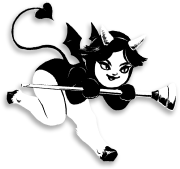
Hahaha. The pain train of animation advice barreling across forum borders! Here's a pretty  set of animations from me: set of animations from me: 
|
|
#
?
Feb 25, 2015 18:40
|
|

|
Scut posted:There's a game mockup that I revisit now and again as a hobby project. It's about managing a small fleet of aircraft and conducting strikes in a kind of brush war. I want this game so bad. Love the color choices, as usual. Would it be advance wars-y or what?
|
|
#
?
Feb 25, 2015 19:10
|
|
|
Scut posted:If you like simple, I'd recommend trying Pyxel Edit. Just tried it, and I gotta say it's pretty comfy. I might use it more.  Could somebody give me some criticism on this quick sprite, as in what I need to improve on, or what the image needs more, etc. I made it in 10-15 mins and decided not to shade the pants but I still do feel I did many things wrong. It just looks too flat to me, as opposed to the really tight sprites you see in games. Example: 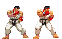 I just want it to stoop looking like a cartoon, and more like, well, a really solid cartoon So any criticism welcome.
|
|
#
?
Feb 26, 2015 00:17
|
|

|
Count Uvula posted:Here's a pretty Gaspy Conana posted:I want this game so bad. Love the color choices, as usual. Would it be advance wars-y or what?  I imagine something turn based. Here's a rough mockup of the direction I see things heading. The lower map portion is taken from my scratchpad so ignore the level design and clutter. The map is where you size up the situation and select which ground troops will act as your forward air controller. In the map you pick your desired strike point and flight path and you are making some guesses as to where the enemy will be once the strike arrives. The top portion would show the active aircraft, its status, the pilot's stress level, anti-aircraft fire, the FAC's status etc. In the upper area you would activate special abilities of your craft or skills of the pilot / FAC. Dodging flak, navigating, targeting etc. On the final approach you get a chance to fine tune the strike point. I'm undecided if that should be based upon rolls of the dice or perhaps some sort of minigame. So that's the loose idea of battle. On the ground you'll buy and maintain aircraft, hire pilots and crew plus manage their well-being. You pick loadouts, select a pilot for the sortie and send em out. One of the hooks I'd like to work into the game is to screw with the min/maxing habits of players. I think I can do this through difficulty in maintaining advanced ships as well as their rarity vs simpler workhorses. You might be able to buy the latest fighter with ECM and super targeting, but the first bit of ground fire it catches could leave it in the hangar for weeks as you wait for parts. Meanwhile an old cropduster carrying iron bombs is flying daily... and scaring the hell out of its pilots. rumtherapy posted:
That said, you could make spriting easier by working at a lower resolution. That Street Fighter sprite is /pretty/ big when you are working in pixels and you can achieve more realistic proportions without getting so large. Rotoscoping could be a good way to learn. Look at Karateka. It had low colour, low resolution sprites that were accurate in scale and movement to a large part. https://www.youtube.com/watch?v=wKqk9kosCs4 Scut fucked around with this message at 01:48 on Feb 26, 2015 |
|
#
?
Feb 26, 2015 01:44
|
|
|
i mak gam (palette by Scut!)
|
|
#
?
Feb 28, 2015 13:33
|
|

|
the chaos engine: https://www.youtube.com/watch?v=dUgPxrvA7us A whole game of the best level from meat boy? Count me in!
|
|
#
?
Feb 28, 2015 14:14
|
|
|
Tann posted:the chaos engine: An entire level tribute to the most overrated terrible flash game ever made?
|
|
#
?
Feb 28, 2015 18:55
|
|

|
I don't think that level was in the flash version.
|
|
#
?
Feb 28, 2015 19:05
|
|
|
zolthorg posted:An entire level tribute to the most overrated terrible flash game ever made? Woah, calm down there buddy, you might cut yourself with all that edginess.
|
|
#
?
Feb 28, 2015 19:32
|
|

|
the chaos engine posted:I don't think that level was in the flash version. i'm talking about N
|
|
#
?
Feb 28, 2015 20:21
|
|
|
rumtherapy posted:I just want it to stoop looking like a cartoon, and more like, well, a really solid cartoon Street Fighter sprites and their ilk were, in all likelihood, probably drawn using the regular pencil-and-paper method before being scanned in and turned into a proper pixel sprite sheet. Here's an example tutorial of the sort of method that can be used to generate more Street Fighter-esque sprites. As Scut mentioned, this sort of thing comes from practicing in real life. Specifically, you want to learn how to draw the basic "real" forms/proportions of the human body (or whatever you happen to be drawing), and then translate that into a more stylized cartoon form.
|
|
#
?
Mar 1, 2015 06:51
|
|


|
This isn't the last we'll be seeing this, and it will be glorious. Contribution : 
|
|
#
?
Mar 1, 2015 19:02
|
|

|
tystatic posted:This isn't the last we'll be seeing this, and it will be glorious. This accurately portrays what real fishing is like. Including the screenshake.
|
|
#
?
Mar 1, 2015 19:37
|
|


|
Posting this at 1x scale because hooboy are the bosses for Temporus gonna be big.
|
|
#
?
Mar 2, 2015 19:30
|
|
|
rumtherapy posted:Just tried it, and I gotta say it's pretty comfy. I might use it more. Sure, I'll give some thoughts. What's with the weird unclear lightsource? Seems like it's coming directly to the side of him, but it should be more above him. Like you said, the pants aren't shaded, but I'd suggest doing so. Giving them that extra depth would really help. (You also need to have more contrast on the skin shades) Check out how dimensional those Ryu sprites look. The shading really shows off his form and overall shape - Which seems obvious, but you have to remember, that's the point of shading. Don't just shade for the sake of it, do it to show depth. A good way to learn how to shade realistically is to do traditional life drawing sketches. Then you can apply those skills to pixel art, and in turn, cartooning. @Scut Man, that looks sick Pik fucked around with this message at 22:15 on Mar 2, 2015 |
|
#
?
Mar 2, 2015 21:51
|
|

|
Thanks for the tips guys, I actually improved a bit on my style. Although, I might need to get used to using a smaller palette. Also, the proportions are kinda off I feel.  But really, thanks.
|
|
#
?
Mar 3, 2015 00:45
|
|
|
rumtherapy posted:Thanks for the tips guys, I actually improved a bit on my style. Although, I might need to get used to using a smaller palette. Also, the proportions are kinda off I feel.  e: did that ninja fart?
|
|
#
?
Mar 3, 2015 05:09
|
|
|
http://youtu.be/FIZ_gDOrzGk Maybe you guys saw this thing two jerks in my studio made. I don't know if it's been on TV yet, I'm on holiday.
|
|
#
?
Mar 3, 2015 12:00
|
|
|
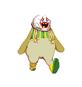
Did some quick tests for idles before I got sick as gently caress last week. This was supposed to be kinda jaunty and old timey, but then someone told me it looks like he's doing a bang bang kind of motion and now I can't unsee it.     I still need to give my palette a looking over.
|
|
#
?
Mar 3, 2015 12:49
|
|

|
bitmap posted:http://youtu.be/FIZ_gDOrzGk This is incredible, the animations are just really joyous and cartoony, it makes me really happy to see ")
|
|
#
?
Mar 3, 2015 15:24
|
|
|
drat, the ending of that was especially cool
|
|
#
?
Mar 3, 2015 15:39
|
|

|
Whoa, this thread turned hostile. HERE'S SOME OF MY poo poo:  /edge
|
|
#
?
Mar 4, 2015 03:29
|
|
|
Dang, shoehead. I am really digging your base, and it makes me want to stop being a coward and work on learning how to do bases myself. until then -   Small wagging I briefly tried to have some leaf debris float away when the tail thumps the ground, but couldn't quite make it look good.
|
|
#
?
Mar 4, 2015 04:53
|
|
|
Shoehead posted:Did some quick tests for idles before I got sick as gently caress last week. It's looking quite smooth and well uh animated! How many frames is that just out of interest? I've been trying to restrict myself in terms of frames (or at least not letting myself get carried away making too many), whilst still making the animation fluid.
|
|
#
?
Mar 4, 2015 19:23
|
|

|
This is my favorite of the lot. The first one looks like he's snapping his fingers and the other two look a little too dancey. Reminds me a lot of Dudley in 3S  who's all about the old timey fisticuffs thing I think you're going for who's all about the old timey fisticuffs thing I think you're going for
|
|
#
?
Mar 4, 2015 20:05
|
|

|
Is pixel art a good place to "start" for design? I know little to nothing of art in general and can't express even the most basic of ideas in a visual way. On top of that, I don't really "think" that way in that I rarely have a starting point or overall reason to draw or create something to begin with. All the OP tutorials are specific to pixel art in such a way that the subject has spent time messing with drawing/creating content prior to getting into this. I don't mind learning one bit, but I can't help but wonder if I'd be saving myself a great deal of trouble starting somewhere/somehow else.
|
|
#
?
Mar 4, 2015 22:57
|
|


|
Warbird posted:Is pixel art a good place to "start" for design? I know little to nothing of art in general and can't express even the most basic of ideas in a visual way. On top of that, I don't really "think" that way in that I rarely have a starting point or overall reason to draw or create something to begin with. All the OP tutorials are specific to pixel art in such a way that the subject has spent time messing with drawing/creating content prior to getting into this. I don't mind learning one bit, but I can't help but wonder if I'd be saving myself a great deal of trouble starting somewhere/somehow else. I've seen a lot of people on here recommend basic drawing to people trying to get into pixel art. If you think you have no sense of form or drawing it will be hard to pixel original stuff from scratch.
|
|
#
?
Mar 4, 2015 23:14
|
|
|
That was my concern. I get some of the base notions, but can't execute on them. I've poked at GIMP for my current project and while I got things done, it took more time to change: to  than most of the rest of the project put together. As you can see, I'm far from happy with how it turned out, but it looks fine for how it's used in the game. I don't mind doing it, but it's supremely aggravating. NOTE: The base image is from a GM tutorial and far FAR exceeds anything I am capable of.
|
|
#
?
Mar 4, 2015 23:55
|
|
|
For the sake of keeping things clear, this isn't pixel art. If you want to learn how to make art, I wouldn't recommend pixel-scale as an ideal route. You should be practicing fundamental basics of illustration like structural drawing, value, and gestural sketching. Practice basic stuff again and again. Then do it again. After that you want to study proportion and composition. Once you have a good grasp of sketching and illustration/painting, pixel art becomes much easier to grasp. The most challenging parts are often where you are trying to visualize light and colour within a small palette, and much of the work involves constant re-arranging of a sort of building block that is the pixel. If you get bogged down in fiddling with the fundamental drawing and painting skills, your composition is likely going to look like poo poo. Scut fucked around with this message at 00:18 on Mar 5, 2015 |
|
#
?
Mar 5, 2015 00:16
|
|
|
I think the taking damage animation looks a little more like he's either about to power-up DBZ-style, or is in the middle of delivering a devastating pelvic thrust. Maybe exaggerate it a little more, river city ransom style. Throw the head back and knock him off balance for a frame.  Scut posted:For the sake of keeping things clear, this isn't pixel art. Beyond basic drawing, a good understanding of color theory is also drat near essential - creating good pixel art with a limited palette is actually really drat hard. Understanding hue, saturation and value and how they best balance them is pretty vital to getting the most impact in the most efficient way. Great pixel art is all about a balance between impact and visual efficiency, getting the most bang for your buck with as few elements as you can.
|
|
#
?
Mar 5, 2015 01:23
|
|

|
Speaking of color theory help I don't think I understand how to do 16 color palettes. Here's some stupid bullshit:   Here's some questions related to that stupid bullshit: 1. How do I make the cloud (yes, it's supposed to be a cloud) in the first picture look actually more like a cloud while making it clear it's a distinct entity? It spawns resources so it needs to read as an active game token and not just a background element. 2. Do the units actually read on top of the buildings or are they too shaded/not contrasting enough? 3. Does anyone have any advice for helping me change this palette to be less terrible? Then again I'm not even sure I'm going to stick with these 16 colours the whole game, maybe I should consider a duochromatic palette with blending with the two colours set to different things per level. Okay, I'm getting off topic. Yeah the background and the structures in the second picture look like hot trash but to be honest all of it does. It's all due a total redesign and overhaul, but knowing the worst of the errors in these images with someone else looking at them would be great. I've never actually presented my dumb sprites to be judged on their own merits removed from an original context before, and I come here now to this thread to be torn to pieces so I might learn better. Or at least learn how beyond help I am. At the very least I don't intend to act defensive and refuse to take advice. Granted, I know I could stand to work on, well, everything more, better grasp of anatomy, gesture drawing, and just general animation theory (I didn't bother making gifs because I already know the animations are stiff as boards and lack any real conviction with the motion, I've learned a lot about animation since I made these sprites like a year ago that I need to put into practice). One thing I'm realising as I'm making this post is how completely opaque and confusing everything is and how nothing looks like it has a function that's immediately obvious. One more reason to tear everything down and start over, I think.
|
|
#
?
Mar 5, 2015 02:02
|
|
|
Scut posted:For the sake of keeping things clear, this isn't pixel art. Yes, I know. The intention was to show my level of incompetence with photo editing software, but you get my drift. I'd really love to try and flesh out this character a bit, but it sounds like I couldn't expect a result that I wouldn't hate for quite a while. I suppose I'll try some concept sketches or whatever and see what happens from there. Edit- While I'm thinking of it, is there a general grouping that sprites from Metal Slug and similar games fall into? ie- 16 bit, 32 bit, ect Warbird fucked around with this message at 02:10 on Mar 5, 2015 |
|
#
?
Mar 5, 2015 02:05
|
|
|
Warbird posted:Edit- While I'm thinking of it, is there a general grouping that sprites from Metal Slug and similar games fall into? ie- 16 bit, 32 bit, ect Metal Slug was made for the Neo Geo which was like a hotrod 16-bit machine. I'd classify it as 'high-end 16-bit' I guess. Cirrial posted:
 Here's a quick edit of that palette. Mostly I tried inserting some warmer tones for the highlights and cut back some of the saturations. Even though this is a night scene, you can implement some of the principles that lighted areas tend to appear warmer and shadows are cooler. Instead of a daylight yellow for the highlights I'm referencing the magentas of your original palette. Draw the cloud to be a similar brightness and contrast level to the characters. As a rule of thumb, active game objects should be higher contrast than environment Your units read as being foreground but they could do with more definition and contrast. I would recommend you go way down in resolution. Like cut it in half at least. More pixels means more variables and work for you.
|
|
#
?
Mar 5, 2015 03:00
|
|
|
The thing about 8 and 16 bit is it doesn't really fit sprites really well - the Genesis, the SNES and the TurboGraphix were all technically 16 bit systems but all had radically different colors they could work with as well as things like size of sprites and number of sprites displayable on the screen at once. Once you get past 8 bit it becomes a lot less useful as a visual descriptor.
|
|
#
?
Mar 5, 2015 03:10
|
|

|
Yeah you're right. For the most part I'd like to see those terms dropped because it tends to perpetuate the 'pixel art = retro' notion.
|
|
#
?
Mar 5, 2015 03:13
|
|
|
Are there any higher-than-32 colour palettes that are still more visually harmonious than just going 'gently caress it all colours', or once you get up to 64 or so do you lose that advantage. I have an idea for a pixel game project but one of the elements is that a lot of the critters would be dynamically palette shifted and I'd need a decent amount of colour granularity to make it work.
|
|
#
?
Mar 5, 2015 03:21
|
|


|
Scut posted:Here's a quick edit of that palette. Mostly I tried inserting some warmer tones for the highlights and cut back some of the saturations. Even though this is a night scene, you can implement some of the principles that lighted areas tend to appear warmer and shadows are cooler. Instead of a daylight yellow for the highlights I'm referencing the magentas of your original palette. Brilliant. I love it! If I do smack my head and decide to implement multiple palettes and runtime palette switching in game, I'll keep these principles in mind when designing future palettes, if I don't cop out and decide to extend from the admittedly arbitrary 16 colour limitation for the whole game. Scut posted:I would recommend you go way down in resolution. Like cut it in half at least. More pixels means more variables and work for you. Just because I overran the 48 hour Ludum Dare time and had to go for the jam (and even then submit with half the sprites flat coloured, unshaded, and all of the sprites having about four frames of animation total) doesn't mean this is an unworkable size! Except it sort of is, yeah. It's just that after every project I worked on prior being 2x scaled, I felt kind of sick of working with chunky pixels, but if I ever want to maybe finish art for a game in this lifetime, well. Also doesn't help that Phaser apparently dropped support for upscaling pixel art in good ways that don't involve ridiculous roundabout hacks, but I digress, this is the wrong thread for ranting about web game frameworks. Worst case scenario I just manually resize every image up by a factor of two, I guess.
|
|
#
?
Mar 5, 2015 03:26
|
|
|
Cirrial posted:1. How do I make the cloud (yes, it's supposed to be a cloud) in the first picture look actually more like a cloud while making it clear it's a distinct entity? It spawns resources so it needs to read as an active game token and not just a background element. 1 - I would remove the solid outline around the cloud - if it's moving independently of the background, just make it flash before it drops powerups or whatever it does and that should do enough to distinguish it from the background. I would also keep the shading into smoother arcs, without the sketchy areas it has now. 2 - The units read pretty well, but similar to the clouds, I would get ride of any solid black outlines on anything that is meant to be in the background. 3 - That palette is fine! But I do have a suggestion for you - right now you've basically segregated your designs into violets and blues, but excluding them from one another. I'd recommend trying to blend the two colors together, instead of keeping them separate all the time. You can still achieve more blue-y or more violet-y environments depending on how much you blend, but right now it seems like you're not using your palette to full effect, each stage is only using half of the resources at your disposal. Maybe use the violets for the warmer highlights on anything that is meant to be closer to the screen, and the blues for everything recessed.
|
|
#
?
Mar 5, 2015 03:37
|
|
|

|
| # ? May 13, 2024 16:39 |
|
|
Cirrial posted:
Worry not, chrome now supports pixelated canvas upscale. (Since 41)
|
|
#
?
Mar 5, 2015 10:15
|
|