|
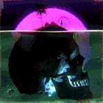
HDR is also a great way to make a picture of your lovely pick-up truck look super awesome on Facebook. edit: the gist of it is you're faking a range of exposure that's more similar to what your eyeballs see. Bad HDR cranks up all the sliders to produce shitpiles like this.
|
 #
?
Feb 25, 2015 07:48
#
?
Feb 25, 2015 07:48
|
|


|

|
| # ? May 21, 2024 20:22 |
|
|
Good HDR should simply look like a well exposed image, and not make you think, "That's HDR." I feel like, unless you know for certain that the scene is out of the dynamic range of the film/sensor, you shouldn't even be able to tell that it's HDR.
|
|
#
?
Feb 25, 2015 10:08
|
|


|
Yeah I get what HDR is, just trying to get the difference between good/bad. I certainly know bad when I see it -- as in the super awesome pick-up truck reference -- but I have used HDR in the past to take pictures of faded gravestones to elicit more detail from their surface (writing), but yeah it is barely noticeable. As far as 'light' goes I suppose 'unnoticeable' is what is meant.
|
|
#
?
Feb 25, 2015 16:50
|
|

|
Good HDR is when you don't notice it. Bad HDR is when you notice it. There's no way that the writing on a gravestone had so much dynamic range that you needed to capture it with multiple exposures. I think that would be an example where you used the wrong tool for the job. There's probably a dozen ways you can bring out details on a flat surface, but HDR is not one of them.
|
|
#
?
Feb 25, 2015 21:48
|
|

|
thetzar posted:The top one irks me because it's not blurred ENOUGH. At a quick glance, it just seems to be a missed shot with a too-slow shutter speed. The geese don't get called out enough. There's also very little tone separation between the geese and the trees when they overlap, unfortunate. I really like how the city looks darker than the sky should allow, but I wish I could see a bit more detail in some of the buildings. Awesome shot! I'm still fairly new and trying to figure things out, but I like to think I'm learning little bits! I took this photo while walking around Detroit with a buddy of mine during the winter festival thing they had going on, in Hart Plaza. I was trying to get the top of it in frame but I was holding the camera far down close to the ground and just snapped a few shots and this was my favorite.  _IGP1792.jpg by alexmthorpe, on Flickr _IGP1792.jpg by alexmthorpe, on FlickrI met up with some forum people during a blizzard so I could practice panning on some dumb parking lot shenanigans, had a blast until a dude in a front loader chased us down the road. I wish I would have used a bit smaller aperture, I feel like it would have made the background blur a bit more pronounced  IMGP1522.jpg by alexmthorpe, on Flickr IMGP1522.jpg by alexmthorpe, on FlickrI just got a wider lens yesterday but haven't had a chance to play with it outside yet, so took a photo in my room. Was trying out weird angles and laying the camera on the floor.  DOOM2474.jpg by alexmthorpe, on Flickr DOOM2474.jpg by alexmthorpe, on FlickrHow are the images? Is the post-proccesing ok, or too much in some of them? I picked up Lightroom and have mostly just been playing with sliders. Anyone have any decent youtube tutorials that aren't just crank the clarity and saturation for instant art?
|
|
#
?
Feb 28, 2015 03:50
|
|

|
Aperture is kind of irrelevant for panning action, the main trick is as long an exposure you can get away with while keeping the subject sharp (which is dependent on operator skill, subject speed, and focus speed).
|
|
#
?
Feb 28, 2015 05:14
|
|

|
Thorpe posted:
I rather like this - the glow halfway up the tower makes it work. Has a cinematic, dystopic feel to it. Thorpe posted:
This doesn't work for me, there is no sense of movement, and the direction of the car and the framing both work against the shot. The white car on white background is quite unfortunate.
|
|
#
?
Mar 2, 2015 11:08
|
|
|
Thorpe posted:
I really dig this. I love the lines moving up the frame from the bottom. I hit up a frozen Niagara falls and shot this weekend.  Moon Behind a Frozen Tree by jmorris4371, on Flickr  Frozen Grass by jmorris4371, on Flickr
|
|
#
?
Mar 2, 2015 18:20
|
|

|
Thorpe posted:
I really like the colors in this one, and the strong diagonal lines in your composition really make it feel dynamic. Awesome shot! quote:I met up with some forum people during a blizzard so I could practice panning on some dumb parking lot shenanigans, had a blast until a dude in a front loader chased us down the road. I wish I would have used a bit smaller aperture, I feel like it would have made the background blur a bit more pronounced This on the other hand doesn't work for me. Photographing a car in motion is about suggesting that motion, and this might as well be stationary. It's partly that you're using too fast a shutter speed to get a nice motion blur going, and partly that at the moment this was taken the car is mostly moving away from you rather than across the frame. Also, it'd probably be stronger if you cropped out the light pole. quote:I just got a wider lens yesterday but haven't had a chance to play with it outside yet, so took a photo in my room. Was trying out weird angles and laying the camera on the floor. For messing around in your room, this turned out pretty cool. Again, strong lines and an unusual viewpoint make for an interesting shot. Edit: Here's some bird pictures from the past few days  Redeye.jpg Redeye.jpg  Crow.jpg Crow.jpg Rainy Day Ducks.jpg Rainy Day Ducks.jpg
Baby Babbeh fucked around with this message at 09:16 on Mar 3, 2015 |
|
#
?
Mar 3, 2015 02:00
|
|


|
Baby Babbeh posted:I really like the colors in this one, and the strong diagonal lines in your composition really make it feel dynamic. Awesome shot! Of these, the crow works best for me. I enjoy how it doesn't look like a textbook shot of a bird, and how there is enough context around it to give a sense of place� though I also think it might be interesting cropped down to just the black bird and the texture of the road. It's an interesting pose, thoug hI also kind of wish there was something on the ground that it was looking at. The first shot seems technically fine (though there seems to be some loss of detail in the whites, that might simply be true to life), and that's a hell of an eye � I do wish the tail hadn't been cropped out. On the last pic, again, well exposed, but leaves me feeling a bit 'meh.' I love the water droplets, but wish that the foreground duck was in focus. It's also a bit odd that I can't see their eyes. I did a photoshoot this past weekend for a friend who wanted some very high-contrast black and white shots as painting reference. He art directed, and I shot. He referenced Lillian Bassman for style, though for my own postings, I haven't worked them over as much as Lillian would have, nor gone THAT hard black and white. I enjoy my midtones. These are some of the first to make it out of lightroom.  Coming with me by thetzar, on Flickr  The surprise by thetzar, on Flickr
|
|
#
?
Mar 3, 2015 14:50
|
|

|
They are good but for the second one, the wall by her feet makes it look like she had two sets of feet. Now that I've seen it, I keep looking at it. Maybe it wasn't obvious in color but the way the pattern lines up with her feet and bring in black and white, I find it really distracting.
|
|
#
?
Mar 3, 2015 16:09
|
|

|
Magic Hate Ball posted:
Nobody seems to have hit these, yet. The first one doesn't really move me one way or the other, though it's technically all right and the yellow is just visible enough to provide a nice colour contrast against the sky. The second one is great. It's got a good sense of the otherworldly, which from the context (I know what the third one is) is entirely appropriate. I might like it even more if you greatly increased the exposure. Bubbles can be made of blown highlights, but it's pretty good the way it is. The third one seems a little out of focus, but I'm not sure it is - I've seen those critters on dives myself and they are basically living fractals so I suppose "sharply in-focus" is close to impossible. Again, otherworldly and appropriately so. It's pretty noisy, but I'm guessing you had to crank the ISO sky-high just to get the shot. My university is running a contest, "Images of Research" and I'm planning to enter these three. Part of the judging will be on the "snappy title" and 150-word description I have yet to write (current titles are the categories in the contest I'll be sending them in for), but from reading the contest description I think the images will be judged rigorously.  From the field by Execudork, on Flickr From the field by Execudork, on Flickr More than meets the eye by Execudork, on Flickr More than meets the eye by Execudork, on Flickr Research in Action by Execudork, on Flickr Research in Action by Execudork, on Flickr
|
|
#
?
Mar 3, 2015 19:28
|
|


|
You're not going to submit any with people in them?
|
|
#
?
Mar 3, 2015 19:33
|
|

|
ExecuDork posted:My university is running a contest, "Images of Research" and I'm planning to enter these three. Part of the judging will be on the "snappy title" and 150-word description I have yet to write (current titles are the categories in the contest I'll be sending them in for), but from reading the contest description I think the images will be judged rigorously. These do feel very lonely, but I don't know if that's a bad thing. However, only the third photo really says 'research' to me. The second is interesting; a flower in bloom with snow, but why? The first is a well-executed shot of a building (with a little distracting flare), but the building itself means very little to me. Is that a drone out behind it? totalnewbie posted:They are good but for the second one, the wall by her feet makes it look like she had two sets of feet. Now that I've seen it, I keep looking at it. Maybe it wasn't obvious in color but the way the pattern lines up with her feet and bring in black and white, I find it really distracting. Interesting; I don't see it that powerfully, but now that you point it out, I see it. The arm of the chair she's got her legs over was actually badly broken, we were trying to make sure the whole thing was hidden. ") Here are a couple extras from the same series:  This is not a conversation by thetzar, on Flickr  The two by thetzar, on Flickr  It's the little talks by thetzar, on Flickr The lighting set up on the last one was a bit different; one of the first we shot, the models are too close tot he wall; too many shadows and too much brightness on it, I now think.
|
|
#
?
Mar 5, 2015 16:41
|
|
|
thetzar posted:Of these, the crow works best for me. I enjoy how it doesn't look like a textbook shot of a bird, and how there is enough context around it to give a sense of place� though I also think it might be interesting cropped down to just the black bird and the texture of the road. It's an interesting pose, thoug hI also kind of wish there was something on the ground that it was looking at. I know you said your friend wanted you to go high contrast, but I think the skin tones in this post and your other post are too light or washed out. It makes everything seem a little less realistic. Especially in the second shot here, the woman's face is a little blown out causing a loss of detail. I wonder if dialing down the highlights just a smidgen would let you save some detail and realism while still capturing the effect.  img594 img594 img595 img595
|
|
#
?
Mar 5, 2015 17:13
|
|
|
thetzar posted:
For the second one, it feels a bit unbalanced with her dead center, him off to the side, and nothing to balance him out.  4-365 You looking at me? (Cocle, Panama) by esa_foto, on Flickr 4-365 You looking at me? (Cocle, Panama) by esa_foto, on FlickrI really like the framing for this one. I'm not sure how I feel about the cow in the background and whether it adds or subtracts from the photo. Also, I swear I didn't HDR this thing.  DSC05676 by esa_foto, on Flickr DSC05676 by esa_foto, on FlickrI like the play between the girl and the background here. I wish she was posed better and I wish I could have composed the shot better. There wasn't much room to move around though to make that happen. I should have waited for a better subject as well and used that background. Maybe someone not wearing a Minnie t-shirt... or maybe that adds to the story of the fight for independence and the rewards from gaining it...  DSC05829 by esa_foto, on Flickr DSC05829 by esa_foto, on FlickrI like the father and daughter sharing a moment. Looking together at something interesting off to the side which probably has to do with the way both of them are dressed up. I like the blurriness of the background but I could have found something less distracting.
|
|
#
?
Mar 9, 2015 19:53
|
|
|
That certainly is a photo of a cow's rear end.
|
|
#
?
Mar 9, 2015 19:58
|
|
|
The photo of a cows rear end probably would have benefited from not having a second cow's rear end in it. I do like the framing through the barbwire, but the other cow standing there in the background sort of muddies the composition. I think the color is really the strong point of the second image, the little girl has a lot of the same values as the mural so she sort of blends in to look a part of it. I sort of wish you'd gotten her from a slightly more head-on angle, but it's a minor gripe.
|
|
#
?
Mar 9, 2015 20:21
|
|
|
effective? spraaaaaaaaaaaaaaaaaaaaaaaaaaaaaaaaaaaaawl by explosive_decompression, on Flickr spraaaaaaaaaaaaaaaaaaaaaaaaaaaaaaaaaaaaawl by explosive_decompression, on Flickre: forgot rules, critique below Subyng fucked around with this message at 04:18 on Mar 10, 2015 |
|
#
?
Mar 10, 2015 03:48
|
|

|
thetzar posted:
|
|
#
?
Mar 10, 2015 04:18
|
|
|
Subyng posted:effective? I like the idea behind this, but two things take away from it for me; it's difficult to tell if it's taken from the same spot, and the top half looks like it was taken well after the clearing of the forest had begun. One or both of those things may have been out of your control though, otherwise I like the concept you're communicating of suburban sprawl taking away from the natural world, and I like the framing of the rental sign at the bottom. I went to Lake Wisconsin with my friends over the weekend, and I'm glad I did because it's likely to thaw out soon if the weather keeps up like they're predicting. This is my first try at long-exposure photography, editing those was tricky and I imagine someone with more experience could bring more out of those pictures.  RC plane at sunset by Viper_X83, on Flickr RC plane at sunset by Viper_X83, on Flickr Nighttime shots-12 by Viper_X83, on Flickr Nighttime shots-12 by Viper_X83, on Flickr Nighttime shots-14 by Viper_X83, on Flickr Nighttime shots-14 by Viper_X83, on Flickr
|
|
#
?
Mar 10, 2015 23:44
|
|

|
JohnClark posted:I like the idea behind this, but two things take away from it for me; it's difficult to tell if it's taken from the same spot, and the top half looks like it was taken well after the clearing of the forest had begun. One or both of those things may have been out of your control though, otherwise I like the concept you're communicating of suburban sprawl taking away from the natural world, and I like the framing of the rental sign at the bottom. The two were taken about 50m away, but they are of the same area. The top shot is indeed of the forest clearing underway. So you interpreted the picture accurately, but I'm not sure how that takes away from the effectiveness of it?
|
|
#
?
Mar 11, 2015 00:22
|
|
|
Subyng posted:The two were taken about 50m away, but they are of the same area. The top shot is indeed of the forest clearing underway. So you interpreted the picture accurately, but I'm not sure how that takes away from the effectiveness of it?
|
|
#
?
Mar 11, 2015 02:46
|
|
|
Not sure about the editing but for your third shot you can try a longer exposure and lowering your iso. I believe you'd get more detail (aka stars) that way. I like your first shot. The tree has interesting geometry. The second is very 'meh' to me, I guess there's a plant growing through the fence and is dying, but it's plain looking and low contrast to my eyes, and the subject is boring. Didn't take any shots for a couple of months, took some shots of flowers.  DSCF7489.jpg by badmountain, on Flickr DSCF7489.jpg by badmountain, on Flickr DSCF7480.jpg by badmountain, on Flickr DSCF7480.jpg by badmountain, on Flickr DSCF7453.jpg by badmountain, on Flickr DSCF7453.jpg by badmountain, on FlickrStill trying to figure out post-processing, most of my previous shots look over-processed to me now, and these ones too. I really like the second pic tho, I think it works well.
|
|
#
?
Mar 13, 2015 18:38
|
|
|
Skizzzer posted:Not sure about the editing but for your third shot you can try a longer exposure and lowering your iso. I believe you'd get more detail (aka stars) that way. I am not so sure on the processing of these, specially the first 2. The white balance seems a bit off to me but maybe that is what you are going for. While not immediately obvious the skewed angle of the first 2 also bothers me, they are also seemingly a bit underexposed which I find distracting. I feel like the only thing they really have going for them is maybe the colours but to due to being a bit dark you loose out on that. The focus on the 2nd does not work for me, it seems like you needed to go for something that had more depth of field or less, as it stands there is one flower that is in focus and the rest are nearly in focus. The 3rd is probably the strongest and has some nice light but flowers are kind of like cats, they are really hard to take an interesting photo of. I think all of these lack any real strong interest or subject. While taking photos around the house may be a good way to practice technique unless you have put some effort into setting something up they are probably going to be boring. ---- 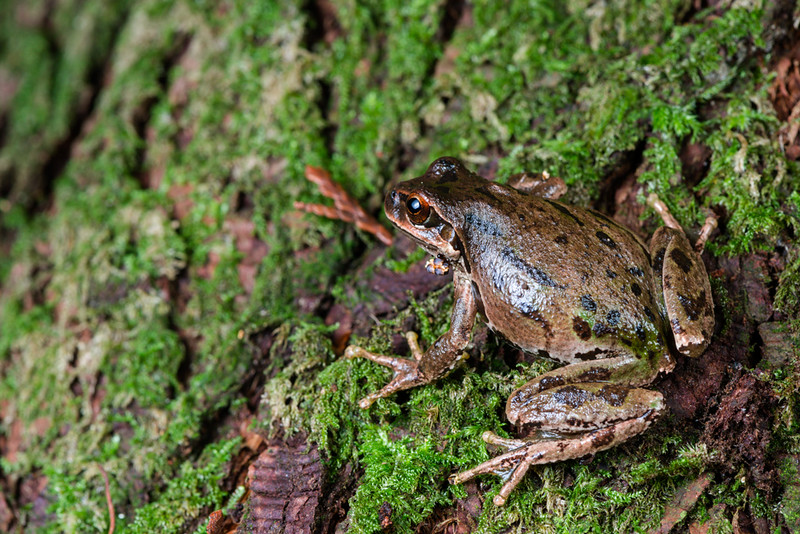 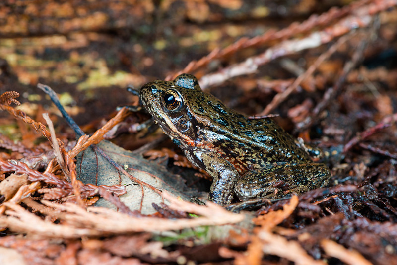
|
|
#
?
Mar 15, 2015 23:34
|
|

|
Thorpe posted:I really like how the city looks darker than the sky should allow, but I wish I could see a bit more detail in some of the buildings. Awesome shot! I'd suggest keep playing with sliders until you find your own way. I mean, if anyone wants to suggest tutorials, there's no harm in watching them, definitely, but I like to treat every image as its own thing I learn about as I go. I'm just getting into the HSL settings, myself, and it's like, wow, this program can really do things! I disagree with Babbeh about the sense of motion in the car picture. The white on white is a bit eh, but I think the snow in the air replaces the sense of movement that is lost by the high shutterspeed eliminating motion blur. I REALLY love the tower one. I'll second the comment about it having a dystopian feel, but it's not the usual desaturated dystopia feel, and I like that. As I said, I just got into the HSL settings, and I'm pretty happy with what Lightroom can do. I think I should crop this picture so the guy in the background is gone, but otherwise I'm pretty okay with this picture.  This one may be a little too centered.  I'm not sure the light in this one works for me. Seems a little too brown in the rocks, so I might fix that. I do like that it reminds me a little bit of the cover of Man On The Rocks. 
|
|
#
?
Mar 16, 2015 13:34
|
|
|
quote:As I said, I just got into the HSL settings, and I'm pretty happy with what Lightroom can do. I think I should crop this picture so the guy in the background is gone, but otherwise I'm pretty okay with this picture. I think the first picture is completely badass except for the dude right behind him, which is a shame because I don't think cropping in tight enough to get rid of him serves this image well. The beach one has nothing going on in the right and bottom of the frame, so I think your instinct to crop in on that one is good. The third one... I really want to like it, but it feels like half a picture to me. You have this really cool frame with great colors but it doesn't frame anything. It has so much potential though... If only there had been a boat or something? I've been experimenting with film:  Untitled by Nick Bremer Korb, on Flickr Untitled by Nick Bremer Korb, on Flickr Crosley Lanes by Nick Bremer Korb, on Flickr Crosley Lanes by Nick Bremer Korb, on Flickr 1900 by Nick Bremer Korb, on Flickr 1900 by Nick Bremer Korb, on Flickr
|
|
#
?
Mar 18, 2015 01:16
|
|

|
 IMG_7235 by difficult listening, on Flickr  IMG_7135 by difficult listening, on Flickr  IMG_6777 by difficult listening, on Flickr Chitin posted:I've been experimenting with film: The aesthetic is nice, I guess, but unfortunately these are all pretty subjectless/directionless. What are you trying to make me look at, or feel? Get closer to things. Magic Hate Ball fucked around with this message at 06:27 on Mar 18, 2015 |
|
#
?
Mar 18, 2015 06:24
|
|
|
Dread Head posted:I am not so sure on the processing of these, specially the first 2. The white balance seems a bit off to me but maybe that is what you are going for. While not immediately obvious the skewed angle of the first 2 also bothers me, they are also seemingly a bit underexposed which I find distracting. I feel like the only thing they really have going for them is maybe the colours but to due to being a bit dark you loose out on that. The focus on the 2nd does not work for me, it seems like you needed to go for something that had more depth of field or less, as it stands there is one flower that is in focus and the rest are nearly in focus. The 3rd is probably the strongest and has some nice light but flowers are kind of like cats, they are really hard to take an interesting photo of. I think all of these lack any real strong interest or subject. While taking photos around the house may be a good way to practice technique unless you have put some effort into setting something up they are probably going to be boring.  Thanks Dread. Your feedback is very much appreciated. I don't feel confident critiquing your photos but I'll give it a shot. Thanks Dread. Your feedback is very much appreciated. I don't feel confident critiquing your photos but I'll give it a shot.Of the two you posted I like the first photo more, because of the contrast between the frog and the moss, and because of the frog's positioning - it looks like he's getting to ready to jump. I feel that the implied motion of the frog and the direction of its eyes both point in the same direction, top left of the frame, and my eye keeps getting drawn to that area. I don't know if it would've been technically possible, but I wish that part of the frame was in focus because of the reasons mentioned. I want to see where its going, even if that area is just more moss and bark. I do love how close and sharp the frog is, I am like a bear in the woods, I never see frogs when I'm out.
|
|
#
?
Mar 19, 2015 18:59
|
|
|
Magic Hate Ball posted:
Went shooting a lot over the past few weeks. Would like feedback on the impression that my photos give, and technical aspects that would make them better:  Untitled by kgao1989, on Flickr Untitled by kgao1989, on FlickrI liked the composition of this shot, and here I learned how to use a wide angle approach (one usually needs to provide foreground interest or else the picture looks too empty), but I feel the water is muddy and that may be considered "ugly"  Dekalb Ave by kgao1989, on Flickr Dekalb Ave by kgao1989, on FlickrWas bokeh used effectively here? Would it have been better to have everything in focus?  Untitled by kgao1989, on Flickr Untitled by kgao1989, on Flickr
|
|
#
?
Mar 20, 2015 00:06
|
|
|
lollybo posted:Went shooting a lot over the past few weeks. Would like feedback on the impression that my photos give, and technical aspects that would make them better: In the first one I'm not really thrilled with the subject or the lighting but you did accomplish your goal of placing something in the foreground. In the second shot the background is separated from the chain and lovely undergrowth in the foreground by shallow depth of field. Not sure why you chose to highlight the chain and lovely undergrowth this way. The out of focus background has a mural of a warrior shooting a bow and arrow from the back of a velociraptor. Why leave that out of focus in favor of some chain? I feel similarly about the mural in the first one. It seems more interesting than the rest of the shot but it's marginalized in the composition. Last shot is ok. Sky is clipped I think and the mid day light is a bit harsh but the composition is ok.
|
|
#
?
Mar 21, 2015 00:00
|
|
|
lollybo posted:
Whether the water is muddy or not doesn't matter, you can take as great a picture of mud as you could of crystal-clear water. What does matter is that this is essentially a picture of an empty space. If this were a frame from a movie or a TV show, this shot would be gearing me up to see a car's tire splash into that puddle. But, since that isn't going to happen, because this is just a photograph, I'm left wanting more in it, and not in a way that feels purposeful or engaging lollybo posted:
I have to agree with Dren on this one, though I do have to say that mural photography is, by and large, boring as hell. What, exactly, were you trying to photograph? What is my eye meant to be drawn towards here? If you'd gotten much closer to the plants you could've gotten something with the dewy stem heads, perhaps, and then that would be a subject (again, this feels like a subjectless/directionless photo). lollybo posted:
Now this photo, though, does have direction and clear subject. The mountains clearly zigzag down from the sky, directing the eye to and along the river to the bottom right corner. Unfortunately, it's a little bit aesthetically oppressive, kinda burnt out - hot whites, crushed blacks. Something I'm curious about, and this might be a good way for you to look critically at your own photos and guide your photography process, is what do you want me to see? I don't mean "some mountains" or "this bush", I mean what effect do you want the photograph to have on me? What aspect of your subject are you trying to impart me with? Is it an atmosphere, or a texture, or a juxtaposition?  IMG_7246 by difficult listening, on Flickr  IMG_7130 by difficult listening, on Flickr  IMG_7192 by difficult listening, on Flickr Magic Hate Ball fucked around with this message at 08:24 on Mar 21, 2015 |
|
#
?
Mar 21, 2015 04:13
|
|
|
Chitin posted:
This is cool, but I think it would be better a few steps to the left so that the tree isn't so prominent. Shame about the fence too. The shadows and lines are great though, can you go back at a similar time of day and try again?
|
|
#
?
Mar 21, 2015 19:00
|
|

|
Thank you to both commenters - I definitely can go back, so I'll try working the scene a bit more.
|
|
#
?
Mar 22, 2015 23:19
|
|
|
Magic Hate Ball posted:
I have to say that I like your pic of cherry blossoms better in your last post than your first one here. I liked the contrast and balance between the sky and the blossoms, whereas in your pic here the blue overwhelms the blossoms, and I'm guessing it's a different tree cause the flowers are not as pink as before. This is unfortunate because the white doesn't look better at all. Also, you have like dust spots or whatever on your lens, which you can see scattered around the photo.  DSCF7604.jpg by badmountain, on Flickr DSCF7604.jpg by badmountain, on Flickr DSCF7602.jpg by badmountain, on Flickr DSCF7602.jpg by badmountain, on FlickrPeople always say to not clip your highlights, but I never knew why until I tried to rescue this pic for a hour in lightroom:  DSCF7560.jpg by badmountain, on Flickr DSCF7560.jpg by badmountain, on Flickr
Skizzzer fucked around with this message at 07:08 on Mar 23, 2015 |
|
#
?
Mar 23, 2015 07:06
|
|
|
Chitin posted:
Honestly I think if this picture was taken about 50 years ago with the look of the cars matching the style of the sign, or 50 years in the future with the cars extremely ageing the style of the sign it would have been an absolutely amazing shot. Also a little more contrast on the foreground sign would have grabbed my eye a little bit better, as of right now it looks like you could not really figure out whether you wanted the sign on the left or the sign on the right. Kwilty fucked around with this message at 23:31 on Mar 24, 2015 |
|
#
?
Mar 24, 2015 23:29
|
|

|
Magic Hate Ball posted:
Magic Hate Ball posted:
Skizzzer posted:People always say to not clip your highlights, but I never knew why until I tried to rescue this pic for a hour in lightroom: The second one on the beach is maybe a tad too dark towards the upper left, it keeps pulling my eye that way. So, I went to NY:  _MG_4471.jpg by AxelDR, on Flickr _MG_4471.jpg by AxelDR, on Flickr _MG_4519.jpg by AxelDR, on Flickr _MG_4519.jpg by AxelDR, on Flickr(Not my pet!)  _MG_4653.jpg by AxelDR, on Flickr _MG_4653.jpg by AxelDR, on Flickr
|
|
#
?
Mar 25, 2015 22:13
|
|

|
404notfound posted:Good HDR should simply look like a well exposed image, and not make you think, "That's HDR." I feel like, unless you know for certain that the scene is out of the dynamic range of the film/sensor, you shouldn't even be able to tell that it's HDR. I would totally normally agree with this, but for some reason I really love it cranked when it's architecture. 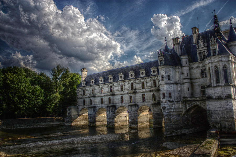 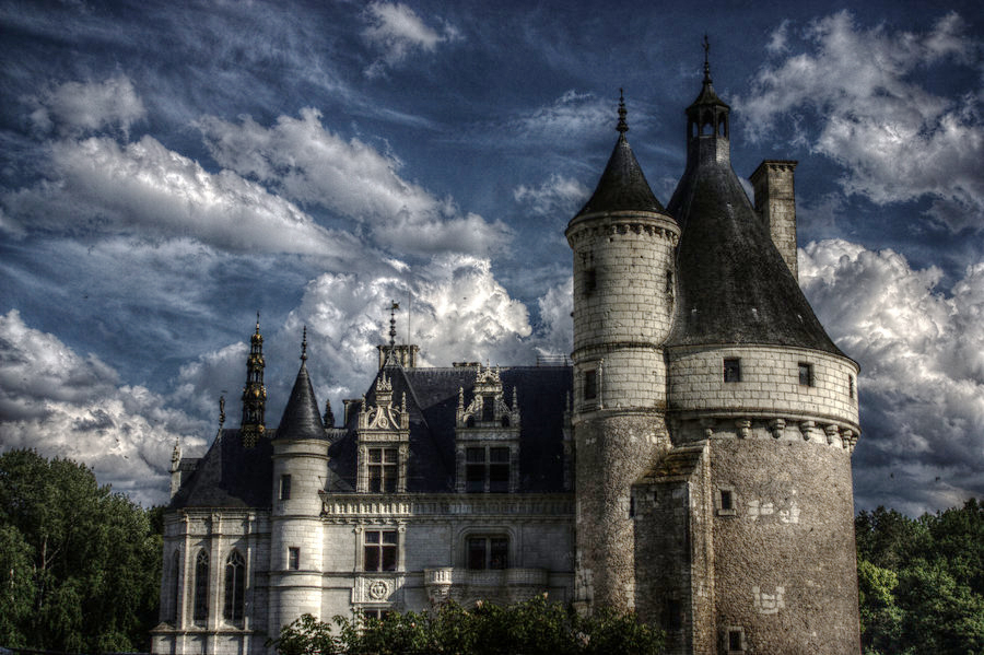 Un-HDR-'d, I don't think either of these are that remarkable. Composition on the first one is good, but I hate that I had to crop out the very front of the castle because it had all kinds of scaffolding and poo poo all over it. The second image is nothing special, but I think with architecture shots the HDR adds something. Ambience. Drama. Something. HDR photos of cars, on the other hand, I totally agree with you about.
|
|
#
?
Mar 25, 2015 23:12
|
|

|
threnody posted:Un-HDR-'d, I don't think either of these are that remarkable. Composition on the first one is good, but I hate that I had to crop out the very front of the castle because it had all kinds of scaffolding and poo poo all over it. An unremarkable image is unremarkable with or without HDR. HDR is not a band-aid for bad photos, sorry.
|
|
#
?
Mar 25, 2015 23:19
|
|

|

|
| # ? May 21, 2024 20:22 |
|
|
threnody posted:I would totally normally agree with this, but for some reason I really love it cranked when it's architecture. these look like a real time rendering demo for an nvidia graphics card from 2007
|
|
#
?
Mar 25, 2015 23:21
|
|