


|
psylent posted:Here's a bunch more of my "Just Finished" runner photos. It was a pretty drat hot and humid day which resulted in some extra sweaty people. The older dude here is 91! I'm really enjoying these!
|
 #
?
Apr 14, 2015 04:28
#
?
Apr 14, 2015 04:28
|
|


|

|
| # ? May 17, 2024 20:35 |
|
|
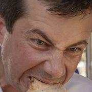
Fart Car '97 posted:Here's a first set of some portraits I took of some friends last weekend. I was experimenting taking portraits with a wide open aperture, which is something I've never done. I really like these, I think wide open portraiture is definitely what I enjoy the most. I haven't gotten to shoot a whole lot lately, but I did get to take some head shots for some friends the other day, like yours, mine are wide open. f/1.8 at a 75mm focal equivalent. I really like how they turned out, I got a couple of lights from an old family friend on the cheap, and he gave me some backdrops for free. This was my first time using them, I really think they will work for me for a while.  FINAL-0532 by Tyler M. Simpson, on Flickr  FINAL-0579 by Tyler M. Simpson, on Flickr  FINAL-0576 by Tyler M. Simpson, on Flickr
|
|
#
?
Apr 14, 2015 07:22
|
|
|
Were these professional headshots or just for fun? The first one doesn't do much for me, but the 2nd and 3rd are on the right track. The 3rd in particular is nice- the hands serve as nice element to bring out the split lighting. That said, I think the dark areas are too dark on 2/3. You should consider lightening them up a bit. It's particularly distracting on the 3rd because there's stuff on his glasses catching the hair light. At the very least try brushing that stuff out. On all 3, I can't tell if you missed focus or if the lens is just soft at 1.8. Either way you should consider stopping down 1/3-2/3 of a stop to gain some sharpness. It will make a little noticeable difference in DOF but the in-focus bits will look a lot nicer.
|
|
#
?
Apr 14, 2015 17:00
|
|
|
Fart Car '97 posted:Were these professional headshots or just for fun? Just for fun, my first time taking headshots as well as my first time using lighting. I do feel that the lens is really soft at 1.8, next time I was thinking of going with 2.8 to see how that goes. I was experimenting with different lighting setups, I was using two lights for most of these, I think I just need practice to get it just right. The dust on the glasses is diffidently something that I missed until I brought them into lightroom to edit. Next time I will be sure to be more aware of things like that. Thank you for the feed back!
|
|
#
?
Apr 14, 2015 22:26
|
|
|
MrBlandAverage posted:
Also wanted to say I liked both of these. I kind of wish you'd had a wider lens on the first one because the cliffs feel compressed and it takes away from the scale, but that's my only complaint. The second one is nice, I think burning the Fart Car '97 fucked around with this message at 22:43 on Apr 14, 2015 |
|
#
?
Apr 14, 2015 22:33
|
|


|
Window light best light. Deluxe by McMadCow, on Flickr Deluxe by McMadCow, on Flickr
|
|
#
?
Apr 17, 2015 09:41
|
|

|
 Claire by SPV Photo, on Flickr
|
|
#
?
Apr 18, 2015 07:15
|
|

|
thetzar posted:I'm really enjoying these!
|
|
#
?
Apr 18, 2015 12:15
|
|

|
McMadCow posted:Window light best light. The second is much stronger. Her expression and the light on her face in the first is not as flattering.
|
|
#
?
Apr 19, 2015 01:36
|
|

|
TheAngryDrunk posted:
digging the sense of movement you've got going here, and I like that I can't see her face. Engagement session today. Wish we would've started earlier or waited until late afternoon. 10am was too late, light wise.  NKPH8528 by nick.kneer, on Flickr NKPH8528 by nick.kneer, on Flickr NKPH9017 by nick.kneer, on Flickr NKPH9017 by nick.kneer, on Flickr NKPH8680 by nick.kneer, on Flickr NKPH8680 by nick.kneer, on Flickr
|
|
#
?
Apr 19, 2015 02:00
|
|
|
dakana posted:digging the sense of movement you've got going here, and I like that I can't see her face. I feel like these are some pretty iffy focus.
|
|
#
?
Apr 19, 2015 02:51
|
|

|
Pukestain Pal posted:I feel like these are some pretty iffy focus. I don't think so. Might be Flickr's nonsense or something. 100% crops:  
|
|
#
?
Apr 19, 2015 04:48
|
|
|
I'd still add a bit a sharpening and see what that does for you. They feel a little flat to me too, but that's just preference.
|
|
#
?
Apr 19, 2015 05:02
|
|
|
dakana posted:digging the sense of movement you've got going here, and I like that I can't see her face. Thank you! Yeah, I thought it worked best as if we're peeking in on a private moment.
|
|
#
?
Apr 19, 2015 06:11
|
|
|
dakana posted:I don't think so. Might be Flickr's nonsense or something. With these crops they look like a Specsavers advert.
|
|
#
?
Apr 19, 2015 14:51
|
|

|
torgeaux posted:The second is much stronger. Her expression and the light on her face in the first is not as flattering. Disagree. The close eye and shadow on the near side of the face in the first one are great.
|
|
#
?
Apr 19, 2015 19:49
|
|

|
voodoorootbeer posted:Disagree. The close eye and shadow on the near side of the face in the first one are great. Well according to her you're both wrong!  I've shot with this model a bunch of times, but with this past shoot she started to feel like her age was showing. Which I of course found to be ridiculous, but that's how it goes.
|
|
#
?
Apr 19, 2015 23:33
|
|
|
 Inn at Cedar Crossing by TomOlson, on Flickr Inn at Cedar Crossing by TomOlson, on Flickr
|
|
#
?
Apr 20, 2015 04:32
|
|

|
McMadCow posted:Well according to her you're both wrong! She's not going to read this is she? Because that's why I thought the second was better. She appears older (and unhappy) in the first.
|
|
#
?
Apr 20, 2015 04:48
|
|
|
RangerScum posted:

|
|
#
?
Apr 20, 2015 05:02
|
|

|
McMadCow posted:Well according to her you're both wrong! Her age is showing. I don't see what that has to do with the quality of the portraits though? I prefer the first over the second, the posing is more interesting.
|
|
#
?
Apr 20, 2015 05:58
|
|
|
RangerScum posted:
I saw this on flickr last night but I just saw the hands now 
|
|
#
?
Apr 20, 2015 19:02
|
|

|
Skizzzer posted:I saw this on flickr last night but I just saw the hands now 
|
|
#
?
Apr 20, 2015 20:24
|
|
|
Skizzzer posted:I saw this on flickr last night but I just saw the hands now Wait what do you mea- whoooa drat RS that rules
|
|
#
?
Apr 20, 2015 21:15
|
|


|
Fart Car '97 posted:I don't see what that has to do with the quality of the portraits though? It doesn't matter to me, no. The only thing I care about when making a portrait is whether or not it's interesting, and hopefully the model is confident enough to want to be a part of something like that. But since the talk was centering around whether or not the lighting and pose was flattering her, I figured I'd chip in with her thoughts on the matter.
|
|
#
?
Apr 21, 2015 02:48
|
|
|
Couple of dudes in fur coats
|
|
#
?
Apr 21, 2015 03:56
|
|

|
i'm just amazed at how this came out without any editing besides your basic contrast/saturation IMG_7670.jpg by kidkissinger, on Flickr IMG_7670.jpg by kidkissinger, on Flickr
|
|
#
?
Apr 21, 2015 07:09
|
|
|
bencreateddisco posted:i'm just amazed at how this came out without any editing besides your basic contrast/saturation I like to call her Bike-Butt (sorry).
|
|
#
?
Apr 21, 2015 09:24
|
|
|
Spedman posted:I like to call her Bike-Butt (sorry). nah, it's a sloppy background
|
|
#
?
Apr 21, 2015 14:47
|
|
|
I think this turned out OK, but I'm awful at pictures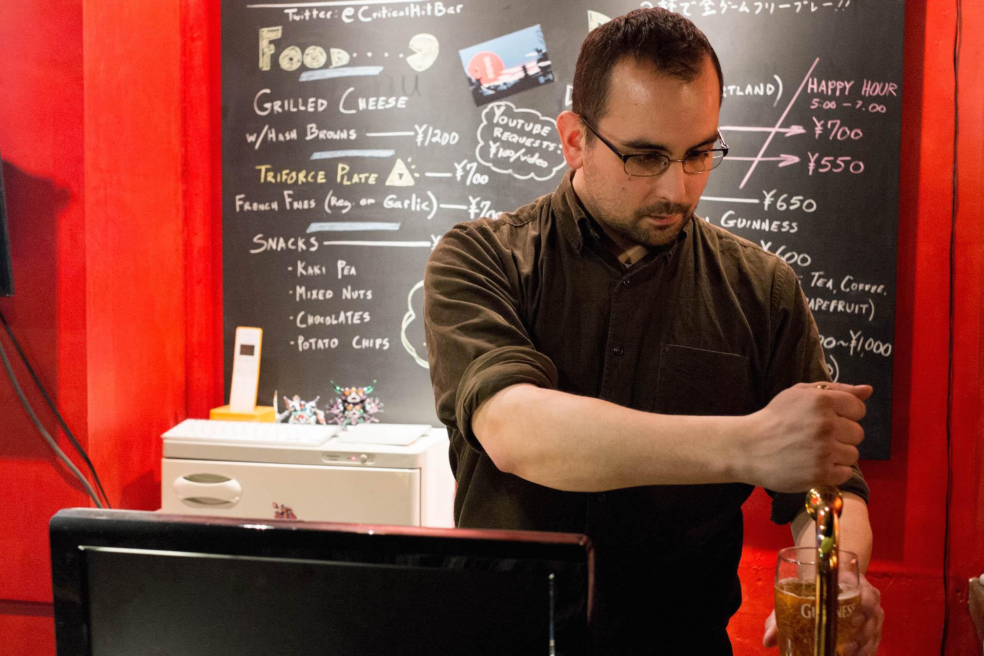
|
|
#
?
Apr 21, 2015 17:37
|
|
|
The most prominently lit/contrasty thing in the picture is the blackboard and stuff in the background. Guess where the eye goes immediately? The guy looks stiff and uncomfortable and he's basically one big shadow when set against the brightness of the background. It's not that flattering a picture to me because of those things.
|
|
#
?
Apr 21, 2015 18:06
|
|

|
Phone posted:I think this turned out OK, but I'm awful at pictures I would try this one as Black and White.
|
|
#
?
Apr 21, 2015 18:20
|
|
|
I'd try dragging it into the trash can where it belongs.
|
|
#
?
Apr 21, 2015 20:24
|
|

|
What comes on a Triforce Plate?
|
|
#
?
Apr 21, 2015 20:32
|
|
|
DJExile posted:What comes on a Triforce Plate? shame
|
|
#
?
Apr 22, 2015 01:49
|
|


|
it's a mixed green salad and there's a 1/10 chance of it containing a bee
|
|
#
?
Apr 22, 2015 03:11
|
|
|
feigning interest posted:it's a mixed green salad and there's a 1/10 chance of it containing a bee the one thing I know isn't on it is chicken,
|
|
#
?
Apr 22, 2015 07:23
|
|
|
 IMG_8982.jpg by kidkissinger, on Flickr IMG_8982.jpg by kidkissinger, on Flickr
|
|
#
?
Apr 23, 2015 05:55
|
|
|
bencreateddisco posted:
A) You missed focus. It appears to be on his eyebrows and not his eyes. B) You should stop down to bring the heel into focus as along with his eyes. I don't think the low DOF adds much to the shot. C) The crop is too tight, I spent too much time trying to figure out what was on his head. Could also have been caused by the missed focus/short DOF causing the heel to be out of focus.
|
|
#
?
Apr 23, 2015 13:59
|
|
|

|
| # ? May 17, 2024 20:35 |
|
|
Fart Car '97 posted:A) You missed focus. It appears to be on his eyebrows and not his eyes. It was a self portrait, but I could have taken steps to get the focus better, stopping down would have probably helped. I agree that the crop is a little tight.
|
|
#
?
Apr 23, 2015 15:33
|
|