


|
lollybo posted:
I like the geometry of the first one better than the wave. It has a simple quality to it and feels 'clean'. Or something. Wave feels too busy and the birds on the wall seem like important features who are then competing for attention and also a bit obscured by the angle. Bought a Mefoto Roadtrip tripod. Really digging it.  Aftermath Aftermath I also took some pics of fireworks but they didn't turn out the way I wanted. It would have been better if I were further away and in a tall building.  Untitled Untitled I couldn't tell if the crowd added or detracted from the photo. In any case, I definitely enjoyed shooting the long exposures of the smoke clearing after the fact. The light scatter is beautiful.  Untitled Untitled
|
 #
?
Apr 19, 2015 23:38
#
?
Apr 19, 2015 23:38
|
|


|

|
| # ? May 27, 2024 11:51 |
|
|
Kudaros posted:
I would like this photo better either without the crowd or with more of it. At the moment they're all kind of crammed into the corner and it's a bit awkward. There's also a ton of fringing going on around them - not sure if it's CA, HDR, sharpening or what but it's definitely present.  Board Room by Nick Bremer Korb, on Flickr Board Room by Nick Bremer Korb, on Flickr
|
|
#
?
Apr 20, 2015 05:52
|
|

|
Chitin posted:I would like this photo better either without the crowd or with more of it. At the moment they're all kind of crammed into the corner and it's a bit awkward. There's also a ton of fringing going on around them - not sure if it's CA, HDR, sharpening or what but it's definitely present. Really awesome but I would give anything to have that TV not be there.
|
|
#
?
Apr 21, 2015 03:18
|
|
|
Chitin posted:I would like this photo better either without the crowd or with more of it. At the moment they're all kind of crammed into the corner and it's a bit awkward. There's also a ton of fringing going on around them - not sure if it's CA, HDR, sharpening or what but it's definitely present. gorgeous i agree about the tv being ugly might be nice to remove some of those reflections via polarizing filter too  IMG_7670.jpg by kidkissinger, on Flickr IMG_7670.jpg by kidkissinger, on Flickr IMG_6751.jpg by kidkissinger, on Flickr IMG_6751.jpg by kidkissinger, on Flickr
|
|
#
?
Apr 21, 2015 07:46
|
|
|
bencreateddisco posted:
What's the poster in the centre background? Also watch your backgrounds, they're both pretty messy although it's less distracting in the second one.
|
|
#
?
Apr 21, 2015 11:30
|
|

|
big scary monsters posted:What's the poster in the centre background? Also watch your backgrounds, they're both pretty messy although it's less distracting in the second one. I dunno, to me that orange thing in the top right of the second is FAR more distracting than a couple of OOF posters.
|
|
#
?
Apr 21, 2015 12:10
|
|


|
I assume that was intentional though. It's not the posters, it's more the bike and the lamp.
|
|
#
?
Apr 21, 2015 12:15
|
|
|
big scary monsters posted:What's the poster in the centre background? Also watch your backgrounds, they're both pretty messy although it's less distracting in the second one. it's an old 2001 poster i think i would use a different aperture if i took that photo again i shot it at like 3.2 and i think i would do it either wide open or much smaller, either way, just committed
|
|
#
?
Apr 21, 2015 14:40
|
|
|
The first photo could stand to be cropped to removed everything from the left, I think. The second photo has an edison bulb in the top right. I took another without it in the frame, but I just kinda liked it?
|
|
#
?
Apr 21, 2015 14:42
|
|
|
bencreateddisco posted:it's an old 2001 poster Thought it might be, cool.
|
|
#
?
Apr 21, 2015 16:30
|
|
|
bencreateddisco posted:
The composition on this image is really strong. It makes the performer seem little, and makes me feel the kind of loneliness that a lone musician can feel on a large stage with a bad crowd. The slightly dilapidated piano and chair add character, I get a sense of the venue and its charm. I know its been discussed, but for what it's worth I also find the light in the upper-right corner distracting.  Chinatown Sign 3 by incarnatedao, on Flickr Chinatown Sign 3 by incarnatedao, on Flickr
|
|
#
?
Apr 25, 2015 04:39
|
|
|
Thirteen Orphans posted:
I don't dislike it, but I feel like the sign's positioning is off. I do like that the beams in the background hit it at a 90 degree angle, though. I think framing to eliminate some of the foliage and such in the background could have brought the focus more onto the sign itself. It might be just my computer/browser, but the gold on the sign seems almost too vibrant. First time comment and here's a photo for critique. I've done most of my sharing on 500px recently, so my Flickr is woefully out of date. Oh well.  Escape to Canyonlands by wallacecp, on Flickr Escape to Canyonlands by wallacecp, on FlickrI am doing a trial of Lightroom right now and am figuring out how to edit the upper right to bring down the exposure a touch. Landscapes have been a weak point for me since I got my DSLR in 2013. This shot is probably the best I've taken, save one other from my recent Moab trip.
|
|
#
?
Apr 25, 2015 06:13
|
|

|
Wow, that's a terrific photo. Would it be possible to get the RAW file? I'd love to play around with it in Lightroom.
|
|
#
?
Apr 25, 2015 07:35
|
|

|
its no big deal posted:I don't dislike it, but I feel like the sign's positioning is off. I do like that the beams in the background hit it at a 90 degree angle, though. I think framing to eliminate some of the foliage and such in the background could have brought the focus more onto the sign itself. It might be just my computer/browser, but the gold on the sign seems almost too vibrant. Use the highlights slider and adjust the exposure slider up a bit if it darkens the rest of your image too much. Good shot!
|
|
#
?
Apr 25, 2015 14:34
|
|

|
Chitin posted:I would like this photo better either without the crowd or with more of it. At the moment they're all kind of crammed into the corner and it's a bit awkward. There's also a ton of fringing going on around them - not sure if it's CA, HDR, sharpening or what but it's definitely present. I really did like this image, but I was honestly not sure what you were going for to be honest. Were you going for a retrofuture, since you have the modern black screen? The blacks are a little overwheleming, making it hard to tell the objects apart, was this your intent?  For me, this is my first attempt at taking an image of a large thing in profile, I had a lot of natural light, so I wanted to take a picture of my car, since the bridge I was going to take pictures of had its scenic overlook closed for construction work
|
|
#
?
Apr 26, 2015 02:45
|
|

|
Ryand-Smith posted:I really did like this image, but I was honestly not sure what you were going for to be honest. Were you going for a retrofuture, since you have the modern black screen? The blacks are a little overwheleming, making it hard to tell the objects apart, was this your intent? To be honest this is like one of those 'here's my dog' pics, it's not immediately clear that the shot is meant to have artistic merit and instead I was looking at the picture thinking maybe you were trying to show us that someone parked improperly or some damage to the car or something. Generally with car photography you want indirect light and a circular polarizer to cut back on glare. Bright sunny days make cars look great in real life but makes for more difficult photography. e: It's also an awkward angle. I can see part of the grill poke into perspective but not enough of the grill for my brain to figure out what it looks like. The height it's shot at is standard kinda head-height as you'd see it as you walk up to it and that alone makes the shot feel undramatic. VelociBacon fucked around with this message at 03:34 on Apr 26, 2015 |
|
#
?
Apr 26, 2015 03:32
|
|
|
Ryand-Smith posted:I really did like this image, but I was honestly not sure what you were going for to be honest. Were you going for a retrofuture, since you have the modern black screen? The blacks are a little overwheleming, making it hard to tell the objects apart, was this your intent? I've been exploring the ways in which incidental or unintentional elements - in this case, shadows, chairs, a TV set - create new forms informed by but independent of the fundamental forms of the architecture. I've been doing mostly exteriors but liked this interior shot. Here are a couple others:  2200 by Nick Bremer Korb, on Flickr 2200 by Nick Bremer Korb, on Flickr Tire Shop by Nick Bremer Korb, on Flickr Tire Shop by Nick Bremer Korb, on Flickrquote:
Echoing what was said above, this looks like "a picture of a car" not something that was photographed intentionally. I'm not an automotive guy but my suggestion for getting away from the "picture I took" look is to change up your angle. You're pretty clearly just standing and pointing the camera - get low, give me the eye-level perspective of the car, not the photographer.
|
|
#
?
Apr 26, 2015 07:56
|
|
|
Chitin posted:
I like this photo a lot, really strong sense of geometry. I can't help but think, if you were a few feet to the right, it would really cool if you caught that "China Cook Restaurant" sign at an exact 90 degree angle. Chitin posted:
This shot is nice as well. I really wish I could see more texture on those tires, but I'm not sure it would be possible to do so without ruining the rest of the photo. Maybe a lower angle, with the tires taking more of the frame, and a slightly longer exposure? BTW, we're following each other on flickr, and I really enjoy your work. Here's the first of a series of self-portraits I'm working on right now.  IMG_8982.jpg by kidkissinger, on Flickr IMG_8982.jpg by kidkissinger, on Flickr
|
|
#
?
Apr 26, 2015 16:20
|
|
|
bencreateddisco posted:Here's the first of a series of self-portraits I'm working on right now. It took me a bit to recognize the shoe, I think you could put a bit more of it into frame, and a liiiiiiiitle bit more DoF, the shoe's heel is out of focus. Finally, I'd see about trying to get some fill light on it, it may get a bit better if you put more of it into frame but as of now it kinda blends with the background in the area above your brow, it only starts to show better to the left. /edit: check the thumbnail on my quote; you can't recognize the shoe, it just looks like a shadow. I know that it's way smaller and some detail will be lost, but I think it illustrates what I was trying to say about it not being recognizable. Here's a few more from my trip to NY  _MG_4614.jpg by AxelDR, on Flickr _MG_4614.jpg by AxelDR, on Flickr  _MG_4502.jpg by AxelDR, on Flickr _MG_4502.jpg by AxelDR, on Flickr _MG_4847.jpg by AxelDR, on Flickr _MG_4847.jpg by AxelDR, on FlickrIs it ok to repost pictures if they didn't get critique'd the first time?  (I don't mean these, these are fresh (I don't mean these, these are fresh  ) )
Edmond Dantes fucked around with this message at 16:34 on Apr 26, 2015 |
|
#
?
Apr 26, 2015 16:31
|
|

|
Edmond Dantes posted:
This isn't legit criticism and I love the tone of the first but these two photos seriously look like you took a hat with you on a trip and you're trying to convince people you have a girlfriend.
|
|
#
?
Apr 26, 2015 16:38
|
|
|
Magic Hate Ball posted:This isn't legit criticism and I love the tone of the first but these two photos seriously look like you took a hat with you on a trip and you're trying to convince people you have a girlfriend. hahahahahaha, fair enough. They belong to a really short asian girl who was part of the tour I was running around town with for the day; I was framing the second one (it was earlier in the day) and she moved her head into frame. I liked it, so I made it a running joke of sorts for a few more shots during the day. v v
|
|
#
?
Apr 26, 2015 16:53
|
|
|
bencreateddisco posted:
I agree with what Edmond Dantes said, I didn't notice the shoe until I looked at the picture a second time. Little more in frame, little more DoF, and a little more light on the shoe will be awesome. I just got back from a vacation, and have about 800 pictures to go through but these are some of the ones I liked best so far:  DOOM4902.jpg by alexmthorpe, on Flickr DOOM4902.jpg by alexmthorpe, on Flickr DOOM5861.jpg by alexmthorpe, on Flickr DOOM5861.jpg by alexmthorpe, on Flickr DOOM4905.jpg by alexmthorpe, on Flickr DOOM4905.jpg by alexmthorpe, on Flickr
|
|
#
?
Apr 26, 2015 17:07
|
|
|
Thorpe posted:I agree with what Edmond Dantes said, I didn't notice the shoe until I looked at the picture a second time. Little more in frame, little more DoF, and a little more light on the shoe will be awesome. Pic 1: I like the background and its low contrast, which makes the figure making the interesting pose stand out very well in a good way. However, I don't think there is a good reason for placing the figure in the dead center here, I guess you were trying to show symmetry? Maybe a closer crop would have helped in that case. Pic 2: Interesting geometric patterns and textures, I think the crop is a little too close though I kind of wanted a bit more context as to what is going on. Pic 3: I like this picture. Simple, well composed, and good bokeh. Did a lot of walking around town today.  Halt by kgao1989, on Flickr Halt by kgao1989, on Flickr IMG_8025.jpg by kgao1989, on Flickr IMG_8025.jpg by kgao1989, on Flickr IMG_8012.jpg by kgao1989, on Flickr IMG_8012.jpg by kgao1989, on Flickr
|
|
#
?
May 1, 2015 01:28
|
|
|
bencreateddisco posted:I like this photo a lot, really strong sense of geometry. I can't help but think, if you were a few feet to the right, it would really cool if you caught that "China Cook Restaurant" sign at an exact 90 degree angle. Thank you! I'm enjoying your stream too. This is nitpicky but I'm finding the heel of the shoe ever so slightly different in value than the body - it seems more saturated and a bit brighter, and now that I've noticed it I'm finding it really distracting. On the subject of self portraits...  Self Portrait - "Tipping Point" by Nick Bremer Korb, on Flickr Self Portrait - "Tipping Point" by Nick Bremer Korb, on FlickrEDIT: darn it Flickr stop crushing my blacks.
|
|
#
?
May 1, 2015 11:12
|
|
|
Thorpe posted:I agree with what Edmond Dantes said, I didn't notice the shoe until I looked at the picture a second time. Little more in frame, little more DoF, and a little more light on the shoe will be awesome. The shoes don't so much for me -- there's no context, I don't know why we're looking at them. The archways are kinda cool, I like the selection of the verywide crop and the texture. Still just a bunch of yawning black mouths with a tent in the corner, though. The guy in the sand is pretty badass, though. Is he dancing? Twirling? I don't really want to know, it's just a great shot. He isn't dropped to black, but there's such haze behind him that he pops right out. I dig a lot. I went to Poland for work and found it to be a very blue place.  Untitled by thetzar, on Flickr Untitled by thetzar, on Flickr Untitled by thetzar, on Flickr Untitled by thetzar, on Flickr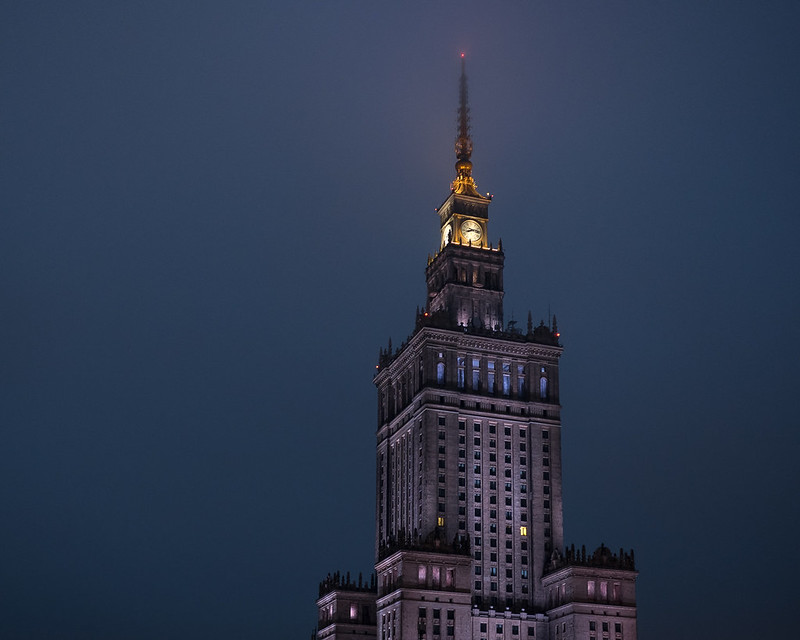 Untitled by thetzar, on Flickr Untitled by thetzar, on FlickrI'm going to push my luck for a fourth here just because I really like this eye contact. I wish I had a longer lens, or could get closer to the trams, or had spent a whole day just taking pictures of people within them.  Untitled by thetzar, on Flickr Untitled by thetzar, on Flickr
thetzar fucked around with this message at 04:59 on May 3, 2015 |
|
#
?
May 2, 2015 23:26
|
|

|
thetzar posted:
I have absolutely no criticism to offer on any of the other photos in the set. I think they are perfectly composed and incredibly crisp. It's honestly really intimidating. This one seems like it would stand to have the highlights dropped a little. I think the brightness of the background makes it easy to lose these faces, though the eye contact is really powerful.  IMG_0383.jpg by kidkissinger, on Flickr IMG_0383.jpg by kidkissinger, on Flickr IMG_0089.jpg by kidkissinger, on Flickr IMG_0089.jpg by kidkissinger, on Flickr IMG_0048.jpg by kidkissinger, on Flickr IMG_0048.jpg by kidkissinger, on Flickr
|
|
#
?
May 3, 2015 00:18
|
|
|
bencreateddisco posted:I have absolutely no criticism to offer on any of the other photos in the set. I think they are perfectly composed and incredibly crisp. It's honestly really intimidating. I really like the first pic, overall I think it is a great composition and the shadow is a neat touch.  IMG_8210.jpg by kgao1989, on Flickr IMG_8210.jpg by kgao1989, on Flickr
|
|
#
?
May 4, 2015 04:55
|
|
|
lollybo posted:
I have the same problem as you, I think, in that I think very strictly about composition to the point where it's obvious what I'm doing. I don't know if that's a bad thing or not, but I'm always separating my exposures into thirds, having "leading lines" coming out of the corners, etc. I think (and this is just me projecting probably) it looks amateurish. So I like your photo, but maybe try playing around with different angles and perspectives. The waterfall coming straight out of the corner to the opposite end screams "look at me," - I think you could have been more subtle about it, and made me think about the picture more.  DSCF9088.jpg by badmountain, on Flickr DSCF9088.jpg by badmountain, on Flickr DSCF9104.jpg by badmountain, on Flickr DSCF9104.jpg by badmountain, on FlickrWhich one is better? And why?  DSCF9201.jpg by badmountain, on Flickr DSCF9201.jpg by badmountain, on Flickr
Skizzzer fucked around with this message at 06:26 on May 4, 2015 |
|
#
?
May 4, 2015 05:52
|
|
|
Bleh, sorry, I broke tables and I can't edit my post now. DSCF9088.jpg by badmountain, on Flickr DSCF9088.jpg by badmountain, on Flickr DSCF9104.jpg by badmountain, on Flickr DSCF9104.jpg by badmountain, on Flickr DSCF9201.jpg by badmountain, on Flickr DSCF9201.jpg by badmountain, on Flickr
|
|
#
?
May 4, 2015 06:37
|
|
|
thetzar posted:
Why do you think you chose to compose this the way you did?
|
|
#
?
May 4, 2015 15:45
|
|

|
Skizzzer posted:Bleh, sorry, I broke tables and I can't edit my post now. 1 & 2 feel a bit claustrophobic for the kind of landscape that i feel like you are trying to go for. if you were further back or these were a wider angle it would sell me a lot more on the serene wooded road feel, also the bottom right on these is pretty unattractive space. i dont have any real reaction to the 3rd photo. here's one from me i'd love some feedback on:  coast by mydoski, on Flickr coast by mydoski, on Flickrhp5+ at dilution H for 12 minutes, the final negative was a little underexposed, i didn't have a red filter on me so i pulled down the sky in post (which kinda amplified the grain in the sky a bit)
|
|
#
?
May 4, 2015 19:22
|
|


|
Mido posted:1 & 2 feel a bit claustrophobic for the kind of landscape that i feel like you are trying to go for. if you were further back or these were a wider angle it would sell me a lot more on the serene wooded road feel, also the bottom right on these is pretty unattractive space. Normally I'd gripe about how grainy this is, but I actually kind of like the sky grain. It really works with the overall lack of contrast to give it a kind of ominous, artificial feeling.
|
|
#
?
May 6, 2015 00:32
|
|


|
Mido posted:1 & 2 feel a bit claustrophobic for the kind of landscape that i feel like you are trying to go for. if you were further back or these were a wider angle it would sell me a lot more on the serene wooded road feel, also the bottom right on these is pretty unattractive space. I know there are a lot of good reasons, and I still think this is a good photo, but without the grain it would be pretty amazing.  hard study by kidkissinger, on Flickr hard study by kidkissinger, on Flickr Steve s by kidkissinger, on Flickr Steve s by kidkissinger, on Flickr
|
|
#
?
May 6, 2015 05:56
|
|
|
Baby Babbeh posted:lack of contrast  I'm not generally that big on grain but I don't feel it detracts from this photo. Maybe if I saw a non-grainy version next to it I'd like that better, I dunno. But it's a great photo either way.
|
|
#
?
May 6, 2015 06:33
|
|
|
hard study by kidkissinger, on Flickr Ok, I love the sheer fullness of this image, it really captures that feeling of "Its 10 PM, we have finals, lets study", why did you chose the top angle for this picture if I may ask. Steve s by kidkissinger, on Flickr[/quote] This one, I'm confused, like, it isn't bad, but the thing feels like an iPhone/Instagram style photo (iPhone 6 is better than most non elite point and shoots imho), but it feels like a place that hasn't changed much even though it is the 21st century. It is very very dark though, like, was that the intent to fill up the image with darkness? I'm just confused more than anything. Halt by kgao1989, on FlickrThis picture, I really loved it, the mix of the street grafitti, the brightness of the photo, and the person walking makes it feel like some of the album covers from the 80s that I tend to like, its an awesome photo, how did you even manage to find the person, just random luck?  This one was my first use of the ultra-wide for non massive group photos, so I was at 10mm I think, I'll check Lightroom, and ugh, I'm annoyed at how hard it was to try and capture something that big from the angle that I had, and the next one was just, I felt like that was the best shot I was going to get that day, I was using the AV setting, the light was great, I had a decent aperture, and I felt it captured something of the New Jersey, but I am not so sure if it came out like I wanted it to. This one was my first use of the ultra-wide for non massive group photos, so I was at 10mm I think, I'll check Lightroom, and ugh, I'm annoyed at how hard it was to try and capture something that big from the angle that I had, and the next one was just, I felt like that was the best shot I was going to get that day, I was using the AV setting, the light was great, I had a decent aperture, and I felt it captured something of the New Jersey, but I am not so sure if it came out like I wanted it to.
RCK-101 fucked around with this message at 16:19 on May 9, 2015 |
|
#
?
May 7, 2015 01:51
|
|
|
bencreateddisco posted:
I think this is an excellent photo. I feel a creeping sense of dread when I look at it, like I am standing in that pitch dark parking lot in the middle of the night. I think its the green-ish light coming from the store? The only part of the composition I am not sure about are some of the lights to the left of the frame. I haven't posted my own photos in this thread for a bit. Here an assortment of photos I have taken recently.  Ari by dshenphotos, on Flickr Ari by dshenphotos, on FlickrThis is the child of a friend's friend. He was an especially rambunctious five year old, very playful and fun. I wanted to try and capture that playfulness in the portrait. I like his posture and the background, but I'm not totally sure how I feel about his legs being chopped where they are.  Isaiah by dshenphotos, on Flickr Isaiah by dshenphotos, on FlickrSame family, different kid. This one was the oldest and most adventurous (nine year old). He climbed up on this concrete pylon, and I took the chance to take his portrait.  Untitled by dshenphotos, on Flickr Untitled by dshenphotos, on FlickrThis was just a snapshot I caught as I noticed this guy walking down the street past me in the middle of the day. Only shot I got, I didn't particularly feel like chasing down the semi-naked guy walking down the street and ask for a second exposure.
|
|
#
?
May 7, 2015 03:36
|
|

|
Ryand-Smith posted:
I wanted to capture the entirety of the table. I just got a 6.5mm lens and this seemed like one of the less unnatural angles to shoot with it.  Halt by kgao1989, on Flickr Halt by kgao1989, on FlickrThis is great. I would have persally adjusted the temp a little down, and it seems pretty soft. It works really well for the lomo feel you were probably going for tho.
|
|
#
?
May 8, 2015 01:28
|
|
|
RangerScum posted:Why do you think you chose to compose this the way you did? Some trial and error, and a lot of consideration. I didn't have any truley wide lenses with me, and backing up significantly fromt he building introduced an awful lot of streetlights and tram lines. Here are a couple of alternate shots I did get only slightly further back:   I sat and considered that first, tilty one for hours. I still like it. But it seemed forced, like I was trying to cram both the sign and the tower into the frame... which I was. The one I posted just fest... calmer.
|
|
#
?
May 8, 2015 12:08
|
|
|
thetzar posted:Some trial and error, and a lot of consideration. I didn't have any truley wide lenses with me, and backing up significantly fromt he building introduced an awful lot of streetlights and tram lines. Here are a couple of alternate shots I did get only slightly further back: I like the bottom one a lot. If you were trying to get both the sign and the building, maybe position the shot more to the right and zoom out a little to get both in without having to tilt. Love the lighting though! These are from a car show at the University of Washington last weekend:  IMG_7435 by mazdalifephotography, on Flickr  IMG_7625 by mazdalifephotography, on Flickr This is from our trip to a car meet on the other side of the state:  IMG_7063 by mazdalifephotography, on Flickr
|
|
#
?
May 8, 2015 19:53
|
|

|

|
| # ? May 27, 2024 11:51 |
|
|
hi liter posted:
You could have taken a step to your left so the boy's head was framed in the sky and not with the... oil thingies popping out from behind him, I feel the DoF difference is not enough to isolate him. Also it may be a tad overexposed. Ryand-Smith, your pics are really really small; the 10mm of the ship is 640x145, can't see poo poo, captain! thetzar posted:Some trial and error, and a lot of consideration. I didn't have any truley wide lenses with me, and backing up significantly fromt he building introduced an awful lot of streetlights and tram lines. Here are a couple of alternate shots I did get only slightly further back: I... I really like this one. Reminds me of those movies/videogames that make the name of the place or the HUD part of the scenery (that may sound weird but I mean it in a really good way). I'm not getting the forced feeling at all from the picture, honestly. 
|
|
#
?
May 9, 2015 00:25
|
|